Site, situation and planning: Target Field

Game three at Target Field, looking east.

I managed to catch one of the games in the first series at Target Field in Minneapolis this week (my Red Sox were in town) and although the Sox lost, it was great to see a new stadium. It was actually the second in a week—I was at Kauffman Stadium in Kansas City last weekend for a Sox game (nice ballpark, in the ‘burbs surrounded by a sea of parking, and I didn’t have time to explore KC)—and it was very interesting to see how the park is sited, and how people are adapting to the new experience, both inside and out.

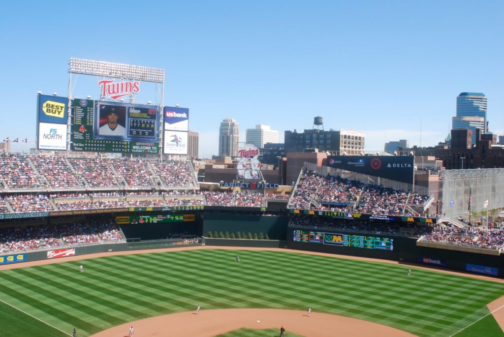
From a baseball perspective, it’s fun to see how people like the inside. I was born and raised on Fenway, and the Metrodome was, um, atrocious. After a Sox loss there, I was depressed. Watching my team get shellacked on Thursday, having skipped out of work, with the sun beating down and the cool breeze blowing, well, it was nice. There are some cute features (the two baseball players—Minnie and Paul—shaking hands across the river when a home run is hit or the game is won), the usual odd angles of a new ballpark, and no baggie in right field. And the view of the skyline is a great touch. Otherwise, it’s a perfectly good replacement for what was a perfectly poor excuse for a baseball stadium.

But this isn’t a baseball blog.

The geographic term “site and situation” is usually applied to whole cities or settlements, but it can really be used to describe the location of nearly any geographic feature. And with 40,000 people, Target Field (or any baseball stadium) can be described as a small city for three (or, in a Red Sox-Yankees game, four and a half) hours at a time. Basically, the site is physical characteristics of, in this case, the stadium. Situation is how it interfaces with what is around it; how it connects to other buildings, roads and transit.

Of all the arenas cities build to glorify their teams (or their selves), baseball parks generally see the most traffic. A football stadium may seat 70,000, but it only sees 10 games a year. Even with other events, such a stadium is hard-pressed to break a million fans. (There’s a good reason football stadiums are often, and maybe should be, built away from downtowns: their demand for parking does not mesh well with surrounding land uses, and moving that many people in and out can strain all but the best-equipped transit systems.) Indoor arenas, even when the combine basketball and hockey, sell out shy of 20,000, and there are only about 80 games a season. That’s 1.6 million. Add in some other shows, and you can break two million. (The Staples Center in LA, with two basketball tenants, may see more fans, although I can’t imagine Clippers games sell out.)

But baseball parks? They usually seat at least 40,000 (most new parks are around this figure). And they have 81 home dates a year. Throw in a few concerts, and you can bring more than three million fans in each year. From an economic development standpoint, baseball stadia are probably the best generator of people in sheer numbers. Even if they don’t have anything beyond baseball, they still bring in more visitors than any other arena.

Of course, the Metrodome didn’t do much for its surroundings. Much as it was 28 years ago, it is surrounded by, well, mostly by parking lots—a suburban stadium in the middle of a city (or, at least, a tangle of highway ramps). Target Field, for many reasons, may not suffer quite the same fate.

Target Field’s Site

Target field sits on a not-quite square plot of land on the northern fringe of Downtown Minneapolis. The street grid in Downtown is oriented to the Mississippi river, which flows five blocks to the site’s east. South of Hennepin, the grid is shifted slightly, but where the ballpark is located, the streets run almost perfectly 45˚ off of the cardinal directions (i.e. NE-SW and NW-SE). Before the ball park was constructed, there was a ditch between 2nd Avenue N and where 4th Avenue N would run. The southeastern half was taken up with the exit ramps of Interstate 394; the rest was a parking lot until it reaches the railroad tracks. The stadium is built above the former parking lot, with a pavilion extending above the railroad tracks.

The park is oriented due east—that is, the batter is looking straight at the rising sun and the pitcher throws the ball to the west. To fit the field in the confined location, the stadium needed to be oriented in a cardinal direction, and baseball stadiums are best located to the northeast. Baseball games are rarely played at sunrise, and this allows for the smallest chance that the sun will be in a player’s eyes. (Although there are two baseball stadia which are oriented due west—and they sometimes have to suspend play at sundown.) With baseball games starting in the afternoon (with one exception, the 11:05 a.m. start for the Patriots Day game in Boston), some parks face south of east, and some due north, but most face northeast. Here’s a great diagram of all the ballparks. And, in case you were wondering, this orientation is set forth as “desirable” in Major League Baseballs rules (1.04).

There’s another major reason for the orientation of the ballpark, but we’ll explore that in the situation discussion. Other than the fact that the stadium is built on stilts over a highway and a railroad (and, in the future, a bike path), there’s not much else exciting about the ballpark’s site, since it is basically reclaimed land (discussions of sites for cities often go on for much longer, incorporating terrain, water sources, deep harbors, rail corridors and the like). Basically, it’s a rather cramped city block in Minneapolis.

Target Field’s easterly orientation gives is a grand view of the Minneapolis skyline; it should be even better at night.

Target Field’s Situation

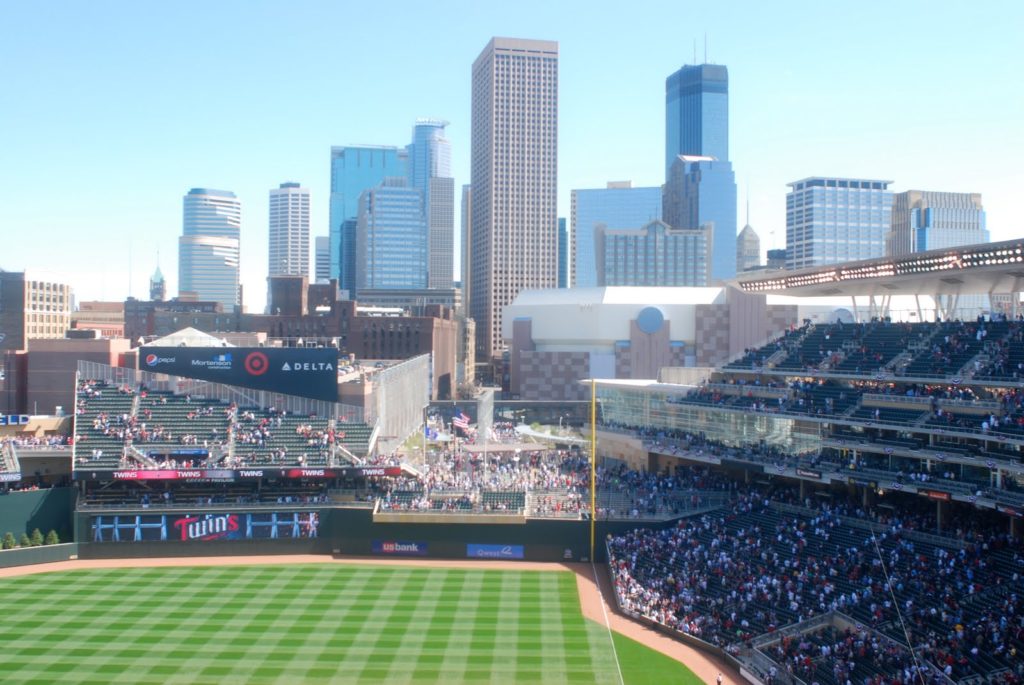
The situation of the ballpark—how it interfaces with the rest of the city—is much more interesting. The orientation, which is a site feature, is, perhaps, more importantly, part of the park’s situation. The reason that the park was sited facing east instead of north is the proximity of Minneapolis’s skyline—the highest buildings between Chicago and Seattle—sits to the southeast of the field. A northerly facing diamond would have nothing in view beyond the stadium’s walls. With the east-facing ballpark, several 800-foot-tall buildings loom less than half a mile above the field (and, yes, you can see in from the higher floors of some of them).

In fact, Target Field is significantly closer to the center of Downtown Minneapolis (we’ll define it as the IDS Center) than the Metrodome. As the crow flies, the nearest gate to Target Field is about a quarter mile from Nicollet. The Metrodome is more than twice that distance. There is quite a bit less surface parking around Target Field, too. Minneapolis has a lot of parking downtown, and, for the most part, these spaces are empty nights and weekends—which is precisely when they are needed for baseball. The Metrodome was almost completely surrounded by surface parking, while Target Field has only a few nearby surface lots.

This lack of surface parking is going to have several interesting effects on the parking market. First, the land near the Metrodome will lose much of its value for parking as the parking for the Twins and Vikings will be disaggregated. The Twins drew 2.4 million fans in 2009, many of whom parked in these surface lots. While Vikings fans will need somewhere to park, there are only about 600,000 Vikings fans, one fifth of the pre-2010 total. If the real estate market picks up in Downtown Minneapolis (one of the few under-construction buildings in the city is on a former parking lot near the Dome), these lots—especially the ones a bit further from the Dome—will net less cash from parking revenue, and thus be more likely to be sold for development.

Around Target Field, the parking situation is a bit more developed. Minneapolis has a many car commuters, and, thus, a lot of parking structures (and some surface parking). The Central Business District is strong enough that it is not infiltrated by surface parking, although there is a good deal on the flanks. The city operates three “ramps” (as parking garages are called here), called the ABC Ramps, which surround the field, have direct freeway access, and about 7,000 parking spaces (assuming 2.5 passengers per car, that’s half the stadium). There are, of course, dozens of other garages downtown, and even some surface parking. With the Target Center (home of the basketball Timberwolves—the hockey Wild play in Saint Paul) and several theaters nearby, the events parking market is rather well established, and there may not be a need to claim more land for parking. However, the few surface parking lots nearby will become more valuable as parking, which may hamper redevelopment efforts in the neighborhood, unless the ballpark increases their value as developed land.

The Twins, who originally played at suburban Metropolitan Stadium (now the Mall of America) have decreased nearby surface parking with each move. Their original ballpark was similar to Kauffman or Miller Park in Milwaukee—everyone drives, and many tailgate. Thirty years later, they are now playing in a very urban-feeling environment.

Target Field is also accessible by transit, and these connections are well publicized by the team and city, which hope to limit the volume of traffic around the stadium on game days. Amongst stadia with transit connections, there are actually few which are located as centrally on a transit system as Target Stadium, or at least as it has the potential to be. Stadia require quite a bit of land and, recently, quite a bit of parking, which are not generally compatible with the centers of transit systems. If you look at older ballparks (or former locations)—Fenway, Wrigley, Yankee Stadium, Shibe and Baker Park (in Philadelphia), Comiskey, Ebbets Field, the Polo Grounds—they are generally on transit lines, and far from the nexus of the transit system. Even in cities with new stadiums, like AT&T Park in San Francisco or the ballpark in Washington, D.C., the parks are generally not near main transit stations. In cities with major transit systems, land near major centers are just too damn valuable for a block of grass and stands which are only used 250 hours each year.

In other words, most baseball stadia require a transfer. They’re not near commuter rail terminal stations. They were built where there was cheap, vacant land, which, for older stadia, was usually a few miles out from the middle of the city. In Boston, this means that thousands jam the trolleys to Kenmore (when this coincides with the end of rush hour, for a 7:00 game, the trains are jammed). In New York, the two lines which serve the Stadium—the IRT Jerome Avenue Line (4) and the IND Concourse Line (B, D)—easily reach crush capacity, especially the over-capacity Lexington IRT which is already way beyond capacity (which is why they’re building the Second Avenue Subway), and the L to Addison in Chicago gets pretty full up to Wrigley.

Minneapolis has one rather-well used transit line, which was extended a stop to serve the stadium. The light rail vehicles on the line are rather large, with a crush capacity of more than 200, meaning a two-car train can carry nearly 500 passengers. Right now, the stadium is at the end of the line, meaning that fans can pour in to empty trains, and as long as the end of the game doesn’t conflict with rush hour (any weekday day games begin at noon, likely in the hopes the game will end before the height of the evening rush) and the trains should be able to clear passengers out before the rush. For 7:00 games, baseball fans will be traveling against rush hour, which is desirable. On evenings and weekends, the trains are relatively empty—the line is rather commuter-oriented—so they an be mostly devoted to game traffic. And the line was designed to stop adjacent to the stadium to allow for ease of boarding and alighting. There are no stairs, escalators or treks to the station. Many bus routes also pass nearby or terminate near the stadium.

In addition to the light rail, a new commuter rail service serves Minneapolis and stops below the stadium.  The 500 fans it can carry is small potatoes compared with the light rail (which can carry that many every few minutes) and it won’t even serve every game (it buys trackage rights from a very well-traveled section of one of the BNSF’s main transcontinental routes). However, it has large parking lots in the suburbs and special fares for ballgames, and appeared to be well-used this past week.

The line for the light rail was long, but orderly. Still, the boarding process needs to be streamlined.

There are definitely some kinks to work out. At the Metrodome, 4000 of the average of 30,000 fans came by train. Target Field seats 40,000 and should be sold out most of the season, and parking is harder and more costly; it’s presumable that upwards of 6000 fans will ride the light rail to the stadium. On Thursday, the line after the game was several hundred people long (but very orderly, as opposed to what happens in Boston or New York; it probably also meant that it was slower and that the maximum nuber of people were not filling the cars). MetroTransit had staff on hand, but did not have the vehicular capacity. In Boston, where the main sticking point is line capacity, the MBTA runs full rush-hour service before and after Red Sox games on the Green Line, and usually stores several cars in the Kenmore Loop, allowing them to run several trains outbound, one after the next, to deal with the post-game rush. Here, the line could support three car trains at three minute headways—700 people 20 times an hour—but was not utilized to that level.

MetroTransit needs to take heed. They have stub tracks beyond the station, and should have as many trains stored there as they can. With 300m of double-track, they should be able to have 10 cars—for 2500 people—stored there, although with two-car trains, only 8 cars for 2000 people may be feasible. They should then run these at three-to-five minute headways for the first half hour after the game. Additional cars stored just south of Downtown at the maintenance facility should be sent as quickly as possible, with boarding on both tracks. With the ability to run three-car trains, this would be a capacity of 8400 to 14000 per hour, more than enough to clear out the stadium traffic in 30 minutes after a game.

In the future, Target Field could become one of the most transit-centered ballparks in the country. Plans are moving forward to build the Central Corridor (to Saint Paul, 2014), and long range plans have these two lines, which will terminate at Target Field (thus doubling capacity through downtown), interlining through downtown with the Southwest Corridor (2015) and the Bottineau Transitway (to the northwest). With 7.5 minute headways (the current rush hour headways on the Hiawatha Line), 32 trains, each carrying up to 500 to 700 passengers, could pass Target Field each hour, carrying 16,000 to 22,000 passengers—more than enough capacity for the ballpark, and a capacity rivaling the transit capabilities of Fenway and Wrigley.

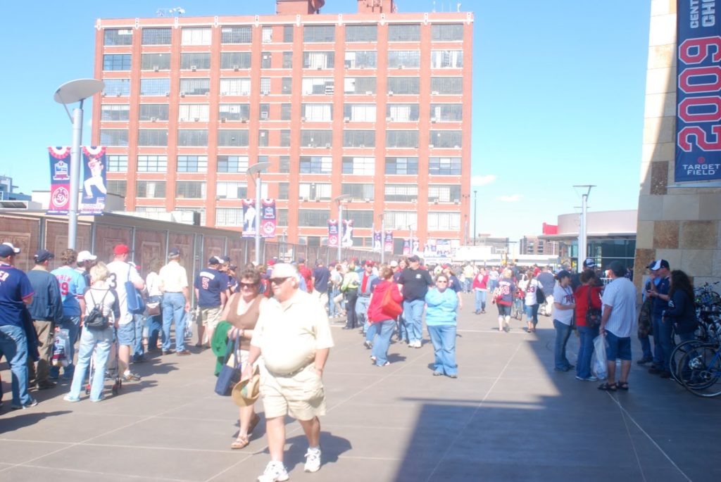
With ample parking in place and the possibility of increased transit service, Target Field may do a better job of drawing nearby development than the Metrodome. The Dome is in a no-mans land. It is surrounded by parking on all sides, and by freeways in two directions. Once transit showed up in 2004, its days as a baseball stadium were all but numbered. Target Field helps connect Downtown Minneapolis to the North Loop, a hodgepodge of new lofts, hip restaurants, and still-operational warehouses. It has a bit of parking, but most of this is a good distance from the ballpark, much further than the huge ramps nearby (thus, its value as parking won’t increase dramatically with the new ballpark). There is a rather obtrusive highway offramp between the stadium and the North Loop; however, if it were dismantled, would yield a plethora of developable land with half a mile of the Mississippi River, Downtown, transit and bicycle facilities. It is also slated to have a line of Minneapolis’s proposed streetcar network pass through it. The North Loop could benefit greatly from being linked to downtown by the park, which bridges the former two-block-wide trench between the neighborhood and the downtown with rather wide pedestrian concourses, and be further developed as a transit-oriented, mixed-use neighborhood, where there are currently underutilized light industrial plots or warehouses within a mile of downtown.

Finally, with Minneapolis currently the top bicycling city in the country, I’d be remiss to not mention the stadium’s situation regarding cycling. And walking. As far as walkability, the ballpark is a few blocks from Hennepin and, while not connected to the Skyway system (which are used more in the winter than summer) it is better connected by sidewalks and by the new pavilion built between the ballpark and the Target Center.

Ten minutes before game time (and ten minutes before the sun came out), the bike racks at the field were full, even though it had rained lightly in the morning. Several other similar racks line the stadium walls.

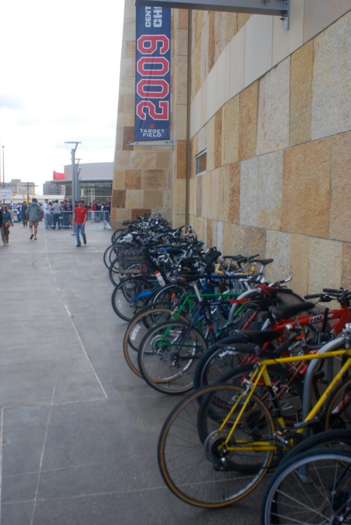
As for cycling, Minneapolis probably has more people who bicycle to baseball games than any other city. The bike racks at the Metrodome, which was actually located near more bike trails than Target Field, were always well used, but they were tucked away on one side of the building, away from most of the trails. The field is surrounded by bike racks (map [pdf]), including racks which line the northwest promenade of the field—built over the railroad tracks—and when I visited this week, they were all packed. Perhaps the Twins need to install some more.

In addition, the Cedar Lake Bike trail, which extends in to downtown from the southwest, is being extended under the ballpark. It will connect the bike trail along the Mississippi River to the stadium, and allow grade-separated bike access to the stadium, avoiding foot and car traffic. With these improvements, the bike facilities near Target Field will be unparalleled in the major leagues. (And, no, when I was living a similar distance from the ballpark in Boston, I never even thought of biking to Fenway.)

With easy transit options (a bus straight from my house; a nice bike ride along the river) and a lovely field I do want to see at night, I’ll be back.

Interregional High Speed Rail: which corridors work where

A recent study (PDF) from a group called America 2050 has put together one of the most data-heavy (and that’s a good thing) approaches to examining high speed rail corridors in the country. There are still some issues, most notably the fact that corridors over 500 miles were ignored (yes, they should be weighted less than 200-400 mile corridors, but, no, with proper speeds attained, they shouldn’t be dropped) and their map does not seem to fully mesh with their data. Still, they take in to account such factors as transit accessibility in cities analyzed, economic productivity (higher local GDP is better), traffic and air congestion and whether the city is in a megaregion (this seems to be a rather ancillary data point).

Their subsequent phasing map, while better than most, seems to be, well, not completely in-line with their data. This is mainly because each corridor seems to be analyzed separately, and overlapping corridors, from their report, are not shown well.

First, they did get the two big corridors right (the “no-brainers,” if you will): California and the Northeast Corridor. Both of these corridors have multiple city pairs in the top-10 of their analysis; in California the San Francisco-San Jose-Los Angeles-San Diego line and in the northeast the Boston-New York-Philadelphia-Baltimore-Washington corridor. Of course, those are obviously the top high speed rail corridors in the country. However, the rest of their “first phase” corridors are less obvious.

In an effort to, perhaps, not leave out the Midwest (where much of the current political support for high speed rail originates), they include, in phase 1, lines from a Chicago hub to Minneapolis, Saint Louis and Detroit. These are all worthy corridors but, according to their analysis, are not in the same echelon as the coastal corridors. Chicago to Saint Louis clocks in at 14th, trailing Chicago to Columbus by a spot. Chicago to Minneapolis ranks 25th, behind corridors such as Cleveland to Washington and Phoenix to San Diego.

With Chicago to Detroit (11th), however, things get interesting. Let’s introduce two maps in to the equation. The first is a map of the top 50 corridors analyzed by America 2050, with the color of a line indicating if they were in the top 50 (red), 40 (orange), 30 (green), 20 (light blue) or 10 (dark blue). Opacity is set rather low, so overlapping lines should show up considerably darker (see the Northeast Corridor, where four top-ten corridors intersect from New York to Philly). From Chicago to Minneapolis and Saint Louis, there are single lines. Despite the presence of some smaller cities (Decatur, Springfield, Urbana-Champaign; Milwaukee, Madison, Rochester) none of these corridors crack the top 50. (Milwaukee-Chicago was not calculated as it is less than 100 miles.) East of Chicago, however, there is a web of lines. From Chicago going east, three cities make the top 16: Detroit, Cleveland and Columbus. And east of there, these cities are all linked eastwards. (Any city with at least two corridors is shown with a point, its size corresponding to the number of corridors.)

So it begs the question: which routes are most applicable to high speed rail if we overlap corridors which could share significant trackage. For instance, Chicago to Detroit, Cleveland and Columbus could all share one high speed link, with short spurs to each of the cities. These three cities could all share a link across Pennsylvania (with Pittsburgh) to Washington, Philadelphia and New York. 11 of the top 50 city pairs are between New York, Philadelphia and Washington in the east and Columbus, Cleveland and Detroit in the west. Since most of the capital costs of constructing a high speed rail line is the initial capital cost, combining several corridors could dramatically reduce the amount of line needed, saving billions.

So, the second map. For this map, lines with little or no overlap were ignored. Other corridors were assigned a (rather arbitrary) point value based on their ranking:

1-10: 6 points
11-20: 4 points
21-30: 3 points
31-40: 2 points
41-50: 1 point

(Why did the top 10 get a slightly higher weight than the rest? Well, the numerical rankings of the top 10 ranged from 100 to 91. The rankings of the next 40 ranged from 91 to 85.)

Here’s another scheme: assign a route with a score of 85 one point, and an additional point for each increase in the score. This is, perhaps, a more equitable approach for larger corridors, and it really pops out the Northeast Corridor. A possible network of 2450 miles (1870 in the East and Midwest, 580 in California) could serve Boston, New York, Philly, DC, Pittsburgh, Columbus, Cleveland, Detroit, Chicago, San Diego, LA, San Jose and San Francisco (and several smaller cities, like Toledo, Harrisburg and Hartford). Adding up only the top 50 MSAs served (those with populations over 1m) and 2500 miles would serve 90m people. That’s not bad.

So, what’s the takeaway here? Well, there are two. The first is that, as much as we want to build a multi-regional high-speed rail network, the Northeast Corridor is still, by far, the largest market for HSR in the country. The second, however, is that even when you exclude the Chicago-to-East Coast routes, the New York-to-Chicago Corridor should still be the third-highest priority to build. And if properly built (with top speeds of 200 mph or a tad more, especially across the flat land west of Canton) such a corridor could begin to compete with airlines, even on >500 mile routes.

Interregional High Speed Rail: the myth of the 400 mile cap

Recently, we began to consider interregional high speed rail, or, in other words, high speed rail spanning more than the current corridors proposed. Before we delve in to details, it’s time to dispel some myths. The first one is that high speed rail is not competitive over distances of 400 miles.

No, I’m not making that up. Obviously, as distances become longer, air travel becomes more competitive, since when they are flying at cruise level, planes are faster than trains. However, making up a number, in this case 400 miles, is just not true. The problem is that very important economists writing for very important newspapers (in this case, Ed Glaeser for the Times and Robert Samuelson for the WaPo) make stuff up, and because they have degrees from places like Harvard, people believe them.

Both writers pieces have been thoroughly discredited (and there are many more such posts, like this one), but no one has mentioned one of Samuelson’s rather-blatant misrepresentations. In his piece, he states as fact (without any source, of course), that

Beyond 400 to 500 miles, fast trains can’t compete with planes.

. This is rather interesting. Why? because not only does he fail to mention places where trains compete comfortably with planes in a 400-500 mile corridor, but he doesn’t mention either a 500+ mile corridor where a train line doesn’t compete or offer any rationale about why they couldn’t.

So, I’ll do his dirty work for him. First of all, let’s find a city pair with high speed rail of greater than 400 miles. Say, Paris to Marseille. By air, it’s 406 miles, by road, it’s about 482. Either way, it’s in Samuelson’s not-really-competitive range. Here’s the interesting thing. Of the air-rail market on the Paris-Marseille route, the TGV has taken 69% of the traffic. That’s up from 22% before completion of the line. I think that’s competitive.

In fact, it’s time, not distance, that governs competitiveness, and the time is definitely more than three hours. According to SNCF’s Guillaume Pepy

High-speed rail has historically captured the major share of combined air/rail traffic along routes where train journeys are under 3 hours. But this is changing, says SNCF’s Pepy: “With air travel becoming more complicated and increasing airport congestion, high-speed rail now wins 50% of the traffic where rail journeys are 4.5 hours or less,” he said. On the Paris-Perpignan route (5 hrs by train), TGV has 51% of the air/rail market, on Paris-Toulon (4 hrs) 68%.

It seems that, even for trips of four or five hours, high speed rail can be competitive. In that amount of time, a train averaging 160 mph could cover 640 to 800 miles. If that is the case, then a lot more corridors are plausible for consideration for high speed rail including a route between the East Coast and the Midwest. Especially between cities with congested airports. In other words, New York and Chicago.

The strange tale of the 21, 53 and 63

This was originally posted as a comment on the Minneapolis Transit blog about increasing limited bus service.

1. Cutting service on the Selby section of the line to every 26-28 minutes is probably not a good idea. The line is rather well-patronized along that section with the current 20 minute headways and reducing it beyond that would make it much less useful (I think it should have more frequent headways, every 15 minutes, anyway). There’s a lot of land along Selby which is either vacant or parking, and better transit service might serve as a catalyst for redevelopment. A better economy would help, too, of course.

2. The 21D is a farce. Supposedly it was wrangled by Saint Thomas in order to have better transit, but it is usually empty until it clears the river. The worst part is, however, that the 20 minute headways on the 21D match the 20 minute headways on the 63 which ends at the same stop, but no one at MetroTransit has ever thought of interlining (I asked). How much sense would that make? Lots. Grand Avenue’s line would no longer dead-end at Saint Thomas, providing access from Grand to the LRT (to Minneapolis and the airport) and Uptown.

Furthermore, of the buses that run west from Saint Paul more than twice an hour (the 3, 16, 21, 63, 74 and 54), the 63 is the only one without a western “anchor.” The 3 and 16 run to the U and downtown Minneapolis, the 21 to Uptown and the 54 and 74 to the Light Rail. The 63 ends in a residential neighborhood in Saint Paul. Finally, going from Grand Avenue to Downtown Minneapolis requires two transfers (unless you go east to Saint Paul, not feasible from the western part of the route), which is time consuming and inconvenient. Interlining with the 21D would solve many problems with little or no additional service required (except, perhaps, when the 21D doesn’t run at rush hour). Running the 63 in to Minneapolis seems almost intuitive. I guess that’s why it hasn’t been done.

3. The bus stops along the 21 line from Uptown to Hiawatha (and in most of the Twin Cities) are way too close together. Since there is often someone getting on at every block, the bus winds up pulling in and out of every stop. No wonder it is scheduled to complete this section of route in 25 minutes, at a speed of less than 10 mph. If bus stops were halved few people would notice the longer walk (still generally under 1/10 miles) and the buses would be speedier. Plus, what it its real utility when it doesn’t run at rush hours?!

4. Finally, the jog to University is very helpful for people who want to transfer there, but very time-consuming for through-riders on the 21. Perhaps the midday 53 could, instead of using the Interstate from Snelling to downtown, use Selby, with stops every 1/2 mile at major cross streets (Hamline, Lexington, Victoria, Dale, Western).

When this was changed some time around 2004 (from the historic Selby-Lake route dating back to the streetcar era), it increased the utility for travel to University and a transfer to the 16, but decreased the utility for cross-town trips by adding to the already-long run time of the bus. Considering how many people transfer to and from the 21 at University, it seems like it would almost make sense to have one leg of the 21 run on Selby to University and Snelling, and then west on University to Minneapolis, and another to run on University from Saint Paul to Snelling, and then west on Marshall and Lake to Uptown. Better 53 service would, of course, help as well, and just cutting off that jog, with half a dozen lights and a mile of extra route, would cut service times.

Interregional High Speed Rail: mapping its genesis

This topic was raised by an IM discussion I was having with my dad as he sat on the tarmac on a plane in Saint Louis:

Dad: My flight has now been delayed a total of 2:35 on account of, they say, air traffic control in Boston because of weather.
Me: Hey question: if you could take a 6 hour train ride from Saint Louis to Boston (feasible, albeit barely) would you rather do that than deal with these airplane shenanigans?
Dad: You betcha. There ought to be a 90-minute hop from here to Chi, and then the eastbound super-express. What route would you propose for that?

Ask and you shall receive.

Before going in to the route (in a separate post to come later), it would be interesting to see what has been proposed for high speed rail routes, and what the genesis of such proposals has been. There have been several, and it is actually quite interesting how they have evolved. What I am going to try to illustrate here is that high speed rail has too-often been touted as a regional solution; it is really an interregional solution as well. Thus, I am consistently flummoxed that few maps show an interest in an East Coast-to-Chicago trunk line, paralleling one of the most congested and delay-prone air routes in the world. (Mention O’Hare and JFK, Newark or LaGuardia in the same breath and seasoned travelers will curse or faint.)

So, now to the maps. I’ve tried to link them in as best I can, but my apologies if some of the links break: some of these maps are rather old. We’ll start way back in the year 2000, when the Bureau of Transportation Statistics published an early draft of an HSR network. It should be noted that this was eons ago in the life cycle of high speed rail. Gas was cheap, airlines were profitable (ha!), and the Acela hadn’t yet run from Boston to Washington.

In general, this looks pretty similar to some of the more recent maps. So it’s pretty much a base. Which is problematic: once people have drawn lines on maps, it’s often hard to redraw them, no matter how little sense they make. Luckily, as a base, most of the nonsense here comes from connections not made, like not linking networks in Jacksonville and Tampa, Houston and Austin or DFW, and Cleveland and Pittsburgh. It’s the last of these which, as we’ll see, is somewhat persistent.

High speed rail didn’t come up much during the Bush Administration (which was preoccupied with throwing enough money to build these entire systems show here at the Iraq money pit), but a new map (from the DOT) was offered up in 2005, which was a general template for the next several years. And it was … pretty similar to the previous one.

It was being used by several sources as late as this year. In other words, from 2000 to 2009 there were basically no changes made.

Finally, the Obama administration, which has now promised money to high speed rail, released their own map, and, well, didn’t rock too many boats. Their “Vision for High Speed Rail in America” is not much more than a couple of tweaks of the existing map. And still, ten years later, regions are, for some reason, not linked.

In the mean time, there have been several regional agencies which have come up with their own maps. The two most prominent are in the Midwest and California. California’s map is relatively simple (although minor changes, such as which pass to use to get from the Bay Area to the Central Valley, have been the cause of much contention) and very nifty on their website. The Midwest map, which is less further along, has seen a bit more flux.

The first map released by the Midwest High Speed Rail authority was rather modest, vague and, frankly, not really high speed rail (with top speeds of 110 mph):

That map disappeared from their server earlier this year (the Web Archive grabbed it, however) and a new, more ambitious one arrived, along with the news that they’d push for 220 mph service from Chicago to Saint Louis (ooh, good idea):

This is actually one of the better maps I’ve seen. It might be overly ambitious, but it does show the high speed routes to major cities, with connections to the east coast, which have been missing previously. Of course, there is no straight line across the Midwest from Pittsburgh, but at least the network realizes that it should be interregional.

Finally, there are a bunch of maps created by various blogs and lobbying groups for high speed rail networks.

The Transport Politic blog offers:

Richard Florida talks about Megaregions and high speed rail without putting up a specific map (a good idea, perhaps)

But others take that map and run with it.

Finally, with that map as a base, a lobbying group called the United States High Speed Rail Association has an ambitious, 17,000 mile network.

So what’s the takeaway? Well, the first is that nothing is really set in stone (except, perhaps, in California). But the second is that only more recently has anyone started looking beyond the corridors first set forth in 2000 (and, presumably, even before then). Which is good. Because even the newest maps, none of which have the backing of the government, have some issues with linking together longer corridors. Both the USHSR’s map and the one from the Transport Politic go through Philly, Harrisburg, Pittsburgh, Cleveland and Toledo on their way from New York to Chicago, adding enough mileage to negate the use of the corridor for longer distances.

Update: America 2050 has posted a study that actually has some basis to it, and the map they create is probably the most sensible yet.. The Transport Politic thinks so, too.

In any case, these maps should be refined: a strong case could be made for the competitiveness of a high-speed line from New York (with branches to Philadelphia, D.C. and even Boston) to Chicago (with branches to Pittsburgh, Cleveland, Detroit, Columbus and other cities). Considering the dismal state of air service between the first and third largest cities in the country, and the horrors of getting from the CBD of each (the two largest downtowns in the nation) to the airports, a modern, 200 mph line could definitely hold its own.

A future post will discuss this.

Cash for clunkers: proof that a gas tax would work?

There has been a lot of debate as to the overall efficacy of the Car Allowance Rebate System, (legislators love acronyms) colloquially known as “Cash for Clunkers.” On a few subjects there isn’t much contention: it has been “successful” in getting people to buy new, and generally more efficient, cars. In other words, if people have a financial incentive to trade up to a more efficient car, they will do so. Especially if the incentive is (probably) set too high.

So, I’m not down on Cash for Clunkers. First of all, it’s proof that a government program can work. It was quick and effective and probably stimulative (more so than environmental)–most of the cars in the program were made in the United States. That’s good in that it may help convince some anti-government types that government is not always the problem. Second, it is not increasing the number of cars on the road. While it is certainly not perfect, a far more worrisome development would have been a program that mailed out checks to people to buy new cars; a program which I could see government embracing. Third, it can’t be debated that the new cars on the road are, in fact, less polluting than the current ones. While not everyone went out and bought the newest Prius (although many are), a 60% gain in efficiency is nothing to scoff at. Even if these cars may be driven more than their predecessors (since they’ll be new and reliable and, well, not clunkers) there will likely be an overall decrease in emissions.

On the other hand, the program could have, obviously, been better administered. First of all, $3500 to $4500 is a lot of money. I thought about buying a clunker, trading it in, buying a new car and turning around and selling that–even with the title transfers, time involved and money lost to depreciation, I’d probably clear a couple grand. (I’m not sure, however, if I could have qualified with a new-to-me clunker.) In any case, smaller sums–$1000 to $2000–would have likely resulted in many sales but not the veritable run on the bank that car dealers have recently seen. In addition, there was no provision for people with clunkers who wanted to get out of car ownership completely. The only way they could do so would be to trade in the clunker, buy a new car, and turn around and sell it. Maybe the next program should be that if you bring in an old car, the government will give you a year-long transit pass for the agency of your choice and a $1000 credit for your local car sharing agency. This, too, would cost less than $3500, and dramatically reduce emissions and the number of cars in the road. (Yes, I have a bit of a vested interest in the second half of this proposal.)

While the transit-car sharing idea is a bit of a pipe dream, politically, one which is less of one would be a better-graduated system. The CARS program had hard cutoffs. If you car gets tenth of a mile per gallon over the limit, you get nothing. A tenth less and nearly $5000 can be in your pocket. Furthermore, you get this money whether you upgrade to a still-overpowered sedan or SUV getting in the low 20s or a Prius (or similar) getting twice that. So what would make more sense would be a graduated system. Trade in an 18 mpg car and go to a 22 mpg and we’ll give you a few hundred dollars for your trouble. Go from a 14 mpg SUV to a Prius (or a similarly “clean” car), and you can cash in on the full $4500. Or more.

That’s all well and good and probably won’t happen. Nor will credits for transit commuters, cyclists and others who choose not to drive. It costs too much money and isn’t terribly stimulative and probably doesn’t have the votes. Furthermore, the CARS program was very simple. Your vehicle either does or does not qualify, and you can get either $3500 or $4500. For these others, we’d need charts. And if you put mathematics in between an American consumer and a deal, they’re far less likely to do it. In other words, if you make it as confusing as doing your taxes, people are going to like it about as much.

There is a relatively simple way to achieve nearly all of these objectives. It would require little administration, since the methods of collection and distribution are already in place (and have been for years, and work fine). Yet, for a variety of reasons, it is a political third rail. It is, of course, the gas tax.

The federal gas tax is 18.4 cents per gallon. That’s right. 18.4 cents. Most states have their own taxes on top (Alaska is the only holdout) raising the total tax as high as 60¢, in New York State. The federal portion was last raised in 1991. Yup, 18 years ago. Since then, prices have increased 58%. Had the gas tax kept up, it would be 29¢ today. The gas tax in 1991, however, accounted for about 17% of the cost of a gallon of gas (at that time, gas, with the tax, cost about $1.20). If gas taxes were based on percentages, they would be about 43¢, and last summer would have crept to nearly 70¢.

So, it’s obvious that gas taxes are low. And it’s also pretty obvious that there is some climate stuff going on, and that having people use less gas would be beneficial. In addition, using less gas would keep prices lower and supplies more stable, as well as encouraging energy independence. These are all good externalities, but, perhaps most importantly, the gas tax, if it is adjusted for some rural populations and low income communities, is a very efficient way to raise tax revenues.

Mention raising the gas tax and you’ll hear two responses. One is “it’s not politically possible.” The other is “it’s regressive.” The first is, sadly, perhaps true. The second is not, and, particularly when it is offset with some sort of tax credit, potentially a straw man. When the tax was last raised, 18 years ago, this was debunked. In several manners, it has to do with how you look at gasoline: whether it is a necessity or a luxury. If it is a necessity, then, yes, the tax is likely somewhat regressive. This is the reason we don’t place punitive taxes on clothing and food: you need both to survive. Gasoline, however, is a different story. In New York City, 55% of the residents do without a car. Yes, it’s a special case. But is there anywhere where more than half the residents do without food or clothing? In several other major cities, more than a quarter of households don’t have cars. For some it is an economic decision. For others, it is about lifestyle. But it is rather obvious that, especially in areas with decent public transport, owning a car is not a necessity.

And for these people, which number in the millions, a gas tax is not regressive at all. Many of them are the same people who the highway lobby defends; the people for whom a gas tax will be painfully regressive. However, as long as they aren’t driving a gas tax will have no effect, although it might drive more people towards transit use and increase service levels.

The other worrisome issue are those people who live in rural areas. For them, higher gas taxes will result in higher costs, because living at a low density tends to require a lot of driving. And for farmers, a rise in gas prices will create a rise in production costs, for both mechanized agriculture and transportation. There are two ways of dealing with this issue. One is direct subsidies to growers to buy cheaper fuel, although such a system would be fraught with fraud and inefficiencies. (If we’ll sell you 10 gallons of cheap gas, is there much of an incentive to economize and only use nine?) A simpler way, of course, is to pass the costs along: food prices might rise a bit, but everyone would have increased costs, and everyone would pay. In addition, there would be a fine incentive to save fuel, which would both reduce costs and be more environmental. For those who live rurally for the lifestyle, they’ve made a choice to live a car-dependent (and fuel-dependent) lifestyle. It’s only fair that they pay more.

Finally, there is a way to make sure that a gas tax would both not hit the poor especially hard and be stimulative as well: return the extra money spent on gas, in advance, as a tax credit. Estimate the amount of gas used per year (recently about 140 billion gallons) and the amount of money that, say, a $1 gas tax increase would raise (with less use, about $120 billion). Knowing that that revenue increase was in store, the government could turn around and write a $500 check to every tax payer in the country at the beginning of the year. A nice letter could be enclosed:

We know that we’re increasing your gas tax. Here’s $500. If you need it for gas, use it for gas. If you want to buy a more efficient car, here’s some help to buy a new car. If you are interested in local transit service, here’s a website where you can find out more. Here’s information about car sharing, car pooling and other fuel saving techniques, too.

Oh, and enjoy the $500!

People worried about fuel costs could save the money for the year. Many others would spend the money in ways that would stimulate the economy. Others would, in the face of higher gas prices, use it for transit passes. And it would be a very progressive tax rebate: it would benefit those at lower income levels far more than those at the top.

In the long run we might, as a society, want to use this money to fund more effective transportation policies. Maybe the amount would decrease by $50 a year as people got more used to higher taxes, by driving more efficient vehicles or driving less. Any extra money could be put towards funding expansion and operation of transit agencies, and building new energy and transportation networks (as the current gas tax is earmarked for transportation). In the short run, as has been discussed in several places (including liberal blogs), consensus is that we can’t get everyone out of their cars tomorrow. But instead of expanding the Cash for Clunkers program, and making it more top-heavy and unwieldy, a gas tax would likely give us better results with easier implementation (since it’s already implemented).

And if everyone were promised a $500 check from the government, it just might be possible.

The Central Corridor: a primer

One of my long-term projects, and when I say long term I mean long term, is to photograph the Central Corridor—between Minneapolis and Saint Paul—block by block, at various stages during its construction. I’ll post some of the photos here, although I assume that the whole avenue will be something along the lines of 150 photographs, and I’ll probably host those separately. I’m waiting on a wider-angle lens (24mm) which will let me more easily convey the street, especially considering its width in Saint Paul. It is my hope that, once the project is completed, photos can be taken from the same spots in the future for a before-and-after effect.

But before we dive in to a look at the Central Corridor—as it now stands—it would be helpful to have a quick (ha) primer on its history and some of the controversy towards bring fixed-guideway transit back to University. It helps to go all the way back to the founding of the Twin Cities. The area was inhabited by the Mdewakanton, a band of Dakota, before western settlement, which began in earnest in the early 1800s (there were traders and explorers before then, but none stayed). Fort Snelling was set up on the bluff overlooking the junction of the Minnesota and Mississippi Rivers, and still stands, but settlement never concentrated there. Instead, two urban centers developed, each with a different purpose. Saint Paul was built at a bend in the Mississippi and was the northernmost port on the river—north of Saint Paul the river enters a deep-walled gorge and a 50-foot waterfall—not conducive to navigation. With steamboats as the main transportation mode of the early- and mid-1800s, the city prospered.

Minneapolis, too, did quite well. While Saint Paul was the northernmost (or, perhaps, westernmost) connection to the east, Minneapolis became, in a way, the easternmost connection to the west, because it had something almost no other city in the Midwest had: water power. Between the Appalachians and the Rockies, there are many large rivers branching off from the Mississippi (in addition to the big river itself), many named after states: the Minnesota, Wisconsin, Illinois, Missouri, Ohio and others. Most of these, however, ply the plains, and, if they fall in elevation do so gradually. Not so for the Mississippi north of Saint Paul. After running in a wide, flat valley for its length, the old glacial outflows which provide that valley—the Saint Croix and Minnesota—diverge and the current main river climbs up through the gorge. Originally, the river fell over a ledge of limestone near the current confluence, and slowly crept north, eroding a few feet each year. This was stopped by the damming and control of the falls in the 1860s, although not for navigation—but for 111 vertical feet of water power. From across the growing wheat fields of the west, grain was shipped to Minneapolis to be milled and shipped east—where else was there available power?

(As an aside, it is often said that Saint Paul is the westernmost Eastern city and Minneapolis is the easternmost Western city. Saint Paul has narrower streets and is hemmed in by topography; most neighborhoods are up on hills. Minneapolis, on the other hand, is above the river, and spreads out across the plains. Perhaps this is a manifestation of from where the cities drew their influence.)

The Twin Cities are separated by about ten miles, and once railroads came in, there were services between the cities, the Short Line was built to help facilitate commuter-type services between the cities. However, while railroads have continued to play important roles in the Twin Cities’ economy even to this day (although less so than in the past), short distance passenger rail has not—the cities never developed commuter rail type services; those were supplied by streetcars. In 1890, the first “interurban” (so-called because it went served both Minneapolis and Saint Paul; it did not resemble a typical interurban) opened along University Avenue. The streetcars put the railroads out of the short-haul business between the cities, and within a few years the Twin Cities had a fully-built streetcar system service most main streets every fifteen minutes—or less. On University (and several other main lines) rush hour service was almost constant.

Low in-city density, little competition from mainline railroads, and relatively little crossover between the two cities (which generally had separate streetcar lines each focused on the downtown), however, meant that there was never impetus to built higher-speed or higher-capacity transportation. With the infatuation with buses of the 1950s, the Twin Cities were quick to rip up the streetcar lines, even where patronage was still high on some lines. Yes, the were shenanigans with proxy battles and speculation about the involvement of General Motors, but even if they lines had continued in private ownership, there was little to keep them from being torn out, like most other cities in the country. The only cities to keep their streetcars had major obstacles in the way of running buses: Boston and Philadelphia had tunnels through their central cities which would not accommodate buses (and nearly all of Boston’s existing lines run on private medians), San Francisco had several tunnels and private rights of way on existing lines, the Saint Charles Line in New Orleans runs in a streets median (or “Neutral Ground”) and Pittsburgh has streetcar tunnels. In every other city in the country—and there were hundreds—the streetcars disappeared. There’s little reason to expect that the Twin Cities, looking at street rebuilds in the time of rubber tires, would have behaved any differently, even without the goons who made it the first major city to switch to buses.

Speculation aside, it would be fifty years until rail transit ran again. The Central Corridor, mostly on University, was the obvious choice for the first corridor, from both a macro-political and planning standpoint. Politically, the line serves Saint Paul, the capitol, the University of Minnesota, and Downtown Minneapolis. Planning, it serves a major transportation corridor with inefficient bus service, high ridership, and the ability to spur more development. Logistically, the line from Minneapolis to the Mall of America, via the airport, was a bit easier to build, on a cancelled expressway right-of-way. And after years of planning and machinations, it was.

Between the two downtowns, however, there is still only bus service. There are three options: the 16 runs every ten minutes, all day, every day. It is very, very slow. There are stops every block, and since it traverses low-to-middle income, dense neighborhoods, it often winds up stopping every block, often for only one or two passengers. Most of the day, the trip—little more than ten miles—takes more than an hour. There is no signal priority, no lane priority, and the bus is far too slow to attract ridership from anyone in a hurry. A second option, which runs mostly at rush hour, is the 50, which stops every half mile or so and runs about 15 minutes faster than the 16. Then there’s the 94, which runs express between the downtowns (with one stop at Snelling Avenue) every fifteen minutes along I-94, which is a few blocks south of University. However, it poorly serves the corridor itself, and is not immune to the rush hour congestion which builds going in to each downtown, often as early as 3:00 p.m.

In other words, there’s no fast, reliable transit connection along University between the Downtowns. The buses are crowded and slow. Despite frequent service, the avenue has a lot of land use poorly suited to its location between several of the major employment centers of the area. Closer to the University, it has been more built up, with some good, dense condo developments, but there are still huge tracts of light industry, unused surface parking lots, big box and strip malls and (mostly) abandoned car dealerships. Thus, it is primed for redevelopment, and, with the coming of fixed rail, will likely (hopefully) change dramatically, once the light rail can provide frequent service to both downtowns. The run time is scheduled to be 39 minutes, much of which will be spent navigating downtowns. Outside the downtowns, nowhere will be more than 30 minutes from either downtown, or the University, any time of day. It will be very accessible. And it will like transform the area dramatically. That’s why I want to photograph it before it all starts.

Next: The Central Corridor: controversy (or: “why is this taking so long?!”)

Viaducts: The High Line

After the success of the Viaduc des Arts in Paris, some New Yorkers looked at their community and realized they had a somewhat similar asset, and didn’t really know what to do with it. Was the structure a blight—as it was seen by the Giuliani administration, which wanted to tear it down—or something worth saving? Like the Viaduc Des Arts, it was nearly 30 years between the abandonment of rail service and the opening of the structure to the public, but the results, in the month which it has been open, have been similarly positive.

The elevated railroad south from 34th street has an interesting history, following the use of the west side of Manhattan. It was first built, at-grade, in the 1850s. Along the Hudson were dozens of docks, and until the 1960s, New York was one of the busiest ports in the world. By the 1920s, the railroad across surface streets on the west side was the cause of so much congestion that a proposal was made to elevated the tracks south of the yards at Penn Station, and by 1934, the work had been completed: a two-track railroad (which was, in places, wider) extended for a couple of miles along the docks.

The line ended at the Saint John’s Park terminal, which was built in the 1860s, and rebuilt once the elevated line was completed. The complex stood near the current Canal Street IRT and IND (1 and ACE) subway stations, a few blocks east of the Hudson. The rebuilt station truncated the line a bit, and it now ended at Spring Street, about a block east of the river—close to the docks—although it retained the name. The facility was impressive, with nearly a million square feet of floor space, eight railroad tracks, dozens of truck bays, customs offices and a connection to the docks. Speed would be improved as well; before the grade separation, trains were limited by law to six miles per hour and had to be preceded by a man on horseback. The New York Central published a pamphlet extolling the virtues of the new line.

In addition to the services to the docks, the line served factories and, especially, the meatpacking district, encompassing more than 250 slaughterhouses. The New York Central touted the relationship of the line to destinations by both ship and railroad (assuredly because they were the only possible provider of service) for factory locations, and, indeed, several were built, some of which straddled the line. During World War II, the line was used heavily to service these various industries. Within 35 years, it would be abandoned.

The decline of the West Side Line was not only attributable to the automobile, although it definitely had an effect. With automobiles and trucks, of course, production no longer needed to be as centralized. In other words, it didn’t have to be on the island of Manhattan. In addition, trucks could more easily make deliveries to Manhattan (although it is still notoriously hard to deliver goods to the island, even the milk in The City expires earlier than elsewhere, due, ostensibly, to longer periods when it is out of refrigeration during transport).

But there were other factors at work in the demise of the Line peculiar to it (many railroads in the country saw major declines with the coming of the car and truck). One was the improvements made in refrigeration. In the first half of the 20th century, meat processing was best done as close to the point of consumption as possible, as refrigeration was rather rudimentary. However, major strides were made in refrigerated trucks and rail cars that by the end of the war, it was easier to process meat outside the city and ship the smaller product—just the meat—in. Thus, of the 250 slaughterhouses which once operated in the meatpacking district, only a couple dozen remain.

The other factor at work was containerized shipping. In “The Box” Marc Levinson details how shipping was extremely inefficient and costly after World War II, especially in major break-in-bulk points like New York City. Shipments would arrive on trains and have to be unloaded, sorted and then reapportioned in to ships for overseas travel. Improvements in efficiency were frowned upon, especially if they would cost the union jobs. New York still accounted for a good deal of shipping until the advent of the container. Within 20 years, the New York docks were moribund, as shipping had shifted to locations which could process metal containers, which were easily lifted from trains and truck to ships. The Saint John’s Park Terminal, at the cutting edge of integrated shipping little more than a generation before, had outlived its usefulness. Factories closed up shop, and the meatpacking district became a den for prostitution, transvestites and others seen as socially undesirable.

It was about the same time that the railroad ceased to be used—the last three carloads were delivered in 1980 and it fell in to disuse. Local residents lobbied for it to be torn down in the 1980s, and it may well have been, had the city not been in such dire financial straits that a demolition and environmental cleanup were not in the cards. By the time the city was solvent enough to tear down the structure, in the 1990s, a small group of devotees and urban explorers—loosely organized as The Friends of the High Line lobbied against its demolition. Thus, while portions were torn down, it was kept intact north of Gansevoort Street. Some of the explorers of the structure, such as Joel Sternfeld (whose book of images from the line is now out of print and fetches high sums on the open market) introduced the structure to the masses, and Giuliani was unable to knock it down. Michael Bloomberg was more supportive of the project, the neighborhood through which the line runs had transformed from a den of vice to one of the trendiest parts of town, and fundraising began to open the structure to the public. The Design Build Network has a good history and description of this time frame of the structure.

Reaction to the project has generally been quite positive. The main detractors have not been those who wish it away, but those who lament the loss of the frontier aspect of the previously wild viaduct. Before it was completed, the High Line was open to a select few who climbed atop it, and wandered through a veritable prairie that was growing up in the middle of Manhattan. The current design tries to incorporate such aspects, keeping some of these plants and portions of the abandoned track, but with demarcated walkways and thousands of visitors, it is a different space entirely. Still, it was not feasible to let the structure rust in to oblivion, and keeping it as a public space is surely preferable to tearing it down, and having the landscape become a sea of condos like any other in New York.

The High Line opened to the public last month. I have not been in New York City since, but it is most definitely a destination the next time I am there. It seems to be similar, at least in the above, to the Viaduc des Arts, although more minimalist in design. How it will continue to interface with the city in the future will be interesting: it is one of the less-developed parts of Manhattan, and still has a few undeveloped parcels facing the High Line. Whether these will ever open out on to the structure is questionable: it’s a rather controlled space (one that is closed at night, for example). Also interesting will be what happens underneath it. Still, it is one of the most exciting new public spaces in New York in some time.

(Part of an occasional series.)

Viaducts: in with the old

Recent travels have taken me to Chicago, San Francisco and Paris (and explain the lack of activity on this page). It is the latter of these cities which I am going to use to explore the above-city landscape.

What is the above-city landscape? Well, in the late 1800s and through much of the 1900s, cities realized that it was generally quite easy to build transportation networks above street level. The first of these took the form of steam-powered, elevated railroads. In most cases, these were built on metal structures above the street, but in a few, they were built as stone or masonry structures instead. The next generation were electrically-powered elevated railroads, which were mostly built in the early 1900s and, in many cases, torn down during the latter half of the 20th century, which were followed by, after 1950, mostly concrete elevated road structures.

Most of these structures, especially the narrower, non-road ones, were built over existing roads. (Road structures are often several lanes wide and required significant property takings, as there were no existing rights of way wide enough to carry them.) Thus, when they fell in to disuse or when they were made redundant by paralleling surface or underground routes, most were seen as a blight to the landscape and torn down. Metal, over-street elevateds are easy targets: they are ugly, they block light, they generally carry noisy traffic and their supports impede the flow of traffic. If they no longer serve a purpose (such as carrying passengers) there is usually little debate as to their fate. Abandoned elevateds are a rare sight indeed.

In a some cases, however, elevated railroads were not built over a street, but next to it, or in between streets. Examples of this type of construction include some active lines, such as the Park Avenue Viaduct in New York, the Reading Viaduct in Philadelphia and various elevated lines in Chicago (the Red Line north of the Loop and the Blue Line east of Logan Square). Quite often, however, segments of urban, elevated lines have been abandoned, for various reasons: a new at-grade or (more often) underground segment opened, their need was made redundant by a parallel line, or the need they served ceased to exist. Once this occurs, cities are left with long, grade separated rights-of-way, and no clear procedure for what to do with them.

Urban viaducts are often seen as a blight, and while they do represent significant infrastructure, there is often pressure to tear them down. In Boston, no one could wait to get rid of the Central Artery—there was almost no discussion of keeping it for any reason. Although it could have been used as an elevated park or a means to connect North and South Stations, consensus was to remove it and reconnect the city to the waterfront. This was likely the correct approach; the structure was close to 100 feet wide and ran between the city and the harbor, casting an ominous shadow.

In some cases, however, disused structures are less abhorred and there is not such swift pressure to demolish them. This, in particular, is the case with railroad structures. Few, if any, highway structures in cities are less than six lanes wide—if you are going to bother building an elevated highway and the various accoutrements which go with it (exits, entrances, underpasses, and such), it makes little sense to build it as a two-lane roadway. A two lane roadway can not handle much traffic, and the marginal cost of adding a few extra lanes is relatively small. Thus, highway bridges tend to be at least six lanes wide, and with shoulders, barriers and supports, they are often 100 feet wide (add a couple of exit ramps and they are even more intrusive). Furthermore, because the roadways need to be accessed from below, these structures are usually built at a minimum height above other streets, often providing less than 20 feet of clearance. Thus, highway structures tend to create large and dark spaces underneath, which are almost universally disliked.

Railroad structures, however, often are built differently. Height is less of a consideration, although elevated structures are usually not built any higher than necessary. However, width is much less of an issue. Highways need to be built to a considerable width because the capacity of a highway lane is only about 2000 persons per hour. One railroad track, however, can carry ten times that many people (trains carrying 1000 passengers and operating at three minute headways are commonplace), so in most cases, no more than two tracks are needed. In a few cases, three tracks are built to allow for extra capacity, and sometimes even four—although since the entirety of Grand Central Station can be served by four tracks, wider structures are rarely necessary. And since railroads don’t need breakdown lanes, exit ramps or barriers, elevated railroad structures are rarely wider than about 40 feet, and often only 20 feet from side to side. These structures are not as often seen as the “Chinese Walls” that highways (or railroads built entirely on fill) are compared to, and therefore not universally torn down when they are no longer in use.

While aerial structures have been abandoned for some time, there is not yet a definitive protocol for what to do with them. Some, of course, are torn down and, often, the rights of way are used for new structures, all but obliterating the previous use (except to the well-honed eye). For instance, the CTA in Chicago demolished several short elevated segments, such as the Humbolt Park Line (the only visible traces of which lie in buildings which end suspiciously short of nearby alleys) and the north end of the Paulina Connector (redundant once the State Street Subway was built), which is only visible where the structure is still used for railroad signals.

More recent closures, however, have not necessarily been followed with demolition. As cities have transformed, planners and residents have realized that there is potential to use old viaducts to create unique urban spaces. Demolishing such structures often leave narrow and sometimes-bizarre plots of land which are not conducive to new development (especially when they are less than two dozen feet wide), so the land does not have much intrinsic value. However, the structures are often quite sound (having often been overbuilt) and seen as opportunities to bring green space in to the city—without demolishing the structure. The two most significant examples of this type of reuse are the Viaduc des Arts / Promenade Plantee in Paris and the High Line, which very recently opened in New York City. We’ll explore both of these in an occasional series.

In lane markings, paint does matter

I had a bit of a treat riding to work today: new paint for the bike lanes on Summit Avenue. Summit is the main east-west bike route west of downtown Saint Paul, extending from the top of the hill near the cathedral to the Mississippi. It is quite well-used, both by recreational cyclists and commuters, and is straight, relatively flat and in decent shape.

The lane markings weren’t disappearing completely (although notice the rather invisible bike stencil, which has not been repainted), but they were getting dull. I wish I had had my camera when they had painted only one of the lines anew; still, the new markings are very noticeable. And I believe it makes a difference. Drivers are more likely to notice the bike lanes, and more likely to look for cyclists; thus, cyclists are more likely to feel safe as they bike. And since a local cyclist was hit—and I saw him down moments later and am still surprised he was not badly hurt—when riding in one of these lanes by a turning vehicle, the more visibility, the better. In other words, well-painted lines will help drivers to look twice for bikes.


Now if they would only plow the lanes properly in the winter, and not let them become an icy mess.

[We’ll have a long post regarding segregated bike lanes soon]