Interregional High Speed Rail: which corridors work where

A recent study (PDF) from a group called America 2050 has put together one of the most data-heavy (and that’s a good thing) approaches to examining high speed rail corridors in the country. There are still some issues, most notably the fact that corridors over 500 miles were ignored (yes, they should be weighted less than 200-400 mile corridors, but, no, with proper speeds attained, they shouldn’t be dropped) and their map does not seem to fully mesh with their data. Still, they take in to account such factors as transit accessibility in cities analyzed, economic productivity (higher local GDP is better), traffic and air congestion and whether the city is in a megaregion (this seems to be a rather ancillary data point).

Their subsequent phasing map, while better than most, seems to be, well, not completely in-line with their data. This is mainly because each corridor seems to be analyzed separately, and overlapping corridors, from their report, are not shown well.

First, they did get the two big corridors right (the “no-brainers,” if you will): California and the Northeast Corridor. Both of these corridors have multiple city pairs in the top-10 of their analysis; in California the San Francisco-San Jose-Los Angeles-San Diego line and in the northeast the Boston-New York-Philadelphia-Baltimore-Washington corridor. Of course, those are obviously the top high speed rail corridors in the country. However, the rest of their “first phase” corridors are less obvious.

In an effort to, perhaps, not leave out the Midwest (where much of the current political support for high speed rail originates), they include, in phase 1, lines from a Chicago hub to Minneapolis, Saint Louis and Detroit. These are all worthy corridors but, according to their analysis, are not in the same echelon as the coastal corridors. Chicago to Saint Louis clocks in at 14th, trailing Chicago to Columbus by a spot. Chicago to Minneapolis ranks 25th, behind corridors such as Cleveland to Washington and Phoenix to San Diego.

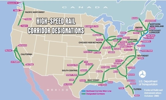
With Chicago to Detroit (11th), however, things get interesting. Let’s introduce two maps in to the equation. The first is a map of the top 50 corridors analyzed by America 2050, with the color of a line indicating if they were in the top 50 (red), 40 (orange), 30 (green), 20 (light blue) or 10 (dark blue). Opacity is set rather low, so overlapping lines should show up considerably darker (see the Northeast Corridor, where four top-ten corridors intersect from New York to Philly). From Chicago to Minneapolis and Saint Louis, there are single lines. Despite the presence of some smaller cities (Decatur, Springfield, Urbana-Champaign; Milwaukee, Madison, Rochester) none of these corridors crack the top 50. (Milwaukee-Chicago was not calculated as it is less than 100 miles.) East of Chicago, however, there is a web of lines. From Chicago going east, three cities make the top 16: Detroit, Cleveland and Columbus. And east of there, these cities are all linked eastwards. (Any city with at least two corridors is shown with a point, its size corresponding to the number of corridors.)

So it begs the question: which routes are most applicable to high speed rail if we overlap corridors which could share significant trackage. For instance, Chicago to Detroit, Cleveland and Columbus could all share one high speed link, with short spurs to each of the cities. These three cities could all share a link across Pennsylvania (with Pittsburgh) to Washington, Philadelphia and New York. 11 of the top 50 city pairs are between New York, Philadelphia and Washington in the east and Columbus, Cleveland and Detroit in the west. Since most of the capital costs of constructing a high speed rail line is the initial capital cost, combining several corridors could dramatically reduce the amount of line needed, saving billions.

So, the second map. For this map, lines with little or no overlap were ignored. Other corridors were assigned a (rather arbitrary) point value based on their ranking:

1-10: 6 points
11-20: 4 points
21-30: 3 points
31-40: 2 points
41-50: 1 point

(Why did the top 10 get a slightly higher weight than the rest? Well, the numerical rankings of the top 10 ranged from 100 to 91. The rankings of the next 40 ranged from 91 to 85.)

Here’s another scheme: assign a route with a score of 85 one point, and an additional point for each increase in the score. This is, perhaps, a more equitable approach for larger corridors, and it really pops out the Northeast Corridor. A possible network of 2450 miles (1870 in the East and Midwest, 580 in California) could serve Boston, New York, Philly, DC, Pittsburgh, Columbus, Cleveland, Detroit, Chicago, San Diego, LA, San Jose and San Francisco (and several smaller cities, like Toledo, Harrisburg and Hartford). Adding up only the top 50 MSAs served (those with populations over 1m) and 2500 miles would serve 90m people. That’s not bad.

So, what’s the takeaway here? Well, there are two. The first is that, as much as we want to build a multi-regional high-speed rail network, the Northeast Corridor is still, by far, the largest market for HSR in the country. The second, however, is that even when you exclude the Chicago-to-East Coast routes, the New York-to-Chicago Corridor should still be the third-highest priority to build. And if properly built (with top speeds of 200 mph or a tad more, especially across the flat land west of Canton) such a corridor could begin to compete with airlines, even on >500 mile routes.

Interregional High Speed Rail: the myth of the 400 mile cap

Recently, we began to consider interregional high speed rail, or, in other words, high speed rail spanning more than the current corridors proposed. Before we delve in to details, it’s time to dispel some myths. The first one is that high speed rail is not competitive over distances of 400 miles.

No, I’m not making that up. Obviously, as distances become longer, air travel becomes more competitive, since when they are flying at cruise level, planes are faster than trains. However, making up a number, in this case 400 miles, is just not true. The problem is that very important economists writing for very important newspapers (in this case, Ed Glaeser for the Times and Robert Samuelson for the WaPo) make stuff up, and because they have degrees from places like Harvard, people believe them.

Both writers pieces have been thoroughly discredited (and there are many more such posts, like this one), but no one has mentioned one of Samuelson’s rather-blatant misrepresentations. In his piece, he states as fact (without any source, of course), that

Beyond 400 to 500 miles, fast trains can’t compete with planes.

. This is rather interesting. Why? because not only does he fail to mention places where trains compete comfortably with planes in a 400-500 mile corridor, but he doesn’t mention either a 500+ mile corridor where a train line doesn’t compete or offer any rationale about why they couldn’t.

So, I’ll do his dirty work for him. First of all, let’s find a city pair with high speed rail of greater than 400 miles. Say, Paris to Marseille. By air, it’s 406 miles, by road, it’s about 482. Either way, it’s in Samuelson’s not-really-competitive range. Here’s the interesting thing. Of the air-rail market on the Paris-Marseille route, the TGV has taken 69% of the traffic. That’s up from 22% before completion of the line. I think that’s competitive.

In fact, it’s time, not distance, that governs competitiveness, and the time is definitely more than three hours. According to SNCF’s Guillaume Pepy

High-speed rail has historically captured the major share of combined air/rail traffic along routes where train journeys are under 3 hours. But this is changing, says SNCF’s Pepy: “With air travel becoming more complicated and increasing airport congestion, high-speed rail now wins 50% of the traffic where rail journeys are 4.5 hours or less,” he said. On the Paris-Perpignan route (5 hrs by train), TGV has 51% of the air/rail market, on Paris-Toulon (4 hrs) 68%.

It seems that, even for trips of four or five hours, high speed rail can be competitive. In that amount of time, a train averaging 160 mph could cover 640 to 800 miles. If that is the case, then a lot more corridors are plausible for consideration for high speed rail including a route between the East Coast and the Midwest. Especially between cities with congested airports. In other words, New York and Chicago.

Interregional High Speed Rail: mapping its genesis

This topic was raised by an IM discussion I was having with my dad as he sat on the tarmac on a plane in Saint Louis:

Dad: My flight has now been delayed a total of 2:35 on account of, they say, air traffic control in Boston because of weather.
Me: Hey question: if you could take a 6 hour train ride from Saint Louis to Boston (feasible, albeit barely) would you rather do that than deal with these airplane shenanigans?
Dad: You betcha. There ought to be a 90-minute hop from here to Chi, and then the eastbound super-express. What route would you propose for that?

Ask and you shall receive.

Before going in to the route (in a separate post to come later), it would be interesting to see what has been proposed for high speed rail routes, and what the genesis of such proposals has been. There have been several, and it is actually quite interesting how they have evolved. What I am going to try to illustrate here is that high speed rail has too-often been touted as a regional solution; it is really an interregional solution as well. Thus, I am consistently flummoxed that few maps show an interest in an East Coast-to-Chicago trunk line, paralleling one of the most congested and delay-prone air routes in the world. (Mention O’Hare and JFK, Newark or LaGuardia in the same breath and seasoned travelers will curse or faint.)

So, now to the maps. I’ve tried to link them in as best I can, but my apologies if some of the links break: some of these maps are rather old. We’ll start way back in the year 2000, when the Bureau of Transportation Statistics published an early draft of an HSR network. It should be noted that this was eons ago in the life cycle of high speed rail. Gas was cheap, airlines were profitable (ha!), and the Acela hadn’t yet run from Boston to Washington.

In general, this looks pretty similar to some of the more recent maps. So it’s pretty much a base. Which is problematic: once people have drawn lines on maps, it’s often hard to redraw them, no matter how little sense they make. Luckily, as a base, most of the nonsense here comes from connections not made, like not linking networks in Jacksonville and Tampa, Houston and Austin or DFW, and Cleveland and Pittsburgh. It’s the last of these which, as we’ll see, is somewhat persistent.

High speed rail didn’t come up much during the Bush Administration (which was preoccupied with throwing enough money to build these entire systems show here at the Iraq money pit), but a new map (from the DOT) was offered up in 2005, which was a general template for the next several years. And it was … pretty similar to the previous one.

It was being used by several sources as late as this year. In other words, from 2000 to 2009 there were basically no changes made.

Finally, the Obama administration, which has now promised money to high speed rail, released their own map, and, well, didn’t rock too many boats. Their “Vision for High Speed Rail in America” is not much more than a couple of tweaks of the existing map. And still, ten years later, regions are, for some reason, not linked.

In the mean time, there have been several regional agencies which have come up with their own maps. The two most prominent are in the Midwest and California. California’s map is relatively simple (although minor changes, such as which pass to use to get from the Bay Area to the Central Valley, have been the cause of much contention) and very nifty on their website. The Midwest map, which is less further along, has seen a bit more flux.

The first map released by the Midwest High Speed Rail authority was rather modest, vague and, frankly, not really high speed rail (with top speeds of 110 mph):

That map disappeared from their server earlier this year (the Web Archive grabbed it, however) and a new, more ambitious one arrived, along with the news that they’d push for 220 mph service from Chicago to Saint Louis (ooh, good idea):

This is actually one of the better maps I’ve seen. It might be overly ambitious, but it does show the high speed routes to major cities, with connections to the east coast, which have been missing previously. Of course, there is no straight line across the Midwest from Pittsburgh, but at least the network realizes that it should be interregional.

Finally, there are a bunch of maps created by various blogs and lobbying groups for high speed rail networks.

The Transport Politic blog offers:

Richard Florida talks about Megaregions and high speed rail without putting up a specific map (a good idea, perhaps)

But others take that map and run with it.

Finally, with that map as a base, a lobbying group called the United States High Speed Rail Association has an ambitious, 17,000 mile network.

So what’s the takeaway? Well, the first is that nothing is really set in stone (except, perhaps, in California). But the second is that only more recently has anyone started looking beyond the corridors first set forth in 2000 (and, presumably, even before then). Which is good. Because even the newest maps, none of which have the backing of the government, have some issues with linking together longer corridors. Both the USHSR’s map and the one from the Transport Politic go through Philly, Harrisburg, Pittsburgh, Cleveland and Toledo on their way from New York to Chicago, adding enough mileage to negate the use of the corridor for longer distances.

Update: America 2050 has posted a study that actually has some basis to it, and the map they create is probably the most sensible yet.. The Transport Politic thinks so, too.

In any case, these maps should be refined: a strong case could be made for the competitiveness of a high-speed line from New York (with branches to Philadelphia, D.C. and even Boston) to Chicago (with branches to Pittsburgh, Cleveland, Detroit, Columbus and other cities). Considering the dismal state of air service between the first and third largest cities in the country, and the horrors of getting from the CBD of each (the two largest downtowns in the nation) to the airports, a modern, 200 mph line could definitely hold its own.

A future post will discuss this.