This is mostly a crosspost from Reddit, with some additional links and information. Show up on Tuesday!
On January 6th, MassDOT and the DCR will (probably) propose the following options to for the Reid Overpass on the Cambridge side of the BU Bridge:
Rebuilding the bridge
Building an at-grade intersection
Building a bike/ped bridge to prioritize people walking and biking
LOL JK, MassDOT will not propose the third one.
But they should.
(They’ll probably present half-baked iterations of what was proposed in 2019, see page 45.)
In general, bicycle-pedestrian overpasses are undesirable, because they introduce unnecessary changes in elevation for people walking and biking. But this intersection is a special case: nearly every bicycle and pedestrian user is already climbing or descending to cross the BU Bridge or the Grand Junction railroad to the east (or both), so a bike/ped bridge would not introduce new climb, but instead just move the existing climb.
A bike/ped bridge, coupled with an at-grade intersection, would be a win-win situation for all constituencies. Traffic between Boston and Cambridge is complicated because crossing the Charles requires navigating a natural bottleneck at one of the bridges between the two cities. The BU Bridge is one of the busiest of these bridges, and connects two intersections with suboptimal geometry on each end with little room in between. An at-grade intersection trying to serve all users would require multiple turn lanes, long signal cycles and long waits for bicycles and pedestrians (think the O’Brien Highway-Land Blvd intersection at the east end of Memorial Drive near Lechmere). A vehicle overpass prioritizes the throughput of vehicles and high turning movements mean there are still busy crossings for people walking and biking.
At peak hour, the intersection is used by approximately:
4000 vehicles of which
1500 cross the overpass
Of the remaining 2500, more than 1000 turn left or right, most crossing the busy east-west bike/ped path at the foot of the BU Bridge
16 buses, carrying upwards of 500 people
400 people on bicycles
200+ people on foot
MassDOT’s plan will likely include no provisions to improve transit, and people walking and biking still have to contend with heavy traffic flows. The presence of several hundred bicyclists and pedestrians per hour complicates traffic, since frequent light cycles are required to allow relatively safe passage. Any of the state’s options will likely keep these conflicts in play.
Here’s why a bike/ped overpass would be preferable for each user group:
Bicycle/pedestrians would be able to move through the intersection without having to cross multiple lanes of traffic, push buttons to request signals, or wait for lights.
Motor vehicles traffic would benefit from reworked roadway geometry which would help to mitigate the narrow, short bridge bottleneck by adding vehicle queue space. Moving the signal at the bottom of the BU Bridge would provide a safer roadway geometry.
Transit users on the 47 and CT2 buses would have signal priority allowing buses to bypass the main traffic light, making trips faster and more reliable.
Cambridgeport residents would see fewer traffic jams backing up into the neighborhood.
Green space would be improved by retaining the existing mature trees in the “oval” of the intersection and by adding trees, green space and stormwater retention in currently-paved areas.
Taxpayers (that’s everyone—we should want more efficient projects!) will benefit from a much less expensive bridge.
In 2012, a busy and complex traffic circle outside of Eindhoven was replaced with an at-grade intersection with bicycle and pedestrian traffic accommodated on a circular bridge overhead, simplifying traffic patterns and improving safety.
Case study 2: Frances Appleton Bridge, Storrow Drive, Boston
In 2018, the Frances Appleton bridge opened adjacent to the Longfellow Bridge, providing a new, wide, accessible overcrossing of Storrow Drive which integrates with the existing landscape and winds through the trees. A similar design could be used at the Reid Overpass area with the overpass winding through the tree canopy above the roadway.
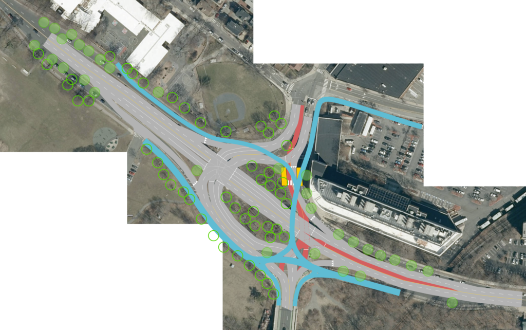
Sketches here show a proposed layout. Here is the full site plan. The legend is as follows:
Blue: bike/ped overpass
Red: bus lanes
Hollow green circles: existing trees
Filled green circles: new trees
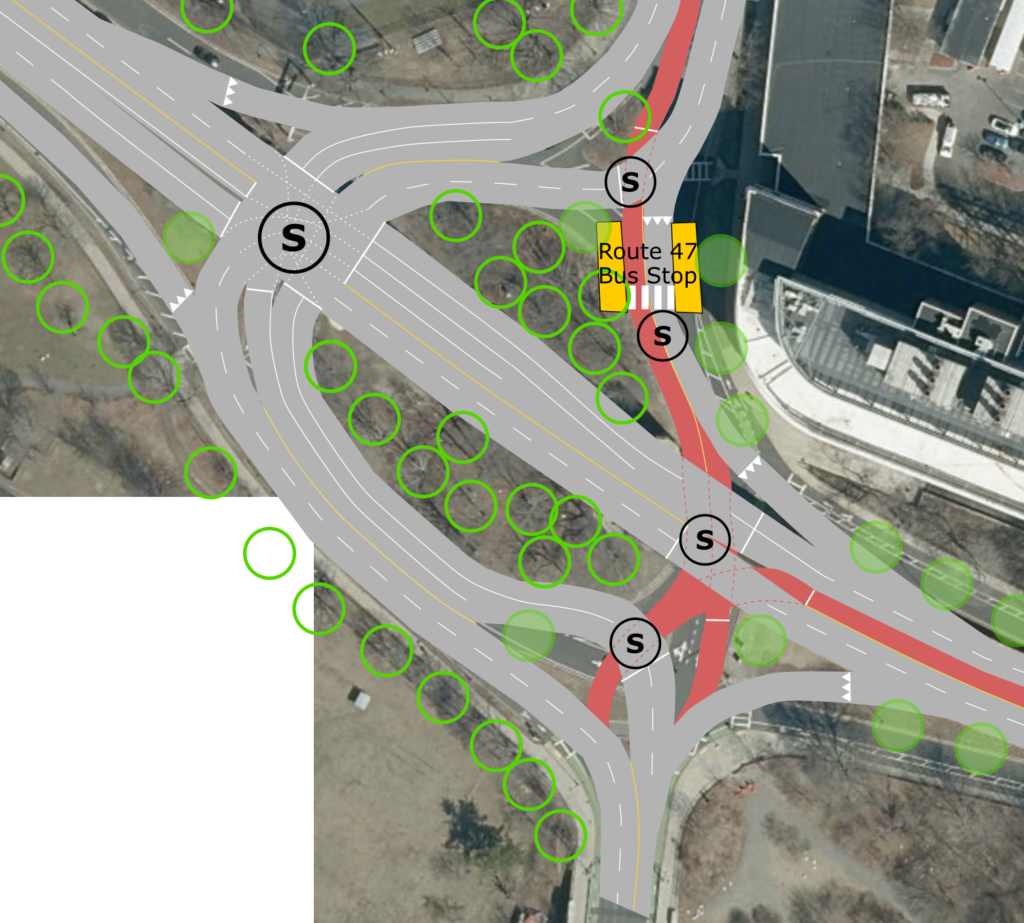
Yellow: bus stops
(S): on second view, signal locations
For east-west bike/ped users, the ramp would rise starting at the existing entrance to the Magazine Beach park, allow users to go to or from the BU Bridge, and then extend east at a level to reach the existing Grand Junction bridge. For north-south users, the route would loop onto the connector to near the 640 Memorial Drive building and have two downramp options, one to and from Waverly Street and the other to the existing Memorial Drive right-of-way, which would be narrowed considerably, and then extending towards Pearl Street. The only downside would be for direct access to Brookline Street, where users would have to make a U-turn on Waverly to access Brookline, as there is not enough room to run a ramp down to the Waverly-Brookline intersection. However, given the upslope of Brookline Street and the MIT-owned property to the east, it’s possible that a bike/ped connection to Brookline could extend north across Waverly and join Brookline at Henry Street (this is not shown).
Removing the overpass, this sketch shows the proposed traffic slows. The four smaller (S) symbols on the right show signals which would only be used for transit operations (or the pedestrian crosswalk to a bus stop), and would let the main traffic flow about 90% of the time. The main signal would be to the northeast of the existing “oval.”
From the BU Bridge traffic from the single lane from the south would filter either right onto Memorial Drive (this is a heavy traffic movement and would be unimpeded by signals or bike/ped traffic) or left around the oval, where it would have three lanes of queue space so that when the signal is active, it could utilize the full capacity of the roadway.
On Memorial Drive in both directions, right turns would be filtered off, with two through lanes at the traffic light. Single left turn lanes would be provided except for a double-left for the heavy demand from Memorial Drive westbound to the BU Bridge south.
From Cambridgeport traffic would follow its existing path around the oval, through the traffic light with a left turn lane, and then merge with the right-turning traffic from Memorial Drive to access two lanes on the BU Bridge itself. This would allow more efficient use of the southbound signal phase at the south end of the bridge, where there is currently a single lane—interrupted by frequent pedestrian crossings—feeding minimal queue space, which would alleviate traffic backups in the existing rotary.
For Transit, the southbound 47 bus would use a left-side bus lane and cross Cambridgeport-bound traffic at a signal to access a bus stop accessible from 64 Memorial Drive. This could replace the existing bus stop on Granite Street, allowing a left-side bus-and-left-turn only lane to bypass additional queues. Buses would then proceed though two transit signals to allow them to merge into BU bridge traffic going south. The northbound 47 would use one of these transit signals to access a mixed-traffic lane from Memorial Drive west to Cambridgeport (a low-volume movement) and a bus stop there. The northbound CT2 would use the general traffic lane, while the southbound CT2 would use a bus lane to bypass the main traffic signal.
Show up on January 6 (next Tuesday) and tell MassDOT that you demand a plan which puts the safety of bicycles and pedestrians first, and that a bridge should be built, but not for cars. And if someone has spiked the bubbles at 10 Park Plaza (or, more likely, their consultant) and DOT shows up with a bike/ped-first plan, make sure they know that the community demands it.
It’s been a busy summer, I’ve posted two blog posts, seen the northern lights in Gloucester, traveled Zurich, DC (thrice), Philly, Hawai’i, Wisconsin, Chicago, Minnesota and San Francisco (twice) and had one child (buried the lede), so obviously I now have ample time to write Good Content on the Internet between diaper changes. Or, at least, to compile my traffic report from the eclipse.
Our Story
I’ll start with our eclipse story. My original plan had been the Price Chopper parking lot in Derby, Vermont, which would put us in a good spot to leave the eclipse and beat the wave onto I-91, riding the crest of the wave down I-91 to I-89 (or potentially going “cross-country” on Route 25) and avoiding Franconia Notch’s bottleneck. However, looking at traffic on Sunday and figuring that we might hit too much traffic going north on Monday, we changed plans, instead going further north into Maine where we expected much less traffic. With clouds pushing east to Syracuse, I assumed that Vermont and New Hampshire would be even more overrun with eclipse-hunters from Pennsylvania and New York pushed east, but that Maine would seem far enough away to attract fewer people (with more lanes going north), even though, without traffic, Bangor is only 1:30 further from New York than Burlington. So we traded the potential of long delays for a much more reliable 4:30 to 5:00 drive.
(It turns out that, based on this thread, I was pretty much right.)
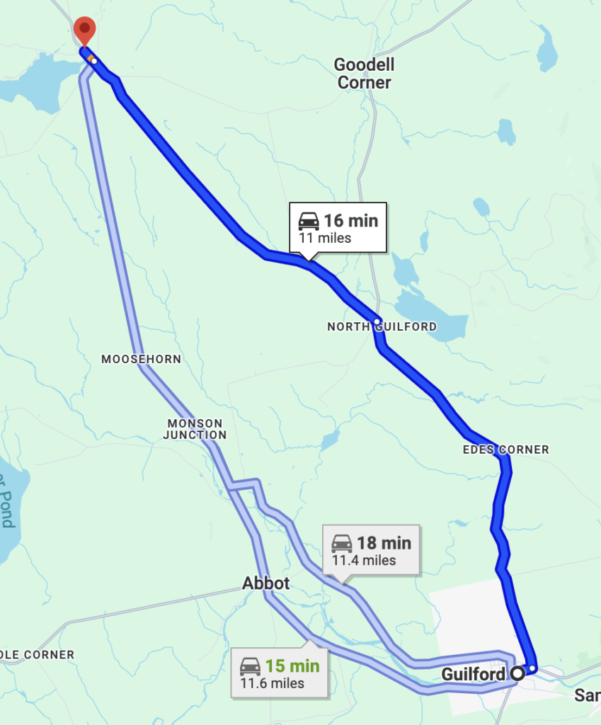
We piled six people in my sister’s minivan on Monday morning and set off for the eclipse. We had clear sailing through Maine and were aiming for Greenville to meet a friend at the airfield there (he has a two-seater aircraft and was one of hundreds of aircraft there). We had strong road trip vibes, stocking up with snacks at the Portland Trader Joe’s and gas at a gas station in a small town having their busiest day on record (we asked). We skirted through small towns to Guilford where, following my dad’s directions and against my better judgement, I took what Google Maps was telling him and not the main road, going through Edes Corner and North Guilford to Monson.
Google Maps suggested this route, since with minimal cell service there was no way for it to know the secondary merge at Monson would back this up a mile. Luckily, we were well into totality at this point.
About a mile south of Monson we ground to a halt. Google Maps had suggested this route because it detected some traffic on Route 6 approaching Monson. However, our route had no cell service, and its algorithm, which had never “seen” congestion on the road before, must have assumed that any reports of congestion from users were data errors, so dozens of vehicles (if not more) were funneled onto this road which ended at a stop sign (or a yield, where the main road has priority). Throughout history, this had never been an issue, peak summer traffic counts show this as a 300 vehicle per day lane feeding into a 2000 vehicle per day lane (AADTs of 600 and 4000, although measurements in the summer, so actual AADT is probably lower since traffic volume here is seasonal). But today, with constant traffic on Route 6, the side road leading in stacked up a mile back. I was a bit frustrated with my dad for leading me into something I had told him not to do (we never should have had a map on a phone open but instead been using our DeLorme, which was on the dashboard of every car we saw parked in Monson) but we were in totality, so this transgression was forgiven.
After half an hour on this roadway, we reached Monson, 10 miles (and about 20 eclipse seconds) short of our destination and well into totality, and decided to set up camp with hundreds of others there. (Potentially a stroke of good luck, as the airport in Greenville would have been a few extra seconds of totality, and potentially an extra hour of driving). I repositioned or vehicle for a quick getaway and repositioned our watching party to be across the street from the vehicle for the eclipse.
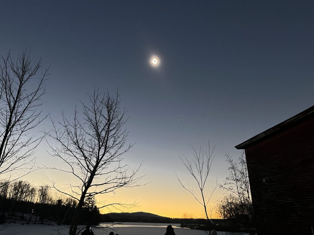
Thirty minutes before showtime, traffic in the town disappeared. It felt almost apocalyptic as hundreds of people stood in a dimming sun (but still bright above a frozen, snow-covered lake) as the sound of vehicles disappeared and all we heard was the wind, birds, and voices. The eclipse came and went and was well-worth the trip.
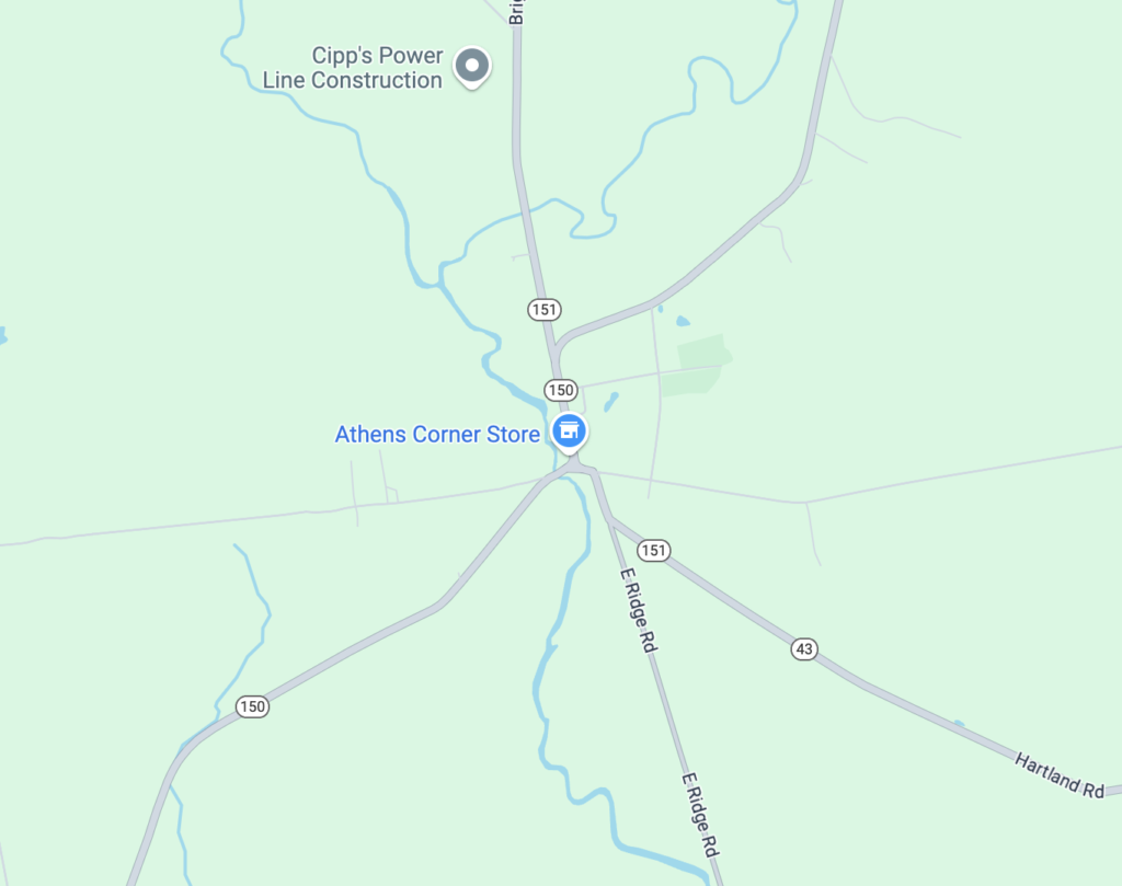
Now, it was showtime. My plan was to avoid potential merges and bottlenecks going south towards the highway, hoping to get to I-95 before enough of a wave formed to cause highway slowdowns. This meant avoiding the route through Guilford, and instead taking Maine Route 16 (AADT 400) to 151 (AADT 300) to Athens, and then going straight south from Athens to cross the Kennebec River in Hinckley to Route 201. This route would mostly be avoiding roads with multiple branches funneling into a trunk towards the Interstate, and would in theory have minimal other traffic trying to go in the same direction.
Maine was much easier to get out of than New Hampshire or Vermont because there isn’t a range of mountains between totality and civilization. The bottlenecks are instead major river crossings—in our case, the Kennebec—and small towns with merging traffic. Our route avoided nearly every town, and we crossed the Kennebec on a small bridge which didn’t have a long trunk feeding into it. The plan was set, but with no cell coverage, we had no way to see if there were backups forming anywhere along the route.
Our route was mostly sound, with the potential bottleneck of Athens, population 952. I didn’t worry too much about leaving town, there were two roads entering with very little catchment, and three exiting south. We came in on route 151, and while 150 was a diagonal route with relatively low demand on eclipse day, it was the primary road (AADT 1900) at that merge, and Route 151 backed up. (We had no cell reception; but almost took a route around Athens which would have potentially saved a few minutes, unfortunately, the traffic started after that point)
Once through this merge, we went straight down East Ridge Road (AADT 900) due south to the Kennebec, had no issue crossing Route 2 (an east-west route on a day with north-south traffic) and spent a couple of minutes in traffic crossing the Kennebec before smooth sailing to Portland for dinner and the rest of the trip to Boston. How did everyone else fare? Let’s find out.
Traffic in counts in Vermont
The track of the eclipse was almost perfectly-situated for traffic jams in northern New Hampshire and Maine. The eclipse path was situated in a more east-west orientation across New England, with most viewing areas in or north of the mountains. Given the mountains, this leaves only three main north-south routes in Vermont and two in New Hampshire. In Vermont, Route 7 runs east of Lake Champlain, with some parallel roads further east but with bottlenecks. Further east, I-89 runs north from White River Junction to Montpelier and Burlington, the latter segment in totality running east-west along the line of totality, a good collector for traffic flowing south (but with limited capacity). East of there, I-91 runs along the Connecticut River, with minor roadways (Route 10 and others) on the New Hampshire side. Other roads in Vermont are circuitous and low capacity. New Hampshire has two main north-south roads through the mountains, Franconia Notch and through North Conway (Route 16 and Route 302, with significant bottlenecks there). Unlike the interstates in Vermont, every roadway in New Hampshire has a single travel lane in each direction, even Franconia Notch, which was built as a two-lane parkway after decades of legal wrangling and eventual compromise. This is generally not an issue other than peak foliage weekends in the autumn. And, it turns out, the eclipse.
Vermont has a number of continuous traffic data points which we can use to dig into these data. One of these is on the short portion of I-93 in Vermont between the Connecticut River and St Johnsbury. While this was in totality, it was near the southern edge, so most traffic was continuing north. (I heard one report from people who made it to the southern bit of totality just before the eclipse, watched the eclipse, and were the first on the road back, making it back to Boston in under three hours.)
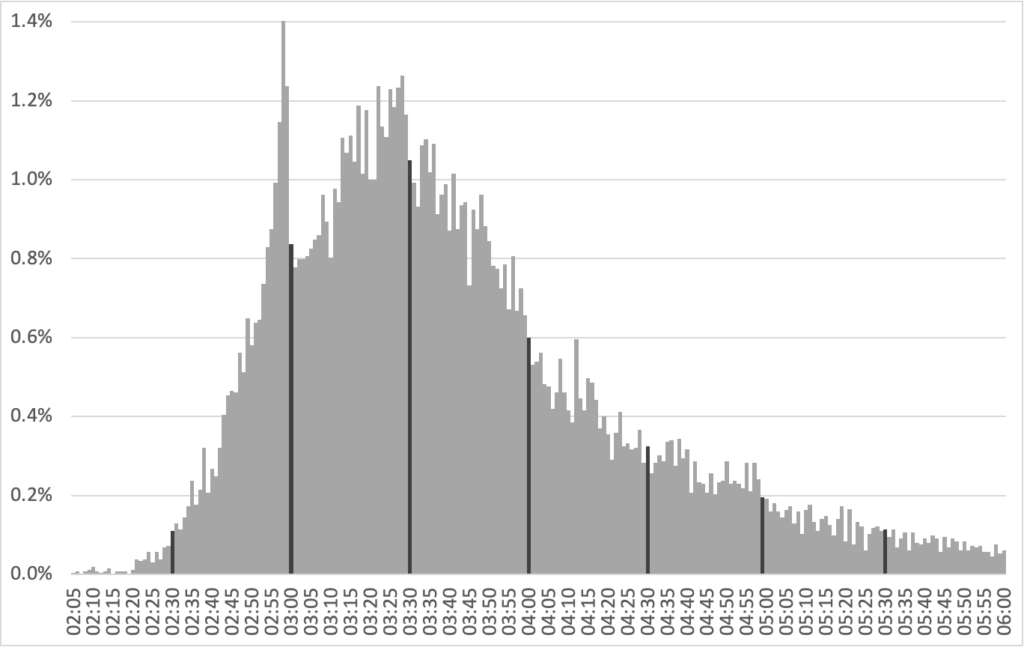
These charts shows northbound and southbound traffic on the day of the eclipse. Blue lines show northbound traffic (towards the eclipse) with red lines showing southbound traffic (away from it). Dashed lines show the normal traffic for weekdays.
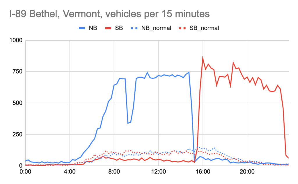
I-89 in Bethel, Vermont is a counter on the north-south portion of the roadway just south of totality. This shows the traffic volume going in and out of Vermont before and after totality. Observations:
Some people drove north overnight. Typical overnight traffic bottoms out around 30 vehicles per hour, the day of the eclipse there were about 100 vehicles per hour even between midnight and 4 a.m., when volumes increased.
Volumes increased to about 2800 vehicles per hour, which is the capacity of the roadway, dropping around 9 a.m., which was likely due to an accident or other event blocking throughput. 2800 vehicles is the approximate capacity of a two-lane roadway, and about 7 times normal.
15-minute traffic counts dropped from 744 between 2:45 and 3:00 to 29 between 3:15 and 3:30, a 26-fold decrease
Non-peak traffic was well below normal all day, with about 30% of normal before and after the eclipse.
Almost immediately after the eclipse, the roadway returned to capacity, but in the other direction, peaking above 3200 between 4 and 5 p.m. Traffic levels decreased somewhat but stayed elevated until nearly midnight when they finally decreased.
Overall, this portion of I-89 processed about 48,000 vehicles on eclipse day, four times more than normal.
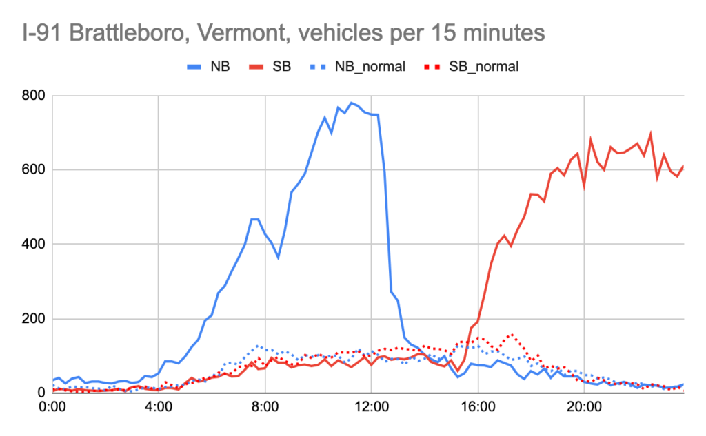
Our next data point comes from I-91 near the southern border of Vermont, about two hours south of totality (without traffic).
As with I-89, traffic was higher than normal overnight and began to pick up around 4 a.m., peaking close to 3000 vehicles per hour (about 8 times normal) until a steep dropoff around 12:15, since if you weren’t through by that point you had little hope of making it to totality (although traffic did remain elevated for another hour).
It mostly stayed below average for the afternoon, but only somewhat, before returning to normal.
Southbound traffic was elevated the rest of the day, around 2400 per hour. These rates were lower since traffic had been metered at various bottlenecks further north, but the further-south location means that traffic remained elevated until well after midnight.
The roadway processed 19,000 vehicles northbound and 21,000 southbound, with a normal of 6000 in each direction.
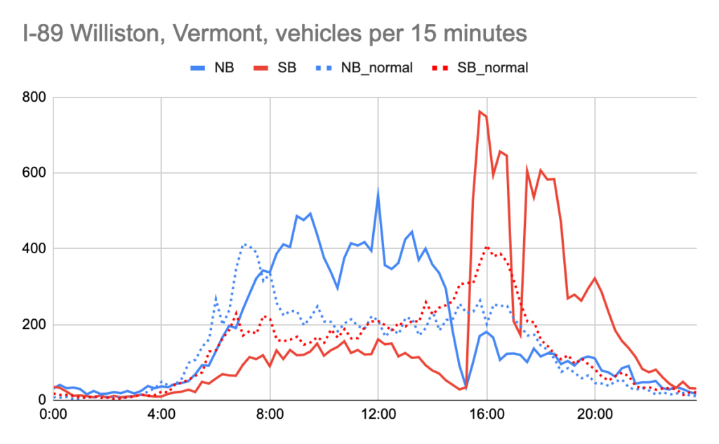
I-89 in Williston shows traffic in a higher-volume area in totality, where traffic has some commuter patterns in and out of Burlington, with higher northbound traffic in the morning and southbound in the afternoon. It is also well within totality, so significant traffic volume had exited the highway at this point.
Here traffic volumes did not begin earlier than normal. Northbound traffic actually was delayed, since it was not commute-based, and rose higher than normal but never reached 2000 vehicles per hour.
Southbound traffic was lower than normal all day, as normal commuting patterns did not occur.
At eclipse time, traffic fell far below normal. There were just 67 vehicles during the 15 minutes of the eclipse, just 12% of normal. Given that, we can surmise that nearly 90% of people were watching the eclipse!
Northbound traffic then spiked but, given that it was in totality, began to drop by 7 p.m. and had fallen to normal by midnight.
Here traffic was just about 20% more than normal, since normal traffic near Burlington is higher.
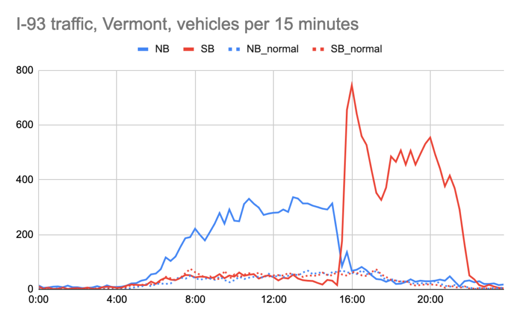
I-93 is the lowest-volume roadway in this dataset, running between the single-lane Franconia Notch and I-91 in St Johnsbury, with only about 5500 vehicles per day.
On the day of the eclipse, northbound traffic began to increase around 5:30 in the morning, but never increased above about 1250 vehicles per hour, even though the volume of a two-lane roadway is double this. This is because Franconia Notch, about 20 miles south, metered traffic into a single lane, so there was no way for any more traffic to enter the roadway, and some of the traffic through the notch was exiting onto other roads in New Hampshire.
During the eclipse, northbound traffic never fell below normal; these are likely latecomers who missed the eclipse (or watched it from the roadway, as this was on the very edge of totality). Northbound traffic returned to normal not long after.
Southbound traffic was normal throughout the day until it began to fall off around 1 p.m. From 2:30 to 3:30, only 97 vehicles passed going southbound, just 40% of normal.
After the event, southbound traffic spiked to nearly 2500 vehicles per hour quickly, but then fell off as upstream congestion and bottlenecks (probably mostly the single-lane offramp from I-91 southbound in St J). Volume fell back to half of this level around 5:30 before some bottlenecks cleared and traffic increased further to around 2000 vehicles per hour, which continued until 10 p.m. before falling back towards normal levels (these vehicles ran into a wall of traffic downstream which didn’t clear out until nearly dawn).
The roadway processed about 11,000 vehicles northbound and 14,000 southbound. This is significantly lower volume than the other Vermont roadways (although more than four times normal, the highest ratio of these data sets), but because of the bottleneck at Franconia Notch, had the worst traffic.
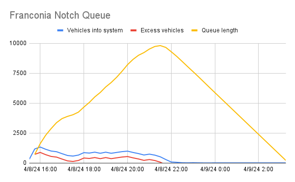
Estimating the Franconia Notch Queue
When I wasn’t driving and had cell reception, I took screenshots of traffic. Here was the situation at 10 p.m., nearly 7 hours after the eclipse:
By this point traffic had mostly cleared out of the eclipse zone, but was stacked up on roadways flowing south. Some of these delays were bottleneck delays, notably at Franconia Notch where three lanes feed into one, but also approaching Concord where I-89 and I-93 merge. The latter has a minimal backup because of the metering effect of the notch, while I-89 is backed up because of the single-lane ramp onto 93. At 10 p.m. on a Monday there is minimal additional traffic and what traffic there is has already been metered upstream. The delays on the other interstates is mostly due to volume; with enough vehicles any friction (exit and entry ramps, minor collisions or other vehicles on the side of the roadway, curves, slow-moving vehicles) can create waves of congestion that back up; this is akin to rush hour traffic when there are move vehicles on the road than the road can safely process.
The worst traffic by this point was approaching Franconia Notch. I predicted it would be bad, but I’m not sure I knew it would be quite as bad as it wound up. Franconia Notch merges down to a single lane, and has not only two lanes of I-93 feeding it, but also Route 3 from Coos County in New Hampshire merging in just before the notch. We know from the I-93 southbound traffic counter that there were about 12,000 vehicles crossing into New Hampshire between 3:30 and 9:30, or about 2000 per hour. Let’s assume that there were an additional 1000 vehicles per hour entering in New Hampshire. 3000 vehicle per hour would cause some congestion on a two-lane highway. But 3000 vehicles per hour into a system which can only process maybe half that creates an exponentially-growing queue.
I am not qualified to write about queuing theory (but you can read more about it here) but one interesting tidbit is that it’s relatively recently explained; for instance, one of the theorems of queuing theory is Little’s Law, which is named after someone who died this fall (RIP Little). Queuing theory assumes random arrivals and allows a calculation of a queue length given arrivals and “servers” allowing systems to be optimized to minimize both queue length and overall capacity. So a bank may be okay with having a line which is 10 minutes long 5% of the time (when a bunch of people arrive) if it means they don’t have an additional teller who is idle most of the day. Or a traffic department may be okay with a two lane roadway if the third lane would only be required 30 minutes per day (although usually they’re happy to build the third lane).
For our purposes, it is important to know that when there are more arrivals than servers, the queue grows exponentially. This is why when there’s a major snowstorm, airline call center times can be days long: the airlines don’t have the ability to expand their staffing levels to meet demand, and once the system is over capacity, new people stack in line faster than they can be processed. In this case, a line of traffic formed north of Franconia Notch.
Let’s assume the Notch (plus the alternate route though Kinsman Notch, on a curvy mountain road with stop signs at the end, which also backed up) can process 1800 vehicles per hour. And let’s assume that the demand for the Notch is 1.8 times the traffic demand from 93 in Vermont. (This is based on reports and twitters that the queue cleared around 3:30 a.m.) We can use this to estimate the queue as follows:
This shows the queue growing quickly after the event, slowing slightly before resuming growth, and reaching a maximum length of about 10,000 vehicles after 9 p.m. before arrivals fell below departures and the queue emptied out. Someone arriving at 9:30 would spend 5.5 hours in the queue crawling forward as vehicles were processed out before getting to the notch and resuming free-flow travel south of the notch (and would have already been in other queues if they’d started out from, say, Newport). This may be an underestimate, as some reports were of 12 to 14 hour trips from Northern Vermont to Boston, although additional delay may have accrued elsewhere: 4:30 p.m. leaving Newport, 9:00 p.m. getting to Littleton, 2:30 a.m. getting through the Notch, 4:30 a.m. getting to Boston. 10,000 vehicles across three lanes (two lanes of 93 plus Route 3) would be about a 15 mile backup, which is about what was observed on 93 and Route 3: back to Littleton and Twin Mountain.
People on Twitter and in the news asked two questions of NHDOT: why did they close exits onto Route 18 and why didn’t they reverse the northbound lanes in the Notch. The first of these is easy: it just would have moved the bottleneck, since it didn’t create new lanes through the Notch (Kinsman Notch was just as bad). The queues may have been shorter, but they would have moved slower. (This is why widening a highway without fixing a bottleneck doesn’t work, and also why lane diets like those on the Longfellow and Harvard bridges between Boston and Cambridge do: the bottlenecks aren’t due to the number of lanes on the bridges; reducing the number of lanes increases the length of the queue, but the queue moves faster.)
The second is a bit harder, but I’d guess that no one really knew how bad it would be and if they had, they would have come up with a plan. They would have needed a northbound detour, and given the mountainous roads nearby, this would have to be communicated dozens of miles south for larger vehicles (at least Plymouth via Route 25, if not Concord), which would have to have been established in time for the end of the event and run all evening. One lane of traffic could have exited at the north end of the Notch at Route 18, crossed under, and run southbound, before running south on Route 3 several miles to reenter I-93 at exit 33. Given the maneuver on and off of the highway and people switching lanes, the capacity probably would not have been a full lane of traffic, and long queues (although maybe not as long) would still have occurred.
Kinsman Notch was so bad that if I zoomed out all the way on my phone to try to show it, the traffic would go away. Here’s the middle portion.
Other eclipse bottlenecks
I took screenshots of traffic all day (and the day before and after, see this hashtag on mastodon; I’ll mirror most of these below). These images show traffic the day of the event. There were usual holiday-weekend bottlenecks in Concord and Franconia Notch around 8 a.m., which were getting worse by 10 a.m.
Note: to view these images larger, right-click and open in a new tab. At some point, I will change them to link automatically, figuring out how to do that right now.
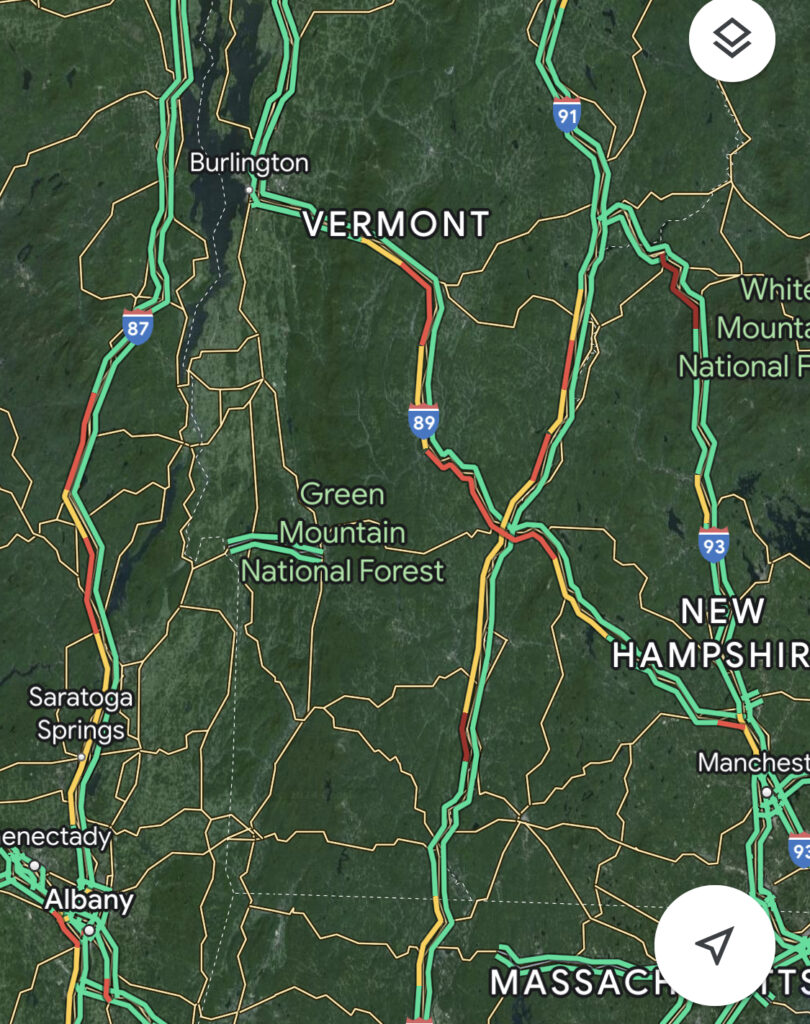
There were also some backups on other roads leading north, along 87 and 91.
Bottlenecks formed in other places not used to them, including Lancaster and Gorham in New Hampshire. Sugarloaf saw traffic based on a busy ski day in April, also anomalous, especially for a Monday (Sugarloaf and Saddleback were sold out months in advance, and wound up having perfect spring skiing conditions). Quebec City is north of totality, so everyone was clogging the bridge to get south.
There was additional traffic elsewhere, including Northeast Pennsylvania, Nashville, Ohio and Detroit.
Here’s Columbus, Cincy, Montreal (more traffic than typical trying to get across the bridge; Montreal was on the edge of totality so people were trying to get to more darkness) and then where the Autoroute from Trois-Rivieres dumps onto the main Quebec-Montreal highway.
Then the Eclipse happened.
And minutes after, the drive home, although I didn’t have cell reception until after 5 p.m. By that time there were long backups on highways which never see them, and even on I-95 north of Bangor, a portion of highway so sparsely traveled they only built a dual-lane carriageway in 1982. There were long queues on 89, 91 and 93 in Vermont and New Hampshire, with bottlenecks forming where demand outstripped capacity.
By 8 p.m. traffic had spread out from the center line across the country (and Canada). Most anywhere with a bottleneck or a demand corridor had a backup.
By 10:30 p.m. I was back at a desktop and had changed my background. If we’d gone to Vermont, I might still be in traffic in Franconia Notch. 93 was back to Littleton, Route 3 to Twin Mountain; Kinsman Notch was jammed, too. Google Maps had eventually figured out that people should go down 89 and cut across the un-jammed Route 25 (or even further south) to avoid the bottlenecks. That had been my plan had we gone to Vermont: get south of the notch and take Route 25 (but there was actually an even better plan, see below).
Not everyone got stuck in traffic on Monday. Some people stayed put and got stuck in traffic midday on Tuesday. (Less traffic, but still not normal.)
How did some people avoid traffic?
What was the best strategy to see the eclipse and avoid traffic? Go diagonally across the demand lines. In New England, the demand to see the eclipse ran almost entirely north-south along major highways. It then spilled over onto secondary and tertiary roads (Kinsman Notch, for example, and some smaller roads in Vermont and elsewhere). But if you managed to find a route which connected the eclipse path to somewhere which was more sparsely populated, you could get home from the eclipse without seeing much in the way of tail lights. Here are two examples.
The Champlain Valley in Vermont to Boston. Middlebury was right near the edge of totality, but even a few miles north would have been in totality without hitting the worst traffic. This would have worked from Burlington as well. Rather than get onto 89 and sit in hours of traffic, the diagonal route, nearly entirely on back roads outside of totality and not crossing through any bottleneck points (in fact, not using an Interstate highway at all) took about 4:30, according to a friend who did just this from Middlebury and hit no traffic. Even with some traffic on Route 7 to get to Midd, this would have been far preferable to hours on I-89.
Newport, Vermont to Boston is normally a three hour trip but on eclipse day was 8 or more (unless you were the first car out of town). But if you were to drive east far enough and then drop diagonally through Maine, you’d avoid the demand lines and would have made the five hour drive with minimal traffic, through Dixville Notch in New Hampshire and Grafton Notch in Maine before picking up the Maine Turnpike home. In both cases, you would have enjoyed a beautiful drive as well.
What about trains?
Some people mentioned: what if we had reasonable passenger rail lines which could have taken people to the eclipse? If we did have a robust rail service to these low-population areas, it still would have required significant capacity to move the requisite number of people. For a sporting event, there is a finite number of people needing transportation from a fixed point, even a large stadium only needs 50,000 people, and these are usually traveling a short distance (within a city). Here, millions of people need to to be moved hundreds of miles to multiple locations (maybe if we had a European-style rail network we could have mustered every rail car on the East Coast to run trains to Burlington).
Because the trains can only reasonably satisfy one trip given the time it takes to get to and from a population center, even with vastly improved infrastructure, rail lines would only have so much utility). The New York City subway has about 5000 cars in service at peak hour, with capacity for about 800,000 people. But on a busy weekday, 6 million people rode the system, nearly 8 times the instantaneous capacity. But if everyone in New York decided to take a subway trip at the same time, the system would be overwhelmed. (It’s why serving outlying stadium events is logistically difficult.)
A note on EVs
Some people drove their electric vehicles to watch the eclipse, using up most of their range to travel 200 miles. On the way home, they attempted to recharge, only to find that there were very few chargers of any kind, and the fast ones were, let’s just say, oversubscribed. Now to be fair, the family described in the article probably would have just sat in traffic had they gotten recharged faster. But the experience shows the scalability of high energy density fuels (gasoline) versus lower-density batteries and has some corollary to the pitfalls of electrifying transit fleets and charging them centrally.
Most of the time, the low number of chargers in rural New England doesn’t matter. Most local drivers charge at home, other users don’t overwhelm infrastructure. And pumps don’t really function the same way as gas stations. Gas stations have almost limitless capacity with the energy stored on-site. Rural stations usually have a few pumps, which are rarely oversubscribed, and if they are the queue moves fast enough because fuel can be moved quickly. Gas pumps can run at up to 10 gallons per minute, so a Prius can get 500 miles of range in 50 seconds, while a less-efficient vehicle may take up to 2 or 3 minutes (plus a minute or two to begin and end the transaction. On average, it’s probably about 3 minutes per 500 miles, or 10,000 miles per pump hour. A small, rural gas station with four pumps could push our 40,000 miles of range over the course of an hour, and doubling the pumps to 8 (many are this size) could get 80,000 miles with minimal additional infrastructure. Over 10 hours, 8 pumps would probably run down much of the capacity of a gas station, but during that time it would service 2000 vehicles (as far as I can tell, no gas stations ran out of gas, even if anecdotally one we stopped at in Maine had their busiest day on record). Gas stations probably had to schedule additional tanker dropoffs after the eclipse, but other than that, there were no knock-on effects.
Meanwhile the fastest EV charger can run at about 250kW. This is a lot of power, and charging 100kW, enough for about 300 miles of range under ideal conditions, would only take about 24 minutes. But this is only a rate, with transaction time, of about 650 miles per charger per hour; to reach the capacity of an eight-pump gas station would require about 120 charging stations. Even if the stations were scalable, bringing enough power into the installation would be a challenge: this would require 30MW of power, enough power for a town of about 25,000 people. The cost to bring in that much power would be untenable for a once-in-a-lifetime event, which is why many EV drivers were stuck. In the long run, it would take a significant build out of electric infrastructure equal the scalability that gas stations already have. So EV drivers faced the queue before the queue, waiting hours to recharge.
Solar signals
Staying in the realm of electricity, we can look at how the New England power market responded to the eclipse. On the left below is the demand for a normal, sunny spring day in New England, in this case, for the day after the eclipse. The orange line shows actual demand, the yellow line shows demand including behind-the-meter solar (mostly rooftop). This illustrates the “duck curve” well, with a huge dip in midday power generation need thanks to massive solar installation; at midday more than 6GW of the 14GW in the ISO were being generated by behind-the-meter (in addition to this, industrial-scale solar puts out another 700+ MW). On the right is the day of the eclipse: it paralleled a normal day but at eclipse time, there was only about 1.2 GW of behind-the-meter solar, about 1/4 of normal (this is estimated, actually may be even less). While totality only crossed a small swath of New England, most of the rest of the region was under 90% or more reduction in sunlight. Not visible to the naked eye, but certainly to a solar panel.
Here are charts of industrial-scale solar (the y-axes are different because the output from the ISO app is different based on other resources, sorry). Eclipse day was normal until about 2:30 when it went down to almost zero, before bouncing back for the rest of the afternoon.
Finally, we can look at the electricity resources and real-time prices for eclipse day. For resources, you can see the spike in natural gas (the light blue line mostly at the top; the steady orange line is nuclear) and imports (the darker blue line at the bottom, which was negative most of the day since New England, with excess power, was mostly exporting). There was also an earlier bump in hydro than usual to account for the eclipse (hydro is the middle blue line, which was steady around 1GW since this was during the spring freshet and dams across the region were running high; by fall, run-of-river baseline hydro is below 300MW). Note a minimal change in renewables; the spikes in other resources were making up mostly for behind-the-meter solar, which doesn’t show up as much in the chart.
There was also a price hike. Prices during early afternoon were below $0, with lots of solar and wind the region needed to incentivize power to be cut back or exported to keep the system from overloading (this is somewhat typical on cool, breezy, sunny days in New England). Demand also dropped (which can be noted on the charts above) for the hour before and after the eclipse; people unplugged enough to reduce draw on the system when half of the region was staring at the sky. Once the eclipse shadow crossed, prices jumped up to incentivize more production, before falling back to more typical levels the rest of the day.
What did we learn?
If there’s a solar eclipse you can reasonably get to, go. But don’t make plans to fly to a specific location that may be cloudy. Be flexible. Avoid bottlenecks. Consider a longer route which avoids where everyone else is going (but don’t use the obvious backup route: Kinsman Notch was a mess, Route 25 was better, Dixville Notch was fine). Two lane highways have clear capacity constraints, and when a queuing system is over capacity, it takes along time for it to clear.
And there you have it, 5500 words about the great eclipse of 2024.
Boston has the worst airport transit in the country (and maybe the world) … at least by a metric I devised below.
Logan airport lies less than two miles from Downtown but under even the best of circumstances a transit trip there can take 25 to 30 minutes (at rush hour, driving can be just as bad). If it wasn’t for the harbor, it would be a pleasant walk; San Diego, the only similarly-close airport in the country, is a nice walk from downtown. But it’s not, and it should be better.
Airport transit can be, and has been, measured in many ways, including:
Your boyfriend Nate Silver (This is a reference to Wonkette in … 2008? God I’m old.) looking at transit travel time versus driving and whether it makes sense to take transit just from a time standpoint and Honolulu somehow has faster transit than driving (not until HART opens, if it ever does).
The Points Guy who somehow has Boston on the Nice List (it’s close, I guess)
CityNerd who uses a similar metric to the one I will, but also doesn’t differentiate based on the distance from the airport, so airports near cities aren’t penalized when they have lousy transit connections (and he also doesn’t do buses, which I get, but they should be included).
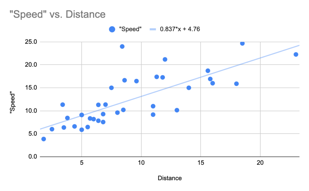
My approach is a bit different: I wanted to look at each airport, the typical travel time to “downtown” with half a headway added to penalize infrequency and calculate the “speed” which this is based on a straight-line distance this covers. Most cities only have one airport. Cities with close-in airport transit connections should not get special treatment over those with airports far away with good transit connections, especially since the noise and pollution of having an airport adjacent to dense housing is not great. (This is where I disagree with Ray’s—uh, CityNerd’s—methodology, which was distance-agnostic, although that was one of his earlier videos and he has since moved to often using more complex analyses.) In a sense, my methodology sort of a second derivative of travel time.
So what does it give us? For the 30ish largest airports (I added a couple extras for … fun, or in the case of Pittsburgh, because my wife was taking the 28X when I was drafting this) the speeds range from 25 mph in Denver to an almost literally pedestrian 3.9 mph in Boston (although the pedestrian route would be longer since there’s a bit of ocean in the way, but a fast triathlete could make it faster than taking transit). The speed to get from Boston to its airport is 50% slower than any other airport in the country.
Airport
Travel time
Headway/2
Distance
Total time
“Speed”
BOS
22
6
1.8
28
3.9
TPA
36
15
5
51
5.9
SAN
17
8
2.5
25
6.0
FLL
20
13
3.5
33
6.4
LAS
36
15
5.5
51
6.5
HNL
27
13
4.4
40
6.6
BNA
32
22
6.8
54
7.6
PDX
41
8
6.4
49
7.8
LGA
39
5
6
44
8.2
CLT
26
15
5.7
41
8.3
PHX
19
8
3.8
27
8.4
MIA
25
8
5
33
9.1
SLC
25
8
5
33
9.1
LAX
57
15
11
72
9.2
AUS
36
8
6.8
44
9.3
BWI
35
15
8
50
9.6
JFK
70
7
13
77
10.1
ORL
35
15
8.5
50
10.2
EWR
50
10
11
60
11.0
MKE
27
7
6.4
34
11.3
DCA
14
4
3.4
18
11.3
PHL
22
15
7
37
11.4
PIT
41
15
14
56
15.0
MSP
22
8
7.5
30
15.0
DTW
30
38
18
68
15.9
DFW
50
10
16
60
16.0
CLE
27
8
9.6
35
16.5
MDW
25
6
8.6
31
16.6
IAH
48
8
15.8
56
16.9
STL
31
10
11.8
41
17.3
SEA
34
5
11.3
39
17.4
ORD
46
4
15.6
50
18.7
SFO
30
4
12
34
21.2
IAD
56
6
23
62
22.3
ATL
17
4
8.4
21
24.0
DEN
37
8
18.5
45
24.7
This metric has a flaw, however: there is a significant correlation between distance from city center and speed. It’s not surprising that the two closest cities to their airports, Boston and San Diego, are two of the three worst performers. A longer distance allows more time at speed and less time in congested areas. Similarly, some of the “fastest” connections are some of the furthest. Denver clocks in at 25 mph and while the A Line is a convenient trip, the airport seems halfway to Kansas, and getting there takes a good deal longer than Boston or San Diego.
So I plotted out these data, and took a regression, and figured out what the “speed” “should be” for each airport based on its distance from the city center. (Yes, that’s a lot of quotation marks in on sentence; this is a made-up metric.) Far-out airports should be faster, the trip doesn’t take place entirely near downtown, so trains can move faster over longer distances between stops and buses can benefit from less-congested highways. This gives us an idea of how fast we would expect a trip to be based on the distance traveled, so airports close in aren’t unduly penalized compared with those far away. The R-squared here is about 0.6, and the line slope is 0.85 mph per mile, plus a constant of 5 (which is basically half of a “decent” headway). So an airport 10 miles from a Downtown should have a travel speed of about 13.5 mph, meaning a 45 minute travel time, which seems about right.
Points above the line are better-than-expected service, those below are worse. The point at 4 miles and 11 mph is DCA, the point at 13 miles and 10 mph is JFK. While the speed is about the same, DCA is much easier to get to by transit because we’d expect an airport as distant as JFK to have better transit.
Put this all together, and we can now compute, for each city, how fast we expect a trip to be compared to the actual speed, and then compare this. This adds a couple more columns to the chart but changes the order significantly. Also note that for this run at the data, I’ve added in the four big airports in Canada (Montreal, Toronto, Calgary, Vancouver) and for airports with under-construction links—namely, Montreal and Honolulu—added them in as well (with an *). (LAX also has something under construction, but I’m not sure it will make it any faster to get there, at least from downtown.) This changes the slope of the line slightly and the calculations are based on that slope. I’ve also bolded the airport name if it has an all-rail connection and italicized it the connection is a one-seat ride (nonstop for buses), and, yes, bold-italic shows a one-seat rail trip.
Airport
Travel time
Headway /2
Distance
Total time
“Speed”
Expected “speed”
Speed/Expected
BOS
22
6
1.8
28
3.9
7.1
54%
TPA
36
15
5
51
5.9
9.7
60%
JFK
70
7
13
77
10.1
16.2
62%
LAX
57
15
11
72
9.2
14.6
63%
LAS
36
15
5.5
51
6.5
10.1
64%
YYC
45
10
6.5
55
7.1
11.0
65%
BNA
32
22
6.8
54
7.6
11.2
67%
PDX
41
8
6.4
49
7.8
10.9
72%
FLL
20
13
3.5
33
6.4
8.5
75%
EWR
50
10
11
60
11.0
14.6
75%
LGA
39
5
6
44
8.2
10.6
78%
SAN
17
8
2.5
25
6.0
7.7
78%
DTW
30
38
18
68
15.9
20.3
78%
BWI
35
15
8
50
9.6
12.2
79%
CLT
26
15
5.7
41
8.3
10.3
81%
ORL
35
15
8.5
50
10.2
12.6
81%
AUS
36
8
6.8
44
9.3
11.2
83%
DFW
50
10
16
60
16.0
18.7
86%
PIT
41
15
14
56
15.0
17.0
88%
IAD
56
6
23
62
22.3
24.4
91%
IAH
48
8
15.8
56
16.9
18.5
91%
MIA
25
8
5
33
9.1
9.7
93%
SLC
25
8
5
33
9.1
9.7
93%
PHX
19
8
3.8
27
8.4
8.8
96%
PHL
22
15
7
37
11.4
11.4
100%
ORD
46
4
15.6
50
18.7
18.3
102%
MKE
27
7
6.4
34
11.3
10.9
104%
STL
31
10
11.8
41
17.3
15.3
113%
SEA
34
5
11.3
39
17.4
14.9
117%
DEN
37
8
18.5
45
24.7
20.7
119%
YVR
26
4
6.7
30
13.4
11.1
120%
CLE
27
8
9.6
35
16.5
13.5
122%
MSP
22
8
7.5
30
15.0
11.8
127%
MDW
25
6
8.6
31
16.6
12.7
131%
DCA
14
4
3.4
18
11.3
8.4
134%
SFO
30
4
12
34
21.2
15.4
137%
YYZ
25
8
12.3
33
22.4
15.7
143%
YUL*
22
3
9.4
25
22.6
13.3
169%
HNL*
12
3
4.4
15
17.6
9.3
190%
ATL
17
4
8.4
21
24.0
12.5
192%
So Boston is still worst on the list. We’d expect a trip for the two miles between Logan Airport and Downtown Boston to go about 7.5 mph, and for the trip to take about 14 minutes. Instead, it takes twice that. But San Diego is no longer as close to the top of the list, beating out Portland, which has a direct rail connection but, because it takes so long to cover a relatively short distance, is worse, and also EWR and JFK, which have all-rail journeys (albeit with forced transfers).
The best transit, by this metric, is Atlanta, which is just 8.4 miles from downtown but averages 24 mph, nearly double what we’d expect, making the trip in 17 minutes with frequent service. Toronto’s current rail line (the UP Express) and Montreal’s upcoming REM are also high, although Montreal’s will be part of an integrated transit system and not an airport-only route. Honolulu will vault near the top of the list, just shy of Atlanta, when (if?) it opens, and SFO and DCA are both near the top. (For the pedantic, I am counting SFO as a direct trip even if for many airlines you have to take a connecting shuttle system.) Note that DCA is ranked similarly to SFO even though it’s speed is half as fast: we wouldn’t expect such high speeds for such a close airport.
Other than Atlanta, the two fastest domestic airports are DEN and IAD, each in the 22 to 24 mph range. At DIA’s distance, it still outpaces its expected speed. Dulles is, by five miles, the furthest airport from its downtown (if you assign BWI to Baltimore, and FLL to Fort Lauderdale, as I have), and we’d expect its transit link to be faster, but the distance and number of stops mean that even the well-running Silver Line is relatively slow. BWI and PDX are the two worst direct rail links, with slow (and especially in the case of BWI, infrequent) trains even if they are convenient to the terminal.
Only one bus connection exceeds the expected travel time, in Milwaukee (which is one of the additions to this list; the airport doesn’t crack the top 30), the airport has a bus from downtown which runs every 13 to 15 minutes basically 24/7 (with some slightly longer headways—and a one hour gap—in the middle of the night). Notably, it’s not even an airport-specific bus, but just a city bus which serves the airport. Pittsburgh’s 28X doesn’t quite have the span or frequency of Milwaukee, but provides a good service given the airport’s distance from Downtown. IAH is similar, but for an airport its size, the transit service is lacking.
Is Atlanta the best airport transit link in the world? No, but it seems to be close. Zurich and Frankfurt both offer fast, frequent service to nearby airfields, each about five miles away (similar to National, although imagine DCA having a stop on the adjacent rail line with through service from the NEC, MARC and VRE). Arlanda outside Stockholm is an outlier. It’s as far from the city as Dulles, but the in-vehicle travel time is just 22 minutes, compared to 56 for Dulles, operating over a 200 km/h railroad (Oslo’s airport is the same distance and a minute faster, but somewhat less frequent). The mode share for Schipol is 50% transit (and 0% hyperloop)!
Somewhat notably, Asian airports seem to have middling airport rail connections, around the 100% mark (using the US/Canada baseline), while Europe leads the pack. (The chart below shows major airports >180% better than expected travel time; the next best I found—SYD—is just 152%, but I likely missed some.)
Airport
Travel time
Headway /2
Distance
Total time
“Speed”
Expected “speed”
Speed/Expected
ZRH
11
3
5
14
21.4
9.7
220%
ARN
22
5
22.7
27
50.4
24.1
209%
FRA
11
5
5.6
16
21.0
10.2
205%
AMS
16
5
7.6
21
21.7
11.9
183%
OSL
21
10
22.7
31
43.9
24.1
182%
There may be others, but Atlanta, and maybe at some point in the future, Honolulu, certainly seems to hold up against the best airports to get to by transit in the world.
And Boston? A fix won’t be cheap. The Silver Line is slow and dumb and prone to tunnel traffic. The Blue Line is a mile from the airport and the buses are … slow and prone to terminal traffic, and a direct link from Downtown quite a bit more expensive. And because the connection is so short, a world-class connection in the 180% range would require a 9 minute trip, including wait time (hello, Zurich). A 100% trip, 15 minutes including the wait, may be more reasonable. An airport people mover would be expensive but could make it in 17 minutes: 4 minute wait, 6 minutes on the Blue Line, 2 minute wait, 5 minutes on a people mover. But for now it remains stuck on the bottom of the list.
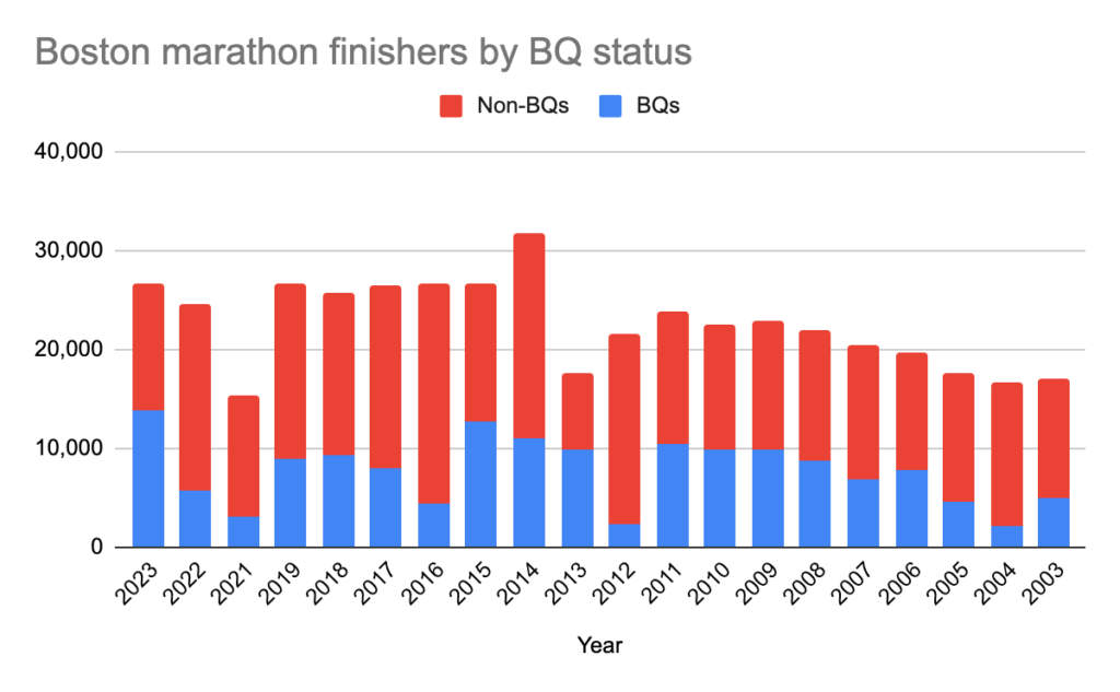
I’m not running the Boston Marathon this year. It’s not for lack of interest: I ran a 2:59:56 last year, my best finish in Boston (by time) and an improvement of 11 seconds over my previous best (and first) race in 2015. I thought it would be plenty fast to qualify, but the weather was good enough last year (fun fact: with more than 13,000 qualifiers more than 51% of finishers requalified. and it had the single highest number of Boston qualifiers of any race, ever), and new sponsor Bank of America stingy enough (apparently they took more sponsor bibs, so the number of qualifiers accepted was about 1000 fewer than previous years) that I missed out. By 24 seconds. Or, since I am in the final year of an age bracket, by 3 months and change.
(As you can tell, I am not bitter about this at all. It would be exceedingly petty to hope for temperatures in the low 70s for the race, but it would also mean that the -7:20 qualifier I ran last fall would be almost a shoo-in if Boston had 4000 qualifiers instead of 14,000. I will make no further comment as I check a weather model. But who am I kidding, it will be 48˚, dry, cloudy with a 20 mph tailwind with my luck.) [it wasn’t, so I have a shot next year]
It does mean that I’ve had extra time to look at the T’s somewhat impressive marathon schedule. For the first time since 2019, the T has the resources to provide extra service, and this is on top of a schedule which already has more frequent midday service. With 64 total trains, it is likely the busiest day on the Worcester Line since the 1950s (at a time when they had four tracks to Framingham before the Turnpike cannibalized two). In addition, several trains have been extended to Southborough, making taking the train to the start a much more reasonable proposition. There are basically trains every 20 to 40 minutes in both directions, so spectating runners in three locations is somewhat reasonable. Plus, there’s a $10 all-weekend pass, so you can hop on and off basically for free. (They are undercharging for this; it should be a separate fare for Monday, but they probably don’t want to have to sell more tickets. It’s good for ridership, at least.)
So with no further ado, here is Ari’s Official Guide to the Railways on Marathon Monday. A couple of notes.
I use train numbers here preceded with a “P.” At least back in the day, trains on the Worcester Line were numbered with a “P” by CSX designating them as Passenger trains. This naming convention makes the text a bit more readable. Also Dave does this, so it is the right thing to do.
Three-digit train numbers (e.g. P518) are normally-scheduled trips. Four-digit numbers (e.g. P7564) are extras or have changed schedules.
This all assumes that everything runs on schedule. So, you know, take it with a small grain of salt. [especially after about 10:00, trains experience 15-25 minute delays between Framingham and Wellesley Hills because without level boarding, it takes a lot of time for people to get on and off]
In Wellesley, I sometimes refer to the stations as “Square,” “Hills” or “Farms” just so I don’t have to type “Wellesley” so much.
If you want to watch the lead men:
Arrive on any train in Framingham before 10:00. There are trains departing at 10:08 and 10:35. The 10:08 train (P7556) will depart almost exactly when the lead men’s pack arrives; you may be able to watch from the train as you roll out of town (the men may outpace the train for the first few hundred yards). The 10:35 (P7564) train will depart after the lead men (and women) are through and when the first Wave 1 runners begin to arrive.
If you take the 10:08 train, you can get off at Wellesley Square (10:23) or Wellesley Hills (10:26) to catch the lead men, who should arrive at Wellesley Square around 10:31 or 10:32 and Hills a few minutes after. P7564 departs Hills at 10:53 if you want to attempt to catch the runners again. The lead women will probably arrive a few minutes later; train P7514 (11:13) will allow you to comfortably watch the lead women run through. These trains will get you to Lansdowne by 11:17/11:37. The first would allow you to get to Lansdowne in time to see the lead men, the latter unlikely.
(Rosie Ruiz would be proud!)
Speaking of women, if you want to watch the lead women:
Arrive in Framingham by 10:15 (train 7653 arrives 10:14). Train P7564 will depart after the lead pack of women has gone through and get you to Wellesley Hills at 10:53, a couple of minutes before they arrive there. Train P7514 will leave Hills at 11:13, and get you to Lansdowne in time to see the lead women a third time quite easily.
If you want to watch a first-wave runner with a 3:00 or faster (given the depth of this year’s field, the entire first wave qualified under ~3:01).
You will still need to be on train P7563 and arrive in Framingham by 10:14, so you’ll get to see the lead women (get there earlier and you’ll see the lead men, too). Your runner should pass in time to take P7514 inbound at 10:55 and get you to Wellesley Square/Hills at 11:10/11:13. From there, P7516’s departure at 11:45/11:48 will give you plenty of time to get Downtown; even P7568 half an hour later would do the trick if your runner is running slower than a 2:50 or so.
If you want to watch a second-wave runner with a 3:15 finish time:
You’ll want to arrive in Framingham by 10:47 (although, of course, you can get there earlier to watch more) on P7513. Your runner should pass through well before 11:30, allowing you to take train P7516 and get to Wellesley Square with plenty of time to cheer. From there P7568 will get you downtown to see them finish.
The third wave is much more spread out with finish times spanning an hour between 3:25 and 4:25. Here are some scenarios:
3:25 runner: P7565 out arriving Framingham at 11:19 (or earlier, of course). P7568 inbound at 12:05, P518 inbound at 12:55 from the Wellesleys.
4:25 runner: You still probably want to arrive in Framingham by 11:19 as above. Depending on the time to cross the start line and your runner’s speed, they will clear Framingham around noon; if so, you can catch the 12:05. Otherwise the 12:40 train (P518) should get you to Wellesley in time to watch them there; you may want to ride it to Wellesley Farms and jog to the course to get ahead of them. From there, you may wish to walk to Riverside and take the Green Line downtown, although the Green Line is often quite slow on Marathon Monday.
For Wave 4 runners, the finish times are even more spread out. A Wave 4 runner may be a charity runner without a qualifying time and run faster, or an older runner with a slower qualifying time running a 4:50 race or slower. In these cases, consult the schedule.
Are you a runner who wants to skip the buses and take the train out?
I’ve never done this, but with the schedules this year it seems quite reasonable. There is a spectator shuttle from the state park near Southborough to Hopkinton and, apparently, to the Commuter Rail station as well. [There is definitely a shuttle from the Commuter Rail Station!] For spectators this might mean that you could watch the start, take a bus to the train station, and potentially see your runner a fourth time (although taking the bus to Southborough and then the train to Framingham in 40 minutes would be tricky; this might work better for later waves and then only if the timing is perfect, you could at least make it to, like, Natick).
But to get to the race, sure, why not? The “athlete village” at the high school is a glorified port-o-let line; and there are plenty more of these near the start line anyway behind the CVS. You could probably even have someone travel out with you to the start spectator area, take your gear, and see you off. (They could drive you there, too, but where’s the fun in that).
Trains P7507, P7561, P7509 and P511 arrive in Southborough at 8:11, 8:45, 9:12 and 9:53, about 50 minutes from Back Bay (and 40 from Boston Landing). Given the convoluted route the buses have to take to get to the high school, this may actually be faster than taking the bus, especially if getting Downtown would require some backtracking. And you’re not crammed into a bus designed for 6-year-olds worried that the driver is going to get on 495 north and wind up in New Hampshire. (Yes, this happened. In 2022 my bus driver—the bus itself was from Methuen so the driver was not familiar with the area—wound up on 495 north. No one batted an eye, because no one was from the area. I made my way to the front of the bus and guided the driver through the cloverleaf at Route 9 and back south to Hopkinton.)
So would I do it? I’m not entirely sure. [Most assuredly.] I trust the T well enough, but I guess the question would be getting from the T to Hopkinton. If all else fails, it’s a 2.5 mile warm-up run (albeit uphill). [I saw people doing this] I assume the buses would run as advertised and I would bet one could be flagged down on the road from the State Park (if they aren’t running to the train station). [Probably couldn’t flag one down, but definitely could take one from the train station.] It looks like you can get into the corrals from Cedar Street[Yes, you can walk right in, it’s kind of a VIP area with some charter buses parked nearby but they don’t seem to discriminate and/or probably assume you’re special, too.], otherwise from South Street would probably work. I’d leave at least an hour to get from the train to the start, but for a Wave 1 runner, leaving Boston Landing at 7:31 might be far preferable to being on a bus at the Common at 6:45.
If I get in in 2025, and the T runs the same schedule, my plan is to take the 7:56 train from Boston Landing arriving at 8:45 at Southborough, and get on a bus there to the start. The next train (8:31-9:11) should work fine but having some buffer is nice. The earlier train would give enough time to walk back to the Athlete’s Village but there’s really no need to do that. If the weather is awful and I really don’t want to wait in the rain I might consider taking the bus, since there’s usually somewhere dry to wait at the start. Plenty of johns at the CVS.
Perhaps I’ll have to go out and do some reportage on the transit situation myself. Enjoy the race, and if you’re running, you’re welcome for the weather. [yeah, sorry, no one die at the finish line please]
A few notes:
Train numbering convention is that trains running to Worcester begin with 500 and theoretically range up to 549. 550 and up are Framingham turns. Even east, odd west.
There’s no express service in the morning. So there’s half the overall frequency of a normal weekday morning, although each station has about the same number of trains, the express trains run local. Service is then redistributed across the midday.
Previous marathon special service was basically to keep the normal weekday schedule and add a couple of trains in the middle of the morning. This increases service all day long, on the baseline of already increase service (2019 base schedules had four trains between 9 a.m. and 4 p.m., current schedules have hourly service, and the Marathon service this year has 14 trains in this timeframe, double the 2019 Marathon schedule and the normal 2024 schedule and more than triple 2019’s base schedule).
Service has also been extended out to Southborough much of the morning, and then as the race moves east, trains turn in Framingham. This really shows that some thought went into making the schedule.
With 63 trains calling at the Wellesleys and at Natick, this will likely be the most trains to stop in Wellesley in the 190 year history of the B&A. There were more trains in 1950, as far as I can tell, but many of them were express and intercity trains (plus, there were still four tracks east of Framingham back then).
The current schedule has 66 trains including the Lake Shore. 1952 had 64, 1950 had 68, 1947 had about 80, 1945 had 94, with nearly hourly service to Springfield (better, if you include local trains). Boston to Springfield in 2:10. Even the 1937 schedule, with about 120 trains daily, and the 1927 schedule, with 160 trains per day (!) has less service to Wellesley. (The 1927 schedule had 8 to 10 local trains between Boston and Riverside between 5 and 6 p.m., running subway-level service on that portion of the four-track railroad.)
At its peak, the B&A ran more service than the Marathon Schedule. Except to Wellesley and Natick, they’ll see the most stops ever on Marathon Monday. (This doesn’t even include intercity service. Also note the Saturday-only midday outbound service; this was back when a regular workweek was five weekdays and a half day on Saturday.)
Subway stations with long escalators usually have three. There are three escalators in Porter Square in Cambridge, and in all (or most) of the long-escalator Metro stations in DC (those don’t have stairs, even). This is mostly so that when one is shut for maintenance, there is redundancy for the others to run. But when all are operational, generally two run up and one runs down.
There’s a good reason for this: escalators are a natural bottleneck, and people arrive at a station pretty much randomly in a steady stream. But people depart stations in clumps: trains arrive and people get off all together. Even still, there can be queuing at bottlenecks where people have to slow down or navigate something which causes them to change their speed. Like getting on or off an escalator (or stairs).
So, there’s an eclipse on Monday. (I promise this is related!)
First thing first: the eclipse is totality or nothing. 99.3% = 0%. You have to go into totality, and preferably far enough in that you get more than two minutes of totality.
Second thing second: avoid clouds, and don’t plan ahead beyond “eclipse day.” In 2017, my father and I were in Louisville with family. The eclipse path there passed from Missouri to South Carolina, and we were prepared to drive any distance in any direction to see it. Turns out that we were able to go towards our intended destination (Chicago) and it was worth it.
Third: You do not need to go to where a bunch of other people go. Or somewhere specific. No matter where you go, if it’s clear, the sky is the sky. (Okay, climbing Mount Mansfield, which isn’t really allowed this time of year anyway because the trails are muddy, might let you watch the eclipse shadow approach over Lake Champlain at 1100 mph, but also is more likely to be in the fog.)
Expect spotty cell coverage at best. Rural areas may already be uncovered, but even the towers there might be completely overwhelmed. Pack a map, and snacks.
I’m very excited about seeing the eclipse. It’s a brilliant celestial event which occurs once every few years-if-not-decades with reasonable travel distance, it’s not commercialized, it’s a great communal event. And … I’m almost as excited about seeing what happens to traffic afterwards because this is a once-in-a-lifetime event and we really have no idea how it is going to play out.
Traffic happens because of the intersection of two elements: volume and bottlenecks (in another sense, demand and supply). A lane of traffic has a theoretical throughput of 2400 vehicles per hour, although this is rarely achieved. Once it becomes saturated with traffic, both speed and volume decreases; this process can take place solely based on volume around 1600 vehicles per hour (or a bit higher). Volume drops to 1000 or even less, with low speeds: this is called “Level of Service F.” (Far too often we plan roads around avoiding this by building oversupply rather than trying to manage demand.) Bottlenecks can cause additional queuing, and this isn’t solely lane drops: merges can be just as bad, as can what I call “sorting” where vehicles approaching an exit have to change lanes. Given high enough volume, this can devolve into a traffic jam, even if there is no theoretical loss of roadway supply. Once a road is congested, it requires a drop in demand to become less congested. That may not happen post-eclipse.
In most cases, we have a good idea of how traffic will behave. In urban areas, we see this occur on a daily basis. In more rural areas, there are certain locations which have frequent traffic when city-dwellers (and suburb-dwellers) return from weekend travel. In New England, these are somewhat illustrative:
I-95 southbound in New Hampshire traffic is the product of two merges and two sorts. First is the 95-16 merge, a 5-to-4 merge. Then is a sort-and-merge for the Hampton Tolls, which were inexplicably built with only two through lanes of toll booths even though 75% of weekend traffic pays electronically. As people move around and squeeze into these lanes, it causes severe congestion. From there you’d expect that the 4 lanes of traffic feeding into 6 (95 south and 495 south) wouldn’t be congested, but with the toll sorting, traffic then has to re-sort to the two destinations, causing additional congestion. (Northbound traffic, while usually not as bad, also has multiple merges and sorts.)
I-93 between Manchester and Concord. While the toll sort here is also problematic, the main issue is the 4-to-3 merge in both directions, with additional traffic streams joining. So again, a merge impacted by a sort.
The Cape Cod bridges. 3-to-2 merges, short merge distances, narrow lanes with poor sight lines, etc.
The Turnpike at Sturbridge. Eastbound it’s a pretty simple 4-to-3 merge. Outbound it’s theoretically 3-to-4 but the sorting into the exit to 84 often backs up miles. (The 290/395 exit often creates its own traffic jams, sometimes these merge: fun!)
I won’t get into Connecticut but the highways there seem to have been planned by looking at a bowl of spaghetti, with left entrances and exits and merges and sorts which will congest in a slight breeze.
Aside from these, and Connecticut, Providence and Boston, there’s just not a lot of traffic in New England. On some fall foliage days, a few single-lane roadways in New Hampshire can have backups of epic proportions, mostly when a town (or even traffic light) lies between a road and a highway: The Kanc, Route 100, Route 16. These are traffic jams that occur a few days per year; a few miles of highway bypass could reduce them, but there’s other reason to do so, especially when some people are going to “do the Kanc” and don’t mind if it takes 4 hours to look at the leaves.
Once these people high the highway, there’s enough capacity for them until they get to a bottleneck closer to home. So we don’t really know how traffic is going to behave with more people on the roads than ever before. We have a sleepy, low-volume subway station and a once-in-a-lifetime event … and we are all taking the escalator.
This is different than Phish: the Vermont traffic jam then was caused by muddy fields which couldn’t be used for parking, and a backup onto the interstate (a mile of traffic only has about 200 vehicles in it; so this was basically a 30-mile-long stationary queue of cars trying to get to a parking lot that didn’t exist, until everyone abandoned their cars and walked to the show). That was caused by everyone trying to get to a single point (that wound up having limited capacity). The eclipse covers thousands of square miles. Many people will get there with time to spare (given how booked-out hotels are, days in advance for some). But once it’s over, it’s over. It’s on a Monday. Everyone is going home. We’ll converge on the same roads. The usual bottlenecks in New Hampshire may see some traffic. But there are new ones further north which have never seen this much traffic.
Vermont doesn’t have many continual traffic counters. There’s one just south of Barre/Montpelier. Peak traffic there is about 1000 vehicles per hour on weekdays, and up to 1500 per hour during peak season (foliage, ski). This is significantly lower than the capacity of a two-lane roadway (3200 to 4000 per hour). The one near Waterbury is similar, there’s a bit more traffic right near Burlington at commute times. These roadways never operate at even 50% capacity. So we have very little idea how they will operate when at or over capacity, particularly when these flows hit downstream bottlenecks.
The AADT (average annual daily traffic) on I-89 ranges in the 20 to 30 thousand range, other area highways are far lower (in New Hampshire, I-93 has an AADT in Franconia Notch of 11,000, and under 7,000 a few miles north in Vermont). During peak summer and foliage weekends, I-91 in Vermont sees as many as 8000 vehicles per day. The busiest stretches of roadway in Boston see that many vehicles per hour in each direction. There are some expectations of 200,000 people going to Vermont for the eclipse. This is a week’s worth of traffic on I-91 and I-89.
So around 3:15 on Monday, or a few minutes after, we’re going to see all sorts of new bottlenecks and people flow onto highways for the trip south. Where will it be worst? Here are my predictions/guesses:
I-89 south of Burlington. Burlington traffic will fill the road, which then runs along the south side of the path of totality, so additional traffic in Waterbury and Montpelier will attempt to merge on; and this is a road with relatively high baseline traffic.
White River Junction. The ramps here are not designed for peak traffic traffic, although the likely peak demand (89S-91S and 91S-89S) luckily do not overlap.
RIP anyone attempting to get from Vermont to New York on Route 7, single lanes and traffic lights do not have particularly high throughput. 87 in New York may not be much better and I wonder what the ferry lines will look like (although it would be a great place to watch the eclipse).
Franconia Notch. I-93 looks like an Interstate, but was built to non-Interstate standards through Franconia Notch after various legal wrangling. With 10,000 vehicles per day, the single lane merge never really backs up. With most of the Boston area converging on it at the same time, well, I’ll be avoiding it.
We have some data to go off of from 2017, when there were similar traffic jams around a very similar event. I tweeted out some traffic photos, shown here are people headed out of major population centers (Atlanta and Charlotte) towards the eclipse. And here’s what happens when there’s road construction narrowing a two-lane road down to one (I think the state DOTs have the message this time, it’s also still the season of winter, not construction).
TRB wrote about it, as did some academic articles. There were traffic jams reported across the country, and locations which had high levels of traffic for hours before, and especially after the event. Here’s a GIF of Google Maps traffic. A lot of the worst traffic was reported in places like rural Kentucky, Idaho and Wyoming which for all intents and purposes do not have traffic.
The eclipse passed over Wyoming, but not Colorado. So tens if not hundreds of thousands of Coloradans headed up I-25 to find totality near Casper. There are very few highways in Wyoming, so traffic was funneled onto this singular roadway. Southbound traffic from Wyoming to Colorado jumped 10-fold once the event was over. Backups were reported for the entire rest of the day, and a 4 hour drive wound up taking 10. I-25 is somewhat unique in that there are no local roadways to shoulder some of the load, so while it may not be a direct corollary to Northern New England, this level of delay may not be out of the question. For the most part, reports found traffic was densest after the event.
The weather this year may also concentrate traffic. 2017’s eclipse was mostly in the clear, but this year is going to be mostly cloudy, with only Northern New England and a swath from southern Missouri to Indianapolis in the clear. Both of these share the characteristics that they are near large population centers not in totality: the Northeast Corridor for New England (and potentially parts of upstate New York) and Chicago and Saint Louis (and others), so add to that longer-distance eclipse fans fleeing Texas and Ohio and traffic may get even worse.
Tips for optimizing for traffic? Well, first optimize for visibility. This is a couple-times-in-a-lifetime event. Once you’ve done that, consider getting yourself near the eclipse center line but pointed in the direction you want to wind up. Then get ready for a long ride home. And once I’m home, yes, I’ll scrape some data and analyze it in this space. (I might throw in some Mass Pike Superbowl data, too.)
There have been many, many people on the Internet and elsewhere who have talked about the “many” lives saved by the quick actions of several layers of responders this week to close the Key Bridge to traffic. I’ll pick on Yonah Freemark here (sorry, Yonah), but you can find any number of twitterers talking about how many lives were saved. This guy said “it could have been hundreds” in an otherwise informative interview. The New York Times story about the audio says it “likely saved lives” which, as I’ll explain, is probably better phrasing.
The bridge collapse occurred at 1:30 in the morning. There’s a pretty good chance that, had the mayday call not gone out and had the local authorities not intervened, there would have only been two vehicles on the bridge, or perhaps none. The presence of the construction crew, which was not able to evacuate the bridge, may have been the reason the response was so quick, since there were police vehicles nearby. This leads to two lessons and a thought:
Major bridges over busy shipping channels should have means to quickly stop traffic (perhaps even automated gates)
Construction crews on such bridges should have good communications and be prepared to quickly evacuate.
The thought is that people vastly overestimate the use of highways at very off-peak times of day. The MTA probably has better data from electronic tolling, but the most recent public traffic count for this bridge seems to be from 2019 (the user interface for Maryland’s traffic counts—like most such interfaces—leaves a lot to be desired). It includes an early Tuesday morning, so it’s probably good enough for a rough estimate. From that, we can find that somewhere around 180 vehicles cross the bridge per hour between 1 and 2 a.m., which would mean that at any given time, there would be approximately 3 vehicles on any given mile of roadway. Since the collapsed portion of the bridge is about 2/3 of a mile long, we would expect there to have been two vehicles on the bridge when it collapsed, right?
Well, kind of. We actually have tools for figuring this out. What’s that music? It … sounds like the entrance music for the Poisson Distribution! The Poisson Distribution is “a discrete probability distribution that expresses the probability of a given number of events occurring in a fixed interval of time if these events occur with a known constant mean rate and independently of the time since the last event.” This is basically how traffic works. (It’s also, for example, how passengers arrive at a transit node.)
We can use the Poisson distribution to find the probability that n vehicles would have been on the collapsed portion of the bridge given the traffic levels. This gives the following:
n = 0: 14% 1: 27% 2: 27% 3: 18% 4: 9% 5: 4% 6: 1% 7 or more: 0.4%
So the modal outcome is (1 or 2) but there’s about the same chance of no cars on the bridge as four or more at that time of day. Given that vehicle occupancy overnight is likely not much more than 1, the number of lives saved by this specific chain of actions is likely in the range of zero to four. If you watch the video, you can see the number of cars on the bridge basically ranges between 0 and 3. As we’d expect. Statistics are fun!
That said, there’s a lot this leaves out. Additional vehicles on a bridge approach could have Thelma-and-Louised off the bridge without warning given driver inattentiveness (although “road” is a major detail). More importantly, having these policies in place means that had this occurred at a higher traffic time of day, it would have prevented a mass casualty event (although it seems like the presence of the work crew may have been part of the reason there were police officials nearby, so we may be very lucky this occurred at 1:30 a.m. and not 5:30 p.m.). Using the Poisson and the peak traffic of 2700 vehicles per hour, there would be a 96% chance of at least 20 vehicles on the span, a 45% chance of at least 30, and a 3% chance of at least 40. (Still, “Hundreds?” Well, Poisson does have a long tail but the probability of that would be quite small.)
Beyond that, there’s an outlier event where the bridge has a traffic jam and vehicles couldn’t clear the bridge with advanced notice. This is why, for example, in the Mont Blanc tunnel, which had a previous mass casualty event, has very specific rules about vehicle separation, and the Tobin Bridge in Boston is closed when an LNG tanker passes underneath. But this roadway had a low-enough traffic count and is far enough from bottlenecks that it’s likely very rare that traffic ever backed up onto the bridge.
There’s also an argument that the ROI for rebuilding the bridge isn’t there for 32,000 vehicles per day (again, thanks, Yonah). Some caveats there. 1) The bridge had $57 million in toll revenue in 2023 ($31 million cars, $26 million commercial vehicles). This is about 8% of the state’s toll revenues, and much of the traffic might move to other tolled facilities. But there would be an overall loss of revenue. 2) The bridge is a haz-mat route and with the other two routes through Baltimore in tunnels, haz-mat would have to detour around the Baltimore Beltway. 3) Would the State of Maryland be able to recover salvage damages from the ship owners and insurers if they chose not to rebuild the bridge? I don’t know, I’m not a lawyer. (Or, for that mattter, a bridge engineer.)
Will such a boat-on-bridge failure happen again? There’s no reason to think it won’t. Ships are getting bigger, and there are only a couple of dozen bridges of this magnitude over waterways with large ships in the country (San Diego, San Francisco and Portland on the West Coast; Houston, New Orleans and Tampa on the Gulf; Jacksonville, Charleston, Chesapeake Bay, Philadelphia, New York and Rhode Island on the Atlantic, plus potentially Boston, Portsmouth, the Penobscot and a couple of canals, although these have much less traffic). In a sense, it already has, and the new Sunshine Skyway has significant deflection infrastructure around it (we just didn’t learn from that disaster). Perhaps this will be a wake-up call to reinforce deflection around vulnerable bridge supports. In the shorter term, large bridge operators should consider having SOP both for bridge users and bridge workers in case of this sort of event.
Recently, Alon asked about the curvature of the MBTA’s Providence Line, which also hosts* Amtrak’s service and has about half of the high-speed rail line in the country. It’s also some of the oldest railroad in the world and the Canton Viaduct is quite possibly the oldest high-speed bridge in the world (barely high speed: 130 mph / 209 km/h), with the bridge dating to 1835 and the rest of the line to 1834. Why is it that the old B&P railroad is suitable for high-speed operation while other railroads are not? It probably is mostly due to luck.
(* “hosts” is a strong word here; the T owns the fee, Amtrak maintains and dispatches the infrastructure and charges the T for this, but the T used to charge Amtrak. This is a whole, uh, thing.)
The first major railroad in the US was in Baltimore, with the Baltimore and Ohio running west along the Patapsco River towards Harper’s Ferry. This route followed the river valley and had numerous sharp curves in the river valley in the 4 to 6 degree range. The railroad was also built on deep granite foundations, much like the Boston and Lowell, as engineers at the time thought that track would be unstable otherwise (it turns out they were dead wrong; track needs some tolerance to move around, which is why today it is mostly laid on ballast). Several other railroads sprang up, mostly from coastal cities, and over a year between 1834 and 1835, three such railroads opened out of Boston, to Providence, Lowell and Worcester.
At this time, when communication between cities took days and across the ocean took weeks or months, there wasn’t much standardization for this new technology. Nothing had moved faster than the speed of a horse up to this point in history, and all of the sudden, large pieces of equipment could move 30 or 40 miles per hour, or faster. No one knew that the rails needed cross ties and not granite support, and no one really seemed to know what kind of curves and grades would be allowable. So, it seems, they guessed.
A note on railway curve measurement. In the US, it is generally expressed in “degrees of curvature” which somewhat paradoxically means “how many degrees of a curve are covered over 100 feet.” (This is a decent shorthand to avoid having to figure out the radius of big circles.) If you think back to trigonometry, a curve has 360˚ in it, so a curve that covers one degree in 100 feet will cover 360˚ in 36,000 feet (about 7 miles) and have a radius of 5730 feet or 1746 meters (the rest of the world often uses curve radius in meters for this). A one degree curve is quite shallow and can support speeds of about 130 mph.
Now, do you use the arc or the chord for this measurement? Generally chords, because the calculations are easier than for arcs (not a lot of pocket calculators in 1832). Highways use arcs. For all but the sharpest curves, the difference is inconsequential. With most mainline railroad track less than 8˚, it doesn’t really matter (it is more of an issue for streetcar track, for instance, Tower 18 on the Chicago L has approximately 70ish degree curves, with an chord of 130′ and an arc of 150′, they use radii).
So the B&O had sharp curves. The Boston railroads were built with fewer, and each company seems to have chosen a standard of sorts. The Boston and Worcester, which had less money than the others for construction and built west through more difficult terrain, was built with a number of curves in the 3˚ to 4˚ range, and many 2˚ or more (so, not really a standard). The Lowell and Providence lines were different: they had greater resources and connected Boston to established mill towns. Railroads at the time didn’t know if they could climb any significant grade, so attempted to avoid hills (they still do). Without any rivers to follow, the B&P and B&L attempted to avoid the glacial hills between their cities and slalomed between them.
For the Boston and Lowell, 2˚ was the measuring stick. The railroad has a number of curves, and nearly all of them measure to almost exactly 2˚, good for about 80 mph (depending on cant deficiency), which is about what the railroad there runs today. I don’t have any definitive information on this, but every major curve on the railroad is just about 2˚, few are less, and none are more. Immediately past Lowell, where the railroad was extended not much later, there is a 5˚ curve: engineers found out trains could make that kind of curve and built it (oh, and there were some expensive factories and a big river in the way).
Providence is similar: it, too, has to run between a number of hills on its way to Providence. The first 10 miles split hills in Boston and then follow the Neponset River, but the river only goes so far and the railroad eventually has to climb. The solution was a grade up to Canton, a bridge across the Canton River (a stream feeding the Neponset) and eventually a straight line from Mansfield to East Providence. The route to Mansfield has a number of curves, including across the Canton Viaduct. Measuring each, they all almost exactly 1˚, a speed good for about 130 mph.
This is the speed the line runs today. While not the highest of high speeds, it means that a trip from Back Bay Station to Providence, a route of 43 miles, takes 30 minutes, including a stop at Route 128 station; without that stop, the average start-to-stop speed would top 100 mph. This also includes the last few miles into Providence, which were built once the B&P realized that sharper curves were possible, so it was built with sharper curves.
The original Providence Station was east of the city, along the Seekonk River. This was suboptimally located for access to the city, and especially for through service (although a now-abandoned tunnel was built in 1909 and could conceivably provide a 3- to 4-minute faster trip between Boston Providence if the right-of-way in the city had not been realigned). In 1847, when the B&P built a connection to the Providence and Worcester railroad to a better location in the city, the connection to the main line was built a sharper curve—approximately 1.25˚—requiring trains there to slow from 150 to 110 mph today. The curvature is still sharper in Providence itself; until they reach the state line the speed limit is 70.
There are not many legacy rail lines which allow for high speed operation, certainly outside of very flat areas. Railroads want to avoid hills and before high speed operations they were generally built to go around them rather than over or under. Pretty quickly (or in the case of the B&O, very quickly) engineers realized that a 3˚ or 4˚ curve was perfectly fine, especially with stronger rails. No one in 1840 was going 100 mph, it was inconceivably fast. A few 5˚ curves were far easier than moving mountains.
But the Providence Line, because of—as far as I can tell—little more than happenstance, wound up with a high-speed right of way. It will never have 180 mph / 300 km/h service on those curves, and smoothing them out, especially at the Canton Viaduct, is nearly impossible. (The median of I-95 would give a straight-enough corridor for a higher-speed alignment to Providence, which would shave only 2 to 3 minutes off travel times but would allow for more redundancy and capacity.) But for a 190-year-old railroad, it’s not bad. It’s a shame engineers figured out so quickly that 1˚ curves weren’t necessary or we could have much faster rail service much more easily.
Note: here is a tool I created to find the curvature of rights-of-way, and no, I definitely didn’t write this post just to call attention to it. Not entirely, anyway.
Or … the case for a stadium-specific train station in Foxboro instead of a sea of parking.
Football stadiums are big, but where do they “belong”?
Football stadiums are generally unlike other types of stadiums. With a few notable exceptions, baseball parks and hockey/basketball arenas are located in relatively urban areas. While they are sometimes surrounded by parking lots (ahem, Chicago) there is usually (but not always, looking especially at you, LA) relatively good transit access. Baseball stadiums generally seat around 40,000 people and are used for 80 to 90 games per year (plus other events), arenas seat fewer than 20,000 but a basketball-football-event arena may be used more than 150 times per year.
Football stadiums are much larger (generally 60,000 to 90,000) but far less frequently used. Aside from 10 or 11 football games, even a large city may only attract a few acts which can fill a 70,000 seat stadium: the Taylor Swifts and Bruce Springsteens and Beyonces of the world. MetLife Stadium in New York has just 23 large events aside from football this year, meaning it sits idle more than 300 days of the year, and it is likely the most heavily-used stadium in the country. There are only a few stadium-level acts touring at any time (it’s a lot easier to fill a 20,000 seat arena compared with a 80,000 seat stadium) and outdoor events can really only take place between May and October in most places. A large stadium will be a ghost town most of the time, not a great land use if you’re trying to build a vibrant area around it.
A ballpark or arena may see upwards of 4 million visitors per year, spread over 100 dates or more. Football stadiums may barely crack one million, concentrated into a couple of dozen dates. These two factors mean that these large stadiums are often sited differently than smaller arenas in the US. But when nearly 100,000 people descend on one location, it’s not easy to accommodate them. Football stadiums can leverage existing downtown infrastructure (transit and parking) but this can lead to or exacerbate to poor surrounding land use. Or they can be built in another existing, American amenity: the suburbs.
A quick aside: American like our stadiums like we like our highways: big. Of the 11 stadiums with a capacity over 100,000, eight are in the US (all college football, two of the other three are cricket, the third is in North Korea so who knows how big it actually is). NFL stadiums are usually a bit smaller, with more premium seating. Still, they’re big, Americans drive cars a lot, and football fans like to stand outside their cars and eat food and drink beer before the game so with few exceptions, at least some outdoor parking is present.
As Ray Delahanty recently pointed out, it’s tricky to get good land use with that size of an arena if it’s placed near a downtown. I’d go further: in the United States, football stadiums are so big and so car-focused and lightly used they don’t belong downtown at all. There are large stadiums in non-US cities which manage to avoid parking seas, although in general they are located in cities where the majority of people don’t drive (don’t worry, they still drink before the game). Of stadiums larger than Soldier Field, the smallest NFL stadium (62,000 seats), 70 of 153 are in the US, including 29 NFL stadiums and plenty of other college stadiums. (Other countries with at least 3 on this list: UK with 7, Germany and China with 5, Brazil with 4, Japan, Mexico, India and Spain with 3, often with access to multiple metro lines or near a major railroad station.) So midsize metro areas and college towns in the US have larger stadiums than the national stadiums in most countries.
Because of these factors (big, America, cars), football stadiums have developed with a lot of parking. The actual football field of play covers 57600 square feet, or about 1.3 acres (wider soccer fields are about 77,000 square feet). The stadium surrounding the field might take up around half a million square feet, or 10 times more. The parking around a football stadium? It takes 10 million square feet (in some cases, more), about 230 acres, which is worth point out is more than about a square kilometer, or nearly 20 times as much space as the stadium and 200 times as much as the field itself.
Many stadiums are indeed surrounded by this sort of sea of parking. Professional American football stadiums tend to fall into two broad categories: those in the suburbs and those downtown. (Larger college stadiums are often much less parking-dependent: many fans come from the adjacent campus and weekend games utilize campus employee parking which otherwise sits empty). Suburban stadiums are generally parking seas: in nearly all cases they utilize stadium-specific parking. (The two exceptions are in Green Bay, when neighborhood streets, yards and lawns soak up much of the parking demand, and Santa Clara, where nearby office parks can be used for weekend events.)
Urban stadiums are rarely islands in the middle of parking seas. For the most case, they rely on existing parking facilities in the downtown neighborhoods they border. There are two glaring exceptions, both of which somewhat paradoxically date back to the early 1900s:
Denver’s Mile High Stadium (or whatever it is called now) is urban-ish. It’s a bit more than a mile from Union Station and the edge of Downtown, too far to take advantage of Downtown parking garages, although there are some closer transit connections. It was originally built on land that existed because it was an early-20th century landfill.
The South Philadelphia Sports Complex, which dates to filled river delta area in the 1920s. The original purpose of the land was to build a large arena for the Army-Navy game larger than the ballparks which football fields were typically squeezed into at the time. This led to perhaps the most robust stadium-only transit service in history. Since neither team was local (the game taking place roughly in between Annapolis and West Point), the Pennsylvania Railroad ran dozens of special trains to a temporary station built on a rail yard adjacent to the stadium, handling tens of thousands of cadets, midshipmen and other attendees. The extension of the Broad Street subway line wouldn’t be built until the 1970s.
Grif Teller’s “Mass Transportation” depicting the Army-Navy game trains.
No modern stadium has been built near a city center with a full 10-million-acre parking ocean. Even here the economics don’t work to have massive parking lots only used a few days per year. It makes much more sense to utilize nearby parking garages which are usually empty on Sundays and that’s what generally occurs. There is some space for tailgaters, but most event-goers use parking garages. An added benefit: downtown areas are designed (for better or worse) to accommodate a lot of people arriving by car at the same time, and usually has a decent transit system which can bring in a fair number of event-goers as well. It’s interesting that there are a number of cities with NFL stadiums and no appreciable rail service: Las Vegas, Jacksonville, Charlotte, New Orleans, Detroit, Indianapolis, Nashville and Cincinnati, and only Atlanta really has a heavy rail-served downtown stadium
Moving a lot of people to one location is … hard, actually?
While these stadiums are at the center of urban bus networks, bringing tens of thousands of people to one place on buses is difficult (for instance, loading 20,000+ people onto buses for the Boston Marathon requires closing several blocks of streets to stage buses and to load them in two lanes at a time, a large queueing area, and all this for a single origin-destination pair, so there is no need to direct people anywhere than to “get on any bus”). And even if these smaller cities took advantage of their bus systems, they would be quickly overwhelmed. Nashville’s system only operates 150 buses at peak times, and only carried 11,000 people all day on Sundays before the pandemic. (Indianapolis, Jacksonville and Cincinnati operate on a similar scale, and several other cities’ transit systems aren’t much larger.) Even if buses were used at scale, it would require a huge fleet. At 50 people per bus (meaning selling almost exactly 100% of the seats on a bus, not an easy task), transporting 20,000 people would require 400 buses, plus dispatch staff, crowd control and route planning. This would dwarf the bus fleets of smaller cities, and since the buses would only provide a single round trip, it would require a full shift of bus and driver pay to move a single load of people, not a particularly efficient use of resources.
Picking up a lot of people in one place and moving them to another happens to a task at which mainline commuter trains excel. A 10-car train can carry upwards of 2000 people (more if packed with standees), so even if one third of attendees came by transit (unlikely for a football game, but more likely for, say, a concert for a singer popular with teens and 20-somethings) it would only take 10 trains to transport everyone. Trains could also transport event-goers to park-and-ride lots unused at off-peak times. 10 trains might only require 50 staff, an order of magnitude less than buses to move the same number of people.
Football stadiums are not designed with transit in mind. There are three football stadiums for which commuter rail is the only high capacity transit connection (others—Baltimore, Seattle, Santa Clara, Chicago’s current stadium—have rail lines nearby but more heavily utilize other forms of transit): the Meadowlands in New Jersey, Foxboro outside of Boston and the proposed Arlington Park stadium outside of Chicago. Not surprisingly, these are the three most extensive commuter rail networks, and in each case, the rail connection is made far outside the city. Each city provides an interesting example of how commuter rail service does, or does not, provide transit access to large events.
Chicago (Arlington Park)
Chicago doesn’t have a football stadium served by commuter rail, yet, but it may not far in the future. The Bears are planning to move from the smallest-in-the-league, 100-year-old Soldier Field on the periphery of Downtown to a larger, more modern suburban stadium on the site of an old racetrack. It’s hard to fault them for this: a new stadium downtown or anywhere near transit would require a large site that would only be used a few times per year. (I guess adjacent to the United Center or Comiskey would work?) Arlington Park is about 20 million square feet (nearly a square mile, three times the size of Suffolk Downs in East Boston) and adjacent to a three-track commuter railroad, which can support frequent service and a 30 minute ride into the city (it also runs on a diagonal through the Northwest side of Chicago, with a number of stations allowing bus and L connections).
Unlike some agencies, Metra is actually pretty good at running extra service to meet extra demand, and would likely be able to stage as many trains as were necessary to move people from this new arena to the city, and also to satellite commuter parking lots along the line. The third track of the railroad would allow the agency to stage as many trains as necessary to handle crowds while maintaining regular service. The station has two adjacent storage tracks, and a new development could allow for an expanded station to manage higher loads. The Bears’ plans don’t call for a sea of parking, but rather a mixed-use development next to a train station. Would I call it a perfect location? I might not go that far, but it’s a decent place for a 75,000-seat football arena.
New York (New Jersey Meadowlands)
Both the Jets and Giants play in the Meadowlands, build on reclaimed land in the swamps in New Jersey. The shared use of of the stadium means that it gets somewhat more frequent use than it otherwise would (a low bar; it still lies dormant more than 300 days each year), and with many non-drivers in the area a rail spur was eventually built to take people to and from the stadium. (It only cost $185 million—equivalent to $265 million today—for 2.3 miles. Really. It may serve 500,000 people per year, or about 1500 per day on average. And it may not even be the biggest boondoggle in the Meadowlands.) Other than events, there is no use of the line, which only serves the sports arena and the American Dream shopping mall, which opened after a 25-year, on-and-off construction period and may be all but stillborn, hemorrhaging money now that it has finally opened its doors (i.e., boondoggle). For football games, it works fine, with between 6000 and 10,000 people arriving and departing by train. For larger events, like line has been overwhelmed since the stated capacity of the line is just 8000 to 10,000 per hour.
This speaks to a bottleneck somewhere along the line:
Perhaps it is an undersized station, with just three tracks (the rail station at Belmont Park on Long Island was originally built with eight tracks, although only two are now in regular operation). 8000 to 10,000 people per hour means that the rail line only supports a full train every 12 to 15 minutes, which hardly seems like the capacity of the line. With three tracks, the Meadowlands station should be able to turn a train in 15 to 20 minutes on each track (and that’s generous, since trains are only loading or unloading at any given time passenger traffic flows in one direction) meaning that the station should support 9 to 12 trains per hour.
Maybe line capacity? The upper bound of the station may stretch the capacity of a two-track railroad with diesel trains and an intermediate stop and existing service; the 18-track terminal at Hoboken would be able to swallow the traffic at the other end of the line. The Pascack Valley, Bergen and Main Lines, which share a trunk route into Hoboken, only amount to three trains per hour at off-peak times (when nearly all concerts and events end, either on a weekend or late in the evening). These lines support 12 trains per hour through Secaucus and into Hoboken at peak hour, meaning that 9 stadium trains plus the normal service would be reasonable. That should allow 18,000 people per hour to be moved.
My guess is that it’s simply the number of trains on the line for high-use events, and inexperience of the agency. With a cycle time to Hoboken and back of more than an hour, NJT would have needed more than a dozen trains on the line to fill the theoretical capacity of the line and station, so rather than having trains stacked up on the line ready to pull into the station, they were relying on six trains to make the round trip and come back for more. This is certainly better for crew utilization, but not so great for the passenger experience.
The 2014 Superbowl, where fans were highly encouraged to take transit, was a stress test the railroad seems to have failedsomewhatspectacularly. It took three hours to clear 35,000 people from the stadium; 12,000 per hour is actually higher than the stated capacity (likely as people pushed onto trains) although some very helpful Internet people suggested just running buses without pointing out that they would have needed about 700 of them. If I had to guess, the issue was a lack of trains and crews:
Boston (Foxboro[ugh])
Which brings us to Foxboro, the third stadium near a commuter rail line. Sort of. There hasn’t been regular passenger service on the Framingham Secondary since 1933. 40 years later, the stadium itself was built, on a shoestring $7 million budget on donated land. At the center of this land deal: parking. The league stipulated that teams play in 60,000-seat stadiums. The itinerant Patriots had used a number of smaller venues: Fenway Park, and three small college stadiums (Harvard, BU and BC) and unlike the Bears, which moved from Wrigley to a “temporary” home at Soldier Field (they’re now looking to move half a century later), there was no large-enough structure in the area.
The owner of a local racetrack offered the land for the stadium but kept the adjacent parking lots which would now generate cash for both horse races and football games. The site happened to be adjacent to a rail line, and from early on some event service was provided. Service, however, is minimal, since the rail line isn’t designed for much more than a few freight trains. In general there is one train from Boston and one from Providence (the Boston train usually sells out) which meet at the platform. There’s no room for anything more. Aside from the poor local infrastructure, the railroad could support direct service from Boston, Providence and Worcester, theoretically linking the stadium to the three largest cities in New England, provided there was room to store more than two trains.
In the past 50 years, Foxboro’s sea of parking has grown, as the complex owner Bob Kraft has since developed a large shopping mall adjacent to the stadium (more of a lifestyle center than the atrocity that is the American Dream in Jersey). This is not a good setup for traffic as Foxboro is accessed by Route 1, a four-lane highway with traffic signals, and traffic is notoriously bad after games (one review calls it a “great stadium with terrible traffic,” a microcosm of Boston, depending on your definition of “great”). Lots of advice to beat the traffic is to take the train, although it means no tailgating and capacity is limited.
Most everyone else has to drive. There are two ways to distribute a lot of vehicles parked in one place. One is to surround the parking lots with highways and ramps (either in the suburbs or downtown). Another is to disperse parking near the stadium, allowing it to filter through nearby neighborhoods (Green Bay does this, but no one in Green Bay complains about Lambeau Field, which is probably against several state laws). Foxboro is located in the corner of a far-flung suburb a quarter the size of the stadium’s capacity. Decisions are made by an open town meeting. The stadium is located on a local four-lane roadway with traffic lights before it spills onto nearby highways. Traffic jams are legendary.
In 2019 the MBTA started, then aborted with the pandemic, and now restarted, a yearlong pilot to bring regular service to Foxboro, partially subsidized by Patriots ownership. Parking is provided for free, which may help apparent ridership, but there’s really little other reason for most riders to go to Foxboro instead of another nearby station, especially since rush hour service from nearby Mansfield is a faster trip by 20 minutes. (Before the pandemic, other lots would be full, but even with ridership bouncing back, parking scarcity is not as much of an issue.) With nothing but parking lots for a mile in any direction, there is about as much need for transit service to the site as there is to a mall Jersey. High ridership, for now is little more than an American Dream.
A station for Foxboro(and Tay Tay and … the World Cup?)
Which is not to say there shouldn’t be a station there. It should, if the 12 million (half square mile) of land were ever developed as something other than parking lots. It may be the largest developable plot of fully-impacted land in the region. And it happens to be next to a railroad. So while the current pilot may not be successful, if the surrounding area were home to 5,000 housing units it would make far more: Windsor Gardens, but on steroids, an anchor a the end of the line. I’m sure the citizens of Foxboro, who enjoy the largesse of the stadium’s tax revenue while keeping the traffic on Route 1 on the periphery of town, would throw a fit, but in Boston right now, nearly any housing is good housing. Transit-oriented? Even better. (In the very long run, a shuttle train to a connecting service on the higher-speed Providence Line might make more sense.)
In the short run, however, the line is wholly inadequate for handling crowds: it consists of one long platform which can handle, at most, two trains, and the slow, single-track lines in either direction make it nearly impossible to store or stage additional equipment near the stadium. So once a train is sold out, it’s sold out. For Patriots games, there’s not too much demand past what is provided. But when a different demographic comes to town, the situation can get dicier.
Enter Taylor Swift. The only ticket hotter than a T Swift ticket to Foxboro was a ticket on a train to get there. Rather than the SUV-driving, tailgating, suburban type, Swifties seemed happy to snag a seat on Commuter Rail from Boston, such that the first batch of tickets sold out almost instantaneously, and when more were added, they went in 90 seconds. (The Swifties who did get onboard seemed to enjoy themselves!)
The lack of any terminal facilities in Foxboro means that there is no way to leverage the existing rail line to bring crowds to the site and reduce the need for parking, parking which could be repurposed for something other than a parking lot only used a few times per year. There is plenty of room for an event rail terminal not significantly different (although at a smaller scale, sketch here) from what the Pennsy ran for the Army-Navy game, in essence, a few tracks facing in each direction allowing trains to park and unload passengers before the game and then swallowing them up afterwards. It need not be fancy, just ramps to platforms to allow accessible boarding for trains waiting for the crowds.
This would allow multiple trains for football games, where there is more demand than current supply and plenty of capacity at nearby park-and-rides at game times. An express train could run from Boston with a local train picking up passengers parking at nearby stations and using the train to avoid the last few miles of gridlock. For an event like a Taylor Swift concert, as many trains as needed to transport the requisite masses. Full trains make money. If the Cape Flyer makes a profit on an $40, 160-mile, 5 hour roundtrip with a couple hundred passengers, 1800 people on a $20, 60 mile roundtrip should be a cash cow. The agency has the resources at off-peak times, and events are scheduled far enough in advance that labor could be arranged well ahead of time. But the real value is in repurposing the land around the stadium from parking to something more beneficial to the region.
It’s hard right now to make an argument that the current Foxboro Stadium land use needs regular transit service. In a region with a housing shortage and relatively few large sites adjacent to rail lines, the half square mile of parking could be put to far better use if it weren’t needed and there was enough transit service to allow people to get to the stadium without driving (even if it just meant parking at an existing Commuter Rail lot elsewhere and taking a train). Should the public pay for this? Certainly not. But if improved rail service were funded by Bob Kraft, it would be a good investment which could leverage the value of the acreage around the stadium to be something other than parking cars for a few days each year.
In the shorter term, Foxboro will host at least 6 games of the 2026 World Cup. These fans will be much closer in demographic to a T Swift concert (international, interested in soccer, less interesting in tailgating) and many will be staying in hotels in Boston (and probably Providence, too). If the T can’t figure out how to manage moving more than 3000 people to and from the stadium on trains, they’ll have to have a fleet of buses, and all of the logistics that go with that. So if there is a good time to build a stadium terminal which can handle larger crowds that time is now.
I’ve run the Boston Marathon five times now, and during three of those, I’ve waited for my bag in a cold rain at the end of the race. While this is certainly preferable to the alternative, the marathon’s bag pick-up illustrates how systems can experience bottlenecks even if the overall system has plenty of capacity.
Boston is a unique race in many ways, but because it requires qualification for most runners, it is perhaps the most “densely-populated” marathon in the world: rather than spreading finishers across a four hour window (2 to 6+ hours), most are concentrated in the qualifying window (under 5 hours, depending on age, with most runners under 4). It certainly isn’t the largest race: New York, London, Paris, Berlin and Chicago all clock in around 50,000 runners, while Boston has settled in at a maximum size of 30,000.
The reason that Boston is smaller is that unlike those other races, it starts in a small town, takes over the high school for the athletes village, and the first few miles are on a two-lane wide road with no shoulders, meaning that even spread across four distinct waves, there are only so many people who can be bused to the start of the race, lined up, and started. (Chicago, by contrast, starts and ends in the Loop, Berlin, London and Paris are served by massive transit systems and New York uses an armada of buses to move people a couple of miles from the ferry to the start, which happens to be on to a major highway). On race morning, the parking lot behind the Hopkinton CVS is a sea of port-o-johns; New York uses the 160-acre Fort Wadsworth, Chicago starts in the middle of Grant Park.
(Aside: as I stood in line for the line for mobile urinals—a Nobel-worthy invention in the field of race waste management—people next to me worried we’d miss the start. “Nonsense,” I said, doing some quick math. “There are 80 urinals. There are about 250 people ahead of us in line. If each person takes 1 minute, we’ll be done peeing in 4 minutes.” We were. Logistically, each urinal holds about 400 liters and men can pee 10 to 20 ml/sec per the Internet, so these urinals will not fill up during the 90 minute pre-race pee period. Let’s move on.)
The roads in Boston eventually widen, although most of the course is less than four lanes wide. When you take this relatively narrow course (parts of London are narrow as well), and add, unlike the other races, the seeding of qualified runners, it means that the field never spreads out. Marathon finish times mostly resemble a bell curve (although with some eccentricities, discussed momentarily). The “average” marathon has a median time of about 4:30 with a standard deviation of about an hour. Boston has a median of about 3:45, with a standard deviation of only about 40 minutes. (Standard deviation data can be found here; European races tend to be a bit faster than American races on the whole per the study linked below.)
Why is it not an exact bell curve? Because many runners attempt to—and generally succeed in running—specific times. [2:59:56 marathoner this year raises hand.] Here is a very interesting business school paper on reference-dependent preferences which included the results from several thousand marathons and shows the distribution of marathon finish times.
The n in this study is 9,789,043, so 100,000 finishers is just about 1% of the race, and other than a peak right around 4 hours, most of the race is under 0.8% per minute. Boston, on the other hand, has a solid hour with more than 0.8% of the race finishing, with a peak minute of 1.4% or 372 runners (in 2023) and several other minutes around 1.2%, or about 320 runners per minute. And that peak reference-dependent preference is a full hour earlier.
In other words, in a typical marathon, 40% of the runners finish in the peak hour (between about 3:35 and 4:35). In Boston, 60% of runners finish in the peak hour (between 2:55 and 3:55). 40% of runners finish across just 38 minutes, a rate more than 50% higher than typical.
Add to this: Boston’s runners are very well-seeded, so the heavy waves tend to start and finish together. In nearly every large race, runners are sorted into waves to start, with each wave starting every 25 to 35 minutes (rather than having one huge field stage and take 30+ minutes to clear the start). In larger races, the wave start means that although there is a peak between 3:55 and 4:00, that peak finishers are spread across multiple start waves. Most runners near the peak in those races do not have a qualifying race time, and are seeded based on interpolated times from other races.
Meanwhile, in Boston, the first three waves of runners almost all have qualifying times based on a recent marathon and are seeded quite well. Boston has less of a reference-dependent preference signature other than at the 3:00 mark, which happens to be the qualifying time for men under 35 and a significant goal for many runners. In fact, the largest single race for people qualifying for the Boston Marathon is usually the previous year’s Boston Marathon (the only exceptions are when the weather is uncooperatively warm). So in other races, at the peak times, runners are spread across multiple waves (not finishing all together), while in Boston most runners coming in at peak times started together (and in some cases ran the whole race within earshot).
Note: I could go and scrape start and finish data with gun times to go into this further, but for now, just trust me on “Boston has a lot of runners finishing together.”
Data from here. A few notes: the BQ standard was decreased by 5 minutes for the 2013 and 2020 races. 2004 and 2012 were run with temperatures in the 80s; 2012 allowed deferrals. 2013 was cut short because of the bombings, but at that point nearly all potential qualifiers had finished; 2014’s field was larger and consisted of many people who hadn’t finished in 2013; most were not qualfiers. 2016 and 2021 were relatively warm years. With 13,700 BQs run, 2023 Boston is the largest number of Boston Qualifying times ever run in a single race. This will likely mean that, after two years where all qualified runners gained entry to the race, there will be a cutoff in 2024.
This all means that at peak finishing times, there are not only 1000 people finishing per minute, but for much of the race, those people all started together. And what does this mean for bag pick-up? Here’s how bag drop works:
Before the 2013 attack, Boston had bag drop at the start: you gave a volunteer your bag and it showed up in Boston on a bus a few hours later. (See DC Rainmaker’s blog post, back before he started reviewing every device.)
After 2013, a bag drop policy was instituted at the start: you left your bag there and took a disposable bag to the start (and for cold years, wore extra clothing, transferring throw-away items from the Goodwills in Boston to Hopkinton).
Setting up a bag drop system for 20,000 or more bags requires erecting the infrastructure in Back Bay the day of the race; at first, this was tents and rows of bins with bags, the system has now morphed into one where you drop your bag at a school bus where it is stored through a window specified by your number range, allowing the storage units to be rolled away after the race (this, on its own, is a very good idea, here’s an image which shows how the easy part—the drop-off—works).
However, the system is still quite space-limited. Most every other big marathon ends in a park, or open area. Boston ends on a main street in the middle of a city. So there is not much room for queuing or storage for the bag drop. Which means that each bus stores approximately 1000 runners’ bags. Which is fine when they are dropped off: runners arrive over the course of about an hour per wave, with some early birds and some late arrivals, meaning about 15 drop-offs per minute, and drop-offs do not have to be sorted to the right person, only put into the right “bin” (a window of a school bus and on the inside, I assume, a numbered seat).
The buses are lined up by wave (red, white, blue, yellow) and then bags are ordered within each wave (1-1000, 1001-2000, etc). It is easy for race volunteers to look at a runner’s bib color and send them in the right direction to drop off their bag. They do, and go off to run their race.
On the pickup end, however, metrics are reversed. 1000 runners may show up over three minutes, and I’d guess as many as 600 of them may all need to get their gear from the same bus. Simply throwing random bags to runners would require, at times, more than three bags per second to be thrown at participants. But unlike drop-off, pickup requires sorting through as many as 25 bags (assuming a bus has 30 seats and bags are sorted into these seats). Without perfect ordering, volunteers search through the pile of bags until they retrieve the correct one. This may take 10 to 20 seconds or more, and even with five or ten volunteers on the bus (there really isn’t space for more), it means only 15 to 60 participants receive their bag each minute. If we assume the geometric mean here of 30 runners served per minute, it would take 30 minutes to serve all the bags in a bus, resulting in long queues.
As this occurs, a wave of long queues forms. Once the high rate of finishers starts around 2:50 from the start, the buses have long lines which form a slow-moving wave from bus to bus. After waiting for my bag in the 4000s for a long period of time in the cold rain (as I have in 2015 and 2018) I shuffled past the bus ahead of me with the 3000s. Aside from a few stragglers, it had no queue, the volunteers there had retrieved all of the bags and were catching their breath. Meanwhile, the queue behind me at the 4000s bus was ebbing, while the queue at the 5000s bus behind us had grown. But elsewhere, three-quarters of the buses, for the white, blue and yellow waves, wouldn’t see their first runners for, in some cases, an hour or more.
In introductory computer science courses, students are often taught about efficient search algorithms. Let me stop here and state that I am completely unqualified to write in depth about the efficiency of search algorithms. But mostly, it is very inefficient to search through an entire unordered list each time you want to find an item. It’s better to either sort the list (and then search through it) or sort the search term in a way that only searches part of the list. (That said, this is, let’s just say, a simplification, people write dissertations about this.)
Essentially, searching an unordered list is what the pile of bags search is. One solution would be to build a better sorting apparatus: I have participated in the American Birkebeiner ski race every year since 2006, and even produce the most popular (read: only) podcast about the race. Drop bags there are sorted and lined up, by number, in a parking lot, and distributed to finishers. This would work in Boston, if only there were several acres of parking lots in the Back Bay which could be used to stage the bags. Fortunately, urban renewal mostly steered clear of Boylston Street (the Pru was built mostly on old rail yards) and we lack the luxury of this open space. The school bus solution allows the apparatus to be set up on the streets, while providing cover from the weather for the bags (and volunteers), but does not lend itself to sorting beyond these bins.
If finishers were better distributed amongst the two dozen (or so) buses as they crossed the line, the sorting problem would be less of an issue. If 240 of 300 people crossing the finish line each minute had dropped a bag and they were evenly distributed amongst the buses, it would mean 10 people per bus per minute, and if five volunteers were on each bus, it would allow 30 seconds per bag for each user without long queues forming. The issue is that with this inefficient search algorithm—which is necessitated by the location of the bag pickup—has concentrated finishers. Hundreds of finishers wind up at a single bus at any time, and there are only so many volunteers who fit on this bus. When these “servers” can’t keep up with the demand of the “customers” (to use queuing theory terminology), the queue grows exponentially until, at some point, the wave of runners ebbs, and the speed at which customers are served exceeds the additions to the queue, and the lines dissipate. Of course, by this time, a similar wave has moved to the next bus down the line.
The author’s 2023 drop bag. Note that this bag (or at least, the 2022 version) can hold a 30-rack of beer (not pictured). No word on whether anyone has ever dropped off a 30-rack.
There is, I believe, a solution to this problem: sort the customers before they get to the bags. The main issue with this setup comes from a concentrated wave of people overwhelming a single service point. If the people were dispersed to more servers, it would allow more efficient use of the volunteers, rather than having one bus overrun while others lie idle. There is a simple way to do this: sort first by the last digit of the bib, and then by bib color and number. This would decrease the concentration of the customers by an order of magnitude, distributing them across the buses, rather than having them queue up in one place where there aren’t enough volunteers to handle them.
Here’s how such a system could work. When the BAA gives out drop bags, runners affix a sticker with their number and wave color. For instance, it might say:
4 8 7 6 or 1 8 7 6 5
This allows a rough sort by color and then number, but color is simply a function of the number, so it does not spread out the customers. Here’s a proposed redesign:
4 8 7 6 or 1 8 7 6 5
What I’ve shown here is that the numbers could have the final number highlighted to help inform people of the new sorting method, allowing the runners to be sorted first by the final number of their bib, and then ordered by their number. This would reduce the concentration by a factor of 10.
Directions about the changes could be given to runners with their drop bag sticker, as well as at the bag drop-off in the morning. Instead of signs pointing to different colors, they would instead point to numbers: 0 to 3 to the left, 4 to 6 to the right, 7 to 9 straight ahead. The start would be less tricky: before the race, people are generally more mentally aware than after running 26.2 miles. Once overcoming this small hurdle, runners would proceed to their number, then to the bus assigned to their color (each bus would likely have two waves assigned) and then the correct range. It would introduce an extra sorting step at the start, but would pay dividends later on.
The finish would introduce more complexity: runners and volunteers would have to direct people based on the last number of their race bib. This would be mitigated in a couple of ways. First, racers would have already experienced the system before the race. Second, volunteers already have to sort barely-cogent runners stumbling their way along Boylston Street by color, so they would instead sort “right/straight/left” by bib number. Once on the right street, runners would be able to find their correct bus by last digit and then color and join a much shorter and congested queue. Rather than 15 to 30 minute queues for bags, most runners would be served in just a few moments.
It might also allow the race organization to cut down on number of volunteers required for the system. Rather than moving volunteers between buses as demand changes, each bus would have even demand during the entire bib pick-up procedure. This would reduce “deadhead” time when volunteers are required to move between buses as they are needed elsewhere, by allowing them to maintain a single duty station during the entirety of the bag pickup process. There would still be 300 or more finishers per minute, but they would be spread across 10 pickup locations at any given time, not concentrated at a single site.
Since this is sometimes a transportation-related site, there is a lesson here in the transportation planning realm: A system which seems efficient may have an unforeseen bottleneck which creates a single point of failure, meaning that a small portion of the system is oversubscribed while the rest is underutilized. A wide highway might encounter a lane drop or even a situation where traffic has to sort into different lanes, resulting in a long backup. A rail line may have plenty of capacity along most of the line but a busy station with long dwell times or a single switch may curtail capacity along the rest of the line. For the Boston Marathon bag pick-up, the well-intentioned decision to simplify the drop bag system results in a bottleneck of hundreds of cold runners huddling under thermal sheets, all too often in cold rain. Simply by changing some procedures, this may have a fix which would benefit everyone involved.
I’ve been part of the calls for the transformation of the MBTA’s Commuter Rail network to more of a “regional rail” network, with more frequent service, especially at off-peak times, for quite a while. The agency has been taking some very small steps towards regional rail, most notably by increasing frequencies on most lines to hourly (where, before the pandemic, midday ridership had been every two hours in many cases, and sometimes worse), and improving service on some lines on weekends (where trains in the past ran only every three hours in some cases). This had led to relatively strong ridership, despite less rush hour commuting, with reported ridership at 76% of pre-pandemic levels. (A caveat is that unlike an agency like, say, Metra, the T has not released much public data about commuter rail ridership.)
There are few “legacy” commuter rail networks in the United States, which have had service dating back to privately-run commuter service (generally in the 1800s). A short history of commuter rail (I’ll defer to Sandy Johnston for the definitive history and yes, you should read his history) is that it is almost as old as the railroad itself, with the first “commutation” fare (a reduced fare for frequent riders) showing up in 1843 in on the Boston and Worcester Railroad. Commuters became an important service and income source in certain large cities, although not in all; in many cases, interurbans or streetcars provided longer-distance services (although often with more frequency than commuter rail). For instance, Los Angeles had no historic commuter rail service, but the Southern Pacific-controlled Red Cars provided a similar service (as did the Key System in the Bay Area and even, to some extent, “Speedrail” in Milwaukee).
In the early 1950s, ridership grew as the suburbs grew, but began to quickly decline as the already worn-out physical plants deteriorated further and the services began to lose money, especially as jobs followed residents out of cities and suburban freeways made driving more time-competitive. Suburban riders often had enough political muscle to force money-losing operations to continue, and eventually Commuter Rail systems were given operating subsidies, allowing most to continue operation (although small systems in Pittsburgh, Cleveland and Detroit disappeared entirely—and Boston came close—and some lines in other cities were abandoned as well). What midday service existed was often cut back further, with some systems operating only at rush hour, and others with minimal midday service.
By the 1980s, subsidies and investment helped to improve some systems, and coupled with increasing congestion and parking costs, ridership began to improve. Before the pandemic, commuter railroads were often some of the least-subsidized forms of transit, recouping costs mostly by charging higher fares for their whiter, more-suburban ridership base while, in many cases, maintaining a 1950s operation on 1850s rights-of-way with 1950s rolling stock. This is the paradox of commuter rail service: by utilizing centuries of investment in the railroad, most of the costs are fixed. Original capital costs were paid generations ago, and many operating costs—maintenance of way, stations, signals—don’t vary depending on the amount of service provided. There is an almost-happy medium—which was attained in some cases pre-pandemic—where thousands of commuters drove to parking lots, boarded clunky, diesel trains (or, in some cases, newer electric trains on clunky, old tracks) for a ride to the city and back because while the experience may not have been particularly pleasant, it was preferable to bumper-to-bumper traffic.
Six cities have maintained this legacy service (Boston, New York, Philadelphia, Washington, D.C., Chicago and San Francisco). In the past 20 years, there has been some investment in new commuter rail systems, almost entirely on existing freight rail corridors (or parallel rights-of-way). In 2019, as measured by passenger-miles, 62% of commuter rail riders were in New York City, 12% in Chicago, and almost 90% in the six legacy cities (and 85% of fixed guideway passenger miles overall are in these cities). Los Angeles has built a system larger, by passenger-miles, than DC or San Francisco, but only by building a sprawling system with more track-miles operated than any other system but New Jersey Transit, which has rail lines in three states and includes operations into both New York and Philadelphia. (Metrolink carried about 400 million passenger miles in 2019, New Jersey Transit carried 2 billion. Commuter rail in New York had 8 billion rides: 20 times more than Los Angeles on a network only three times the size.)
Measuring passenger-miles is a measure of outputs, and is sort of just a stand-in for the system size and development patterns, plus factors such as the portion of the region served. Caltrain serves only one corridor in the region, but if San Francisco included BART—a system which derives significant ridership from its outer branches which act as commuter rail, albeit with much better frequencies—it would be the fifth-highest agency in the country by passenger-miles, trailing just the New York City’s subways and commuter rail agencies.
I wondered if I could measure inputs, as in, how much service is provided for each mile of track. Since so much of the cost of providing service is fixed (already paid for), the marginal cost to run more trains (which, in many cases, just means running existing rolling stock more frequently at off-peak times) is quite low. Luckily for me, the National Transit Database requires transit operators to report this (all data here is from the NTD’s 2019 data set; 2022 may begin to paint a reasonable post-pandemic picture but it won’t be released for months). I am also more interested in the number of trains operated as opposed to the number of cars operated; as a passenger, a two-car train every 15 minutes is far superior to an 8-car train every hour, and the NTD tracks this as “train miles.”
So I came up with my utilization intensity metric for fixed guideways: train miles per fixed guideway mile. It’s basically looking at frequency, but over an entire network. I then separated these by mode and agency and sorted them from lowest to highest. The results are not especially surprising, but do paint a bit of a picture of how American transit does, and doesn’t, work. (The data used here can be found in a Google Doc here.)
In the chart above, colors represent modes, where orange is heavy rail, blue light rail and gray commuter rail. Not surprisingly, New York City’s subway system is by far the most intensely-used system in the country. For every mile of track, there are more than 80,000 train miles per year, meaning that on average there is a train approximately every 6.5 minutes. PATH comes in second, followed by the MBTA’s Green Line, which ranks highly since its four branches are interlined in a high-capacity tunnel. The next ten slots are about evenly split between large heavy rail networks (Chicago, DC, Boston) and big-city light rail networks (San Francisco, Seattle, Houston, Minneapolis) which, in some cases, are being asked to perform a role similar to a heavy rail system, with grade separation, tunnels and long vehicles.
Most heavy rail networks cluster at or above 40,000, meaning a train, on average, every 12 minutes, inclusive of off-peak and overnight times. Many smaller light rail systems fall in the 20,000 to 35,000 range, which still means that they provide service every 15 minutes during much of the day, but in some cases with 20 or even 30 minute headways at off-peak times on less-used systems. And eventually, we arrive at our most intensely-used heavy rail system, two of which are above an inflection point where usage begins to drop. Given that two-thirds of commuter rail ridership is in New York City, it’s got to be in New York, right?
Nope.
Denver.
There’s a lot to fault about Denver’s transit system: that it follows freeways and doesn’t serve existing populations, that Colfax should have had a light rail line years ago, that new light rail and regional rail lines are sometimes built with huge parking lots instead of development, that it somehow took three years to figure out the crossing gates on the airport line, and that the light rail maybe should have been regional rail to begin with anyway.
But Denver did, and does, two things right. First, they built a 23 mile rail line in 2016 for $1.2 billion. Yes, the line follows existing rights-of-way (but separated from the freight railroad, because we can’t have nice things), but at an inflation-adjusted cost of $65 million per mile, which includes grade crossings, several flyovers, signals, full electrification, stations and rolling stock. Second, they run the service as frequent regional rail, not commute time-focused commuter rail. Which means that it is the most frequent commuter rail system in the country.
Denver’s airport service runs every 15 minutes from 4 a.m. to early evening, and then every half hour until after midnight on weekdays. And on Saturdays. And Sundays. Philadelphia has an airport service too. It’s run with the same electrified rail cars Denver uses, on a fully grade-separated line with double track the full route (Denver manages 15 minute headways with a portion of single track). It runs every 30 minutes on weekdays … and every hour on weekends (and this is still more frequent than most of Philadelphia’s “Regional Rail” lines). Denver and Philadelphia have the same level of past investment in their rail networks: electrification, grade separation, and in the case of the Airport Line in Philadelphia, level boarding. But Denver provides more than twice as much service.
The next two commuter rail agencies are in New York, MetroNorth (which nearly matches Denver) and the LIRR. Long Island and New Jersey fall down this list because they include more low-frequency tails which provide infrequent service along exurban and even quasi-rural routes (like the Port Jervis Line or Greenport, which only sees four trains per day). Then there’s SEPTA, which despite running trains only every two hours on weekends on some lines and hourly on weekdays still runs more service than other agencies. Beyond that, some newer systems, including in places like Texas, Florida and Utah, provide more service than the two largest non-New York systems: Metra in Chicago and the MBTA in Boston.
Metra doesn’t many good excuses for its lack of service. Before the pandemic, Metra services were very rush hour-focused. Take, for example, the heavily-trafficked BNSF line. With three tracks, Metra ran complex local/express service, filling trains at bus transfers and park-and-rides in the suburbs and depositing them in the city. 11 trains arrived in Chicago between 7 and 8 each morning, and another 12 between 8 and 9. The rest of the day had service every hour, and on Sundays, trains ran every two hours. More trains arrived in Chicago between 7 and 8 a.m. on a weekday than the entire day on Sunday (the 2019 summer schedule added a test train on Sunday morning and afternoon to provide hourly frequencies during part of the day).
One somewhat-reasonable excuse is that the BNSF Line, like some other Chicago-area lines (but not all), had heavy freight traffic, with dozens of freight trains operating each day. These trains were relegated to operating at non-peak times (at peak hour, passenger service occupied all three tracks), so the morning rush hour level of service wouldn’t be possible. Still, service every 30 minutes (or even 20 or 15) could be provided, potentially with some schedule padding built in for freight interference moving on and off of the corridor, with strategic investments to improve conditions (and, maybe some strategic reforms to the freight rail industry as a whole). With changing travel patterns post-pandemic, Metra is looking to move away from the high commuter skew (it has already cut schedules back at commute times based on demand) towards a more regional rail system.
Boston doesn’t have this excuse. While Chicago is the major freight logistics hub in the country, freight rail in and around Boston has dwindled to a few carloads per week aside from some through traffic that crosses the ends of a couple of the regions Commuter Rail lines. The MBTA controls nearly the entire network, and can not point to dozens of freight trains as a reason it can’t run more midday service, and it runs less service than Chicago. During the pandemic, the agency has moved to hourly service on most of its lines on weekdays (still every two hours on weekends) but in 2019 it ran 20% less service than Metra, and only 1/4 the service of Denver, despite similar base infrastructure (two-track railroad with minimal interfering traffic). This means that cities like Boston and Chicago are doing far less to leverage past investment than they could. Traffic congestion has returned—Boston is ranked fourth in the world—but with trains every hour or two, there’s little reason for most people to try to take one. The MBTA has given lip service to a “rail transformation” but actual policy has been at best lacking at at worst forays into technologic gadgetry.
The bottom of the list is populated by smaller systems: regional systems like the Keystone service between Harrisburg and Philadelphia (which, fun fact, is by far the fastest transit service in the country, averaging 56 mph) or the Downeaster from Boston to Maine (which is … not as fast). Aside from LA’s sprawling system, others are usually single-line systems in smaller cities, or, in the case of MARC in Maryland, a full-service line (the Penn Line) with rush-hour-only service on other line dragging down the average.
For other systems in cities that don’t rhyme with “Enver” there is a good policy outcome: running more trains. Everything needed to do this is in place: track, signals, trains, stations and probably even interested passengers. It requires little more than some additional staff and some additional fuel. With peak demand lower, it’s time for commuter rail agencies to be dragged, kicking and screaming, into the 21st century. Except for Denver, they’re already here.