New York ridership-vs-distance chart

On his blog Pedestrian Observations, Alon Levy recently compared ridership on the different commuter lines in New York. It’s an interesting post, with a chart of the different lines which was begging to be thrown in to Excel and graphed. Which I’ve done:

Notes: line width is proportional to ridership. Lines are grouped by color. Green = NJT. Yellow = NJT operating in to New York. Blue = Metro North. Red = LIRR. The chart will definitely make more sense when referenced to the original post

Levy points out that lines are almost operating as separate systems: some as closely-spaced commuter rail (the group of lines more to the left) and some as almost intercity rail (the ones more to the right). In the first group, half of the ridership rides from stations between 30 and 40 km from the city center. In the second, half the ridership takes rides from at least 50 km out. What’s interesting to note is that each group has lines from each system; it’s not like the LIRR has denser lines while the Metro North has far-flung stations.

It does seem that lines which were once or are now major intercity routes are more likely to have longer-distance commuters and look more like intercity trains. The four lines in this group constitute the three main lines which operate frequent intercity service from New York (the LIRR doesn’t have any cities to operate to, of course) to Boston (New Haven), Albany (Hudson) and Philly/DC (NEC). Of course, even though the Metro North in Connecticut serves trains to Boston and Springfield, it is still painfully slow with maximum speeds of only 70 mph, half the speed of the NJT NEC towards Trenton.

Anyway, I think the chart looks pretty cool. (Next up: giving the same treatment to Boston’s trains, and whining about the MBTA’s commuter services a bit.)

Bike sharing trip lengths

For a transportation data junkie like me, one of the great things about bike sharing is that the system lets you log in and see your trips. I’ve been riding Hubway for about a month, and I’ve taken 21 trips. Of these trips, 20 have been ten minutes or less. The one longer trip was 13 minutes. At no time have I gotten even half way to the 30 minute cutoff. Over on the right is a chart of the trips I’ve taken. The frequent four-minute trip is when I jump on a Hubway at Charles and ride it across town to my office, docking it outside the building. It’s faster than taking the T another stop, fighting the crowd at Park Street and either walking the Common or taking the Green Line one stop to Boylston.

This will probably change once Hubway launches in Cambridge, especially if they manage to put a station in the park near my house (not that likely, since it’s a mostly residential area, although it is halfway between Central Square and the grocery stores on the river, so there might be good traffic to those areas; I’ve been lobbying Whole Foods by Twitter to sponsor a rack there). I figure a trip on a Hubway from home to work would take about 16 minutes, so I’d still be well within the limit. And if I were taking a longer trip on a shared bike, I’d probably be cognizant of the time limits and swap a bike in and out at a rack (you just have to dock and undock) to reset the clock and get another half hour. Fifteen seconds of my time is certainly worthwhile to save a few bucks, and most trips are bound to pass by a Hubway rack.

Anyway, bike sharing in New York City is getting readier to launch and there’s a bit of a hoo-rah about how high its marginal hourly rates are. It is worth noting that the 97% of rides which are under 30 minutes in DC, as quoted by this article, (and 99+% are under an hour) are rides for frequent users on a monthly or annual pass. Capital Bikeshare publishes a lot of data (*) on their website (from which the chart below was taken) and the number of trips under an hour, for annual users, is pretty staggering. The number of trips under 2 hours—at which point trip costs really get out of hand, is 99.83%.

The main impact of overage costs are on casual users. For casual users, only slightly more than half of trips are completed within the free half-hour time limit, and 25% of trips are longer than an hour. So these folks pay. This is okay with me, for the most part, since they basically subsidize the riders who pay $50 to $100 and ride the bikes for several months. (If I make 20 trips per month of 8 months, my $50 Hubway fee will divide out to about 30¢ per trip.)

There seem to be two types of casual user (someone buying a single- or multi-day pass). One are people who want to try out the system (or use the system) in a similar manner to a frequent user and understand fully how it works. These folks probably fall mainly within the time limit. The second group are the people using shared bikes in place of rental bikes (which CitiBikes encourages on their website for longer-duration trips). This is basically how carsharing and traditional car rental operate. For a short trip (a few hours) a shared car is most certainly cheaper than a rented one. For a multi-day trip, it’s probably cheaper to go with a rental car. Bicycles, not surprisingly, have shorter trip times, and more disparity between low-cost (or no-cost) shorter trips and quite expensive long ones.

And rental bikes aren’t that cheap. The first hour is $14. Half a day is $39. These rates are more expensive than bike sharing for the first 90 minutes, on par from one-and-a-half to three hours, and cheaper beyond that. So if you want to rent a bicycle to roll around Manhattan all day, bike sharing probably isn’t for you. But take a look at the number of trips in DC longer than two hours. It’s only about 5% (and casual users only account for 1/6th of all trips). So the number of users dinged for particularly long trips is rather small.

There’s obviously a learning curve to the pricing scheme, and a number of Yelpers in Boston have apparently not understood it (although, frankly, it’s not that hard to understand). Apparently Hubway could do a better job of communicating this, and maybe CitiBikes should as well. What I really am surprised by is how someone would take bike with no lock and keep it out in a city for five or six hours! It’s not like they’re riding a century on it. I’d have to assume that even an oblivious tourist would get scared off by Boston traffic after a while, or run out of room on the Charles River paths and make for a cafe or museum. And in New York, where most any bicycle parked anywhere is asking to be stolen, having a rental bike is a liability. With a shared bike, all you have to do is find the nearest dock and leave the bike there. No lock required. With well-placed kiosks, this should be relatively easy.

What will be interesting is how this affects revenue from casual users (looking at the data from DC, I doubt that more than a handful of frequent users will ever pay an overage fee). While casual users do not account for much of the ridership, they do provide a good income stream. It’s possible that the higher rental costs will drive away prospective users. Even with higher prices, the drop in ridership will result in less revenue from casual ridership.

However, we’re talking about New York. There are a lot of potential casual riders (tourists), so it might be good to have higher prices as a bit of a barrier to entry to keep casual users from usurping the transportation demand aspect of bike sharing. And New York tourists don’t seem particularly price sensitive. Visitors to the City are paying $300 a night for a hotel room, $150 for tickets to a show and $40 for a pre-show meal at a mediocre Times Square restaurant. At those rates, what is another $25 to ride a bike around Central Park for a couple of hours? The higher rates—especially for casual users—strike me as a good balance between keeping bikes in the system available and maximizing revenue.

* CaBi has CSV files with every trip taken, too. I’m drooling.

What is the busiest road in the country?

I originally drafted this in 2009 and was reminded of it by a recent Room for Debate article in the Times, which pointed out that

if the morning subway commute were to be conducted by car, we would need 84 Queens Midtown Tunnels, 76 Brooklyn Bridges or 200 Fifth Avenues.

which is about the same point I am trying to make here …)

What is the busiest road—the busiest single right of way—in the United States? The Jersey Turnpike? The George Washington Bridge? The Bay Bridge? Any number of roads in Los Angeles? Houston? Chicago? The 401 in Ontario?—okay, that’s twenty lanes wide and in Canada.

But the answer is, none of the above. And no other multi-lane suburban monstrosity. In fact, quite arguably the busiest roadway in the United States is five lanes wide—of which two are for parking. And it has sidewalks! It’s not particularly what goes on on the street, although the road is often congested. But, still, three lanes? Parking? Presumably traffic lights? And it is busier than dozen-lane-wide Interstates?

There’s a lot of pedestrian traffic on the street too. Especially since, every eight or ten blocks, thousands of people disappear down stairways and provide most of the traffic on the street. Of course, the street is Lexington Avenue in New York, and most of the traffic comes from ridership aboard the Lexington Avenue Line. WIth 1.3 million trips daily, the line would, on its own, be the largest rapid transit system in the country, other than New York. With more than 50 trains per hour at rush hour—in each direction—the line has a crush-load capacity of close to 100,000 passengers per hour.

(Oh, yeah, there are some cars and buses and bicycles on the surface, but these are margins of error compared to the capacity underground.)

How many cars would it take to move 100,000 people per hour? Well, let’s assume 1.5 people per car at rush hour. That’s about 67,000 cars. Various studies have pegged the capacity of a highway lane at about 2000 cars per hour, or more than one every two seconds. Any more and the speed—and then the capacity—drops. (I can’t find the source, but maximum capacity occurs at around 50 mph, after which, if you add any more vehicles, speed drops precipitously. So if you are in traffic which begins to drop below the speed limit, get ready to slow further.) Highways are relatively inefficient for their space—the five lanes of Lexington avenue, even if they were a highway, could only handle about a tenth of the capacity of the Lexington Line.

So, how many lanes would it take to move 100,000 people per hour? Well, let’s make one more assumption. Crush capacity in the peak direction, and full capacity (100 per car) in the other—150,000 people, or 100,000 cars. The math is rather obvious: it would take about 50 lanes to move the number of cars as one subway line—or about the total number of north-south lanes on Central Park Drive, 5th, Madison, Park, Lexington, 3rd, 2nd, 1st and York Avenues, and FDR Drive.

Or to put it another way, every packed-full, ten-car subway train in New York City (or similarly-full trains elsewhere) is equivalent to a full lane of rush hour traffic for an hour.

Are buses the wrong technology for the Northeast Corridor?

In the past few years, most every budget-conscious (read: cheap) traveler in the northeast corridor has jumped on the bus. Fifteen years ago, Peter Pan owned the Boston-to-New York corridor, and with an almost-monopoly charged fares which were not much less than Amtrak. Since then, the industry has changed very significantly:

  1. The trains have gotten faster, better, and more expensive. 15 years ago, train travel still required an engine change in New Haven and barely cleared 100 mph north of there. Travel times were four and a half hours. Despite Acela’s lack of actual high speed, travel times have been shaved by an hour (or, for the cheaper alternatives, half an hour). And the train has gone from competing to the bus to competing with the airlines, so fares have risen (as has ridership) significantly.
  2. Bus options have multiplied and fares have dropped. It was only in the late-1990s that the Chinatown Bus fad began. While Peter Pan would charge (and I’m going on memory here) $25 to $40 each way from Boston to New York, Fung Wah and its many competitors had fares of $10—often payable in cash to the driver. They had no overhead (bus stations), very low personnel costs and, with full buses running constantly, at high rates of speed, a profitable, if uncomfortable and traffic-prone service. But, $10! Almost instantly, fares were cut by 50-80%, and the bigger players, once they caught on, came up with copycat services for lower prices. Now there are as many as half a dozen buses running between Boston and New York each hour, most of them express service. It’s the free market at work.
  3. Technology has made non-air service much more productive. Fifteen years ago, if you had a laptop, it was big, clunkly and slow. Sure, you could write up a report on it, but only with the information you had on hand. Otherwise, if you got on the train, you were in the dark for four hours. Same with cell phones: keeping a connection through the wilds of Connecticut and Rhode Island was an iffy proposition at best. Oh, and if your NiMH battery ran low, well, hopefully you’d packed a magazine. Airplanes had the same downfalls, but you were only in the air for 45 minutes. Now? Cell service is uninterrupted. Most buses and trains offer free wifi (it has a way to go, but you can generally send email at least). Laptops are light and powerful, most have long battery lives, and many buses and Amtrak offer 110V power outlets. Productivity is attainable, at least on the train where you’re not packed in like sardines.
To boil it down, however, the allure of buses is their cheapness. The legroom of an airplane (if that) and the speed of a car (if that). If the bus and the train were priced similarly, would anyone take the bus?


But as cheap as buses are, they have several minor deficiencies which, when compounded, make for a transportation mode which lacks many safety features of air and train travel. It’s not just a question of oversight of small, fly-by-night (or, um, drive-by-night) companies. It’s an issue of buses using over-capacity infrastructure clogged with other large vehicles traveling at high speeds.

Buses are, in a sense, quite scalable, which is one of their selling points but also a cause of many problems. If you run out of room on one bus, you just add another bus (although buses have to run at or near capacity to attain the efficiency which makes them so cheap). One more driver, one more set of wheels—the only issue is that peak travel times tend to have more traffic, so companies often have to charter tour buses (known as wet leasing) at these times (which may not have the same amenities). However, this further segments the industry, and means that while airplane pilots and railroad engineers have stringent training and safety guidelines, bus drivers from tour operators may be driving routes for the first time (I heard a story recently of a bus which took the Merritt and somehow didn’t hit any bridges before it was pulled over by the state troopers).


The bus companies afraid to ever have prices above a set maximum (since their product is based solely on low prices), so they vary pricing on the low end of the scale (Buy in advance for $1 tickets!). No company has started charging $40 or $50 for travel on Thanksgiving weekend even though the extra $20 would be pure profit. The fear is that higher prices, even when demand may call for it, might drive their customers to other lines or other modes. But it means that during times of high demand, wet leasing is almost a given.

The issue with scalability then becomes the terminal facilities, which are more scalable than airlines and railroads simply because there is an alternative: load the buses curbside on the street. (At least in New York; Boston effectively banned this a few years back by threatening to write tickets to Chinatown buses which would block streets for twenty minutes at a time loading and unloading passengers.) This makes it much easier for the overall bus network to add capacity, but it impedes street flow in several locations in Manhattan.

Buses also seem prone to rather catastrophic failure, as is the case with most mass transit. However, while train derailments and airline mishaps—despite the over-capacity infrastructure—are rare, bus issues are commonplace. Several years ago, after watching Chinatown buses roll along well above the speed limit and seemingly take corners on two wheels, my mother offered to pay the difference between them and a more traditional bus line (whose drivers’ main concern didn’t seem to be their next cigarette break). It’s not to say that bus travel isn’t quite safe: it is. Buses on city streets never get going too fast and drivers have rest at the end of their routes, and buses on rural highways don’t have much other traffic to contend with. Which leaves buses on heavily-traveled highways, with drivers behind the wheel for four hours straight, or, with traffic or weather, much more.

In a most of the country, this is not as much of an issue as in the northeast. But in the northeast, there is very little highway which resembles rural interstate. Every conceivable route between Boston and New York is three lanes wide (save 95 or 395, which is narrower in portions but significantly longer than other routes). Exit ramps are often short and abrupt, speed limits change continually, and gridlock is frequent. Complicating the matter, south of Hartford, there are several automobile-only parkways, concentrating commercial traffic on I-84, I-684 and I-95. (And thank goodness that buses aren’t trying to buses aren’t vying for space on the raceway known as the Merritt.) (Update: This doesn’t necessarily keep buses off of low-bridge roadways; a driver in Syracuse got lost and took a cars-only parkway, resulting in four deaths in 2012.)

Finally, buses are solely dependent on the vigilance of their drivers, who often drive long shifts under less-than-ideal conditions in traffic and weather. Airlines are heavily regulated and operate under the auspices of the air traffic control system as well as their own companies’ dispatchers. Oh, and they have “operator redundancy” in the form of a copilot (if one pilot nods off there’s another to fly the plane). While railroads can implement systems such as positive train control, speed limiting and, in the long run, exclusive right-of-way to separate their operations from other traffic, buses assuredly can not. There’s no backup safety system: one minor slip-up by the driver can result in a major incident. There’s also little oversight: bus drivers are not tracked by speed (some claim to speed limit their buses, but I’m pretty sure I’ve seen buses over 80 on the Mass Pike), leaving that up to state highway authorities, who may not be particularly vigilant in ticketing speeding or otherwise unsafe drivers.


These are all relatively minor issues, but they compound. Let’s run them down:
  1. Bus scalability results in frequent wet leases, and drivers who are unfamiliar with roads, routes and traffic patterns
  2. Buses frequently speed, increasing the likelihood of an accident
  3. Buses, due to their profile, are prone to rolling and flipping
  4. Drivers are often poorly paid and work long shifts in excruciating traffic, leading to fatigue
  5. Roads between Boston and New York are confusing and often have short merges and sharp turns, and congestion, in addition to delaying buses and fatiguing drivers, creates more dangerous traffic conditions
  6. Many roads are car-only, so buses are squeezed on to roads with heavy truck traffic.
It is this last point, truck traffic, which was responsible for the recent bus catastrophe in New York. No one knows if the bus was actually clipped by a tractor trailer or was attempting to avoid it, but it is clear that an incursion by a truck’s trailer played a part in the accident (as did driver fatigue and the geometry of the roadway). And another driver cites trucks as a major problem:

“Tractor-trailers are our biggest problem,” Mr. Ha said. “When the rear of the truck slides toward you, you have to stay calm because if you steer too hard to avoid it, you might flip.”

Drivers know that trucks are a problem. And accidents—truck-related or not—are frequent. While there haven’t been any accidents of this magnitude yet, the bus service in the northeast has been a powder keg with a lit fuse, and the frequent breakdowns, fires and rollovers have had remarkably few deaths. Until now. It will be interesting to see if this accident, which seems more related to the structural operation of buses over busy highways with fatigued drivers rather than glaring driver error, changes the demand curves for transportation in the NEC.


In any case, it’s time to look at our regional transportation structure and decide whether the low end of our transportation structure should be road based or should be modernized for safety, speed and reliability. Amtrak’s antiquated Northeast Corridor is maxed out, New York’s airports are as well, and the roads are congested and not particularly safe. Perhaps Amtrak’s $100b+ proposal for the Northeast Corridor, with the potential to have capacity to move most traffic off the road, is a safety issue.

Will a Midtown pedestrian mall kill Midtown?

In a word, no.

The Next American City had a post regarding pedestrian malls which, in some cases, are having cars reintroduced. They were originally a reaction to suburban shopping malls, and an attempt to retain retail in former downtowns. Their success has been decidedly mixed. The pedestrian movement is moving towards complete streets, which makes more sense. Streets were once rather democratic places, but were completely turned over to automobiles (with things like jaywalking statutes). A few were further segregated, with pedestrian malls.

There seem to be two types of pedestrian mall—those where nearly everyone arrives by car, and those where the pedestrian mall is at the center of an already-pedestrian-friendly area. The former are generally small and medium cities, the latter larger cities with decent transit or college towns. Then there’s Manhattan.

Manhattan is not trying to boost a lagging retail sector. Times Square, Herald Square and 34th Street is probably the most bustling area in the whole country. And while downtown retail has suffered in nearly every city in the country, New York has a large enough transit-centric population that Midtown has no trouble even with tight, very expensive parking. New York’s attempts at pedestrianization are reactions to having given too much space away to cars—five lanes of traffic with narrow, crowded sidewalks. In addition, the diagonal crossing of Broadway caused traffic havoc, and with the box often blocked, gridlock ensued. (Well, it still ensues.) With traffic stalled and thousands of pedestrians, Times and Herald Squares resemble pedestrian malls more often than not—with a bunch of cars blocking the way.

The New York Times asked a bunch of folks (it’s a good read) if they thought that the pedestrianization of Midtown was a good idea, and everyone said yes. Well, everyone except the token nay-sayer. (Actually they had a guy from Reason who was able to say that “pedestrian malls could be viable in Manhattan.”) They had to find someone to say that the pedestrian improvements were bad for the city, and they found one Randall O’Toole.

Usually Randall expounds on a laughable, oil- and car-lobby-funded blog where he argues time and again that if we all drove everywhere it’d be great. I choose not to spend my time debunking every one of his articles (for instance: New York would do better with buses than subways) and the straw men and red herrings and use of irrelevant data (in the New York case, he argues that buses cost less per passenger mile to operate, which is true in many cities, but not in New York). But this is not a blog, it’s the paper of record (or a blog on the PoR’s website). In any case, he makes some very interesting assertions regarding the street closings in Midtown. Here are some choice quotes:

Closing Broadway to auto traffic may reduce congestion on cross streets and avenues, but limiting auto access could also turn Broadway itself into a deserted wasteland.

In 1959, Kalamazoo, Mich., tried to help its downtown compete with suburban shopping malls by closing a street to auto traffic and turning it into a pedestrian mall. Over the next 30 years, more than 200 American and Canadian cities created similar malls.

Far from helping retail districts, most of these pedestrian malls killed them. Vacancy rates soared, and any pedestrians using the malls found themselves walking among boarded up shops or former department stores that had been downgraded to thrift shops or other low-rent operations.

That’s his opening. He’s comparing Midtown Manhattan to Kalamazoo. Uh, Randall, I think there are some minor density differences going on there. And some minor land use and land value differences. Tell me, did Kalamazoo in 1959 have one of the worlds largest subway systems and two of the worlds largest train stations? Was Kalamazoo’s pedestrian mall anchored by the largest store in the world (and the flagship of the largest nationwide department store chain) at one end and the largest theater district in the country at the other?

Then, in a study of fallacies, he goes on:

In most situations, automobiles drive retail. Pedestrian malls don’t create pedestrians; they only work on streets that are already dominated by pedestrian traffic.

Where to start. “In most situations” does not, quite specifically, apply to all situations. “Pedestrian malls don’t create pedestrians.” That’s a bit of a straw man, since there’s no need to create more pedestrians in Midtown Manhattan, is there? And as for working on streets dominated by pedestrian traffic—anyone who’s ever walked in Manhattan would probably agree that that would be a fair description of the streets there.

And if you naïvely think that’s all, you’d be wrong:

Broadway might have sufficient pedestrians to maintain retail businesses — but it might not. It may be that many of the pedestrians originally arrived by taxi or in other automobiles. And given the current economy, any change for the worse could put already teetering shops out of business.

Broadway might not have sufficient pedestrians to maintain retail businesses? Seriously? If you took a poll of New Yorkers to see if they thought Broadway didn’t have enough pedestrians to support retail business I believe those answering in the affirmative would be pretty darned close to 100 percent. It might be no—from every hundredth person. And are most people arriving by taxi or car? Well, not by car. The few people who do arrive by car are paying enough in parking fees and the time cost of driving in to Midtown that an extra few minutes of gridlock won’t make any difference. Those in taxis aren’t about to drive to Passaic if the ride was a few minutes longer.

And the teetering shops? Well, I’m pretty sure Macy’s isn’t going anywhere real soon.

In any case, it’s pretty obvious Randall O’Toole hasn’t been to Manhattan, or if he did he didn’t open his eyes. If he wants to keep a blog where he proffers fabrications, fine. But if he is going to write swill like this, the Times shouldn’t give him the time of day.

But perhaps a Times commenter said it best: “Comparing Buffalo to Manhattan is like comparing Randall O’Toole to an actual scholar.”

The rise of jaywalking

As an East Coaster in the Midwest, one thing I can’t stand are people who refuse to jaywalk. In college, I’d look both ways, see no traffic and cross against the light, and my friends would stand stationary on the sidewalk. I had more than one conversation imploring them to cross—as I stood in the middle of the street. And the drivers? Well, they’re oblivious—there’s trouble crossing streets even in crosswalks.

So I’m all for jaywalking. I know the statute, and choose to ignore it at will. I was here first (i.e. pedestrians were here before cars. If there is no good reason I shouldn’t cross a street (generally an oncoming vehicle), I’ll cross the street.

And it turns out, jaywalking is good for cities. A Slate article and two blog posts discuss something interesting: streets before cars were relatively safe. Here’s Market Street in San Francisco in 1906—utterly chaotic, but nothing moving fast enough to be dangerous (it’s a cool video). Cars made them dangerous, and something had to be done.

In the early days, there were some who argued that cars should be limited or governed to low speeds. Sadly, these folks lost out to an all-out assault from auto and road interests. And the term “jaywalking”? It was foisted on to the unwitting American public. Instead of cars being a danger to pedestrians, pedestrians were now a danger to cars. And in may cases, pedestrians have gone danger, to nuisance, to, well, gone, or so marginalized on the side of eight lane arterials that they’ve all but disappeared.

Webster says jaywalking originated in 1915. Google news seems to agree. But what’s interest is how it blossomed in usage in the early 1920s and has been used to stigmatize pedestrians ever since. Google News’ archives can be very useful here, showing its use in news articles from the dawn of time. Or in this case, 1910:

Apparently, it all started in 1919. You can search each decade and various themes appear:
1920s: Debate over whether to have laws and whether laws work. Jaywalking is generally an evil. And, yes, boy scouts were deputized to warn of the dangers of evil jay walking.

1930s: Okay, we’ve decided that jaywalking is bad. Very bad. Jaywalkers will kill Main Street. And a study showed that jaywalkers actually lose time. (It was commissioned by the Elks.) New York plans to put up walk/wait signs (yeah that worked out real well, patient New Yorkers never jaywalk).
1940s: Laws get crazy. Judges get crazier. Pedestrians begin to fight back. And fines will work? Ha. (These articles are all gems.)
1950s: New York begins enforcing jaywalking rules (oh, and the paper of record says the term dates to 1917). New Yorkers don’t care. Cops in Chicago don’t care. And a few people fight back.
1960s: Laws continue. Public continues to ignore them. Or protest.
1970s: Jaywalking continues. Ordinances continue. As to people standing up to silly rules. Regionality begins. People in New York jaywalk, while those in Seattle and LA don’t.
1980s: Tickets keep coming, and believe it or not, people keep jaywalking. New York seems to give up, issuing 25 jaywalking tickets in 1989. LA issued 132,000.
1990s: New Yorkers don’t care. Bostonians really don’t care (and the fine? $1). Rudy Giuliani tries to raise fines and enforcement. New Yorkers are not happy. Cops think it is silly. And the first ticket written is dismissed. Rudy is laughed off. By 1999, the whole charade is just that. New Yorkers call jaywalking “logical.”
2000s: New Yorkers ridicule Seattle. New Yorkers use statistics, and Rudy has given up. (Jaywalking while flipping off and cussing out a cop may get you disorderly conduct, though.) Bostonians don’t care. Saint Paul doesn’t really care. Atlanta, apparently, does. Gadgets become the new menace to pedestrians. And the crusade moves to ticketing bicyclists who don’t wait for lights to change.
The tide has turned. Jaywalk, my friends. Jaywalk proudly. If, you know, it gets you where you are going a little faster.

Interregional High Speed Rail: which corridors work where

A recent study (PDF) from a group called America 2050 has put together one of the most data-heavy (and that’s a good thing) approaches to examining high speed rail corridors in the country. There are still some issues, most notably the fact that corridors over 500 miles were ignored (yes, they should be weighted less than 200-400 mile corridors, but, no, with proper speeds attained, they shouldn’t be dropped) and their map does not seem to fully mesh with their data. Still, they take in to account such factors as transit accessibility in cities analyzed, economic productivity (higher local GDP is better), traffic and air congestion and whether the city is in a megaregion (this seems to be a rather ancillary data point).

Their subsequent phasing map, while better than most, seems to be, well, not completely in-line with their data. This is mainly because each corridor seems to be analyzed separately, and overlapping corridors, from their report, are not shown well.

First, they did get the two big corridors right (the “no-brainers,” if you will): California and the Northeast Corridor. Both of these corridors have multiple city pairs in the top-10 of their analysis; in California the San Francisco-San Jose-Los Angeles-San Diego line and in the northeast the Boston-New York-Philadelphia-Baltimore-Washington corridor. Of course, those are obviously the top high speed rail corridors in the country. However, the rest of their “first phase” corridors are less obvious.

In an effort to, perhaps, not leave out the Midwest (where much of the current political support for high speed rail originates), they include, in phase 1, lines from a Chicago hub to Minneapolis, Saint Louis and Detroit. These are all worthy corridors but, according to their analysis, are not in the same echelon as the coastal corridors. Chicago to Saint Louis clocks in at 14th, trailing Chicago to Columbus by a spot. Chicago to Minneapolis ranks 25th, behind corridors such as Cleveland to Washington and Phoenix to San Diego.

With Chicago to Detroit (11th), however, things get interesting. Let’s introduce two maps in to the equation. The first is a map of the top 50 corridors analyzed by America 2050, with the color of a line indicating if they were in the top 50 (red), 40 (orange), 30 (green), 20 (light blue) or 10 (dark blue). Opacity is set rather low, so overlapping lines should show up considerably darker (see the Northeast Corridor, where four top-ten corridors intersect from New York to Philly). From Chicago to Minneapolis and Saint Louis, there are single lines. Despite the presence of some smaller cities (Decatur, Springfield, Urbana-Champaign; Milwaukee, Madison, Rochester) none of these corridors crack the top 50. (Milwaukee-Chicago was not calculated as it is less than 100 miles.) East of Chicago, however, there is a web of lines. From Chicago going east, three cities make the top 16: Detroit, Cleveland and Columbus. And east of there, these cities are all linked eastwards. (Any city with at least two corridors is shown with a point, its size corresponding to the number of corridors.)

So it begs the question: which routes are most applicable to high speed rail if we overlap corridors which could share significant trackage. For instance, Chicago to Detroit, Cleveland and Columbus could all share one high speed link, with short spurs to each of the cities. These three cities could all share a link across Pennsylvania (with Pittsburgh) to Washington, Philadelphia and New York. 11 of the top 50 city pairs are between New York, Philadelphia and Washington in the east and Columbus, Cleveland and Detroit in the west. Since most of the capital costs of constructing a high speed rail line is the initial capital cost, combining several corridors could dramatically reduce the amount of line needed, saving billions.

So, the second map. For this map, lines with little or no overlap were ignored. Other corridors were assigned a (rather arbitrary) point value based on their ranking:

1-10: 6 points
11-20: 4 points
21-30: 3 points
31-40: 2 points
41-50: 1 point

(Why did the top 10 get a slightly higher weight than the rest? Well, the numerical rankings of the top 10 ranged from 100 to 91. The rankings of the next 40 ranged from 91 to 85.)

Here’s another scheme: assign a route with a score of 85 one point, and an additional point for each increase in the score. This is, perhaps, a more equitable approach for larger corridors, and it really pops out the Northeast Corridor. A possible network of 2450 miles (1870 in the East and Midwest, 580 in California) could serve Boston, New York, Philly, DC, Pittsburgh, Columbus, Cleveland, Detroit, Chicago, San Diego, LA, San Jose and San Francisco (and several smaller cities, like Toledo, Harrisburg and Hartford). Adding up only the top 50 MSAs served (those with populations over 1m) and 2500 miles would serve 90m people. That’s not bad.

So, what’s the takeaway here? Well, there are two. The first is that, as much as we want to build a multi-regional high-speed rail network, the Northeast Corridor is still, by far, the largest market for HSR in the country. The second, however, is that even when you exclude the Chicago-to-East Coast routes, the New York-to-Chicago Corridor should still be the third-highest priority to build. And if properly built (with top speeds of 200 mph or a tad more, especially across the flat land west of Canton) such a corridor could begin to compete with airlines, even on >500 mile routes.

Interregional High Speed Rail: the myth of the 400 mile cap

Recently, we began to consider interregional high speed rail, or, in other words, high speed rail spanning more than the current corridors proposed. Before we delve in to details, it’s time to dispel some myths. The first one is that high speed rail is not competitive over distances of 400 miles.

No, I’m not making that up. Obviously, as distances become longer, air travel becomes more competitive, since when they are flying at cruise level, planes are faster than trains. However, making up a number, in this case 400 miles, is just not true. The problem is that very important economists writing for very important newspapers (in this case, Ed Glaeser for the Times and Robert Samuelson for the WaPo) make stuff up, and because they have degrees from places like Harvard, people believe them.

Both writers pieces have been thoroughly discredited (and there are many more such posts, like this one), but no one has mentioned one of Samuelson’s rather-blatant misrepresentations. In his piece, he states as fact (without any source, of course), that

Beyond 400 to 500 miles, fast trains can’t compete with planes.

. This is rather interesting. Why? because not only does he fail to mention places where trains compete comfortably with planes in a 400-500 mile corridor, but he doesn’t mention either a 500+ mile corridor where a train line doesn’t compete or offer any rationale about why they couldn’t.

So, I’ll do his dirty work for him. First of all, let’s find a city pair with high speed rail of greater than 400 miles. Say, Paris to Marseille. By air, it’s 406 miles, by road, it’s about 482. Either way, it’s in Samuelson’s not-really-competitive range. Here’s the interesting thing. Of the air-rail market on the Paris-Marseille route, the TGV has taken 69% of the traffic. That’s up from 22% before completion of the line. I think that’s competitive.

In fact, it’s time, not distance, that governs competitiveness, and the time is definitely more than three hours. According to SNCF’s Guillaume Pepy

High-speed rail has historically captured the major share of combined air/rail traffic along routes where train journeys are under 3 hours. But this is changing, says SNCF’s Pepy: “With air travel becoming more complicated and increasing airport congestion, high-speed rail now wins 50% of the traffic where rail journeys are 4.5 hours or less,” he said. On the Paris-Perpignan route (5 hrs by train), TGV has 51% of the air/rail market, on Paris-Toulon (4 hrs) 68%.

It seems that, even for trips of four or five hours, high speed rail can be competitive. In that amount of time, a train averaging 160 mph could cover 640 to 800 miles. If that is the case, then a lot more corridors are plausible for consideration for high speed rail including a route between the East Coast and the Midwest. Especially between cities with congested airports. In other words, New York and Chicago.

Interregional High Speed Rail: mapping its genesis

This topic was raised by an IM discussion I was having with my dad as he sat on the tarmac on a plane in Saint Louis:

Dad: My flight has now been delayed a total of 2:35 on account of, they say, air traffic control in Boston because of weather.
Me: Hey question: if you could take a 6 hour train ride from Saint Louis to Boston (feasible, albeit barely) would you rather do that than deal with these airplane shenanigans?
Dad: You betcha. There ought to be a 90-minute hop from here to Chi, and then the eastbound super-express. What route would you propose for that?

Ask and you shall receive.

Before going in to the route (in a separate post to come later), it would be interesting to see what has been proposed for high speed rail routes, and what the genesis of such proposals has been. There have been several, and it is actually quite interesting how they have evolved. What I am going to try to illustrate here is that high speed rail has too-often been touted as a regional solution; it is really an interregional solution as well. Thus, I am consistently flummoxed that few maps show an interest in an East Coast-to-Chicago trunk line, paralleling one of the most congested and delay-prone air routes in the world. (Mention O’Hare and JFK, Newark or LaGuardia in the same breath and seasoned travelers will curse or faint.)

So, now to the maps. I’ve tried to link them in as best I can, but my apologies if some of the links break: some of these maps are rather old. We’ll start way back in the year 2000, when the Bureau of Transportation Statistics published an early draft of an HSR network. It should be noted that this was eons ago in the life cycle of high speed rail. Gas was cheap, airlines were profitable (ha!), and the Acela hadn’t yet run from Boston to Washington.

In general, this looks pretty similar to some of the more recent maps. So it’s pretty much a base. Which is problematic: once people have drawn lines on maps, it’s often hard to redraw them, no matter how little sense they make. Luckily, as a base, most of the nonsense here comes from connections not made, like not linking networks in Jacksonville and Tampa, Houston and Austin or DFW, and Cleveland and Pittsburgh. It’s the last of these which, as we’ll see, is somewhat persistent.

High speed rail didn’t come up much during the Bush Administration (which was preoccupied with throwing enough money to build these entire systems show here at the Iraq money pit), but a new map (from the DOT) was offered up in 2005, which was a general template for the next several years. And it was … pretty similar to the previous one.

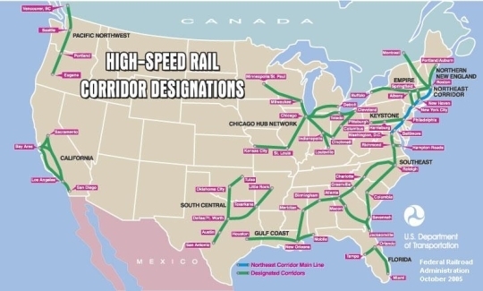
It was being used by several sources as late as this year. In other words, from 2000 to 2009 there were basically no changes made.

Finally, the Obama administration, which has now promised money to high speed rail, released their own map, and, well, didn’t rock too many boats. Their “Vision for High Speed Rail in America” is not much more than a couple of tweaks of the existing map. And still, ten years later, regions are, for some reason, not linked.

In the mean time, there have been several regional agencies which have come up with their own maps. The two most prominent are in the Midwest and California. California’s map is relatively simple (although minor changes, such as which pass to use to get from the Bay Area to the Central Valley, have been the cause of much contention) and very nifty on their website. The Midwest map, which is less further along, has seen a bit more flux.

The first map released by the Midwest High Speed Rail authority was rather modest, vague and, frankly, not really high speed rail (with top speeds of 110 mph):

That map disappeared from their server earlier this year (the Web Archive grabbed it, however) and a new, more ambitious one arrived, along with the news that they’d push for 220 mph service from Chicago to Saint Louis (ooh, good idea):

This is actually one of the better maps I’ve seen. It might be overly ambitious, but it does show the high speed routes to major cities, with connections to the east coast, which have been missing previously. Of course, there is no straight line across the Midwest from Pittsburgh, but at least the network realizes that it should be interregional.

Finally, there are a bunch of maps created by various blogs and lobbying groups for high speed rail networks.

The Transport Politic blog offers:

Richard Florida talks about Megaregions and high speed rail without putting up a specific map (a good idea, perhaps)

But others take that map and run with it.

Finally, with that map as a base, a lobbying group called the United States High Speed Rail Association has an ambitious, 17,000 mile network.

So what’s the takeaway? Well, the first is that nothing is really set in stone (except, perhaps, in California). But the second is that only more recently has anyone started looking beyond the corridors first set forth in 2000 (and, presumably, even before then). Which is good. Because even the newest maps, none of which have the backing of the government, have some issues with linking together longer corridors. Both the USHSR’s map and the one from the Transport Politic go through Philly, Harrisburg, Pittsburgh, Cleveland and Toledo on their way from New York to Chicago, adding enough mileage to negate the use of the corridor for longer distances.

Update: America 2050 has posted a study that actually has some basis to it, and the map they create is probably the most sensible yet.. The Transport Politic thinks so, too.

In any case, these maps should be refined: a strong case could be made for the competitiveness of a high-speed line from New York (with branches to Philadelphia, D.C. and even Boston) to Chicago (with branches to Pittsburgh, Cleveland, Detroit, Columbus and other cities). Considering the dismal state of air service between the first and third largest cities in the country, and the horrors of getting from the CBD of each (the two largest downtowns in the nation) to the airports, a modern, 200 mph line could definitely hold its own.

A future post will discuss this.

Viaducts: The High Line

After the success of the Viaduc des Arts in Paris, some New Yorkers looked at their community and realized they had a somewhat similar asset, and didn’t really know what to do with it. Was the structure a blight—as it was seen by the Giuliani administration, which wanted to tear it down—or something worth saving? Like the Viaduc Des Arts, it was nearly 30 years between the abandonment of rail service and the opening of the structure to the public, but the results, in the month which it has been open, have been similarly positive.

The elevated railroad south from 34th street has an interesting history, following the use of the west side of Manhattan. It was first built, at-grade, in the 1850s. Along the Hudson were dozens of docks, and until the 1960s, New York was one of the busiest ports in the world. By the 1920s, the railroad across surface streets on the west side was the cause of so much congestion that a proposal was made to elevated the tracks south of the yards at Penn Station, and by 1934, the work had been completed: a two-track railroad (which was, in places, wider) extended for a couple of miles along the docks.

The line ended at the Saint John’s Park terminal, which was built in the 1860s, and rebuilt once the elevated line was completed. The complex stood near the current Canal Street IRT and IND (1 and ACE) subway stations, a few blocks east of the Hudson. The rebuilt station truncated the line a bit, and it now ended at Spring Street, about a block east of the river—close to the docks—although it retained the name. The facility was impressive, with nearly a million square feet of floor space, eight railroad tracks, dozens of truck bays, customs offices and a connection to the docks. Speed would be improved as well; before the grade separation, trains were limited by law to six miles per hour and had to be preceded by a man on horseback. The New York Central published a pamphlet extolling the virtues of the new line.

In addition to the services to the docks, the line served factories and, especially, the meatpacking district, encompassing more than 250 slaughterhouses. The New York Central touted the relationship of the line to destinations by both ship and railroad (assuredly because they were the only possible provider of service) for factory locations, and, indeed, several were built, some of which straddled the line. During World War II, the line was used heavily to service these various industries. Within 35 years, it would be abandoned.

The decline of the West Side Line was not only attributable to the automobile, although it definitely had an effect. With automobiles and trucks, of course, production no longer needed to be as centralized. In other words, it didn’t have to be on the island of Manhattan. In addition, trucks could more easily make deliveries to Manhattan (although it is still notoriously hard to deliver goods to the island, even the milk in The City expires earlier than elsewhere, due, ostensibly, to longer periods when it is out of refrigeration during transport).

But there were other factors at work in the demise of the Line peculiar to it (many railroads in the country saw major declines with the coming of the car and truck). One was the improvements made in refrigeration. In the first half of the 20th century, meat processing was best done as close to the point of consumption as possible, as refrigeration was rather rudimentary. However, major strides were made in refrigerated trucks and rail cars that by the end of the war, it was easier to process meat outside the city and ship the smaller product—just the meat—in. Thus, of the 250 slaughterhouses which once operated in the meatpacking district, only a couple dozen remain.

The other factor at work was containerized shipping. In “The Box” Marc Levinson details how shipping was extremely inefficient and costly after World War II, especially in major break-in-bulk points like New York City. Shipments would arrive on trains and have to be unloaded, sorted and then reapportioned in to ships for overseas travel. Improvements in efficiency were frowned upon, especially if they would cost the union jobs. New York still accounted for a good deal of shipping until the advent of the container. Within 20 years, the New York docks were moribund, as shipping had shifted to locations which could process metal containers, which were easily lifted from trains and truck to ships. The Saint John’s Park Terminal, at the cutting edge of integrated shipping little more than a generation before, had outlived its usefulness. Factories closed up shop, and the meatpacking district became a den for prostitution, transvestites and others seen as socially undesirable.

It was about the same time that the railroad ceased to be used—the last three carloads were delivered in 1980 and it fell in to disuse. Local residents lobbied for it to be torn down in the 1980s, and it may well have been, had the city not been in such dire financial straits that a demolition and environmental cleanup were not in the cards. By the time the city was solvent enough to tear down the structure, in the 1990s, a small group of devotees and urban explorers—loosely organized as The Friends of the High Line lobbied against its demolition. Thus, while portions were torn down, it was kept intact north of Gansevoort Street. Some of the explorers of the structure, such as Joel Sternfeld (whose book of images from the line is now out of print and fetches high sums on the open market) introduced the structure to the masses, and Giuliani was unable to knock it down. Michael Bloomberg was more supportive of the project, the neighborhood through which the line runs had transformed from a den of vice to one of the trendiest parts of town, and fundraising began to open the structure to the public. The Design Build Network has a good history and description of this time frame of the structure.

Reaction to the project has generally been quite positive. The main detractors have not been those who wish it away, but those who lament the loss of the frontier aspect of the previously wild viaduct. Before it was completed, the High Line was open to a select few who climbed atop it, and wandered through a veritable prairie that was growing up in the middle of Manhattan. The current design tries to incorporate such aspects, keeping some of these plants and portions of the abandoned track, but with demarcated walkways and thousands of visitors, it is a different space entirely. Still, it was not feasible to let the structure rust in to oblivion, and keeping it as a public space is surely preferable to tearing it down, and having the landscape become a sea of condos like any other in New York.

The High Line opened to the public last month. I have not been in New York City since, but it is most definitely a destination the next time I am there. It seems to be similar, at least in the above, to the Viaduc des Arts, although more minimalist in design. How it will continue to interface with the city in the future will be interesting: it is one of the less-developed parts of Manhattan, and still has a few undeveloped parcels facing the High Line. Whether these will ever open out on to the structure is questionable: it’s a rather controlled space (one that is closed at night, for example). Also interesting will be what happens underneath it. Still, it is one of the most exciting new public spaces in New York in some time.

(Part of an occasional series.)