2.7 million kilowatt hours is a lot of power, but …

There’s a good* article on California’s high speed rail plans in the LA Times. I’m not going to focus on the questions of how to engineer a high speed rail system through mountain passes (it’s interesting, though), but look at one number which is put forth in the article:

When completed and fully operational, the bullet train will need an estimated 2.7 million kilowatt hours of electricity each day — about a quarter of Hoover Dam’s average daily output.

2.7 million kilowatt hours! That’s a lot. That’s … 2.7 gigawatt hours! A big scary number! A quarter of the Hoover Dam! A number worthy of exclamation points! What a power-hungry system this will be. Why not shelve it, and have everyone drive and fly between San Francisco and LA?

Because as far as transportation goes, this is pretty darned efficient. Transportation uses a lot of power, and high speed rail is one of the more efficient ways to move people from one point to another. How much power does a car use? One gallon of gas has the equivalent of about 34 kWh. Now, let’s assume that the average vehicle, being driven at highway speeds, gets, oh, I’ll pick a number out of the air: 34 miles per gallon. This yields the very convenient measure of 1 kWh per mile. If the average vehicle has two occupants (a reasonable estimate for long-distance drives), it yields 0.5 kWh per mile. (Airplanes have a similar fuel efficiency.)

It’s about 400 miles from San Francisco to Los Angeles. So the average person will use 200 kWh for that trip. 2,700,000 (2.7 GWh) divided by 200 yields—13,500. 2.7 million kWh is enough power to transport, using current technologies, 13,500 people each day between Los Angeles and California, or about 5 million per year.

The current HSR plans call for 1000-passenger trains (approximately—this is what is run in many other HSR systems) running every 9 minutes between San Francisco and Los Angeles at peak hours (7-10 a.m., 4-7 p.m.). That yields a peak-hour capacity of about 6.5 trains in each direction, or 13,000 passengers.

In other words, 2.7 million kWh would be enough to power the entire California High Speed Rail system—or enough to get one hour’s worth of high speed rail passengers to make the same trip by car or plane. To put it another way, 2.7 million kWh in it’s equivalent of gasoline will move about 5 million people between LA and San Francisco. It will move 20 to 30 million Californians along the same route by high speed rail—six times the efficiency!—with power left over for another 30-50 million shorter, interregional trips.

And this doesn’t address where the power comes from. For vehicles and air travel, it is from fossil fuel. For electricity, it can come from renewable sources in a state blessed with hydro, wind and solar. Right now, 20% of California’s power is from renewable sources; by 2020 the mandate is for 33%. With high speed rail drawing power from the grid, some of it’s power will probably come from the Hoover Dam.

( * if slightly concern-trolling—yes, crossing faults is a worry but it’s not like Japan’s Shinkansen runs through a seismically-inactive region)

Doing it wrong

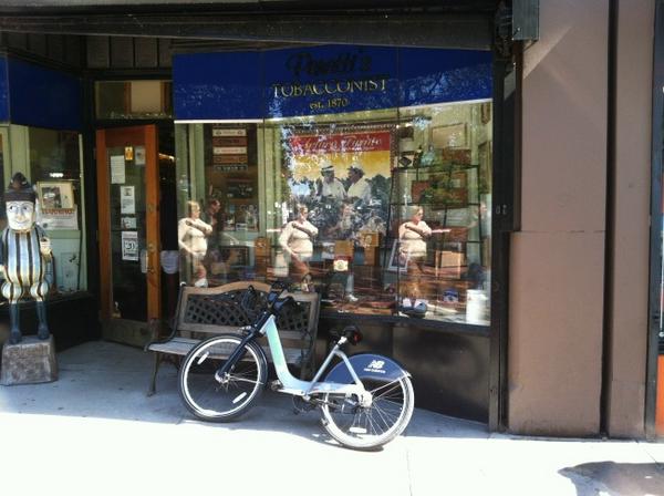
A quick explanation about a picture that I took and is now on the Boston Magazine website (about how not to use Hubway). Basically, I was walking to Boloco (probably) after a trip on Hubway and saw a shared bike propped outside a tobacconist (yeah, there’s a tobacconist, although he did not sell scratched records). It looked kind of silly left all alone, although right behind me, the photographer, there was a guy—the friend of the Hubwayer in question—standing with his bike and watching over. And about 12 seconds after I snapped this picture, the rider came out and grabbed the bike. So it was never in any real danger.

Of course … there is a Hubway station on the same block.

Personal Hubway Report

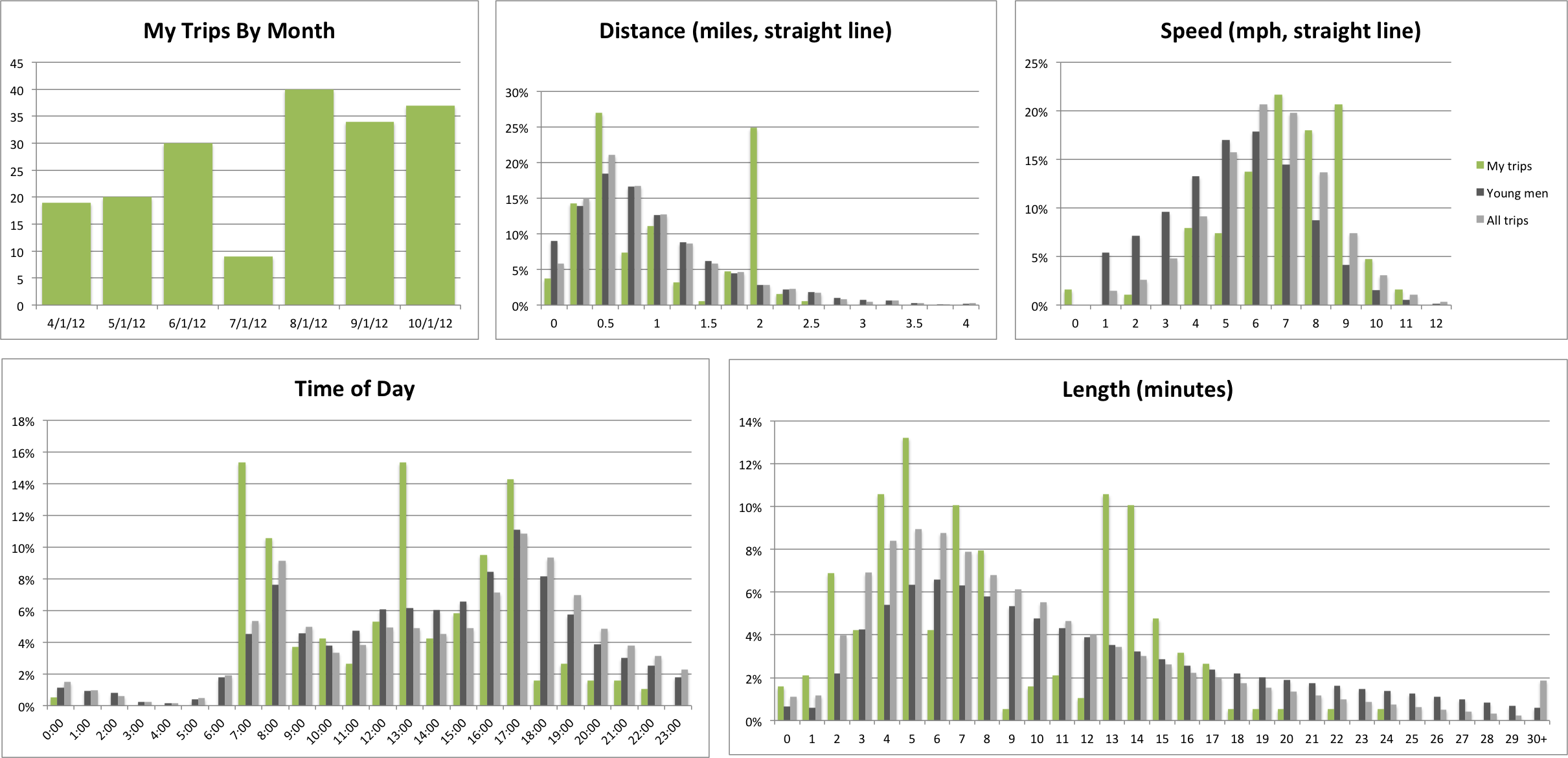
Back in May, a month in to my Hubway membership, I analyzed bike share trip length data, and ran a quick “analysis” of my own personal trips. Since then, I’ve logged more than 100 more bike sharing trips, and put together a bit more robust of an analysis to see my trip data. Since starting with Hubway:

  • 123 trips
  • 7:29 average trip length
  • 0.96 average trip straight-line distance
  • 15:20 hours on Hubway
  • 117 miles on Hubway (straight-line distance)
  • 7.63 mph average speed (straight-line)
  • 29 unique stations used (24 unique starts, 25 unique ends)
  • 90 of 123 trips started or ended at the most frequently used station (44/46)
  • 8:1 ration of starts to ends at Charles Circle (24/3), which is much easier to bike from than to bike to.

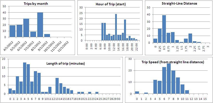
I can also break these numbers in to charts. And I love charts! (N.B.: for all charts, the number of trips is on the vertical axis.)

Hey, that’s pretty cool! There’s some interesting data here. First—July. I think that a combination of being away most weekends and warm temperatures lowered my trip count. More importantly, Hubway didn’t launch in Cambridge (where I live) until August, so all my trips were work-based. And I rode my (own) bike to work most of July. Oh, and there was the minor issue of a bicycle accident which knocked me out of the saddle for most of the month.

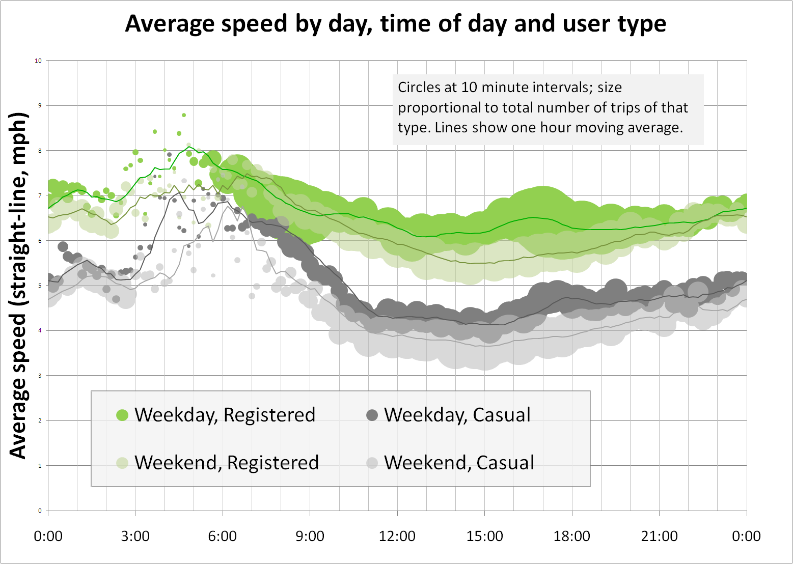
As for the timing of my trips, this is a tri-modal distribution, which matches rather well with overall bike share use patterns for weekdays. There’s a peak in the morning, when I am biking to work, and another in the evening, when I’m biking home. (And since I’m supposed to be in the office by 8, I’m convinced that Hubway’s clock is off by a few minutes!) The midday bump is when I take a bike for errands, which I do relatively often at lunch. It’s nice to have a dock at my building.

And the trip lengths? These are tri-modal, too. The peak of 4-5 minute trips correlates well with my frequent multi-modal commute walking to Central Square, taking the Red Line to Charles, and biking to my office, much faster than another stop and a walk or transfer would take me. (The reverse, thanks to one-way streets, is far less speedy; I’ve started 24 trips at Charles Station and only ended 3 there; it’s particularly hard to get there by bike.) The 7-8 peak is mostly lunch trips, and the 13-17 is from when I started commuting by Hubway in August.

Trip distance (straight line) mostly parallels trip length, and speed is a pretty nice bell curve. Since this is based on straight-line distances, there is some more variation than would be expected, because more roundabout trips wind up with slower “speeds” than straight shots. (My highest speed was when I biked straight down Commonwealth Avenue and made a bunch of lights.) This is probably comparable to average straight-line traffic speeds in Boston at rush hour.

Will I keep these data updated? Is the Pope Catholic? Does a bear relieve himself in the woods? Have I been tracking every mile I’ve traveled by mode for the last year and a half daily?

To get these data, I copied (in batches of 20) and pasted the trip data from my Hubway account (from their website) in to Excel; luckily it pasted very easily. Trip lengths were calculated from latitude and longitude data grabbed from Hubway Tracker. If you copy your personal trip data in to Excel and email it to me (ari.ofsevit on the Gmails) I’d be glad to get the data to you and send you charts of your own!

MBTA ridership and demand elasticity

This spring, I wrote about how the MBTA’s fares are really not that high. Fares went up on the order of 20 to 25%, and the T apparently expected ridership to fall by 5% or so. The numbers are in for the first month and while ridership did fall (the first decline, year-over-year, in 14 months), it was off by less than 1/10 of 1%.

There’s a local company which builds pricing software which is not surprised. They studied the base transit fare and calculated as long as it stayed under about $2.75 there would not be a major impact on ridership. Demand for transit is rather inelastic—people have to get to work—and they’re willing to pay an extra 60¢ a day (or $11 per month) in order to get to a job which pays many dollars per hour. For the average subway commuter, it’s still far cheaper to pay $70 for a monthly pass than to pay gas, tolls and (especially downtown, or in Kendall or Harvard) parking.

What’s interesting is where ridership fell. I expected that the increases in the cost of Commuter Rail to be a detriment to ridership. While transit and bus rose by 17% and 20%, commuter rail fares rose by 25-30%. And with higher fares to start, the nominal increase was $1.25 to $2.25. For monthly passes, which now range from $173 to $314, the increase in fares ranges from $38 to $64, which is not chump change. Commuter Rail customers are more likely to own cars than bus and transit users, and there was a lot of hand-wringing that commuters would abandon the rails and drive instead.

But that hasn’t happened. Even with lighter summer traffic, commuter rail posted gains. So did buses and boat traffic. The only declines were on The Ride (where fares doubled*) and on the Subway. Commuter Rail ridership is up. But the subway, where fares rose by a quarter and a nickel, is down.

However, the more I thought about it, the more it makes sense. While the subway prices stayed well within a range where they won’t have a major impact on demand, there is enough elasticity in supply to allow people to utilize other options. For most Commuter Rail riders, the trip is more than 10 miles and their only other option is driving, which is more expensive and subject to the whims of traffic. The cost of driving might be somewhat less marginally more, but it’s still more. So the supply is quite inelastic—even with fare increases the train is still cheaper than driving.

For subway riders, it’s a different story. Except for the Riverside and Quincy lines, most of the T’s ridership is concentrated within about 6 miles of downtown. Many subway riders have a commute which is only three or four miles long. The supply here is not constrained to transit or driving, but adds walking and cycling to the mix. With a mild summer (June was 1 degree below average, July and August 2 above) and expansion of bike sharing, as well as at-capacity rush-hour trains, it’s quite possible that many commuters looked at the fare hike and tested the elasticity of the short-distance travel supply. And that people looked at a mile-and-a-half ride on the train and decided to save $2 and take a half-hour walk. The price for walking or biking is essentially zero, so commuters were able to overlook the inconveniences of these modes due to the price savings. In other words, they pumped up their tires or put on their shoes.

Come winter, when it’s cold and rainy (or, like in 2011, snowy) these new riders may stream back towards the turnstiles (or, uh, Charlie Card machines). In any case, I doubt the drop in subway ridership is due solely to the rise in prices as much as it is due to riders exploring other options.

* I am torn how to feel about The Ride fares. On the one hand, paratransit is a lifeline for many disabled and disadvantaged groups who would otherwise not be able to get around without it. On the other hand, it commands a subsidy on the order of $40 per ride (if that was the rate of subsidy for all MBTA riders, the annual subsidy would be on the order of $15 billion per year—the cost of one Big Dig), and its ridership is growing exponentially. Paratransit is an important government service, but because it is shouldered by the T, a service for a few thousand riders a day is subsidized heavily by over a million other riders. A good solution, perhaps, would be sequestering funding for The Ride and funding it separately from the T at large.

Ten years after I enroll, Macalester’s transit is slated to improve

Ten years ago, I arrived in Saint Paul, Minnesota as a (n extremely awkward 18-year old) first-year college student at Macalester College. Recently the college tweeted that new students could follow the campus life account and hash tag to stay abreast of move-in information. This made me feel old: when I moved in, we didn’t have hash tags. Or Twitter. Or Gmail. And forget about smart phones; many of us didn’t even have regular phones. And the Spotlight was an anticipated publication because it had everyone’s picture and phone number. In print form. Three years later, it would be fully supplanted by Facebook (which was based on a series of similar publications at Harvard).

Some things, however, have not changed. The 63 bus still bisects campus on Grand Avenue, and the 84 still runs north-south along Snelling Avenue. Even so, the public transport options from Macalester to the rest of the world (beyond the “bubble”) have changed in the past ten years, and are about to change exponentially. The two bus routes which serve campus will still follow their streetcar predecessors’ routes, but new rail lines will finally give them more flexibility and greatly enhance service.

Public transit lines can be very slow to change. They are rooted firmly in history; in most cities bus lines are based on streetcar lines built around 1900, and this entrenchment is not frequently updated to reflect more modern travel needs. For instance, the 63 bus runs west from Macalester and dead-ends at the University of Saint Thomas a mile to the west. This is the same route it’s run since 1890. (The only changes have been in headways, which have varied between 15 and 30 minutes over the last 10 years.) It connects there with one spur route of the 21, although it’s not timed, so except to get to Saint Thomas, there’s little reason to take the bus west. In 1900, the neighborhood was focused on Saint Paul, and ridership was mostly to downtown. Now, with Minneapolis a major draw, the bus provides very little connectivity to the west, instead dead-ending at an unheated bus shelter with a single transfer.

The 84 is slightly-more updated. By 2002, it had shed it’s streetcar-era jog up Pascal and moved to a full run on Snelling. (It also shed it’s Saint Paul-specific route number in 2000 or so, when the bi-city numbering scheme was integrated.) In 2000, it had several branches, and the airport branch was only served every hour-or-so, providing quick but infrequent access to MSP. (This was dramatically improved by 2002, when, during the heyday of Macalester-airport connectivity, there was an airport-bound bus twice an hour and the single-seat trip took under 30 minutes.) In 2004, when the Hiawatha Light Rail line opened, the route was changed to provide connections to the train and thence the airport, increasing travel times (especially with the moronic Montreal loop, which adds an out-of-the-way mile to the route with no appreciable gain) and no additional airport-bound headways, although the other half of the buses do connect to the airport-bound 54 bus which makes a tolerable airport connection every 15 minutes.

As much as that particular route has devolved, connectivity to the light rail and Minneapolis has improved for the 84. And with the new line on University finally being built, Saint Paul in general, and Macalester in particular, is going to reap dramatically improved transit access.

To the south, the 84 will see an increase from four to six buses per hour. The Montreal loop will be eliminated, shaving several minutes from the Snelling-Hiawatha trip. Headways on that branch will not be improved, however, so connections to the Hiawatha Line (Apparently, the Hiawatha Line is going to become the Blue Line, and the Central Corridor the Green Line. It’s probably good—unlike Hiawatha, “Central Corridor” is a pretty horrid name for a transit line, but I’m still not used to it.) will not be improved. This is too bad, and hopefully the short-turn trips at Ford Parkway could be extended across the river. Still, there is an improvement in frequency to Ford Parkway, and an improvement in time to 46th Street, both of which are gains. (In comparison, when the Hiawatha Line opened, there was no improvement in headways coupled with a loss in travel time.)

To the north, the 84 will serve its current route, but do so 50% more often. In addition, at some point it might become a “rapid bus” service and eliminate many single-patron stops, speeding the route mightily.

To the east there will be no net improvement in weekday headways, although the renewed emphasis on the 63 bus will likely mean less of a likelihood of headway reductions in the near future. (In 2001, headways were 15 minutes on the route west of Downtown, in 2003 they were expanded to Sunray, in 2005 they were reduced to 30 minutes West of Downtown and in 2009 they were finally made 20 minutes on both sides of the route.) And the weekend headways, which are currently 30 minutes on Saturday and an hour on Sunday, will be improved dramatically.

Finally, to the west, the most improvements occur. Right now, outside of rush hour, travel to Minneapolis is a trip on the 84 and a transfer to the express-bus 94 (30 minute frequencies outside of rush hour) or the 16/50 (10 minute headways at least, but horrendously slow service. The light rail will halve scheduled times, and with the 84 matching its headway, the average connection at Snelling and University will be 5 minutes in both directions. The average trip time will be 30 minutes from Macalester to Nicollet, as fast as the current connection but with no traffic delays at rush hour and triple the frequency middays.

In addition, the 63 bus will provide service west and a connection to the light rail. So, from campus, there will be 9 options per hour to get to Minneapolis, and a quick wave of the smart phone will tell you which bus is slated to arrive next. If an 84 is 9 minutes off but a 63 is due in 2, walk to Grand. If the 63 just passed, grab an 84. Coming back, if you can make a quick connection at Raymond to the 63, hop on it; otherwise, stay on the train.

When I was on campus, I rode the bus east with some frequency to Saint Paul (15 minute headways and a 15 minute ride) but rarely ventured to Minneapolis. When I lived in Saint Paul, headways on the 63 were worse and there were still no good connections to Minneapolis, so I spent a lot of time bicycling. I’d still probably bike for this trip with the Central Corridor plan in place, but I can think of multiple times where I decided not to take a trip to Minneapolis because the weather was lousy and the bus schedules uncooperative. Having improved headways to all points of the compass will be a boon for Macalester students, and a boon for the residents of Saint Paul. Hopefully they’ll be enticed to come out and use it.

MBTA ridership time/distance charts

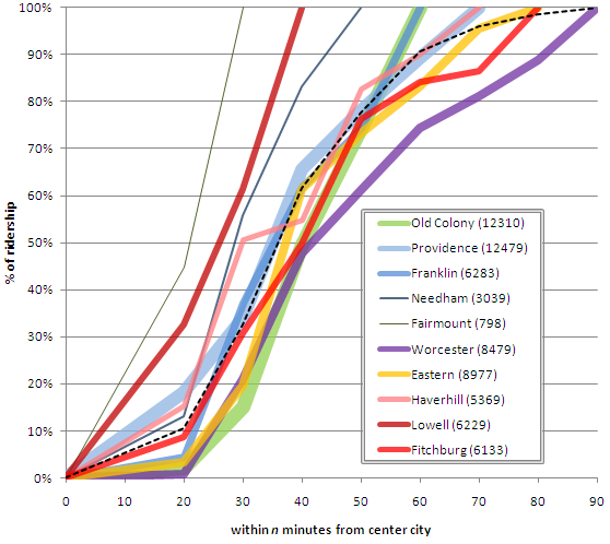
I posted a chart in reference to Alon Levy’s post about commuter rail ridership distribution a few weeks left. He pointed out that the same treatment could be given to commuter rail in other cities, like Boston. Results as follows:

Note: Old Colony includes the Greenbush Line unless otherwise noted. “Eastern” is the Newburyport/Rockport Line, which is the old Eastern Railroad. Traveler distributions for its branches are pretty similar.
This chart is the same as the ones for New York. The ridership levels are lower, of course, as are the distances. Only 5% of Boston’s ridership comes from beyond 60 km, while 25% of New York’s ridership travels that distance. Now, since I collected these data, I can run them for other variables. Here, for example, is the same chart shown by minutes instead of kilometers:

A couple of notes: travel times were calculated for the shortest scheduled travel time, and are shown from each outlying station to North and South Stations. Service to Back Bay is 5-6 minutes shorter on the non-Old Colony South Side lines.
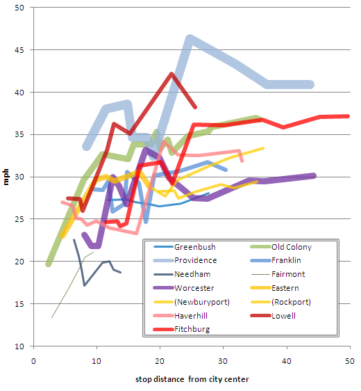
There’s a bit more variation here. Notably, the Lowell Line shows up as having shorter travel times, since it is a relatively short line with relatively fast speeds. And the Worcester Line, which is one of the longer lines, stands out as having longer travel times, although it achieves relatively good ridership despite this. One other way to view these data is to look at average speed by line. Do note that this chart is not cumulative, but show the fastest available service for each station:
Note: these times are for inbound trains only; the Worcester Line does have some outbound trains which average 38 mph from South Station to West Natick.

Note how the Providence Line and the Lowell Line are by far the fastest in the system. The express from Mansfield to Boston averages 45 mph; the run to Back Bay averages nearly 55. The Lowell Line, which has speed limits of 70 mph, averages over 40 mph on express runs from North Billerica (less from Lowell which has a long, slow section through a yard south of the station. These lines have more spread-out stations and are mostly grade-separated; except for two grade crossings in West Medford there are no public grade crossings on the Lowell Line and none between Boston and Providence.

The Fitchburg Line is relatively fast (especially for express trains) although it’s length means that trip times are long. It benefits in ridership by not paralleling a direct highway to the city and it is slated for speed upgrades which should shave 10 minutes off travel times. Other line speeds are relatively abysmal (Haverhill might see improvements based on ongoing trackwork), with a particular finger pointed at the Worcester Line.

The MBTA will soon seal the deal to buy the whole of the line to Worcester. I wouldn’t hold my breath on increased speeds. The T could have purchased higher speed cars and electric motors for the Providence Line. Did they? No. The line to Worcester is double-tracked in its entirety (except for a stretch through the Allston yards, but that should be remedied) and has four grade crossings (indeed, the only four grade crossings between Boston and Springfield) in total. There is no reason that 80 mph line speeds would be difficult to attain in short order, and 110 in the longer range. But there’s little about higher speeds and shorter times coming from upstairs.

There’s potential for ridership with trip times equal to or better than driving. Worcester is slightly off the Turnpike, so the 45 mile trip takes closer to an hour. At rush hour, there’s usually traffic adding another fifteen or thirty minutes. And the tolls—$3.60 each way—add to the cost of driving significantly, as it’s the only line where the driving option is tolled. Sub-hour trip times should be easy, and 60 mph, 45 minute trip times not out of the question (beyond that, connections to Springfield and Amherst would be much more feasible if trip times to Worcester were halved). That would be progress for the state’s second largest city. … As long as the T actually serves Worcester (and doesn’t just build a park-and-ride on the outskirts as they seem to like to do).

West Medford: the best candidate for an MBTA grade separation

[Some minor updates Dec 2015]

Like most commuter rail systems in the US, most of the MBTA lines have numerous grade crossings. They vary significantly by line, with some mostly grade-separated, and some having grade crossings at a rate of one per mile. For most, the current and near-term future service does not demand any major grade separation; the Northeast Corridor high speed line is already grade separated, others would not be cost-effective because of either the sheer number of grade separations that would need to be built or because building them would do little to speed travel or improve traffic.

Here is a breakdown of each line, the number of grade crossings, the distance of the first grade crossing from the terminal station (i.e. how many miles is the line grade separated before the first crossing) and the total length of the line. Also noted are any major stretches which are already grade separated. Distances taken/estimated from the MBTA’s Blue Book (pdf). Here’s a map and list:

  • Eastern to Beverly: 8 crossings, 18 miles, first at mile 3. 8 mile gap.
  • Rockport Branch: 20 crossings, 17 miles. 
  • Newburyport Branch: 19 crossings, 18 miles. 
  • Haverhill: 27 crossings, 33 miles, first at mile 6. 
  • Wildcat Line: 4 crossings in 2 miles.
  • Lowell: 3 crossings, 25 miles, first at mile 5. Other than two crossings in West Medford, the only other is a private crossing at Wilmington (mile 15).
  • Fitchburg: 38 crossings, 50 miles, first at mile 3.
  • Worcester: 4 crossings, 44 miles. Only crossings in pairs at miles 21 and 25.
  • Needham: 5 crossings, 14 miles, first at mile 12.
  • Franklin: 8 crossings, 30 miles, first at mile 14, second at 23, the rest between 27 and 30.
  • Providence: Fully grade separated.
  • Stoughton Branch: 8 crossings in 4 miles.
  • Middleboro/Lakeville: 13 crossings, 36 miles, first at mile 15.
  • Plymouth: 27crossings, 36miles, first at mile 11.
  • Greenbush: 25 crossings, 28 miles, first at mile 10.
A few things stand out. First of all, inside Route 128, there are numerous grade crossings on north-side lines, but none on south-side lines. And there are four branches which have particularly few grade crossings: the Providence Line (none), the Worcester Line (only four, which are in two pairs four miles apart near the midpoint of the line), the Franklin Line (two crossings in the first 27 miles) and the Lowell Line.

The obvious choices for some sort of grade separation would therefore be:

The crossings on the Worcester Line, while bothersome, are not the major reason for slowdowns on that stretch (even the fastest trains run the length of the line in 1:20, an average speed of only 33 mph). All trains stop at Framingham (where the two most congest crossings lie) and Ashland is only a few miles past. If there were plans to dramatically upgrade this line to higher speed operation, say, to provide 50 minute service times from Worcester, then the crossings would be more troublesome. For now, once the state completes the purchase of the line, they’ll need to work to upgrade speeds and dispatching before they tackle bridges. Additionally, Framingham may be rebuilt to deal with traffic congestion, and such a project wouldn’t be cheap since there are several intersecting freight lines which would need to be separated, too.

The Franklin Line’s crossings both border stations, and the Franklin Line does not serve a large anchor city at the end of the line (an extension would be possible to Milford, but Milford is only a quarter the size of Lowell). Since the grade separations are near the end of the line, it would only benefit a few of the passengers to make costly changes. 

The Lowell Line, however, has ridership as high as the Franklin Line (in a shorter distance) and also hosts some trains from the Haverhill Line as well as Amtrak’s Downeaster trains from Portland. The Worcester Line’s ridership is higher, but much more spread out. Half of the Worcester Line’s ridership lies east of Framingham, so a grade crossing there would add no benefit for them. Every rider on the Lowell Line would benefit from a West Medford grade separation. Additionally, with higher speeds, service currently serving Maine, and potentially serving New Hampshire, would be speedier. The Boston and Lowell—one of the first railroads in the country—was built in the 1830s to serve the mills in Lowell and has continued to be the main north-bound rail line throughout its history. Despite its age, it has low grades and wide turns and would be a good candidate for moderately-high speed train service (80-110 mph).

Then there are the operational efficiencies possible from eliminating the West Medford crossings. Most grade crossings have upkeep costs which include power and maintenance. In order to keep from having whistles blown, however, these High Street crossing has a paid attendant in little shacks 24 hours a day, one of two in the MBTA system (the other is at Greenwood on the Haverhill Line). This incurs an annual cost of $864,000 annually, or $432,000 for the Medford watchman. This still doesn’t keep motorists from breaching the crossing, which can tie up train service for hours and do quite a number of the car involved (if not, in this case, the motorist).

A grade separation would have obvious benefits: it would save half a million dollars per year in crossing costs, it would speed the trip for thousands of commuters on express trains through the station, it would remove a major safety hazard and it would ease traffic congestion where trains pass every ten minutes during peak hours.

How much would it cost? Hingham recently held up the state for $40 million in order to have a grade separation in their town. This included two approaches and 900 feet of tunnel; a similar length of tunnel (albeit a single track) than would be required in West Medford (this is assuming an 800-foot station in the cut and that the less-used Canal Street crossing was closed to allow for tracks to descend off the Mystic River bridge). The higher cost of burying two active-service tracks would be mitigated by the much broader footprint in the area. The right-of-way in West Medford is 60 feet wide and mostly borders roadways and industrial properties, the right-of-way in Hingham was only about 20 feet wide in places as it wound between commercial shops. One other factor may be the water table: West Medford is only about 24 feet above sea level (the level of the Mystic River is at sea level) so the bottom of the cut would be near sea level, and possibly impacting the water table. With that said, the Hingham tunnel is similarly low.

And how would you do it? Well, I’d imagine a three-phased scenario. First, slurry walls would be built on either side of the current tracks to act as the supports for the final trench, as well as any utility work at the current crossings. The current tracks would then be replaced by shoo-fly tracks on either side and the trench excavated, and a bridge built at the High Street crossing with the road rerouted temporarily there. Finally, the tracks would be relaid through the trench and the station rebuilt akin to the Waverley Station in Belmont.

Why not an elevated station like in Winchester? In Winchester, the 1950s-era grade separation replaced half a dozen crossings, not just one or two. (HistoricAerials.com from 1955 shows the route during construction; it also shows Waverley just after it was completed.) It also created a wall across the community (albeit a wall safer than the numerous grade crossings on the busy main line). That being said, it would likely be struck down by locals today, especially by many nearby residents in Medford (which has many houses near the tracks).

The main issue would be lowering the tracks quickly enough to provide clearance. It is about 1000 feet from the end of the Mystic Bridge to High Street. Assuming the river bridge isn’t rebuilt (although it might be a good time to do so) a 2% grade would lower the tracks 20 feet by High Street, more than enough for clearance. A slight deviation in the street, raising it three or five feet, would dramatically reduce the grade. Electrification of this route would solve any grade issues.

Once separated, this track, which is relatively straight from Boston to Wilmington and beyond, could be upgraded to speeds of 79, 90 or even 110 miles per hour. This would shave minutes off of travel times to Lowell and Portland, and potentially Nashua, Manchester, Concord and beyond. With Interstate 93 gridlocked for hours each day, rail service to New Hampshire and Maine makes sense, and grade separating West Medford can make this service more time-competitive while making West Medford quieter, less congested and safer.

Chinatown to Charles: the Bermuda Triangle for bikes in Boston

When I bike to work, my route is simple. I head down Main Street in Cambridge, cross the Longfellow Bridge, and take a right on to Charles Street. I go diagonally across Beacon Street on to the Common, bike down the wide bike path there, and then bike half a block (or, if I’m on a Hubway, a whole block), slowly, down a sidewalk to the office. It’s simple, relatively safe and even pretty fast.

On the way home, I don’t even bother to try the reverse. It is damn near impossible to get from the Chinatown/Theater District/Park Square area to the Longfellow Bridge, and the options are dangerous and annoying enough that I wind up on the Commonwealth Avenue bike lanes to the Harvard Bridge to Cambridge, a less direct, but much safer route. As such the inbound and outbound portions of my ride are, except for half a block of Mass Ave in Cambridge, completely different.

But what about when I have to go to Kendall? There are several options for getting to the Longfellow, each of which has some major bikeability issue. The main issue is that Charles Street is one way, with no provision for cyclists going northbound. It’s sidewalks are narrow and riding contraflow is a death wish (oh, and it’s illegal). Beacon Hill—the neighborhood it traverses—is comprised of one-lane, one-way roads, and they have been signed in such a way as to prohibit through traffic, which is sensible since it was laid out way, way before cars were invented. This would be fine, but there is no parallel to Charles Street. To the east is Storrow Drive. To the west is Beacon Hill. There’s no good way to get the third of a mile from the Common to Charles Circle.

I’ve gone through the options (none of them good) and rated each from 1-5 for three categories: bike-car safety (how safe is it in spaces shared with cars?), bike-ped safety (how safe is it on spaces shared with pedestrians?) and bikeability (is it really annoying to bike?):

The Storrow double-cross is what you get if you ask Google Maps. It’s a pretty bad suggestion. The two crossings are coded as bike lanes, and while they do provide traffic-free crossings of Storrow Drive, neither is bike friendly, at all. To get to the bridges, you first have to cross four lanes of traffic on Charles Street, without the benefit of lights, unless you dismount and use crosswalks at the corner of Charles and Beacon. The path on the north side of the Public Garden is not bikeable. I call this the Beacon Weave. It’s not much fun on a bike.

And all that does is get you to the bridges. The first crossing (1) is the Fiedler Bridge near the Hatch Shell. To gain altitude, it has two hairpin turns on each approach, the bottom of which is completely blind. Biking at a walking pace, or walking altogether, is necessary going up and down this bridge, which often has heavy foot traffic. Assuming you navigate that bridge, you get a couple hundred yards of easy riding before you have to navigate another double-hairpin bridge (2) to get back across Storrow. This one is less blind than the Fiedler, but it’s narrower and just as trafficked. Even then, that only gets you to the far side of Charles Circle, where you have to jockey in traffic turning off of the Longfellow and on to Storrow before you can get to the bike-laned regions on the bridge itself. This require four separate crosswalks or some creative light-running.

This route would be a bit more doable if there were a path from the river bike path to the Longfellow. But there’s not. It’s pretty nasty.

Verdict:
Bike-car safety: 3
Bike-ped safety: 1
Bikeability: 0
Grand total: 4

The Beacon Hill Stumble-Bumble is probably the most direct route, but it fails for a variety of reasons. Mainly, it involves going down several one-way streets the wrong way, which causes Google Maps to say things like “walk your bike” in the directions more than once. Plus, these streets are steep, narrow and have blind corners. It might be fun if you are a bike messenger, but if you value your life, it’s a pretty bad option. If a car comes the other direction, there is not enough room to pass with any degree of comfort and safety. And the streets are designed to not let you through, so if you don’t know your way, you’ll wind up lost and spit out on to Charles, Beacon or Cambridge Street anyway.

Verdict:
Bike-car safety: 1
Bike-ped safety: 2
Bikeability: 0
Grand Total: 4

The Beacon Hill Crossover is another Google Maps suggestion, and it’s slightly better than the first. It has you cut across the Common (or you can go around on Beacon), climb Beacon Hill, and descend on Bowdoin Street. That part of the route, aside from the hill climb, is not too bad. Then you hit Cambridge Street. Outside of rush hour, this isn’t that bad. During rush hour, this backs up off of Storrow Drive, and to get to the Longfellow you have to slalom slow-moving cars, and then get through the intersection at Storrow. There, it behooves you to find the left-most lane, because most of the traffic is turning right on to Storrow with no idea that a bicyclist might be going straight. Charles Circle is bike no-man’s-land (no-bike’s-land?) and it is several heartbeats before you are in the relative safety of the bike lane on the bridge. Oh, and there are always hordes of pedestrians running across Charles Circle to get to the T stop. A variant of this route via the less-hilly but longer and more-pedestrian-mall Downtown Crossing, which scores similarly, is shown as well.

Verdict:
Bike-car safety: 1
Bike-ped safety: 1
Bikeability: 3
Grand Total: 5

The Storrow Shortcut is the route I actually use. It isn’t pretty, but it certainly gets the job done. The main issue is that it requires either biking a narrow, decaying sidewalk along Storrow Drive or, more comfortably, actually biking down Storrow Drive itself! Google doesn’t realize that Storrow is not officially closed to bikes, and that there is a sidewalk along that route, so I can only show this route in driving directions. And, no, it’s not as crazy as it sounds.

On the few hundred yards of Storrow I bike, the road is three lanes wide and it has a narrow-but-painted shoulder line. It’s definitely better than the rutted-and-cracked sidewalk. Traffic is usually very slow there in the afternoon, and I can usually glide past the gridlock for the couple of blocks up towards the T stop. Once there, I hop on to the sidewalk and the unused part of Embankment Road and then under the bridge before hooking a left towards Cambridge. It avoids one-ways the wrong way, it misses the thick of the pedestrians, and it requires a minimum amount of weaving through traffic (but doesn’t miss the Beacon Street Weave). It’s ugly, but it works.
  
Verdict: 
Bike-car safety: 1
Bike-ped safety: 4
Bikeability: 2
Grand Total: 7


All of this, of course, could be solved with a two-way cycle track on Charles. This has been proposed, but has not seen any steps taken towards actual construction. Charles is three lanes of traffic and parking on both sides. Its shops are mostly pedestrian-oriented, and it probably doesn’t need this parking, but taking it out would cause an uproar. However, the street would, and should, function perfectly well with two lanes. And such a lane would funnel Cambridge-bound traffic from the Back Bay across the Theater District and Chinatown to the Financial District and even the Seaport. It would be well used.

New York ridership-vs-distance chart

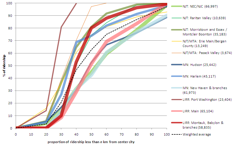
On his blog Pedestrian Observations, Alon Levy recently compared ridership on the different commuter lines in New York. It’s an interesting post, with a chart of the different lines which was begging to be thrown in to Excel and graphed. Which I’ve done:

Notes: line width is proportional to ridership. Lines are grouped by color. Green = NJT. Yellow = NJT operating in to New York. Blue = Metro North. Red = LIRR. The chart will definitely make more sense when referenced to the original post

Levy points out that lines are almost operating as separate systems: some as closely-spaced commuter rail (the group of lines more to the left) and some as almost intercity rail (the ones more to the right). In the first group, half of the ridership rides from stations between 30 and 40 km from the city center. In the second, half the ridership takes rides from at least 50 km out. What’s interesting to note is that each group has lines from each system; it’s not like the LIRR has denser lines while the Metro North has far-flung stations.

It does seem that lines which were once or are now major intercity routes are more likely to have longer-distance commuters and look more like intercity trains. The four lines in this group constitute the three main lines which operate frequent intercity service from New York (the LIRR doesn’t have any cities to operate to, of course) to Boston (New Haven), Albany (Hudson) and Philly/DC (NEC). Of course, even though the Metro North in Connecticut serves trains to Boston and Springfield, it is still painfully slow with maximum speeds of only 70 mph, half the speed of the NJT NEC towards Trenton.

Anyway, I think the chart looks pretty cool. (Next up: giving the same treatment to Boston’s trains, and whining about the MBTA’s commuter services a bit.)

Dear Mr. McGrory: stop the anti-bike/ped snark

Brian McGrory is a columnist for the Boston Globe, and someone told me he’s a good one. However, he has it out for anyone not driving their own car, I think, unless he is being very coy and sarcastic. When Hubway was launching last July, he proposed banning bikes altogether. It’s pretty tongue-in-cheek. Obviously he doesn’t want to ban bikes, but he wants cyclists to do a better job of obeying the rules. Sure, he posits that all cyclists are lycra-clad speedsters who run red lights with abandon. (We’re not.) I get the point; but there was probably a better way to say it.


But was that an isolated incident of non-driving hate? Apparently not. Today, after last year endorsing a war against bikes, McGrory rails against the war against cars. Apparently—and believe you me, I have not noticed this—Mayor Tom Menino, in declaring his support of bikes and walkers, has actually declared war on the automobile. So “the car is no longer king” is a battle cry. Right.


McGrory’s latest column is pure rubbish. It turns out Menino wants to convert some parking spaces to “pop-up parks” or “parklets.” This sent McGrory in to a rage. The mayor is crazy! he writes. And he needs to be committed.


Apparently, the lack of vehicular traffic is to blame for every problem in the Downtown Crossing area:

The car is still banned from Downtown Crossing, even while it’s painfully obvious that the hard luck neighborhood would benefit enormously from vehicular traffic. Cities around the country have turned their tired pedestrian malls back into real streets with great success.

Oh, where to begin? First of all, many of the country’s de-pedestrianized malls have been in places like Buffalo and Kalamazoo, not the most vibrant of metropolises. Pedestrian malls are going strong in cities like Denver, Burlington, Minneapolis and Boulder, and New York has cordoned off main streets in its retail core to widespread praise. Second, it’s quite possible that a lot of the issues in the area are due to a massive hole, and the mayor has been instrumental going as far as to threaten eminent domain takings (nothing says blight like an abandoned building) to speed reconstruction forwards. Third, it’s not like the retail district there is dead. While it might not hop at night, during the day the area is filled with thousands (by some counts, a quarter million) of pedestrians daily. Adding a few hundred car trips would be to the detriment of these hordes.


And it’s painfully obvious that cars along the currently-pedestrian streets would help? Apparently McGrory hasn’t ever been to Filene’s or Jordan Marsh (or Macy’s). The streets in Downtown Crossing are one-way, one-lane streets. They are busy with pedestrians, cyclists and deliveries, and trafficked streets nearby usually feature stalled vehicles waiting for lights. I’m not sure how a few extra vehicles in the area—and no on-street parking, assuredly—would be a panacea for the woes. A Wegmans or Target and 500 units of housing, on the other hand, might help.


McGrory concludes, after positing not an iota of actual data, that “the mayor is at war with the car, and the drivers are the collateral damage.” He, as we have seen, believes everyone drives, or at least, everyone ought to. I would contend that the mayor is simply fulfilling the wishes of the majority of voters who elected him. (Yes, believe it or not, Hizzoner still stands for elections.) 51% of Bostonians don’t drive to work, and only 44% drive (it was 51% ten years ago). Yet most of the real estate of our rights of way is given over to cars, even if they are a smaller fraction of the users on a stretch of road.


Maybe, Mr. McGrory, the mayor is simply acting in the best interests of his constituency. Or, at least, the constituency who has actually gotten out of their cars in the top walking city n the country. If you’d like, I’d be glad to take you on a walk and bike ride to some of the places you’d like to have teeming with cars instead of vehicles. Let me know.