Personal data collection: Hubway

Back in 2011, as part of a convoluted New Year’s resolution, I started tracking my personal travel daily. Each day, I record how many miles I travel, by what mode, and whether I am traveling for transportation or exercise/pleasure. Why did I start collecting these data? Because I figured that there was the chance that some day it would be useful.

And that day is … today!

I realized recently that I had a pretty good comparative data set between the April to July portion of 2012 and 2013. Not too much in my life changed in that time frame. Most days I woke up, went to work, came home and went for a run. Probably the biggest difference, transportation-wise, was that in 2012 there were no Hubway stations in Cambridge, and in 2013 there were. In addition, since Hubway keeps track of every trip, I can pretty easily see how many trips I take, and how many days I use each mode.

To the spreadsheets!

The question I want to test is, essentially, does the presence of bike sharing cause me to walk and bike more frequently, less frequently or about the same? Also, do I travel more miles, fewer or about the same? A few notes on the data. First, I am using April 6 (my first Hubway ride in 2012) to July 9 (in 2012 I had a bike accident on the 10th and my travel habits changed; Hubway launched in Cambridge at the end of the month, anyway). Second, I collect these data in 0.5 mile increments, and I don’t log each and every trip (maybe next year) but it’s a pretty good snapshot.

The results? With Hubway available, I ride somewhat more mileage, but bicycle significantly more often. In addition, my transit use has declined (but I generally use transit at peak times, so it takes strain off the system) and I walk about the same amount.

Here are the data in a bit more detail for the 95 days between April 6 and July 9, inclusive:

Foot travel. In 2012 I walked 84 days in the period a total of 190.5 miles. In 2013, the numbers 83/180. (Note that I do not tally very short distances in these data.)

Bicycle travel. In 2012, I biked 66 and, believe it or not, in 2013 I actually biked fewer days, only 64. As for the distance traveled, I biked 466.5 miles in 2012, and 544.5 miles in 2013. So despite riding slightly fewer, I biked nearly 20% more distance. This can be partially explained by my participation in 30 Days of Biking in 2012, when I took many short trips in April.

In addition, in 2013 I began keeping track of my non bike-share cycling trips. I only rode my own bike 14 days during the period, tallying 44 trips on those days. But there were many days where I rode my own bike and a Hubway; I took 29 Hubway trips on days I rode my own bike; on 8 of the days I rode my own bike, I rode a Hubway as well.

Bike share trips. In 2012 I rode Hubway on 39 days, totaling 71 rides, an average of 1.8 Hubway rides per day riding Hubway. In 2013, I rode Hubway on 58 days, but tallied 185 rides, an average of 3.2! So having Hubway nearby means that I ride it more days, and more often on the days I ride.

Transit. In 2012, I took transit almost as frequently as bicycling, 61 days. I frequently rode the Red Line to Charles Circle and rode Hubway from there to my office. In 2013, my transit use dropped by nearly half, to just 31 days, as I could make the commute by Hubway the whole way without having to worry about evening showers or carrying a lock.

We might look for the mode shift here. My walking mode shift has not changed dramatically. My bicycling mode shift hasn’t appreciably increased, although the number of total rides likely has. My transit mode shift has decreased, as I shift shorter transit rides to Hubway.

Now, if they ever put a station near my house, I’ll get to see how those data would stack up. My hypothesis: I’d never walk anywhere, ever.

Hubway Data Challenge (and updated personal charts)

Back in September, I grabbed my Hubway use, cajoled it in to some charts, and posted them here for the world to see. Remember how cool those charts were, with 130ish data points?

This is what happens when you get more than 130 data points!

Well, in October, Hubway released the data from all rides taken on the system, which added another (approximately) 550 thousand data points, so I decided to rerun these data added together, for a grand total of about 550,130 data points.

(Totally off subject, but this reminds me of the old joke about significant digits the docent at the Museum of Natural History. A student asks how old the dinosaur skeleton is. And he replies “it is 68,000,038 years old.” The student asks how they know such an exact number and he says “when I started working here, they told me it was 68 million years old. And that was 38 years ago!”)

Ha ha ha. Anyway, I spent the next month dealing with this slightly larger data set, charting and mapping the data, cursing Excel (especially the Mac OS version which is so poorly designed that it will only run one one core of my four-core processor at a time, in other words, I would like my money back, Mr. Gates) and churned out an entry in the Hubway Data Challenge contest. The winner gets a free helmet, Hubway membership and t-shirt, which is slightly better than a sharp poke in the eye! You can find my entry at the above link, or go directly to it here. It has CSS! And some moderately interactive features!

Then I went and looked through all the other entries. From people who know how to make websites that work, and from people who know how to write code to do cool things. And then, I won anyway! Well, I was one of several winners. But still.

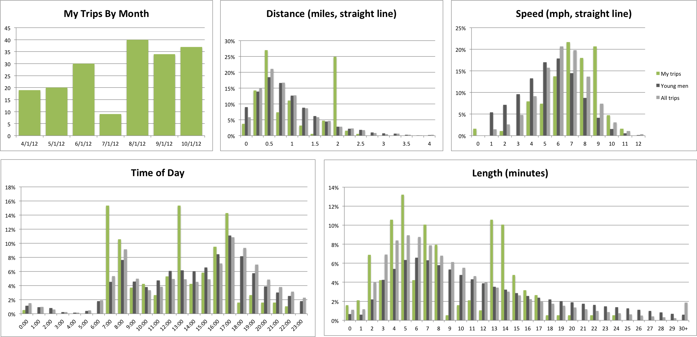
Anyway, here is my latest Hubway usage report, you can clicky to make it bigger. OH AND! If you want this treatment for your Hubway trips (and the map, too; the map is pretty cool) let me know and I will make it for you. Payment in beer is readily accepted.

Personal Hubway Report

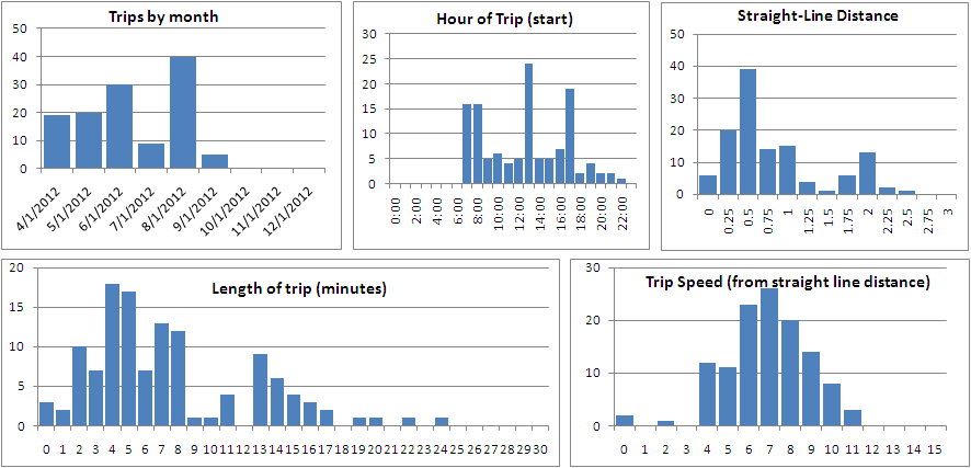
Back in May, a month in to my Hubway membership, I analyzed bike share trip length data, and ran a quick “analysis” of my own personal trips. Since then, I’ve logged more than 100 more bike sharing trips, and put together a bit more robust of an analysis to see my trip data. Since starting with Hubway:

  • 123 trips
  • 7:29 average trip length
  • 0.96 average trip straight-line distance
  • 15:20 hours on Hubway
  • 117 miles on Hubway (straight-line distance)
  • 7.63 mph average speed (straight-line)
  • 29 unique stations used (24 unique starts, 25 unique ends)
  • 90 of 123 trips started or ended at the most frequently used station (44/46)
  • 8:1 ration of starts to ends at Charles Circle (24/3), which is much easier to bike from than to bike to.

I can also break these numbers in to charts. And I love charts! (N.B.: for all charts, the number of trips is on the vertical axis.)

Hey, that’s pretty cool! There’s some interesting data here. First—July. I think that a combination of being away most weekends and warm temperatures lowered my trip count. More importantly, Hubway didn’t launch in Cambridge (where I live) until August, so all my trips were work-based. And I rode my (own) bike to work most of July. Oh, and there was the minor issue of a bicycle accident which knocked me out of the saddle for most of the month.

As for the timing of my trips, this is a tri-modal distribution, which matches rather well with overall bike share use patterns for weekdays. There’s a peak in the morning, when I am biking to work, and another in the evening, when I’m biking home. (And since I’m supposed to be in the office by 8, I’m convinced that Hubway’s clock is off by a few minutes!) The midday bump is when I take a bike for errands, which I do relatively often at lunch. It’s nice to have a dock at my building.

And the trip lengths? These are tri-modal, too. The peak of 4-5 minute trips correlates well with my frequent multi-modal commute walking to Central Square, taking the Red Line to Charles, and biking to my office, much faster than another stop and a walk or transfer would take me. (The reverse, thanks to one-way streets, is far less speedy; I’ve started 24 trips at Charles Station and only ended 3 there; it’s particularly hard to get there by bike.) The 7-8 peak is mostly lunch trips, and the 13-17 is from when I started commuting by Hubway in August.

Trip distance (straight line) mostly parallels trip length, and speed is a pretty nice bell curve. Since this is based on straight-line distances, there is some more variation than would be expected, because more roundabout trips wind up with slower “speeds” than straight shots. (My highest speed was when I biked straight down Commonwealth Avenue and made a bunch of lights.) This is probably comparable to average straight-line traffic speeds in Boston at rush hour.

Will I keep these data updated? Is the Pope Catholic? Does a bear relieve himself in the woods? Have I been tracking every mile I’ve traveled by mode for the last year and a half daily?

To get these data, I copied (in batches of 20) and pasted the trip data from my Hubway account (from their website) in to Excel; luckily it pasted very easily. Trip lengths were calculated from latitude and longitude data grabbed from Hubway Tracker. If you copy your personal trip data in to Excel and email it to me (ari.ofsevit on the Gmails) I’d be glad to get the data to you and send you charts of your own!