When Boston Almost Lost Commuter Rail

The 1970s was not a good time for rail commuters in Boston. New roadways had opened and several rail lines shut, and those left had anemic schedules. In the 1950s, Commuter Rail was provided by private carriers (the Boston and Maine north of the city, the Boston and Albany—owned by the New York Central—on the Worcester Line and the New Haven elsewhere from South Station) in a manner similar to today on major lines, with less service on some branch lines (nearly all of which have since been abandoned). Many of these timetables from 1952 can be found here. In the late 1940s, South Station handled 125,000 passengers, far more than today. Only Chicago, Philadelphia and New York had similar or larger systems.

Significant cuts came in the 1950s, including the demise of the Old Colony Lines when the Southeast Expressway opened. After beginning to provide subsidies in the 1960s to commuter railroads, the T was in the midst of a many-years-long experiment to figure out how to best fund Commuter Rail, and service was often cut in towns which refused to pay up, leading to closed-door service where trains would bypass stations in a non-paying municipality. (This coincided with upheaval in the rail industry in general, as Penn Central and Boston and Maine both teetered on the brink of insolvency, while still operating the T’s Commuter Rail system.) Termini were cut back and on the north side outer sections of rail lines often only had a single trip in the morning and evening (or as the T would say today: “twice a day“).

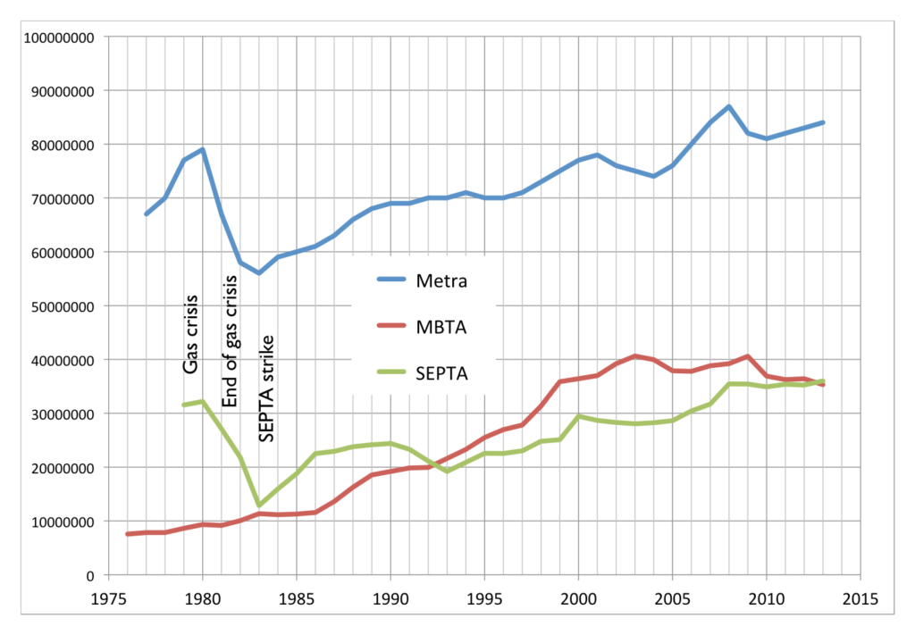
Rail lines, owned by bankrupt freight lines (even the mostly-passenger New Haven had been merged in to the ill-fated Penn Central), fell in to disrepair. Service to South Sudbury was cut in 1971 (49 minutes Sudbury to North Station; try that today), Worcester was dropped in 1975, Bedford (35 minutes to Boston) was mothballed in 1977 and Woburn in 1981. What service remained was often run on a skeleton schedule with only a handful of inbound runs in the morning and outbound in the evening. Ridership and service would better be compared to the ill-fated lines in Pittsburgh, Cleveland and Detroit. No longer was the MBTA in the same league as Metra, SEPTA or the lines serving New York. It was a hair away from disappearing all together.

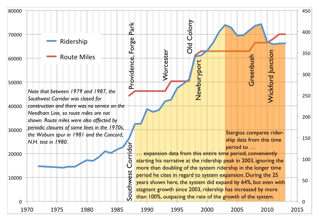
In the 1980s, however, something changed. The state bought new equipment, rebuilt track and increased the number of trips. By the 1990s, the Southwest Corridor was complete, the Old Colony Lines rebuilt (or, in the case of Kingston, overbuilt), and service reinstated to Worcester, Providence and Newburyport. Lines which saw one train a day in the 1970s (or, at times, zero) had 20, and most weekend service had been reinstated. Ridership responded: while 15,000 passengers boarded trains daily in 1972 (and most of the rest of the decade), by 2000, 60,000 passengers rode the rails each day.

The patterns of this change are interesting. Today (note that current numbers use the median ridership for the past 10 years, based on MBTA Blue Book data to account for variability in passenger counts in single years), about 46,000 passengers use lines radiating from South Station while 26,000 passengers use those from North Station. In 1972, the numbers were much lower, and the ratios reversed: 11,000 passengers used North Station, and fewer than 5,000 used South Station lines. So while North Station has grown significantly in the past 40 years—by 150%—South Station has increased by nearly ten times (1000%). It’s hard to imagine how sleepy South Station must have been in the 1970s, as compared to the constant streams of commuters crowding the concourse today.

Line-by-line, even station-by-station, there are dramatic differences in the changes over the years.

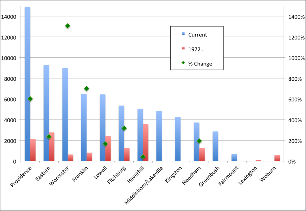
Of the top five lines in 1972, four were on the North Side: Haverhill, Eastern Route (Newburyport/Rockport), Lowell, Attleboro and Fitchburg. Today, three of the top five lines are on the South Side: Providence, Eastern, Worcester, Franklin and Lowell. In 1972, the Worcester Line bested only the two-station Woburn spur and the Lexington/Bedford line, both of which were discontinued in the ensuing decade.

In 1972, the Reading Line—the single Haverhill train operated via the Wildcat Line—accounted for more than 20% of Commuter Rail’s total ridership. I-93 hadn’t yet fully opened to Boston, and the Orange Line ended in Everett rather than Oak Grove. While overall Haverhill ridership has increased, all of the gains have come from the outside of the line; there are fewer passengers at nearly every station from Reading inbound. The Worcester Line, on the other hand, carried just 600 passengers on three rush hour trains. Today it has that many trains per hour at rush hour, each of which carries 600 passengers (or more).

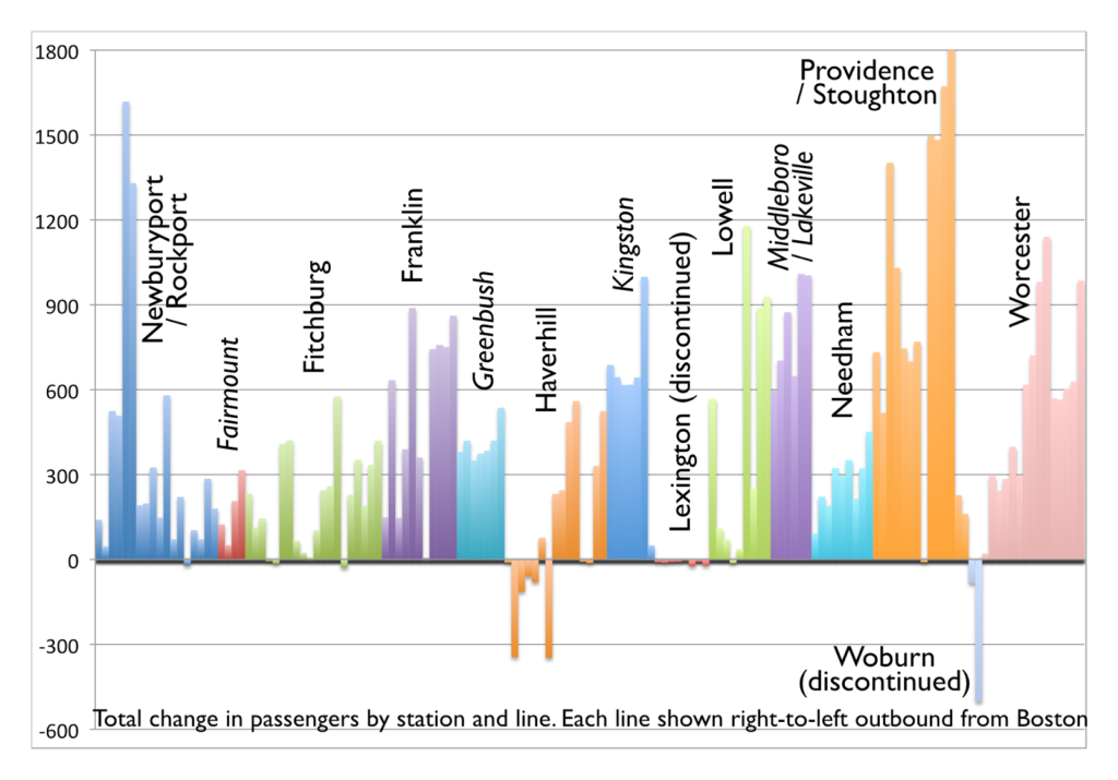
In absolute numbers, the biggest gains have been along the Providence Line and at Salem and Beverly, where several stations have seem gains of more than 1000 riders per day (some of which, like Providence and South Attleboro, had a baseline of zero). Many stations across the system have gained 500 riders a day or more. The inner Haverhill Line and nearby stations on the Woburn Branch stand out as the only stations to lose significant ridership; most other stations showing ridership declines are small stations which were closed (the largest, West Acton, now has a shuttle bus to South Acton, where parking is full before 7 a.m.).

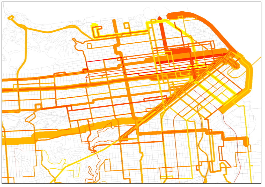
These data can also be mapped, of course. The map shows the disparate growth on different lines, and how minimal ridership was in 1972, especially south and west of the city, compared with today.

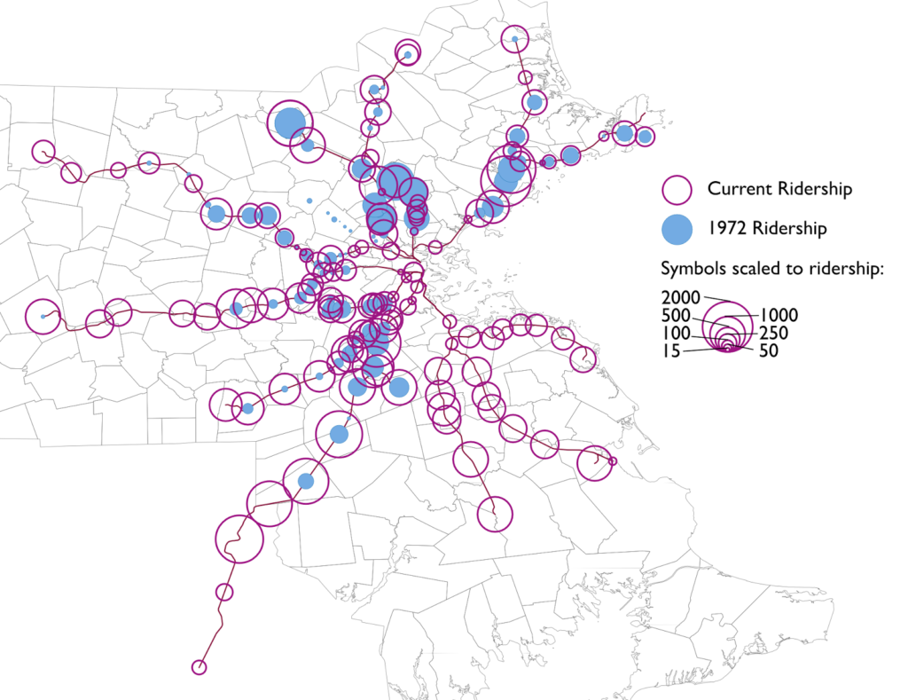
Note that 1972 ridership is shown in B&M blue, since the B&M operated the majority of the system then.

Boston came very close to losing its commuter rail system in its entirety, something which occurred in no other city (the closest was the abandonment of the non-electrified portions of the SEPTA system in the early-1980s; while Boston’s ridership began to rise in the 1980s, SEPTA and Metra saw ridership decline in the early ’80s). Had the highway moratorium not come in to place in 1972 and the Southwest Corridor been built as a highway, it may have meant the end of commuter service south of the city. Worcester ridership was minimal, and the T threatened to curtail north side service entirely—the majority of the system at that point—if it couldn’t buy the assets of the Boston and Maine.

Improvements and additions to trackage and rolling stock from the 1970s to 1990s fueled dramatic growth in the system, although it has leveled off in the past decade, a combination of higher fares and an aging physical plant. While the system is no longer on the brink of insolvency—even if it were, adding 60,000 cars to Boston’s already strained road system would be a non-starter—it needs a new round of investment as the city, and especially the downtown core, continues to grow.

Boston Transportation Data

Sometimes, people ask for transportation data that they assume doesn’t exist but, au contraire, it does. There are some other data I have which I can provide on request, but aren’t posted publicly (and some of those are based on calculations I’ve made which might not be entirely perfect). Here are some of the resources I know of. Most are large PDFs, because that’s where data exists, right?

  • Massachusetts traffic volume counts. This has most vehicular traffic counts in the Commonwealth.
  • MBTA Blue Book has a lot of detailed information on MBTA operations. It does not have everything, but a lot: bus and transit ridership, some historic data (older versions of the Blue Book have data going back further; at some point I would like to compile these older data in to one document beyond Commuter Rail, which I have).
  • Commuter Rail counts by train. These data are outdated (2012) but give a good idea of how many people rider specific trains, at least on the day the count was completed.
  • Commuter Rail system survey. These data are even more outdated (2008) but even richer, including access and transfer data. It’s pretty dense.
  • Changes to MBTA service since 1964. A very comprehensive look at every bus line in the system, and every change to service in the past 50 years. 
  • Summary of Commuter Rail operations, including the number of train sets required.
  • MBTA salaries, in a very not-useful PDF document. I have an Excel somewhere. 
  • Keolis bid document, with salary information for various positions and job descriptions.
  • NTD Database, with transit system comparisons. You can also download the whole database as a database or in excel.
  • Monthly data by mode, 2007-2014
  • Archive of Commuter Rail schedules (Dave Weebly).
I will update this post frequently as needed. 

Jim Stergios is bad at math

Update: It turns out, the Pioneer Institute as a whole is bad at math.

Jim Stergios, of the Koch-funded Pioneer Institute (edit: NOT the author of the discredited absenteeism report; my apologies to them for that insinuation, it’s only that, you know, Baker ran the Pioneer Institute, and the report was used by his commission had similar issues to other Pioneer reports), uses a lot of numbers to try to set up his arguments in response to a piece by Jim Aloisi. The problem? He uses numbers which are very convenient for him, ignoring longer trends which make his argument far, far more flimsy, and in many cases, completely refuted. He starts with an agenda, he warps data to make it fit that agenda. The problem is, the data tell a much, much different story.

• First, he references that in 2011 and 2012, 8 million commuter rail passengers were inconvenienced by late or delayed trains. That’s a big number. 8 million! But he doesn’t have a denominator. A big number without a denominator is meaningless (which was what most of the hubbub about the absenteeism report was about.) How many trips are there, annually, on the T’s commuter rail? If it’s 16 million, that’s a lot of delays. If it’s 80 million, it’s not quite as much. The answer? In 2011 and 2012, there were about 75,000,000 trips on Commuter Rail. So 8 million represents about 10%. Could this number be improved? Certainly. But without a denominator, this is a scare tactic: a number with no context. He claims that this resulted in a loss of ridership and revenue. But without any other years to compare it to (Were delays better or worse in 2006? He doesn’t say.), those claims are specious, at best.

(Vertical lines show locations of system expansions.)

• Then there’s this:

Notwithstanding the fact that the MBTA added more commuter track miles than other major transit systems in the country over the past 25 years, quickly raised fares and continued substandard service led, remarkably, to a decline of 13 percent in commuter rail ridership from 2003 to 2013.

Can you spot the incongruity there? Stergios assails the T’s expansion over 25 years, but is only concerned about it’s ridership over 10. It turns out that before 2003, the T was the fastest-growing commuter rail system in the country. If you look at the period from 1988 to 2013, T commuter rail ridership more than doubled. Even if you exclude extensions, at stations open in 1988 and 2013, it grew 65%. I made the argument that T ridership is hampered by high fares, and stand by that conjecture. In fact, for trips between 18 and 27 miles, the T has the highest fares of any commuter rail system in the country (this will be explored in depth in a later post).

It’s almost as if the investment in commuter rail in the 1980s and 1990s paid dividends in ridership during that time. But for an institute that wants to cut investment in transit, those data are very inconvenient. So they choose to ignore them. Thus, his data are misleading at best, and borderline fraudulent at worst.

• So he’s stepped in it already, but then he links to an article from his policy “research” institute that allows him to step in it some more. That article goes to great lengths about how, between 2003 and 2013, the T was the only major commuter rail system to lose ridership. You know what, I can’t argue with that. During that time period, the T did lose ridership, while other agencies gained. Again, I contend that it’s due to fare policy, but we each have our ideas why. But notice how he again very conveniently picks 2003 as his start date, which was the highest ridership on record. By doing so without showing any other data, he suggests that the T has underperformed other commuter rail networks. Let’s see if that is actually the case.

Annual ridership for SEPTA, Metra, MBTA

The two most similar commuter rail networks—with multiple legacy lines feeding the city center—are SEPTA in Philadelphia and Metra in Chicago. They also (conveniently for me, this time) have ridership data back as far as 1980. (Here’s SEPTA, here’s Metra, which I estimated from a chart but is exact enough for this post. Unlike Pioneer I don’t obscure my data sources; all MBTA data came from the Blue Books available on the T’s web site.) And, yes, the MBTA has had stagnant ridership in recent years, while SEPTA and Metra have both trended upwards. (This is also the case with New York’s commuter railroads, as well as Caltrain and MARC.) So there is certainly a case to be made that the MBTA’s commuter rail networks has been a laggard in recent years. This is likely due to a variety of factors, including stagnant service levels (SEPTA has, in recent years, been adding service), increasing fares (both Metra and SEPTA have lower fares per mile) and equipment and trackage which has been allowed to fall in to disrepair (SEPTA has invested heavily in their physical plant recently, and Metra runs on freight lines which have kept their tracks in good working order).

But the chart above is only one way to look at these data. Another is to normalize everything by an arbitrary year. I used 1988 (left), because Stergios likes to look back that far (sometimes). But for fun, I also made a chart that goes back to 1979 (right), because that’s the first year I have data from for all three systems.

Feel free to click to enlarge. The 1988 chart shows how, in the past 25 years, ridership on the MBTA Commuter Rail system has far outpaced SEPTA or Metra, growing by more than double while the others grew at a much slower rate. Go back to 1979, and the T has more than quadrupled, while, after falling off in the early 1980s, Metra and SEPTA only recently surpassed gas crisis ridership levels. In fact, if you look back to most any year but 2003, you get a very different picture. But, again, Pioneer’s “research” is picking and choosing numbers to fit their narrative, but not to show what actually happened.

• But wait, there’s more. He also claims that the MBTA has added more commuter track than any other system in the country in the past 25 years. Here he’s not fudging numbers, he’s just plain wrong. The T operates 394 miles of commuter rail. Metrolink, in Los Angeles, operates 388 miles. However, Metrolink began operation in 1992 which—let me get out my abacus, carry the 2—is only 23 years ago. So in the past 23 years they’ve added 388 miles. I’m not sure to the decimal of the amount the T has added (it’s about 145 miles over that time, of which at least 20 is in, and paid for by, Rhode Island) but it is certainly less than 388; even in 1988 the T operated more than, say, a shuttle from North Station to West Medford.

• Stergios also references his bus maintenance study, but that study borderlines on laughable, and may also be the subject of a separate post. Of several data irregularities there, the most glaring are the comparisons that the Pioneer Institute draws from the most comparable bus systems. For example, the list of most comparable bus systems to the T’s includes many systems in warm climates with low living expenses and ridership 1/10th of the T. Are we surprised that the transit authority in El Paso or San Bernardino has lower costs?

They make a major comparison to MetroTransit in the Twin Cities, an agency that also maintains buses in a colder climate. But nowhere in the report do the point out that while they have the same number of buses, the T carries twice as many passengers, and therefore, twice as many passengers per bus. This means that the T runs many more buses at or over capacity. A bus crammed with 75 passengers on board carries about 30% of its total weight in passengers, putting much more stress on not just the motor, but the air bags, axles, struts, tires and other equipment. (Imagine loading a Toyota Corolla with five 180 pound people and 500 pounds more in the trunk and a roof box. That’s what the T asks much of it’s fleet to do several times per day.) Many of the T’s bus routes run at this capacity on a daily basis. Only a few MetroTransit routes do, and often over longer distances. For instance, the MetroTransit Route 5 has comparable ridership to the T’s #1 bus, but its route is three times longer, meaning that the bus is not full nearly as often.

It is opaque as to how the Pioneer Institute chose other comparable agencies, but they often talk about the 79 other “large” agencies. However, the T is one of the top 10 agencies, and comparing it to an agency with as many passengers a day in total as the #1, #39 and #66 buses carry makes no sense. Is there a correlation between bus maintenance costs and overall ridership? They don’t bother to find out, and continue with these false, apples-to-oranges comparisons. The only comparable agencies in their database of the 20 most-similar systems are WMATA in DC and Muni in San Francisco (and even this is not apples-to-apples; WMATA carries fewer passengers per bus while San Francisco has no winter weather). Those agencies’ costs perfectly bracket the T’s maintenance costs per mile: the T is $3.80, WMATA is $3.20 and Muni $4.40. Compared to those agencies, the T is about where it should be.

Stergios claims that if the T operated with the efficiency of the average of these “comparable agencies” it would save $40 million a year or more. But if it operated with the efficiency of the agency in San Francisco? The T would actually spend more money. This whole study comes apart if you pull any one of many loose threads. That it is even in the discussion shows how picking only very particular data can make pretty much any point. What’s sad is that the legislature and governor bought it hook, line and sinker.

• There’s the stuff that’s just plain wrong. He claims that:

MBTA Board of Directors inexplicably authorized $47 million to purchase the Pittsfield-to-Connecticut Housatonic line

Really? The T is buying rail lines in Berkshire County? That sounds a lot like a MassDOT project, and indeed it is. They’re related, certainly, but that’s not money coming from the T’s pot. This is just careless.

WGBH fancies itself a news organization, and, as such, should have a fact checking department. Most of Stergios’s article does not pass even the slightest sniff test. GBH should be ashamed for publishing this article full of half truths at best, and several outright lies. As for Stergios and the Pioneer Institute? Anything that comes from them is immediately suspect, and usually, when examined, mostly false. They should crawl back in to their hole until they can present data with a straight face.

How schedule adherence affects headways

There’s an article on TheAtlanticCities which is bouncing around the office about how painful it is to wait for a train (I’d add: especially if you don’t know when it might come). But even with the proliferation of countdown timers (except, uh, on the Green Line), any disruption to the published (or, at least, idealized) headways can cause headaches. And when headways get at all discombobulated, passenger loading becomes very uneven, resulting in a few very crowded trains that you, the passenger, are more likely to wind up waiting for and squeezing aboard.

For instance, let’s say that you ride the Red Line in Boston. The published headway is 4.5 minutes (two lines, 9 minute headways for each line). Assuming you’re going south through Cambridge, the agency should be able to send out trains at the exact headways from the two-track terminus, barring any issues on the outbound run. You’d expect that, upon entering the station, you’d have an average wait of 2:15, and the longest you’d ever wait for a train would be 4:30 (if you walked in just as the doors were closing and the train was pulling out of the station).

In a perfect world, this would be the case. In the real world, it’s not. In fact, it probably seems to many commuters that their average wait for the train is more in the four-minute range, and sometimes as long as seven or eight minutes. And when a train takes eight minutes to come, the problem compounds as service bunches: the cars get too full, and dwell times increase as passengers attempt to board a sardine-can train and the operator tries to shut the doors.

Here’s the rub: even if most services run on a better-than-average headway, passengers are more likely to experience a longer wait. Here’s an extreme example. Imagine a half hour of service with five trips. With equal headways, one would arrive every six minutes, and the average wait time would be three minutes. Now, imagine that the first four services arrived every 2.5 minutes, and the final one arrived after 20 minutes. The average headway is still six minutes. However, the experienced average is far worse. Unless the services operate at that frequency due to load factors, passengers likely require the service at a constant (or near-constant rate). Imagine that one passenger shows up each minute. The first ten are whisked away quickly, waiting no longer than three minutes. The next 20 wait an average of 10 minutes, with some waiting as long as 20. In this case, even with the same average headway, 14 passengers—nearly half—wait longer than the longest headway if the service was evenly-spaced.

I used the Red Line as an example because I have experience with this phenomenon, and also data. Back when I first collected Longfellow Bridge data, I tracked, for two hours, how often the trains came. It turns out that the headway is actually 4:10 between 7:20 and 9:20, more frequent than advertised. However, nearly half of the trains come within three minutes, which means that there is a long tail of longer headways which pulls the average down. So instead of an average wait time of 2:05, the average user waits quite a bit longer.

Assuming that each train carries all passengers from each station (not necessarily a valid assumption), the average customer waits 2:32. This doesn’t seem like a long time, but it means that while the trains are run on approximate four minute headways, the actual experience is that of five minutes, a loss of 20% of the quality of service. Five minute headways aren’t bad. The issue is that there are several periods where customers wait far longer than five minutes, resulting in overcrowding on certain trains, and longer waits for the same ones. The chart below shows wait times for each minute between 7:23 and 9:23. Green is a wait of 2:15 or less, yellow 4:30 or less (the advertised headway). Orange is up to 6:45, and red is longer. About one sixth of the time a train is running outside of the given headways. And three times, it is longer than 150% of the advertised headway.

Another personal observation is that, try as I might, I seem to always get caught on a packed-full train. This is due to the same phenomenon. Of the 30 trains noted, only eight of them had headways of more than 4:30. Those 8 trains—which, assuming a constant flow of riders, accounted for 27% of the passengers—served 56 of the 120 observed minutes, carrying 47% of the ridership! Ten trains came within 2:30 of the previous trains. These trains accounted for 33% of the service, but only served 19% of the ridership. So while one-in-three trains is underloaded, you only have a one-in-five chance of getting on one of those trains. And while only about a quarter of services are packed full, you have a nearly 50% chance of riding one of those trains. So if you wonder why it always seems like your train is packed full, it’s because it is. But there are just enough empty services that once a week you might find yourself in the bliss of a (relatively) empty train car.

Overall, I mean this as an observation of headways, not as an indictment of the MBTA. Running a railroad with uneven loads (especially at bus- and commuter rail-transfer stations), passengers holding doors and the like can quickly cascade in to a situation where certain trains are overloaded, and others pass by with plenty of room. Still, it’s infuriating to wait. But it’s interesting to have data, and to visualize what it looks like during the course of what seems to be a normal rush hour.

(On the other hand, there are some services, like the 70 bus, which have scheduled uneven headways and where the actual level of service is significantly impacted, but that’s the subject of another post entirely.)

Personal data collection: Hubway

Back in 2011, as part of a convoluted New Year’s resolution, I started tracking my personal travel daily. Each day, I record how many miles I travel, by what mode, and whether I am traveling for transportation or exercise/pleasure. Why did I start collecting these data? Because I figured that there was the chance that some day it would be useful.

And that day is … today!

I realized recently that I had a pretty good comparative data set between the April to July portion of 2012 and 2013. Not too much in my life changed in that time frame. Most days I woke up, went to work, came home and went for a run. Probably the biggest difference, transportation-wise, was that in 2012 there were no Hubway stations in Cambridge, and in 2013 there were. In addition, since Hubway keeps track of every trip, I can pretty easily see how many trips I take, and how many days I use each mode.

To the spreadsheets!

The question I want to test is, essentially, does the presence of bike sharing cause me to walk and bike more frequently, less frequently or about the same? Also, do I travel more miles, fewer or about the same? A few notes on the data. First, I am using April 6 (my first Hubway ride in 2012) to July 9 (in 2012 I had a bike accident on the 10th and my travel habits changed; Hubway launched in Cambridge at the end of the month, anyway). Second, I collect these data in 0.5 mile increments, and I don’t log each and every trip (maybe next year) but it’s a pretty good snapshot.

The results? With Hubway available, I ride somewhat more mileage, but bicycle significantly more often. In addition, my transit use has declined (but I generally use transit at peak times, so it takes strain off the system) and I walk about the same amount.

Here are the data in a bit more detail for the 95 days between April 6 and July 9, inclusive:

Foot travel. In 2012 I walked 84 days in the period a total of 190.5 miles. In 2013, the numbers 83/180. (Note that I do not tally very short distances in these data.)

Bicycle travel. In 2012, I biked 66 and, believe it or not, in 2013 I actually biked fewer days, only 64. As for the distance traveled, I biked 466.5 miles in 2012, and 544.5 miles in 2013. So despite riding slightly fewer, I biked nearly 20% more distance. This can be partially explained by my participation in 30 Days of Biking in 2012, when I took many short trips in April.

In addition, in 2013 I began keeping track of my non bike-share cycling trips. I only rode my own bike 14 days during the period, tallying 44 trips on those days. But there were many days where I rode my own bike and a Hubway; I took 29 Hubway trips on days I rode my own bike; on 8 of the days I rode my own bike, I rode a Hubway as well.

Bike share trips. In 2012 I rode Hubway on 39 days, totaling 71 rides, an average of 1.8 Hubway rides per day riding Hubway. In 2013, I rode Hubway on 58 days, but tallied 185 rides, an average of 3.2! So having Hubway nearby means that I ride it more days, and more often on the days I ride.

Transit. In 2012, I took transit almost as frequently as bicycling, 61 days. I frequently rode the Red Line to Charles Circle and rode Hubway from there to my office. In 2013, my transit use dropped by nearly half, to just 31 days, as I could make the commute by Hubway the whole way without having to worry about evening showers or carrying a lock.

We might look for the mode shift here. My walking mode shift has not changed dramatically. My bicycling mode shift hasn’t appreciably increased, although the number of total rides likely has. My transit mode shift has decreased, as I shift shorter transit rides to Hubway.

Now, if they ever put a station near my house, I’ll get to see how those data would stack up. My hypothesis: I’d never walk anywhere, ever.

When the T steps in it, what happens on Twitter

Not 10 minutes after I got in to the office today, word came out that there was a power problem on the Green Line, and the Red Line was in rough shape. This is a fine example that 44-year-old trains in 110-year-old tunnels need some investment. Next thing we knew, there were 30 minute wait for Red Line trains (scheduled headway: 4 minutes) and the Green Line was shut down at the peak of rush hour with inadequate bus replacement.

I was interested in looking at pictures from the junkshow, while sitting in a heated environment. And I realized that the number of Tweets tagged #MBTA was increasing. Starting at 8 a.m., the number of tweets per minute went from 3 per minute screaming up to triple that amount by 9 a.m. The tweets then leveled off and fell back. The Green Line was still shut down (it didn’t open until after 11:00) but the Red Line had recovered and the rush hour crunch had dissipated. Not much to comment on here, just a quick look at what happens to Twitter when two thirds of the MBTA’s ridership is affected by broken-down trains on a cold, cold morning.

Yelp Transit Maps

Yelp-rated routes in Boston. Click to embiggen.

I noticed a while ago—as did some other folks—that Yelp users have been, for some time, rating transit lines. I was intrigued. Here was really interesting data about how people felt about different transit lines, distilled in to a simple 1-to-5 rating. While not every line was ranked in Boston (my first search) there were plenty that were, and I compiled a list of routes, star-ratings and the number of Yelps.

In Boston, only some routes were rated, and they were, not surprisingly, centered in the more student- and hipster-centric part of the city. For instance, no bus line in Dorchester or Mattapan got Yelped, but most in Cambridge and Somerville have many reviews. I figured the best way to show these data was on a map, and after some machinations (especially in resorting the shapefile so the thinner lines would display on top of the thicker ones) I got the map above. It’s pretty cool—click it to enlarge. (Here’s the full MBTA system map if you’re not familiar with the lines; I left off route numbers for clarity.)

But I realized that pretty cool wasn’t cool enough. There was probably a much richer data set out there. Boston has about 750 Yelp reviews, 450 of those for rail lines. Was there city with a wired-in community, lots of bus and transit routes, and high transit ridership? Did I just describe San Francisco to a T? And, voila, there are nearly 2000 Yelp reviews of transit lines in San Francisco, at least one (and usually many more) for nearly every line Muni runs (see exceptions below). (Here’s the Muni system map.)

Muni Lines, as reviewed by Yelp. Click to Embiggen.
San Francisco inset. Click to embiggen.

That. Is. Sexy. The N-Judah has nearly 200 reviews. Wow. And in case the downtown area is too clustered for you, there’s an inset to the right.

I also realized that I had a pretty fun data set here, too. I went to a talk by Jarrett Walker the other day at MIT where he mentioned, amongst other things, that we should not focus on the technology used for transit, but whether if fulfills the mission of getting people from one place to another. In San Francisco, we have a jumble of buses, trolleybuses, streetcars and even cable cars and we have a pretty good way of quantifying whether they are accomplishing the job of transit. (In Boston, even though the B Line serves tens of thousands of passengers a day it manages a 1.36 Yelp rating—remarkable as the lowest possible rating is 1. None of its 34 raters give it a 4 or a 5. Still, it moves a lot of people marginally faster than they could walk.)

First, I averaged the ratings by technology type. Trolleybus route get more reviews than bus routes, probably because they are more heavily used. The average rating for these, however, is quite similar. (The average is a straight average of each line, the weighted average weighs more frequently-rated lines by the number of ratings). Cable cars and PCCs (F-Marked and Wharves) have higher ratings but many are likely by tourists. Light rail lines, however, are frequently rated, and given low ratings, significantly lower than the bus routes.
Vehicle type Routes Avg Reviews Avg Stars Weighted Avg
Bus 39 22 3.03 2.77
Trolleybus 12 41 2.95 2.79
Cable Car 3 64 3.81 3.87
PCC 1 114 3.42 3.42
Light Rail 5 65 2.31 2.43
A forthcoming post will compare local and express bus routes. (Hint: people like riding expresses more than locals.)

I am so interested in San Francisco’s Yelp bus ratings that I’ve tabled the whole of the network.

Line Vehicle Stars # Ratings Line Vehicle Stars # Ratings
1 Trolleybus 2.96 78 48 Bus 2.71 17
2 Bus 2.53 26 49 Bus 2.33 40
3 Trolleybus 4.53 17 52 Bus 2.5 8
5 Trolleybus 2.73 55 54 Bus 2.6 10
6 Trolleybus 2.88 16 66 Bus 4 1
9 Bus 2.42 26 67 Bus 3.4 5
10 Bus 3 24 71 Bus 2.56 27
12 Bus 3.33 15 108 Bus 2.5 16
14 Bus 2.55 44 01AX Bus 3.67 6
17 Bus 3.67 6 01BX Bus 3.31 13
18 Bus 3.25 16 08X Bus 2.56 18
19 Bus 2.66 41 14L Bus 4 3
21 Trolleybus 3.58 31 14X Bus 4 6
22 Trolleybus 2.74 92 28L Bus 4.33 3
23 Bus 3 9 30X Bus 3.2 35
24 Trolleybus 2.81 32 31AX Bus 3.56 9
27 Bus 2.07 28 31BX Bus 3.75 8
28 Bus 2.48 42 38AX Bus 3.71 14
29 Bus 2.5 36 38BX Bus 3.29 7
30 Trolleybus 1.98 82 38L Bus 3.44 61
31 Trolleybus 2.48 23 71L Bus 3.5 10
33 Trolleybus 3.24 33 California Cable Car 4.13 69
36 Bus 2.1 10 F PCC Streetcar 3.42 114
37 Bus 3.42 12 J Light Rail 2.49 45
38 Bus 2.45 119 KT Light Rail 2.13 23
41 Trolleybus 2.82 17 L Light Rail 2.13 38
43 Bus 2.82 28 M Light Rail 2.23 31
44 Bus 2.83 24 N Light Rail 2.55 189
45 Trolleybus 2.62 21 Powell-Hyde Cable Car 3.78 99
47 Bus 2.13 23 Powell-Mason Cable Car 3.52 25

The only lines not Yelped are the 35-Eureka and 56-Rutland. These lines have 30-minute headways (as does the 17-Parkmerced, see this route service chart with headways for all lines) while most lines in San Francisco have service every 15 minutes or better.

Next up: New York’s subways. And beyond.