Update: It turns out, the Pioneer Institute as a whole is bad at math.
Jim Stergios, of the Koch-funded Pioneer Institute (edit: NOT the author of the discredited absenteeism report; my apologies to them for that insinuation, it’s only that, you know, Baker ran the Pioneer Institute, and the report was used by his commission had similar issues to other Pioneer reports), uses a lot of numbers to try to set up his arguments in response to a piece by Jim Aloisi. The problem? He uses numbers which are very convenient for him, ignoring longer trends which make his argument far, far more flimsy, and in many cases, completely refuted. He starts with an agenda, he warps data to make it fit that agenda. The problem is, the data tell a much, much different story.
• First, he references that in 2011 and 2012, 8 million commuter rail passengers were inconvenienced by late or delayed trains. That’s a big number. 8 million! But he doesn’t have a denominator. A big number without a denominator is meaningless (which was what most of the hubbub about the absenteeism report was about.) How many trips are there, annually, on the T’s commuter rail? If it’s 16 million, that’s a lot of delays. If it’s 80 million, it’s not quite as much. The answer? In 2011 and 2012, there were about 75,000,000 trips on Commuter Rail. So 8 million represents about 10%. Could this number be improved? Certainly. But without a denominator, this is a scare tactic: a number with no context. He claims that this resulted in a loss of ridership and revenue. But without any other years to compare it to (Were delays better or worse in 2006? He doesn’t say.), those claims are specious, at best.
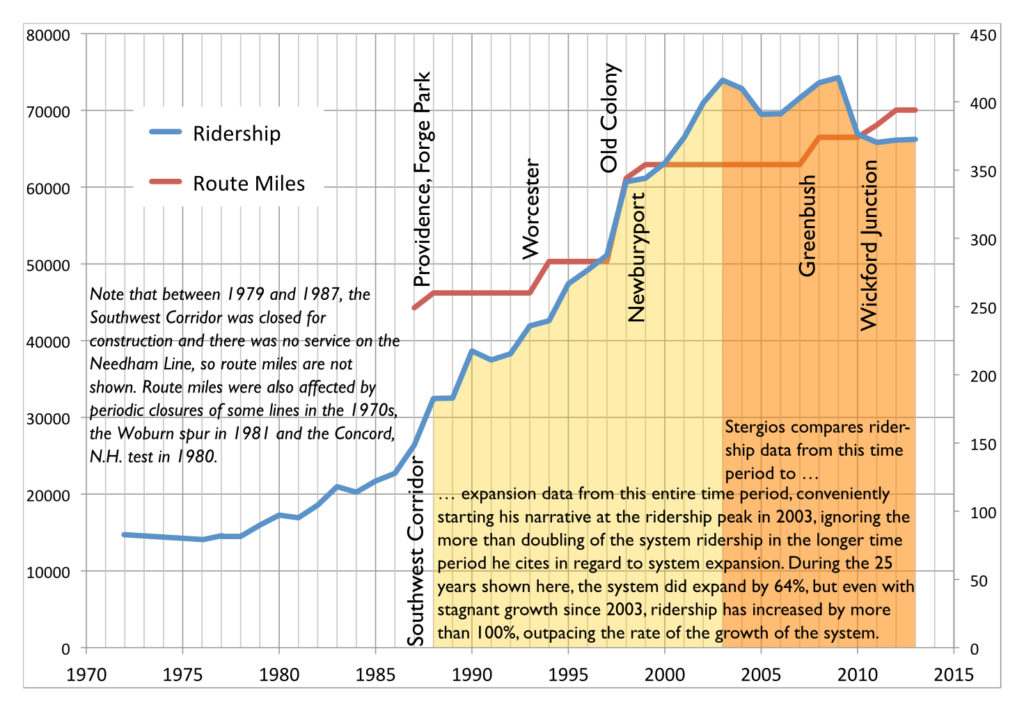 |
| (Vertical lines show locations of system expansions.) |
• Then there’s this:
Notwithstanding the fact that the MBTA added more commuter track miles than other major transit systems in the country over the past 25 years, quickly raised fares and continued substandard service led, remarkably, to a decline of 13 percent in commuter rail ridership from 2003 to 2013.
Can you spot the incongruity there? Stergios assails the T’s expansion over 25 years, but is only concerned about it’s ridership over 10. It turns out that before 2003, the T was the fastest-growing commuter rail system in the country. If you look at the period from 1988 to 2013, T commuter rail ridership more than doubled. Even if you exclude extensions, at stations open in 1988 and 2013, it grew 65%. I made the argument that T ridership is hampered by high fares, and stand by that conjecture. In fact, for trips between 18 and 27 miles, the T has the highest fares of any commuter rail system in the country (this will be explored in depth in a later post).
It’s almost as if the investment in commuter rail in the 1980s and 1990s paid dividends in ridership during that time. But for an institute that wants to cut investment in transit, those data are very inconvenient. So they choose to ignore them. Thus, his data are misleading at best, and borderline fraudulent at worst.
• So he’s stepped in it already, but then he links to an article from his policy “research” institute that allows him to step in it some more. That article goes to great lengths about how, between 2003 and 2013, the T was the only major commuter rail system to lose ridership. You know what, I can’t argue with that. During that time period, the T did lose ridership, while other agencies gained. Again, I contend that it’s due to fare policy, but we each have our ideas why. But notice how he again very conveniently picks 2003 as his start date, which was the highest ridership on record. By doing so without showing any other data, he suggests that the T has underperformed other commuter rail networks. Let’s see if that is actually the case.
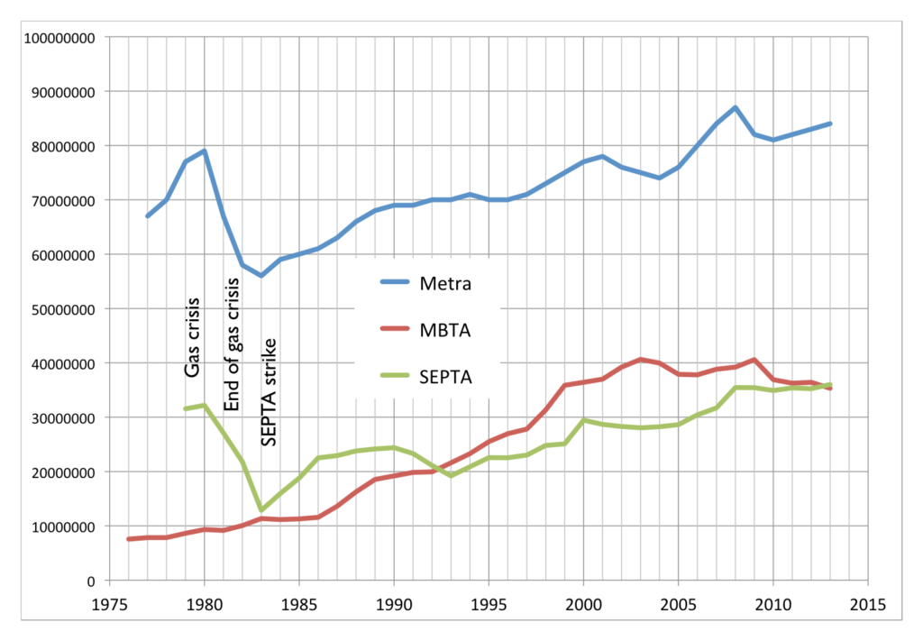 |
| Annual ridership for SEPTA, Metra, MBTA |
The two most similar commuter rail networks—with multiple legacy lines feeding the city center—are SEPTA in Philadelphia and Metra in Chicago. They also (conveniently for me, this time) have ridership data back as far as 1980. (Here’s SEPTA, here’s Metra, which I estimated from a chart but is exact enough for this post. Unlike Pioneer I don’t obscure my data sources; all MBTA data came from the Blue Books available on the T’s web site.) And, yes, the MBTA has had stagnant ridership in recent years, while SEPTA and Metra have both trended upwards. (This is also the case with New York’s commuter railroads, as well as Caltrain and MARC.) So there is certainly a case to be made that the MBTA’s commuter rail networks has been a laggard in recent years. This is likely due to a variety of factors, including stagnant service levels (SEPTA has, in recent years, been adding service), increasing fares (both Metra and SEPTA have lower fares per mile) and equipment and trackage which has been allowed to fall in to disrepair (SEPTA has invested heavily in their physical plant recently, and Metra runs on freight lines which have kept their tracks in good working order).
But the chart above is only one way to look at these data. Another is to normalize everything by an arbitrary year. I used 1988 (left), because Stergios likes to look back that far (sometimes). But for fun, I also made a chart that goes back to 1979 (right), because that’s the first year I have data from for all three systems.


Feel free to click to enlarge. The 1988 chart shows how, in the past 25 years, ridership on the MBTA Commuter Rail system has far outpaced SEPTA or Metra, growing by more than double while the others grew at a much slower rate. Go back to 1979, and the T has more than quadrupled, while, after falling off in the early 1980s, Metra and SEPTA only recently surpassed gas crisis ridership levels. In fact, if you look back to most any year but 2003, you get a very different picture. But, again, Pioneer’s “research” is picking and choosing numbers to fit their narrative, but not to show what actually happened.
• But wait, there’s more. He also claims that the MBTA has added more commuter track than any other system in the country in the past 25 years. Here he’s not fudging numbers, he’s just plain wrong. The T operates 394 miles of commuter rail. Metrolink, in Los Angeles, operates 388 miles. However, Metrolink began operation in 1992 which—let me get out my abacus, carry the 2—is only 23 years ago. So in the past 23 years they’ve added 388 miles. I’m not sure to the decimal of the amount the T has added (it’s about 145 miles over that time, of which at least 20 is in, and paid for by, Rhode Island) but it is certainly less than 388; even in 1988 the T operated more than, say, a shuttle from North Station to West Medford.
• Stergios also references his bus maintenance study, but that study borderlines on laughable, and may also be the subject of a separate post. Of several data irregularities there, the most glaring are the comparisons that the Pioneer Institute draws from the most comparable bus systems. For example, the list of most comparable bus systems to the T’s includes many systems in warm climates with low living expenses and ridership 1/10th of the T. Are we surprised that the transit authority in El Paso or San Bernardino has lower costs?
They make a major comparison to MetroTransit in the Twin Cities, an agency that also maintains buses in a colder climate. But nowhere in the report do the point out that while they have the same number of buses, the T carries twice as many passengers, and therefore, twice as many passengers per bus. This means that the T runs many more buses at or over capacity. A bus crammed with 75 passengers on board carries about 30% of its total weight in passengers, putting much more stress on not just the motor, but the air bags, axles, struts, tires and other equipment. (Imagine loading a Toyota Corolla with five 180 pound people and 500 pounds more in the trunk and a roof box. That’s what the T asks much of it’s fleet to do several times per day.) Many of the T’s bus routes run at this capacity on a daily basis. Only a few MetroTransit routes do, and often over longer distances. For instance, the MetroTransit Route 5 has comparable ridership to the T’s #1 bus, but its route is three times longer, meaning that the bus is not full nearly as often.
It is opaque as to how the Pioneer Institute chose other comparable agencies, but they often talk about the 79 other “large” agencies. However, the T is one of the top 10 agencies, and comparing it to an agency with as many passengers a day in total as the #1, #39 and #66 buses carry makes no sense. Is there a correlation between bus maintenance costs and overall ridership? They don’t bother to find out, and continue with these false, apples-to-oranges comparisons. The only comparable agencies in their database of the 20 most-similar systems are WMATA in DC and Muni in San Francisco (and even this is not apples-to-apples; WMATA carries fewer passengers per bus while San Francisco has no winter weather). Those agencies’ costs perfectly bracket the T’s maintenance costs per mile: the T is $3.80, WMATA is $3.20 and Muni $4.40. Compared to those agencies, the T is about where it should be.
Stergios claims that if the T operated with the efficiency of the average of these “comparable agencies” it would save $40 million a year or more. But if it operated with the efficiency of the agency in San Francisco? The T would actually spend more money. This whole study comes apart if you pull any one of many loose threads. That it is even in the discussion shows how picking only very particular data can make pretty much any point. What’s sad is that the legislature and governor bought it hook, line and sinker.
• There’s the stuff that’s just plain wrong. He claims that:
MBTA Board of Directors inexplicably authorized $47 million to purchase the Pittsfield-to-Connecticut Housatonic line
Really? The T is buying rail lines in Berkshire County? That sounds a lot like a MassDOT project, and indeed it is. They’re related, certainly, but that’s not money coming from the T’s pot. This is just careless.
WGBH fancies itself a news organization, and, as such, should have a fact checking department. Most of Stergios’s article does not pass even the slightest sniff test. GBH should be ashamed for publishing this article full of half truths at best, and several outright lies. As for Stergios and the Pioneer Institute? Anything that comes from them is immediately suspect, and usually, when examined, mostly false. They should crawl back in to their hole until they can present data with a straight face.