How much money could All Door Boarding save?

This is sort of a post-live blog from Transportation Camp NE. One of the first sessions was regarding all door boarding on the MBTA. There are a lot of ins and outs—notably, that you have to account for all scenarios where people could access the system, for example potentially without paying a fare (Silver Line airport) or having proof thereof (boarded with a friend who paid and parted ways)—but it was a good discussion, and something that is moving forwards, but needs to move faster. I pointed out that the discussion needs to not be pushed by the small minority who complains (loudly) about fare evasion, or really by fare evasion at all, but by vehicle speed and efficiency, since 95% or more of passengers already pay their fare: we need to improve service for the vast majority.


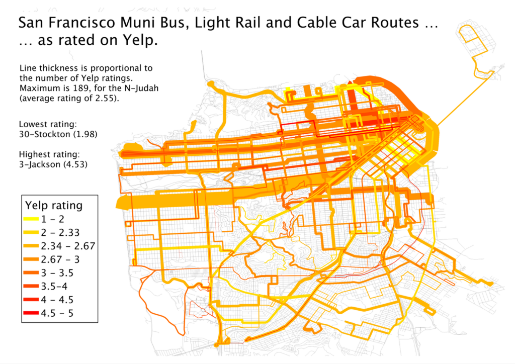
Often, when we talk about all door boarding, we talk about the real and potential time savings. Muni, in San Francisco, started experimenting with all door boarding, and it turned out it worked really well, and they went system-wide, and it has saved passengers time. According to their final report, it saves 1.5 seconds per passenger boarding or alighting, and speeds overall vehicle speed by 2%. 1.5 seconds does not seem like a large number, but it begins to get a lot bigger when aggregated over a large number of passengers.
SF Muni and the MBTA have a similar number of surface passengers: about 500,000. (The T has about 400,000 bus passengers and another 100,000 or so surface boardings of light rail; looking at only surface lines, the T and Muni are actually quite similar in terms of size.) So, if we can save 1.5 seconds per person—we’ll look only at boardings, since many trips either end at a terminal station where all doors are used or are surface Green Line boardings that end in a tunnel—we wind up with 750,000 seconds saved per day. This is, rounded down a bit, 200 hours saved. The cost of operating an MBTA bus is about $163 per hour, and for a light rail vehicle $250 per hour. Let’s assume that half of that is direct operating cost: operator wages and such. Assuming the lower bound, it would save $16,000 per day. Even if there were no savings on non-weekdays, in 250 weekdays it would equate to operational savings of $4 million
Savings add up, quick.
Let’s look at it a different way. A full, two-car Green Line train in the morning carries approximately 300 passengers. On the B or the D lines, the surface portion of the route takes 32 to 34 minutes to run at peak rush hour (according to the T’s scheduled time). Saving 1.5 seconds on each of these boardings, would equate to 450 seconds, or 7.5 minutes: more than a 20% savings for the above ground route. With the addition of signal priority on the B line, you could be looking at speeding the route by 30% or more—a game changer for one of the slowest—and most heavily-used—surface lines.
The transit planners will say “well, these savings will probably just be added in to headway recovery time.” First of all, if you actually do realize a 7 minute saving, you’re talking about an entire rush hour headway, so I doubt it will all disappear, unless you are going to be lining up multiple vehicles at rush hour. But second of all, if these wind up making headway recovery times much more even, that’s great. That means you’ll have the same capacity without having to dispatch a train as soon as it arrives, but rather on even headways. This is likely to reduce the number of vehicles that wind up bunching, overloading and slowing down.
But let’s run with the $4 million figure. There are, on buses and the Green Line, probably about 1500 doors that would need car readers. If a pole-mounted reader costs $4000, the system could be paid for in a year and a half. Or if the system were assumed to last five years, you’d have $20 million to put towards the cost of the readers ($6 million) and additional enforcement ($12 million, or $2.4 million per year).
Oh, and customers? They’d get a faster ride. It’s a win-win, for everyone. Except the few curmudgeons who are less concerned with how the vehicles run, and more about the anecdote about the person they once saw jump a fare gate.

Yelp Transit Maps

Yelp-rated routes in Boston. Click to embiggen.

I noticed a while ago—as did some other folks—that Yelp users have been, for some time, rating transit lines. I was intrigued. Here was really interesting data about how people felt about different transit lines, distilled in to a simple 1-to-5 rating. While not every line was ranked in Boston (my first search) there were plenty that were, and I compiled a list of routes, star-ratings and the number of Yelps.

In Boston, only some routes were rated, and they were, not surprisingly, centered in the more student- and hipster-centric part of the city. For instance, no bus line in Dorchester or Mattapan got Yelped, but most in Cambridge and Somerville have many reviews. I figured the best way to show these data was on a map, and after some machinations (especially in resorting the shapefile so the thinner lines would display on top of the thicker ones) I got the map above. It’s pretty cool—click it to enlarge. (Here’s the full MBTA system map if you’re not familiar with the lines; I left off route numbers for clarity.)

But I realized that pretty cool wasn’t cool enough. There was probably a much richer data set out there. Boston has about 750 Yelp reviews, 450 of those for rail lines. Was there city with a wired-in community, lots of bus and transit routes, and high transit ridership? Did I just describe San Francisco to a T? And, voila, there are nearly 2000 Yelp reviews of transit lines in San Francisco, at least one (and usually many more) for nearly every line Muni runs (see exceptions below). (Here’s the Muni system map.)

Muni Lines, as reviewed by Yelp. Click to Embiggen.
San Francisco inset. Click to embiggen.

That. Is. Sexy. The N-Judah has nearly 200 reviews. Wow. And in case the downtown area is too clustered for you, there’s an inset to the right.

I also realized that I had a pretty fun data set here, too. I went to a talk by Jarrett Walker the other day at MIT where he mentioned, amongst other things, that we should not focus on the technology used for transit, but whether if fulfills the mission of getting people from one place to another. In San Francisco, we have a jumble of buses, trolleybuses, streetcars and even cable cars and we have a pretty good way of quantifying whether they are accomplishing the job of transit. (In Boston, even though the B Line serves tens of thousands of passengers a day it manages a 1.36 Yelp rating—remarkable as the lowest possible rating is 1. None of its 34 raters give it a 4 or a 5. Still, it moves a lot of people marginally faster than they could walk.)

First, I averaged the ratings by technology type. Trolleybus route get more reviews than bus routes, probably because they are more heavily used. The average rating for these, however, is quite similar. (The average is a straight average of each line, the weighted average weighs more frequently-rated lines by the number of ratings). Cable cars and PCCs (F-Marked and Wharves) have higher ratings but many are likely by tourists. Light rail lines, however, are frequently rated, and given low ratings, significantly lower than the bus routes.
Vehicle type Routes Avg Reviews Avg Stars Weighted Avg
Bus 39 22 3.03 2.77
Trolleybus 12 41 2.95 2.79
Cable Car 3 64 3.81 3.87
PCC 1 114 3.42 3.42
Light Rail 5 65 2.31 2.43
A forthcoming post will compare local and express bus routes. (Hint: people like riding expresses more than locals.)

I am so interested in San Francisco’s Yelp bus ratings that I’ve tabled the whole of the network.

Line Vehicle Stars # Ratings Line Vehicle Stars # Ratings
1 Trolleybus 2.96 78 48 Bus 2.71 17
2 Bus 2.53 26 49 Bus 2.33 40
3 Trolleybus 4.53 17 52 Bus 2.5 8
5 Trolleybus 2.73 55 54 Bus 2.6 10
6 Trolleybus 2.88 16 66 Bus 4 1
9 Bus 2.42 26 67 Bus 3.4 5
10 Bus 3 24 71 Bus 2.56 27
12 Bus 3.33 15 108 Bus 2.5 16
14 Bus 2.55 44 01AX Bus 3.67 6
17 Bus 3.67 6 01BX Bus 3.31 13
18 Bus 3.25 16 08X Bus 2.56 18
19 Bus 2.66 41 14L Bus 4 3
21 Trolleybus 3.58 31 14X Bus 4 6
22 Trolleybus 2.74 92 28L Bus 4.33 3
23 Bus 3 9 30X Bus 3.2 35
24 Trolleybus 2.81 32 31AX Bus 3.56 9
27 Bus 2.07 28 31BX Bus 3.75 8
28 Bus 2.48 42 38AX Bus 3.71 14
29 Bus 2.5 36 38BX Bus 3.29 7
30 Trolleybus 1.98 82 38L Bus 3.44 61
31 Trolleybus 2.48 23 71L Bus 3.5 10
33 Trolleybus 3.24 33 California Cable Car 4.13 69
36 Bus 2.1 10 F PCC Streetcar 3.42 114
37 Bus 3.42 12 J Light Rail 2.49 45
38 Bus 2.45 119 KT Light Rail 2.13 23
41 Trolleybus 2.82 17 L Light Rail 2.13 38
43 Bus 2.82 28 M Light Rail 2.23 31
44 Bus 2.83 24 N Light Rail 2.55 189
45 Trolleybus 2.62 21 Powell-Hyde Cable Car 3.78 99
47 Bus 2.13 23 Powell-Mason Cable Car 3.52 25

The only lines not Yelped are the 35-Eureka and 56-Rutland. These lines have 30-minute headways (as does the 17-Parkmerced, see this route service chart with headways for all lines) while most lines in San Francisco have service every 15 minutes or better.

Next up: New York’s subways. And beyond.

How high are MBTA fares? Not.

According to the news, Occupy Boston has a new target: the MBTA. This is wrongheaded. They should protest the crawl with which the legislature is able (or unable) to make changes to the T’s funding mechanism, the debt burden shouldered by the agency from the Big Dig and myriad other poor decisions by the state and by the T in the last ten or twenty years. But protesting a modest fare increase? Not helpful.


Back in January, when the draconian proposals came out, my reaction was “well it must not be as bad as last time—then they were threatening to shut down commuter rail at 7 p.m.” Because of intransigence on the part of the legislature, the T has to threaten huge cuts, and then make smaller ones, so it’s a better pill to swallow. This time, at least, people seem to realize it’s a problem. Whether the legislature will act is another question all together.


In any case, the T will be raising fares to $2. Monthly passes will rise to $70. This is what the Occupy folks are protesting. And, well, this is really not a big deal. Look at other cities fares:

(“Lower Fares” are shown where there is are multiple monthly pass levels except those based on peak and off-peak fares. Notes: Houston has no monthly pass system. Boston has a $48 bus-only pass, San Francisco’s higher fare allows in-city travel on BART, Denver sells a year of transit passes for the price of 11 months, Miami gives a 10% discount for group purchases. Washington DC has no monthly passes, but a $15 weekly bus pass and a $32 weekly Metro pass allowing fares up to $3.25, which covers travel within the city limits.)

Only two cities have lower fares than Boston, and neither of these has a comparable level of transit. San Francisco does sell a cheaper pass for non BART-users, but those are confined to MUNI lines which are, well, not particularly speedy (the longest MUNI lines are about the distance from South Station to Alewife, but they take more than 22 minutes to complete the route). If you look at the “Big Six” cities with MSA transit use over 10% and center city transit use over 20% (Boston, SF, Philly, Chicago, DC and New York), the average monthly pass is about $85. DC has no real monthly pass option. And New York tops out over $100. Of course, their trains do run all night.


Here is another way of showing that the MBTA fares aren’t that high—looking at fares for major transit systems through the last 100 years in nominal and current dollars.

{“dataSourceUrl”:”//docs.google.com/spreadsheet/tq?key=0Aq40hr6FfrocdEk4Q21pS3V2eFVGeUw4NXVYdTBOMVE&transpose=0&headers=1&range=E1%3AO102&gid=0&pub=1″,”options”:{“vAxes”:[{“viewWindowMode”:”pretty”,”viewWindow”:{}},{“viewWindowMode”:”pretty”,”viewWindow”:{}}],”series”:{“0”:{“color”:”#1155cc”},”1″:{“color”:”#6d9eeb”},”2″:{“color”:”#cc0000″},”3″:{“color”:”#ea9999″},”4″:{“color”:”#ff9900″},”5″:{“color”:”#f9cb9c”},”6″:{“color”:”#38761d”,”lineWidth”:4},”7″:{“color”:”#00ff00″,”lineWidth”:4},”8″:{“color”:”#999999″},”9″:{“color”:”#cccccc”}},”useFormatFromData”:true,”booleanRole”:”certainty”,”curveType”:””,”height”:333,”animation”:{“duration”:500},”legend”:”in”,”theme”:”maximized”,”width”:600,”lineWidth”:2,”useFirstColumnAsDomain”:true},”state”:{},”chartType”:”LineChart”,”chartName”:”Chart 2″}

I left out DC (which has distance-based fares) and SEPTA (I couldn’t find fare history data for Philly) and threw in gas prices for fun. Note that the T has generally been about the same price as MUNI in San Francisco, and cheaper than Chicago and New York. (Except from 1920 to 1950, when Boston fares were a dime, and New York was a nickel.) The transit agencies all raise their fares to cope with increasing prices. And while the T has never hit the two dollar mark before, unless there’s deflation this year (there won’t be) it’s likely that prices will, in real terms, regress below the $2 mark in the next couple of years. It’s also significantly cheaper than New York and Chicago—especially since Chicago doesn’t have free bus transfers on single fares. And lest we complain further, Boston has had the lowest fare around since MUNI raised fares to $2 a couple years back.

Oh, and unless gas prices tumble real soon (and we’ll need another proper recession for that; in other words, we really don’t want cheap gas) any transit system is still cheaper than a gallon of petrol.


A few notes:

  1. New York has slight discounts—10% from 1993 to 2009, 7% since 2009, when purchasing at least $10 of transit fare. Chicago has charged between 10¢ and 30¢ for bus-train transfers since the 1960s. 
  2. Since most transit users (about 2/3 in Boston) use monthly passes—an advent of the last 30 years or so—their actual fare per ride, assuming 2.5 rides per day for a transit-dependent user, is significantly lower: under a dollar in Boston. In transit-heavy New York, assuming 3 rides per day yields a cost per trip of just over a dollar.
  3. DC’s higher fares and lack of monthly passes yield a higher farebox recovery rate compared with other systems of over 60%.
  4. Commuter rail fares are going up, too, but for a less sensitive population: 28% of bus riders have incomes over $75,000, while 72% of Commuter Rail riders do.
  5. Data sources for Boston (Note that this study has transit fare comparisons in it, but doesn’t use the most-frequently-purchased fares; for instance it shows a single ride in New York as $2.50 and in Boston as $2. Most users pay less.), New York, Chicago, San Francisco. Gas prices from the EIA. Inflation from the BLS.

Charlie and the Clipper

On a recent trip to San Francisco, I found out that they were still giving away their new, integrated, cross-agency (and boy, with Muni, BART, Samtrans, Golden Gate, Caltrain and AC Transit in the city alone there are a lot of agencies to cross) smart card, called the Clipper Card. I stuck one in my pocket and tapped on to a ferry, a bus, a train, a subway, and a streetcar. Except, it wasn’t quite the tap-your-wallet convenience I’ve come to associate with my Charlie Card.

So I experimented. Clipper and LA TAP card worked fine. Clipper and Charlie? Not so much. And a week later in Boston, well, the Charlie Card didn’t work well here unless the Clipper was out of proximity. It’s too bad; proximity cards are very convenient, speed transactions and boarding, and can make a multi-agency hodgepodge like San Francisco (to say nothing of LA) somewhat more seamless. But, really, someone should assure that the cards’ frequencies don’t interfere with eachother.

(Or, perhaps, I can dream of a day when transit agencies nationwide are all on the same frequency, and system. Ha!)

(posted from iPhone; will clean up later)