This is the third in a series about the ITDP bus rapid transit report for Boston, and the ITDP standard in general.
One of the claims often made by BRT propagandists is that constructing bus rapid transit is seven times cheaper than light rail transit.
This is from the executive summary of the ITDP’s Boston BRT report:
Analysis of recent transit development costs
in the United States suggests that implementing BRT in these
corridors would also be more cost-effective than other options
for improving the existing transportation system. Based on this
evidence, on average, BRT can be seven times more affordable
per mile implemented than light rail.
Their “Benefits of BRT” page repeats this factoid several times. Quite a ways down the page do they use some properly weasely language to qualify their statement: “BRT can on average be up to seven times more affordable than light rail.” (Italics mine.) Hey, guys? That’s now how averages work. An average is the sum of a set of numbers, divided by the total number in the set. It’s like saying “In February, Boston gets, on average, up to 65 inches of snow.” Boston must be a snowy place, a reader would say, since some there must be a lot of years that have more snow than that. Except “up to” denotes an outlier. Boston normally gets, in average, about 12 inches of snow in February. 65 inches is an outlier. The ITDP report is off by about the same factor.
If this seven-times-as-expensive figure were the case—especially in corridors where demand is not likely to exceed 2500 passengers per hour—then it would make a lot of sense to build, right? If you can get 25 miles of BRT for the price of four miles of light rail, it’s a no-brainer. But what about if you can get nine miles of BRT for the price of four miles of light rail? Because that’s the actual ratio: light rail comes in at slightly more than twice the cost. And the while the ITDP bandies about that number, they cite no actual evidence to back it up.
Given the capacity constraints of bus rapid transit, it becomes a harder choice: if you spend half the cost of light rail on a bus system that doesn’t have the capacity to serve the needs of the corridor, it’s wasted money. It becomes a sort of Yogi Berra white elephant: no one goes there anymore, it’s too crowded. Crowds seem like success, and they are, to a point. But overcrowded transit runs more slowly and is more prone to uneven headways. In other words, if you build it, and they come, then what?
 |
|
* Planned for ~2020. Ridership includes 38, 38R, 38AX, 38BX
† Included significant grade separation/bridges/tunneling
‡ Primarily in an existing right-of-way
All dollar figures adjusted for inflation (2015)
|
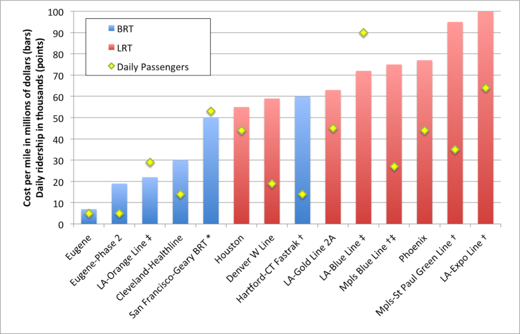
I like charts (you’ll know that if you’re a frequent reader) and here is one. It shows the costs per mile, and daily ridership, for a variety of BRT and LRT projects which have been built recently. I included several Los Angeles LRT examples because it is the only city which has built both BRT (to the level of an ITDP standard) and LRT in that time, and included the much older (relatively) Blue Line because it was mostly built on an old Pacific Electric right-of-way, much like the BRT Orange Line. Is light rail more expensive to construct than bus rapid transit? Yes. Is it seven times more expensive? Certainly not. The distance-weighted average construction cost for light rail is about 225% higher than BRT, less than a third of the difference that the ITDP suggests. (I’ve left out rail examples here—the Central Link in Seattle, for example—which include significant tunneling or grade separation, and similar BRT systems.)
There is only one example of BRT construction which is seven times less expensive than any similar light rail line: the Emerald Express in Eugene, Oregon.
Eugene, Oregon The Emerald Express was cheap to build: but you get what you pay for. The line serves a transit system which has a daily ridership of 40,000; fewer than most of the light rail lines above. It runs every ten minutes—frequent by the standards of a small town—but will require significant more investment to go any faster. Why? Because many of its exclusive lanes are bidirectional: a bus may have to wait for a vehicle going the other way to clear. It’s like a single-track railroad with passing loops for buses. And the stations are not what you’d see in Bogota: here is one along a less populated stretch of the route. This is not to say that there’s anything wrong with the Emerald Express—it is good for the community it serves. But that type of infrastructure would be overwhelmed on opening day in Boston.
Oh, also: the second leg of the Emerald Express—with similar BRT features—is coming in a bit higher: $19 million per mile. So the one-seventh number? It’s pretty selective.
Los Angeles Then there’s the Orange Line in LA. It is certainly successful, relative to an unused corridor, anyway. It runs every four minutes and carries 30,000 passengers per day. It’s basically at capacity. It cost $27 million per mile to build initially (but the recent extension was more than $50 million per mile), and has a third the capacity of the Blue Line, built in a similar corridor. It wasn’t built as light rail because, well, it’s along story that includes Orthodox Jews and corrupt politicians. You can’t make this up. Since it’s over capacity, there are initial plans to improve capacity (costing another $20 million per mile) or convert it to rail ($65 to $95 per mile).
The cost for a bus line that will perform anywhere near the level of a rail line will wind up being just about as high, and will still have a much lower capacity—certainly nowhere near the 90,000 passengers the Blue Line carries. Of course, there’s a sunk cost issue. Having already spent $600 million on a busway, there’s an argument not to “throw this money away”. But the total cost for the busway could come to $1 billion by the time all is said and done, about what light rail would have cost in the first place, with a lower overall capacity. So the BRT is really a white elephant, even if it’s one that transports a lot of people. This is a perfect illustration of the problem I posited above: you spend a lot of money on a project and quickly it is overburdened.
Cleveland Perhaps the best example of a successful BRT line in the US is the HealthLine. It was built along six miles of Euclid Avenue from downtown east towards a university/hospital cluster (including, yes, the eponymous Cleveland Clinic, and Case Western, too). It carries about 14,000 passengers per day, and does so in a well-designed corridor (the only one in the US to qualify as Silver based on the ITDP’s standards). The corridor varies between about 70 and 90 feed wide. The cost? $30 million per mile. It was probably a good investment. There is a roughly parallel heavy rail line that makes the end-to-end trip faster, so there’s never likely to be very heavy corridor ridership, and it likely won’t have to scale beyond it’s single-lane capacity. Of course, this rail line has plenty of capacity (it is by far most lightly used metro system in the country) between the HealthLine’s endpoints, so there is a valid question as to whether these investments were necessary.
BRT boosters (ITDP) point out that the HealthLine has been the $5.8 billion of development which has taken place along the line. (Well, other sources put the number in the $4 billion range; it’s a big number.) Which is great. But two important caveats. First: correlation does not imply causation. Much of this development was planned out well before the line was built. Much of it likely would have taken place if no improvements had been made. It’s not like the Cleveland Clinic (with 1500 beds and $9 billion in annual revenue) waited for the bus line out front to be built. Or that Case Western—with a $2 billion endowment—didn’t spend any of it until the HealthLine was completed.
The comments by Coolebra in this article flesh this out very well, as does this article. As one commenter there quips:
I could probably go put a giraffe near the Cleveland Clinic, and surely the Clinic will build another building within the next 24 months (or two). I can publish a study showing that giraffe investment is the best way spur development as cities run around to put giraffes across their neighborhoods.
The point being: there are a variety of factors which account for the return on investment for any transit line. Crediting all of it to a single source is folly. And let’s all say it together: correlation does not imply causation!
Second: most of the improvements have taken place on the eastern end of the line. This happens to be where it mostly parallels the aforementioned Red Line rail line. Saying that all of the development in the area occurred because of the HealthLine would be like ascribing all of the development between Dudley Square and the Financial District in Boston to the Silver Line. It helps, but there are a couple other factors—and rail lines—involved.
So there’s nothing wrong with the HealthLine, per se. It is a decent investment and has room to grow. But there needs to be a bit more nuance in analyzing it’s ability to leverage private investment than claiming that anything built within a stone’s throw—a college campus and two major hospitals—is only there because of the BRT. (In fact, they’re there because of transit—originally, Euclid Avenue had a streetcar, of course.)
Hartford Very recently-opened is CTFastrak in between Hartford and New Britain. Like the HealthLine, it probably doesn’t have the capacity needs for a rail line, and there’s no existing light rail infrastructure in Hartford to build upon. It’s reasonably fast, mostly grade-separated, and serves both buses along the line and others that enter the line part way along it. (It’s brand new, but has been getting good reviews.) Of course, it cost $60 million per mile to build, which is comparable to most new light rail lines. It will probably score well when the ITDP comes to town (separate platforms, some passing lanes, etc) and they’ll probably gloss over the fact that it cost as much as a couple of sets of railroad tracks.
It might be a good time to point out another hidden BRT cost: maintenance facilities. Light rail costs almost always include the operating fleet as well as the cost of maintenance facilities. Most BRT systems makes use of existing maintenance infrastructure, at least to start, which reduces costs in the short run but in the long run will require more or larger garages to be built down the road, especially if the line is successful (the cost of the vehicles is usually included in the cost of the system). I don’t believe BRT costs have future maintenance facility requirements amortized in to their figures. Since these are likely shared with other bus operations, the costs won’t be factored in to the cost of the system. Such facilities can cost more than half a million dollars per bus, adding a million dollars per mile in costs for frequent systems.
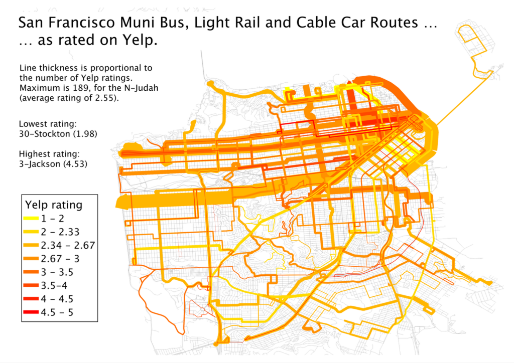
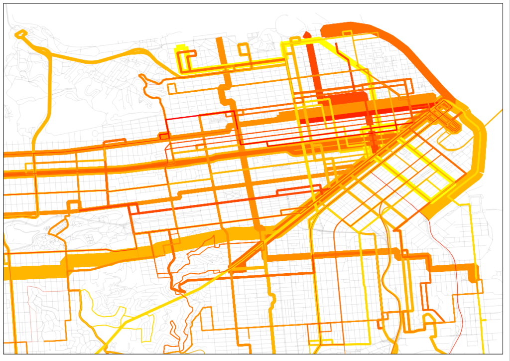
San Francisco And then there’s Geary, one of the busiest bus lines in the country. It has more than 50,000 daily passengers spread out among four routes, the 38, the 38R (a limited stop route) and two rush-hour express routes, the 38AX and 38BX, which serve an outer portion of the line before using other streets to access downtown San Francisco. In a sense, these already function as a local-express BRT network, just without the bus lanes, stations and other amenities the ITDP looks for. So basically BRT, without the R. Do they function well? Hard to say. People seem to like the limited and express options (I mapped their Yelp scores a few years back) although at rush hour the 38R, which comes every four minutes, is at or near capacity (running 60 foot buses).
The city is planning to build BRT and have it “light rail ready” because they don’t have the money for light rail. The problem is that this is going to have the capacity issues that the Orange Line has in Los Angeles on day one. Yes, better platforms, signal priority and wider doors may help, but the system already carries more than 3,000 passengers per hour, so it won’t have the capacity in a two lane system. Much of it is being built as side lanes instead of in a center median, especially in the inner part of the route, so limited buses will be able to pass locals in mixed traffic lanes. But it won’t really solve the capacity crunch, especially if there’s traffic in those lanes.
There are two ways to add enough capacity on Geary. One would be to build light rail. A three-car light rail train every five minutes would carry 6000 people per hour and not be at capacity. The second would be to build a full-on four-lane Bogotá-style BRT system. The corridor already has local, limited and express buses: at rush hour, there are nearly 60 buses per hour serving the corridor. This would allow buses with different service patterns to skip stops easily, and as we’ve said before, a multi-lane system does have capacity that will match light rail.
There are only two issues. The first is that even the half-baked BRT system will cost $50 million per mile (and run in to the same white elephant/sunk cost issue as LA has). A four-lane system would likely cost more, getting in to the range of the average light rail system. The second is that while there is enough space on the street for this type of system, there’s not much to spare. Geary is about 100 feet wide—one of the widest streets in San Francisco—but it is still narrow compared to most streets in Bogotá. Since most highways in the City were never built (or removed) and these few rider surface streets, it functions as a thoroughfare, as well as a shopping street. So to take four lanes plus stops for a busway would leave only 35 feet or so on each side, barely enough for one lane and parking. This likely wouldn’t fly, so you get single-lane BRT: pretty expensive, but minimal improvement to capacity. The B-Geary was one of the last lines in San Francisco to lose streetcar service, and the only way to keep enough of the road for cars and have enough transit throughput is a light rail line, even if it would cost more. BRT is, to quote Sarah Palin, lipstick on a pig.
Minneapolis-Saint Paul There are several light rail lines which have been built as well; for some of them there was a conscious choice made between bus and rail transit. The Green Line between Minneapolis and Saint Paul is one. When it was proposed, bus rapid transit would have cost about a third of the cost of rail. But it’s unlikely that it would have been able to handle the passenger loads that the rail line carries, especially since it serves both the University of Minnesota (with 50,000 students, one of the largest in the country) and both downtown Minneapolis and Saint Paul (Minneapolis being the larger traffic generator). The line already carries 35,000 passengers daily—more than the ten-year-old Blue Line (which was built along an already-cleared but never-built freeway right-of-way)—a year in to service. With those riders, Minneapolis now has the highest ridership of any light rail system opened since 2000.
It also serves the Cities’ main sporting arenas (the ballpark, hockey, basketball and both football stadiums and the minor league ballpark; and yes, the Twin Cities may be the most over-stadiumed city in the country), so in addition to heavy loads at rush hours, it has to cope with frequent event traffic as well. If it were a bus rapid transit system, it would have been overloaded from the start. As a light rail line, it can cope with demand with 10 minute headways at all times (except overnight, and, yes, it runs 24 hours a day), which means it could easily double capacity—or more—if ridership increases.
Which is not to say that the Twin Cities don’t have any bus rapid transit. They have a couple of freeway-based lines (which don’t really conform to ITDP standards) and are planning several arterial lines, which may not have exclusive lanes but will have better stops, all-door boarding and more frequent service. One, on Snelling Avenue, intersects the light rail lines near both lines’ midpoints. While Snelling once had a streetcar, it probably wouldn’t merit one today, but it connects the two rail lines and will provide an important link in the region.
While the Twin Cities may be somewhat light rail-heavy in their planning, they are choosing appropriate modes for each corridor. They aren’t hamstringing heavily-used routes with inadequate BRT because it’s cheaper (or because buses are always better, or something) but aren’t spending on light rail where BRT will do the trick (the streetcar plans are another story, and how I feel about them—conflicted—is the topic of another post entirely). Rail cost more than twice as much as BRT would have (but certainly not seven times as much) on University Avenue. But it provides more utility than BRT on day one, with room to grow. It was a smart investment, and the right choice.
I’m more familiar with the Twin Cities than other regions, but imagine there are others which act similarly. But the ITDP wouldn’t give them the time of day and certainly doesn’t examine rail systems as “gold standard” or otherwise. Perhaps it’s time we took a more holistic approach towards analyzing transit investments—looking at ridership, throughput and actual costs, not hyperbole—rather than engaging in mode wars (the Transport Politic made just this point recently). Let’s choose the right mode for each corridor, not blindly push for one over another based on preconceived agendas.