Getting Transit (Mostly) Right: Minneapolis-Saint Paul edition

Minneapolis and Saint Paul do not necessarily lend themselves to being a transit paradise. The core of the region is not particularly dense, and wide roads and a mostly-built freeway system make driving too easy. The tree-lined avenues of Minneapolis and Saint Paul are mostly lined by single-family homes and duplexes with sizable yards and alleyways, meaning that population densities are far less than the three-deckers of Boston, side-by-side bungalows of Chicago and row houses of DC, so there are fewer people to provide the necessary patronage for a dense network of frequent transit lines. The factors that push people to transit that define the urban experience in a Boston, New York or DC—heavy congestion and high parking costs—are, if not completely absent, less of an issue. And without many grade-separated lines, there are few cases where transit has a distinct time advantage over rush hour traffic.

Additionally, much of the area is pockmarked by both active and abandoned industry and transportation networks, further diluting the population (while, at the same time, providing significant potential for brownfield redevelopment). Most in-city residents live within a short walk of a bus line (the suburbs, for the most part, are less dense and even more car-dependent), but frequencies are often only every 20 or 30 minutes. Since the demise of the streetcar network (most car lines ran every 10 or 12 minutes or better, and streetcar ridership peaked at 238 million per year, triple transit ridership today) and the rise of the highways in the 1950s and 1960s, driving has just been to easy to compete with transit. Even at its peak, Minneapolis had just under 10,000 people per square mile, Saint Paul only 6,000; neither reached the peak density of large rust belt cities further east. (Both cities saw their populations bottom out in 1990 and have gained about 10% since.)

Minneapolis-Saint Paul was one of the largest cities without rail transit until its first line opened in 2004—a 12 mile line for a cost, in current dollars, $905 million (including two major elevated overpasses and a mile-long tunnel under the airport, despite exceeding initial estimates it is, in retrospect, quite cheap.)—and the second corridor, linking Minneapolis and Saint Paul, came online in 2014. These two corridors have, in their own right, made Minneapolis’s “Metro” the most heavily-used rail system to have been inaugurated since 2000 (since surpassed by Seattle’s Link, which is experiencing overcrowding with its recent extension), with more than 60,000 passengers per day. But there are two new smaller-scale developments which show that the Twin Cities are more forward-thinking in providing transit, and may well entice passengers out of cars while providing transit along corridors with high potential for redevelopment.

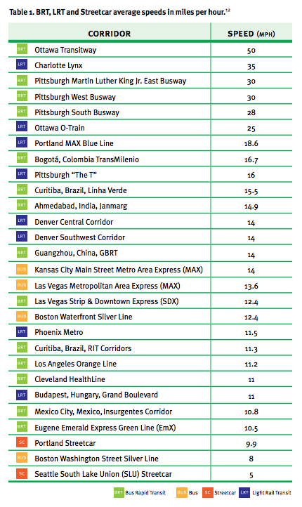
The first is the speeding up of the Green Line (formerly the Central Corridor) between Minneapolis and Saint Paul. When it first opened, the signal system of the line was not optimized for transit: trains often waited at cross streets for vehicular traffic despite the promise of transit signal priority. While the line is not perfected in the way that the Blue Line, which has gated, at-speed grade crossings, operates (and, running in the center of a city street, it likely never will be) the kinks are being worked out, and the promise of a 39-minute downtown-to-downtown ride is coming to fruition (the downtown sections are still quite slow and trains have minimal signal priority there). Speeds have also been improved, to 40 mph between most stations and 50 where there are no cross streets for long distances. (Note that this center-running light rail line runs faster than any MBTA subway or light rail service.) Further progress may be made, but the cities have not kowtowed to a few delayed drivers, and reaped both the operational efficiencies of running trains faster, as well as the potential for higher ridership. Trains run just every ten minutes, but with three 100-foot-long railcars, they have a capacity of more than 500 passengers each.

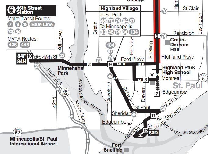
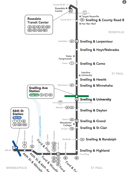
The second is the upcoming A Line bus rapid transit route in (mostly) Saint Paul. While not true BRT—there are few, if any, protected lanes, and the efficacy of transit signal priority will have to be tested—it’s the right steps towards getting more riders on to buses, and then on to trains beyond. The 84 has long been an important crosstown route running north-south between Minneapolis and Saint Paul. It connects the Green Line at Snelling Avenue with the Blue Line at 46th Street in Minneapolis, and with the rail lines has acted as a major feeder route to the two lines, albeit an urban bus route with frequent stops, often picking up just one or two passengers at each due to the density of the area, slowing down the route.

The new A Line will eliminate the Montreal joggle, a vestige
from the pre-light rail routing of the line.

Beyond this, it has had its share of issues. It has long been a frequent route—every fifteen minutes for the trunk service—but service was downgraded in 2004 when the direct trip to the airport and Mall of America was severed and required a transfer to the Blue Line. Additionally, until recently, only every other trip made the airport run, meaning service to the rail line was only available every 30 minutes, a major transfer penalty, especially changing from rail to bus. The other branch of the route dead-ended at the 54 bus, which also ran to the airport, but with less frequency (every 15 minutes) and without the passenger amenities at the transfer point. Furthermore, the line had several twists and turns. Before 2004, it made several jogs through Saint Paul en route to the airport. In the past decade, most buses serving the light rail have detoured half a mile south of the straight east-west route to the rail transfer station, providing some additional coverage but adding several minutes of extra travel time to each trip. When there are few advantages to bus travel in the first place, once a route goes out of its way in this manner, driving becomes even more logical.

No joggles! The new A Line will follow
the city street grid: the most direct route.

The new A Line BRT route will eliminate many of the factors which make driving more desirable in this corridor. First, stops will be consolidated, from eight or ten per mile to two or three, mostly at major nodes, bus transfers and “100% corners” which developed around these streetcar transfer points in the first half of the 20th century (the term has since been applied to highway interchanges in suburbia and transit transfer stations downtown). Each stop will be more developed, with heftier shelters with heating elements (important in Minnesota winters) and real-time departure information (important for everyone, but especially choice riders). Each station will have a fare machine and provide off-board fare collection, distinct vehicles with wider doors, and all-door, level boarding to minimize dwell times. Furthermore, buses will stop in the right travel lane, at a curb bump-out, so buses will not waste time pulling in and out of travel lanes. This will all enhance the speed of the route and the customer experience, and an analysis shows that it will bring many jobs closer to residents of the corridor.

Frequency will increase as well, with 10 minute headways matching headways of the light rail lines (frequency had been increased in 2014 to this level when the Blue Line opened, but not all buses ran to the Blue Line in Minneapolis), so transfers between the two lines will be minimal. Very importantly, these won’t just be rush-hour frequencies, but for midday service seven days per week (shoulder periods—before 6 a.m. weekdays, slightly later on weekends, and after 7:30 p.m. on weekdays and slightly later on weekends—will be somewhat less frequent, but still generally every 15 or 20 minutes). And the hodgepodge of coverage-based joggles will be eliminated: an every-half-hour 84 route will provide this coverage service, but the every-ten-minutes A Line will follow the grid to a T—or, as it happens, a backwards “L”—taking the most direct route possible. (The 84 will also provide service every block along Snelling Avenue, continuing a fallacy among many transit agencies that stops can not be consolidated at any cost. Thus some operational efficiencies will be lost by having empty buses running along the route, as nearly all passengers will opt for the faster and more frequent A Line. Even with stations every half mile along the Blue Line, MetroTransit still runs the 16 bus along the route, making these frequent stops. Based on limited observations, there are few, if any, riders, and it may behoove the agency to take whatever constituent hits are involved in putting this type of service out of its misery.)

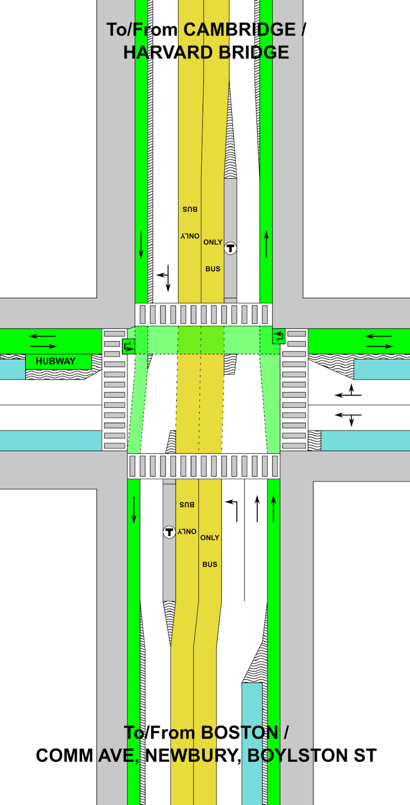
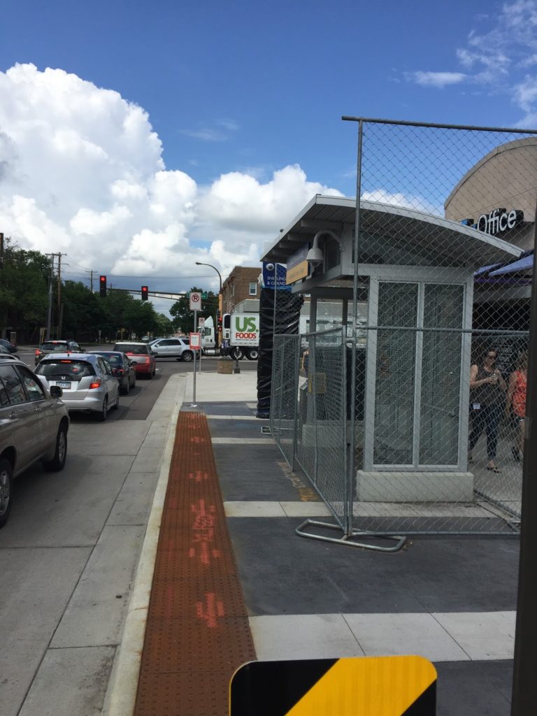
New stations feature curb bump-outs so buses
board in regular traffic lanes.

Is it perfect? Certainly not. Buses will still be susceptible to congestion, especially in the crowded Midway area, where exclusive bus lanes may be a future improvement. But it’s a major improvement, and for (relatively) minor dollars. Rather than a showy BRT or rail system (the corridor is probably not dense enough for rail, and doesn’t have the traffic issues that would require a full-on, expensive BRT system) the new A Line seems to address the most salient issues with a cost-benefit analysis, with low-cost, high-impact solutions (what they call Arterial BRT). It can also be incremental; if it’s successful, it will give the political capital to make further improvements, which may mean taking car travel lanes or parking spaces for queue jump lanes of exclusive bus facilities. It will leverage the much-improved Green Line light rail connecting to the downtowns with a better connection from the Snelling corridor, and the Blue Line at the other end. This system did not have free-falling ridership that would require a Houston-level redesign (bus ridership has grown in recent years, even as a major corridor—University Avenue—was replaced by light rail), but certain corridors—like the 84—did need improvement (others still do). This is a model which should be used for other high-use corridors in the Twin Cities (which is planned), and other systems in the US as well.

I started riding the 84 in 2002 (it still carried a note that it had been renamed from the Saint Paul 4—until 2000 Minneapolis and Saint Paul parochially had duplicate route numbers in different cities, like boroughs in New York) as a first year student at Macalester College, frequently to and from the airport. It ran every half hour, but with direct service it made the terminal impressively close: even with the joggles in the route, it was less than a 20 minute ride, door-to-door. The actually service degraded in 2004 with the rail transfer: it usually took about 30 or even 35 minutes, especially with the extra trip down to Montreal Avenue, and still only every half hour.

It took ten years, but a sensible route has finally been worked out. While the new service won’t match the speed of the pre-2004 service, with a more direct route, fewer stops and 10 minute headways for both the bus and the light rail, the trip, even with a transfer, should take about 25 minutes (with a perfect transfer at non-peak times, it may actually beat the circa-2004 20-minute mark), with the bus running up to 25% faster. Considering it will come three times as often, it will (finally) take full advantage of the light rail, and provide better service to the Snelling corridor in Saint Paul. Hopefully residents will notice the improvements and avail themselves of better transit options, even if it’s never perfectly competitive with an automobile.

Update: so far people are mostly happy with it, with one curmudgeon who won’t walk the extra block to a stop in the winter, supposedly. Update 2: Ridership on the corridor is up 25%.

More ITDP truth-stretching

I wrote a lot last spring about the ITDP and their biased reporting on bus rapid transit. I thought I was done. I wanted to be done. And then I was looking something up and found this. More specifically, I found pages 23 and 24 and I just don’t know where to start. First on page 23:

BRT, however, has a distinct operational advantage over LRT: A BRT vehicle
can operate in mixed traffic on normal streets and then enter dedicated BRT
infrastructure without forcing passengers to transfer to another vehicle. LRT,
by contrast, can only operate where there are rail tracks, and passengers
coming from locations not served by the tracks must transfer to and from
buses, or to space-consuming park-and-rides, in order to use the system. 

This is just not true at all! A subway system can’t operate in mixed traffic. But light rail systems can—and do—all the time! Here’s an example from Boston. Here’s Pittsburgh. Here’s Philadelphia, San Francisco and Sacramento. And all of Toronto. Their big hit against light rail is belied by examples in many of the large cities in the United States! It’s just wrong.

And then there’s page 24. Oy, page 24. Here, they have a list of average speeds for different transit systems. The idea being, I think, is that look how fast some of those BRT systems are! Look, in Ottawa, the average speed of a bus is 50 mph. 50! That’s really fast. That’s basically faster than any transit service in the country. I’m really not sure what conclusions they’re trying to draw from these data.

And the data seem specious, and I looked in to where they got their data from. Which was from a footnote (well, really an endnote) 129 pages later in the document. They know no one is scrolling back that far (Al Franken—yes, Senator Al Franken—makes this point about Ann Coulter; see page 19). Here’s where the data is from:

12. Speed data is from the following sources: Ottawa, Interview
with Colleen Connelly, OC Transpo, 2012; Cleveland: Interview with
Michael Schipper, Greater Cleveland Regional Transit Authority,
2012; Las Vegas, ITDP, Recapturing Global Leadership in Bus Rapid
Transit, 2011; Pittsburgh, Interview with David Wohlwill, Port
Authority of Allegheny County, 2012; Eugene, Interview with Tom
Schultz, Lane Transit District, 2012; Boston, ITDP, Recapturing
Global Leadership in Bus Rapid Transit, 2011; Portland: Interview
with Jillian Detweiler, TriMet, 2012; Phoenix, Interview with
Abhishek Dayal, Valley Metro, 2012; Charlotte: Interview with Tina
Votaw, Charlotte Area Transit System (CATS), 2012; Los Angeles:
Interview with Gayle Anderson, Metro, 2012; Kansas City: Interview
with Randy Stout, Kansas City Area Transportation Authority, 2013

Let me get this straight. They got speed data—data!—from a bunch of reports they commissioned themselves and from interviews. If they got accurate data, it would be one thing. But these numbers are wrong! First of all, there’s no way that the average speed for the Ottawa transitway is 50 mph. And they asked people for an average speed, and people gave it to them, and they probably didn’t understand what an average is because the ITDP itself doesn’t understand what an average is.

Here’s a trip on buses which serve the Ottawa Transitway. It takes 55 minutes on the vehicle. The distance is about 25 km. The average speed? 17 miles per hour. Even an all-on-the-transitway trip takes 20 minutes to go 15 km. That’s 30 mph, which is better. But still nowhere near 50. Maybe they got their metric conversions confused?

Let’s go to the Charlotte Lynx. Does it average 35 mph? It runs 9.6 miles in 26 minutes. It averages 22 mph. Not 35. Pittsburgh? 9 miles in 22 minutes (25 mph).

And some of the low numbers are too low. They claim Denver’s light rail averages 14 mph. Even through the city center, it runs 14 miles in 38 minutes. That’s 22 mph. Phoenix? 23 miles in 65 minutes (21 mph). The Orange Line in LA—advertised as 11.2 mph—actually runs 18 miles in 57 minutes, at 19 mph. They’re even sandbagging the mode they want to push!

In any case, it turns out that a fixed guideway transitway—light rail or bus—will run at about 20 mph, stops included. The Silver Line in Boston is susceptible to traffic, but at low-traffic times it even makes 12 mph. How did I find these numbers? The Internet, from actual schedules and times. It would behoove the ITDP to actually do some research as opposed to just making numbers up.

It’s time to radically rethink Mass Ave and Beacon St

There’s an intersection in Boston, at the end of the Harvard Bridge, that I bike through all the time.

So do a lot of other people.

Today, one of those people didn’t make it.

Legend:
White: Roadway
Yellow: Exclusive transit
Green: Bicycle
Gray: Pedestrian
Blue: Parking
“Wavy” = barrier or curb

The corner of Mass Ave and Beacon Street is dangerous. Like, really dangerous. It’s relatively narrow in both directions (i.e. not wide enough to easily separate uses), but still wide enough that cars can get up a decent amount of speed. It is heavily traveled by many modes, and has frequent buses and other large vehicles. Some of those things aren’t going away (no, we can’t kick the #1 bus out). We know it’s dangerous; we have for some time. Yet we’ve done nothing about it. Today, that has yielded tragic results.

But there are certainly things we could do. The intersection is dangerous for a variety of reasons:

  • The bike lane disappears so that there can be three (3) lanes on the Boston-bound side.
  • Buses pull in and out of the bike lane to make passenger stops.
  • Bicyclists have no leading signal, so they have to go at the same time as cars.
  • Cyclists accelerate down the grade off the bridge, quickly catching up on turning traffic.
  • Trucks swing out to make wide right turns from the left lane, oblivious to bicycle traffic three, and cyclists don’t see the trucks turning right; trucks then turn across these lanes.
  • There is frequently heavy traffic, so cyclists have to weave between stuck cars. When there’s less traffic, wide lanes allow cars to go fast.
  • Beacon Street has three lanes of traffic east of Mass Ave, making it feel much more like a highway than a city street, despite traffic counts that would barely require two. (It has fewer cars than parallel Comm Ave, which has—wait for it—two lanes of traffic.)
  • There are minimal bicycle facilities on Beacon Street, making cycling there especially dangerous.
As usual, most of the real estate on the street is given over to cars. It was seen as a real coup when Nicole got parking removed on one side of Mass Ave and bike lanes installed in 2012 and, at the time, it was. But we’ve come a long way since then. Comm Ave is getting protected bike lanes. And one of the first protected intersections in the country, which is downright Dutch! We’re fixing bicycling safety issues in other parts of the city: it’s high time we did so at this intersection as well.
There’s another element at play, too, which you can see if you look at the diagram that’s been staring you in the face since you started reading this post: this is a huge transit corridor. With the 1 and CT1 buses, it handles 15,000 bus riders per day, add in the M2 Shuttle and bus passengers account for 20,000 people on Mass Ave, despite lousy service and near-constant gridlock impacting schedules. Given that traffic counts for the bridge are only about 25,000, it means that if you’re crossing the bridge, there’s a better than even chance that you’re on a bike or a bus, as I’ve pointed out before. Yet even with the new lanes (thanks, MassDOT!), we still give 82% of the bridge space to cars, with no priority for transit.
So here’s what you could do:
  • Put a bus lane on the Harvard Bridge, extending south along Mass Ave to Boylston Street (and perhaps beyond). Build a new station at Boylston in the center of the roadway (you’d need left-door buses for this, but these exist), safety-zone type stops like shown here but both adjacent to the Hynes station, or exclusive bus lanes on the sides with signals to allow the buses to move to the center of the roadway. (This could be extended further south as well, but traffic is usually not as bad south of Boylston.) At Beacon Street, install offset bus stations on either side of the street (there’s not room for a single station) with signal priority. Modal equity is a good thing. And despite my feelings about the ITDP’s bus study (this would hardly qualify as gold standard by their rankings with offset stations and lanes demarcated by paint and not concrete, but there’s not room for that), I think this is a great place for bus lanes! And by putting them in the center, you reduce any instances of buses having to cross and block the lanes to make passengers stops.

    This will require removing only a couple of parking spaces on Mass Ave as the busway transitions in to the middle of the street to allow parking on one side. As far as I can tell, the businesses in the area have done fine without parking. Until Boylston, there are two ways of dealing with left turns. One would be to allow left turns from the bus lane, with a green light preceding any bus arrival to clear the lane. Even better would be to ban left turns all together, like San Francisco has on Market Street. This is safer for cyclists, pedestrians and vehicles, and addresses a major congestion issue (while allowing longer phases for straight movements). The few vehicles needing to go left could make a series of three rights (right on Comm/Newbury, right on Charlesgate, right on Marlborough/Comm) instead.

    (Why not at Beacon, too? A northbound driver past Marlborough would have to go all the way to Cambridge to get back. So the left turn lane there fits and allows that movement, although it could be reassessed if it received very little use.)

  • On Mass Ave, the southbound bike lane should be separated to the intersection. This is the most dangerous area, where cyclists are most likely to be right hooked as one was today. Bicyclists should have a separate phase to cross when there will be no other cross traffic allowed. At other times, cyclists could have a red signal for the straight or left (yes, left; more in a second) movement, but a green signal for a right turn on to Beacon Street. In addition, a curb or bollard south of the cycletrack on Beacon would require large trucks turning right to do so with much better visibility for cyclists, which could preclude the need to use specific bicycle signals to keep the users safe.
  • South of Beacon, Mass Ave would be a bike lane without separation to fit in the bus station, but would transition to a parking-protected separated facility.
  • Going northbound, the protected lane would similarly lose its protection at the stop. However, with no right turns possible, there would be no worry of a right hook. It would regain protection across the Harvard Bridge.
  • The Harvard Bridge is currently two five-foot bike lanes and four 11-foot travel lanes. By reducing the travel lanes by one foot each, a two-foot buffer is easily attainable.
  • Now, on to Beacon Street. Beacon Street is easy. It’s currently three 12-foot travel lanes and two six-foot parking lanes. There is no need for three lanes given traffic volumes on the street (just 7500 to 9500 per day!); two would suffice. If you pulled the width back to ten feet, you’d have 16 feet available to add two feet to each parking lane (8 feet instead of 6), a 2 foot buffer and a 10-foot-wide, two-way protected bike lane all the way to the Common. Which is why you’d need the aforementioned left turn from Mass Ave.
This is all doable. The big hurdle is convincing people that cars might have to wait in some more traffic so that transit riders, bicyclists and pedestrians—the majority of the users in the area—can have a faster and safer experience. We’ve seen what happens with the current layout: gridlock, congestion, pollution, with deadly results. It’s high time we made a change.

Update 8/9: In the original diagram, I had near-side bus stops, but it is noted that
far-side bus stops might work better from a transit signal priority point of view, and to allow for larger vehicles to make right turns. This turned out to be the case from a physical point of view as well inasmuch as it doesn’t require the busway to jog nearly as much if the parking moves from one side of Mass Ave to the other. The main issue is that cars would now be aiming right at the “safety zone” style bus stops and an errant car could drive in to a group of waiting passengers, but a protruding island could guide them towards the roadway. (By minimizing the amount of zigging and zagging, it would allow for more parking as well.) Another issue is that this would not accommodate the M2 Shuttle as well, as it turns right on to Beacon Street, but it could continue and go right on Mass Ave or have a separate stop further down Beacon Street. I’ve also added left turn boxes for cyclists. If you’re interested, the original design is shown to the left.

I also have a design shown to the right which has much less transit priority but puts a two-way bikeway in the center of Mass Ave (with enough room for a jersey-style crash barrier on either side). While it would provide a quite-safe bicyclist experience for those going straight, there are a number of significant downsides:

  • Bicyclists turning right would have to cross traffic at an intersection, and could not pull to the curb.
  • It would be very difficult to design a means for cyclists to enter and exit this cycling facility from the Paul Dudley White bike path along the river.
  • Turning movements for cyclists between Beacon and Mass Ave would also be difficult as there would be nowhere for cyclists to wait for a turning phase, which would be required for all turns.
  • Where, inevitably, bike lanes move from the middle to the side it would be an awkward transition (as is the case with the Comm Ave bike lanes at Charlesgate). 
  • The potential for transit improvements are minimal. The main benefit is that there would be no need to transition transit from the middle to the center as would be the case in other scenarios, but buses can more easily signal across mixed traffic. However, transit would only share a lane with right-turning vehicles, and the only way to really improve bus speeds would be to somehow assure that drivers didn’t use the right turn lane to bypass traffic and then attempt to merge back in. Good luck with that.
Update 8/20: Clarified a few things and slightly changed the diagram.

Beyond Better Buses: Build a Better Network

This is the final in a series of articles about the place and practicality of bus rapid transit in Boston. Previous installments can be found at this link, or below:

and finally, this conclusion discussing how to build a better transportation network.

The Boston BRT report’s heart is in the right place. They want better transit. But we don’t just need a better bus rapid transit network. We need a better transportation network. Let’s not fight mode wars, let’s leverage the resources we have, and work towards a better network and better transit all over.

A recent article in NextCity put it well: the US can’t afford “nice” transit, so people fawn over BRT. And it works, in places. But this is a false dichotomy; it sells ourselves short. If we push BRT when another option would make more sense, it’s a square-hole-round-peg solution and we’re bound to have a system that is either underutilized or over capacity. No one mode is always the answer. If someone publishes a study positing that, we should ask if it is actually proposing a solution, or an agenda.

What Boston does need, wholesale, is a better transportation network, with improved hub-and-spoke routes and, especially, better connectivity to growing urban activity centers.  In the early 20th century, transportation infrastructure focused on the center of the city, with high capacity transit converging downtown. Later in the 20th century, most transportation infrastructure focused growth on the outskirts, accessible only by road. (Every so often someone proposes bus rapid transit or a monorail or something along 128, but that’s a lost cause. The employment density, with offices scattered amongst sprawling parking lots a mile from the roadway, is way too car-oriented for effective transit of any type. Last mile shuttles can provide decent connections for some employees; most others will have to brave traffic; any other transit is massively subsidizing car-oriented development.) Many other cities are continuing down the downtown-suburban split: even in San Francisco where tech companies either hole up in downtown towers or sprawling suburban office parks all but inaccessible by transit and reliant on highly subsidized corporate shuttles which are still at the whims of traffic.

Boston has managed to establish growing, dense and urban recent development focused in Longwood, Kendall, the Seaport and similar areas. While not as accessible by transit as downtown, they’re close enough that the just last mile needs to be solved or enhanced to leverage the existing transit network. (Apple, for instance, is building a “transit center” in to their huge new campus. That’s the last mile. Unless they can build a bus lane on 280, they just have to figure out the first 40; their goal is to have just 2/3 of their employees driving alone to work; neither Kendall, the LMA or even the Seaport is nearly that high.) Boston is lucky: many of fastest growing large employment centers are dense, transit-oriented and close together.

They just need more and better transit. Boston needs to go from hub-and-spoke to a network. It’s a hard choice to make, and system expansion needs to dovetail with system maintenance; one can’t cannibalize another. But while Boston’s hub-and-spoke network doesn’t serve the next century particularly well, that can be remedied, and improve transit for all. And better buses are certainly part of this solution.

But only part. In the past two posts, I’ve gone through many of the routes proposed by the ITDP and myself, and examined which mode would be best, how they would interact with the current transportation system, and how they would form a better network. And, as I am wont to do, created a map:

There’s a lot of BRT on that map. It acts as a feeder service to transit lines, as crosstown routes, and to speed transit through major chokepoints. Of course, none of these would likely qualify for “gold standard” BRT. All would be cheaper, and are in corridors where they are the right solution, not something that would work well in Bogotá or Mexico City transplanted in to Boston. The rest of the network builds much of the Urban Ring—not with a zigzagging overbuilt bus route—and adds significant capacity to the system. It solves huge last mile issues to the commercial nodes in the city, and good circumferential routes will take a lot of connections and take pressure off the downtown routes. It leverages huge portions of the existing network—especially the Commuter Rail lines—and brings them closer to the quickly-growing areas. By doing so, it brings much more housing, both in the cities and the suburbs, within a reasonable transit commute of most major downtown employment nodes.

It’s a network. It connects people to jobs. It encourages mode shift. It provides system redundancy, so if one line has issues, there is another way around. It brings good service to underserved neighborhoods, it puts many more people’s jobs within the reach of commuter rail termini, and it doesn’t force everyone to transfer through downtown, or take a slow bus through rush hour traffic. It is not focused on one mode over another: some work well with buses, others with light rail, others with heavy rail, and still another (the Grand Junction and its extensions) with an RER-style commuter line operating at high frequency. It provides the kind of system the city needs to grow without overstressing the infrastructure we have now. But it doesn’t put all the eggs in one modal basket.

If we are going to have dreamy, long-term proposals about transit in Boston, let’s at least have some that fit in with the system we have, not the system on another continent.

Perhaps we should look north?

What is the best analog for the future of transit in the US? If you ask the ITDP, they point south: Mexico, Colombia, Brazil, countries which have invested heavily in bus rapid transit. It’s a rather curious comparison for a couple of reasons. First, those countries have much lower standards of living than the US does, so that operating costs for high-personnel transportation systems (buses require five to ten times as many drivers as trains) have a lower cost. Another is the streetscapes: many South American cities have Haussmann-style boulevards with plenty of room for BRT systems which are wide enough to support high-capacity systems. We don’t have that in the US. There is also a climate question. Countries with no freeze-thaw cycle can more easily build asphalt and concrete busways and expect them to last, while in the US, they require more preventative maintenance.

So perhaps the best place to look is not to our south, but to our north. That’s right. Canada. Unlike the US, no city in Canada had a pre-war subway system. When demand outstripped street supply, Canadian cities have taken a number of different tacks towards addressing transit needs:

  • Montreal’s looked to Paris and its Metro system is today the third busiest metro system in North America, with more than a million passengers daily, more than all but Mexico City and New York. It’s bus system carries another million and a half passengers.
  • Toronto’s Rapid Transit system also carries more than a million passengers per day, and is supplemented by the city’s extensive surface network, which carries nearly two million more passengers, and Go Transit commuter services, which launched only in the 1960s and carries nearly 300,000 passengers, and is being upgrade to electrified service to provide faster and more frequent trains. All told, Toronto has nearly 3 million daily riders, and TTC’s 73% farebox recovery ratio is the highest of any system in Canada or the US.
  • Ottawa’s OCTranspo carries more than half a million passengers daily, nearly all of them on buses. Many of these buses use mostly-grade-separated transitways and Ottawa is the only city in the ITDP’s database (scoring bronze status). Yet Ottawa is working to convert most of it’s bus rapid transit to light rail. Why? Capacity. The downtown segment, with 100 mostly 60-foot buses per hour, is oversubscribed. Even the ITDP admits it (although their circular logic is that this just points to the success of BRT, although they don’t give any solution for increasing capacity). 
  • Calgary and Edmonton both have light rail systems. Calgary’s is very well patronized, with more than 300,000 daily passengers using a single downtown trunk line, and illustrates that surface-running light rail can far exceed bus capacities in a limited corridor (including double the capacity that the ITDP quotes for light rail). Calgary’s system is now the most heavily-used light rail system in North America (yes, more than the Green Line in Boston) and both systems are expanding.
  • Vancouver hosts Canada’s newest rail system, Skytrain, a “light metro” system which is fully grade-separated but has slightly less capacity than a full metro. Most of Skytrain is above-grade, although several sections are in tunnels as well. Notably, it is fully automated, reducing operation costs further. The city has several very busy bus routes (particularly the 99 to UBC) which are planned to be replaced by Skytrain lines in the future.

Unfortunately (or maybe fortunately) the ITDP hasn’t studied these Canadian systems, because—especially in the case of the newer systems outside of Toronto and Montreal—they don’t fit in to “BRT good light rail bad” narrative. If Ottawa had built light rail like Calgary, they would not have the capacity constraints that are now causing them to build a light rail line instead. Downtown Calgary is booming for a variety of factors, but one is that its light rail line has the capacity to serve the number of commuters necessary to support the dense downtown without highways. It would probably be booming similarly had BRT been build instead, but it’s likely that system would be over capacity and, like Ottawa, would need significant enhancements or a mode change. Montreal had a bus rapid transit line that they’re rebuilding on a peripheral street for US$25m per mile, although costs are ballooning and it’s a lengthy project, and Montreal’s trunk lines are still served by underground rail.

Canadian cities have generally been successful in getting people to commute without driving, much moreso than in the US. Even in the Texas of Canada (Alberta), half the commuters to Downtown Calgary take transit to work (and Calgary does not have many large peripheral office parks; development is focused downtown). Bus rapid transit has worked in Ottawa, but congestion, especially in the downtown area, has caused the system to be replaced with light rail. While the outer portions work with buses, where many routes merge and streets get narrower (and Ottawa has a grid street system downtown with relatively wide roads) it has been overwhelmed.

So, back to Boston, a city which is more similar to Canadian cities than it is to, say, Mexico or Curitiba. Canadian cities have somewhat similar development patterns, highways (Montreal and Toronto both have highways serving downtown and terrible traffic, does that sound similar?) and standards of living. The ITDP chooses analog cities of Cleveland, Mexico City and Belo Horizonte in Brazil. These are examples of cities which have bus rapid transit. I’m just not sure how well they compare to Boston.

How much does BRT cost? 7X less than LRT? (Hint: No.)

This is the third in a series about the ITDP bus rapid transit report for Boston, and the ITDP standard in general.

One of the claims often made by BRT propagandists is that constructing bus rapid transit is seven times cheaper than light rail transit.

This is from the executive summary of the ITDP’s Boston BRT report:

Analysis of recent transit development costs
in the United States suggests that implementing BRT in these
corridors would also be more cost-effective than other options
for improving the existing transportation system. Based on this
evidence, on average, BRT can be seven times more affordable
per mile implemented than light rail.

Their “Benefits of BRT” page repeats this factoid several times. Quite a ways down the page do they use some properly weasely language to qualify their statement: “BRT can on average be up to seven times more affordable than light rail.” (Italics mine.) Hey, guys? That’s now how averages work. An average is the sum of a set of numbers, divided by the total number in the set. It’s like saying “In February, Boston gets, on average, up to 65 inches of snow.” Boston must be a snowy place, a reader would say, since some there must be a lot of years that have more snow than that. Except “up to” denotes an outlier. Boston normally gets, in average, about 12 inches of snow in February. 65 inches is an outlier. The ITDP report is off by about the same factor.

If this seven-times-as-expensive figure were the case—especially in corridors where demand is not likely to exceed 2500 passengers per hour—then it would make a lot of sense to build, right? If you can get 25 miles of BRT for the price of four miles of light rail, it’s a no-brainer. But what about if you can get nine miles of BRT for the price of four miles of light rail? Because that’s the actual ratio: light rail comes in at slightly more than twice the cost. And the while the ITDP bandies about that number, they cite no actual evidence to back it up.

Given the capacity constraints of bus rapid transit, it becomes a harder choice: if you spend half the cost of light rail on a bus system that doesn’t have the capacity to serve the needs of the corridor, it’s wasted money. It becomes a sort of Yogi Berra white elephant: no one goes there anymore, it’s too crowded. Crowds seem like success, and they are, to a point. But overcrowded transit runs more slowly and is more prone to uneven headways. In other words, if you build it, and they come, then what?

* Planned for ~2020. Ridership includes 38, 38R, 38AX, 38BX
† Included significant grade separation/bridges/tunneling
‡ Primarily in an existing right-of-way
All dollar figures adjusted for inflation (2015)

I like charts (you’ll know that if you’re a frequent reader) and here is one. It shows the costs per mile, and daily ridership, for a variety of BRT and LRT projects which have been built recently. I included several Los Angeles LRT examples because it is the only city which has built both BRT (to the level of an ITDP standard) and LRT in that time, and included the much older (relatively) Blue Line because it was mostly built on an old Pacific Electric right-of-way, much like the BRT Orange Line. Is light rail more expensive to construct than bus rapid transit? Yes. Is it seven times more expensive? Certainly not. The distance-weighted average construction cost for light rail is about 225% higher than BRT, less than a third of the difference that the ITDP suggests. (I’ve left out rail examples here—the Central Link in Seattle, for example—which include significant tunneling or grade separation, and similar BRT systems.)

There is only one example of BRT construction which is seven times less expensive than any similar light rail line: the Emerald Express in Eugene, Oregon.

Eugene, Oregon The Emerald Express was cheap to build: but you get what you pay for. The line serves a transit system which has a daily ridership of 40,000; fewer than most of the light rail lines above. It runs every ten minutes—frequent by the standards of a small town—but will require significant more investment to go any faster. Why? Because many of its exclusive lanes are bidirectional: a bus may have to wait for a vehicle going the other way to clear. It’s like a single-track railroad with passing loops for buses. And the stations are not what you’d see in Bogota: here is one along a less populated stretch of the route. This is not to say that there’s anything wrong with the Emerald Express—it is good for the community it serves. But that type of infrastructure would be overwhelmed on opening day in Boston.

Oh, also: the second leg of the Emerald Express—with similar BRT features—is coming in a bit higher: $19 million per mile. So the one-seventh number? It’s pretty selective.

Los Angeles Then there’s the Orange Line in LA. It is certainly successful, relative to an unused corridor, anyway. It runs every four minutes and carries 30,000 passengers per day. It’s basically at capacity. It cost $27 million per mile to build initially (but the recent extension was more than $50 million per mile), and has a third the capacity of the Blue Line, built in a similar corridor. It wasn’t built as light rail because, well, it’s along story that includes Orthodox Jews and corrupt politicians. You can’t make this up. Since it’s over capacity, there are initial plans to improve capacity (costing another $20 million per mile) or convert it to rail ($65 to $95 per mile).

The cost for a bus line that will perform anywhere near the level of a rail line will wind up being just about as high, and will still have a much lower capacity—certainly nowhere near the 90,000 passengers the Blue Line carries. Of course, there’s a sunk cost issue. Having already spent $600 million on a busway, there’s an argument not to “throw this money away”. But the total cost for the busway could come to $1 billion by the time all is said and done, about what light rail would have cost in the first place, with a lower overall capacity. So the BRT is really a white elephant, even if it’s one that transports a lot of people. This is a perfect illustration of the problem I posited above: you spend a lot of money on a project and quickly it is overburdened.

Cleveland Perhaps the best example of a successful BRT line in the US is the HealthLine. It was built along six miles of Euclid Avenue from downtown east towards a university/hospital cluster (including, yes, the eponymous Cleveland Clinic, and Case Western, too). It carries about 14,000 passengers per day, and does so in a well-designed corridor (the only one in the US to qualify as Silver based on the ITDP’s standards). The corridor varies between about 70 and 90 feed wide. The cost? $30 million per mile. It was probably a good investment. There is a roughly parallel heavy rail line that makes the end-to-end trip faster, so there’s never likely to be very heavy corridor ridership, and it likely won’t have to scale beyond it’s single-lane capacity. Of course, this rail line has plenty of capacity (it is by far most lightly used metro system in the country) between the HealthLine’s endpoints, so there is a valid question as to whether these investments were necessary.

BRT boosters (ITDP) point out that the HealthLine has been the $5.8 billion of development which has taken place along the line. (Well, other sources put the number in the $4 billion range; it’s a big number.) Which is great. But two important caveats. First: correlation does not imply causation. Much of this development was planned out well before the line was built. Much of it likely would have taken place if no improvements had been made. It’s not like the Cleveland Clinic (with 1500 beds and $9 billion in annual revenue) waited for the bus line out front to be built. Or that Case Western—with a $2 billion endowment—didn’t spend any of it until the HealthLine was completed.

The comments by Coolebra in this article flesh this out very well, as does this article. As one commenter there quips:

I could probably go put a giraffe near the Cleveland Clinic, and surely the Clinic will build another building within the next 24 months (or two). I can publish a study showing that giraffe investment is the best way spur development as cities run around to put giraffes across their neighborhoods.

The point being: there are a variety of factors which account for the return on investment for any transit line. Crediting all of it to a single source is folly. And let’s all say it together: correlation does not imply causation!

Second: most of the improvements have taken place on the eastern end of the line. This happens to be where it mostly parallels the aforementioned Red Line rail line. Saying that all of the development in the area occurred because of the HealthLine would be like ascribing all of the development between Dudley Square and the Financial District in Boston to the Silver Line. It helps, but there are a couple other factors—and rail lines—involved.

So there’s nothing wrong with the HealthLine, per se. It is a decent investment and has room to grow. But there needs to be a bit more nuance in analyzing it’s ability to leverage private investment than claiming that anything built within a stone’s throw—a college campus and two major hospitals—is only there because of the BRT. (In fact, they’re there because of transit—originally, Euclid Avenue had a streetcar, of course.)

Hartford Very recently-opened is CTFastrak in between Hartford and New Britain. Like the HealthLine, it probably doesn’t have the capacity needs for a rail line, and there’s no existing light rail infrastructure in Hartford to build upon. It’s reasonably fast, mostly grade-separated, and serves both buses along the line and others that enter the line part way along it. (It’s brand new, but has been getting good reviews.) Of course, it cost $60 million per mile to build, which is comparable to most new light rail lines. It will probably score well when the ITDP comes to town (separate platforms, some passing lanes, etc) and they’ll probably gloss over the fact that it cost as much as a couple of sets of railroad tracks.

It might be a good time to point out another hidden BRT cost: maintenance facilities. Light rail costs almost always include the operating fleet as well as the cost of maintenance facilities. Most BRT systems makes use of existing maintenance infrastructure, at least to start, which reduces costs in the short run but in the long run will require more or larger garages to be built down the road, especially if the line is successful (the cost of the vehicles is usually included in the cost of the system). I don’t believe BRT costs have future maintenance facility requirements amortized in to their figures. Since these are likely shared with other bus operations, the costs won’t be factored in to the cost of the system. Such facilities can cost more than half a million dollars per bus, adding a million dollars per mile in costs for frequent systems.

San Francisco And then there’s Geary, one of the busiest bus lines in the country. It has more than 50,000 daily passengers spread out among four routes, the 38, the 38R (a limited stop route) and two rush-hour express routes, the 38AX and 38BX, which serve an outer portion of the line before using other streets to access downtown San Francisco. In a sense, these already function as a local-express BRT network, just without the bus lanes, stations and other amenities the ITDP looks for. So basically BRT, without the R. Do they function well? Hard to say. People seem to like the limited and express options (I mapped their Yelp scores a few years back) although at rush hour the 38R, which comes every four minutes, is at or near capacity (running 60 foot buses).

The city is planning to build BRT and have it “light rail ready” because they don’t have the money for light rail. The problem is that this is going to have the capacity issues that the Orange Line has in Los Angeles on day one. Yes, better platforms, signal priority and wider doors may help, but the system already carries more than 3,000 passengers per hour, so it won’t have the capacity in a two lane system. Much of it is being built as side lanes instead of in a center median, especially in the inner part of the route, so limited buses will be able to pass locals in mixed traffic lanes. But it won’t really solve the capacity crunch, especially if there’s traffic in those lanes.

There are two ways to add enough capacity on Geary. One would be to build light rail. A three-car light rail train every five minutes would carry 6000 people per hour and not be at capacity. The second would be to build a full-on four-lane Bogotá-style BRT system. The corridor already has local, limited and express buses: at rush hour, there are nearly 60 buses per hour serving the corridor. This would allow buses with different service patterns to skip stops easily, and as we’ve said before, a multi-lane system does have capacity that will match light rail.

There are only two issues. The first is that even the half-baked BRT system will cost $50 million per mile (and run in to the same white elephant/sunk cost issue as LA has). A four-lane system would likely cost more, getting in to the range of the average light rail system. The second is that while there is enough space on the street for this type of system, there’s not much to spare. Geary is about 100 feet wide—one of the widest streets in San Francisco—but it is still narrow compared to most streets in Bogotá. Since most highways in the City were never built (or removed) and these few rider surface streets, it functions as a thoroughfare, as well as a shopping street. So to take four lanes plus stops for a busway would leave only 35 feet or so on each side, barely enough for one lane and parking. This likely wouldn’t fly, so you get single-lane BRT: pretty expensive, but minimal improvement to capacity. The B-Geary was one of the last lines in San Francisco to lose streetcar service, and the only way to keep enough of the road for cars and have enough transit throughput is a light rail line, even if it would cost more. BRT is, to quote Sarah Palin, lipstick on a pig.

Minneapolis-Saint Paul There are several light rail lines which have been built as well; for some of them there was a conscious choice made between bus and rail transit. The Green Line between Minneapolis and Saint Paul is one. When it was proposed, bus rapid transit would have cost about a third of the cost of rail. But it’s unlikely that it would have been able to handle the passenger loads that the rail line carries, especially since it serves both the University of Minnesota (with 50,000 students, one of the largest in the country) and both downtown Minneapolis and Saint Paul (Minneapolis being the larger traffic generator). The line already carries 35,000 passengers daily—more than the ten-year-old Blue Line (which was built along an already-cleared but never-built freeway right-of-way)—a year in to service. With those riders, Minneapolis now has the highest ridership of any light rail system opened since 2000.

It also serves the Cities’ main sporting arenas (the ballpark, hockey, basketball and both football stadiums and the minor league ballpark; and yes, the Twin Cities may be the most over-stadiumed city in the country), so in addition to heavy loads at rush hours, it has to cope with frequent event traffic as well. If it were a bus rapid transit system, it would have been overloaded from the start. As a light rail line, it can cope with demand with 10 minute headways at all times (except overnight, and, yes, it runs 24 hours a day), which means it could easily double capacity—or more—if ridership increases.

Which is not to say that the Twin Cities don’t have any bus rapid transit. They have a couple of freeway-based lines (which don’t really conform to ITDP standards) and are planning several arterial lines, which may not have exclusive lanes but will have better stops, all-door boarding and more frequent service. One, on Snelling Avenue, intersects the light rail lines near both lines’ midpoints. While Snelling once had a streetcar, it probably wouldn’t merit one today, but it connects the two rail lines and will provide an important link in the region.

While the Twin Cities may be somewhat light rail-heavy in their planning, they are choosing appropriate modes for each corridor. They aren’t hamstringing heavily-used routes with inadequate BRT because it’s cheaper (or because buses are always better, or something) but aren’t spending on light rail where BRT will do the trick (the streetcar plans are another story, and how I feel about them—conflicted—is the topic of another post entirely). Rail cost more than twice as much as BRT would have (but certainly not seven times as much) on University Avenue. But it provides more utility than BRT on day one, with room to grow. It was a smart investment, and the right choice.

I’m more familiar with the Twin Cities than other regions, but imagine there are others which act similarly. But the ITDP wouldn’t give them the time of day and certainly doesn’t examine rail systems as “gold standard” or otherwise. Perhaps it’s time we took a more holistic approach towards analyzing transit investments—looking at ridership, throughput and actual costs, not hyperbole—rather than engaging in mode wars (the Transport Politic made just this point recently). Let’s choose the right mode for each corridor, not blindly push for one over another based on preconceived agendas.

What is the actual capacity of BRT?

This is the second in a series about the ITDP bus rapid transit report for Boston, and the ITDP standard in general.

When proponents of Bus Rapid Transit—

You know what? I need to redefine this. I am a proponent of BRT. But I am a proponent of BRT in context. When the ITDP talks about transit, they only mention BRT. Heavy rail, light rail, commuter rail, these are seen as competition, and need to be denigrated whenever possible. BRT is the solution, anything else is not even worth mentioning. 


This is myopic. Bus rapid transit is a tool, but just a a tool box needs more than just a hammer, transit needs a variety of modes working together depending on a city’s existing infrastructure, needs and geography. BRT needs to be used where and when it is appropriate, but it is not a one-size-fits-all solution for every transit need. I’ve already discussed how BRT is not particularly compatible with narrow streets, and how the cities used as analogs to Boston are anything but. 

—So to begin again:

When propagandists of BRT (yup, I went there, ITDP) talk about the benefits of bus rapid transit, they don’t tell the whole story. Their argument is that bus rapid transit has the ability to transport as many people as any other mode (45,000 per hour!), at a fraction of the cost. In very isolated cases, this may be true. However, they don’t mention that this is an extreme outlier. The infrastructure required for that number takes up enough space that it is compatible only in urban areas with long, wide thoroughfares with space to build. Without this, capacities are an order of magnitude lower, and BRT is much harder to scale than rail.

Here is what the ITDP shows for capacities in people per direction per hour:

This is somewhere in the neighborhood of being true (it’s, shall we say, rosy), but it shows absolute maxima, which for BRT are often attained in conditions which, in most cities, are unworkable. (Let’s also set aside the fact that 6000 people per hour on a non-BRT bus system equates to 1 minute headways, that a four-track metro like the 6th Avenue Line in New York runs at a capacity of 60,000 per hour and theoretically could run at 100,000 and that light rail is capable of more than 20,000 passengers per hour in, for example, Calgary. So, it’s basically not true then; see below.) The BRT number is from Bogotá, and it is an outlier. The way that Bogotá attains that number is by having the BRT system in the center of a highway with wide stations and two lanes for buses on either side, necessitating about 70 feet of street width. This requires four bus lanes at stations, and the street width to accommodate that something many cities just don’t have.

Without this width, BRT carries many fewer people. Bus and rail transit scale in two very different ways. Imagine (or look at the chart to the right) a graph where the X axis is the route, and the Y axis is the width of the corridor or the number of lanes/tracks. Rail scales along the X axis, by adding vehicles to the train, so that going from one car to 10 cars gives ten times the capacity. However, adding a second track (increasing the Y axis) only doubles capacity, there are no similar economies of scale. BRT can only lengthen the vehicle so much; most BRT buses top out around 100 feet (carrying about 160 passengers). However, doubling the number of lanes a BRT uses increases capacity by 10 times (or even a bit more; the most frequent route in Bogotá has 350 vehicles an hour—a bus ever 10 seconds!). So while rail can scale by an order of magnitude within a narrow corridor, BRT scales best in another dimension. However, this requires four lanes of width, plus stations, to have the same increase in capacity.

This becomes an issue when capacity is an issue. For a line transporting 1000 or 2000 people an hour, rail is no better than bus: a single-car light rail train every 8 minutes has about the same capacity as a 60-foot bus every 4 minutes. (This is assuming they have similar signal priority, level boarding and fare collection mechanisms to minimize dwell times and unnecessary stops.) Both these frequencies are show-up-and-go frequencies; the average wait time for a three minute headway versus a six minute one is a negligible 120 seconds, a small percent of total trip time.

But if demand increases, a rail line can easily add capacity while a BRT system can not. Increase demand to 3000 people per hour, and a rail line will handle it fine: a two-car light rail train every seven minutes does the trick. However, a BRT system maxes out around 60 trips per hour, and even at this point, even a minor load imbalance (say, from connecting services) or a traffic light cycle missed (say, to allow pedestrians to cross*) will cause bunching. There are diminishing returns at very low headways as being slightly out of sync can cause bunching and crowding issues. There’s a reason the BRT line in Los Angeles (the Orange Line) has four minute headways, and not less. Beyond that, bunching, and accompanying diminishing returns, are inevitable.

[Update: Mexico City has more frequent service, it’s just that Google Maps transit doesn’t show that. Thanks, Google Maps! And I didn’t go in to the GTFS file to see what was going on, and it’s a somewhat complex file! So, Mexico’s BRT system has higher throughput, especially given their longer buses, maxing out around 12,000 per hour. Of course, with vehicles every minute at-grade, bunching is inevitable as crossing phases have to be a certain length on wide streets, so speed declines. It’s certainly faster than minibuses in mixed traffic, which the system replaced.]

Beyond 3000 people per hour? A two-lane bus system has problems; crowding will increase dwell times, and capacity or speed may actually go down. A light rail line will reach this point as well, but will be carrying many more passengers when it does so. Boston and San Francisco run 35 to 40 light rail trains per hour underground, with a capacity of 15,000 passengers per hour (Boston, with some three-car trains, actually has a slightly higher capacity). Calgary runs 27 three-car trains (with plans to increase to four) through downtown at rush hour, at-grade! 27 four-car trains will give it a capacity of 22,000 per hour. (Their system carries more than 300,000 riders per day, higher than Boston or San Francisco.) That’s on par with pretty much any BRT system (Bogotá’s is over capacity, and they are actively looking to build parallel lines to reduce the demand on the main trunk routes.), but the stations and track only take up about 40 feet of street width, enough for a lane of traffic and wide sidewalks in an 80-foot building-to-building downtown corridor, still narrower than any BRT street in Bogota.

In any case, the chart that the BRT report has should actually look something like this, accounting for typical loads and outliers:

Typical loads are lines such as the Broadway IRT for the four-track metro, the Red Line in Boston for the two-track metro, a single branch of the Green Line for the LRT, and the Orange Line in LA for BRT. I took a guess at the typical throughput of a four-lane BRT; I couldn’t find any specific schedule or loading data.

Maximum loads are theoretical maxima. For a four-track metro, this is double a two-track metro (the 6th Avenue line is the busiest trunk line in New York, running about 30 trains per hour with a capacity north of 60,000, but could carry more). For two-track metros, several are in the 40000 range: the Victoria and Central lines in London (33 trains per hour, 1150 passengers per train), and the L train in New York (20 trains per hour, 2200 passengers per train). For BRT, four lane, the number is from Bogota. For light rail, the number is from Calgary, assuming they implement four-car trains as scheduled this year. And for BRT, two lane, the number is from a single-lane, one minute headway system with 100-foot buses (which don’t exist in the US).

Two notes:

  1. Bogotá’s system is an outlier. Most BRT systems carry many fewer passengers, especially the majority of lines which do not have passing lanes at stations to increase their capacity. While light rail can scale dramatically, BRT can not, unless the streets are wide enough. Which, in Boston, they’re not.
  2. Four-lane BRT is akin to four-track metros in capacity enhancement (a four-track metro can carry, in theory, more than 100,000 passengers per hour). However, a four-track metro is only necessary in very high demand situations; most two-track metros can be scaled to meet demand. Four-lane BRT, however, is necessary even when demand is well below what a typical metro line, or even light rail line, might carry. 

Here’s another way to look at capacity. It shows how different transit modes attain capacity: rail by adding vehicles (and, to get very high frequency, extra tracks) and BRT by adding passing lanes and frequency. It also shows a dotted line at 60 trips per hour—a one minute headway. Most systems operate to the left of the dashed line. In the case of rail systems, this is because more capacity is generally not needed. In the case of BRT, however, it is because the system is operating near its maximum. In reality, the lines should curve flatter beyond 30 trips per hour (except for four-lane BRT) as bunching and load imbalances cause diminishing returns.

In any case, it’s another way to show that while BRT is a useful tool in the transit toolbox, it has a very finite capacity unless it can be expanded to four lanes (plus stations). If you are trying to design a system which can scale, you either need to have that corridor space available (as is the case in Bogotá), or build a rail line. Without that, bus rapid transit can carry about 2500 passengers per hour, but it can’t scale higher.

[ * A note on pedestrians: surface BRT is constrained by the length of crossing traffic light cycles. Even with full signal preemption, a crossing cycle needs to be long enough to clear crossing traffic, and for pedestrians to cross the street. In most cases, a BRT corridor will be wide enough to require 30 seconds of pedestrian crossing time. At 5 or 6 minute headways, this is not a problem; the BRT only requires 10 or 15 seconds every two to three minutes, or so. At three minute headways, it requires 15 seconds every 90 seconds, and at two minutes, 15 seconds every 60, and at a minute, BRT requires half of the signal time. It is likely that buses at this frequency would, at times, be forced to stop because of the length of the pedestrian phase (and to keep cross traffic flowing at all), which would create bunching and crowding problems downstream. Again, most single-lane BRT networks operate at four minute headways, which constrains capacity. Beyond that, they lose signal priority advantages, which constrains speed. In other words, there’s a fair argument that for surface transit, a three minute headway may be better than a one minute headway.]

Boston will not have “Gold Level” BRT: the streets are way too narrow

I’m digesting the study from Boston BRT from the ITDP group (second installment on the actual capacity of BRT here) and while I certainly appreciate forward-thinking planning in transit, I feel that they are selling us a bill of goods in several respects. One is promising that Boston can cheaply and easily have a “Gold Level” bus rapid transit, a level attained only by a handful of South American cities. The problem is that Boston’s street geometry and grid does not allow for that level of service, even by the ITDP’s own scorecard. We shouldn’t marry ourselves to an artificial and unattainable standard, but we should build the transit system that we need.

The scorecard is out of 100 points, and you need 85 to meet the gold standard.

Here are the Boston BRT’s routes, and their highest possible scores (within reason, anyway) based on the detailed ITDP scorecard (sorry for the janky Blogspot table format):

Criteria Points Blue Hill Ave Dudley-Downtown Hyde Park Ave Dudley-Harvard Dudley-Sullivan Notes
Dedicated Busway 8 7 5 5 5 5 Assumes separated lanes for 75% of BHA, and colorized/exclusive lanes for 75% of other corridors.
Busway Alignment 8 8 5 5 5 5 Assumes an average of 5 points for corridors other than BHA.
Intersection treatments 7 5 5 2 2 2 Will be hard to ban turns across busway outside of Blue Hill Ave corridor. Assume some turns prohibited and signal priority.
Multiple Routes 4 4 4 0 4 4 No other buses use Hyde Park Ave
Demand Profile 3 2 2 3 3 3 Highly dependent on high-demand areas, which are often the most space-constrained. 
Center Stations 2 2 1 0 1 1 Center stations + lanes require 32 feet of width.
Station Quality 3 2 2 1 1 1 10 foot required width unlikely at all stations in narrower corridors.
Pedestrian Access 3 3 0 0 0 0 Requirement of 10 foot sidewalks rare in Boston.
Bicycle Parking 2 1 1 1 0 0 Standard of bike racks in most stations unlikely.
Bicycle Lanes 2 1 1 1 1 1 Some bike lanes qualify for one point.
Bicycle Sharing 1 0 0 0 1 1 Requires bike sharing at 50% of stations.
Systemwide 55 47 47 47 47 47 See Below
Total 8 82 73 65 70 70

Systemwide points assumes that Boston could qualify for full marks in a variety of categories, i.e. there are no physical constraints: operating hours (2), comtrol center (3), platform level boarding (7, although this may be difficult on downtown corridors), top-ten corridors (2), multiple corridors (2), emissions (3), intersection setback (3, assuming exceptions for frequent short blocks), pavement quality (2, although whether a 30-year pavement is attainable in New England’s climate is unknown), station distance (2), 2+ doors (3), branding (3), passenger information (2), accessibility (3), system integration (3).

Systemwide points where Boston would not qualify for full marks: fare collection (7/8, assumes full proof-of-payment system; otherwise it requires turnstiles at each station), express-local service (0/3, requires passing lanes), passing lanes (0/4, requires wider streets), docking bays (0/1, requires passing lanes).

Given these scores, the highest corridor scores 82, three points shy of “gold” standard, and that’s being quite generous in some categories (i.e., it will be tough to ban turns for most vehicles since there is not an adjacent grid which can handle the excess traffic, or squeeze in bike lanes in already narrowed corridors, and I’m still not sure why renderings along, say, Hyde Park Avenue don’t show stations, which take up a good deal of space). Two other corridors make the “silver” standard of 70 (barely), and the others are “bronze”. Even still, it would be a lot of work to shoehorn in enough ITDP-standard busway to meet that. Mexico City, which the report uses as a model, doesn’t even reach the gold standard on any of their lines, despite most of them running in streets wider than in Boston. In the US, only Cleveland has attained silver level, and Euclid Avenue there is mostly 80 feet wide (110 feet between buildings) and the narrowest parts are 60 feet wide. We need to have better-performing buses in Boston, but we need to adapt what works in other cities, not wed ourselves to a metric that is ill-suited to our city’s older, narrower streets.
I sketched the BRT networks in Bogotá and Mexico D.F., showing the curb-to-curb street width of each street where BRT operates. I divided the streets in to five categories:
  • 130 feet or wider. This is the majority of street widths in Bogotá. 
  • 100 – 130 feet. This is the minimum width in Bogotá except for two short portions: a narrow portion to a terminal downtown on a bus-only street (which is still 50 feet wide at its narrowest) and the southern portion, which runs non-stop through an undeveloped area to a terminal station. This is generally the minimum for passing lanes at stations.
  • 75 – 100 feet. This is the minimum width of most streets in the Mexico City network. Few Boston streets are even this wide. This generally permits single-lane stations, but not stations with passing lanes. This is the bare minimum width for a “Gold Level” BRT (although Mexico’s system is rated “silver”.
  • 55 – 75 feet. This is the minimum width of any BRT line in Mexico City. This is the minimum width for a complete street with two lanes of BRT, a station and either two lanes of traffic or one lane of traffic and bicycling facilities.
  • Less than 55 feet. There is no way to fit BRT on a street this wide without removing all but one lane of traffic. While BRT can run on streets of this width, they have to be in areas which do not require any auto access, and nearby streets need to be able to host adequate bicycling facilities. In a city like Boston without any street grid, this is impossible to provide. There might be a it of fungibility at the high end of this scale—something like the 53-foot-wide Harvard Bridge which could have a bus lane, a travel lane and a bike lane on each side, barely—but only in areas that don’t require any stations, at which point it’s just too narrow. 

One of these things is not like the other. Much of the supposed gold standard BRT route network in Boston is simply too narrow to have gold standard BRT. It’s also worth noting that while in Bogotá and Mexico BRT runs in relatively straight lines, in Boston, outside of Blue Hill and Hyde Park avenues, it’s much more serpentine. This is because of the cities’ unique geographies, and it doesn’t make sense to establish a single “standard” when each city is inherently different.

Here’s a fun game, called “where do you site the station?”
Because people do have to get on and off the buses somewhere.
Oh, and a street segment like this would require cars to turn
across the busway to access driveways.

In the ITDP’s 25 page report, here’s what they say about street geometry:

Boston has a unique cityscape, and while the ITDP analysis shows that
Gold Standard is possible, there are stretches where routing would pose a challenge. For
example, tight passages can still accommodate BRT, but in some cases a street may need
to be made BRT-only, or converted to one-way traffic.

By “stretches” I think they mean “pretty much everywhere.”

They also admit that it might be a wee bit harder to fit “gold standard” in Boston:

It’s important to note that all of these travel time projections
are based on implementing BRT at the gold standard throughout the entire length of the corridor. This study acknowledges that achieving every
element of Gold Standard in a few portions of some of the
corridors would require some bold steps. The exact corridor
routing and any associated trade-offs will have to be explored in
more detailed analyses in the future.

Yet their travel time savings analyses (appendix C, here) assume median bus lanes, which they state aren’t possible. This is—ahem—a lie. From Dudley to Harvard most of their savings come from congestion reduction:

Median-aligned dedicated BRT infrastructure
will greatly reduce the 20.6 minute delay associated
with congestion. 

Yet most of this corridor is too narrow to support median bus lanes and stations. (Not to mention that by analyzing the 66 they choose the longest possible Dudley-to-Harvard route—the 1, CT1 or Silver-to-Red Lines are all faster—and 66 bus schedules to Harvard include schedule padding for the loop through Harvard Square.) Yes, in theory, most of the corridor could have such lanes, but only if a single lane were left for vehicles, driveway access and loading, to say nothing of bicyclists. That’s just not going to happen, especially on that route through Brookline.

So, they acknowledge that street width might be an issue (read: probably impossible), but that’s something to be studied in the future, but the numbers assume that it’s a done deal. (More studies! More money for the ITDP!) This is intellectually dishonest. If something isn’t going to work, it should probably inform your study. This would be be like if someone studied a high speed rail line and said “do note that because we can’t plow straight through a major metropolis, the exact corridor routing might be slightly longer than analyzed” but then analyzed the straight line distance anyway.

Look at the maps above. Street width is a slightly bigger problem than they make it out to be. It comes down to the fact that the highest performing bus rapid transit lines are built in cities which already have a lot of room to work with. Boston is much less like South America or Asia (newer cities with wide roads) and much more like Europe (older cities with more constrained rights of way). There are not many ITDP busways in Europe.

More to come on such topics as where we should have BRT in Boston, how we should go about implementing it, and what we should implement in corridors where BRT is not workable. But suffice to say, we should not paint ourselves in to a corner by adhering to an arbitrary standard like the one from the ITDP.

Bus Lanes on the Harvard Bridge

April was Bus Month here at Amateur Planner, and May is showing no signs of slowing down. I noticed recently that in a traffic jam on the Harvard Bridge (which occur regularly, especially during baseball season), there are not many buses on the bridge, but they carry a large portion of the people crossing it. So I waited for the next traffic jam on the bridge (not a long wait) and went to take a photograph, which I then annotated:

This was taken at the 250 Smoot marker (so about two thirds of the way to hell), and I noted that, in stopped traffic, there were 20 cars per 100 Smoots (this is a bit more than 25 feet per car; Smoot markers make it really easy to quickly measure things). I took a quick census of the number of people in each car (appeared to be about 1.3) and set about making the graphic above. (The bus numbers account for one at all-seated capacity, one at normal standing capacity, and one at crush load.)
Then I tweeted it, and it may have gotten retweeted a couple of times.
There was one bizarre (in my opinion—and I’m really not sure if it’s uninformed or malicious) response thread, which amounted to the following (as requested by the Tweeter, the full conversation is below):
This is where the bus does go. (1/4 and
1/2 mile buffers of MBTA bus routes.)
So, pretty much everywhere.

Responder: Plenty of people need to get where buses don’t go.
Me: I’m fine with them having one lane of the Harvard Bridge, and the buses go a *lot* of places; if they ran faster than cars, more people would take them.
Responder: So glad you’re not making the rules.
Me: Here are areas within 1/4 and 1/2 miles of bus routes, where again are people going that the buses don’t go? [See map at right.] And why should my tax $$ go to pay for buses to sit in traffic so cars can … sit in traffic? >50% of the people on the bridge are in buses. Why not give them 50% of the space?
Responder: It’s the when, not the where. Bus schedules don’t nec. match ppl’s schedules. RedSox fans all over NE. [editor’s note: see original Tweet in thread.]
Me: So if the buses were 15 minutes faster than driving, people would take them, and anyone who *drives* to Fenway deserves a dope slap. [There’s] plenty of parking at Alewife-Riverside-Wellington-Wonderland. Trains run every 5 mins. Why should 20k+ bus passengers be delayed 10 mins for a few Sox fans?
Responder: It’s about making connections too—when too many connections get inefficient, driving works.
Me: Driving works? Tell that to the people on that bridge: people were walking faster. Bus lanes means more people opt for transit, fewer cars overall, and less traffic.
Responder: Just because buses work for you doesn’t mean they work for all.
Me: That’s the problem. They don’t work. The deck is stacked in favor of driving. I’m not saying ban cars, I’m saying let’s equalize street real estate. Why shouldn’t a bus with 50 passengers have priority over a car with 1 or 2?

But this is the usual reactionary inability to see the greater good. Take away a lane from cars, and it’s an affront to driving. An affront to freedom. Un-American. Never mind the majority of people on that bridge aren’t driving cars. They don’t matter. Still, I haven’t heard this turned in to an equity argument, so that’s kind of groundbreaking.

So the first part of this blog post is a plea: Ms. Cahill, I want to know what goes through the mind of someone who can’t see that transit efficiency is a societal benefit, and that it will amount to more people using fewer vehicles. Please email me, comment here, and discuss. I want to know.

The second part is me, trying to quantify what would happen to vehicles displaced by a bus lane on the Harvard Bridge, and what the time savings would be for bus riders as opposed to the time penalties for drivers. And, as I am wont to do, I did this in chart form. I imagined a hypothetical traffic jam stretching across the bridge (0.4 miles) in a closed system where all of the cars feed off of Mass Ave on to the bridge (this is close to the case, but some traffic does enter from Memorial Drive):

At first glance, going from two lanes to one would double the length of roadway needed to store the same amount of cars. But several other factors come in to play. First of all, the buses take up the space of 8 cars—at least. Then, we can assume that 10% of the cars remaining will shift modes: if taking the bus is all of the sudden significantly faster than driving, people will use it. And people in taxis (by my estimation, 10% of the traffic on the bridge) will likely switch in greater numbers since they’re starting closer by: I estimated 50% mode switch there. Then there’s induced demand: make the traffic on Mass Ave worse, and some drivers—I said 10%—will choose another route, whether it’s the Longfellow or the BU Bridge or further afield.

Add these together, and I would guess that traffic would increase by between 1/3 and 1/2. Assuming that traffic moves at 5 mph, this would mean an increase of 2.5 to 4 minutes for each person in a car on the bridge. But it would also mean that buses would cross unencumbered by traffic, making the trip in one minute, and saving every bus passenger 7 (this assumes that the bus lanes extend back to Vassar Street, displacing bus stops and a few parking spaces on Mass Ave through MIT). With these numbers, drivers would incur 510 minutes of additional delay, but bus passengers would save nearly three times that much time—a dramatic benefit.

Am I way off base with these numbers? I don’t think so. When the Longfellow went from two lanes to one, vehicle traffic decreased by nearly half! Traffic spread to other locations, people chose other modes (walking, biking, transit), or didn’t make trips. The traffic apocalypse that was predicted didn’t materialize, and life has gone on.

The Harvard Bridge is one of the most heavily-traveled bus corridors in the city, up there with the North Washington Bridge, the Silver Line on Washington Street, the 39/66 concurrency on South Huntington, portions of Blue Hill Avenue, some streets to Dudley and the feeder buses to Forest Hills. (All of these should have bus lanes, by the way.) The 1 and CT1 combine for more than 15,000 trips per day and, at rush hour, better than one bus every 6 minutes. The bridge also carries the heavily-traveled M2 MASCO shuttle 6 times per hour. Combined, these routes account for a full (usually crush-load) bus every three minutes—which is why in a 10 or 12 minute traffic jam there are three or four buses on the bridge at any given time—transporting at least 1000 passengers per hour.

Bus lanes would allow these bus lines to operate more reliably, more efficiently and more quickly, meaning the same number of buses could run more trips, and carry more people. Which, if they’re 10 minutes faster than cars, they’re going to be carrying! This would be something that could be tested and quantified, and it could be done as a temporary pilot with cones and paint. There is no parking to worry about, no bus stops to relocate: just set aside one lane for buses (and give buses signal priority at either end of the bridge). This would take the cooperation of MassDOT, DCR, Boston and Cambridge—and prioritize “those people” riding transit over real, taxpaying non-socialist Americans—so I don’t expect it to happen any time soon.