Mapnifiscent Needs More Bikeshare

There’s a great site called Mapnifiscent. You put in a location, it calls up the Google Maps GTFS API (probably), and it tells you where you can get in n minutes. What if you have a bike? If you have a bike, you can change the settings and say “I have a bike!” and it will factor that in to the equation. (One minor point of contention: it assumes 3 mph straight-line for walking, but just 6 mph for bikes. 3 mph in a straight line for walking seems quite fast, as it probably equates to 4-5 mph when roads are taken in to account. 6 mph seems slow, although when I calculated Hubway speeds it is actually a pretty good estimate for straight-line urban biking speeds.)

What if you have a Bike Share fob? Well—that’s anyone’s guess. A great new feature would be for Mapnifiscent to scrape the XML feed off of bike share sites (for instance, here’s Boston and DC) and plug locations in to their formula. It could then offer an option “are you a Bike Share member” which would allow estimates based on combined transit-bike share-walking trips; and show how bike sharing can enhance transit by expanding access. Because, let’s face it: you don’t always have a bike with you. And sometimes it’s not allowed.

Cool map of the day

This past summer, I took a post from Alon Levy and charted out the ridership for New York’s commuter lines, and then built on that to chart the average speeds from various stations for the MBTA. (10 points if you’ve followed along so far.)

The next logical step, of course, was to map these. And someone has. Peter Dunn has mapped both the MBTA transit services and the commuter rail based on time. (His other maps are equally cool, I particularly like the ones of state highway shields and the Appalachian Trail.) The transit map (here’s the full scale version) is particularly useful in figuring out, visually, how far it is between different stations. Good stuff!

A minor quibble: he used Google trip finder to get the times between stations, although this time varies by time of day. For the Commuter Rail, thanks to express trains, there are several instances where the trip time from the last station before an express run (Natick, South Acton and Salem are examples) is actually faster than the next-closest station that doesn’t have express runs. This is a bit harder to show in these maps.

For transit, the T’s schedule is something of a junk show. What would be interesting is looking at how the transit maps change based on the time of day. The MBTA’s Blue Book (large PDF) has the scheduled run times for transit services at different times of day (see chapter 2, pages 13, 20, 24 and 28). There seem to be two factors which impact run time. One is that on lines with multiple branches (the Red and Green lines) there are more delays at junctions when trains are more frequent. The other is that, for all lines, dwell times increase when there are more passengers boarding and alighting the trains.

These differences vary between lines, but one stands out. Here are the longest and shortest run times for each line, with the range of average speeds:

Time Range
(min)
Speed Range
(mph)
Blue 18 – 23 15.5 – 19.8
Green (B) 33 – 53 7.4 – 12
Green (C) 23 – 42 8.3 – 15.1
Green (D) 34 – 46 16.3 – 21.6
Green (E) 25 – 35 8.8 – 12.3
Orange 32 – 36 18.5 – 20.1
Red (Ashmont) 35 – 42 16.7 – 20
Red (Braintree) 46 – 55 19.2 – 23

Notice anything? The slowest speeds are, of course, on the Green Line, although the grade-separated D Line attains speeds which match the other heavy rail lines (even while it has to traverse the painfully slow Central Subway). But even the Green Line has much more variability than it’s heavy rail counterparts. Why? Assuredly, a lot of it has to do with the lack of all-door boarding and on-board fare collection.

It would be interesting to compare two of Dunn’s maps, one showing the best case scenario for each line, and one (perhaps when moused-over) showing the worst case. In any case, good stuff.

Failures in mapping

Just, yuck.

I was on the Silver Line today (mostly a failure on its own, but it does get you to the airport) and noticed what has to be one of the worst maps I’ve seen in recent memory. It’s a map of Logan Airport, located in the Silver Line platform area at South Station. It has some useful information, but it is so cluttered and so ill-presented that it might as well be in Greek. Or Swahili. It’s just a horrible representation of the information a transit traveler would need to navigate the airport.

  • It’s not to scale. That’s fine, but certain parts of the map are so not-to-scale that they are misrepresentations of where features are located. For instance, did you know the Airport Blue Line station is located right next to Terminal E? Neither did I. Hey, maybe you can walk there!
  • It implies that the Airport MBTA station is not in between the ramps in to and out of the airport from Route 1A. It is.
  • The bus routes on the map are incomprehensible. Lines which shouldn’t cross do cross, there are no arrows showing that the system is one-way, and there are some places where lines representing bus routes just end (look above the cell phone lot, for instance). And the Massport bus makes a big sweeping loop over itself for no apparent reason.
  • The color scheme is … gray, gray, gray, black and so-dark-a-blue-that-it-looks-black. But the terminals are colorful! Too bad we can’t really tell much else apart. Like the airport routes and the Silver Line.
  • Terminal A is shown with its auxiliary gates, but there’s no gate detail for any other terminal. This is extraneous, and confusing; who cares what’s on the other side of security when you’re standing at South Station. Also, Terminal B isn’t shown as being two separate stops, it is just a big B in the middle of the parking. (Oh, and don’t worry, because when you get to Terminal B and don’t know which stop to get off at, there’s a chance the audio announcement will be through the whole list of airlines by the time the bus leaves the station.)
  • There are way too many roads. I don’t care how roads loop around and over each other to get to Boston. Or where car rentals are. Or even where the parking garages are. If I’m in the Silver Line Station, I’m probably not driving to the airport. I know this may be a stock map of the airport, but in that case it doesn’t belong at South Station.
  • The Silver Line routes to and from South Station should be labeled as such. They don’t even say “South Station”! Instead it’s labeled as “To South Boston.” That’s pretty misleading. Although not as misleading as calling the Ted I-90 and I-93. That’s just plain wrong. Again. Silver Line, not driving.
  • Okay, so maybe the I-93 and I-90 belong with the “to South Boston,” as in “to 90 and 93.” But it’s not to I-90, it is I-90. It’s to I-93. In any case, there should be some differentiation between what it is and what it is to. Good lord, can it get any worse?
  • And once you get to South Station, what line to you transfer to? Beats the hell out of me. God forbid they put in something about the Red Line.
  • In fact, the only time a T logo appears on the map is down at the Blue Line Station. Is there anything about that being the Blue Line? Nope. There’s some text off in the corner but this is a schematic map. Oh and the label for the station? About half way across the map. But if you were at South Station, you might see the T, and wonder if you’d wind up there after your trip. Negative.
  • Can you walk indoors from Terminal C to Terminal E? I have no idea. And this map doesn’t really make it seem one way or the other. Or let you know that you can take a sidewalk between these terminals.
  • The blue lines showing elevated, inter-terminal walkways are one of the better features of this map. However, even here the symbology is not consistent. Sometimes they end in blue circles. Sometimes the line just ends. Sometimes the line ends in the middle of a parking facility (Terminal E) with no cue as to whether you can get to the terminal, where the skyway actually extends (and if you ever miss a Silver Line bus by a hair at Terminal A, you can hustle across to Terminal C or E faster than the bus can round the airport). This is a complete graphic design fiasco!
  • I’m not even going get started on what is going on with the road through Central Parking.
  • It’s all well and good that the South Cargo Area is shown on the map, but I’m not sure how pertinent that is for anyone at South Station.
Now, I’m no graphic designer (see my Hubway data viz if you want proof of this) but in an hour on a airplane I sketched up with a better and more useful map than this. (It’s pretty bad, but not this horrible.)
Perfect? Hardly. But it is superior in every way to the photo above. It drops a lot of extraneous information, but adds in things that make it a lot more useful. Now, Massport, which is swimming in money from parking fees, should design something at least this useful on their own.

UPDATE: Posted a new/better map here.

In other words, #fail.

(As for Logan, a hodgepodge of terminals that makes little sense and is generally added to with little plan for the future, it should be added to Dave Barry’s list of airports that should be “renovated with nuclear weapons”. Although, thanks to the new tunnel, it is now easier to get to from downtown Boston than Colorado, which was not necessarily the case in 1999.)

Yelp Transit Maps

Yelp-rated routes in Boston. Click to embiggen.

I noticed a while ago—as did some other folks—that Yelp users have been, for some time, rating transit lines. I was intrigued. Here was really interesting data about how people felt about different transit lines, distilled in to a simple 1-to-5 rating. While not every line was ranked in Boston (my first search) there were plenty that were, and I compiled a list of routes, star-ratings and the number of Yelps.

In Boston, only some routes were rated, and they were, not surprisingly, centered in the more student- and hipster-centric part of the city. For instance, no bus line in Dorchester or Mattapan got Yelped, but most in Cambridge and Somerville have many reviews. I figured the best way to show these data was on a map, and after some machinations (especially in resorting the shapefile so the thinner lines would display on top of the thicker ones) I got the map above. It’s pretty cool—click it to enlarge. (Here’s the full MBTA system map if you’re not familiar with the lines; I left off route numbers for clarity.)

But I realized that pretty cool wasn’t cool enough. There was probably a much richer data set out there. Boston has about 750 Yelp reviews, 450 of those for rail lines. Was there city with a wired-in community, lots of bus and transit routes, and high transit ridership? Did I just describe San Francisco to a T? And, voila, there are nearly 2000 Yelp reviews of transit lines in San Francisco, at least one (and usually many more) for nearly every line Muni runs (see exceptions below). (Here’s the Muni system map.)

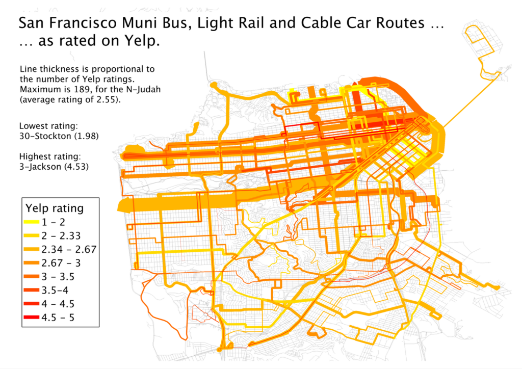
Muni Lines, as reviewed by Yelp. Click to Embiggen.
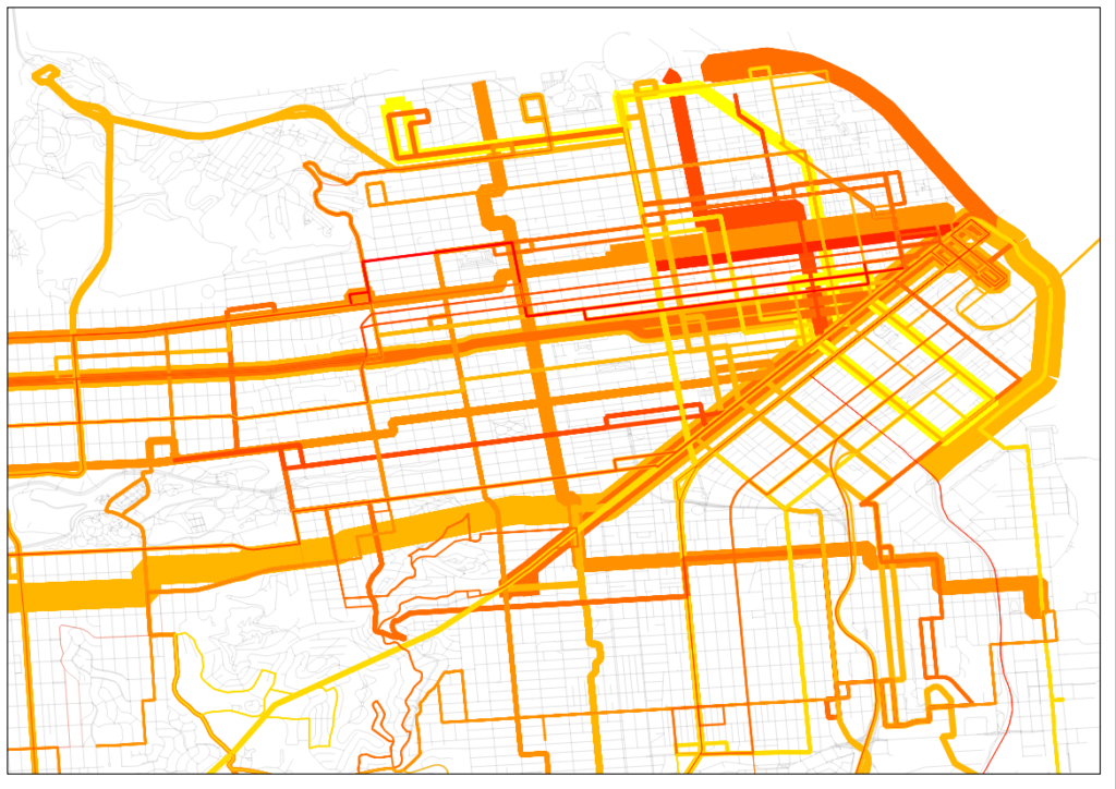
San Francisco inset. Click to embiggen.

That. Is. Sexy. The N-Judah has nearly 200 reviews. Wow. And in case the downtown area is too clustered for you, there’s an inset to the right.

I also realized that I had a pretty fun data set here, too. I went to a talk by Jarrett Walker the other day at MIT where he mentioned, amongst other things, that we should not focus on the technology used for transit, but whether if fulfills the mission of getting people from one place to another. In San Francisco, we have a jumble of buses, trolleybuses, streetcars and even cable cars and we have a pretty good way of quantifying whether they are accomplishing the job of transit. (In Boston, even though the B Line serves tens of thousands of passengers a day it manages a 1.36 Yelp rating—remarkable as the lowest possible rating is 1. None of its 34 raters give it a 4 or a 5. Still, it moves a lot of people marginally faster than they could walk.)

First, I averaged the ratings by technology type. Trolleybus route get more reviews than bus routes, probably because they are more heavily used. The average rating for these, however, is quite similar. (The average is a straight average of each line, the weighted average weighs more frequently-rated lines by the number of ratings). Cable cars and PCCs (F-Marked and Wharves) have higher ratings but many are likely by tourists. Light rail lines, however, are frequently rated, and given low ratings, significantly lower than the bus routes.
Vehicle type Routes Avg Reviews Avg Stars Weighted Avg
Bus 39 22 3.03 2.77
Trolleybus 12 41 2.95 2.79
Cable Car 3 64 3.81 3.87
PCC 1 114 3.42 3.42
Light Rail 5 65 2.31 2.43
A forthcoming post will compare local and express bus routes. (Hint: people like riding expresses more than locals.)

I am so interested in San Francisco’s Yelp bus ratings that I’ve tabled the whole of the network.

Line Vehicle Stars # Ratings Line Vehicle Stars # Ratings
1 Trolleybus 2.96 78 48 Bus 2.71 17
2 Bus 2.53 26 49 Bus 2.33 40
3 Trolleybus 4.53 17 52 Bus 2.5 8
5 Trolleybus 2.73 55 54 Bus 2.6 10
6 Trolleybus 2.88 16 66 Bus 4 1
9 Bus 2.42 26 67 Bus 3.4 5
10 Bus 3 24 71 Bus 2.56 27
12 Bus 3.33 15 108 Bus 2.5 16
14 Bus 2.55 44 01AX Bus 3.67 6
17 Bus 3.67 6 01BX Bus 3.31 13
18 Bus 3.25 16 08X Bus 2.56 18
19 Bus 2.66 41 14L Bus 4 3
21 Trolleybus 3.58 31 14X Bus 4 6
22 Trolleybus 2.74 92 28L Bus 4.33 3
23 Bus 3 9 30X Bus 3.2 35
24 Trolleybus 2.81 32 31AX Bus 3.56 9
27 Bus 2.07 28 31BX Bus 3.75 8
28 Bus 2.48 42 38AX Bus 3.71 14
29 Bus 2.5 36 38BX Bus 3.29 7
30 Trolleybus 1.98 82 38L Bus 3.44 61
31 Trolleybus 2.48 23 71L Bus 3.5 10
33 Trolleybus 3.24 33 California Cable Car 4.13 69
36 Bus 2.1 10 F PCC Streetcar 3.42 114
37 Bus 3.42 12 J Light Rail 2.49 45
38 Bus 2.45 119 KT Light Rail 2.13 23
41 Trolleybus 2.82 17 L Light Rail 2.13 38
43 Bus 2.82 28 M Light Rail 2.23 31
44 Bus 2.83 24 N Light Rail 2.55 189
45 Trolleybus 2.62 21 Powell-Hyde Cable Car 3.78 99
47 Bus 2.13 23 Powell-Mason Cable Car 3.52 25

The only lines not Yelped are the 35-Eureka and 56-Rutland. These lines have 30-minute headways (as does the 17-Parkmerced, see this route service chart with headways for all lines) while most lines in San Francisco have service every 15 minutes or better.

Next up: New York’s subways. And beyond.