If you’re anything like me, you took a look at Google Maps at some point in the past 24 hours. And if you’re anything like me, within seconds you realized that Google had made significant symbology changes to the interface. It’s enough to catch your eye, but not drastic enough to limit functionality. It took me a second to place many of the changes. And while all of their servers seem to have been updated, I have enough old screenshots saved that I can go back and find older maps and suss out some of the major changes. A quick overview of what I found for other map nerds like me:
 |
| iOS version |
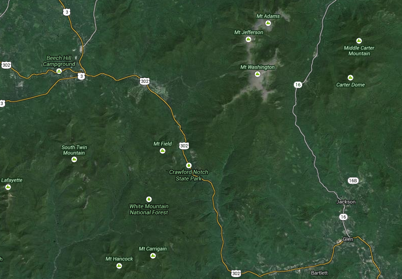
Roads:
Gone are yellow roads. Gone. The old map’s road hierarchy was:
- Minor roads: Light gray line (when zoomed out) / white line with gray border (zoomed in)
- Minor arterials: Yellow background with a darker tan border
- Highway ramps: Light orange background, darker orange border
- Highways: Orange background, and even darker borders
The new map hierarchy has changed somewhat significantly as follows:
- Minor roads have generally retained their symbology, although at some zoom levels they are a darker gray to better offset them from minor arterials.
- Minor arterials, however, are now a white background with a gray border. The only difference between the arterials and the smaller roads is in the line width—the more major roads are wider, and do not turn to single gray lines as quickly when zooming out. Yellow roads have been eliminated.
- Major arterials have a new classification of light orange. Roads with this classification include, for example, Storrow Drive and Commonwealth Avenue in Boston. It also seems that all US Highways are included in this category.
- Highway ramps are given a paler orange symbology.
- Limited access highways are given a darker symbology, and have decreased somewhat in scope, inasmuch as roads like Storrow Drive are no longer in this category.
 |
| iOS version(pardon the Spotcycle app points on the old part.) |
What this boils down to is a lot less color, especially in urban areas. While it does mean that major highways better stand out, making US Highways—a somewhat anachronistic designation since the US Highway designation was somewhat outdated in the 1960s as Interstates became the main thoroughfares—automatically a higher level in the hierarchy is a questionable decision. I’m not sure how I like the loss of the yellow roads, but it does allow built areas to slightly slip in to the background and for other features to gain more prominence.
Labels:
There have been several changes to labels, with different types of labels getting dramatically different symbology. In the past, most every label was black. Now, there are several variations:
- City, town and neighborhood names are now much lighter brown, and retain all-caps when zoomed. They blend in to the background a bit due to the color, but stand out due to the capitalization and seem a bit bolder.. There does seem to be some confusion; at least in the iOS interface some town names are still black when zoomed out.
- Road labels now echo the road type, although they have quite dark. So orange roads have dark orange labels, for instance.
- Transit station names are now a dark blue color.
- Point features are still black, lakes are still blue and parks are still green.
Area Feature Colors:
Most of the colors of features have been changed, and they are now generally more saturated colors than before. Most noticeable is the change in lakes. In the old interface, lakes were a uniform color of blue, and a rather dull blue at that. The new symbology in the browser version not on creates a more vibrant blue, but it is darker at the outside and lighter towards the center, creating almost a glowing feeling. It works well.
The colors for other features have changed as well. Most noticeably, the difference between parks and golf courses (at higher zoom levels) has been increased, with a lighter, more vibrant green for park areas.
In addition, when zoomed out, there is increased hill shading in mountainous areas; this disappears when you zoom in.
 |
Browser version(pardon the traffic on the old section; this comes from a post originally
over at Unconventional Data. Most of my screenshots have traffic, anyway.) |
Point Features:
One of the other major changes have been to point features. Some, such as rail stations, have had their color saturated. And most any feature that didn’t previously have a border has had one added. Since the background of the map is gray, not white, and the background of these circles is white, the point features stand out much more. The symbols have been somewhat simplified, which is generally good, although the park symbol—a tree—is somewhat anachronistic when used for an urban plaza. There are more categories, as well, particularly for features like restaurants and ATMs.
One issue is that these point features also show up on the satellite imagery, where the white background makes their appearance somewhat jarring.
 |
| Browser version |
Transit:
Clicking on “transit” will, in many cities, show fixed-guideway transit lines. In San Francisco, it shows all bus lines. Very cool, although coverage is limited and sporadic (i.e., there’s commuter rail in San Francisco and Chicago but not New York or Boston). GTFS transit directions still work. If you try to overlay transit over bicycling, the transit overtakes the cycling interface. So it’s not quite multimodal.
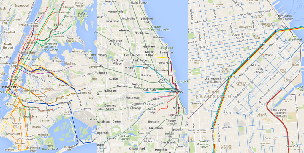 |
Browser version
New York City (Subway only), Chicago (L and Metra), San Francisco (all modes) |
Easter Eggs:
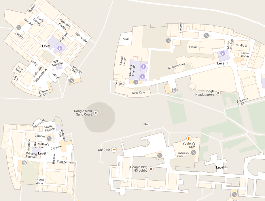
While building outlines and parcel lines haven’t been dramatically changed, some Google offices show interior detail. I guess we all get a quick peek in to that special world!
Here’s Google HQ:
Here’s the
New York office, and
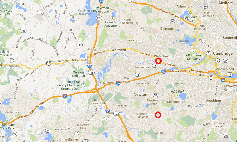
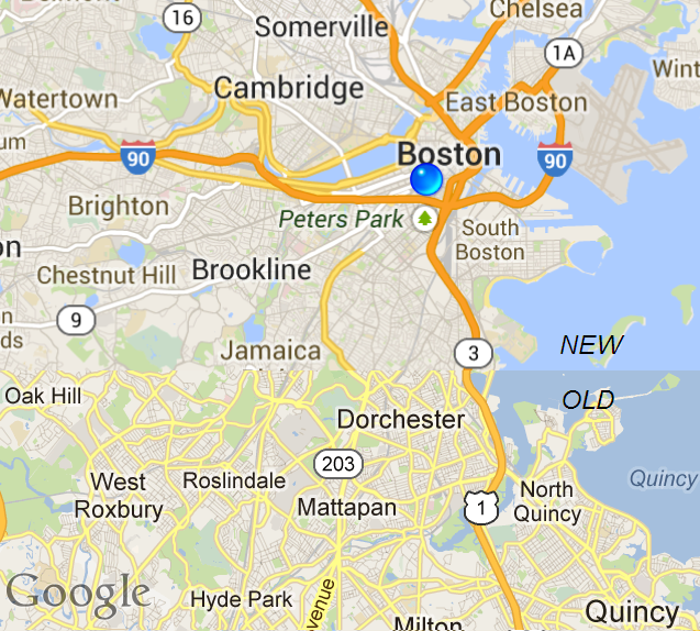
Boston. Not far away from the Mountain View HQ is the
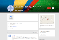
Bonnie Kitty Fake Company. Here it is on
Google Plus. I wonder if this is an easter egg, or if someone forgot to delete a test. Sadly, the number they have listed for it does not go through. Here’s a screenshot of the page for Bonnie Kitty, in case it disappears. Notice a familiar color scheme?
Welcome to Google.