
 |
| Just, yuck. |
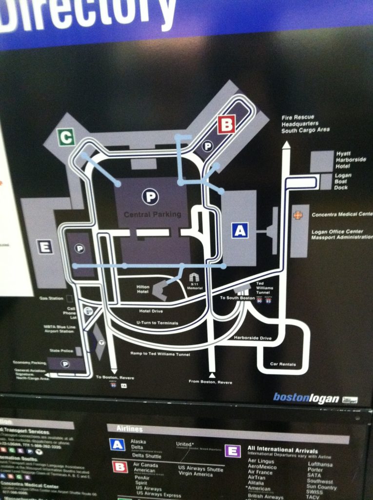
I was on the Silver Line today (mostly a failure on its own, but it does get you to the airport) and noticed what has to be one of the worst maps I’ve seen in recent memory. It’s a map of Logan Airport, located in the Silver Line platform area at South Station. It has some useful information, but it is so cluttered and so ill-presented that it might as well be in Greek. Or Swahili. It’s just a horrible representation of the information a transit traveler would need to navigate the airport.
- It’s not to scale. That’s fine, but certain parts of the map are so not-to-scale that they are misrepresentations of where features are located. For instance, did you know the Airport Blue Line station is located right next to Terminal E? Neither did I. Hey, maybe you can walk there!
- It implies that the Airport MBTA station is not in between the ramps in to and out of the airport from Route 1A. It is.
- The bus routes on the map are incomprehensible. Lines which shouldn’t cross do cross, there are no arrows showing that the system is one-way, and there are some places where lines representing bus routes just end (look above the cell phone lot, for instance). And the Massport bus makes a big sweeping loop over itself for no apparent reason.
- The color scheme is … gray, gray, gray, black and so-dark-a-blue-that-it-looks-black. But the terminals are colorful! Too bad we can’t really tell much else apart. Like the airport routes and the Silver Line.
- Terminal A is shown with its auxiliary gates, but there’s no gate detail for any other terminal. This is extraneous, and confusing; who cares what’s on the other side of security when you’re standing at South Station. Also, Terminal B isn’t shown as being two separate stops, it is just a big B in the middle of the parking. (Oh, and don’t worry, because when you get to Terminal B and don’t know which stop to get off at, there’s a chance the audio announcement will be through the whole list of airlines by the time the bus leaves the station.)
- There are way too many roads. I don’t care how roads loop around and over each other to get to Boston. Or where car rentals are. Or even where the parking garages are. If I’m in the Silver Line Station, I’m probably not driving to the airport. I know this may be a stock map of the airport, but in that case it doesn’t belong at South Station.
- The Silver Line routes to and from South Station should be labeled as such. They don’t even say “South Station”! Instead it’s labeled as “To South Boston.” That’s pretty misleading. Although not as misleading as calling the Ted I-90 and I-93. That’s just plain wrong. Again. Silver Line, not driving.
- Okay, so maybe the I-93 and I-90 belong with the “to South Boston,” as in “to 90 and 93.” But it’s not to I-90, it is I-90. It’s to I-93. In any case, there should be some differentiation between what it is and what it is to. Good lord, can it get any worse?
- And once you get to South Station, what line to you transfer to? Beats the hell out of me. God forbid they put in something about the Red Line.
- In fact, the only time a T logo appears on the map is down at the Blue Line Station. Is there anything about that being the Blue Line? Nope. There’s some text off in the corner but this is a schematic map. Oh and the label for the station? About half way across the map. But if you were at South Station, you might see the T, and wonder if you’d wind up there after your trip. Negative.
- Can you walk indoors from Terminal C to Terminal E? I have no idea. And this map doesn’t really make it seem one way or the other. Or let you know that you can take a sidewalk between these terminals.
- The blue lines showing elevated, inter-terminal walkways are one of the better features of this map. However, even here the symbology is not consistent. Sometimes they end in blue circles. Sometimes the line just ends. Sometimes the line ends in the middle of a parking facility (Terminal E) with no cue as to whether you can get to the terminal, where the skyway actually extends (and if you ever miss a Silver Line bus by a hair at Terminal A, you can hustle across to Terminal C or E faster than the bus can round the airport). This is a complete graphic design fiasco!
- I’m not even going get started on what is going on with the road through Central Parking.
- It’s all well and good that the South Cargo Area is shown on the map, but I’m not sure how pertinent that is for anyone at South Station.
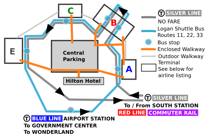
UPDATE: Posted a new/better map here.
(As for Logan, a hodgepodge of terminals that makes little sense and is generally added to with little plan for the future, it should be added to Dave Barry’s list of airports that should be “renovated with nuclear weapons”. Although, thanks to the new tunnel, it is now easier to get to from downtown Boston than Colorado, which was not necessarily the case in 1999.)