
This past summer, I took a post from Alon Levy and charted out the ridership for New York’s commuter lines, and then built on that to chart the average speeds from various stations for the MBTA. (10 points if you’ve followed along so far.)
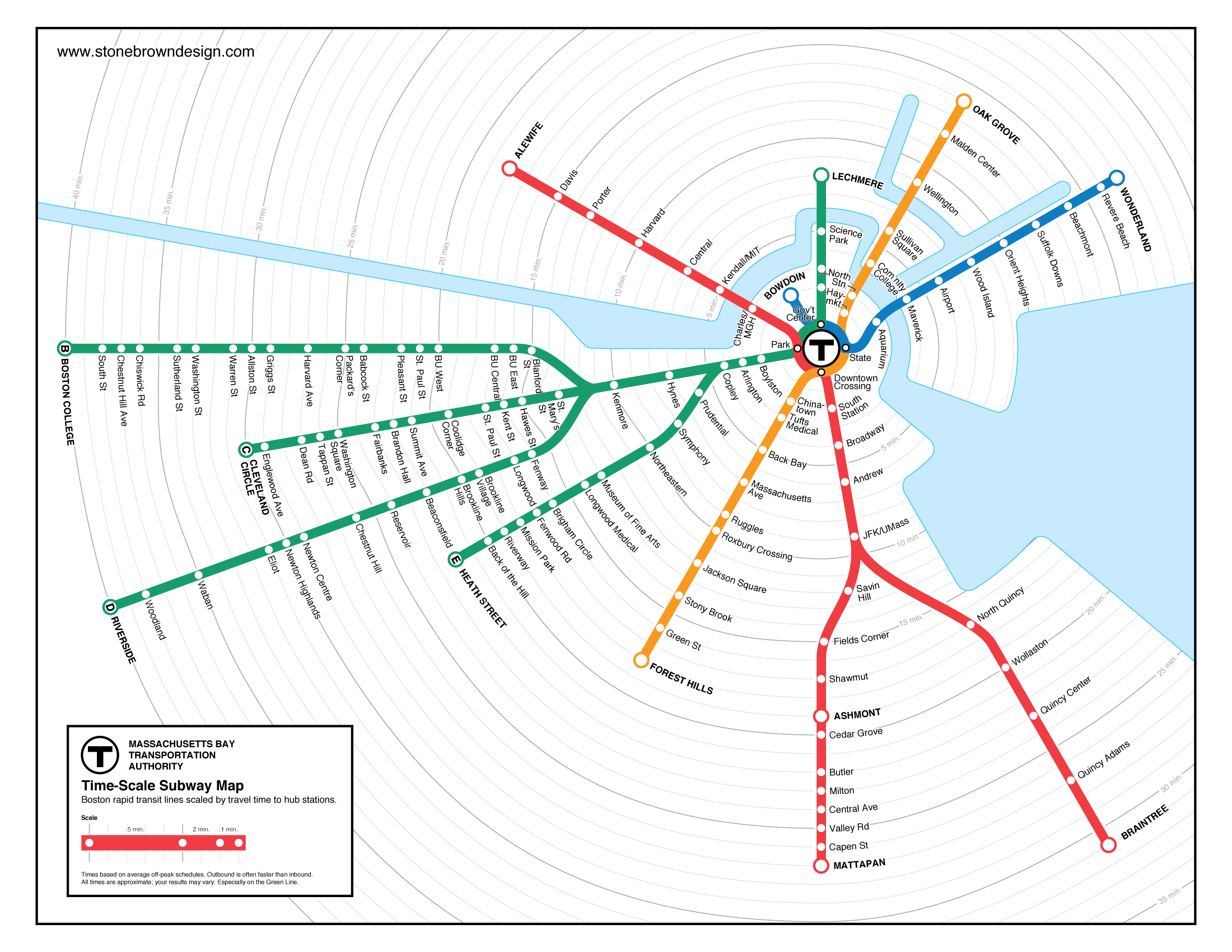
The next logical step, of course, was to map these. And someone has. Peter Dunn has mapped both the MBTA transit services and the commuter rail based on time. (His other maps are equally cool, I particularly like the ones of state highway shields and the Appalachian Trail.) The transit map (here’s the full scale version) is particularly useful in figuring out, visually, how far it is between different stations. Good stuff!
A minor quibble: he used Google trip finder to get the times between stations, although this time varies by time of day. For the Commuter Rail, thanks to express trains, there are several instances where the trip time from the last station before an express run (Natick, South Acton and Salem are examples) is actually faster than the next-closest station that doesn’t have express runs. This is a bit harder to show in these maps.
For transit, the T’s schedule is something of a junk show. What would be interesting is looking at how the transit maps change based on the time of day. The MBTA’s Blue Book (large PDF) has the scheduled run times for transit services at different times of day (see chapter 2, pages 13, 20, 24 and 28). There seem to be two factors which impact run time. One is that on lines with multiple branches (the Red and Green lines) there are more delays at junctions when trains are more frequent. The other is that, for all lines, dwell times increase when there are more passengers boarding and alighting the trains.
These differences vary between lines, but one stands out. Here are the longest and shortest run times for each line, with the range of average speeds:
Time Range
(min)Speed Range
(mph)Blue 18 – 23 15.5 – 19.8 Green (B) 33 – 53 7.4 – 12 Green (C) 23 – 42 8.3 – 15.1 Green (D) 34 – 46 16.3 – 21.6 Green (E) 25 – 35 8.8 – 12.3 Orange 32 – 36 18.5 – 20.1 Red (Ashmont) 35 – 42 16.7 – 20 Red (Braintree) 46 – 55 19.2 – 23
Notice anything? The slowest speeds are, of course, on the Green Line, although the grade-separated D Line attains speeds which match the other heavy rail lines (even while it has to traverse the painfully slow Central Subway). But even the Green Line has much more variability than it’s heavy rail counterparts. Why? Assuredly, a lot of it has to do with the lack of all-door boarding and on-board fare collection.
It would be interesting to compare two of Dunn’s maps, one showing the best case scenario for each line, and one (perhaps when moused-over) showing the worst case. In any case, good stuff.
Somehow the time map shows that it takes 2 whole minutes to go from Back of the Hill to Heath Street. How is that possible?