Big Car Sharing News

You may remember that I am interested in car sharing. You may also remember that I stated that I didn’t think car sharing was a good investment. You are going to hear a lot about Zipcar being bought by Avis today. This may be a mutually beneficial agreement: Avis gets in to the hot car-sharing market, and gets to leverage its much larger business for Zipcar’s benefit. (I’m assuming it will be run as a separate brand; they stand to lose a lot of cache, especially in competitive markets, if they drop the successful Zipcar marketing.)

But as for the investment piece: yes, investors are getting a 50% premium on the current stock price (ZIP), and almost double the recent lows it hit this year. It’s also 2/3 the price of the IPO a year ago, and less than half of the post-IPO heights Zipcar realized in 2011. So anyone who got excited about Zipcar and bought stock at the IPO price or above is going to take a haircut. And Avis Budget (CAR) doesn’t appear to be a major growth property.

This sale doesn’t mean that car sharing is mature, but that it is growing. Independent CSOs will continue to have a foothold  in several cities, competing with Zipcar and keeping prices down in those markets (see, in particular, Chicago and San Francisco in the US, Toronto and Vancouver in Canada; and then there’s Montreal where Communauto is such a force that Zipcar has steered clear). It will be interesting to watch this market continue to evolve.

I love responsive government!

My commute home is almost entirely in bike lanes on Commonwealth and Massachusetts Avenues. Both are decent bicycle facilities on busy roads, but the Comm Av lane is rather unique in that it is a left-side lane. It’s very nice in that there are no issues with open car doors, and it runs alongside the Comm Ave median, so there are no pedestrians nearby. This facility was studied extensively: Google has a lot of information on it; the first five links here are a good primer.

(In the long run, this might work very well as a raised, separated and wider bike lane along the Comm Ave median would be a further improvement, which could be made eight feet wide by taking a foot from the median and a foot from each of the 11-foot travel lanes, which could be narrower since Comm Ave is closed to trucks and buses.)

There are even bike boxes, so that bicyclists traveling on the left and wishing to turn right can cross in front of stopped traffic without impeding the crosswalks. It’s quite nice. All of the roads are one-way, so when you’re biking the street there are only four crossings in each direction where you have to worry about any cars turning in front of you from the left-hand travel lane across your travel path.

However, at those four locations, turning traffic can be dicey or dangerous. The left-hand lane is the first of its kind in the area, so drivers are not accustomed to how to behave. And state law is not particularly applicable, as bike lanes are defined as lanes and the driving manual states that you must  “turn from the lane closest to the lane you want to enter” while the statute tells you to be as close to the curb as practicable. And a bike lane is defined as a lane. So drivers might be supposed to signal, merge safely in to the bike lane and make their turn, rather than passing a cyclist and abruptly hooking in front of them. But cars don’t do that, and no one really knows what drivers should do. And that’s for right turns—no one has ever seen a left turn, which exists at less than a dozen locations on Comm Ave anyway.

Common sense dictates that a driver should, if they are going to make a turn, yield to cyclists if they are present, letting them cross the intersection and then make the turn. Which would be fine, but I’ve had multiple occasions of left-hook turns in front of me in the lane, causing me to have to slam on my brakes and nearly hit the vehicle. All of these cars had passed me and not noticed or not cared. I chased down and chastised two of these (it wasn’t much of chase; they encounter a red light in the Comm Av median) and both—one a civilian and one a taxicab—said I didn’t have right-of-way.

So I wrote to the city. “These are great lanes,” I wrote, “but at these intersections we should have signs telling motorists to yield to bicyclists on turns. I copied the bicycle coordinator (Nicole Freedman has moved on to white pastures) on an email to the Taxi police. The last time I’d sent an email about a dangerous road, the pothole was filled. But I didn’t expect much.

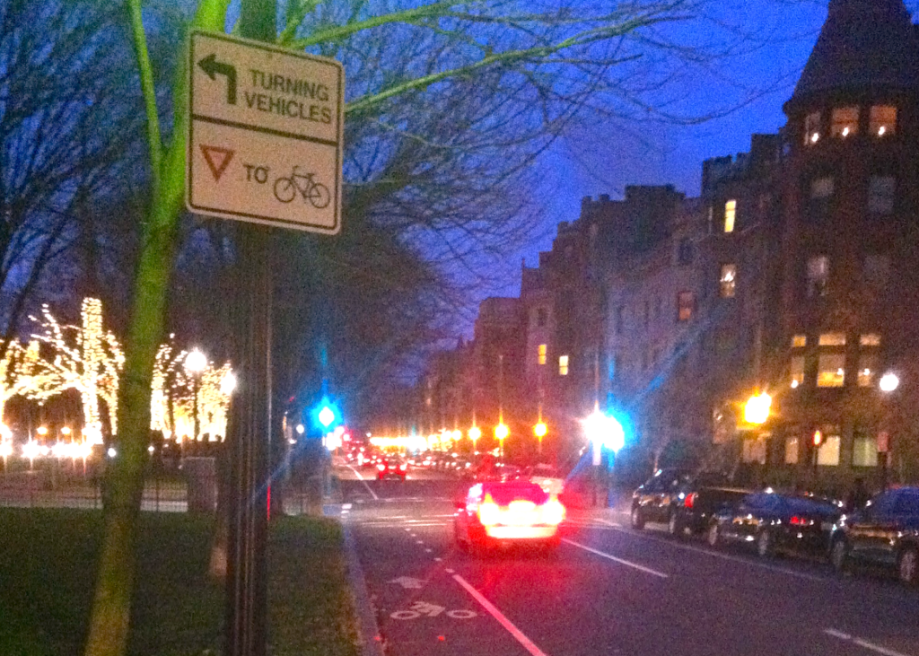
Until I was riding today and noticed the signs.

WOW. That’s perfect. I have no idea if it’s thanks to my email, but it gets the point across. It’s not foolproof, but it certainly lets vehicles know that they do not have right-of-way, and should think twice before cutting in front of a cyclist.

I’m impressed, Boston Bikes.

Quick note on the sign picture. I tried taking it with my phone with the flash on, and the reflectivity washed the sign out. I tried taking it without, and it was dark. So, finally, I used the headlights of the passing vehicles to get the right exposure, and it came out, well, good enough.

Leveraging Massport money to support overnight transit in Boston

Like clockwork, talk about overnight transit has bubbled up to the surface in Boston again. No one is arguing they run the trains overnight on 100-plus year infrastructure. The list of cities that do that in the US is New York, a couple lines in Chicago and PATCO in Philly. But most major transit cities provide some sort of overnight service on at least a few major routes (such as Philly, San Francisco, Chicago, LA, Seattle, Twin Cities, Miami and others, for example, but not DC, although trains do run until 3 a.m. on Friday and Saturday nights). And most have at least some bus service past 1 a.m.
When night comes to Boston, buses wait for the last train to reach transfer stations, and then the system shuts down. Cold. A couple of routes run by 3:30, but it’s not until 5 that the system comes back to life.
I’ve thought a lot about late-night transit service in Boston. Night Owl was useful but it provided service to the wrong constituency, and we were basically subsidizing getting drunk college kids home on weekend nights (a laudable goal if they’d otherwise be driving, but many would probably otherwise take cabs or stumbling or not going as far from home in the first place). Ed Glaeser wrote about how it is helpful to the city a couple years ago.
The way to think about this, I think, is to look at what groups require late-night service first and figure out how best to provide that. The second step is to figure out who pays for it, and it might not have to be the MBTA.
So, the groups that require late-night transit include:
  • Nightlife patrons
  • Late night / early morning employees
  • Late night / early morning travelers
The Night Owl buses were designed to serve almost solely the first group. When the service didn’t pay for itself (since MBTA contract pays double-time after midnight, costs skyrocket), it looked like hardworking ridership and taxpayers were subsidizing students and twenty-somethings and their hard-drinking habits. This is not good politics, especially since the service was only provided on Friday and Saturday nights. Sure, it added incrementally to the city’s nightlife accessibility, but it cost the T a lot and didn’t serve any constituents which really needed to be served.
A politically expedient and lasting service would have to serve the two other groups, namely, people who are trying to get places in the middle of the night and who aren’t just too drunk to drive. There are two main groups here, and as it would happen they have rather complementary travel patterns: overnight workers and late-arriving and early-departing travelers. And this creates an interesting funding mechanism: a lot of these folks are trying to get to or from the airport. In other words, make Massport pay for it.
Why Massport? They have the need, and they have the money. Right now, Massport buses hundreds of workers from an off-site garage in Chelsea to the airport, 24 hours a day. Parking at the airport is frozen by statute so in order to keep inventory available, Massport raises rates. Parking is the cash cow for the agency, and both supply and demand are inelastic and limited (demand because business travelers fill many of the spaces and are more than willing to pay for—or expense—the cost no matter how high) higher rates lead to proportionally higher revenues. Even with higher rates, parking is frequently full.
So, when parking rates when up by $3 a day recently, it netted the agency a cool $10 million. A year. Part of that has gone to reducing the prices for Logan Express, and part of it to free rides on the Silver Line (this speeds boarding, too—although it does little to speed the ride).
Let’s go back to our constituencies. First, overnight employees. There are overnight employees across the city, but with Boston’s parochial climate, there are not too many at bars, clubs and all-night businesses. There are, however, a lot at the airport. Flights arrive at Logan until 12:30 a.m., and those flights need ground personnel, baggage handlers and other staff to unload. And those people need to get home. The could take a bus to Chelsea and drive home from the garage; many likely do just that, as the last Silver Line bus to make connections to downtown leaves at 12:25. Plus, if flights are delayed, they are as well, so some transit options would be helpful.
Hand-in-hand with these workers are late-night plane arrivals. Now, it could be argued that these travelers should know there is no transit available to them and arrange for a ride or take a taxicab. But this all breaks down with any delay: there are no cabs at the airport after 1 a.m. It is much more lucrative for a taxi to pick up fares between Back Bay and Cambridge and Brighton than deadhead through the tunnel with no promise of a fare and a stiff toll whether they have a passenger or not. I’ve arrived on a delayed flight and the cab line at 3:00 was 45 minutes long. I actually thought about crashing in the terminal until the first buses started running at 5:30.
At the very least, the Silver Line—or a Massport shuttle to South Station—should run all night. It’s a little easier to get a cab at South Station, anyway.
The second half of the overnight constituency is larger and perhaps more important. Since Boston is not a hub airport, many flights leave early in the morning to get to Chicago, Atlanta, Newark and other cities where passengers make connections elsewhere. The first flights leave at 5:30, and Logan runs a full flight schedule by 6:00 a.m. That happens to be the earliest a you can make a connection to the Blue or Silver Line from any other transit line on the system. So unless you’re leaving after 7:00, you’re out of luck taking transit to the airport.
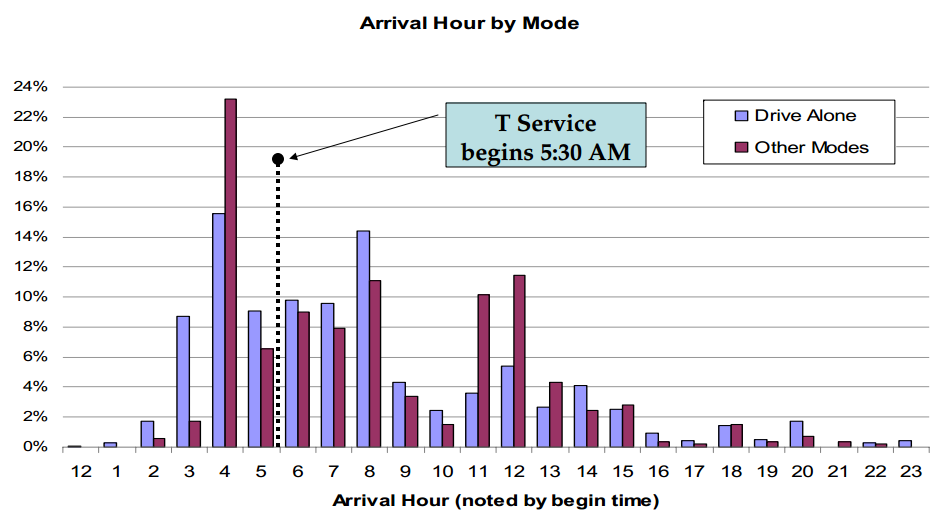
More importantly, 6:00 flights mean 5:00 check-ins—and with post-9/11 security, 4-something arrivals. This means that everyone in the airport, from gate agents and ground crew to TSA staff to flight attendants and pilots, has to be fully-staffed no later than 5:00. To the right is, from a Massport PDF, the arrival times for Logan employees. Two thirds arrive by private auto, and the peak arrival time is between 4 and 5 a.m., well before transit service commences.
Massport already runs early-a.m. bus service. Logan Express buses, frequently used by employees, leave terminals at 3:00 and, with no traffic, arrive more than early enough for early-arriving staff and passengers. These buses serve suburban park-and-rides; there’s no similar service for anyone who lives inside the 128 corridor (with a couple of minor exceptions). In other words, there’s better early morning transit from the suburbs to the airport than anywhere in the city.
The MBTA actually runs very limited early-morning service as well. The MBTA’s route 171 runs at 3:50 and 4:20 from Dudley Station to the airport, arriving by 4:15 as a through route the 15, and it and the 32/39, 57 and 89 have early morning runs to Haymarket and a connection via the 117 to the airport. This is all nice, even though these routes are all but hidden from the general public, although the 194 has found its way on to Yelp (more on Yelp transit maps).
Anyway, what I’m trying to point out here is that there is some ridership need, some money, and some routes already in place. Massport wouldn’t run in to Pacheco issues (an arcane, if well-intentioned, law regarding operation of public services by private corporations), and likely wouldn’t run in to the pay-scale issues the MBTA runs in to. Marketing service as serving overnight workers and travelers (there are some intercity buses and trains which arrive at South Station after the T stops running) rather than drunk college kids will be more palatable. And the taxi lobby, which might object to the T/Massport nudging in to their drunk college kid business, might be happy for them to deliver passengers downtown from the airport where they can get rides home.
So, here’s a rough idea of what I’d propose, in order of priority and/or implementation:

  1. Run shuttles 24 hours a day from South Station to the airport. This can take the form of the Silver Line from 5:30 a.m. to 12:30 a.m., and then a Massport shuttle every 15 or 30 minutes overnight. In the overnight hours, the bus could stop at surface level outside South Station and skip the Silver Line tunnel, running express to and from the airport.
  2. Run Logan Express buses every hour overnight to and from termini. Right now the earliest bus leaves for the airport at 3:00 a.m. and the last leaves Logan after 1 a.m. There’s already minimal layover at the termini.
  3. Incorporate overnight Logan Express buses with strategically-places transit stations. For instance, have the Peabody bus stop at Wonderland, the Woburn bus stop at Wellington, Malden and/or Alewife, the Framingham bus stop at Riverside and the Braintree bus stop at JFK/UMass. This would allow commuters near those stations to take Logan express during the non-MBTA hours, and the MBTA at the other end of their shift.
  4. Have Massport buses take over for early-morning MBTA service, or integrate this service with South Station shuttles.
  5. Integrate Massport buses serving transit nodes throughout the MBTA area with the South Station Shuttle. For instance, run Silver Line-sized buses to South Station every 30 minutes, and then have a transfer point there for buses to imperfectly trace major transit corridors. I say imperfectly because such a service needs only to travel near transit stations, not to them, allowing them to take straighter, faster lines. I’d propose the following routes, trying to serve major park-and-rides transit stations and Logan Express lots:
    • Red Line South serving JFK/UMass, Ashmont, Quincy Center, Braintree
    • Orange Line South serving Orange Line Stations and the Green Line E branch via Huntington Avenue, Tremont Street and Columbus Avenue, with a possible extension to the Route 128 Park-and-Ride. (Another option here would be to trace the route of the old Orange Line Elevated down Washington Street through Dudley and integrate the E Line with the B, C and D ines by running it down Huntington and then up to Audubon Circle)
    • Green Line (B, C and D) via Beacon Street, Route 9 to Riverside, with an overnight extension to the Framingham Logan Express.
    • Red Line North via Mass Ave to Alewife.
    • Orange Line North Malden or Oak Grove, then up 93 to Woburn.
    • Blue Line to Peabody via Wonderland and Lynn.
Here’s a crude Google Map:

These lines could run every hour (and perhaps half-hour on Friday and Saturday nights), meeting shuttles at South Station from the airport. There could be full interchanges there, and possibly a secondary transfer point at Kenmore Square between the Red Line North, Green Line and Orange Line South lines. The system wouldn’t perfectly serve late-night bar-goers, but it wouldn’t be designed to; the fact that it would be nearby would be an ancillary benefit to their mobility. This route structure specifically leaves out Allston, for instance, where bar patrons would have the option of walking (stumbling?) less than a mile to Beacon Street or taking a taxicab and having fewer drunk-and-disruptive passengers in the system.
Assuming $125 per vehicle hour, you’d probably need two vehicles per route for hourly headways. That’s $250 per hour per route, or $1500 per hour, or $7500 per night, plus a South Station-Logan shuttle, so $8000. Operating this daily would cost $3 million per year, which could be fully funded by a $1 increase in parking at the airport. Then there are savings from running fewer Logan Express buses (with early and late departures handled by this service), fewer MBTA buses, and recouping some costs from fares. At $5 for a flat fare you could reasonably expect 200 riders—or $1000 per night.
So, Massport, can we get this to happen?

Failures in mapping

Just, yuck.

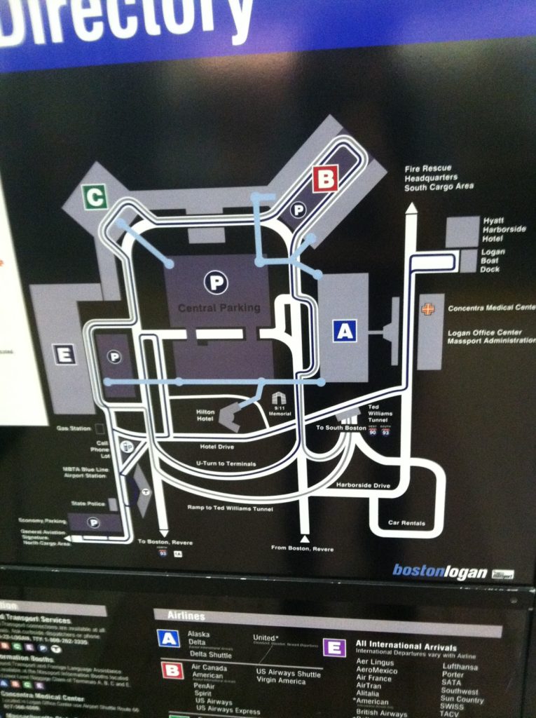
I was on the Silver Line today (mostly a failure on its own, but it does get you to the airport) and noticed what has to be one of the worst maps I’ve seen in recent memory. It’s a map of Logan Airport, located in the Silver Line platform area at South Station. It has some useful information, but it is so cluttered and so ill-presented that it might as well be in Greek. Or Swahili. It’s just a horrible representation of the information a transit traveler would need to navigate the airport.

  • It’s not to scale. That’s fine, but certain parts of the map are so not-to-scale that they are misrepresentations of where features are located. For instance, did you know the Airport Blue Line station is located right next to Terminal E? Neither did I. Hey, maybe you can walk there!
  • It implies that the Airport MBTA station is not in between the ramps in to and out of the airport from Route 1A. It is.
  • The bus routes on the map are incomprehensible. Lines which shouldn’t cross do cross, there are no arrows showing that the system is one-way, and there are some places where lines representing bus routes just end (look above the cell phone lot, for instance). And the Massport bus makes a big sweeping loop over itself for no apparent reason.
  • The color scheme is … gray, gray, gray, black and so-dark-a-blue-that-it-looks-black. But the terminals are colorful! Too bad we can’t really tell much else apart. Like the airport routes and the Silver Line.
  • Terminal A is shown with its auxiliary gates, but there’s no gate detail for any other terminal. This is extraneous, and confusing; who cares what’s on the other side of security when you’re standing at South Station. Also, Terminal B isn’t shown as being two separate stops, it is just a big B in the middle of the parking. (Oh, and don’t worry, because when you get to Terminal B and don’t know which stop to get off at, there’s a chance the audio announcement will be through the whole list of airlines by the time the bus leaves the station.)
  • There are way too many roads. I don’t care how roads loop around and over each other to get to Boston. Or where car rentals are. Or even where the parking garages are. If I’m in the Silver Line Station, I’m probably not driving to the airport. I know this may be a stock map of the airport, but in that case it doesn’t belong at South Station.
  • The Silver Line routes to and from South Station should be labeled as such. They don’t even say “South Station”! Instead it’s labeled as “To South Boston.” That’s pretty misleading. Although not as misleading as calling the Ted I-90 and I-93. That’s just plain wrong. Again. Silver Line, not driving.
  • Okay, so maybe the I-93 and I-90 belong with the “to South Boston,” as in “to 90 and 93.” But it’s not to I-90, it is I-90. It’s to I-93. In any case, there should be some differentiation between what it is and what it is to. Good lord, can it get any worse?
  • And once you get to South Station, what line to you transfer to? Beats the hell out of me. God forbid they put in something about the Red Line.
  • In fact, the only time a T logo appears on the map is down at the Blue Line Station. Is there anything about that being the Blue Line? Nope. There’s some text off in the corner but this is a schematic map. Oh and the label for the station? About half way across the map. But if you were at South Station, you might see the T, and wonder if you’d wind up there after your trip. Negative.
  • Can you walk indoors from Terminal C to Terminal E? I have no idea. And this map doesn’t really make it seem one way or the other. Or let you know that you can take a sidewalk between these terminals.
  • The blue lines showing elevated, inter-terminal walkways are one of the better features of this map. However, even here the symbology is not consistent. Sometimes they end in blue circles. Sometimes the line just ends. Sometimes the line ends in the middle of a parking facility (Terminal E) with no cue as to whether you can get to the terminal, where the skyway actually extends (and if you ever miss a Silver Line bus by a hair at Terminal A, you can hustle across to Terminal C or E faster than the bus can round the airport). This is a complete graphic design fiasco!
  • I’m not even going get started on what is going on with the road through Central Parking.
  • It’s all well and good that the South Cargo Area is shown on the map, but I’m not sure how pertinent that is for anyone at South Station.
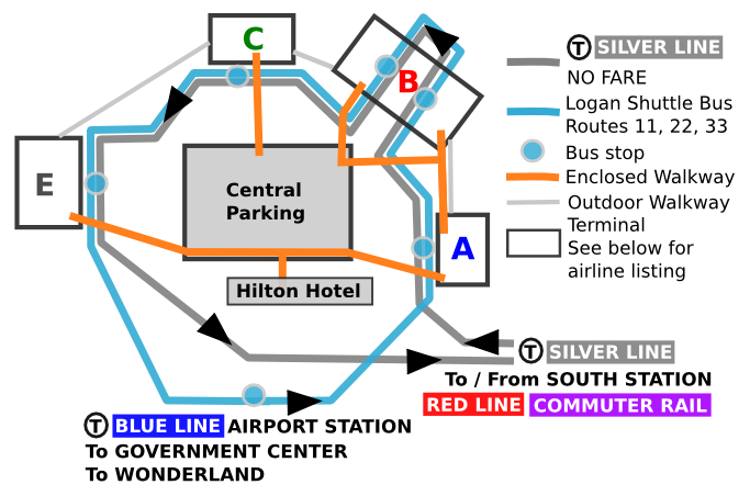
Now, I’m no graphic designer (see my Hubway data viz if you want proof of this) but in an hour on a airplane I sketched up with a better and more useful map than this. (It’s pretty bad, but not this horrible.)
Perfect? Hardly. But it is superior in every way to the photo above. It drops a lot of extraneous information, but adds in things that make it a lot more useful. Now, Massport, which is swimming in money from parking fees, should design something at least this useful on their own.

UPDATE: Posted a new/better map here.

In other words, #fail.

(As for Logan, a hodgepodge of terminals that makes little sense and is generally added to with little plan for the future, it should be added to Dave Barry’s list of airports that should be “renovated with nuclear weapons”. Although, thanks to the new tunnel, it is now easier to get to from downtown Boston than Colorado, which was not necessarily the case in 1999.)

“No Headphones While Driving” goes for bikes, but moreso

Driving around Massachusetts today, I noticed some of the variable message boards—you know, the ones which usually flash YOU BOOZE, YOU CRUISE, YOU LOSE and infrequently tell you about traffic conditions were proffering a message near and dear to my heart.

NO HEADPHONES WHEN DRIVING. ONE EARBUD ON PHONE OKAY.

This is important. Just because we’ve said that hands-free driving is okay (Is it as safe as undistracted driving? probably not, but a conversation can be a good way to stay awake and alert, I’ve found.) doesn’t mean that you can rock out to your tunes on your headphones. That’s a primary offense and can get you a citation. And, jesus, people, haven’t you ever heard of a stereo? Or are your earbuds that good?

But here’s my message to whoever will listen (we’ll file these under Ari’s Friendly-if-Somewhat-Passive-Aggressive Helpful Hints to Cyclists, along with “For fuck’s sake, wear a helmet!” and “You’re riding the wrong way down JFK Street in Harvard Square in rush hour? Seriously?”): Wearing headphones on a bike is ridiculously dumb, and it’s against the law, too. When you’re in a car, what you’re listening for are sirens, car horns and, well that’s about it, everything else gets drowned out by car noise.

When you’re on a bike, you have a lot more potential to use audio cues. I’ve found that I actually can get more information as to the presence of vehicles by listening than a quick glance over my shoulder. I’ve heard other cyclists overtaking me (this happens more often on Hubway bikes than it does on real wheels), I’ve heard cars starting, I’ve heard any number of cues which affected how I cycled. And if I’d had earphones in, I would have heard none of it.

Yet so often I see people riding with earphones in. I sort-of-kind-of understand this in two situations. First, if you are a professional cyclists and your coach is telling you things in a race. Still, you don’t have two. Second, and this is the sort-of-kind-of, if you’re on a segregated bicycle facility (bike path) and there aren’t many other users and you’re going faster than them. But if that’s the case, just deal with listening to nature for a few minutes.

And a quick note: if you’re riding a fixed gear bike with no brakes, at night, not wearing a helmet, wearing earbuds without anything reflective and with no lights, only about half the things (brakes, lights, reflective) are illegal. But THEY’RE ALL STUPID. Colin Reuter made some similar points a few years back, so go read that.

Yelp Transit Maps

Yelp-rated routes in Boston. Click to embiggen.

I noticed a while ago—as did some other folks—that Yelp users have been, for some time, rating transit lines. I was intrigued. Here was really interesting data about how people felt about different transit lines, distilled in to a simple 1-to-5 rating. While not every line was ranked in Boston (my first search) there were plenty that were, and I compiled a list of routes, star-ratings and the number of Yelps.

In Boston, only some routes were rated, and they were, not surprisingly, centered in the more student- and hipster-centric part of the city. For instance, no bus line in Dorchester or Mattapan got Yelped, but most in Cambridge and Somerville have many reviews. I figured the best way to show these data was on a map, and after some machinations (especially in resorting the shapefile so the thinner lines would display on top of the thicker ones) I got the map above. It’s pretty cool—click it to enlarge. (Here’s the full MBTA system map if you’re not familiar with the lines; I left off route numbers for clarity.)

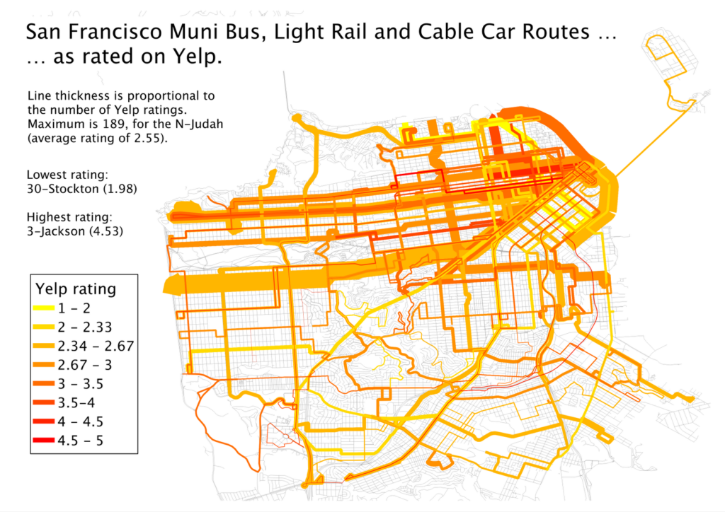
But I realized that pretty cool wasn’t cool enough. There was probably a much richer data set out there. Boston has about 750 Yelp reviews, 450 of those for rail lines. Was there city with a wired-in community, lots of bus and transit routes, and high transit ridership? Did I just describe San Francisco to a T? And, voila, there are nearly 2000 Yelp reviews of transit lines in San Francisco, at least one (and usually many more) for nearly every line Muni runs (see exceptions below). (Here’s the Muni system map.)

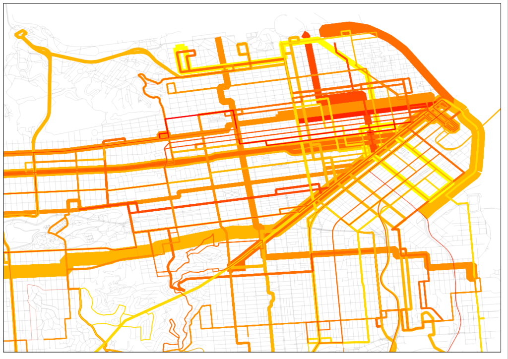
Muni Lines, as reviewed by Yelp. Click to Embiggen.
San Francisco inset. Click to embiggen.

That. Is. Sexy. The N-Judah has nearly 200 reviews. Wow. And in case the downtown area is too clustered for you, there’s an inset to the right.

I also realized that I had a pretty fun data set here, too. I went to a talk by Jarrett Walker the other day at MIT where he mentioned, amongst other things, that we should not focus on the technology used for transit, but whether if fulfills the mission of getting people from one place to another. In San Francisco, we have a jumble of buses, trolleybuses, streetcars and even cable cars and we have a pretty good way of quantifying whether they are accomplishing the job of transit. (In Boston, even though the B Line serves tens of thousands of passengers a day it manages a 1.36 Yelp rating—remarkable as the lowest possible rating is 1. None of its 34 raters give it a 4 or a 5. Still, it moves a lot of people marginally faster than they could walk.)

First, I averaged the ratings by technology type. Trolleybus route get more reviews than bus routes, probably because they are more heavily used. The average rating for these, however, is quite similar. (The average is a straight average of each line, the weighted average weighs more frequently-rated lines by the number of ratings). Cable cars and PCCs (F-Marked and Wharves) have higher ratings but many are likely by tourists. Light rail lines, however, are frequently rated, and given low ratings, significantly lower than the bus routes.
Vehicle type Routes Avg Reviews Avg Stars Weighted Avg
Bus 39 22 3.03 2.77
Trolleybus 12 41 2.95 2.79
Cable Car 3 64 3.81 3.87
PCC 1 114 3.42 3.42
Light Rail 5 65 2.31 2.43
A forthcoming post will compare local and express bus routes. (Hint: people like riding expresses more than locals.)

I am so interested in San Francisco’s Yelp bus ratings that I’ve tabled the whole of the network.

Line Vehicle Stars # Ratings Line Vehicle Stars # Ratings
1 Trolleybus 2.96 78 48 Bus 2.71 17
2 Bus 2.53 26 49 Bus 2.33 40
3 Trolleybus 4.53 17 52 Bus 2.5 8
5 Trolleybus 2.73 55 54 Bus 2.6 10
6 Trolleybus 2.88 16 66 Bus 4 1
9 Bus 2.42 26 67 Bus 3.4 5
10 Bus 3 24 71 Bus 2.56 27
12 Bus 3.33 15 108 Bus 2.5 16
14 Bus 2.55 44 01AX Bus 3.67 6
17 Bus 3.67 6 01BX Bus 3.31 13
18 Bus 3.25 16 08X Bus 2.56 18
19 Bus 2.66 41 14L Bus 4 3
21 Trolleybus 3.58 31 14X Bus 4 6
22 Trolleybus 2.74 92 28L Bus 4.33 3
23 Bus 3 9 30X Bus 3.2 35
24 Trolleybus 2.81 32 31AX Bus 3.56 9
27 Bus 2.07 28 31BX Bus 3.75 8
28 Bus 2.48 42 38AX Bus 3.71 14
29 Bus 2.5 36 38BX Bus 3.29 7
30 Trolleybus 1.98 82 38L Bus 3.44 61
31 Trolleybus 2.48 23 71L Bus 3.5 10
33 Trolleybus 3.24 33 California Cable Car 4.13 69
36 Bus 2.1 10 F PCC Streetcar 3.42 114
37 Bus 3.42 12 J Light Rail 2.49 45
38 Bus 2.45 119 KT Light Rail 2.13 23
41 Trolleybus 2.82 17 L Light Rail 2.13 38
43 Bus 2.82 28 M Light Rail 2.23 31
44 Bus 2.83 24 N Light Rail 2.55 189
45 Trolleybus 2.62 21 Powell-Hyde Cable Car 3.78 99
47 Bus 2.13 23 Powell-Mason Cable Car 3.52 25

The only lines not Yelped are the 35-Eureka and 56-Rutland. These lines have 30-minute headways (as does the 17-Parkmerced, see this route service chart with headways for all lines) while most lines in San Francisco have service every 15 minutes or better.

Next up: New York’s subways. And beyond.

Philly vs Melbourne

A quick follow-on to my previous post on clock face scheduling. I mentioned the commuter rail system in Melbourne, Australia. It’s being rebranded as a Metro system with service levels to match. Even the longest branch line has midday service at least every 30 minutes, and most of the system has service every 20, 15 or 10 minutes, with clock face scheduling at all times.

Melbourne has 231 miles of electrified route, and serves about 700,000 passengers daily. That’s more than any commuter rail system in the US outside New York City (where three systems combine with about a million riders), more than double Chicago (a city with a population more than double Melbourne) and five times the ridership of Philadelphia and Boston.

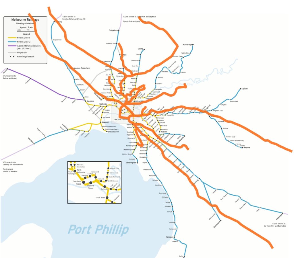
The Melbourne rail map, with the Philadelphia Regional Rail lines
flipped, rotated and overlaid (in red). Center City Philadelphia is centered
on the Melbourne CBD. In this map, the NEC runs northwest-southeast
and the Main Line runs east-southeast. Finding GIS data for Philadelphia
was simple, finding it for Melbourne’s rail lines much harder. Also note:
Purple lines on the Melbourne map are not electrified and thus not
counted in the track mileage here; Philly’s non-electric line, namely
the NJT-operated Atlantic City Line, is not shown.

Why compare Melbourne and Philadelphia? Both operate almost solely electric trains. They have nearly the same track length (about 221 miles for Philadelphia; Boston has almost double the track length with not much more ridership). And, most importantly, both linked two separate commuter systems with downtown tunnels in the 1970s and 1980s to improve efficiency in their systems.

Now, while it’s not apples to apples, it’s not apples to oranges. Both systems have about 1 million daily riders on their non-regional rail systems (270m in Melbourne, 290m in Philadelphia). Melbourne lacks any heavy rail subway, but has an extensive tram network; Philadelphia has heavy rail, light rail, streetcars and buses, with the buses carrying slightly more than half the load. Both cities have populations in the neighborhood of 5 million. Melbourne is much more isolated (Philly is less than two hours from New York, Baltimore and DC, Melbourne is that far from Geelong, Bendigo and Ballarat) but both have extensive, car-centered suburbs.

Both systems saw ridership bottom out in the early 1980s and have doubled (in the case of Philadelphia, tripled, although the low occurred after hundreds of miles of diesel service was scrapped and a crippling strike severely cut ridership) since. Both run under overhead wires. Both have quadruple-tracking on some core segments.

And Melbourne’s regional rail system carries more than five times as many passengers as Philadelphia’s.

There are a bunch of reasons why this is the case. Two of the biggest: Frequency is certainly one—Melbourne has more commuter rail lines with 30-minute-or-better headways all day than there are in the entire United States (*)—only two SEPTA lines operate more-than-hourly. Melbourne’s two-zone fare structure, with full integration with bus and tram lines (this is the subject of another post entirely), also makes it much easier to use the system.

It would be a very interesting exercise to see if running SEPTA with Melburnian service levels and a simplified fare structure dramatically increased ridership—especially if someone has $100m burning a hole in their pocket.

* Actually, Melbourne has 11 full lines with at-least 20 minute headways and two others with 15 minute headways before branches split near their termini and have service every half hour. This is more than the 9 lines in the US which have 30 minute service patterns. BART and Washington Metro’s outlying branches could be seen as a similar system to Melbourne’s, but they were built in the ’70s; most lines in Melbourne were built in the 1800s.

Midday clock face scheduling on commuter rail systems

I somewhat-infrequently take the MBTA’s commuter rail network, usually for work. The trains midday are rather infrequent (with up to two-hour headways) but usable. Still, I almost certainly have to check schedules  before scheduling meetings or figuring out what time to get to the train. But not always. When I have a meeting in Lowell, I always know that I have to be at North Station at 10 past the hour, and that I’ll arrive in Lowell at 5 til the hour, and that the train leaves Lowell at quarter past and arrives in Boston on the hour (and Lowell’s hourly bus routes are timed to this, too). No schedule? No worries.

If I boarded at any other station, I’d know the schedule there, too (Winchester: inbound :42, outbound :39). It’s much easier to remember how many minutes past the hour service depart than try to memorize an entire schedule. This is called clock face scheduling, and it makes it much easier to use transit.
Commuter rail in the US is commute-time oriented, with frequent services during peak hours and less frequent (and in many cases no) service midday. The frequency, as well as the, for lack of a better word, consistency (whether a schedule adheres to clock face scheduling) varies between systems and individual lines within a system. Midday train service is not heavily utilized, and most systems run full-length trains at these times, so there is certainly not a capacity constraint. However, in many cases, confusing-if-not-Byzantine schedules are a barrier to entry to new ridership, and Americans are happy to jump in their cars if given any excuse.

But, if it’s provided at even a minimal level of service, rail transit can provide decent service over long distances, particularly when not focused on park-and-ride type service but walkable, town-center service (so, generally on older suburbs which developed around rail transit). As important, commuter rail often links smaller cities—and their transit systems—in to the larger system, especially in New York, Boston and Chicago. Rail can provide service that buses can not, because they can operate at relatively high speed, stop in a town center, and then resume their speed without getting bogged down in ten minutes of traffic in each town or having to get on and off highways. The technology of using full train sets may not be ideal—shorter multiple-unit trains would be more economical—but the trains are there, so you might as well use them. 

Here’s a chart of commuter rail lines in the US which have midday service. Some lines have a single midday run; these were not included here. I’ve categorized each by its level of service and whether it adheres to a clock face schedule. The levels of service are:
  • Local-Express (multiple stopping patterns during the off-peak)
  • + hourly (better than hourly service)
  • Hourly (service approximately every hour)
  • – hourly (service less frequently than every hour)
And the clock face levels are:
  • Yes (schedules adhere to a clock face schedule; up to 2 minutes of variation allowed)
  • Mostly (most schedules are clock face, but there are up to 5 minute variation or one or two trains with a more significant variation)
  • Partially (part of the schedule is clock face, part is not)
  • No
“Headway” denotes the maximum midday headway, not the average. 30/60 denotes more frequent service on the inner portion of a long (>50 mile) line.
Finally, the “City” column denotes whether the line serves a secondary city at its terminus, or whether it serves mostly suburbs. Examples of “City” lines would be Lowell, Providence, Worcester (MBTA), New Haven and Poughkeepsie (Metro North), Trenton (SEPTA, NJT), Baltimore (MARC), Aurora/Naperville, Waukegan, Joliet (Metra), San Jose (Caltrain). These lines should see more ridership during the midday, and benefit more from hourly, clock face scheduling.
System
Line
Service
Clockface
Headway
City
LIRR
Port Jefferson
(inner)
Local-Express
Yes
30/60
N
Metro
North
Harlem Line
Local-Express
Yes
30/60
N
Metro
North
New Haven Line
Local-Express
Yes
30/60
Y
LIRR
Babylon
Local-Express
Mostly
35
N
LIRR
Port Washington
Local-Express
Mostly
35
N
Metro
North
Hudson Line
Local-Express
Mostly
65
Y
SEPTA
Airport
+ hourly
Yes
30
N
SEPTA
Paoli/Thorndale
+ hourly
Mostly
35
N
NJT
Northeast
Corridor
+ hourly
No
38
Y
Austin
Capital
MetroRail
Hourly
Yes
60
N
Caltrain
Caltrain
Hourly
Yes
60
Y
LIRR
Far Rockaway
Hourly
Yes
60
N
LIRR
Hempstead
Hourly
Yes
60
N
LIRR
Long Beach
Hourly
Yes
60
N
LIRR
Ronkonkoma
Hourly
Yes
60
N
MBTA
Lowell
Hourly
Yes
60
Y
METRA
METRA electric
Hourly
Yes
60
N
METRA
Milwaukee
District North
Hourly
Yes
62
N
METRA
Milwaukee
District West
Hourly
Yes
60
Y
METRA
Rock Island
Hourly
Yes
60
Y
METRA
UP North
Hourly
Yes
60
Y
Metro
North
New Canaan Line
Hourly
Yes
60
N
NJT
NJ Coast Line
(inner)
Hourly
Yes
60
N
NJT
Raritan Valley
Hourly
Yes
60
N
SEPTA
Lanesdale/Doylestown
Hourly
Yes
60
N
SEPTA
Media/Elwyn
Hourly
Yes
60
N
SEPTA
Warminster
Hourly
Yes
60
N
SEPTA
West Trenton
Hourly
Yes
60
N
UTA
FrontRunner
Hourly
Yes
60
Y
Tri-Rail
Tri-Rail
Hourly
Yes
60
Y
MARC
Penn
Hourly
Mostly
66
Y
MBTA
Beverly
Hourly
Mostly
79
Y
NJT
Main Line
Hourly
Mostly
70
N
SEPTA
Manayunk/Norristown
Hourly
Mostly
60
N
SEPTA
Wilmington/Newark
Hourly
Mostly
65
Y
NJT
Morris and Essex
Hourly
Partially
60
N
SEPTA
Chestnut Hill
West
Hourly
Partially
60
N
SEPTA
Fox Chase
Hourly
Partially
74
N
SEPTA
Trenton
Hourly
Partially
65
Y
NJT
Montclair
Hourly
No
60
N
SEPTA
Chestnut Hill
East
Hourly
No
72
N
DFW
Trinity Railway
Express
– hourly
Yes
90
Y
LIRR
Montauk
– hourly
Yes
120
N
LIRR
Oyster Bay
– hourly
Yes
120
N
LIRR
Port Jefferson
(outer)
– hourly
Yes
97
N
LIRR
West Hempstead
– hourly
Yes
120
N
MBTA
Fairmount
– hourly
Yes
120
N
MBTA
Newburyport
– hourly
Yes
120
N
MBTA
Rockport
– hourly
Yes
120
Y
METRA
BNSF
– hourly
Yes
120
Y
METRA
North Central
Service
– hourly
Yes
120
N
METRA
Southwest
Service
– hourly
Yes
144
N
METRA
UP Northwest
– hourly
Yes
120
N
METRA
UP West
– hourly
Yes
120
Y
Metro
North
Waterbury
– hourly
Yes
180
Y
Metrolink
San Bernardino
– hourly
Yes
120
Y
NJT
Bergen
County
– hourly
Mostly
96
N
NICTD
South Shore Line
– hourly
Partially
120
Y
MBTA
Fitchburg
– hourly
No
120
Y
MBTA
Franklin
– hourly
No
120
N
MBTA
Greenbush
– hourly
No
141
N
MBTA
Haverhill
– hourly
No
160
Y
MBTA
Kingston
– hourly
No
142
N
MBTA
Middleboro/Lakeville
– hourly
No
141
N
MBTA
Needham
– hourly
No
130
N
MBTA
Providence
– hourly
No
150
Y
MBTA
Worcester
– hourly
No
140
Y
Metro
North
Danbury
– hourly
No
180
Y
Metrolink
Antelope Valley
– hourly
No
180
Y
NJT
Atlantic City
– hourly
No
137
Y
NJT
NJ Coast Line
(outer)
– hourly
No
120
N
NJT
Pasack Valley
– hourly
No
180
N

 Lots of interesting things going on here:

  • Nearly every line with a maximum two-hour-or-better headways has 30-, 60- or 120-minute clock face scheduling. The only exception is the Trinity Railway Express between Dallas and Forth Worth, which runs every 90 minutes. 
  • With one exception, lines with better-than-hourly service adhere to clock face scheduling. The exception is the NJ Transit Northeast Corridor Line, which may be constrained by arrival slots in the Hudson River tubes (it does run at least every 38 minutes, however).
  • Amongst the major multi-line commuter rail networks (MBTA, SEPTA, METRA, NJT, MN and LIRR) only SEPTA has full hourly service on all lines, most of them operating on a clock-face or partially clock-face schedule (headways get shorter on the shoulders of rush hour, but while 45-minute headways provide more service, it might just confuse passengers and not actually encourage ridership). 
  • The New York services have hourly-or-better service on their main lines, but some far-out branches see less service. Most other agencies have some lines with hourly service, and some with less.
  • Most hourly services are operated on-or-near clock face, and even two outliers could, with minor changes, be made hourly.
  • All METRA lines in Chicago have clock face scheduling, and many the ones which are not hourly have only one two-hour service gap.
  • The MBTA, by these metrics, probably has the worst service of any major system. The Lowell Line is the only line with hourly, clock face service; although the Beverly-Boston portion of the combined Newburyport/Rockport lines has a similar level. While several MBTA lines are commuter-oriented, others serve some of the largest cities in the region: Worcester, Fitchburg, Lawrence, Providence and Brockton. 
So, yeah, the MBTA. Alon Levy wrote at some length about its poor service levels, and I concur. What’s particularly bothersome is that the MBTA has an example of a line which lines up against some of the better commuter rail lines in midday service in Lowell. And while Lowell trains aren’t packing five cars full, they regularly disgorge 100 riders each hour on to the platforms at North Station. I’m not necessarily saying that the T should try to improve the service on every line (without better funding, that’s probably a non-starter) but it certainly could use the Lowell line as a bit of a model.
The MBTA is also hamstrung by some single-track bottlenecks which hamper more frequent service, particularly on the Old Colony Lines and those to Franklin, Needham, Fitchburg and Haverhill (portions of the latter two are being double-tracked). And there are dispatching and scheduling issues to Worcester and Providence, respectively, and there is hourly, clock face service to Beverly before the split to Newburyport and Rockport.

Here are the minutes between trains for midday service between Worcester and Boston (the two largest cities in New England):

Inbound: 60, 140, 90, 110, 75, 90, 77. Outbound: 135, 85, 112, 53, 90, 80

And for Boston and Providence (cities 1 and 3):

 Inbound: 85, 90, 146, 149, 62, 48. Outbound: 60, 155, 85, 145, 105, 30

At 180,000 apiece, Providence and Worcester are two of the largest non-hub cities served by commuter rail (only Aurora and some cities in the LA agglomeration are bigger; I’m excluding major cities at the ends of smaller systems like Baltimore, San Jose, Fort Worth and Tacoma). And, yet, their service is sub-par.

Other MBTA lines are similarly random. I can’t imagine that the train times are a response to any specific peaks in demand at certain times, nor do they appear to be a response to other traffic on the railroad. They just don’t make any sense.

Still, this can be remedied. Fitchburg and Haverhill could have hourly service with ongoing improvements to their trackage (hopefully this will be a goal for the Fitchburg Line once it is (re)duplicated in 2014). The state is paying an arm and a leg to acquire the line to Worcester, and they ought to try to improve frequencies to the state’s second-largest city (outside of rush hour, private buses provide relatively-frequent service to Worcester, but don’t serve any towns in between). And while the Providence line does have intercity trains running at double the speed of the commuter rail, there are only two per hour, and with passing tracks stray commuter trains could be scheduled in between. Or—even better—the T could acquire electric motors or multiple units and run the Providence line under the wire, with faster running times and cheaper operation.
One hour frequencies certainly aren’t ideal—consider that in Melbourne, Australia (population 4m) most suburban lines run every 10, 15 or 20 minutes with a stated goal of clock face scheduling (and attract 700k riders per day, more than double Chicago and nearly as many as in New York City!)—but they provide a base level of transit. Two hour headways are quite minimal, and especially sub-par when they don’t even operate on any reliable frequency. More frequent and predictable midday service also help ridership during peak periods by giving commuters more of a guarantee that, should they have to leave at a non-peak time, there will be predictable service.

Combining hourly service and clock face schedules is the standard for American commuter rail systems, but many lines fall far short It should be the goal of commuter rail operators to offer at least this level of service whenever possible. The facilities are there and the vehicles are there. The trains won’t be full, but making schedules and service easier to understand will certainly increase ridership.

Hubway Data Challenge (and updated personal charts)

Back in September, I grabbed my Hubway use, cajoled it in to some charts, and posted them here for the world to see. Remember how cool those charts were, with 130ish data points?

This is what happens when you get more than 130 data points!

Well, in October, Hubway released the data from all rides taken on the system, which added another (approximately) 550 thousand data points, so I decided to rerun these data added together, for a grand total of about 550,130 data points.

(Totally off subject, but this reminds me of the old joke about significant digits the docent at the Museum of Natural History. A student asks how old the dinosaur skeleton is. And he replies “it is 68,000,038 years old.” The student asks how they know such an exact number and he says “when I started working here, they told me it was 68 million years old. And that was 38 years ago!”)

Ha ha ha. Anyway, I spent the next month dealing with this slightly larger data set, charting and mapping the data, cursing Excel (especially the Mac OS version which is so poorly designed that it will only run one one core of my four-core processor at a time, in other words, I would like my money back, Mr. Gates) and churned out an entry in the Hubway Data Challenge contest. The winner gets a free helmet, Hubway membership and t-shirt, which is slightly better than a sharp poke in the eye! You can find my entry at the above link, or go directly to it here. It has CSS! And some moderately interactive features!

Then I went and looked through all the other entries. From people who know how to make websites that work, and from people who know how to write code to do cool things. And then, I won anyway! Well, I was one of several winners. But still.

Anyway, here is my latest Hubway usage report, you can clicky to make it bigger. OH AND! If you want this treatment for your Hubway trips (and the map, too; the map is pretty cool) let me know and I will make it for you. Payment in beer is readily accepted.