Beyond Better Buses: Build a Better Network

This is the final in a series of articles about the place and practicality of bus rapid transit in Boston. Previous installments can be found at this link, or below:

and finally, this conclusion discussing how to build a better transportation network.

The Boston BRT report’s heart is in the right place. They want better transit. But we don’t just need a better bus rapid transit network. We need a better transportation network. Let’s not fight mode wars, let’s leverage the resources we have, and work towards a better network and better transit all over.

A recent article in NextCity put it well: the US can’t afford “nice” transit, so people fawn over BRT. And it works, in places. But this is a false dichotomy; it sells ourselves short. If we push BRT when another option would make more sense, it’s a square-hole-round-peg solution and we’re bound to have a system that is either underutilized or over capacity. No one mode is always the answer. If someone publishes a study positing that, we should ask if it is actually proposing a solution, or an agenda.

What Boston does need, wholesale, is a better transportation network, with improved hub-and-spoke routes and, especially, better connectivity to growing urban activity centers.  In the early 20th century, transportation infrastructure focused on the center of the city, with high capacity transit converging downtown. Later in the 20th century, most transportation infrastructure focused growth on the outskirts, accessible only by road. (Every so often someone proposes bus rapid transit or a monorail or something along 128, but that’s a lost cause. The employment density, with offices scattered amongst sprawling parking lots a mile from the roadway, is way too car-oriented for effective transit of any type. Last mile shuttles can provide decent connections for some employees; most others will have to brave traffic; any other transit is massively subsidizing car-oriented development.) Many other cities are continuing down the downtown-suburban split: even in San Francisco where tech companies either hole up in downtown towers or sprawling suburban office parks all but inaccessible by transit and reliant on highly subsidized corporate shuttles which are still at the whims of traffic.

Boston has managed to establish growing, dense and urban recent development focused in Longwood, Kendall, the Seaport and similar areas. While not as accessible by transit as downtown, they’re close enough that the just last mile needs to be solved or enhanced to leverage the existing transit network. (Apple, for instance, is building a “transit center” in to their huge new campus. That’s the last mile. Unless they can build a bus lane on 280, they just have to figure out the first 40; their goal is to have just 2/3 of their employees driving alone to work; neither Kendall, the LMA or even the Seaport is nearly that high.) Boston is lucky: many of fastest growing large employment centers are dense, transit-oriented and close together.

They just need more and better transit. Boston needs to go from hub-and-spoke to a network. It’s a hard choice to make, and system expansion needs to dovetail with system maintenance; one can’t cannibalize another. But while Boston’s hub-and-spoke network doesn’t serve the next century particularly well, that can be remedied, and improve transit for all. And better buses are certainly part of this solution.

But only part. In the past two posts, I’ve gone through many of the routes proposed by the ITDP and myself, and examined which mode would be best, how they would interact with the current transportation system, and how they would form a better network. And, as I am wont to do, created a map:

There’s a lot of BRT on that map. It acts as a feeder service to transit lines, as crosstown routes, and to speed transit through major chokepoints. Of course, none of these would likely qualify for “gold standard” BRT. All would be cheaper, and are in corridors where they are the right solution, not something that would work well in Bogotá or Mexico City transplanted in to Boston. The rest of the network builds much of the Urban Ring—not with a zigzagging overbuilt bus route—and adds significant capacity to the system. It solves huge last mile issues to the commercial nodes in the city, and good circumferential routes will take a lot of connections and take pressure off the downtown routes. It leverages huge portions of the existing network—especially the Commuter Rail lines—and brings them closer to the quickly-growing areas. By doing so, it brings much more housing, both in the cities and the suburbs, within a reasonable transit commute of most major downtown employment nodes.

It’s a network. It connects people to jobs. It encourages mode shift. It provides system redundancy, so if one line has issues, there is another way around. It brings good service to underserved neighborhoods, it puts many more people’s jobs within the reach of commuter rail termini, and it doesn’t force everyone to transfer through downtown, or take a slow bus through rush hour traffic. It is not focused on one mode over another: some work well with buses, others with light rail, others with heavy rail, and still another (the Grand Junction and its extensions) with an RER-style commuter line operating at high frequency. It provides the kind of system the city needs to grow without overstressing the infrastructure we have now. But it doesn’t put all the eggs in one modal basket.

If we are going to have dreamy, long-term proposals about transit in Boston, let’s at least have some that fit in with the system we have, not the system on another continent.

What is the actual capacity of BRT?

This is the second in a series about the ITDP bus rapid transit report for Boston, and the ITDP standard in general.

When proponents of Bus Rapid Transit—

You know what? I need to redefine this. I am a proponent of BRT. But I am a proponent of BRT in context. When the ITDP talks about transit, they only mention BRT. Heavy rail, light rail, commuter rail, these are seen as competition, and need to be denigrated whenever possible. BRT is the solution, anything else is not even worth mentioning. 


This is myopic. Bus rapid transit is a tool, but just a a tool box needs more than just a hammer, transit needs a variety of modes working together depending on a city’s existing infrastructure, needs and geography. BRT needs to be used where and when it is appropriate, but it is not a one-size-fits-all solution for every transit need. I’ve already discussed how BRT is not particularly compatible with narrow streets, and how the cities used as analogs to Boston are anything but. 

—So to begin again:

When propagandists of BRT (yup, I went there, ITDP) talk about the benefits of bus rapid transit, they don’t tell the whole story. Their argument is that bus rapid transit has the ability to transport as many people as any other mode (45,000 per hour!), at a fraction of the cost. In very isolated cases, this may be true. However, they don’t mention that this is an extreme outlier. The infrastructure required for that number takes up enough space that it is compatible only in urban areas with long, wide thoroughfares with space to build. Without this, capacities are an order of magnitude lower, and BRT is much harder to scale than rail.

Here is what the ITDP shows for capacities in people per direction per hour:

This is somewhere in the neighborhood of being true (it’s, shall we say, rosy), but it shows absolute maxima, which for BRT are often attained in conditions which, in most cities, are unworkable. (Let’s also set aside the fact that 6000 people per hour on a non-BRT bus system equates to 1 minute headways, that a four-track metro like the 6th Avenue Line in New York runs at a capacity of 60,000 per hour and theoretically could run at 100,000 and that light rail is capable of more than 20,000 passengers per hour in, for example, Calgary. So, it’s basically not true then; see below.) The BRT number is from Bogotá, and it is an outlier. The way that Bogotá attains that number is by having the BRT system in the center of a highway with wide stations and two lanes for buses on either side, necessitating about 70 feet of street width. This requires four bus lanes at stations, and the street width to accommodate that something many cities just don’t have.

Without this width, BRT carries many fewer people. Bus and rail transit scale in two very different ways. Imagine (or look at the chart to the right) a graph where the X axis is the route, and the Y axis is the width of the corridor or the number of lanes/tracks. Rail scales along the X axis, by adding vehicles to the train, so that going from one car to 10 cars gives ten times the capacity. However, adding a second track (increasing the Y axis) only doubles capacity, there are no similar economies of scale. BRT can only lengthen the vehicle so much; most BRT buses top out around 100 feet (carrying about 160 passengers). However, doubling the number of lanes a BRT uses increases capacity by 10 times (or even a bit more; the most frequent route in Bogotá has 350 vehicles an hour—a bus ever 10 seconds!). So while rail can scale by an order of magnitude within a narrow corridor, BRT scales best in another dimension. However, this requires four lanes of width, plus stations, to have the same increase in capacity.

This becomes an issue when capacity is an issue. For a line transporting 1000 or 2000 people an hour, rail is no better than bus: a single-car light rail train every 8 minutes has about the same capacity as a 60-foot bus every 4 minutes. (This is assuming they have similar signal priority, level boarding and fare collection mechanisms to minimize dwell times and unnecessary stops.) Both these frequencies are show-up-and-go frequencies; the average wait time for a three minute headway versus a six minute one is a negligible 120 seconds, a small percent of total trip time.

But if demand increases, a rail line can easily add capacity while a BRT system can not. Increase demand to 3000 people per hour, and a rail line will handle it fine: a two-car light rail train every seven minutes does the trick. However, a BRT system maxes out around 60 trips per hour, and even at this point, even a minor load imbalance (say, from connecting services) or a traffic light cycle missed (say, to allow pedestrians to cross*) will cause bunching. There are diminishing returns at very low headways as being slightly out of sync can cause bunching and crowding issues. There’s a reason the BRT line in Los Angeles (the Orange Line) has four minute headways, and not less. Beyond that, bunching, and accompanying diminishing returns, are inevitable.

[Update: Mexico City has more frequent service, it’s just that Google Maps transit doesn’t show that. Thanks, Google Maps! And I didn’t go in to the GTFS file to see what was going on, and it’s a somewhat complex file! So, Mexico’s BRT system has higher throughput, especially given their longer buses, maxing out around 12,000 per hour. Of course, with vehicles every minute at-grade, bunching is inevitable as crossing phases have to be a certain length on wide streets, so speed declines. It’s certainly faster than minibuses in mixed traffic, which the system replaced.]

Beyond 3000 people per hour? A two-lane bus system has problems; crowding will increase dwell times, and capacity or speed may actually go down. A light rail line will reach this point as well, but will be carrying many more passengers when it does so. Boston and San Francisco run 35 to 40 light rail trains per hour underground, with a capacity of 15,000 passengers per hour (Boston, with some three-car trains, actually has a slightly higher capacity). Calgary runs 27 three-car trains (with plans to increase to four) through downtown at rush hour, at-grade! 27 four-car trains will give it a capacity of 22,000 per hour. (Their system carries more than 300,000 riders per day, higher than Boston or San Francisco.) That’s on par with pretty much any BRT system (Bogotá’s is over capacity, and they are actively looking to build parallel lines to reduce the demand on the main trunk routes.), but the stations and track only take up about 40 feet of street width, enough for a lane of traffic and wide sidewalks in an 80-foot building-to-building downtown corridor, still narrower than any BRT street in Bogota.

In any case, the chart that the BRT report has should actually look something like this, accounting for typical loads and outliers:

Typical loads are lines such as the Broadway IRT for the four-track metro, the Red Line in Boston for the two-track metro, a single branch of the Green Line for the LRT, and the Orange Line in LA for BRT. I took a guess at the typical throughput of a four-lane BRT; I couldn’t find any specific schedule or loading data.

Maximum loads are theoretical maxima. For a four-track metro, this is double a two-track metro (the 6th Avenue line is the busiest trunk line in New York, running about 30 trains per hour with a capacity north of 60,000, but could carry more). For two-track metros, several are in the 40000 range: the Victoria and Central lines in London (33 trains per hour, 1150 passengers per train), and the L train in New York (20 trains per hour, 2200 passengers per train). For BRT, four lane, the number is from Bogota. For light rail, the number is from Calgary, assuming they implement four-car trains as scheduled this year. And for BRT, two lane, the number is from a single-lane, one minute headway system with 100-foot buses (which don’t exist in the US).

Two notes:

  1. Bogotá’s system is an outlier. Most BRT systems carry many fewer passengers, especially the majority of lines which do not have passing lanes at stations to increase their capacity. While light rail can scale dramatically, BRT can not, unless the streets are wide enough. Which, in Boston, they’re not.
  2. Four-lane BRT is akin to four-track metros in capacity enhancement (a four-track metro can carry, in theory, more than 100,000 passengers per hour). However, a four-track metro is only necessary in very high demand situations; most two-track metros can be scaled to meet demand. Four-lane BRT, however, is necessary even when demand is well below what a typical metro line, or even light rail line, might carry. 

Here’s another way to look at capacity. It shows how different transit modes attain capacity: rail by adding vehicles (and, to get very high frequency, extra tracks) and BRT by adding passing lanes and frequency. It also shows a dotted line at 60 trips per hour—a one minute headway. Most systems operate to the left of the dashed line. In the case of rail systems, this is because more capacity is generally not needed. In the case of BRT, however, it is because the system is operating near its maximum. In reality, the lines should curve flatter beyond 30 trips per hour (except for four-lane BRT) as bunching and load imbalances cause diminishing returns.

In any case, it’s another way to show that while BRT is a useful tool in the transit toolbox, it has a very finite capacity unless it can be expanded to four lanes (plus stations). If you are trying to design a system which can scale, you either need to have that corridor space available (as is the case in Bogotá), or build a rail line. Without that, bus rapid transit can carry about 2500 passengers per hour, but it can’t scale higher.

[ * A note on pedestrians: surface BRT is constrained by the length of crossing traffic light cycles. Even with full signal preemption, a crossing cycle needs to be long enough to clear crossing traffic, and for pedestrians to cross the street. In most cases, a BRT corridor will be wide enough to require 30 seconds of pedestrian crossing time. At 5 or 6 minute headways, this is not a problem; the BRT only requires 10 or 15 seconds every two to three minutes, or so. At three minute headways, it requires 15 seconds every 90 seconds, and at two minutes, 15 seconds every 60, and at a minute, BRT requires half of the signal time. It is likely that buses at this frequency would, at times, be forced to stop because of the length of the pedestrian phase (and to keep cross traffic flowing at all), which would create bunching and crowding problems downstream. Again, most single-lane BRT networks operate at four minute headways, which constrains capacity. Beyond that, they lose signal priority advantages, which constrains speed. In other words, there’s a fair argument that for surface transit, a three minute headway may be better than a one minute headway.]

The T’s bus maintenance costs are … generally in line with other large transit agencies

Shirley Leung, the Globe’s business columnist (and Olympics cheerleader) wrote a spurious article on Friday about MBTA privatization (we dissected that piece line-by-line here, and promised this longer post), where she leaned significantly on a recent study from the Pioneer Institute. Why Pioneer is taken seriously in regards to transportation is beyond me. Their numbers rarely stand up to the light of day, and when Very Serious Columnists are taking their analysis as gospel, it is a bad sign for the news media, and bad for local politics in general.

This post will look at some depth at the Pioneer Institute’s bus maintenance cost study, titled “The T’s Bus Maintenance Costs are Out of Control.” I’ve referenced the spurious “research” from the Pioneer Institute before, and mentioned this report; this is a full examination. Their assertion is that the T’s bus maintenance costs are “out of control”, some of the highest in the country, and that the T could save tens of millions of dollars a year if they just reformed how they maintain their bus fleet, asserting that their costs are twice as expensive as “peer agencies” (as defined by them, although we’ll see that their definition of “peer” is, well, suspect). There are numerous problems with this study and the numbers they use in it, to the point where their conclusions are drastically overstated and need to be fully reexamined. Since this is a very long post, I am going to break it in to two pieces: a shorter executive summary, and a larger jump deep in to the weeds of the data.

This post will discuss and dissect the following specious and disingenuous parts of the report:

  • The Pioneer Institute’s faulty definition of “peer agencies”; the metric they use to select agencies is one of few which by definition varies by agency policy.
  • Is “cost per revenue mile” the best metric for measuring the effectiveness of maintenance operations? Does a different number (cost per revenue hour) give us better data and better match how most bus operations account for bus costs, anyway?
  • Pioneer cites Minneapolis as a close analog. But they don’t account for dramatic differences in costs of living and maintenance facilities in the two cities.
  • Pioneer also digs in to the T’s salary database to pull out examples of highly-paid maintenance workers. Yet they look only at the top salaries, not at averages. This is simply hyperbole; their selective use of data serve not to inform people but to scare or anger them.
Overall, much of the supposed variation between the MBTA’s costs and other agencies that Pioneer cites are easily debunked, and they misuse data to misconstrue a problem to fit their agenda of privatization and overall cuts to transit. Instead of looking at appropriate data to try to see how the MBTA could best reign in costs, they use some of the worst data they can find to make hyperbolic statements. And when MBTA reform panels view these data as fact, they’ll make uninformed decisions.

In Brief: By Manipulating data, Pioneer Misrepresents Facts on the Ground

To make its case that the T’s costs are “out of control”, Pioneer first needs to find other agencies to compare the costs to. While there are many ways to use the National Transit Database to choose systems similar to the T, the Pioneer Institute takes an interesting approach. And I don’t mean interesting as in novel, I mean interesting as in suspect. The most logical idea would be to use a list of other large transit systems, but the Pioneer Institute uses miles between “failures” which the NTD explicitly points out in their definitions is subject to variation in agency policy.

By doing so, and by selecting agencies which carry one fifteenth as many passengers at MBTA buses alone (and in some cases as few as one fiftieth—or two percent—of the total number of passengers) they are really comparing apples to oranges. The T is being compared to sunbelt cities (no road salt, roads with less traffic and fewer acceleration and deceleration cycles) with many fewer passengers. These include systems which serve Palm Beach County, suburban Detroit and El Paso, for example, yet the report doesn’t compare the T to Philadelphia or Seattle, much better analogs. Comparing the T to its actual peers—other top-20 transit agencies—makes the costs go from 100% higher to just 40%. More than half of the supposed out of control costs are because of a false comparison.

The report also uses “revenue miles” while “revenue hours” would be a better metric. The T, which serves a compact, urban area, has a relatively high maintenance cost per revenue mile while its cost per revenue hour is more in line with other areas. It turns out that per hour (and many bus operation costs are per hour, not per mile) the T has some of the most efficient buses in the country, in the company of Chicago, San Francisco and New York, and far ahead of El Paso and Spokane. To put it another way: not all miles are created equally: a mile on the T will have more stops, more acceleration and more stress on the bus infrastructure, but also many more passengers.

Pioneer then cites Minneapolis as a good analog for the MBTA. While Minneapolis has a similar number of buses to the T, this analysis is somewhat fraught for a few reasons. First, Minneapolis carries only about half the bus passengers of the MBTA (and operates only a nascent rail system, so its overall transit ridership is only 20% of the T). Minneapolis also has much newer maintenance facilities (all have been built since the 1980s) as opposed to the T’s facilities, many of which date from the streetcar era. In addition, Minneapolis has the capacity to store nearly all of their vehicles indoors, a far cry from the T’s outdoor yards. Boston does have an advantage, however; it’s facilities are much more centrally-located, and it has only about half the deadhead requirements moving vehicles in and out of service that Minneapolis has, saving significant operating expenses.

Finally, Pioneer makes a hyperbolic statement about how highly-paid some T maintenance employees are, but it of course only cites the highest paid employees, and doesn’t look at any averages. The average worker is not paid in excess of $100,000; and the $70,000 maintenance salaries commanded by the skilled workers who keep the T’s rolling stock in place may be high, but are commensurate with the high cost of living. (House prices in Boston are twice what they are, for example, in Minneapolis.) The high salaries cited are due to overtime accrued (those lazy union members at it again, working 60 hour weeks), likely at times when many vehicles are in need of repairs to maintain service (the T has a relatively low spare ratio, so a problem which at another agency might be put off while a new bus is put in to service would have to be fixed at the MBTA). These cost differentials, and the fact that the MBTA has invested far less in capital facilities than Minneapolis (upgrading all of the T’s bus facilities would likely stretch beyond a billion dollars), bring the costs much closer together. Additionally, the T keeps a lower headcount (which saves on the number of benefited employees) and instead pays more overtime. This may actually save money, since for many employees the cost of benefits amounts to 30% or more of base salary, so having more employees working fewer hours may cost more.

Pioneer’s study is a textbook case of having an agenda and massaging data to best fit ones premonition. The problem is that under more scrutiny, the numbers mostly fall apart. The T’s maintenance costs are more expensive than several other large systems (although notably less than New York), and there are certainly lessons that we could learn from them. However, instead of beating the drum of the greedy unions and that privatization is the only answer, we should look at what works—and what doesn’t work—and how the T can take advantage of more efficient workplace and management practices. Relations between government and the T unions have never been warm, but specious threats based on hollow data and parroted time and again in the news media will not help the matter. And rather than trying to drive a wedge between management and the laborers, the T should give the unions a seat at the table: workers without the constant specter that their jobs may be outsourced are likely to be more productive, which may save money in the long run.

In Detail: The Numbers Behind the Curtain


What is a “Peer Agency” anyway?


In their report, the Pioneer Institute defines the “peer agencies” against which they compare the MBTA’s costs. Before we get in to exactly how they do so, below are three lists of cities (or in the case of larger statewide agencies, the city or region in which the agency operates). Two are what the Pioneer Institute used as their “peer agency” list. Which do you think is a better fit for the comparison against the T? (NB: I’ve colored systems which appear on two or more of the lists to show the amount of crossover between them.)

List A: List B: List C:
Washington, D.C.
Houston
Oakland
Salt Lake City
Sacramento
San Jose (VTA)
Saint Petersburg
Spokane 
Baltimore (MTA)
New Jersey Transit
Orange County, Calif.
Cleveland
San Diego
Delaware Transit
Suburban Detroit
Palm Beach County
Albuquerque
Cincinnati
Jacksonville
Suburban Chicago
Washington, D.C.
Houston
Oakland
Salt Lake City
Sacramento
San Jose (VTA)
Saint Petersburg
Spokane 
Minneapolis
San Francisco
Chicago
Fort Worth
Dallas
San Bernardino
Rochester, N.Y.
Syracuse
Providence (RIPTA)
Charlotte
El Paso
Memphis
Washington, D.C.
Houston
Oakland
Baltimore (MTA)
New Jersey Transit
Minneapolis
San Francisco
Chicago
New York City
Los Angeles
Philadelphia
Denver
Miami
Atlanta
Pittsburg
San Diego
Las Vegas
Portland
Honolulu
Seattle
Any guesses?

List C is a list of the largest bus transit systems in the country by daily ridership. Lists A and B are the lists the Pioneer Institute uses. Does it make sense to compare the MBTA to cities like Spokane, Salt Lake City and Saint Petersburg? Or does it make more sense to use cities like Los Angeles, Philadelphia and Denver? I’d argue the latter. The Pioneer Institute, apparently, thinks the former. Note that of the Pioneer Institute’s two lists comprise 32 cities, of which just 8—25%—are among the top 20 transit systems. The MBTA, for comparison, is the 7th largest.

Before we go any further, let’s look at one piece of data for these lists:

Pioneer List A: Pioneer List B: Top 20 Agencies:
Mean Daily Ridership 157396 186315 483682
Median Daily Ridership 100596 67335 320815

They’re comparing apples to oranges! The average ridership for the top 20 bus agencies is 483,000. (The T carries 405,000 daily.) The average sizes of the agencies Pioneer is comparing the MBTA to are 32% and 39% as big. Looking at the median size (more important, actually, since Pioneer does not weight their averages), the median Pioneer agency is 16-25% as big as the T. Unless there’s a very good explanation as to why they chose these agencies, it seems that they weren’t chosen for a logical reason.

So, how did Pioneer define “Peer Agency”? They looked at two metrics for vehicle maintenance: miles between failures (List A) and miles between major mechanical failures (List B). Pioneer Institute took some lower bound for the size of a bus fleet or daily ridership (somewhere in the neighborhood of 100 buses or 25,000 daily riders; they don’t define this) and sorted it by the overall miles between mechanical failures metric (which they define as “maintenance productivity performance”) from the National Transit Database (NTD) to find the “most similar” agencies.

This is problematic for two reasons. First, choosing this lower bound means that they are going to be comparing a wide variety of systems very different from the T, as seen by the list above that includes several transit systems with one tenth or fewer the daily ridership of the MBTA. Six of the agencies have ridership under one tenth of the T—40,000—another 13 come in under 100,000, or less then a quarter the size of the T. This means that nearly half of the MBTA’s “peer agencies” carry 1/4 or fewer the number of passengers daily; few of these have interconnected rail systems either. One comparison, to Palm Beach Transit, is so risible that on a Sunday, the 28 bus in Boston carries more passengers than the entire Palm Beach transit system.

This is more of an issue, because it means that Boston is being compared to many cities which have far, far less transit service. Since the MBTA carries 2/3 of its passengers by rail (New York, DC and—believe it or not—Atlanta are the only other cities in the country with more rail riders than bus riders) it means that the MBTA carries fifty times as many passengers each day than the smallest “peer” agencies in cities where transit accounts for a tiny percentage of trips. I’m going to pause and say this again: the Pioneer Institute defines a “peer agency” as one which carries 2% as many passengers daily as the MBTA. That’s a rounding error! This is like trying to draw conclusions by comparing Starbucks and an independent coffee shop. It doesn’t make any sense.

Thus, most of these systems will have buses which operate in much different conditions than the T. They have longer distances between stops, far less acceleration and deceleration, fewer passengers per bus and much less time spent with crush-load capacities which put more strain on the vehicle’s physical infrastructure. In most cases, their routes often operate through less-dense city centers and not mainly as a feeder system for subway stations like the T does, with many fewer cycles between full and empty.

Second, and perhaps even more egregious, there’s the definition of system failures (italics mine):

(List A) Other Mechanical System Failure: A failure of some other mechanical element of the revenue vehicle that, because of local agency policy, prevents the revenue vehicle from completing a scheduled revenue trip or from starting the next scheduled revenue trip even though the vehicle is physically able to continue in revenue service. 

(List B) Major Mechanical System Failure: A failure of some mechanical element of the revenue vehicle that prevents the vehicle from completing a scheduled revenue trip or from starting the next scheduled revenue trip because actual movement is limited or because of safety concerns.

While most NTD numbers are rather concrete (“passenger miles traveled” or “revenue service hours”) these much more fungible based on different maintenance criteria for different agencies. Note especially that the first list is explicitly based on local agency policy. So, not only is Pioneer choosing cities with much smaller systems, but they are compounding this issue with a metric which varies by local agency policies! What’s more, some agencies, like the Maryland Transit Agency, don’t report “other mechanical system failures”, only major ones.

It would make sense to use a variable that is well-correlated for this analysis. Here are the r-squared values for agencies with at least 25,000 daily bus passengers:

  • Major failures and maintenance cost per revenue mile: 0.049
  • Other failures and maintenance cost per revenue mile: 0.018
  • Average weekday passengers and maintenance cost per revenue mile: 0.39

One of these things is not like the others. One of these things is correlated order of magnitude with the cost per mile than the others. And the numbers range more than one might expect: major failures range from every 1600 miles to once every 117,000 miles; and other failures, for agencies which report them, range from once every 2900 miles to once every 953,000 miles.

What might cause a bus to be removed from service in one system might not in another. There’s nothing wrong with that, but it makes it very suspect to use these numbers as a basis for further analysis, especially when better numbers certainly exist. It would make much more sense to choose the cities in the top 20 to compare to the MBTA. The problem is that such a list wouldn’t have supported the Pioneer Institute’s “conclusions” nearly as strongly.

Pioneer is measuring the “productivity” of a bus maintenance shop by the frequency with which the buses broke down without looking at any other data. This is like measuring the “productivity” of a doctor by the frequency with which his or her patients die. Which is all well and good—some doctors are actually more productive than others—except that a cardiologist is going to have more patients die than an optometrist, a gerontologist is going to have more patients die than a pediatrician, and a doctor that works in a high smoking state like  Kentucky is going to have more people die than someone working in Utah. If you’re not correcting for the age of the vehicle, variations in the kinds of vehicles used, and variations in the duty cycle, you’re going to come to some screwy conclusions.

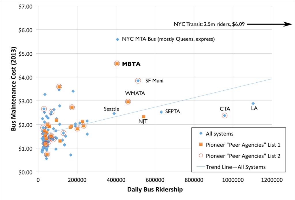
I like charts, so here is one. It shows transit systems with more than 20,000 riders. Note how the Pioneer Institute’s “peer agencies” are mostly clustered in systems with much lower ridership than the MBTA. I threw in a best fit line for fun, and, yes, larger agencies have higher maintenance costs. Which is not surprising.

In any case, it comes down to a sort of Occam’s Razor question: the obvious definition of “peer agency” would be “other large transit systems.” Since that was not the metric used, we need to look in to why it was not. If there’s no good answer why it wasn’t—and there isn’t—then it certainly seems like the reason Pioneer used these criteria is to try to prop up their preconceived conclusion, rather than to make an honest argument.

I’ve only compiled the 2013 data (why? because I am doing this evenings and weekends and I don’t have a paid team of fellows and researchers funded by right-wing climate change deniers to go back through several years), but note the following:

Pioneer List A: Pioneer List B: Top 20 Agencies:
MBTA maintenance
cost % of average
208% 192% 153%

In other words, just by choosing a more representative data set, we’ve explained away half of the discrepancy between the T and other agencies.

But, wait, there’s more. Let’s say you only looked at the small group of agencies clustered near the T. There’s a big (50% increase) gap between Denver at 250,000, and Seattle, at 391,000, and another 50% gap between SEPTA and the CTA. If we compare Boston to Seattle, New Jersey, San Francisco, New York MTA Bus division and Philadelphia, the T averages just 140% of those other agencies, barely one third of the difference Pioneer’s “data” show. That seems like a much more representative sample than, say, Salt Lake, Sacramento, San Jose, Saint Petersburg and Spokane. I would wonder if the Pioneer Institute would deign to offer an explanation as to why they chose “peer agencies” in the manner that they did.

As I see it, there are three. One is that they randomly picked the metric to categorize this, and somehow stumbled on to the worst one they could since it’s really the only NTD data which varies by agency. I doubt this based on the Occam’s Razor principle that if you asked a student in a first year transportation statistics class what to use, they’d be hard-pressed to come up with what Pioneer did. The second is that someone doing research at Pioneer just isn’t that bright, and that’s a possibility. But the third is more nefarious: they came in to the study with a question they had a preconceived answer for, and then found the snippet of data which best supported their thesis. The problem is, well, the data.

Are all miles created equally?


Once the Pioneer Institute chose the wrong systems to compare the T to, they then chose to compare those systems based on a metric of “maintenance cost per mile.” On its face, this seems like a good analysis, and it’s not bad, but it ignores the issue that not every mile is created equally. For instance, which causes more wear and tear on a bus: a mile in stop-and-go traffic with a stop every 800 feet and 60 passengers on the bus, or a mile at 35 mph with two traffic lights and two passenger stops carrying 20 or 30 passengers?

Here’s another way to think about it: which is more stressful for your car? Driving with four passengers, a full trunk in stop-and-go traffic or a highway trip? The former is what buses in major cities are put through on a daily basis. But in many of the “peer systems” on the lists above, buses ply faster suburban arterials in much less dense areas. This means that they make fewer stops, and at those stops they pick up fewer people. That means less wear and tear on door mechanisms, air bags, transmissions, tires and even the vehicle frame. Wear and tear on a bus depends on its operational environment.

A better metric—one that accounts more for operational differences—would be maintenance cost per revenue hour. Bus costs are usually measured in hours (operators are paid by the hour, not the mile) and calculating revenue hours is a better way to account for different operating environments. For instance, a bus in City A might average 10 miles per hour and a bus in City B might average 15 mph. However the bus in City A might have more passengers over the course of that hour, more openings and closings of the doors, and a heavier average load. Cost per hour lets us better account for this.

So how does the T stack up on this basis? It’s still quite high, around $45.00, while the top 20 cities average to $30 and the Pioneer “peers” come out at $25. Instead of being 200% of its peers, the T is “only” 180%. So by using this metric, the T is still underperforming. However, there are more outliers in the same range. In the previous chart, the T was the only agency in the range of the New York systems; in this metric, it is joined by three others: VTA (Santa Clara County/San Jose), Pittsburgh and Detroit. Still, it is 50% higher than its peers, so there is some room for improvement. Perhaps Pioneer’s conclusions should not be “we need to privatize everything and eliminate the unions” but rather “let’s see what these other cities are doing and what we can do better.”

Is Minneapolis the right analog?

Much of Pioneer’s study focuses on comparing the MBTA to MetroTransit, the bus system in Minneapolis, Saint Paul and the surrounding area. After comparing the T to the two lists of 20 cities (one of which includes MetroTransit) the authors focus in on comparing the T to one such agency which is more like the T. (And in a stunning use of logic, they don’t choose, say, El Paso.) MetroTransit operates a similarly-sized fleet to the MBTA, and also operates in winter weather (which is not the case for many “peer agencies” above). So comparing the T to Minneapolis is not a bad choice.

But are there differences that probably account for a lot of the difference? Certainly. First of all, Minneapolis carries about 215,000 bus passengers, about half as many as Boston. The average trip is longer, as buses are the workhorse of the system (the two rail lines combine for only about 60,000 passengers per day), so there are fewer bus-rail transfers. But the number of trips per revenue mile in Minneapolis is still only 60% of Boston*—in fact, Boston has one of the highest number of trips per mile of any system in the country.

[ * This will probably be lower in coming years, as Minneapolis replaced one of its busiest bus lines—the 16 and 50, connecting downtown Minneapolis and Saint Paul and accounting for 10% of the total system ridership—with a light rail line in 2014. This has led to a significant overall increase in transit use (already nearing 2030 estimates with 36,000 daily riders), but an overall decrease in bus patronage and the number of passengers per bus. The 16 ran at 24 hour service and 10 minute headways at most times of day and was supplemented by the limited stop 50, especially at rush hours. Combined, they carried 24,000 passengers per day. ]

Pioneer examines several years of data (to their credit) and I’m looking just at 2013 (because this isn’t, you know, my job), so there are obviously fleet age questions, but when looking at a sample of this size (2 cities), there are all sorts of questions. Did numbers spike some years because many buses went out for mid-life overhaul? Were old buses give only very necessary maintenance in anticipation of retirement? Did new buses coming online require much less maintenance? I’m not sure how much difference this might make.

But what I do think makes a difference are two factors:

  • The Twin Cities have a much lower cost of living than Boston
  • While Boston uses a variety of maintenance yards, some of which date back well in to the streetcar era, the Twin Cities made large investments in large, modern and enclosed maintenance facilities.

Boston is an expensive place to live. Housing prices are skyrocketing and affordable housing is somewhat hard to come by. Working on buses requires the ability to commute to a maintenance facility, most of which are located in areas with high housing prices, and staff need to be paid accordingly. Minneapolis is far less expensive. Housing prices in the Twin Cities in 2014 were just 53% as high as in Boston, and the overall cost of living was 16% lower. Since personnel costs are a large part of maintenance costs, it is not surprising that it costs more to pay staff in Boston.

Then there’s the question of capital investment. One of the reasons the T is reluctant to add bus service is that it can’t expand its fleet. The number of buses is constrained by yard space, and new bus yards don’t come cheap. Recent discussions about rebuilding the bus yard at Arborway have quoted figures in the range of $200 to $250 million, and that’s one of more than half a dozen facilities the T operates. Rebuilding enough bus yards for the whole system would likely be a billion dollar project, or higher.

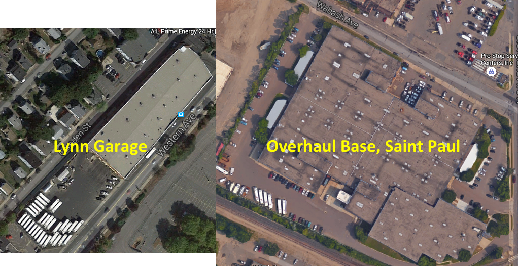
What’s more, the current locations of the T’s bus yards are worth a lot of money, and would help with the regional housing crunch. One sits at Arborway, and could be sold for $20 million (or leased to a developer as well)—and the city would also reap property taxes from a property which is currently untaxed. Another, Cabot, sits steps from the Seaport District and South Station, Albany is similarly situated in the South End, and the largest is the Charlestown Yard, in a decrepit-but-transit-rich part of Sullivan Square. So there’s the opportunity cost of not selling these off for development as well. But having well-located bus yards is an asset to the T, as it’s non-revenue (“deadhead”) mileage is some of the lowest of any large system (11%), it can’t afford to lose any facilities without replacing that capacity, and large plots of land in warehousing or industrial areas are not plentiful in Boston.

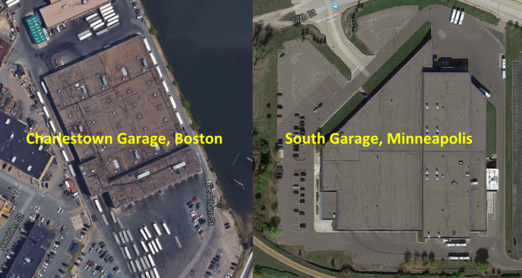
Minneapolis, on the other hand, has relatively new bus maintenance facilities. Every facility has been built since 1980. (And there are only six facilities, as opposed to the MBTA’s nine, lending economies of scale.) With lower land prices and much less density, most of the facilities are relatively centrally located, yet don’t take up valuable, transit-rich land. What’s more, every bus facility in Minneapolis is fully enclosed. In Boston, most bus facilities consist of an open yard with a maintenance garage. In the case of Arborway—one of the largest facilities—it is a small, temporary building. Buses are by and large stored outside. In Minneapolis, nearly all buses are stored inside. There’s adequate room to work, and the buses being stored don’t sit overnight in freezing temperatures.

Even still, the Twin Cities’s bus yards are not as centrally-located as Boston’s (T yards are often shoehorned in to small parcels; MetroTransit yards are usually larger and squarer). While Boston runs 11% of its mileage out of revenue service (deadhead), the Twin Cities run 24% (and as far as hours go, Boston is 9% deadhead and the Twin Cities 14% owing to a larger and less-crowded highway system in the Twin Cities). To access these newer, more efficient facilities requires significantly more operation expense. It would be as if the T built new bus facilities in Billerica, Southborough and Brockton: they’d likely be more efficient, but savings would be eaten up driving buses back and forth to and from them. Given the T’s salaries, if their garages were located such that they required 14% deadhead hours like the Twin Cities, it would add $5 million to annual operating costs.

That being said, MetroTransit has certainly invested money in vehicle maintenance facilities that the T has not. If the T had spent a billion dollars on a set of brand new bus maintenance facilities, it would likely spend less on maintaining its buses. Of course, if we assume that there is $1 billion in deferred facility capital outlay and that a bus maintenance facility has a useful life of 50 years, it would cost $20 million per year to build those facilities, money the T is currently spending on other projects. I’m not saying that this is a logical way to do business; the T should budget for and build adequate maintenance facilities. But comparing a system with new, enclosed facilities with the T’s antiquated mishmash of bus yards and small garages certainly needs some qualification.

The T’s maintenance budget runs $40 to $60 million ahead of MetroTransit each year. But, again, there’s much more to this than meets the eye. If the T required as many deadhead hours as MetroTransit, it would cost $5 million extra in operating costs just to get the buses to and from the garage. Given the difference in cost of living, the T’s salaries are higher than MetroTransit’s. If we only look at salary, the cost of living difference accounts for $6 million of that difference, and if we add in benefits it’s $11 million. And then, there’s the $10 to $20 million annually that the T hasn’t spent on new maintenance facilities. Better fleet renewal and capital outlay for maintenance facilities would probably help the T’s maintenance budget: maintenance is not siloed financially from the rest of the transit system’s operation.

In 2013 the T spent $104 million on vehicle maintenance to MetroTransit’s $45, so I’ll use those numbers. I will note that was a year before the T accepted a large order of New Flyer hybrid buses, which should require less maintenance than the 20-year-old RTS fleet they replace. In 2013 T’s bus fleet (average age: 9.4 years) was significantly older than MetroTransit’s (average age: 5.1 years). (I’m not even accounting for the lower capital costs the T has with an older fleet, although the fleet age obviously manifests as higher maintenance costs.) This could certainly be reanalyzed for other years; by using the year when MetroTransit had a much newer fleet, this probably paints the T in a worse light than is actually the case. According to Pioneer, during years in which the fleets for the MBTA and MetroTransit were similar ages, the T’s costs were only about double MetroTransit’s.

In any case:

Total Annual Expendeture $105m % of total
– Deadhead operation cost difference

– Cost of living difference (salary, salary+benefits)

– Facility construction

–$5m

–$6m-$11m

–$10m-$20m

5%

6-10%

10-19%

Adjusted total $69-$84m 66-80%
% of difference $21m-$36m 35-58%
† Adjusted total ($90m MBTA) $55m-$70m 22-39%
† % of difference ($90m MBTA) $20m-$35m 44-78%

† From 2006 to 2009, MBTA costs were about 200% of MetroTransit costs, and the bus fleets’ ages were similar. Assuming that if the T had a similarly-aged bus fleet to MetroTransit and double the costs, it would have a $90 million maintenance budget. If this is a good way to account for the fleet’s age difference, between 40 and 80% of the difference could be explained by deadhead operation expenses, cost of living and facilities.

Citing high salaries as a scare tactic


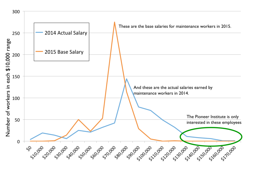
One of the favorite pastimes of the anti-union, anti-government folks is to find someone who works for the government and makes a lot of money and hold it up as an example of government waste (well, unless it’s a football coach; they’re fine with that). In their report, they go and find examples of people making a lot of money (a painter making $80,000! A machinist making $120,000! A car cleaner bringing home $70,000!) and use this to show how wasteful government is. But, of course, this is hyperbole. These are outliers: probably people who worked a lot of overtime—some 60 hour weeks—in order to make that much money. Since transit runs 24/7, there’s overtime to be had: a few extra buses break down, or someone calls sick and a worker picks up an extra shift. Are there some savings to be had from better oversight of overtime? Probably. But without showing the average numbers, these are pure scare tactics, a rhetorical device that doesn’t stand up to any scrutiny. Luckily, I have the T’s salary database sitting around (which is public record, of course), so we can do some such analysis.

Yes, all MBTA salaries are public information.
You can access the file here.

It’s unlikely the T will ever be able to use non-union employees, even if maintenance is privatized. Given the construction boom in Boston, these salaries do not seem far out of hand for union labor (union sheet metal workers, for example, make nearly $100 per hour, or $200,000 per year, although they don’t of course, have the job security a T worker does). Here are the base salary ranges for the major employment categories among the T’s bus maintenance personnel:

Fueler $34964 – $43014
Machinist $57262 – $77750
Car cleaner $60278
Painter/Carpenter $82035
Foreman $87672 – $100672
Sheet metal $89669
Pipefitter $94994
Wireperson $95617

On average, employees earned 119% of their 2015 base salaries in 2014. Why? As mentioned before, overtime. Could the T hire more employees and pay less overtime? Probably. But if they did, there’d be outcry from Pioneer about how even more workers were getting the platinum-level union compensation package and benefits. They want to privatize operations, and assure lower pay and benefits for everyone. Is that a way to treat public employees? I’m all for accountability, but it shouldn’t require these sort of threats.

To add it all together …


Pioneer’s top line statement—that the T could have saved $250 million in bus maintenance costs over 6 years—is specious. They massage and manipulate data, but it doesn’t stand up to any scrutiny. Does the T have some of the highest maintenance costs around? Yes, it does (although New York is higher still). Some of this is due to the operating environment, some is due to local costs of living, some is due to the lack of appropriate facilities and, yes, some may be due to the performance of MBTA employees. The T could probably reduce it’s overall maintenance expenditures with different management practices, but to insist that those are put in to place without any funding (for instance: to insist on better management while many repairs take place in outdated and/or temporary facilities) is just silly. To use blatantly and obviously manipulated numbers to make this argument is disingenuous, and, once examined, the Pioneer Institute’s argument falls apart. There is very little defense for this sort of sloppy “analysis,” and it certainly should not be relied upon to make policy changes.

Using several different—and more honest—metrics, we can explain away much of that difference:

  • 60% of the Pioneer Institute report’s difference in costs arise from their suspicious definition of “peer agency.” Of the $250 million that they claim the T could save, that accounts for $150 million of it.
  • Just by using maintenance cost per hour instead of maintenance cost per mile, the difference is 20% lower.
  • In comparison to the Twin Cities, we can explain 35% to 75% of the difference in costs between the two systems.
The Pioneer Institute had an agenda: to reduce the power of public employee unions and privatize all that they can. Their position may well be “why spend time and money figuring out how to reform our management when we can just outsource it and let the magic of free market competition figure all that out for us, via a contractor, now?” But without good data on other systems (Has any large system privatized and had major cost benefits? They don’t say.) this is a hollow sentiment. And the MBTA’s current contractors have been doing a less-than-stellar job of late: the publicly run subway operations recovered from the blizzards far more quickly than the private-contract Commuter Rail system.

Pioneer saw a well-compensated set of individuals, and tried to make a case that they are lazy, that they have a poor work ethic, and that compared to their peers in other cities, that they have poor work quality. It’s true that MBTA costs are higher than many other agencies, and the T could probably implement policies to bring costs down to some degree. Upon further examination, however, it is the “research” coming from the Pioneer Institute that is low quality, not the work of the maintenance department at the MBTA.

Going in circles on the Silver Line. Or, how the T could save $1m tomorrow.

In my last post on the Silver Line, I wrote about how the poorly-timed light at D Street causes unnecessary delays. If you’re lucky enough to get across D Street, you then go through the power change at Silver Line Way and then begin the loop back to get on to the Ted Williams Tunnel to the airport (and soon, Chelsea). The end of Silver Line way sits right above the tunnel portal. But to get to that point requires a roundabout route, often in heavy traffic, which takes a full mile to return you right to where you started.

If only there were a better way.

There is.

After leaving the busway, the Silver Line outbound route goes down the Haul Road, merges in to a ramp from the Convention Center and D Street, and runs fully half the distance back to South Station—in mixed traffic—before finally turning on to the Turnpike towards the tunnel and the airport. What’s the point of building a bus rapid transit corridor if you then spend the same distance sitting in traffic to get back to where you started?

What’s worse, the “Bus Rapid Transit” endures two traffic lights in mixed traffic, and this traffic is often heavy, especially when when convention traffic from the nearby convention center spills on to the highway at already heavily traveled times of day. The route is more than a mile long, and in perfect conditions takes 3 or 4 minutes, but in heavy traffic can easily take 10 or 15; this traffic especially renders the “rapid” part of BRT useless.

Before entering this morass, there is access to the tunnel via a ramp next to a state police facility. If the buses could use this ramp, they would save three quarters of a mile of travel, two traffic lights, a yield at a merge and, conservatively, two minutes per trip. Combined with the potential savings at the D Street light, these two improvements could save 10% of the total round trip time between South Station and Logan—or Chelsea.

Now, perhaps there’s a technical reason the Silver Line buses couldn’t use the ramp. Maybe it was too steep for the buses. But in 2006, when part of the tunnel collapsed, the T was granted permission to use the “emergency” ramp to access the tunnel beyond the panel collapse. A Globe editorial from that summer praised the T for its quick thinking in utilizing this routing. Yet when the tunnel panels were fixed, the buses were rerouted to the roundabout course which brings them halfway back to South Station before they enter the tunnel.

MassDOT actually has these buttons.
Time to put them in to action.

There’s obviously no physical reason this ramp can’t be used, since it was used in the past. And any argument that the merge wouldn’t be long enough to be safe is unconvincing, especially since it would only be used by a bus every four or five minutes, even when the Gateway project to Chelsea is completed. The in-tunnel merge has 1/10 of a mile before the lane ends, far longer than similar merges on to the Turnpike in the Prudential Tunnel. Suggestions that this would be unsafe are protective hokum; with appropriate merge signage (perhaps even a “bus merging when flashing” light) there should be no reason why this can’t take place safely. The Transportation Department, MBTA and State Police need to convene to figure out the best way to use this facility, but the answer certainly should not be the usual “no,” or “but we’ve always done it that way.”

There’s an environmental justice piece, too, especially with the extension to Chelsea, a disadvantaged city a stone’s throw from Downtown Boston, but a slow ride away by transit. Right now, Chelsea residents are at the whim of the 111 bus—and the traffic on the Tobin Bridge. It seems foolish to build a brand new bus line to Chelsea but not to address one of the major bottlenecks on the rest of the route. If the Governor is serious about implementing reforms to improve service and save money, he should look beyond specious claims of sick time abuse and at where interagency cooperation could save time for passengers and time and money for transit operations.

Dr. Evil. Transit economist.

It costs the T $162 to operate a bus for an hour. The SL1 Airport service operates 128 trips per day, and we can reasonably expect that the Chelsea service will operate with a similar frequency. Fixing the D Street light and using this ramp could conservatively save 4 minutes for each of these 256 trips, which would equate to an operational savings of $1,000,000 per year.

Is this a drop in the bucket as far as the T’s overall revenue is concerned? Sure, it’s less than one tenth of one percent. However, it’s a million dollars that could be saved, pretty much overnight, with basically no overhead investment. We spent more than half a billion dollars building the Silver Line tunnel and stations, and acquiring the buses. And the SL1 buses actually turn a (slight) operational profit! It’s high time we removed some of the stumbling blocks it’s saddled with and let it operate with a modicum of efficiency.

#FixTheSilverLine

Downtown Boston is Busmageddon? Really?!

Update: A shortened far less ad hominem version of this has been published in Commonwealth Magazine.

Every so often an article comes along which is so inane, so poorly researched and so utterly stupid that it requires a line-by-line refuting.

The article in question, which has a dateline of March 31 so I’m assuming it’s not an April Fools joke, is:

End downtown Boston’s busmageddon Add reworking bus routes to the MBTA’s to-do list

Oh boy.

The first four paragraphs go on about how people are taking public transit in Boston. Fine. Then you get to paragraph 5:

We need a comprehensive policy regarding usage of the public way. 

Good! We agree. We do need a comprehensive policy regarding usage of the public way. Right now, approximately 75% of the roadways in Downtown Boston are dedicated to automobiles. Another 20% are sidewalks, and 5% are bike lanes. Yet the number of cars is decreasing (to quote the author two paragraphs earlier), and the majority of people coming to Boston don’t use cars. So why do cars (as usual) get the vast majority of space? Why should they get all the real estate if they only account for a minority of travelers? Who knows.

Loading must be done during limited hours, as is the case in other great cities.

Loading? Fine. That’s a halfway-decent point. Care to elaborate? (Apparently not.)

To keep the city from devolving into perpetual gridlock, we also must address tour buses and MBTA buses downtown.

Boston has no through bus routes through downtown, the only city in the country to do so. Perpetual gridlock? How much of the gridlock downtown is caused by buses at Haymarket (in their own terminal, mind you), the Franklin-Federal loop, the Silver Line and a few other sundry routes, as opposed to, say, tens of thousands of cars trying to ply narrow streets downtown? Tour buses? Sure, get rid of those space-hogging menaces. But getting rid of a few MBTA buses? Please.

And what of these other great cities? What do they have in common? London? Bus lanes. New York City? Bus lanes. Minneapolis? Double bus lanes. Boston? Well, we have the Silver Line, but it barely has bus lanes downtown.

Let’s get the buses off of our streets so that pedestrians and bicyclists can be safe.

Red herring! Red herring! Red mfing herring! T Buses account for, oh, maybe 2% of traffic downtown. Maybe. Probably less. Certainly far less than any other city in America. Take a look at Bostonography’s great bus speed map (a screen capture to the right). Notice that there is actually a gap in Downtown Boston with no bus service. Compared to nearly any other city in the country, Boston has less bus service in its downtown. Other top bicycling cities like Minneapolis, Seattle, San Francisco and Portland have many more buses, yet no one is demanding that buses be pushed to the outskirts there.

Yet buses are menace to pedestrians and bicyclists? Should we consider doing something about the other 95% the traffic downtown? The cars? Or are pedestrians and cyclists somehow immune to them?

As Doug Most reminded us in The Race Underground, Boston constructed the first subway tunnel in the late 1890s to get trolleys off the street; we can certainly do likewise today by making good on the commitment to a tunnel connecting South Station with the Silver Line spur that heads to Dudley Square.

Oh, good lord. Yes, we could spend $2 billion to build the Silver Line Phase III tunnel. Somehow this would solve all of our transportation problems. Except for the buses going to Haymarket, South Station and all of the express buses. It wouldn’t really get any cars off the street (although by his logic, cars on the street aren’t the problem). It would create a low-capacity, slow route that could be replicated for 1/100th of the cost with signal priority and bus lanes. But that might impact cars and their drivers dense enough to think the best way to Downtown Boston is to drive.

There is also no reason why people wanting to go to Salem should have an express bus waiting for them around the corner from Macy’s …

Most people going to Salem don’t wait by Macy’s: they wait at the Haymarket bus station. (Also, if you’re actually from Boston, it’s Jordan Marsh. But I digress.) It’s not perfect, but it’s covered, and the buses pull in to a busway to load and discharge passengers. But so what if they do? Downtown Crossing is right in the center of the city. If we make people from Salem walk ten minutes, or squeeze on to an already-over capacity subway train, they’re more likely to say “the hell with it” and drive. Do cars cause congestion? Or just the 16 buses per day that run from Salem to Downtown Crossing?

… nor should city street patterns necessitate that a bus make a left turn from a right lane to meander through downtown streets to get to the Mass Pike.

The 500-series buses do load on narrow streets and have to reach the Mass Pike. Why? Because they are basically the replacement for the other two tracks of the Boston and Albany railroad. When the tracks were paved over for the Turnpike, the 500-series buses replaced local service there. There were proposals in the ’40s to run service similar to the Highland Branch from Park Street, out the Tremont Street portal, on to the tracks parallel to the current Worcester Line, and out to Allston, Brighton and Newton (huge file here). Instead, we had got the Turnpike, which express bus service, which is express until it sits in Turnpike traffic. If you hadn’t built the city for cars, you wouldn’t have to worry about the buses; the streetcars could be underground in that aforementioned tunnel.

Large buses making wide turns on narrow downtown streets, even more narrow because of mounds of snow, clog the streets and imperil the safety of the public. 

Large buses clog the streets? What about parked cars? What about moving cars in traffic? How about we eliminate downtown on-street parking and give the buses their own lanes, and make sure the mounds of snow are removed from them. And do only the buses imperil public safety? No pedestrian has ever been killed by a car, right?

We should eliminate bus lines which make no sense and relocate the terminus of lines now heading downtown to South Station and North Station …

We have an intercity bus terminal at South Station. It’s at capacity. There’s no way to add T buses in to it. And it’s a five minute walking transfer to the already-over capacity Red Line.  The current routes that could conceivably go to South Station aren’t perfect, but they seem to work. Maybe we should create a network of downtown bus lanes instead? Cyclists and pedestrians would know where the buses would be, and it would help buses move through downtown more quickly.

And North Station? That’s why we have the Haymarket bus station. It has room for buses and easy connections to the Orange and Green lines. Perhaps when the Government Center Garage is rebuilt, it will include a better bus terminal and connections, and bus lanes across the bridge to rebuilt bridge to Charlestown.

… where there is access to underground transit, commuter rail and the interstate highway system.

Yes, there is access to underground transit. That’s all well and good. Except that underground transit is growing faster than other parts of the system, while struggling with decades-old equipment and overcrowding. Most downtown buses operate like commuter rail: they go from the suburbs to the city. There’s little need for passengers to transfer to commuter rail, rather they want to transfer to their place of work. Instead of dropping people at the outskirts of downtown, we should have more central bus routes that balance operational efficiency with getting people where they want to go. Give as many people a one-seat ride and a comfortable place to wait, and they’ll be more likely to ride.

Even as we eagerly await the Red Sox return to Fenway Park, and the melting of the last mounds of snow (most likely in that order), we should be thinking – and planning – ahead.

If you really want to encourage safer streets, getting rid of transit is certainly not the way to go. Planning ahead will certainly be important, but let’s plan the right way. The right way might be a congestion charge, to get cars off the streets at peak times. The right way might be to build bus lanes so that bus riders have seamless trips through downtown to their destinations. The right way might be to require tour buses, an actual menace to pedestrians and cyclists which provide no actual public good, to stick to certain streets, routes and times.

Or the right way may be to raise the goddamn parking tax. Right now, Boston has one of the lower parking taxes around. Because parking is very much constrained, it is not subject to the whims of supply and demand: a daily tax on parking spaces would likely not even affect the consumer price much, but move some of the profit from the property owners to the city. Given the negative externalities of cars on city streets, and the fact that most people utilizing parking spaces are from out of town, the city should raise taxes and use the money to improve public transportation, perhaps starting with, that’s right, buses.

So the right way is not to demonize public transit and couch it in the guise of pedestrian and bicycle safety is disingenuous at best. Ignoring the fact that nearly all traffic downtown is made up of cars driving on subsidized roadways and offering debunked solutions is a farce. Note the red X on the map to the right. It shows the location of the author’s office in relation to the 448/449/459 and 500-series bus routes in Boston. What are the chances he’s just rubbed the wrong way by seeing a bunch of buses outside of his office? You know, buses that make it really convenient for people to get there?

Let’s build better bus facilities. Lincoln Street and the Surface Artery which all the 500-series routes follow have plenty of room for a bus lane (Lincoln Street has two lanes of traffic and two of parking). Federal has parking on both sides. Why not take some of that space which is making the streets narrow and dangerous and use it for buses? It might make it a little less convenient for Mr. DiCara to drive there. That’s probably his real beef.

And Commonwealth Magazine should be on the hook, both for not fact-checking this article, and for letting someone with no actual expertise in the industry write it in the first place. Just because he saw a lot of buses at Lincoln and Summer one morning doesn’t mean that they’re the problem. I wonder how he gets to work, anyway?

Tallying snow and cold in Boston

I’ll update this scorecard for the next few weeks.
Follow @ofsevit on Twitter for the latest version

A few weeks ago, I wrote about how unprecedented the weather has been in Boston, and how it affects the transportation system. How unprecedented is this February? It is the confluence of two 500-year events: temperature and precipitation have both experienced anomalies at least 3 standard deviations from the mean. It is without parallel.

We covered snowfall in the last post, here we’ll focus more on the cold temperatures.
There has been one month, in the recorded climatological history of Boston, where the average temperature was below 20 degrees. 1934. It was unprecedented cold: the all-time record-low was set in Boston at -18 (a temperature which, with the observation station being moved to Logan Airport in 1936, will likely never be matched; the airport has only recorded three days below -10, the most recent in 1957). The average temperature in February 1934 was 17.5˚. The next highest months were Januarys in the late 1800s when the temperature averaged 20.1 (records date to 1872). Winter temperature records are very nicely normally distributed (69/96/99.7; other months are similarly distributed but there is much less nominal variability in the summer), and there has only once been a a month more than 3 standard deviations from the mean out of more than 400 winter months. 1934.

It is quite likely that eight decades later, 2015 will be the second. The dreaded polar vortex last year gave us departures from the mean of 2 to 3 degrees. (To be fair, we were on the edge of the vortex last year, and the Upper Midwest had similarly anomalous weather.) This year, we’re likely to run more than 10 degrees below normal. The average high for mid-February is 40˚. We haven’t seen that temperature in nearly a month, one of the longest stretches on record.

Thus far, temperatures in Boston have averaged 18.2 degrees, and if the forecast for the next week holds up, the average will actually fall below the 1934 record. With five days beyond then in the month, even if we revert to seasonal climatology normals (unlikely, given the current pattern and modeling), we’d set the second coldest month on record. If the weather stays cold, as is advertised, we’ll see the second winter month more than three standard deviations from the mean. And we might break the all time coldest monthly record. Which, given climate change (mean temperatures have risen 3-4 degrees since 1872), is particularly impressive.

Apparently it has snowed quite a bit as well. And, yes, the seven feet in three weeks has never happened before (and may well never happen again), and the past month has already outpaced any winter season in Chicago, New York or DC (and is one storm away from topping Minneapolis). But without the cold temperatures, it wouldn’t have had the same effect: some snow would have melted even with a few days over 40˚. In 1978, days in the 40s and 50s helped reduce the snowpack to 4″ before The Blizzard. In 2013, a week in the 40s reduced a major blizzard to a few inches of crust. This year, we haven’t seen 40˚ since MLK Day. The snow combined with the temperatures is really a double-whammy: two once-in-500-year events, at the same time.

From Sam Lillo @splillo

It’s something no one could have planned for, and something we’ll never see again. And I do need to update one of the charts in that first post: the 28 day snowfall. The current chart is here. But it may increase.

Update: According to Sam Lillo, who has some great posts like this one, Boston has had more snow in the past month that Buffalo ever has. Will try to confirm (confirmed).

Don’t use bus routes to subsidize malls …

especially if the mall isn’t the final stop on the route.

I recently had the pleasure of riding the entire route of the 34E, one of the MBTA’s longest bus routes. The route starts in Walpole Center, makes a beeline to Washington Street (which extends from Boston to Providence) and runs in a straight line to Forest Hill Station. A straight line, that is, except, for a bizarre figure-eight loop through the Dedham Mall. The loop-the-loop to access the mall unnecessarily lengthens the route, costs the T money, costs passengers time, and subsidizes private development, all to service the front door of an auto-centered development.

Instead of continuing on Washington Street, the mall loop takes 8 or 10 minutes as the bus leaves the street, navigates no fewer than eight stop signs and traffic signals, makes two separate looped turn-arounds and traverses the same intersection three times. The route is scheduled for a full hour for the 14 mile trip from Walpole to Forest Hills, so the detour through the mall accounts for 13 to 16% of the total run time, all to serve two stops (out of more than 80 total on the route) which would otherwise require a 2 to 5 minute walk.

In other words, for riders wishing to get to the Dedham Mall, it would likely be faster if the bus ran straight on Washington Street and they got off and walked in to the mall, rather than taking a circuitous route to be dropped near the door. And for everyone else, it would save 8 to 10 minutes each way of not riding through the mall parking lot.

I rode the route on a weekday evening a few days before Christmas. This should have been a high water mark for people using the 34E to get to the mall. While my bus was full—there were probably between 45 and 50 passengers on board at any given time (and probably 70 or more served along the route)—only two or three got on or off at the mall. So, in order to serve this small number of passengers, the rest of the bus had to loop in and out and in and out of endless parking lots and driveways, because front-door service to the mall is apparently required.

From HumanTransit.org

What is particularly irksome is that in this case—and it’s not isolated, but, at least in Boston, perhaps the most egregious (the 350 serves the Burlington Mall with a similar detour, but much closer to the terminus of the route, meaning that many fewer passengers are inconvenienced by the route’s detour)—is that anyone who rides the bus past the mall has their trip dramatically lengthened (how dramatically? 18 minutes a day, five days a week, 50 weeks a year adds up to 75 hours of extra time on the bus annually). Jarrett Walker talks of “being on the way” and the mall is decidedly not; the 34E takes what should be a straight-line transit trip and degrades it to a mall circulator, despite the thousands of passengers who ride the bus daily.

In addition, running service via the mall requires several hidden subsidies which degrade service and provide a perverse incentive for people to drive instead of use transit. This one, in turn, further subsidizes the car-centric mall over pedestrian-oriented business districts, several of which are served by this route. There is also the direct subsidy to businesses at the mall. If I open a store on a street near an existing transit line, I would not (and should not) expect the transit agency to reroute the transit line to provide a stop at my front door. Yet we provide this service to the mall.

This subsidy can be quantified, in fact. The T doesn’t break down service between the 34E and the 34, but let’s assume that slightly more than half the passengers on the route are carried by the 34E (looking at the total number of vehicles on the route at different times of day)—or about 2500 passengers. The route costs $3.09 per passenger to operate (66¢ average bus fare paid plus $2.43 subsidy), or a total cost per day of about $7725. If we calculate 15% of this approximately $1150, meaning that over the course of a year—even given lower service levels on weekends—the cost to serve the mall is well north of $300,000 per year. [Update: these numbers may be somewhat lower given that morning service—before the mall opens—and some peak evening rush hour trips do skip the mall.]

Here’s another way to look at this: currently, the 20 minute evening headways on the 34E requires 6 buses running the route in about (or just under), each bus makes a round trip in two hours. If the run time were reduced to 51 minutes by omitting the mall, the same six buses could make seven round trips, reducing headways and, thus increasing capacity on the route. If you could get it to 50 minutes, the same headways could be maintained with 5 buses, which would save 1/6 of the route’s operating cost while providing the same service. But, instead, we provide service to the mall, at the expense of everyone who isn’t the mall.

What to do? Make the mall subsidize the route—yes, to the tune of $350,000 per year—or have them build an ADA facility from Washington Street to the mall. The extra cost of running this route in to the mall for 10 years could buy a very nice set of bus shelters, crosswalks and a ramp from Washington Street to the mall’s front door. Another option would be to run the 34—which ends its route nearby—to the mall, instead of putting this joggle in the middle of the 34E. While it might not have the same cost savings, it would at least not have the effect of costing thousands of passenger hours each day. Or, abandon service to the mall all together. Malls are dying, anyway, and it should not be the business of public transit agencies to help prop them up.

Comments on Allston

Harry Mattison, who’s leading the charge regarding the Mass Pike realignment that has been discussed for some time, asked me to reply to his email chain with some comments. I figured I’d post them here. This is what I think about the project and comments I will be submitting. Most of it is aligned with what the rest of the committee is pushing, with a bit at the end echoing some earlier ideas I’ve had. In any case, the more they hear from the public, the better, so please send comments to:

dot.feedback.highway@state.ma.us

by the close of business on Monday, September 29. You can find another example letter here.

*****

I am writing regarding the continuing planning process for the Allston Interchange project. While the project plans have certainly progressed from the originally-proposed “suburban-style interchange” (which seemed specious at the time and hopefully wasn’t a red herring to make urbanists feel like MassDOT was committed making changes), there is much work to be done. My comments will focus on several areas—overall design, development potential, transit use, bicycling and pedestrian connections and parkland—to assure that the highway utility is maintained but that this project is a positive development for the surrounding community. This is a once-in-a-lifetime opportunity to remake this parcel of land, and to connect Cambridge, Allston, Boston University and surrounding communities. Failing to do so will be a failure of the planning process, and a dereliction of duty for MassDOT in its GreenDOT, Health Transportation Compact and overall mode shift goals.

The overall design of the project as an urban-style interchange is certainly better than high, looping suburban ramps, but it has room for improvement. The footprint of the project, both in its width and height, must be minimized. For the width, a highway with “interstate standards” has been proposed for the viaduct section, with 12 foot breakdown lanes and a much wider viaduct looming over the Charles, and engineers argue that this is a requirement. This is risible. Much of the Central Artery project lacks such lanes, as does the current structure. It will certainly be less costly to build a narrower structure with less material (savings that could be used for other area improvements), and traffic and congestion in the area is caused by many factors, none of which is the width of this structure. The current structure should be the maximum width of the new project, not the minimum. West of the viaduct, the current proposal should be modified to assure that the maximum amount of the highway is built at or below grade to allow overhead use in the future. All surface streets should be built as city streets, with single turn lanes, low design speeds and provisions for bicycles, pedestrians and transit use.

Finally, the project team must have direct input from the planning, architecture and landscape architecture fields, with a focus on the emerging “placemaking” field. Even with changes, it seems that this is being viewed first and foremost as a highway project. It must be viewed as an economic development project, which happens to have a highway running through it.

It is very important that whatever the design of the final highway, it is minimally disruptive to overall development in the area. This area lies within a mile of Boston University, Harvard and MIT. It will have good highway connections, and (hopefully) excellent transit connections to much of the population and economy of Boston. The value of the land for housing, education and commercial uses will be almost unparalleled in the area, and there are certainly examples of high-value properties built overhead highways. (One must look no further than the Prudential Center for a good example.) The provisions for overhead decking should be built in to the project, if not the decking itself, which is far less expensive to build as part of a brownfield construction project than an existing highway. This decking should, if possible, extend over the rail corridor as well (Back Bay Station would be an example here, as would many New York City Transit properties). With more and more residents wanting to live in transit-accessible areas, we should assure that potential housing properties are kept as easily built as possible.

As this area grows, it could become the next Kendall Square: a nexus of education and technology. Currently, the rail yards and highway produce minimal tax revenue for the City of Boston, which has to deal with the air and noise pollution they create. Allowing maximum development potential here should be a priority for the Commonwealth, to allow the city future tax revenues from development here. Cambridge residents enjoy low property tax rates due to the many businesses in the Kendall Square area; extending this to Allston would benefit all of the residents of the city. Many international companies have relocated to Boston and Cambridge, and we should give them every opportunity and location to do so. The Boston Society of Architects has had some great examples of this type of development potential here.

Transit must be a priority for this project, not an afterthought. The oft-mentioned West Station should not merely be a design element of this project, it should be built as part of the project, if not before the mainline of the roadway. Further development of this area will not take place because of its proximity to a highway; transit access will drive growth in the 21st century. West Station must be built with a minimum of four rail tracks to serve both the burgeoning Worcester Line as well as potential service on the Grand Junction. The state is spending millions of dollars improving Worcester service and expanding the number of trains, and a West Station service current uses (steps from Boston University) and future growth is a must. The Grand Junction Line must be built with two full tracks for potential future service; it’s ability to link Allston, Cambridge, North Station and beyond (and by doing so, provide much better connections for travelers from west of Boston wishing to get to Cambridge, the cause of much of the surface traffic in the area) should not be understated.

In addition, the plans must have provisions for future north-south transit in the area. Currently, travel from Boston University to Harvard Square requires 40 minutes and a minimum of one transfer, often with travel through the congested center of the subway network. New traffic patterns should allow for a direct connection between BU and Allston, continuing on the south end to Kenmore Square or the Longwood Medical Area, and the north side to Harvard Square. While there are certainly valid arguments that heavy car traffic should be precluded from this area, transit service should be prioritized. A transitway from the Packards Corner area via West Station to Harvard Street would fulfill objectives of the Urban Ring, as well as allow much better connectivity through the neighborhood. This should be planned with signal priority over other vehicular traffic, the potential for future grade separation, and the potential for conversion to light rail so as to meet up with the Green Line on Commonwealth Avenue. Imagine, a Green Line branch from Cleveland Circle to Harvard Square via Commonwealth Avenue and Allston. This would certainly be possible in the future if we design the appropriate rights of way today.

In addition to transit, bicycle and pedestrian travel must be well-integrated in to the project. The recent concepts put forth have certainly improved original plans, but, again, bicycle and pedestrian infrastructure should be a priority, not an afterthought. Pains should be taken to assure that routes are safe, adequately wide (a minimum of 25 feet wherever possible) and direct, with minimal street crossings. A well-built bicycle and pedestrian network will make trips which are currently convoluted, roundabout and/or dangerous much more desirable, and certainly allow for better connectivity and attaining mode shift goals by shifting travelers away from cars. Other existing and future human-scale corridors should be designed for maximum efficiency in moving people without cars. Within a 30 minute walk of this area are many of the leading health, education, science and commercial institutions in the world. They should be accessible without sitting in traffic.

This project parallels the Charles River, and surround park land must be a priority. From the Charles Dam to the Eliot Bridge and beyond, much of the DCR parkland is taken up by high speed roadways. We have turned our back on the river in the name of moving vehicles, and this is something we should begin to take steps towards mitigating. This project will give us a good first stab at that. As mentioned above, no parkland should be sacrificed for a wider viaduct: we have seen too much green space appropriated as pavement in the past generations. Soldiers Field Road should be migrated as far away from the river as possible, creating a promenade or “Allston Esplanade” similar to what we have further to the east, which should connect with development alongside and above the highway. The current bike path, which is, at places such as the River Street Bridge, less than five feet wide (well below any reasonable safety standard) in the name of keeping car traffic moving must be changed: we should no longer throw the safety of cyclists and pedestrians to the wind in order to make traffic flow better. It is laudable that MassDOT is working with the DCR: they should be included in this process going forward.

Furthermore, there is a dramatic opportunity to work with Harvard to move Soldiers Field Road away from the river across a much longer distance, and in turn create one of the premiere riverfront parks in the country. This would entail looping Soldiers Field Road west of Harvard’s Business School campus and the Harvard Stadium, likely in a below-grade facility to mitigate the impact on the neighborhood there. However, without sacrificing any capacity and allowing shorter distances for motorists, it would allow the DCR to decommission the roadway between the Eliot Bridge and the Allston project site, allowing a wide, linear park to form along the river, benefiting not only local residents, but all residents of the Commonwealth. (A rough outline of this plan can be found here.)

The Allston Turnpike project is an opportunity to shape the entire region for the next 100 years. We must assure that all plans allow for the maximum future development. Again, this is not merely a highway project: it is a long term development project which we must allow to have positive returns for the Commonwealth’s economy and quality of life.

Street hierarchy planning sense … from Chicago

I was thinking the other day about planning streets. About how the default is to plan for cars first and for other users after. And about how it should work, which is that we should decide what our priorities are for each area (some areas might have transit prioritized over bicycles, some might have bicyclists prioritized over transit) and then plan based on those assumptions. For instance, if cars are not prioritized, planning shouldn’t be subjected to a level of service analysis, because vehicular delays should not affect design.

And then I saw this Tweet retweeted by Gabe Klein. And this picture:

Chicago gets it, at least in theory. Here’s how it would/should play out on Comm Ave:

  1. Pedestrians come first. Everyone (well, nearly everyone) is a Pedestrian (on Comm Ave) as they access stores, shops and buildings. Design for their mobility and safety first.
  2. Transit comes next. Take the B Line, add the 57 bus and the BU shuttles and you have 40,000 users using only a fraction of the streetscape. Keep them moving, keep them safe.
  3. Then bicyclists. Bicycles don’t use much space, but the space they do use is used efficiently for a relatively high speed of travel. Plus it’s healthy and emission free. Keep them safe and moving.
  4. Okay, we’ve come to cars. Is there enough room for cars? If the answer is yes, but it doesn’t meet some arbitrary delay guideline (level of service), too bad. We’ve accommodated everyone else. We can’t close the road to cars completely, but if they lose a lane of travel, it’s not the end of the world. If we lose a couple of drivers from Framingham, so be it.
So, kudos to Chicago for getting it right. And hopefully, Boston won’t get it wrong.

No need to duplicate transit on Comm Ave

NB: This got picked up on Universal Hub and there are a bunch of comments there. I’ll respond to comments in both forums, but probably here more. One note of clarification: I’m not saying that this should be the plan, but that it should be considered. Like much of the Commonwealth Avenue project, the planning process has been opaque and has had no public input. Also, this comment is a great illustration of what you could have.

The Boston Globe recently ran a story about proposed changes to Commonwealth Avenue. Of issue is that while Comm Ave is wide, it is not infinitely wide, and the changes will widen the transit reservation (mainly for safety for track workers, presumably this would also allow for wider stations), narrowing the rest of the road enough that the city is reticent to add cycle tracks, because it would narrow bus stops, and stopped buses would delay vehicles. (I’m just going to touch on the fact that there really shouldn’t be an issue with delaying traffic in favor of buses, bicyclists and pedestrians, but that’s not the scope of this post.)

What I am going to point out is that all of these issues could be mitigated by moving the 57 bus route and the BU buses to the center reservation of Comm Ave with the trolley tracks. This would result in the removal of bus infrastructure from the sides of the street—buses could instead stop at the same stations as Green Line trains. While this would be novel for Boston, it has been used in other cities, and while it could result in delays for transit riders, with better stations and transit signal priority, it would result in a better experience for all customers.

There are a variety of benefits from such a plan:

  •  Buses would move out of mixed traffic, resulting in fewer traffic delays for buses (especially at the busy BU Bridge intersection) and fewer conflicts between buses and traffic.
  • The duplicative infrastructure of having parallel bus and trolley stops would be eliminated. In their place, larger, more substantial stations could be built in the center transit median.
  • Instead of waiting for either a bus or a trolley, riders could board “whatever comes first” for short trips between Packards Corner and Kenmore Square, and riders wishing to go further east than Kenmore could take a bus to Kenmore and transfer down to a B, C or D car.
  • Removing bus stops would eliminate the conflict with buses pulling across the bike lanes when entering and exiting stops.
  • Removing bus stops would allow for more parking spaces to be added to the street. The number would be small—probably in the 12 to 18 range—but not negligible, and would assuage the (dubious) constant calls for more parking in the area.
  • In addition, there would no longer be issues with cars and taxicabs blocking bus stops, requiring buses to stop in the travel lanes.
  • Wider stations would better serve disabled users, with higher platforms better allowing wheelchairs and other disabled users to board and alight transit vehicles.
  • Narrower side lanes (parked cars are narrower than buses) would allow for more bicycle and sidewalk space, including the possibility of cycle tracks.
  • Without bus stops, there would be no need for bus passengers to get off of buses and cross a cycling facility.
  • With signal priority implemented, transit travel times through the corridor could be improved for bus and trolley riders.

The main reason to not to do this is that it hasn’t been done before. The cost to pave the trackbed—and to pave it well—wouldn’t be negligible, but since the entire corridor is under construction, it would be feasible. There would have to be some study to see if the number of vehicles would cause congestion in the transit reservation.

Additionally, there would have to be a specific signal to allow buses to enter and leave the corridor at each end of the corridor—especially the east end where they would have to merge back in to traffic. However, the 57 bus would only have to merge in to and out of the left lane since it then accesses the busway at Kenmore, which is in the center of the roadway. This could be attained with a signal activated by the approaching vehicle—again, a novelty in Boston, but by no means a procedure without global precedent.

The B line has 26,000 surface boardings, most of which travel to Boston University or through the campus and in to the tunnel. The 57 bus adds 10,000 more, and the BU Bus serves countless others. There are tens of thousands of pedestrians in the corridor, and thousands of bicyclists—it is one of the most heavily-traveled bicycle corridors in the city. Yet we are planning for cars—minority users of the corridor—first, when we should be planning for transit first (by far the largest user of the corridor by the number of passengers carried), then bicyclists and pedestrians. Cars should be an afterthought, put in to the plans after other users have been accommodated, not before. Of course, had the old A line never been converted to buses, Commonwealth Avenue would not host any MBTA services, and wouldn’t need any bus infrastructure. But that battle was lost 45 years ago.