The T’s bus maintenance costs are … generally in line with other large transit agencies

Shirley Leung, the Globe’s business columnist (and Olympics cheerleader) wrote a spurious article on Friday about MBTA privatization (we dissected that piece line-by-line here, and promised this longer post), where she leaned significantly on a recent study from the Pioneer Institute. Why Pioneer is taken seriously in regards to transportation is beyond me. Their numbers rarely stand up to the light of day, and when Very Serious Columnists are taking their analysis as gospel, it is a bad sign for the news media, and bad for local politics in general.

This post will look at some depth at the Pioneer Institute’s bus maintenance cost study, titled “The T’s Bus Maintenance Costs are Out of Control.” I’ve referenced the spurious “research” from the Pioneer Institute before, and mentioned this report; this is a full examination. Their assertion is that the T’s bus maintenance costs are “out of control”, some of the highest in the country, and that the T could save tens of millions of dollars a year if they just reformed how they maintain their bus fleet, asserting that their costs are twice as expensive as “peer agencies” (as defined by them, although we’ll see that their definition of “peer” is, well, suspect). There are numerous problems with this study and the numbers they use in it, to the point where their conclusions are drastically overstated and need to be fully reexamined. Since this is a very long post, I am going to break it in to two pieces: a shorter executive summary, and a larger jump deep in to the weeds of the data.

This post will discuss and dissect the following specious and disingenuous parts of the report:

  • The Pioneer Institute’s faulty definition of “peer agencies”; the metric they use to select agencies is one of few which by definition varies by agency policy.
  • Is “cost per revenue mile” the best metric for measuring the effectiveness of maintenance operations? Does a different number (cost per revenue hour) give us better data and better match how most bus operations account for bus costs, anyway?
  • Pioneer cites Minneapolis as a close analog. But they don’t account for dramatic differences in costs of living and maintenance facilities in the two cities.
  • Pioneer also digs in to the T’s salary database to pull out examples of highly-paid maintenance workers. Yet they look only at the top salaries, not at averages. This is simply hyperbole; their selective use of data serve not to inform people but to scare or anger them.
Overall, much of the supposed variation between the MBTA’s costs and other agencies that Pioneer cites are easily debunked, and they misuse data to misconstrue a problem to fit their agenda of privatization and overall cuts to transit. Instead of looking at appropriate data to try to see how the MBTA could best reign in costs, they use some of the worst data they can find to make hyperbolic statements. And when MBTA reform panels view these data as fact, they’ll make uninformed decisions.

In Brief: By Manipulating data, Pioneer Misrepresents Facts on the Ground

To make its case that the T’s costs are “out of control”, Pioneer first needs to find other agencies to compare the costs to. While there are many ways to use the National Transit Database to choose systems similar to the T, the Pioneer Institute takes an interesting approach. And I don’t mean interesting as in novel, I mean interesting as in suspect. The most logical idea would be to use a list of other large transit systems, but the Pioneer Institute uses miles between “failures” which the NTD explicitly points out in their definitions is subject to variation in agency policy.

By doing so, and by selecting agencies which carry one fifteenth as many passengers at MBTA buses alone (and in some cases as few as one fiftieth—or two percent—of the total number of passengers) they are really comparing apples to oranges. The T is being compared to sunbelt cities (no road salt, roads with less traffic and fewer acceleration and deceleration cycles) with many fewer passengers. These include systems which serve Palm Beach County, suburban Detroit and El Paso, for example, yet the report doesn’t compare the T to Philadelphia or Seattle, much better analogs. Comparing the T to its actual peers—other top-20 transit agencies—makes the costs go from 100% higher to just 40%. More than half of the supposed out of control costs are because of a false comparison.

The report also uses “revenue miles” while “revenue hours” would be a better metric. The T, which serves a compact, urban area, has a relatively high maintenance cost per revenue mile while its cost per revenue hour is more in line with other areas. It turns out that per hour (and many bus operation costs are per hour, not per mile) the T has some of the most efficient buses in the country, in the company of Chicago, San Francisco and New York, and far ahead of El Paso and Spokane. To put it another way: not all miles are created equally: a mile on the T will have more stops, more acceleration and more stress on the bus infrastructure, but also many more passengers.

Pioneer then cites Minneapolis as a good analog for the MBTA. While Minneapolis has a similar number of buses to the T, this analysis is somewhat fraught for a few reasons. First, Minneapolis carries only about half the bus passengers of the MBTA (and operates only a nascent rail system, so its overall transit ridership is only 20% of the T). Minneapolis also has much newer maintenance facilities (all have been built since the 1980s) as opposed to the T’s facilities, many of which date from the streetcar era. In addition, Minneapolis has the capacity to store nearly all of their vehicles indoors, a far cry from the T’s outdoor yards. Boston does have an advantage, however; it’s facilities are much more centrally-located, and it has only about half the deadhead requirements moving vehicles in and out of service that Minneapolis has, saving significant operating expenses.

Finally, Pioneer makes a hyperbolic statement about how highly-paid some T maintenance employees are, but it of course only cites the highest paid employees, and doesn’t look at any averages. The average worker is not paid in excess of $100,000; and the $70,000 maintenance salaries commanded by the skilled workers who keep the T’s rolling stock in place may be high, but are commensurate with the high cost of living. (House prices in Boston are twice what they are, for example, in Minneapolis.) The high salaries cited are due to overtime accrued (those lazy union members at it again, working 60 hour weeks), likely at times when many vehicles are in need of repairs to maintain service (the T has a relatively low spare ratio, so a problem which at another agency might be put off while a new bus is put in to service would have to be fixed at the MBTA). These cost differentials, and the fact that the MBTA has invested far less in capital facilities than Minneapolis (upgrading all of the T’s bus facilities would likely stretch beyond a billion dollars), bring the costs much closer together. Additionally, the T keeps a lower headcount (which saves on the number of benefited employees) and instead pays more overtime. This may actually save money, since for many employees the cost of benefits amounts to 30% or more of base salary, so having more employees working fewer hours may cost more.

Pioneer’s study is a textbook case of having an agenda and massaging data to best fit ones premonition. The problem is that under more scrutiny, the numbers mostly fall apart. The T’s maintenance costs are more expensive than several other large systems (although notably less than New York), and there are certainly lessons that we could learn from them. However, instead of beating the drum of the greedy unions and that privatization is the only answer, we should look at what works—and what doesn’t work—and how the T can take advantage of more efficient workplace and management practices. Relations between government and the T unions have never been warm, but specious threats based on hollow data and parroted time and again in the news media will not help the matter. And rather than trying to drive a wedge between management and the laborers, the T should give the unions a seat at the table: workers without the constant specter that their jobs may be outsourced are likely to be more productive, which may save money in the long run.

In Detail: The Numbers Behind the Curtain


What is a “Peer Agency” anyway?


In their report, the Pioneer Institute defines the “peer agencies” against which they compare the MBTA’s costs. Before we get in to exactly how they do so, below are three lists of cities (or in the case of larger statewide agencies, the city or region in which the agency operates). Two are what the Pioneer Institute used as their “peer agency” list. Which do you think is a better fit for the comparison against the T? (NB: I’ve colored systems which appear on two or more of the lists to show the amount of crossover between them.)

List A: List B: List C:
Washington, D.C.
Houston
Oakland
Salt Lake City
Sacramento
San Jose (VTA)
Saint Petersburg
Spokane 
Baltimore (MTA)
New Jersey Transit
Orange County, Calif.
Cleveland
San Diego
Delaware Transit
Suburban Detroit
Palm Beach County
Albuquerque
Cincinnati
Jacksonville
Suburban Chicago
Washington, D.C.
Houston
Oakland
Salt Lake City
Sacramento
San Jose (VTA)
Saint Petersburg
Spokane 
Minneapolis
San Francisco
Chicago
Fort Worth
Dallas
San Bernardino
Rochester, N.Y.
Syracuse
Providence (RIPTA)
Charlotte
El Paso
Memphis
Washington, D.C.
Houston
Oakland
Baltimore (MTA)
New Jersey Transit
Minneapolis
San Francisco
Chicago
New York City
Los Angeles
Philadelphia
Denver
Miami
Atlanta
Pittsburg
San Diego
Las Vegas
Portland
Honolulu
Seattle
Any guesses?

List C is a list of the largest bus transit systems in the country by daily ridership. Lists A and B are the lists the Pioneer Institute uses. Does it make sense to compare the MBTA to cities like Spokane, Salt Lake City and Saint Petersburg? Or does it make more sense to use cities like Los Angeles, Philadelphia and Denver? I’d argue the latter. The Pioneer Institute, apparently, thinks the former. Note that of the Pioneer Institute’s two lists comprise 32 cities, of which just 8—25%—are among the top 20 transit systems. The MBTA, for comparison, is the 7th largest.

Before we go any further, let’s look at one piece of data for these lists:

Pioneer List A: Pioneer List B: Top 20 Agencies:
Mean Daily Ridership 157396 186315 483682
Median Daily Ridership 100596 67335 320815

They’re comparing apples to oranges! The average ridership for the top 20 bus agencies is 483,000. (The T carries 405,000 daily.) The average sizes of the agencies Pioneer is comparing the MBTA to are 32% and 39% as big. Looking at the median size (more important, actually, since Pioneer does not weight their averages), the median Pioneer agency is 16-25% as big as the T. Unless there’s a very good explanation as to why they chose these agencies, it seems that they weren’t chosen for a logical reason.

So, how did Pioneer define “Peer Agency”? They looked at two metrics for vehicle maintenance: miles between failures (List A) and miles between major mechanical failures (List B). Pioneer Institute took some lower bound for the size of a bus fleet or daily ridership (somewhere in the neighborhood of 100 buses or 25,000 daily riders; they don’t define this) and sorted it by the overall miles between mechanical failures metric (which they define as “maintenance productivity performance”) from the National Transit Database (NTD) to find the “most similar” agencies.

This is problematic for two reasons. First, choosing this lower bound means that they are going to be comparing a wide variety of systems very different from the T, as seen by the list above that includes several transit systems with one tenth or fewer the daily ridership of the MBTA. Six of the agencies have ridership under one tenth of the T—40,000—another 13 come in under 100,000, or less then a quarter the size of the T. This means that nearly half of the MBTA’s “peer agencies” carry 1/4 or fewer the number of passengers daily; few of these have interconnected rail systems either. One comparison, to Palm Beach Transit, is so risible that on a Sunday, the 28 bus in Boston carries more passengers than the entire Palm Beach transit system.

This is more of an issue, because it means that Boston is being compared to many cities which have far, far less transit service. Since the MBTA carries 2/3 of its passengers by rail (New York, DC and—believe it or not—Atlanta are the only other cities in the country with more rail riders than bus riders) it means that the MBTA carries fifty times as many passengers each day than the smallest “peer” agencies in cities where transit accounts for a tiny percentage of trips. I’m going to pause and say this again: the Pioneer Institute defines a “peer agency” as one which carries 2% as many passengers daily as the MBTA. That’s a rounding error! This is like trying to draw conclusions by comparing Starbucks and an independent coffee shop. It doesn’t make any sense.

Thus, most of these systems will have buses which operate in much different conditions than the T. They have longer distances between stops, far less acceleration and deceleration, fewer passengers per bus and much less time spent with crush-load capacities which put more strain on the vehicle’s physical infrastructure. In most cases, their routes often operate through less-dense city centers and not mainly as a feeder system for subway stations like the T does, with many fewer cycles between full and empty.

Second, and perhaps even more egregious, there’s the definition of system failures (italics mine):

(List A) Other Mechanical System Failure: A failure of some other mechanical element of the revenue vehicle that, because of local agency policy, prevents the revenue vehicle from completing a scheduled revenue trip or from starting the next scheduled revenue trip even though the vehicle is physically able to continue in revenue service. 

(List B) Major Mechanical System Failure: A failure of some mechanical element of the revenue vehicle that prevents the vehicle from completing a scheduled revenue trip or from starting the next scheduled revenue trip because actual movement is limited or because of safety concerns.

While most NTD numbers are rather concrete (“passenger miles traveled” or “revenue service hours”) these much more fungible based on different maintenance criteria for different agencies. Note especially that the first list is explicitly based on local agency policy. So, not only is Pioneer choosing cities with much smaller systems, but they are compounding this issue with a metric which varies by local agency policies! What’s more, some agencies, like the Maryland Transit Agency, don’t report “other mechanical system failures”, only major ones.

It would make sense to use a variable that is well-correlated for this analysis. Here are the r-squared values for agencies with at least 25,000 daily bus passengers:

  • Major failures and maintenance cost per revenue mile: 0.049
  • Other failures and maintenance cost per revenue mile: 0.018
  • Average weekday passengers and maintenance cost per revenue mile: 0.39

One of these things is not like the others. One of these things is correlated order of magnitude with the cost per mile than the others. And the numbers range more than one might expect: major failures range from every 1600 miles to once every 117,000 miles; and other failures, for agencies which report them, range from once every 2900 miles to once every 953,000 miles.

What might cause a bus to be removed from service in one system might not in another. There’s nothing wrong with that, but it makes it very suspect to use these numbers as a basis for further analysis, especially when better numbers certainly exist. It would make much more sense to choose the cities in the top 20 to compare to the MBTA. The problem is that such a list wouldn’t have supported the Pioneer Institute’s “conclusions” nearly as strongly.

Pioneer is measuring the “productivity” of a bus maintenance shop by the frequency with which the buses broke down without looking at any other data. This is like measuring the “productivity” of a doctor by the frequency with which his or her patients die. Which is all well and good—some doctors are actually more productive than others—except that a cardiologist is going to have more patients die than an optometrist, a gerontologist is going to have more patients die than a pediatrician, and a doctor that works in a high smoking state like  Kentucky is going to have more people die than someone working in Utah. If you’re not correcting for the age of the vehicle, variations in the kinds of vehicles used, and variations in the duty cycle, you’re going to come to some screwy conclusions.
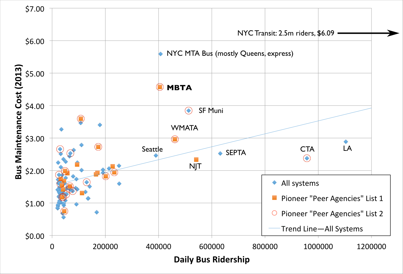
I like charts, so here is one. It shows transit systems with more than 20,000 riders. Note how the Pioneer Institute’s “peer agencies” are mostly clustered in systems with much lower ridership than the MBTA. I threw in a best fit line for fun, and, yes, larger agencies have higher maintenance costs. Which is not surprising.

In any case, it comes down to a sort of Occam’s Razor question: the obvious definition of “peer agency” would be “other large transit systems.” Since that was not the metric used, we need to look in to why it was not. If there’s no good answer why it wasn’t—and there isn’t—then it certainly seems like the reason Pioneer used these criteria is to try to prop up their preconceived conclusion, rather than to make an honest argument.

I’ve only compiled the 2013 data (why? because I am doing this evenings and weekends and I don’t have a paid team of fellows and researchers funded by right-wing climate change deniers to go back through several years), but note the following:

Pioneer List A: Pioneer List B: Top 20 Agencies:
MBTA maintenance
cost % of average
208% 192% 153%

In other words, just by choosing a more representative data set, we’ve explained away half of the discrepancy between the T and other agencies.

But, wait, there’s more. Let’s say you only looked at the small group of agencies clustered near the T. There’s a big (50% increase) gap between Denver at 250,000, and Seattle, at 391,000, and another 50% gap between SEPTA and the CTA. If we compare Boston to Seattle, New Jersey, San Francisco, New York MTA Bus division and Philadelphia, the T averages just 140% of those other agencies, barely one third of the difference Pioneer’s “data” show. That seems like a much more representative sample than, say, Salt Lake, Sacramento, San Jose, Saint Petersburg and Spokane. I would wonder if the Pioneer Institute would deign to offer an explanation as to why they chose “peer agencies” in the manner that they did.

As I see it, there are three. One is that they randomly picked the metric to categorize this, and somehow stumbled on to the worst one they could since it’s really the only NTD data which varies by agency. I doubt this based on the Occam’s Razor principle that if you asked a student in a first year transportation statistics class what to use, they’d be hard-pressed to come up with what Pioneer did. The second is that someone doing research at Pioneer just isn’t that bright, and that’s a possibility. But the third is more nefarious: they came in to the study with a question they had a preconceived answer for, and then found the snippet of data which best supported their thesis. The problem is, well, the data.

Are all miles created equally?


Once the Pioneer Institute chose the wrong systems to compare the T to, they then chose to compare those systems based on a metric of “maintenance cost per mile.” On its face, this seems like a good analysis, and it’s not bad, but it ignores the issue that not every mile is created equally. For instance, which causes more wear and tear on a bus: a mile in stop-and-go traffic with a stop every 800 feet and 60 passengers on the bus, or a mile at 35 mph with two traffic lights and two passenger stops carrying 20 or 30 passengers?

Here’s another way to think about it: which is more stressful for your car? Driving with four passengers, a full trunk in stop-and-go traffic or a highway trip? The former is what buses in major cities are put through on a daily basis. But in many of the “peer systems” on the lists above, buses ply faster suburban arterials in much less dense areas. This means that they make fewer stops, and at those stops they pick up fewer people. That means less wear and tear on door mechanisms, air bags, transmissions, tires and even the vehicle frame. Wear and tear on a bus depends on its operational environment.

A better metric—one that accounts more for operational differences—would be maintenance cost per revenue hour. Bus costs are usually measured in hours (operators are paid by the hour, not the mile) and calculating revenue hours is a better way to account for different operating environments. For instance, a bus in City A might average 10 miles per hour and a bus in City B might average 15 mph. However the bus in City A might have more passengers over the course of that hour, more openings and closings of the doors, and a heavier average load. Cost per hour lets us better account for this.

So how does the T stack up on this basis? It’s still quite high, around $45.00, while the top 20 cities average to $30 and the Pioneer “peers” come out at $25. Instead of being 200% of its peers, the T is “only” 180%. So by using this metric, the T is still underperforming. However, there are more outliers in the same range. In the previous chart, the T was the only agency in the range of the New York systems; in this metric, it is joined by three others: VTA (Santa Clara County/San Jose), Pittsburgh and Detroit. Still, it is 50% higher than its peers, so there is some room for improvement. Perhaps Pioneer’s conclusions should not be “we need to privatize everything and eliminate the unions” but rather “let’s see what these other cities are doing and what we can do better.”

Is Minneapolis the right analog?

Much of Pioneer’s study focuses on comparing the MBTA to MetroTransit, the bus system in Minneapolis, Saint Paul and the surrounding area. After comparing the T to the two lists of 20 cities (one of which includes MetroTransit) the authors focus in on comparing the T to one such agency which is more like the T. (And in a stunning use of logic, they don’t choose, say, El Paso.) MetroTransit operates a similarly-sized fleet to the MBTA, and also operates in winter weather (which is not the case for many “peer agencies” above). So comparing the T to Minneapolis is not a bad choice.

But are there differences that probably account for a lot of the difference? Certainly. First of all, Minneapolis carries about 215,000 bus passengers, about half as many as Boston. The average trip is longer, as buses are the workhorse of the system (the two rail lines combine for only about 60,000 passengers per day), so there are fewer bus-rail transfers. But the number of trips per revenue mile in Minneapolis is still only 60% of Boston*—in fact, Boston has one of the highest number of trips per mile of any system in the country.

[ * This will probably be lower in coming years, as Minneapolis replaced one of its busiest bus lines—the 16 and 50, connecting downtown Minneapolis and Saint Paul and accounting for 10% of the total system ridership—with a light rail line in 2014. This has led to a significant overall increase in transit use (already nearing 2030 estimates with 36,000 daily riders), but an overall decrease in bus patronage and the number of passengers per bus. The 16 ran at 24 hour service and 10 minute headways at most times of day and was supplemented by the limited stop 50, especially at rush hours. Combined, they carried 24,000 passengers per day. ]

Pioneer examines several years of data (to their credit) and I’m looking just at 2013 (because this isn’t, you know, my job), so there are obviously fleet age questions, but when looking at a sample of this size (2 cities), there are all sorts of questions. Did numbers spike some years because many buses went out for mid-life overhaul? Were old buses give only very necessary maintenance in anticipation of retirement? Did new buses coming online require much less maintenance? I’m not sure how much difference this might make.

But what I do think makes a difference are two factors:

  • The Twin Cities have a much lower cost of living than Boston
  • While Boston uses a variety of maintenance yards, some of which date back well in to the streetcar era, the Twin Cities made large investments in large, modern and enclosed maintenance facilities.

Boston is an expensive place to live. Housing prices are skyrocketing and affordable housing is somewhat hard to come by. Working on buses requires the ability to commute to a maintenance facility, most of which are located in areas with high housing prices, and staff need to be paid accordingly. Minneapolis is far less expensive. Housing prices in the Twin Cities in 2014 were just 53% as high as in Boston, and the overall cost of living was 16% lower. Since personnel costs are a large part of maintenance costs, it is not surprising that it costs more to pay staff in Boston.

Then there’s the question of capital investment. One of the reasons the T is reluctant to add bus service is that it can’t expand its fleet. The number of buses is constrained by yard space, and new bus yards don’t come cheap. Recent discussions about rebuilding the bus yard at Arborway have quoted figures in the range of $200 to $250 million, and that’s one of more than half a dozen facilities the T operates. Rebuilding enough bus yards for the whole system would likely be a billion dollar project, or higher.

What’s more, the current locations of the T’s bus yards are worth a lot of money, and would help with the regional housing crunch. One sits at Arborway, and could be sold for $20 million (or leased to a developer as well)—and the city would also reap property taxes from a property which is currently untaxed. Another, Cabot, sits steps from the Seaport District and South Station, Albany is similarly situated in the South End, and the largest is the Charlestown Yard, in a decrepit-but-transit-rich part of Sullivan Square. So there’s the opportunity cost of not selling these off for development as well. But having well-located bus yards is an asset to the T, as it’s non-revenue (“deadhead”) mileage is some of the lowest of any large system (11%), it can’t afford to lose any facilities without replacing that capacity, and large plots of land in warehousing or industrial areas are not plentiful in Boston.

Minneapolis, on the other hand, has relatively new bus maintenance facilities. Every facility has been built since 1980. (And there are only six facilities, as opposed to the MBTA’s nine, lending economies of scale.) With lower land prices and much less density, most of the facilities are relatively centrally located, yet don’t take up valuable, transit-rich land. What’s more, every bus facility in Minneapolis is fully enclosed. In Boston, most bus facilities consist of an open yard with a maintenance garage. In the case of Arborway—one of the largest facilities—it is a small, temporary building. Buses are by and large stored outside. In Minneapolis, nearly all buses are stored inside. There’s adequate room to work, and the buses being stored don’t sit overnight in freezing temperatures.
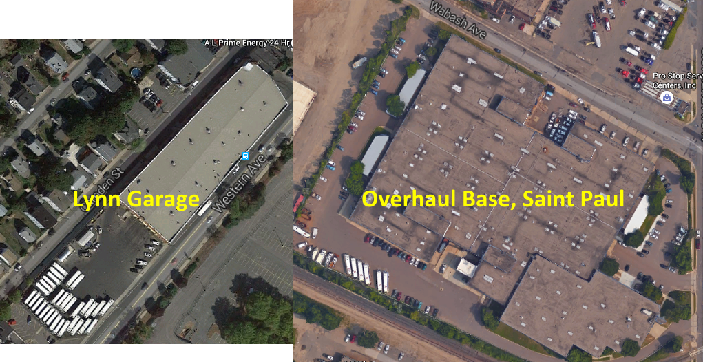
Even still, the Twin Cities’s bus yards are not as centrally-located as Boston’s (T yards are often shoehorned in to small parcels; MetroTransit yards are usually larger and squarer). While Boston runs 11% of its mileage out of revenue service (deadhead), the Twin Cities run 24% (and as far as hours go, Boston is 9% deadhead and the Twin Cities 14% owing to a larger and less-crowded highway system in the Twin Cities). To access these newer, more efficient facilities requires significantly more operation expense. It would be as if the T built new bus facilities in Billerica, Southborough and Brockton: they’d likely be more efficient, but savings would be eaten up driving buses back and forth to and from them. Given the T’s salaries, if their garages were located such that they required 14% deadhead hours like the Twin Cities, it would add $5 million to annual operating costs.

That being said, MetroTransit has certainly invested money in vehicle maintenance facilities that the T has not. If the T had spent a billion dollars on a set of brand new bus maintenance facilities, it would likely spend less on maintaining its buses. Of course, if we assume that there is $1 billion in deferred facility capital outlay and that a bus maintenance facility has a useful life of 50 years, it would cost $20 million per year to build those facilities, money the T is currently spending on other projects. I’m not saying that this is a logical way to do business; the T should budget for and build adequate maintenance facilities. But comparing a system with new, enclosed facilities with the T’s antiquated mishmash of bus yards and small garages certainly needs some qualification.

The T’s maintenance budget runs $40 to $60 million ahead of MetroTransit each year. But, again, there’s much more to this than meets the eye. If the T required as many deadhead hours as MetroTransit, it would cost $5 million extra in operating costs just to get the buses to and from the garage. Given the difference in cost of living, the T’s salaries are higher than MetroTransit’s. If we only look at salary, the cost of living difference accounts for $6 million of that difference, and if we add in benefits it’s $11 million. And then, there’s the $10 to $20 million annually that the T hasn’t spent on new maintenance facilities. Better fleet renewal and capital outlay for maintenance facilities would probably help the T’s maintenance budget: maintenance is not siloed financially from the rest of the transit system’s operation.

In 2013 the T spent $104 million on vehicle maintenance to MetroTransit’s $45, so I’ll use those numbers. I will note that was a year before the T accepted a large order of New Flyer hybrid buses, which should require less maintenance than the 20-year-old RTS fleet they replace. In 2013 T’s bus fleet (average age: 9.4 years) was significantly older than MetroTransit’s (average age: 5.1 years). (I’m not even accounting for the lower capital costs the T has with an older fleet, although the fleet age obviously manifests as higher maintenance costs.) This could certainly be reanalyzed for other years; by using the year when MetroTransit had a much newer fleet, this probably paints the T in a worse light than is actually the case. According to Pioneer, during years in which the fleets for the MBTA and MetroTransit were similar ages, the T’s costs were only about double MetroTransit’s.

In any case:

Total Annual Expendeture $105m % of total
– Deadhead operation cost difference

– Cost of living difference (salary, salary+benefits)

– Facility construction

–$5m

–$6m-$11m

–$10m-$20m

5%

6-10%

10-19%

Adjusted total $69-$84m 66-80%
% of difference $21m-$36m 35-58%
† Adjusted total ($90m MBTA) $55m-$70m 22-39%
† % of difference ($90m MBTA) $20m-$35m 44-78%

† From 2006 to 2009, MBTA costs were about 200% of MetroTransit costs, and the bus fleets’ ages were similar. Assuming that if the T had a similarly-aged bus fleet to MetroTransit and double the costs, it would have a $90 million maintenance budget. If this is a good way to account for the fleet’s age difference, between 40 and 80% of the difference could be explained by deadhead operation expenses, cost of living and facilities.

Citing high salaries as a scare tactic


One of the favorite pastimes of the anti-union, anti-government folks is to find someone who works for the government and makes a lot of money and hold it up as an example of government waste (well, unless it’s a football coach; they’re fine with that). In their report, they go and find examples of people making a lot of money (a painter making $80,000! A machinist making $120,000! A car cleaner bringing home $70,000!) and use this to show how wasteful government is. But, of course, this is hyperbole. These are outliers: probably people who worked a lot of overtime—some 60 hour weeks—in order to make that much money. Since transit runs 24/7, there’s overtime to be had: a few extra buses break down, or someone calls sick and a worker picks up an extra shift. Are there some savings to be had from better oversight of overtime? Probably. But without showing the average numbers, these are pure scare tactics, a rhetorical device that doesn’t stand up to any scrutiny. Luckily, I have the T’s salary database sitting around (which is public record, of course), so we can do some such analysis.

Yes, all MBTA salaries are public information.
You can access the file here.

It’s unlikely the T will ever be able to use non-union employees, even if maintenance is privatized. Given the construction boom in Boston, these salaries do not seem far out of hand for union labor (union sheet metal workers, for example, make nearly $100 per hour, or $200,000 per year, although they don’t of course, have the job security a T worker does). Here are the base salary ranges for the major employment categories among the T’s bus maintenance personnel:

Fueler $34964 – $43014
Machinist $57262 – $77750
Car cleaner $60278
Painter/Carpenter $82035
Foreman $87672 – $100672
Sheet metal $89669
Pipefitter $94994
Wireperson $95617

On average, employees earned 119% of their 2015 base salaries in 2014. Why? As mentioned before, overtime. Could the T hire more employees and pay less overtime? Probably. But if they did, there’d be outcry from Pioneer about how even more workers were getting the platinum-level union compensation package and benefits. They want to privatize operations, and assure lower pay and benefits for everyone. Is that a way to treat public employees? I’m all for accountability, but it shouldn’t require these sort of threats.

To add it all together …


Pioneer’s top line statement—that the T could have saved $250 million in bus maintenance costs over 6 years—is specious. They massage and manipulate data, but it doesn’t stand up to any scrutiny. Does the T have some of the highest maintenance costs around? Yes, it does (although New York is higher still). Some of this is due to the operating environment, some is due to local costs of living, some is due to the lack of appropriate facilities and, yes, some may be due to the performance of MBTA employees. The T could probably reduce it’s overall maintenance expenditures with different management practices, but to insist that those are put in to place without any funding (for instance: to insist on better management while many repairs take place in outdated and/or temporary facilities) is just silly. To use blatantly and obviously manipulated numbers to make this argument is disingenuous, and, once examined, the Pioneer Institute’s argument falls apart. There is very little defense for this sort of sloppy “analysis,” and it certainly should not be relied upon to make policy changes.

Using several different—and more honest—metrics, we can explain away much of that difference:

  • 60% of the Pioneer Institute report’s difference in costs arise from their suspicious definition of “peer agency.” Of the $250 million that they claim the T could save, that accounts for $150 million of it.
  • Just by using maintenance cost per hour instead of maintenance cost per mile, the difference is 20% lower.
  • In comparison to the Twin Cities, we can explain 35% to 75% of the difference in costs between the two systems.
The Pioneer Institute had an agenda: to reduce the power of public employee unions and privatize all that they can. Their position may well be “why spend time and money figuring out how to reform our management when we can just outsource it and let the magic of free market competition figure all that out for us, via a contractor, now?” But without good data on other systems (Has any large system privatized and had major cost benefits? They don’t say.) this is a hollow sentiment. And the MBTA’s current contractors have been doing a less-than-stellar job of late: the publicly run subway operations recovered from the blizzards far more quickly than the private-contract Commuter Rail system.

Pioneer saw a well-compensated set of individuals, and tried to make a case that they are lazy, that they have a poor work ethic, and that compared to their peers in other cities, that they have poor work quality. It’s true that MBTA costs are higher than many other agencies, and the T could probably implement policies to bring costs down to some degree. Upon further examination, however, it is the “research” coming from the Pioneer Institute that is low quality, not the work of the maintenance department at the MBTA.

Globe Business is unfamiliar with the transit business

An article so bad a whole page of letters
was needed to point out all its flaws!

A few weeks ago, the Globe Business section wrote about Kendall Square traffic, barely paying lip service to transit and cycling (and ignoring the fact that most of the complaint was in regards to a construction project which will rehabilitate the 30-year-old infrastructure which is falling apart). The article was rightfully called out by no fewer than eight letters (one by your’s truly)—the entire back page!—in the opinion section.

To follow that up, today future Boston2024 spokesperson and cheerleader-in-chief Shirley Leung writes a completely misinformed, Jim Stergios-esque piece about transit privatization, which demands a full line-by-line refutation (sometimes called a “fisking“). So, here goes (original in italics, my comments not):

It costs the MBTA a staggering $20 per passenger to provide late-night bus service. At that rate, the authority might as well hand out cab vouchers.


This is true, if you look at no externalities, which is something business writes don’t know about, I guess. If you look at increased transit trips before the late night service begins, it shows that providing later service increases transit use earlier on as well. Additionally, increased late night service helps the local economy (more people out spending more money) and especially the low-wage service workers who are required to run it and don’t have to shell out for expensive taxi trips.

But if the T can be cut free from the state’s antiprivatization law — which Governor Charlie Baker and Speaker Bob DeLeo are proposing to do — it just might be able to operate a night owl service that makes financial sense. 


One of the reasons the Night Owl service costs what it does to run is that service is more heavily used in certain areas, and less-so in others. So, what are we going to do? Operate only a couple of routes that have a lot of riders (the Red and Green lines, basically) and not operate to lower-income areas where people actually need the service?

And here’s how: Get someone else to run it.


Now, I know the mere thought has members of the Carmen’s Union and their supporters in the Senate fuming, but let’s not make privatization the bogeyman — or for that matter, the system’s savior. The T has plenty of functions that are privatized, from commuter rail to ferry service, with varying degrees of success.


The major T service that is outsourced is Commuter Rail. You know, the system that took a month and a half to return to service after the snow (the subway took weeks less), canceled trips without telling the higher-ups at the T and stranded passengers. That one? That’s the model?

No one is proposing to outsource all bus or subway operations, but the T needs more flexibility in order for true reform to take root. In other words, we can’t keep the same handcuffs on if we ever want to escape our miserable transit past.

Our “miserable transit past.” The one that has seen ever-increasing ridership despite aging infrastructure and car-centric planning. The snow this winter was not only unprecedented for Boston, but for any other major city anywhere in recorded history. Apparently Sweden had similar accumulations in 1965 and the rail system was shut down for two weeks.

“I am not saying privately run services are a panacea,” Transportation Secretary Stephanie Pollack told me. “They are a tool, and they need to be an option.”


The antiprivatization statute, known on Beacon Hill as the Pacheco Law after its primary sponsor, Senator Marc Pacheco of Taunton, was created in 1993 in reaction to Governor Bill Weld’s privatization initiatives. The law, pushed through by public employee unions, makes it difficult for certain Massachusetts agencies to contract with private firms for any work being done by state workers. Baker is proposing to free the MBTA from the constraints of Pacheco, while DeLeo’s version calls for a five-year suspension of the statute. 


So let’s get back to the example of late-night service, and imagine what Pollack could do if the Pacheco law no longer applied to the MBTA.

Yes, let’s imagine.

Last year, the Massachusetts Bay Transportation Authority launched with much fanfare a one-year pilot to extend train and bus service until 2:30 a.m. on Saturdays and Sundays. Fares do not cover the cost of running the T, but the subsidy on late-night service is substantially more. For example, a typical bus ride costs the MBTA $2.74 per passenger, while the cost for late-night service is nearly eight times the amount.

Most late night rides are on the subway, which costs the T significantly less per passenger (about $1). The $2.74 figure is for bus trips only, and includes all trips: rush hour service is far more efficient, breaking even on some trips, while evening and weekend service, with less patronage, has a greater subsidy.

It’s more expensive because the agency is using its full-size 40-seat buses at night when there are fewer riders. 


This could be said for middays, evenings, weekends and holidays, too. Most late night service is provided by trains, which is why it’s much more popular than the 2001-era bus-only service.


What’s more, the buses run on a schedule designed for daytime commuters.

No. They don’t. Only a few buses run at all late at night, and all routes operate at far less frequent schedules than at rush hour. The 111, for example, runs every three minutes at rush hour. It runs every 15 minutes during late night service. That’s one fifth the service.

Freed to do what it wants, the MBTA could hire an outfit like Bridj, the upstart Boston transit service that employs 14-passenger bus shuttles and designs demand-based schedules.


Despite their posturing, Bridj currently runs specific routes which change intermittently but not based on real-time demand. 14 passenger vehicles might not be enough for late-night service on some routes, so they could theoretically replace only some routes. (Bridj will respond that they have some “special sauce”—their words, not mine— to deal with this but I’ll believe that when I see it; for now it’s a fixed route system.)


 The savings come from being able to adapt to a nighttime business model.

Which is going to be a heavy lift for them. Currently, the T’s late night service carries about 10,000 passengers each day of late night service, in approximately two hours (5000 passengers per hour). Right now, Bridj carries maybe 500 passengers each day during morning and evening rush hours over approximately five hours (1000 passengers per hour). So we’d be asking them to scale by 5000%, which is a lot, considering they’ve added minimal service since they began a year ago (and have cut back service as well, although this goes mainly unreported). Maybe they could supplement service on a few outlying routes, but it’s unlikely they’d replace the transit system wholesale, so any savings would be minimal.

But the opportunity to use partners like Bridj goes beyond providing a special service. Similarly, the MBTA could save money by outsourcing bus routes with low ridership — and there are many of them. For example, one route in Lynn makes nine trips a day carrying a total of 45 people, which means on average of five people are riding that bus.

Oh, Shirley. The route that Leung is referring to is the 431 in Lynn. It makes nine round-trips per day between Neptune Towers, an affordable housing development in Lynn, and Central Square. Some of its trips are pull-outs from the garage: a bus leaving the Lynn garage, rather than operating out of service, picks up passengers along a route it would already be serving. All trips are interlined with another trip (usually the 435). It operates a total of 1:22 each day, so at $162 per hour (the T’s hourly cost for bus operations) it costs about $220 to operate per day, discounting the fact that some trips would operate anyway since on pull-outs and pull-backs. Most of the trips are run in downtime between other trips, so instead of paying a driver to sit at the Lynn busway, the T provides service to an affordable housing development nearby, so the marginal cost of the service is quite a bit lower.

And how would another provider provide this service? Each round trip takes 10 minutes. Will a private operator pay a driver to sit in Lynn for an hour, run a 10 minute trip, and then sit in Lynn for another hour? Is that efficient? It could be argued that a smaller shuttle could make the trip back and forth to Neptune Towers more frequently, and that may be true. But that type of service is not really one the T provides, nor should it be one; the 431 is the case where the T has an otherwise idle bus for a few minutes and uses those to provide additional service at a minimal extra cost. This should be applauded, not derided.

This is a very good illustration of what I would call the “end of route” fallacy. If we imagine the 431 as an extension of the 435 bus (which, for all intents and purposes, it is), Leung sees an empty bus near a terminal point and assumes the whole line is empty. The 435 carries 900 passengers on a typical weekday between Lynn and the Liberty Tree Mall (making 16 round trips, so 28 passengers per trip in each direction). Leung is only looking at the 45 passengers it carries on this short extension. It’s akin to the people who say “that bus comes by all the the time and there’s never anyone on it” and then you find out they live one stop from the end of the route and by the time the bus reaches its destination it’s packed full of passengers.

There’s a further comment here: the T operates a few such routes which never see terribly high ridership but serve specific populations and are politically unfeasible to cut. One one end of the spectrum is a route like the 431, or the 68 in Cambridge. The 68 is never full, but it provides service between to Red Line stations to Cambridge’s City Hall annex and library, and is thus politically important. (The 48 bus in JP is a great example; its 85 riders each day were not happy to see it go.) Then there are train stations like Hastings and Silver Hill in Weston. They only have a few riders per day, but those riders are the “right” riders. Cutting these routes, in the grand scheme of things, saves very little money compared to the trouble it creates.

The 68 and 48 might be examples where the T could contract out services, but they are small potatoes compared with the rest of the system. Most every T route requires a larger bus at many times during the day. (88% of routes and 92% of trips are on routes which average at least 15 riders per trip—obviously more at rush hours—a size above which an operator needs a Commercial Driver’s License and commands a higher salary.) And since buses can’t magically switch from a 14 foot cut van in to a 40 foot transit bus, it would mean more time deadheading back and forth from bus yards at different times of day. Is that efficient?

But eliminating Pacheco is not just about saving money. It can also be about improving service. Yes, the MBTA could actually add routes with the help of private partners.

Yes, maybe we’d get back the 48, and the 68 would operate with smaller buses. There are maybe 10 routes the T operates which could conceivably see service with smaller vehicles to meet demand at all times. They account for two or three percent of the service. By the time you outfit those small vehicles with compatible fare equipment, ADA access and otherwise make them interoperable with the T, it makes sense to just cut your losses and operate a one-size fleet.

That’s what most excites Bridj founder and chief executive Matt George — the ability to bring his idea of flexible mass transit, well, to the masses who ride the MBTA. When he launched Bridj last summer, he never considered it competing with public transportation.

Good thing they don’t have an ad at the station in Coolidge trying to lure commuters away from their crowded (read: efficient) commute to a smaller, less crowded (read: less efficient) vehicle. While Bridj is often secretive about their numbers, sometimes they let stats slip, and it’s not the rosy picture they paint publicly. For instance, they claim that 20% to 30% of their riders are “new to transit”, while the other three quarters apparently are lured off of other services. And again, Bridj, which operates about 50 trips per day in Boston, has a capacity of about 700 passengers (if every seat of every bus is full, which is not the case), or about 0.05% of the MBTA. It’s quite possible that their shuttle buses actually operate more miles than the cars and taxis of the few people who weren’t riding transit beforehand.

“We are in a supplementary position,” George said. “We are neither set up nor we are interested in wholesale taking over anything.”

Which is good, because they’re not about to. But right now, they “supplement” peak hour transit, which is when the T does well for itself and likely makes a profit. (Oh, and a lot of it runs underground, so it doesn’t create more congestion.) It’s those pesky other times of the day and week that lose money, but provide necessary service. The T, in a sense, supplements itself.

Another big idea from Pollack is to look at whether the MBTA should own and maintain its rail cars and buses. Perhaps the state should look at whether it’s more cost-effective to lease — and require the manufacturer to maintain those vehicles.

What’s that sound? Is it a bird? Is it a 40 foot CNG NABI? No, it’s the Pioneer Institute being wrong about something, again!

That, in one fell swoop, attacks two problems. The T cannot keep up with maintenance of the existing fleet and infrastructure, with a $6.7 billion backlog of repairs that is growing. It also has come under fire for spending $80 million annually on bus maintenance, nearly twice as much as other transit agencies, according to an analysis by the Pioneer Institute, which blames the high cost on overstaffing.

This site has published a full refutation of the Pioneer Institute’s report. Let’s just say that their data analysis is specious at best and intellectually dishonest (okay: lies) at worst. The T spends less on bus maintenance than New York, and only 40% more than other large transit agencies (not 100% more). That 40% could be made up with better management practices (which should be investigated) and with capital investment in the T’s maintenance infrastructure. While other cities often have large, indoor storage yards and new maintenance facilities, many of the T’s date back nearly a century, and most buses are stored outdoors. More to come on this soon.

Here are some more numbers from the Pioneer Institute to chew on. Unlike the MBTA, the regional transit authorities — from Springfield to Lowell — can outsource. They spend, on average, $6.38 per mile to operate their privatized lines, compared with the MBTA, which spends $16.63 per mile to run its bus routes.

Has Leung seen the service provided by some other RTAs? Many run much smaller vehicles already, so it shouldn’t be surprising that their services are cheaper to run. Service is much more limited; many RTAs run service only until early evening and few run any service on Sunday at all! Likewise, the service they do run is rarely near capacity, and crush-load buses puts much more wear-and-tear on the physical infrastructure of the bus. A fully loaded bus carries 50% of its weight in passengers. Imagine driving a Toyota Corolla with five 200-pound people crammed in to it, and 400 pounds of luggage in the trunk, versus two people. Do you think that the overloaded car will need new tires, shocks, struts and a transmission (not to mention use more fuel) than the one with one or two people and a suitcase in the back seat? This is an apples to oranges comparison.

The fear of privatization comes down to taking away somebody’s job. If that’s the case, the Senate should work up a compromise to make sure union drivers are at the wheels of private buses.

Fine, but then expect the costs to not save that much money, since there are added costs (more yard space, more out-of-service operation) to those operations to eat in to any savings.

A reprieve from the Pacheco Law would go a long way to fixing the T. But, as the governor told lawmakers last month in defense of his broad plan to shake up the T, if nothing changes, then nothing will change.

A reprieve from Pacheco will make at most a very small dent in a few services the T operates. It may reduce costs by 20% for 10% of the buses the T runs. That would be one half of one percent of the T’s total budget. Is that really worthwhile? There are certainly places where the T could be more efficient. But except in a few cases, this is not a real solution, but anti-government mumbo-jumbo.

On free transfers

There is a Tweet going around that Baker’s MBTA bill has language that would allow the T eliminate free transfers. This is bad policy for a variety of reasons, disproportionately impacts the poor, disabled and elderly and would run counter to industry best practices. More on that another time. For now, here is the specific language in case you want to contact your legislator.

Current statute contains the following (Chapter 161A, Section 5, Subsection (r)):

To adopt, and revise as appropriate, a fare policy which addresses fare levels, including discounts, fare equity and a fare structure, including, but limited to, fare media and passes. Said fare policy shall include a system for free or substantially price-reduced transfer privileges.

And Governor Baker’s Bill (here) would replace that language with:

[T]o adopt a fare policy that balances the operational needs of the authority, the extent to which the authority’s fare recovery ratio is consistent with those of peer systems, the objective of increasing ridership and maximizing total fare revenues and the needs of its riders, including those of lesser means.

Much more on what the role of government is (to maximize revenue or to provide necessary services?) another time. But this is bad policy, and should not be implemented or put in to law.

Jim Stergios is bad at math

Update: It turns out, the Pioneer Institute as a whole is bad at math.

Jim Stergios, of the Koch-funded Pioneer Institute (edit: NOT the author of the discredited absenteeism report; my apologies to them for that insinuation, it’s only that, you know, Baker ran the Pioneer Institute, and the report was used by his commission had similar issues to other Pioneer reports), uses a lot of numbers to try to set up his arguments in response to a piece by Jim Aloisi. The problem? He uses numbers which are very convenient for him, ignoring longer trends which make his argument far, far more flimsy, and in many cases, completely refuted. He starts with an agenda, he warps data to make it fit that agenda. The problem is, the data tell a much, much different story.

• First, he references that in 2011 and 2012, 8 million commuter rail passengers were inconvenienced by late or delayed trains. That’s a big number. 8 million! But he doesn’t have a denominator. A big number without a denominator is meaningless (which was what most of the hubbub about the absenteeism report was about.) How many trips are there, annually, on the T’s commuter rail? If it’s 16 million, that’s a lot of delays. If it’s 80 million, it’s not quite as much. The answer? In 2011 and 2012, there were about 75,000,000 trips on Commuter Rail. So 8 million represents about 10%. Could this number be improved? Certainly. But without a denominator, this is a scare tactic: a number with no context. He claims that this resulted in a loss of ridership and revenue. But without any other years to compare it to (Were delays better or worse in 2006? He doesn’t say.), those claims are specious, at best.

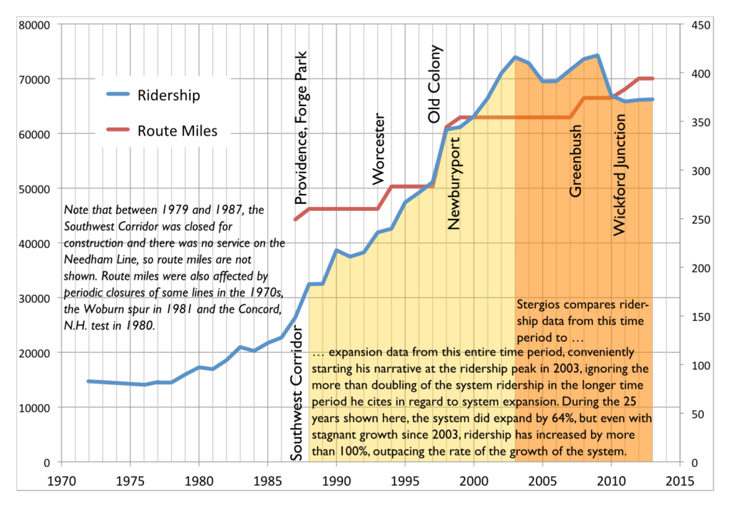
(Vertical lines show locations of system expansions.)

• Then there’s this:

Notwithstanding the fact that the MBTA added more commuter track miles than other major transit systems in the country over the past 25 years, quickly raised fares and continued substandard service led, remarkably, to a decline of 13 percent in commuter rail ridership from 2003 to 2013.

Can you spot the incongruity there? Stergios assails the T’s expansion over 25 years, but is only concerned about it’s ridership over 10. It turns out that before 2003, the T was the fastest-growing commuter rail system in the country. If you look at the period from 1988 to 2013, T commuter rail ridership more than doubled. Even if you exclude extensions, at stations open in 1988 and 2013, it grew 65%. I made the argument that T ridership is hampered by high fares, and stand by that conjecture. In fact, for trips between 18 and 27 miles, the T has the highest fares of any commuter rail system in the country (this will be explored in depth in a later post).

It’s almost as if the investment in commuter rail in the 1980s and 1990s paid dividends in ridership during that time. But for an institute that wants to cut investment in transit, those data are very inconvenient. So they choose to ignore them. Thus, his data are misleading at best, and borderline fraudulent at worst.

• So he’s stepped in it already, but then he links to an article from his policy “research” institute that allows him to step in it some more. That article goes to great lengths about how, between 2003 and 2013, the T was the only major commuter rail system to lose ridership. You know what, I can’t argue with that. During that time period, the T did lose ridership, while other agencies gained. Again, I contend that it’s due to fare policy, but we each have our ideas why. But notice how he again very conveniently picks 2003 as his start date, which was the highest ridership on record. By doing so without showing any other data, he suggests that the T has underperformed other commuter rail networks. Let’s see if that is actually the case.

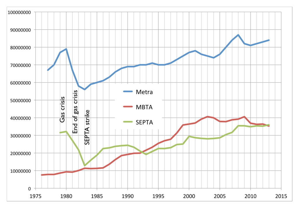
Annual ridership for SEPTA, Metra, MBTA

The two most similar commuter rail networks—with multiple legacy lines feeding the city center—are SEPTA in Philadelphia and Metra in Chicago. They also (conveniently for me, this time) have ridership data back as far as 1980. (Here’s SEPTA, here’s Metra, which I estimated from a chart but is exact enough for this post. Unlike Pioneer I don’t obscure my data sources; all MBTA data came from the Blue Books available on the T’s web site.) And, yes, the MBTA has had stagnant ridership in recent years, while SEPTA and Metra have both trended upwards. (This is also the case with New York’s commuter railroads, as well as Caltrain and MARC.) So there is certainly a case to be made that the MBTA’s commuter rail networks has been a laggard in recent years. This is likely due to a variety of factors, including stagnant service levels (SEPTA has, in recent years, been adding service), increasing fares (both Metra and SEPTA have lower fares per mile) and equipment and trackage which has been allowed to fall in to disrepair (SEPTA has invested heavily in their physical plant recently, and Metra runs on freight lines which have kept their tracks in good working order).

But the chart above is only one way to look at these data. Another is to normalize everything by an arbitrary year. I used 1988 (left), because Stergios likes to look back that far (sometimes). But for fun, I also made a chart that goes back to 1979 (right), because that’s the first year I have data from for all three systems.

Feel free to click to enlarge. The 1988 chart shows how, in the past 25 years, ridership on the MBTA Commuter Rail system has far outpaced SEPTA or Metra, growing by more than double while the others grew at a much slower rate. Go back to 1979, and the T has more than quadrupled, while, after falling off in the early 1980s, Metra and SEPTA only recently surpassed gas crisis ridership levels. In fact, if you look back to most any year but 2003, you get a very different picture. But, again, Pioneer’s “research” is picking and choosing numbers to fit their narrative, but not to show what actually happened.

• But wait, there’s more. He also claims that the MBTA has added more commuter track than any other system in the country in the past 25 years. Here he’s not fudging numbers, he’s just plain wrong. The T operates 394 miles of commuter rail. Metrolink, in Los Angeles, operates 388 miles. However, Metrolink began operation in 1992 which—let me get out my abacus, carry the 2—is only 23 years ago. So in the past 23 years they’ve added 388 miles. I’m not sure to the decimal of the amount the T has added (it’s about 145 miles over that time, of which at least 20 is in, and paid for by, Rhode Island) but it is certainly less than 388; even in 1988 the T operated more than, say, a shuttle from North Station to West Medford.

• Stergios also references his bus maintenance study, but that study borderlines on laughable, and may also be the subject of a separate post. Of several data irregularities there, the most glaring are the comparisons that the Pioneer Institute draws from the most comparable bus systems. For example, the list of most comparable bus systems to the T’s includes many systems in warm climates with low living expenses and ridership 1/10th of the T. Are we surprised that the transit authority in El Paso or San Bernardino has lower costs?

They make a major comparison to MetroTransit in the Twin Cities, an agency that also maintains buses in a colder climate. But nowhere in the report do the point out that while they have the same number of buses, the T carries twice as many passengers, and therefore, twice as many passengers per bus. This means that the T runs many more buses at or over capacity. A bus crammed with 75 passengers on board carries about 30% of its total weight in passengers, putting much more stress on not just the motor, but the air bags, axles, struts, tires and other equipment. (Imagine loading a Toyota Corolla with five 180 pound people and 500 pounds more in the trunk and a roof box. That’s what the T asks much of it’s fleet to do several times per day.) Many of the T’s bus routes run at this capacity on a daily basis. Only a few MetroTransit routes do, and often over longer distances. For instance, the MetroTransit Route 5 has comparable ridership to the T’s #1 bus, but its route is three times longer, meaning that the bus is not full nearly as often.

It is opaque as to how the Pioneer Institute chose other comparable agencies, but they often talk about the 79 other “large” agencies. However, the T is one of the top 10 agencies, and comparing it to an agency with as many passengers a day in total as the #1, #39 and #66 buses carry makes no sense. Is there a correlation between bus maintenance costs and overall ridership? They don’t bother to find out, and continue with these false, apples-to-oranges comparisons. The only comparable agencies in their database of the 20 most-similar systems are WMATA in DC and Muni in San Francisco (and even this is not apples-to-apples; WMATA carries fewer passengers per bus while San Francisco has no winter weather). Those agencies’ costs perfectly bracket the T’s maintenance costs per mile: the T is $3.80, WMATA is $3.20 and Muni $4.40. Compared to those agencies, the T is about where it should be.

Stergios claims that if the T operated with the efficiency of the average of these “comparable agencies” it would save $40 million a year or more. But if it operated with the efficiency of the agency in San Francisco? The T would actually spend more money. This whole study comes apart if you pull any one of many loose threads. That it is even in the discussion shows how picking only very particular data can make pretty much any point. What’s sad is that the legislature and governor bought it hook, line and sinker.

• There’s the stuff that’s just plain wrong. He claims that:

MBTA Board of Directors inexplicably authorized $47 million to purchase the Pittsfield-to-Connecticut Housatonic line

Really? The T is buying rail lines in Berkshire County? That sounds a lot like a MassDOT project, and indeed it is. They’re related, certainly, but that’s not money coming from the T’s pot. This is just careless.

WGBH fancies itself a news organization, and, as such, should have a fact checking department. Most of Stergios’s article does not pass even the slightest sniff test. GBH should be ashamed for publishing this article full of half truths at best, and several outright lies. As for Stergios and the Pioneer Institute? Anything that comes from them is immediately suspect, and usually, when examined, mostly false. They should crawl back in to their hole until they can present data with a straight face.

The golden age of American railroading was in the Upper Midwest

In a factually-inaccurate-and-not-yet-corrected post, Michael Tomansky heard an anecdote (the Beatles made it from New York to DC in 2:15) and reported it as fact, claiming that it represented a golden age of American railroads which we will never see again. It most certainly is not: the GG1s the Pennsylvania Railroad rain in the 1960s were only capable of 100 mph as a top speed, and would have had to average 100 mph to get from New York to DC in that time (it’s quite nicely 225 miles in 2.25 hours). Scheduled times never fell below 3:30. 2:15? It didn’t happen. By the late ’60s, the Metroliners were running up to 125 mph on the corridor, with trains making stops clocking in at 3 hours and nonstops running in 2:30 once a day—it turns out it makes sense to stop in Philadelphia and Baltimore. Acela Express trains now make the trip in 2:45 making six stops; speed improvements could conceivably get this to 2:30, or to 2:15 non-stop (which is unlikely as intermediate stops cost only a few minutes and account for a lot of ridership).

But the fact of the matter is that before the Metroliners, there were very few trains that eclipsed 60 mph average speeds. Many streamliners of the ’40s and ’50s ran between 55 and 60, and a few, notably the Twentieth Century Limited and one of the Pennsylvania’s New York-DC runs, broke the 60 mph barrier. (The site linked has decent schedule information; easier than combing through the 1000-plus page Guide to the Railroads.)

The notable exception to this is not a single train, but a competitive market: from the late 1930s through the early 1960s, three separate railroads ran five trains per day between Chicago and Saint Paul at damn near—and in one case, over—70 miles per hour over a distance of over 400 miles, with several stops. (It was another half hour, after a long stop and at slower speeds, to the trains’ termini in Minneapolis.) In fact, for two decades between the beginning of World War II and the opening of the Shinkansen, they were likely the three fastest rail trips over 200 miles in the world. Here a good primer on the competition and the Chicago-Minneapolis schedule from 1952:

9:00-2:30, Morning Zephyr, 431 miles, 66 mph (in 1940: 6 hours, 72 mph)
10:30-6:05, Morning Hiawatha, 410 miles, 58 mph
1:00-7:15, Afternoon Hiawatha, 410 miles, 66, mph
3:00-9:15, Twin Cities 400, 409 miles, 65 mph
4:00-10:15, Afternoon Zephyr, 431 miles, 69 mph

There were several other trains, including overnight options, each day, and these five schedules which could get you between the Twin Cities and Chicago in barely the time it takes to drive today (without traffic). Today’s Empire Builder runs the route in 7:45, at a respectable 55 mph, but nowhere near the 70+ of yesteryear (between some stations, the trains averaged over 80 mph, stop to stop; runnings speeds well over 100 were not uncommon). So while railroad speeds have slowly increased on the East Coast, it’s the rest of the country that has seen speeds come down: in particular, the Twin Cities to Chicago market.

Why did this route have faster speeds than anywhere else? Part of it is geography. Each line had its advantages, but none had many tight curves or long grades, and there were few intermediate stops to slow the trains. But part of it is competition: not with car or air travel, but with each other. Nowhere else was there a similar three-way competition over this distance. Once one railroad established the 6-hours-or-so benchmark in the mid-30s, the others quickly followed suit, and it proved to be good business. They kept the speeds in to the 1950s, when regulations bogged down the railroads, and subsidies flooded road and airport construction; the trains slowly disappeared in the 1960s. Today’s Empire Builder follows several different pieces of the former roads.

In another country, there never would have been three trains plying the same route. French railroads were nationalized in the 1930s, and Germany and Japan’s railroads were decimated during the war and rebuilt afterwards. If American railroads had been similarly nationalized or had the same sort of investment, there’s a chance that the three competing railroads could have combined resources to build a single, higher-speed line: all had rolling stock capable of over 100 mph, so five or perhaps even four hour trips would have been possible even without electrification. However, after the war American railroads did not see government investment (we certainly spent more money rebuilding railroads in Europe than we did in the US) and without a time advantage over airliners or interstates, trains that averaged near 70 mph, and except for one line on the East Coast, haven’t come back.

Bridge costs and subsidies

Driving east on Route 2 today (carpooling!) we crossed through the Route 2 construction zone over 128. The 60-or-so-year-old bridge is decaying and is being fully rebuilt. 

Average daily traffic: 104,000, give or take.
Length of the bridge: 340 feet.
Cost: $50 million.
Cost per linear foot: $147,000
Cost per linear foot per person*: $1.18
(* assumes 1.2 passengers per car)

A bit closer to the city, there’s another bridge which whisks commuters in and out of Boston every day. It’s twice as old as the Route 2 bridge, and carries more people (but fewer vehicles). I speak, of course, of the Longfellow.

Average daily traffic: 130,000, give or take (20,000 cars, 100,000 Red Line, 10,000 bikes & peds)
Length of the bridge: 1850 feet.
Cost: $255 million.
Cost per linear foot: $138,000
Cost per linear foot per person*: $1.04

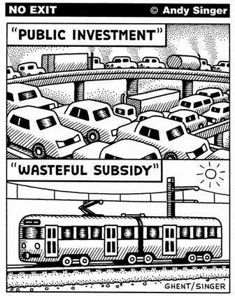
From Andy Singer.

The Longfellow Bridge, which is in a dense urban environment (harder to access with materials), over water (necessitating floating in many materials), includes significant historic elements (so it can’t be replaced with an off-the-shelf box-girder design), and is longer and higher than the Route 2 bridge, is actually cheaper to rebuild overall, and even moreso when you factor in the number of daily users. Sure, you could get five Route 2 bridges for the cost of one Longfellow, but those five bridges, end to end, wouldn’t reach across the Charles. So when we talk about transit subsidies versus highway subsidies, we should remember that, at least in this case, it’s cheaper to rebuild a multi-modal bridge than one used just by cars.

I’m not saying that we shouldn’t rebuild the Route 2 bridge. We can’t let our infrastructure crumble. But when it comes to rebuilding infrastructure, it’s important to know that every time you see cones on the side of the road, there’s a real cost involved. I would not be surprised if there are a lot of people who look at the Longfellow as a bloated project—a quarter billion dollars!—and don’t give a second thought driving by the orange barrels on Route 2.

Yet if we measure return on investment by how much new bridge we get per person traveling on it, it’s the little bridge replacement project out in Lexington that costs us more. And while the Longfellow is one of only a few transit-centric replacement projects (and even it contains a majority asphalt), there are scores of bridge replacement projects across the Commonwealth that chew up a lot more money. No one ever blinks an eye at a proposal to rebuild a decaying highway bridge. That’s necessary maintenance. But more transit projects are a much harder sell, even if they’re more efficient.

The problems with autonomous vehicles in cities

When I hear about how autonomous vehicles are the panacea for urban traffic woes, I’ve been skeptical. With every apparent advance—like the recently reported hand signal patent—I come back to the fact that they apparently still don’t work in the rain (it hasn’t rained much in Mountain View recently) and certainly not snow. And they’ve driven 700,000 miles, but mostly on the same subset of suburban roads that have been meticulously mapped, not new and varied roads across a variety of terrain and regions.

But I see the main issue is that autonomous vehicles will be unable to interact with people in the same way that people driving cars can. There’s a turn in Central Square in Cambridge from Mass Ave to Pearl Street (I happen to live a few blocks away) that’s a good example. It is right by a subway entrance and major bus stop, so there are tons of pedestrians. It has a couple of crosswalks but no signals. To make the turn, you often have to wait until pedestrians “screen” oncoming traffic, worm your way left, and find a gap in the pedestrian traffic to slowly get on to Pearl Street. Everyone is okay with this if it’s done at a slow speed—if you waited until conditions were perfect, you’d never make the turn. But by the letter of the law, none of this is legal. To make the left, you would have to wait until there is no oncoming traffic (rare), whether there are people in the crosswalk or not. Then to cross the crosswalk, you have to wait until there are no pedestrians within 10 feet of the crosswalk, a situation which might occur here once every 45 minutes. (It should be noted that crosswalk laws vary slightly from state to state, so rules would have to be coded differently for each jurisdiction.)

People driving cars can get through this intersection. But an autonomous car can’t be coded to break laws. If (more likely, when) it was involved in an accident, the code would be subject to discovery, and examined at length. If anything was found that permitted the car to break a traffic law, it would be legal ammunition to go after the deep-pocketed developers. In cities, everyone fudges the law a bit for things to work. Pedestrians step off near-if-not-in the crosswalk. Cyclists nudge over the line and leave a light a few seconds early. Cars slowly make turns when they don’t have right of way and pedestrians break stride so the cars can get through. It’s not perfect, but works. Sort of.

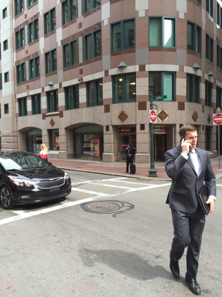
So, take a look at the picture to the right. In the middle, note that there is a person waiting at a crosswalk. An autonomous vehicle would see this person and stop to let them cross the street. But they would just stand there. The person might flick their hand, but the car won’t easily be able to interpret that as “oh, I’m waiting, go ahead.” Which puts the autonomous vehicle—or its coders—in a conundrum. If you stop for a pedestrian but they don’t cross, how long do you wait? 5 seconds? 10 seconds? A minute? Can you really have any rule there that would allow you to break the letter of the law and cross a crosswalk with a waiting pedestrian? And how often will an autonomous vehicle come to a complete stop because a person is near a crosswalk, even if they aren’t crossing? Will there have to be a manual override? However will that work?

Yet everyone driving a conventional car was able to quickly and easily tell that this woman was not crossing the street. Every so often she would wave her arm. An autonomous vehicle would have little ability to discern this movement. Waving at a friend? Waving at a person? Waving cars ahead? Waving because she was just released from an underfunded mental institution and waves at everyone? It turns out, the waves were pretty well correlated with the passage of taxicabs. Aha, she was hailing a taxi! This is something that every driver was able to intuit immediately, and no one stopped for her at the crosswalk. But an autonomous vehicle would be stuck. For how long? Who knows. Imagine a cab traversing 5th Avenue in Midtown Manhattan? It would wind up screeching to a halt every block as a New Yorker flung out a hand to try to nab an empty cab.

Sure, there might be fixes to this specific problem. Maybe Uber will render taxis a thing of the past. (But then won’t people waiting on the curb for an Uber create the same type of problem?) Maybe every taxi will be fitted with a transponder so that an autonomous car can see a person waving and correlate it to the location of a taxicab and make the connection that they’re hailing a cab. (Which seems to be a complex solution to a simple problem.) Maybe people will learn to hail cabs only away from crosswalks (fat chance). And even if this problem is somehow solved, there are thousands of others like it. Driving a car in a busy city has infinitely more scenarios than on a controlled access highway. You can control for one outcome, but there are thousands of others that may pop up.

And many of these will be one-off scenarios. The aforementioned intersection at Pearl Street is probably unlike most any other in the world. Cyclists are not required by law to use hand signals. A car may not signal, but may shade to the right, something some motorists (and many cyclists) know means they’re probably going to turn. To get around a double-parked car, you may have to cross the double-yellow line. Human drivers can pretty easily assess the scenario and risks involved and decide whether to operate outside the letter of the law. But an autonomous vehicle, in any of these situations, may find itself stuck. The whole selling point of the self-driving car is that it will be able to operate without a human driver. But in cities, it seems that there would have to be frequent manual overrides when the car finds itself between a rock and a hard place: where it can’t go forwards without breaking a rule.

People are good at breaking rules—and in city driving, bending the rules is frequently a necessity. Computers—by design—are not.

When Multiple Agencies Attack … a NYT Reporter

The New York Times ran an article this week wherein a reported attempted to navigate Los Angeles by transit. There’s an obvious faux pas in a picture caption (see right, and see if you can figure out what it might be), but otherwise the piece is a list of trials, tribulations and eventual successes trying to navigate Los Angeles by something other than a car.

Sometimes successfully.

As someone who once navigated LA for a week mostly by transit—aided by an iPhone and, at times, a friend at USC—I can empathize with Mr. Hanc to a degree: it can be hard to figure out how to use the system. And while I would criticize some of his convoluted routes and relying on infrequent direct buses when there were better options (and, yes, I’ll try to reconstruct his journeys later), another glaring issue is the multi-agency mishmash, especially in the part of LA where many of his travels took him: the area between Westwood, LAX and downtown.

First, Metro’s system is huge. The LACMTA carries more than a million passengers a day; only New York carries more. Since New York has the bus system separated out by borough, it’s probably the most complex system map in the US. Seriously, check it out:

Good luck making sense of that! But to add insult to injury, there are no fewer than 47 (forty-seven!) municipal bus operators. LA Metro has a long history of interagency squabbles—it was created in 1993 after two separate operators were merged because they almost built two subway lines that didn’t connect. And while, as far as I can tell as an outsider, there is not much contention right now, there are certainly still multiple agencies running multiple—and sometimes parallel—services, without fare or schedule integration.

It makes it tough, especially as an outsider, to use the system. When I was there, without time constraints, I stuck to Metro services (and a trip on Metrolink, the region-wide commuter rail service) even when another trip might have been better. I had a 7-day pass, and didn’t want to bother with learning the transfer purchase system. So I stayed away from Dash, and the Culver CityBus, and the Big Blue Bus, and others. But in the area that the Times author was traveling, he had too many choices, which led to enough confusion that he wound up taking at least one trip by car, and convoluted routings on others.

There’s obviously a lot of history and issues of local control, but from an outsider, it makes the whole system—which is complex enough already!—a pain to use. I know if, for instance, I’m in Chicago, and I want to go to a suburb, I might wind up on Metra and a Pace bus. Or that in New York I might need to take NJT or a Bee Line Bus or a bus out on Long Island. But to go from LA to Santa Monica is like going from Manhattan to Brooklyn, or the Near North to Wicker Park. Even in San Francisco, home to dozens of local agencies (many of them large—AC Transit is the tenth largest bus system in the country) the boundaries are generally clear: Muni in the city, AC across the bay, SamTrans south, Golden Gate north, VTA in San Jose.

In LA, all bets are off. It means that local riders may be penalized for crossing a city line; at least in San Francisco, the systems are county-run, and the dense cities (San Francisco and Oakland) only really have one system to use. Anyone unfamiliar with transit—whether a car-driving local or a visitor—will be flummoxed, as the author was:

But when I got to Westwood, I was dumbfounded. Buses of every size and color whizzed by: big blue City of Santa Monica buses, green Culver City buses, blue and white U.C.L.A. “Bruin Bus” shuttles. A barista at a nearby Starbucks pointed me to the one I wanted: the Metro Rapid 734 bus.

If you’re LA, and your reputation is already that it’s hard to navigate by transit, extra barriers to entry don’t help. The LACMTA is actually a pretty good system, buses are frequent, well-marked, go most everywhere, and once you learn the difference between an orange local bus and a red “Rapid” bus, as well as the fares (no transfers, cheap day passes) and a few other eccentricities, it’s easy (if not always speedy) to use. That is, unless you wind up going somewhere served by another agency. Then it’s almost as if you’ve flown to another city, even if you’re a mile away.

So, to recreate John Hanc’s journey, using GTFS, which has most transit agencies in it (and which I think he could have been helped by):

His first trip was from LAX to an unnamed hotel that overlooked the 405 he had to take the 734 on Westwood to get to. The 734 crosses the 405 on Sunset before going over the Sepulveda; it’s likely that it he was staying at one of the hotels at or near Sunset and Sepulveda. While he chose the airport bus to Westwood, a more frequent and less confusing option would have been the Culver CityBus 6 or 6R to Westwood ($1 fare instead of $10) from the airport bus transit center, and then a change to the 734. That bus would have dropped him on Westwood, not a few blocks away, for an easier transfer. Still, it’s multi-agency, so it’s not simple. And you have to get to the first bus on an airport shuttle, too.

The next morning he went from his hotel to the Hammer museum. He got a ride, even though it would be an easy, one-seat ride on the 734, every 20 minutes or so.

Next, he needs to take an afternoon trip from UCLA to downtown LA. This should be pretty easy, if not super fast. His buddy Mark works right downtown, near the terminus of all the buses and near the actual subway. Somehow Hanc finds a commuter bus that runs less frequently (four times a day!), and trades frequency for speed—and winds up waiting an hour for it. There’s a LA Metro route 534 from Culver City to Malibu, but it’s not the route he’s looking for: he wants a LA DOT 534, which is a different service entirely, although the fare media are at least integrated. Here, it pays to learn that any time you might make up waiting for an infrequent service you could spend already moving towards your destination, albeit slowly.

But it’s another illustration of how convoluted the overlapping systems are. You can take the LA DOT 534, or you can take Metro 720 to the Red/Purple Line, both of which will get you downtown in about 1:00, and which run parallel to each other. But there’s no fare or schedule integration. Maybe it makes sense for a daily commuter. Maybe. But for an outsider? Forget about it. It should be noted that if and when the Purple Line Extension a.k.a. Subway to the Sea (although it won’t quite get there) is completed, it will be a one-seat subway ride from Westwood to downtown, rendering the current alphabet soup for that ride moot. This might be done in 20 years.

Did he have to even go downtown? He could have taken an express bus due north and met Mark in Valley Glen, saving Mark the drive out of the way to pick him up, and himself the long wait for the bus. Since LA has no real center, it’s generally possible to get from one place to another without going downtown. (Although maybe he and Mark had dinner downtown; he doesn’t say.)

The next day he takes a BRT Line to a Subway. Easy. (Apparently Mark prefers to sit in traffic even though he lives walking distance from the Orange Line.) Then he was taking the Antelope Valley Line out to Newhall and coming back to Burbank, before transferring one stop outbound to the Burbank airport. He could have taken the 164 to Burbank, and then gone outbound on Metrolink from there. That would have also meant he would have bought a ticket from a machine rather than a person (and, yes, it’s perfectly fine to buy a ticket between non-downtown locations). And on the way back, rather than backtracking to Burbank and switching trains, he could have, again, taken a train to a bus.

So kudos to John Harc for sorta kinda getting around LA by transit. If only he’d actually planned ahead a little more, he could have saved a lot of time. And a couple of rides with Mark.

Bus Lanes on the Harvard Bridge

April was Bus Month here at Amateur Planner, and May is showing no signs of slowing down. I noticed recently that in a traffic jam on the Harvard Bridge (which occur regularly, especially during baseball season), there are not many buses on the bridge, but they carry a large portion of the people crossing it. So I waited for the next traffic jam on the bridge (not a long wait) and went to take a photograph, which I then annotated:

This was taken at the 250 Smoot marker (so about two thirds of the way to hell), and I noted that, in stopped traffic, there were 20 cars per 100 Smoots (this is a bit more than 25 feet per car; Smoot markers make it really easy to quickly measure things). I took a quick census of the number of people in each car (appeared to be about 1.3) and set about making the graphic above. (The bus numbers account for one at all-seated capacity, one at normal standing capacity, and one at crush load.)
Then I tweeted it, and it may have gotten retweeted a couple of times.
There was one bizarre (in my opinion—and I’m really not sure if it’s uninformed or malicious) response thread, which amounted to the following (as requested by the Tweeter, the full conversation is below):
This is where the bus does go. (1/4 and
1/2 mile buffers of MBTA bus routes.)
So, pretty much everywhere.

Responder: Plenty of people need to get where buses don’t go.
Me: I’m fine with them having one lane of the Harvard Bridge, and the buses go a *lot* of places; if they ran faster than cars, more people would take them.
Responder: So glad you’re not making the rules.
Me: Here are areas within 1/4 and 1/2 miles of bus routes, where again are people going that the buses don’t go? [See map at right.] And why should my tax $$ go to pay for buses to sit in traffic so cars can … sit in traffic? >50% of the people on the bridge are in buses. Why not give them 50% of the space?
Responder: It’s the when, not the where. Bus schedules don’t nec. match ppl’s schedules. RedSox fans all over NE. [editor’s note: see original Tweet in thread.]
Me: So if the buses were 15 minutes faster than driving, people would take them, and anyone who *drives* to Fenway deserves a dope slap. [There’s] plenty of parking at Alewife-Riverside-Wellington-Wonderland. Trains run every 5 mins. Why should 20k+ bus passengers be delayed 10 mins for a few Sox fans?
Responder: It’s about making connections too—when too many connections get inefficient, driving works.
Me: Driving works? Tell that to the people on that bridge: people were walking faster. Bus lanes means more people opt for transit, fewer cars overall, and less traffic.
Responder: Just because buses work for you doesn’t mean they work for all.
Me: That’s the problem. They don’t work. The deck is stacked in favor of driving. I’m not saying ban cars, I’m saying let’s equalize street real estate. Why shouldn’t a bus with 50 passengers have priority over a car with 1 or 2?

But this is the usual reactionary inability to see the greater good. Take away a lane from cars, and it’s an affront to driving. An affront to freedom. Un-American. Never mind the majority of people on that bridge aren’t driving cars. They don’t matter. Still, I haven’t heard this turned in to an equity argument, so that’s kind of groundbreaking.

So the first part of this blog post is a plea: Ms. Cahill, I want to know what goes through the mind of someone who can’t see that transit efficiency is a societal benefit, and that it will amount to more people using fewer vehicles. Please email me, comment here, and discuss. I want to know.

The second part is me, trying to quantify what would happen to vehicles displaced by a bus lane on the Harvard Bridge, and what the time savings would be for bus riders as opposed to the time penalties for drivers. And, as I am wont to do, I did this in chart form. I imagined a hypothetical traffic jam stretching across the bridge (0.4 miles) in a closed system where all of the cars feed off of Mass Ave on to the bridge (this is close to the case, but some traffic does enter from Memorial Drive):

At first glance, going from two lanes to one would double the length of roadway needed to store the same amount of cars. But several other factors come in to play. First of all, the buses take up the space of 8 cars—at least. Then, we can assume that 10% of the cars remaining will shift modes: if taking the bus is all of the sudden significantly faster than driving, people will use it. And people in taxis (by my estimation, 10% of the traffic on the bridge) will likely switch in greater numbers since they’re starting closer by: I estimated 50% mode switch there. Then there’s induced demand: make the traffic on Mass Ave worse, and some drivers—I said 10%—will choose another route, whether it’s the Longfellow or the BU Bridge or further afield.

Add these together, and I would guess that traffic would increase by between 1/3 and 1/2. Assuming that traffic moves at 5 mph, this would mean an increase of 2.5 to 4 minutes for each person in a car on the bridge. But it would also mean that buses would cross unencumbered by traffic, making the trip in one minute, and saving every bus passenger 7 (this assumes that the bus lanes extend back to Vassar Street, displacing bus stops and a few parking spaces on Mass Ave through MIT). With these numbers, drivers would incur 510 minutes of additional delay, but bus passengers would save nearly three times that much time—a dramatic benefit.

Am I way off base with these numbers? I don’t think so. When the Longfellow went from two lanes to one, vehicle traffic decreased by nearly half! Traffic spread to other locations, people chose other modes (walking, biking, transit), or didn’t make trips. The traffic apocalypse that was predicted didn’t materialize, and life has gone on.

The Harvard Bridge is one of the most heavily-traveled bus corridors in the city, up there with the North Washington Bridge, the Silver Line on Washington Street, the 39/66 concurrency on South Huntington, portions of Blue Hill Avenue, some streets to Dudley and the feeder buses to Forest Hills. (All of these should have bus lanes, by the way.) The 1 and CT1 combine for more than 15,000 trips per day and, at rush hour, better than one bus every 6 minutes. The bridge also carries the heavily-traveled M2 MASCO shuttle 6 times per hour. Combined, these routes account for a full (usually crush-load) bus every three minutes—which is why in a 10 or 12 minute traffic jam there are three or four buses on the bridge at any given time—transporting at least 1000 passengers per hour.

Bus lanes would allow these bus lines to operate more reliably, more efficiently and more quickly, meaning the same number of buses could run more trips, and carry more people. Which, if they’re 10 minutes faster than cars, they’re going to be carrying! This would be something that could be tested and quantified, and it could be done as a temporary pilot with cones and paint. There is no parking to worry about, no bus stops to relocate: just set aside one lane for buses (and give buses signal priority at either end of the bridge). This would take the cooperation of MassDOT, DCR, Boston and Cambridge—and prioritize “those people” riding transit over real, taxpaying non-socialist Americans—so I don’t expect it to happen any time soon.

Going in circles on the Silver Line. Or, how the T could save $1m tomorrow.

In my last post on the Silver Line, I wrote about how the poorly-timed light at D Street causes unnecessary delays. If you’re lucky enough to get across D Street, you then go through the power change at Silver Line Way and then begin the loop back to get on to the Ted Williams Tunnel to the airport (and soon, Chelsea). The end of Silver Line way sits right above the tunnel portal. But to get to that point requires a roundabout route, often in heavy traffic, which takes a full mile to return you right to where you started.

If only there were a better way.

There is.

After leaving the busway, the Silver Line outbound route goes down the Haul Road, merges in to a ramp from the Convention Center and D Street, and runs fully half the distance back to South Station—in mixed traffic—before finally turning on to the Turnpike towards the tunnel and the airport. What’s the point of building a bus rapid transit corridor if you then spend the same distance sitting in traffic to get back to where you started?

What’s worse, the “Bus Rapid Transit” endures two traffic lights in mixed traffic, and this traffic is often heavy, especially when when convention traffic from the nearby convention center spills on to the highway at already heavily traveled times of day. The route is more than a mile long, and in perfect conditions takes 3 or 4 minutes, but in heavy traffic can easily take 10 or 15; this traffic especially renders the “rapid” part of BRT useless.

Before entering this morass, there is access to the tunnel via a ramp next to a state police facility. If the buses could use this ramp, they would save three quarters of a mile of travel, two traffic lights, a yield at a merge and, conservatively, two minutes per trip. Combined with the potential savings at the D Street light, these two improvements could save 10% of the total round trip time between South Station and Logan—or Chelsea.

Now, perhaps there’s a technical reason the Silver Line buses couldn’t use the ramp. Maybe it was too steep for the buses. But in 2006, when part of the tunnel collapsed, the T was granted permission to use the “emergency” ramp to access the tunnel beyond the panel collapse. A Globe editorial from that summer praised the T for its quick thinking in utilizing this routing. Yet when the tunnel panels were fixed, the buses were rerouted to the roundabout course which brings them halfway back to South Station before they enter the tunnel.

MassDOT actually has these buttons.
Time to put them in to action.

There’s obviously no physical reason this ramp can’t be used, since it was used in the past. And any argument that the merge wouldn’t be long enough to be safe is unconvincing, especially since it would only be used by a bus every four or five minutes, even when the Gateway project to Chelsea is completed. The in-tunnel merge has 1/10 of a mile before the lane ends, far longer than similar merges on to the Turnpike in the Prudential Tunnel. Suggestions that this would be unsafe are protective hokum; with appropriate merge signage (perhaps even a “bus merging when flashing” light) there should be no reason why this can’t take place safely. The Transportation Department, MBTA and State Police need to convene to figure out the best way to use this facility, but the answer certainly should not be the usual “no,” or “but we’ve always done it that way.”

There’s an environmental justice piece, too, especially with the extension to Chelsea, a disadvantaged city a stone’s throw from Downtown Boston, but a slow ride away by transit. Right now, Chelsea residents are at the whim of the 111 bus—and the traffic on the Tobin Bridge. It seems foolish to build a brand new bus line to Chelsea but not to address one of the major bottlenecks on the rest of the route. If the Governor is serious about implementing reforms to improve service and save money, he should look beyond specious claims of sick time abuse and at where interagency cooperation could save time for passengers and time and money for transit operations.

Dr. Evil. Transit economist.

It costs the T $162 to operate a bus for an hour. The SL1 Airport service operates 128 trips per day, and we can reasonably expect that the Chelsea service will operate with a similar frequency. Fixing the D Street light and using this ramp could conservatively save 4 minutes for each of these 256 trips, which would equate to an operational savings of $1,000,000 per year.

Is this a drop in the bucket as far as the T’s overall revenue is concerned? Sure, it’s less than one tenth of one percent. However, it’s a million dollars that could be saved, pretty much overnight, with basically no overhead investment. We spent more than half a billion dollars building the Silver Line tunnel and stations, and acquiring the buses. And the SL1 buses actually turn a (slight) operational profit! It’s high time we removed some of the stumbling blocks it’s saddled with and let it operate with a modicum of efficiency.

#FixTheSilverLine