More ITDP truth-stretching

I wrote a lot last spring about the ITDP and their biased reporting on bus rapid transit. I thought I was done. I wanted to be done. And then I was looking something up and found this. More specifically, I found pages 23 and 24 and I just don’t know where to start. First on page 23:

BRT, however, has a distinct operational advantage over LRT: A BRT vehicle
can operate in mixed traffic on normal streets and then enter dedicated BRT
infrastructure without forcing passengers to transfer to another vehicle. LRT,
by contrast, can only operate where there are rail tracks, and passengers
coming from locations not served by the tracks must transfer to and from
buses, or to space-consuming park-and-rides, in order to use the system. 

This is just not true at all! A subway system can’t operate in mixed traffic. But light rail systems can—and do—all the time! Here’s an example from Boston. Here’s Pittsburgh. Here’s Philadelphia, San Francisco and Sacramento. And all of Toronto. Their big hit against light rail is belied by examples in many of the large cities in the United States! It’s just wrong.

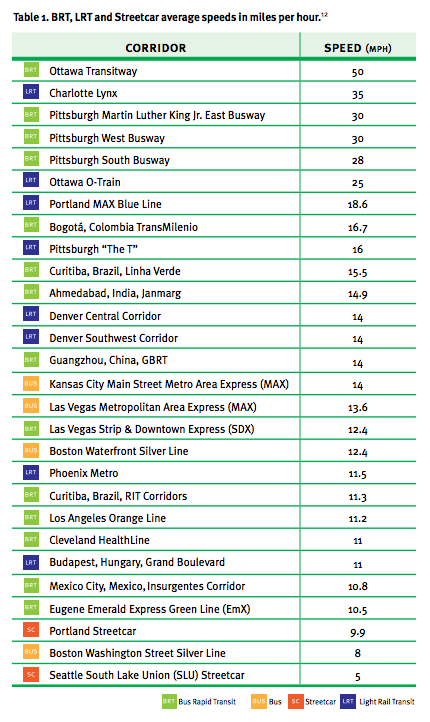
And then there’s page 24. Oy, page 24. Here, they have a list of average speeds for different transit systems. The idea being, I think, is that look how fast some of those BRT systems are! Look, in Ottawa, the average speed of a bus is 50 mph. 50! That’s really fast. That’s basically faster than any transit service in the country. I’m really not sure what conclusions they’re trying to draw from these data.

And the data seem specious, and I looked in to where they got their data from. Which was from a footnote (well, really an endnote) 129 pages later in the document. They know no one is scrolling back that far (Al Franken—yes, Senator Al Franken—makes this point about Ann Coulter; see page 19). Here’s where the data is from:

12. Speed data is from the following sources: Ottawa, Interview
with Colleen Connelly, OC Transpo, 2012; Cleveland: Interview with
Michael Schipper, Greater Cleveland Regional Transit Authority,
2012; Las Vegas, ITDP, Recapturing Global Leadership in Bus Rapid
Transit, 2011; Pittsburgh, Interview with David Wohlwill, Port
Authority of Allegheny County, 2012; Eugene, Interview with Tom
Schultz, Lane Transit District, 2012; Boston, ITDP, Recapturing
Global Leadership in Bus Rapid Transit, 2011; Portland: Interview
with Jillian Detweiler, TriMet, 2012; Phoenix, Interview with
Abhishek Dayal, Valley Metro, 2012; Charlotte: Interview with Tina
Votaw, Charlotte Area Transit System (CATS), 2012; Los Angeles:
Interview with Gayle Anderson, Metro, 2012; Kansas City: Interview
with Randy Stout, Kansas City Area Transportation Authority, 2013

Let me get this straight. They got speed data—data!—from a bunch of reports they commissioned themselves and from interviews. If they got accurate data, it would be one thing. But these numbers are wrong! First of all, there’s no way that the average speed for the Ottawa transitway is 50 mph. And they asked people for an average speed, and people gave it to them, and they probably didn’t understand what an average is because the ITDP itself doesn’t understand what an average is.

Here’s a trip on buses which serve the Ottawa Transitway. It takes 55 minutes on the vehicle. The distance is about 25 km. The average speed? 17 miles per hour. Even an all-on-the-transitway trip takes 20 minutes to go 15 km. That’s 30 mph, which is better. But still nowhere near 50. Maybe they got their metric conversions confused?

Let’s go to the Charlotte Lynx. Does it average 35 mph? It runs 9.6 miles in 26 minutes. It averages 22 mph. Not 35. Pittsburgh? 9 miles in 22 minutes (25 mph).

And some of the low numbers are too low. They claim Denver’s light rail averages 14 mph. Even through the city center, it runs 14 miles in 38 minutes. That’s 22 mph. Phoenix? 23 miles in 65 minutes (21 mph). The Orange Line in LA—advertised as 11.2 mph—actually runs 18 miles in 57 minutes, at 19 mph. They’re even sandbagging the mode they want to push!

In any case, it turns out that a fixed guideway transitway—light rail or bus—will run at about 20 mph, stops included. The Silver Line in Boston is susceptible to traffic, but at low-traffic times it even makes 12 mph. How did I find these numbers? The Internet, from actual schedules and times. It would behoove the ITDP to actually do some research as opposed to just making numbers up.

Four things the T has done well

I throw a lot of shade at the T. They deserve it. But every so often it’s good to remember that while there are lot of things the T does poorly, there are certainly things they’ve excelled at, things that are done well, and things that are way ahead of other transit agencies. Here are four:

  • In-Tunnel cell service.
    Go to New York. Get on the Subway. Try to send a message to someone. Unless you’re at the brand new Fulton Street Transit Center (which cost, uh, a lot) there’s basically no service. Maybe once in a while you get a little through a subway grate, and a few stations have wifi. But the T has had service in the tunnels for years (I think it was in 2012 when the Red Line in Cambridge got service) and there are only a few short segments (the E Line at Prudential and Symphony, the Silver Line) left to go. And I’ve seen some of the strongest signal ever in T stops, standing right by (read: getting zapped by) the antenna.

    The T also had the first Commuter Rail wifi service, but that’s never been terribly reliable (although it launched in 2008, which was the dawn of the iPhone). Now everyone can tether anyway.

  • Mobile Commuter Rail ticketing.

    It’s now been three years since the MBTA introduced mobile ticketing. As far as I can tell, it works pretty darned well. You can buy single tickets pretty easily, and even get a discount on a monthly pass (since you don’t get a subway/bus pass as well). The T was the first to have it, and other cities are catching up. Chicago just launched their app for Metra and it’s, well, not perfect. The mTicket app was inexpensive for the T to launch (free, I think, but it takes a cut of each transaction, which makes sense) and works well. And ahead of other agencies. It’s hard to argue with that.

  • Countdown Clocks.

    No, the Green Line doesn’t quite have countdown clocks everywhere. But they’re coming; and the T has done a pretty good job of getting the data and the infrastructure for a relatively low cost. But before you complain, go to New York. Except for the A Division (the IRT lines, or the lines with numbers) and the L train, none of the trains have countdown clocks. The reasons why are certainly very complex, but the Green Line also lacks infrastructure to tell where a train is (except on a much smaller scale). New York has sort of taken a “wait and see” approach, adding the data when signal upgrades are made. The T realized that people might want this information, and made it happen.

  • Open data.

    The T is really, really good about open data. Back in the dark ages (7 years ago, when the DOT was EOT) transit agencies were very protective of their data, wanting licensing fees to release it (really). No one wanted to tell anyone where a train might actually be, and when it might actually get there. Credit to Jim Aloisi for calling everyone out and basically opening up all the data. Within hours of the open data, there were apps.

    Now pretty much everyone has open data, but the T’s is actually pretty good, with bus and train locations for all vehicles in the system, useful data aggregation, and a ton of third-party apps. Turns out, it’s cheaper to give the data away for free than to try to make your own apps. Shocker.

    Plus, you get some amazing visualizations.

So when you get pissed off at the T because their train schedules are a mess, or their bus schedules are a mess, or they procure untested technology for high prices, remember that there are at least some things that they get right.

And if all else fails, remember: it took the T 120 years to wreck the transit infrastructure. DC has done it in 35.

New North Side Schedules: Good, Bad and Ugly

State of the art computer modeling? Yes.
Common sense? No.
Better service? Time will tell.

UPDATE! Schedule changes postponed!

The MBTA’s new schedules are out for the North Side Commuter Rail. The changes are … interesting. There are good parts, especially for Fitchburg and Newburyport riders. There are bad parts (things people won’t like), especially for people used to less-crowded short turns, and some bizarre service gaps which impact the shoulder periods of rush hour. And then there are ugly parts—parts that just don’t make any sense—that show that the process was not fully thought out. Unfortunately, it will probably take some time before this is changed, and require some public outcry for this to occur. A consultant and a computer model were used for these schedules, but common sense seems to have been left by the wayside.

Tl;DR:


Good news for 

  • Newburyport branch riders
  • Outer Haverhill riders
  • Fitchburg line except Lincoln, Concord, West Concord
Bad news for
  • Rockport branch riders used to every train being express
  • Rockport branch reverse commuters
  • Swampscott, Lynn and Chelsea
  • Inner Haverhill riders, especially Wakefield
  • Winchester, Wedgemere, West Medford
  • West Concord, Concord, Lincoln

Visualizing changes at North Station

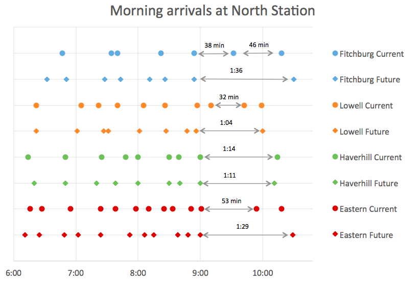
The most blatant example of this is the timing of the schedules: there are no trains—on any line—arriving at North Station between 9:00 and 10:00 a.m., and none which depart North Station between 6:30 and 7:25 p.m. So for anyone who works a 10 to 6 shift is completely hosed. This needs to be fixed. If no one rode these trains, I could see the logic. But people do. MassDOT counts these sorts of things. Some trains in the 6:45 range carry 400 customers. Let’s not make them all drive, mmkay? Each line should have a “catch-all” train: a train between frequent peak service and infrequent midday and evening service that arrives North Station around 9:30 and departs around 7:00 to fill those gaps. Just because the T defines rush hour as ending at 9:00 and 6:30 doesn’t mean demand shuts off entirely at that point.

Here’s another thing: right now, arrivals and departures are somewhat spread out, so that passengers on connecting services (read: the Orange and Green lines) aren’t all riding at peak hours. In case you haven’t noticed, the Orange and Green (and Red and Blue, for that matter) lines are, uh, full. These schedules will mean that more passengers will funnel in to North Station between 8:00 and 9:00, when the trains have less capacity, rather than spreading service out later in the morning when there is some more space on the Green and Orange lines.

And weekend service is still anemic: most lines have gaps between trains of three hours. Why would anyone take the train? Hourly service should be a goal.

Let’s also take a quick look at some of the T’s stated goals with this schedule change, and whether they are being met, in particular, page 7. (The PDF can be found here.)


* Increased Peak Train Service. In general, this is attained.


* Additional Peak Express Service from Outer
Points
. This is attained, but often at the expense of service to inner core stations.


Does this look more evenly spaced to you?
Current: Average service gap 25 mins, standard deviation: 13 minutes
Future: Average service gap 35 minutes, standard deviation: 30 minutes

Evenly Spaced Peak Service from Inner Core
Stations.
 No! Not only is this not attained, and do most inner core stations lose service, but some of the spacing gets much more uneven. For instance, service gaps at Swampscott go from 14-28-20-21-31-16-28-9 to 13-47-50-14-38-10. Currently, the range of gaps is 9 to 31 minutes; with the new schedule it ranges from 10 to 50!

The average time between departures goes from 25 to 35 minutes—a significant service cut, and the standard deviation in the gap goes from 13 minutes to 30! (If you include only arrivals at North Station before 9 a.m., the current average/stdev is 20/7, the future is 26/15. In no way is that evenly spaced.

Not only is this goal not attained, but it is downgraded significantly from current service. Again, they may have used computers, but lack some common sense.


* Optimized Peak Arrival and Departures from
North Station for Key Job Start and End Times
. Key Job Start Times is completely undefined, but it seems to mean “everyone works 9-5.” This is not the case.
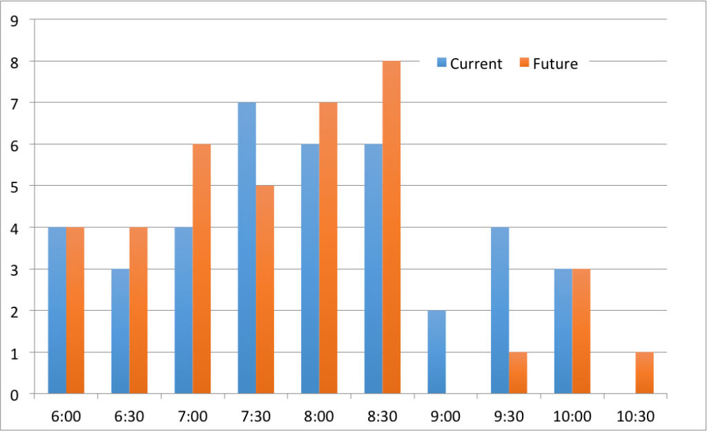

The T claims a goal is to reduce crowding.
But the new schedule has arrivals bunched at North Station.

Efficient Train Movements at North Station to
Mitigate Crowding
. Guess again. There are actually more concentrated arrivals and departures at North Station with the new schedule. This means more people crowding on to connecting services—the Green and Orange lines, and shuttles like EZRide—which are already at capacity.


* Standardized Peak “Box”: AM Peak North Station Arrival: 6:00 -9:00 PM Peak North Station Departure: 3:30 –
6:30
. This is a solution looking for a problem. Passengers aren’t concerned about standardization of schedules between lines. They are concerned about having a train which serves their needs. And this doesn’t address the fact that the span of rush hour service, and the location of service gaps, is worse with the new schedule.


* Regular Off-Peak Departure Times. In general, this is attained.
Line-by-line, here are some

The Fitchburg Line (New Schedule Here)


Fitchburg wins. So do North Leominster, Shirley, Ayer, Littleton and South Acton. Beyond there …

The Good. After investing a lot of money in the Fitchburg corridor in the past three years, cutting back weekend service during that time while the improvements were made. Now that it’s mostly finished, top speeds go from 60 to 80 mph, and with some high level platforms to speed boarding. The result? Travel times drop from 4 to 14 minutes, with the greater speeds on express trains. The fastest “super-express” that runs from Porter to South Acton drops from 32 to 24 minutes—a 25% improvement—giving that segment an average speed of 55 mph: the fastest single run of any train on the T’s Commuter Rail system. (Yes, even the Providence Line: the T refuses to spec equipment to run over 80 mph even though that line supports 125 mph.) There are more express trains, more local trains, and an earlier arrival at North Station. It’s a real win.
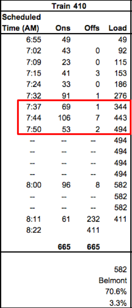
Train 410 boardings, 2012.
From here

The Bad. The new express services are nice, but there are some issues. First, West Concord, Concord and Lincoln lose express service all together. This is a reduction in service for these communities, which will have fewer trains and longer trips. In addition, parking at South Acton is usually full before 7 a.m., so even though later express trains will stop there, they may have fewer riders as no one will be able to get to the station. Running the later express trains local to Lincoln would make too much sense, apparently, to help spread the ridership.

With the new track work, the schedules for these express trains will still be very competitive, but they’ll have more ridership. In the evening, one of the two express trains should have service added back at Lincoln and the Concord stations. Despite all the improvements, Concord, West Concord and Lincoln go from 5 departures to 4 in the morning. On train 410, Concord is the busiest stop, and more than 200 passengers board at these three stations (see right, from here). There is very little logic in cutting these stations. If anything, they should get a second express. How this counts as providing better service is questionable.

Weekend schedules get slightly better with all trains running to Fitchburg. But there are only trains every two-and-a-half hours, which, well, sucks. This kind of schedule means that the train is a mode of last resort on a weekend, and will attract few riders. This is an issue for the MBTA as a whole.

At some point, I’d heard that the plan was for the first train to arrive at Fitchburg before 8:00. 8:35 is certainly an improvement over the current 10 o’clock arrival, but could be earlier. The 45 minute headways the line currently has inbound between 7 and 9 p.m. shift to the 4 to 6 p.m. range, great for reverse commuters.

The new schedules should attract more commuters, especially to the express trains from Acton and Littleton. Driving Route 2 will never be time-competitive at rush hour with a 35 minute trip from South Acton to Boston. The issue there is that the parking lots have limited capacity and fill early. Increasing parking may be necessary, and in the longer range a station at West Acton would help spread the demand.

The Ugly. The last Fitchburg train leaves at 7:13—earlier than the current schedule—and there’s not another train until 9:00. The last rush hour train leaves Littleton at 7:51. In the current schedule, there’s another train at 8:58, but the new schedule has a gap until 9:35. So there’s no train in to North Station between 9 and 10 a.m. Want to drop the kids at school, grab a train at 8:30 and arrive downtown at 9:30? Tough luck. The T decided that rush hour trains should arrive between 6 and 9 a.m. and doesn’t seem to understand shoulder scheduling. Many other Commuter Rail schedules go from 30 minute rush hour to 60 minute midday headways (or longer) with a 45 minute headway in between. The same thing happens on either side of the evening rush. The T apparently doesn’t think that anyone works a non-9-to-5 schedule. If you want to grab a drink after work, you better grab two; you’ll be waiting a while.

There’s also the issue of what I call the “last trip fallacy.” Often the second-to-last service a route runs will be relatively busy, and people will see the last service as a safety net. So it appears that the final service doesn’t get high ridership, but it is the reason that the run before gets better ridership. If an agency cuts the final service—or in this case, creates a gap between the final rush hour train and the first evening train—people traveling at that time will simply abandon the system. There is no excuse for this type of poor service planning.

Suggestions: 
* Push trains 410 and 492 back 10 to 20 minutes for a slightly later departure.
* In the evening, push train 421 back 15 or 20 minutes to better fill that service gap.
* Serve Lincoln, Concord and West Concord with trains 406, 410 and 417.

The Lowell Line (New Schedule Here)

The Lowell Line is currently the best-scheduled line the T runs. It has hourly, clockface schedules (which this page has long advocated for): show up midday at Winchester at 42 minutes past the hour and there’s a train to Boston. It’s what most other cities do, but the T can’t be bothered to run this sort of schedule on any other line. Lowell suffers from other issues, notably poor highway access to the Lowell and North Billerica park-and-ride lots (an extension to a park-and-ride lot at the New Hampshire border would be key—but should be paid for by New Hampshire), and a long gap between stations along the Billerica and Tewksbury Line.

But otherwise, this schedule is … ugly.


The Good. There’s not much improvement to report. I guess at least you don’t lose the hourly midday headways. That’s nice. And the bizarre and silly 322/216 pairing mid-afternoon goes away (two inbound trains ten minutes apart). Outbound service gains an express, and gets a nice gap-plugger 3 and 4 p.m.


The Bad. The weekend service. The T demonstrates five days per week that hourly service is feasible on the Lowell line, and that ridership supports it. Lowell, with the National Historic Park and Folk Festival, as well as a dense downtown, could easily support weekend headways. Yet it only sees a train every two hours.

In the morning, inbound service before 10 a.m. actually decreases significantly, from from 11 trains to 8! Neither of the Haverhill line trains stops at Wilmington or Anderson, reducing service on the inner part of the line. Right now, there are trains inbound from Anderson at 8:30, 8:45, 9:15 and 9:35. The new schedule has no train departing between 8:36 and 9:35. There’s plenty of room at the park-and-ride at Anderson, and today, if traffic on 93 is worse than usual, you don’t have to wait too long for the next train. With the new schedules? Good luck: miss 8:36 and you’re waiting an hour. The trains at 8:45 and 9:15 aren’t empty. Maybe both of those trains need not run, but a service around 9:00 seems like it would be necessary.

While the outer end of the line doesn’t lose service, the inner part gets killed. Winchester, Wedgemere and West Medford go from 9 trains arriving North Station before 10 a.m. to 6—a 33% service cut!

Outbound, the same issue arises: there’s no train between 6:25 and 7:25. Right now there is a train at 6:25, 6:55 and 7:30. The new schedule just kills off the 6:55 run. That’s just plain silly.

The Ugly. Let’s start with trains 304 and 306. Train 304 runs local out of Lowell at 6:40. Train 306 runs express ten minutes later and is scheduled in to North Station just four minutes after 304. Even without any issue on 304, this would mean that even without any delay, the express would be riding the local’s signals. This makes no sense. It could be easily solved in two separate ways: 1) Swap the local and express runs for 304 and 306. 2) Run 306 five minutes later, so that instead of a 10 minute gap and then a 24 minute gap, you get more even headways.

As commenter Tommy points out, the longest inbound gap in service at any time in the Lowell schedule is between—drumroll please—8:30 and 9:45 in the morning. Who goes to work between 8:30 and 9:45 in the morning? Anyone? Bueller? The answer is: more than 213 people from Winchester, Wedgmere and West Medford alone! The T touts “consistent, hourly local off-peak service” but doesn’t bother to provide this at the shoulder period of rush hour. Please.

Then there’s the Downeaster. The T claims they used computers to plan for constraints like Amtrak services. So then how would they explain the following:

* MBTA 337 departs North Station 6:00, arrives Anderson 6:25
* Amtrak 687 departs North Station 6:05, arrives Anderson 6:23

Now some of you may look at that and say “ooh! ooh! midline overtake!” Nope, there’s an inbound scheduled to leave Anderson at 6:05 and arrive North Station at 6:30. Sorry, guess again.

This is simply a glaring oversight. The T hired a contractor, ran a bunch of simulations, and completely borked Amtrak’s schedule. That’s just sloppy. Come on.

Suggestions:


Oh, boy, there are a lot here:

* Fix trains 304 and 306. This is not hard! Push 306 ten minutes later (it won’t affect the following Downeaster) to fill the gap.
* Stop each of the Wildcat trains at one of either Anderson or Wilmington, and maybe inner stations as well. Those trains aren’t full at Ballardvale, and the extra time to make one stop will not drastically affect the schedule (especially at Wilmington, where the line speed coming off of the Wildcat is 20 mph so the stop penalty is minimal). In the long run, running more trains via Wildcat and having skip-stop service on the inner part of the line would make a lot of sense; this can be a separate post all together.
* Push train 312 back to at least 8:25, its current departure time. Run it local; the two Haverhill Line trains will provide express service to Anderson and Wilmington.
* Good god, fix the Downeaster conflict. That’s just painful.
* And run service between 6:25 and 7:30. Reinstating the 6:55 Wildcat train would make a lot of sense.

The Haverhill Line (New Schedule Here)

The Good: Line speeds get faster; train schedules improve by 5 to 6 minutes for many trains. That’s good, and might mean that some trains running ahead of schedule will no longer have to wait a couple of minutes to maintain schedules. Train 206 will run from Haverhill to Boston in 58 minutes via the Wildcat Line, which is really quite good, although some of this time is saved with an express run in on the Lowell Line; this will result in a reduction in service on the Lowell Line. Another change is that midday short-turns are mostly eliminated, including the Anderson turn (which then ran duplicative service via the Wildcat), with more full-line service. This is good.

The Bad: Same as above. No trains inbound between 9 and 10, but that’s actually the current case for this line. And since this schedule is only being tweaked, it might be better planned when it’s complete.

But for some outbound trains, there’s some weirdness. Right now, there are outbound trains at 2:20, 3:10, 3:50 and 4:30. The new schedule has a big gap between 2:00 and 3:30 for the outer stations (vial the Wildcat Branch) and until 3:45 for the inner local. The 5:15 express, which currently makes its first stop in Wakefield, now will skip Wakefield—the third busiest stop on the line—but won’t save any time. This stop should be added back in. (More than 1000 people—more ridership than the Wakefield station!—have signed a petition calling for just this.)

The Ugly. Like other lines, there’s a big gap—70 minutes—after 6:30. The current schedule then has an 8:40 train; that disappears. So there’s a two-hour gap in the early evening where there wasn’t one before. This could adversely affect ridership in this area.

We’ll see if they can further disrupt the line once the bridge maintenance in Haverhill is done.

Suggestions: 
* See if there is a way to account for the long service gap between the 2:00 departure an the first evening departures at 3:30 and 3:45. Maybe running the 3:30 as a local train would free up the other set to run another local run earlier in the afternoon (or reinstate the 6:55).
* Add Wakefield back in to the afternoon express run.
* Add some stops to Wildcat trains (see Lowell Line)
* Add service back to the evening schedule, which loses service with the new schedules.

The Newburyport/Rockport Line (New Schedule Here)

The Good: Newburyport gets some express trains. They haven’t had those in a long time (maybe not since the ’60s). Rockport loses some express trains but gets a later morning departure—currently the last train inbound on the Rockport branch departs at 7:22; the new latest train leaves 28 minutes later. That’s good! Newburyport’s last train gets a little earlier; 7:42 instead of 7:55.

Afternoon reverse-peak service on the Newburyport line is improved dramatically, with three inbound rush hour departures, no three-plus hour service gap after 5:55, and hourly departures all evening. This serves Ebsco Publishing, which has several dozen Commuter Rail riders from Boston and the North Shore owing to a generous transit benefit, limited on-site parking and a short walk from the station to the office.

The Bad: Service on this line is squeezed dramatically, and stops closer to the city lose service.

There is significant reverse-peak ridership on this line to Ipswich, where Ebsco Publishing has a parking crunch and transit benefit. Yet there’s no outbound service between 7:15 and 9:00. The new schedule doesn’t address this, but it could, and improve late-morning commute times as well:

The 7:05 Beverly turn train could be extended to Newburyport. This would give Newburyport a later departure in the range of 8:05, with an Ipswich arrival of 7:45. It could then depart at 8:20, depart Salem around 8:50, and arrive at 9:20. What happens to the current short turn? There are trains inbound from Beverly at 7:53, 8:00 and 8:10. The middle train is the current turn. An extra car on the 7:53 and 8:10 would take the necessary capacity. We don’t need Orange Line-level headways on the inner part of the Eastern Route, at least not at the expense of later service.

There’s also the question of why there is a 50-minute gap between Rockport service during the height of evening rush, and two Newburyport trains running 20 minutes apart. These could be better scheduled. And the current Salem transfer for the 6:45 evening train—which allows it to serve both lines—is gone. This is a good idea poorly executed: there is really no explanation why the transfer should take 23 minutes. Other Commuter Rail systems with transfers are able to run them much more quickly; the transfer train could sit north of Salem, wait for 171 to pull out, get backed in by the conductor, load, and leave 5 or 10—at most—minutes later. But instead of fixing this, it is axed. Great. (This would be a good place for DMU service, allowing one train to run the trunk route from North Station to Salem and set of DMUs to pick up one of the branches, especially for non-rush service.)

And for Swampscott, Lynn and Chelsea? Sorry, guys, you lose two trains per rush hour, and while you currently have service every 30 minutes or better, get ready for some 50 minute service gaps.

The Ugly:

Train 120. Express from Rockport to North Station. I just can’t even. I don’t have words. It makes my eyes bleed. This introduces a three hour gap for the reverse commute from Gloucester inbound. This is insane. People use these trains. I’ve been on these trains. They’re not full, but they serve the general public. Run this train with stops. If it means that some trains in the 6:00 range are run a bit later, that’s probably good. Just make the goddamn stops. This schedule is just stupid.

The huge gaps in late rush hour service both morning and evening is also so bad it belongs in Ugly, not just Bad. There are six trains scheduled in to North Station between 8:06 and 9:00—that’s one every 9 minutes. Then there’s a 90 minute service gap. Do you run the Red Line every four minutes at rush hour and then have a 40 minute service gap? No! Don’t do that here.

The current schedule, while not much better, has six trains in 1:06, and then a 54 minute gap.  We’re taking something that is a problem, and making it worse. This is asinine. The above schedule change, which would enhance reverse-peak service, would also plug this hole quite nicely, with a catch-all train leaving Beverly and Salem around 8:50, and arriving in Boston around 9:20. Subway-level service is great, but it should not come at the expense of shoulder-peak times.

The afternoon is similar. Currently, the 6:45 departure from North Station carries more than 400 passengers, and it is unceremoniously brought out back and shot. There are trains leaving North Station at 6:10, 6:20 and 6:30, and then nothing until 7:45. Just pushing each of these trains back by a few minutes—departing 6:10, 6:30 and 6:50—would make a huge difference. If one of these is the turn of 120, then the extra time will give it sufficient time to make inbound stops.

Suggestions:
* Train 120. Fix it. It should make inbound stops. Otherwise it’s a brutal waste of public funds, running a revenue train with maybe half a dozen passengers and creating a three-hour service gap.
* Fix the service gaps in the later morning and later evening rush periods. Two plans to do so are outlined above.
* A train every 9 minutes is nice, but with any hiccough will cause cascading service issues. Better to have a train every 15 minutes, and get rid of the 90 minute later-morning gap.
* Look in to an improved Salem transfer for a later PM rush hour train.

Fixing the 70 Bus (at least part of it)

I posted about a year ago about the 70 bus, with its bizarre schedule and uneven headways between Waltham and Boston. I have a friend who has taken the 70 daily for a decade, outbound in the morning and inbound in the evening. And she’s not alone. After another discussion about the uneven headways, poor schedule adherence and endemic bunching, I decided to ask her (and some of her friends) to keep track of scheduling and crowding. That spreadsheet is growing. If you take the 70, I’m happy to have you help out.

I’m particularly interested in crowding, because it seems the MBTA, in the afternoon, has taken the initiative to have even outbound headways (a laudable goal; morning inbound could use some help, too), but pay no attention to inbound traffic. They may assume that because it runs from Cambridge towards Waltham, everyone takes it in that direction. And plenty do. But plenty also use it for the “reverse” commute; my friend regularly shares the bus with 50 or 60 of her closest friends. The corridor is growing; she reports the bus is getting busier. It needs to be scheduled to provide service to this area, lest potential customers vote with their feet and drive instead.

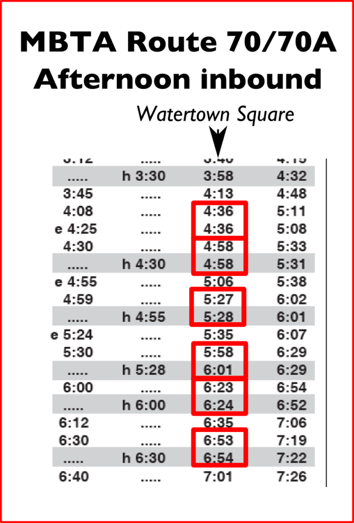
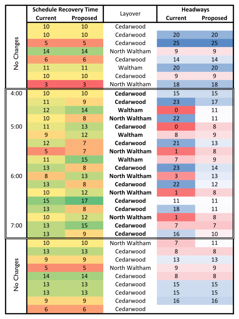
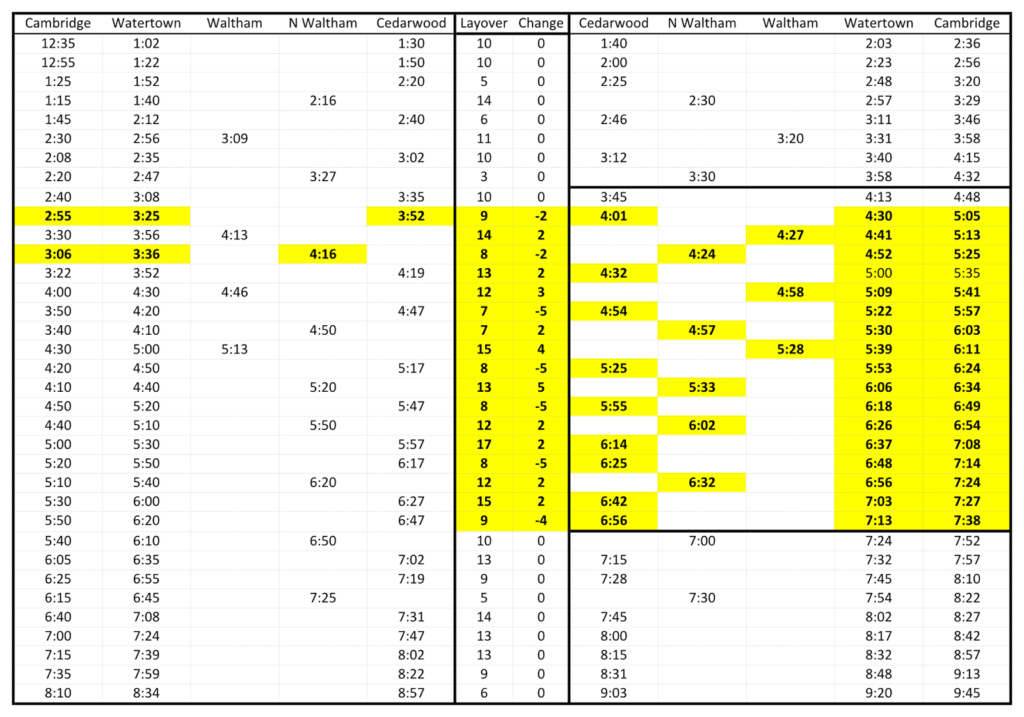
If you look at the afternoon inbound schedule (part of it is shown to the right), it is scheduled to have bus bunching. There are 16 buses departing Watertown Square between 4 pm and 7 pm, on average, one every 11 minutes. However, twelve of these buses are scheduled to come in pairs, three minutes apart or less. So in reality there is only service 10 times during those three hours, or once every 18 minutes. That’s a big difference. To put it in a math-ier way, the current schedule has an 11 minute headway with a standard deviation of 9:25. That’s not good. (The goal, with even headways, should be zero.)

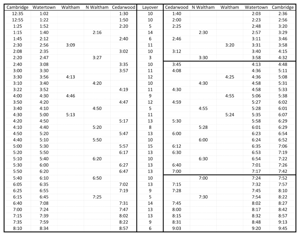
With some complex routing schemes, buses come in to a route from one line and leave the other end on to another. But the 70 extends out to the edge of the system, and a bus at the end of a line had little choice other than to turn around and run back to Cambridge. It’s particularly complex with three separate termini—Cedarwood, the North Waltham figure-8 (the 70A) and several short turns in Waltham Square—but it’s pretty easy to reverse-engineer the schedule and figure out which outbound bus runs inbound, and how much schedule recovery each bus has. By doing this, we can see whether it might be possible to make some small changes to the schedule in order to have buses scheduled at more regular intervals and provide better service overall. Right now, with the T out of space for new buses, we can’t really add service. But we can certainly make the service we have run better.

Scheduled times in Watertown Square.

So here’s my proposal: by slightly changing two early departures out of Cambridge (in the 3:00 range) and changing layover times by no more than five minutes (and leaving at least 7 minutes for schedule recovery at the Waltham end of the route) we can go from 11 minutes with a standard deviation of 9:25 to the same 11 minute average headway, but with a standard deviation of 2:45. The longest current headway is 23 minutes, with five headways over 20 minutes, and the current shortest headway is 0 minutes (two buses scheduled at the same time). The proposed schedule has all headways between 7 and 17 minutes. They’re not perfectly even, but they’re a whole lot better.

Take a look at the conditional formatting to the right. Muted, middle colors are less variable. Right now, the schedule seems optimized for even layover times at the expense of even headways. So a bus is somewhat more likely to leave on time, but then scheduled to be part of a bunch. The proposed schedule varies the layover times somewhat more (stdev of 2:19 vs 3:02), but it is far less variable for headways. Note how all the dark blue and bright red colors disappear from the chart on the right, and while there is some variability, there is far less than the current schedule. This means that buses aren’t scheduled to run in groups of two, and there are no longer scheduled 20-25 minute service gaps (which, with traffic fluctuations, can easily turn in to waits of half an hour or more, on a route which, nominally, has a bus every 10 to 12 minutes).

The T needs to analyze the patronage of the route, and make sure that they aren’t robbing Peter to pay Paul. Service reliability for normal peak ridership is very important, but it should not come at such a great expense to reverse peak riders. They constitute a large percentage of the passengers on the route—likely higher than many other comparable MBTA routes—and the T should balance the needs of all passengers, not just create a schedule which works for one direction at the expense of the other.

This afternoon, I watched the 70 on Nextbus as buses bunched—some as scheduled and some on their own. The schedule for the 70A in particular does not seem to have enough time for all buses on the route, and the figure-8 service pattern in North Waltham is pretty special. The 70 is a very complex route and in the long run the right answer is probably to cleave off the 70A and operate the route as a single route to alleviate bizarre headways and bunching. But in the short term, a few minor changes could be made for the next schedule rating, which would alleviate some of the problems experienced by riders today.

For the reference of current passengers, here’s an afternoon schedule which shows the originating point of various buses. Note that Waltham buses are likely more timely than Cedarwood buses, and both are more reliable than the 70A from North Waltham. Note that both this schedule and the one below are sorted by Watertown inbound, so the outbound trips are not in order. (If you’re going outbound, it’s basically a bus every 10 minutes at rush hour, inbound, it’s a bit more difficult to comprehend)

And here is the proposed schedule, with changes highlighted (and the number of minutes the layover is changed shown as well). It should be entirely feasible to implement this schedule, making very minor changes to the early part of the pre-evening rush outbound, and dramatically improving conditions for riders in the evening coming inbound.

Electrifying Fairmount would be cheaper than buying DMUs

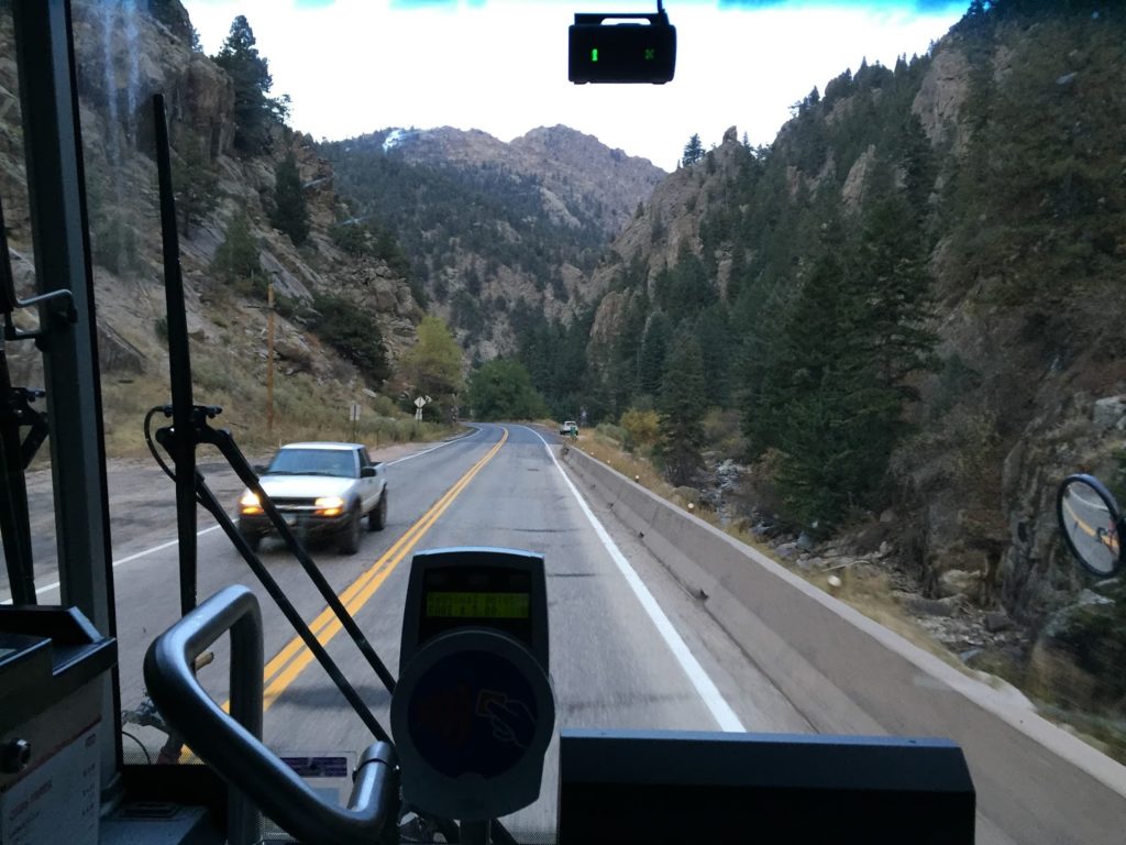
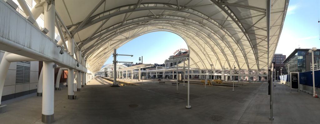
 I spent a few days in Colorado for a wedding and (shocker) rode the transit system there quite a bit. Oh, I hiked and trail ran, too. I didn’t take a train trip, but did ride a variety of buses (including the spectacular N route up and down Boulder Canyon), but I did wander around Denver some, and was witness to the spectacular new Union Station project. It has a eight-track rail terminal (two pairs of three-track high-level platforms and two low-level platforms for long distance service) and a connected underground bus terminal which has access to nearby HOV lanes. And dozens of cranes erecting buildings around it.

The N bus goes up and down a 10% grade through
Boulder Canyon. It’s a beautiful ride, although it must
be one of the more difficult routes to drive. A friend said
that during a snowstorm drivers have asked passengers
to move to the back of the bus to increase traction.

Most impressive? The rail terminal is fully electrified. When Denver’s Commuter Rail lines begin service next year, they’ll be operated fully under the wire, with the same electrification (25kV 50 Hz AC) that Amtrak runs between Boston and New Haven. And they are planning to operate high quality service: some of the most frequent Commuter Rail in the country, with 15 minute headways all day on some lines, and never worse than 30 minutes between trains. Only a few lines in the country (in the New York area) can boast that kind of frequency.

This is not the typical newly-built Commuter Rail built in the US. That would be what you get in Minneapolis, Nashville, Dallas or Seattle: moderately-frequent service at rush hour superimposed on a freight railroad and little service at other times. Legacy systems tend to do better, but the MBTA’s service leans towards the latter, especially outside of rush hours, when most lines have service gaps as long as 2 hours (or in some cases, longer).

Denver’s Union Station terminal is particularly impressive.

There’s one MBTA commuter line in particular which could use more frequency: the Fairmount Line. Unlike most of the Commuter Rail lines, it doesn’t stretch far in to the suburbs, passing through town centers, park-and-rides, and marshes and swamps. It has no four-plus mile gaps between stations, some of which are parking lots far from where anyone lives, with few riders off-peak. Instead, it serves a dense part of Boston with stations every mile, or in some cases, even more closely spaced. It should be run like a subway—like Denver is planning—yet it runs about as inefficiently as possible: service only operates once per hour, and that service is operated with a push-pull engine-and-coaches set-up which is suited far better to service Fitchburg, Middleboro or Rockport.

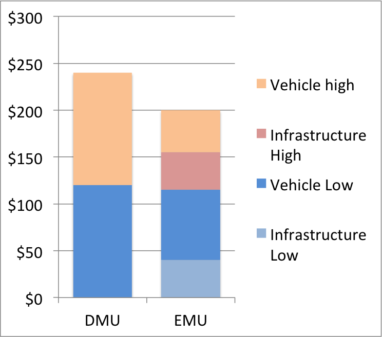
The T’s solution? It was to purchase diesel multiple units (DMUs) until the governor shelved that proposal (and quite possibly rightfully so). One potential reason? The projected cost for 30 of the vehicles was $240 million, or $8 million per car. DMUs are relatively unproven in the stringently regulated US railroad environment (although they have more success in Europe) and the cost for such vehicles would be very, very high. That leaves aside the fact that DMUs are best used for low-volume, longer-distance services. Anywhere which has frequent service and closely-spaced stations is better served by electric service (as Denver decided). Yes, the up-front, in-the-ground infrastructure costs more, but the operation costs are much lower, to say nothing of noise and local pollution reduction. And with off-the-shelf rolling stock (which is much cheaper) and an electrification system partially in place, it winds up being much less expensive overall.

The Fairmount Line is the perfect candidate for electrification. It is perhaps the most perfect candidate of any diesel line in the US outside of Chicago and San Francisco (where planning is in place to electrify Caltrain). It is only 9 miles long, and the final mile in to the terminal is already electrified (this would be by far the most expensive piece to run wire, but it’s already there). It has, in those nine miles, eight stops, meaning that the much faster acceleration afforded by electric propulsion pays dividends in travel time savings. It serves a corridor which could easily support trains every 15 minutes (especially if they were better integrated in to the rest of the system), with high population densities and accessible stations. Parallel subway and bus lines are over capacity, and it serves a poorly-served region which currently relies on slow-moving, crowded buses. And best of all, both ends of the line are adjacent to existing electrification—the northernmost mile is already under the wire!—so it would not need to be built as a stand-alone system, but would be integrated in to the existing electrification.

Even with initial infrastructure costs, it’s quite possible that
EMU service on the Fairmount Line would be no more 
expensive than DMUs. The significant upside, however, in 
procuring off-the-shelf technology, 
is a lower chance of cost overruns.

Then there are the costs. Electrifying existing rail is not very expensive: generally in the range of $5 to $10 million per mile (Caltrain’s costs, which are built to also allow high speed rail to operate, are $18 million per mile). Since this wouldn’t be built from scratch—since it can tie in to existing electrification—costs should be in the low part of this range. Let’s say it does cost $10 million per mile for the 8 as-yet unelectrified miles: that’s an initial cost of $80 million.

But then, instead of buying expensive, unproven DMUs, you can buy off-the-shelf electric multiple units, or EMUs. How off the shelf? Philadelphia and Denver both are running Silverliner V cars; in Denver’s case, on the same electrification system we have in Boston. On the basis of power and clearances, it is quite possible you could roll a Denver EMU in to South Station and run it up and down the Providence Line tomorrow (signal issues notwithstanding). Philadelphia placed an order for 120 cars for $274 million: a per-unit cost of $2.28 million. Even if Boston doesn’t get quite the same volume discount, 30 EMU units would, at $3 million each (the approximate cost of Denver’s units), cost $90 million. (2016 update: More-reliable M8s Connecticut just bought cost in the $4 million range, but include both third rail shoes and pantographs, which likely inflate cost somewhat.) Even with the initial investment in electrification, the total cost would be $170 million, 30% cheaper than that many DMUs! Even if a maintenance shop were needed (and Readville, adjacent to the end of the line, would be well situated for it), it would still come out cheaper. In the short term, heavy maintenance could be contracted out to MetroNorth’s New Haven shops, and cars towed down the line as need be. Even at $4 million—the average cost of DMUs produced today for other systems—the EMUs plus the wire would come out even.

An EMU is basically an oversized subway car: it’s built for faster speeds and is heavier since it is in the FRA’s domain, but otherwise has traction motors, a pantograph and a drivetrain. So it should cost about the same as (or a bit more than) a subway car, and indeed it does. The MBTA’s procurement of Red and Orange line cars comes in at about $2 million per car, so $3 million is in the ballpark. M8s or Silverliners cost more, since they are larger and faster vehicles, but not that much more, because rather than having to be designed for the specific specifications of Boston’s subway lines, they can be built to exactly the same specs as Denver or Philadelphia (although maybe we don’t want those) and shipped out the door.

An EMU can accelerate much more quickly, spend more time
at top speed, and save several minutes of operation time each trip.

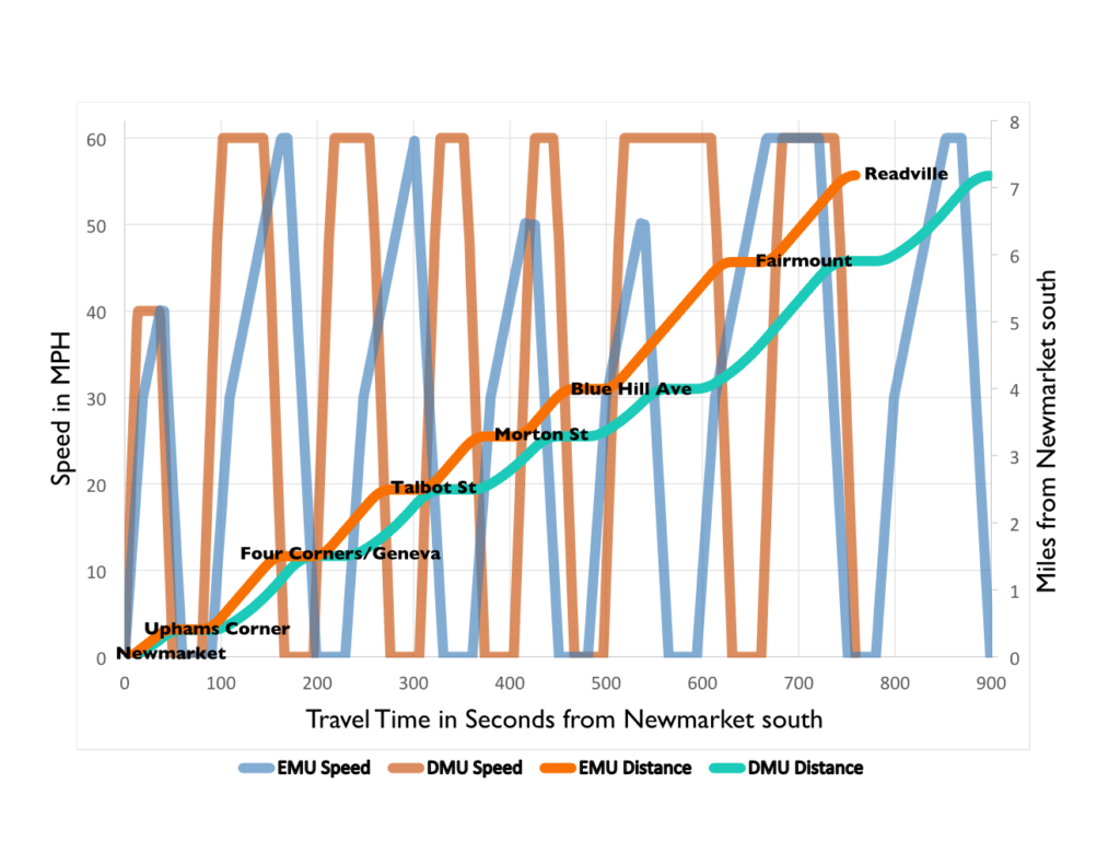
Then there are the benefits. First, electric trains are quieter. A lot quieter. Second, they don’t need to be kept running overnight to keep from freezing up. Third, they have far less local particulate pollution (and if renewables are used for power, they are much cleaner overall), important for the environmental justice communities the line serves. And finally, they accelerate faster. A lot faster. The rail cars being used in Sonoma and Marin counties are spec’ed for 1.6 miles per hour per second (mphps) to start, and just 0.7 mphps at 30 mph. (This is much like an MBTA diesel-hauled train.) The Silverliners? 3 mphps to 50 mph, and then declining to 2 mphps at 100 mph. In other words: to reach 30 mph, it takes a DMU 31 seconds; to reach 50 mph, it takes 1:15. A Silverliner can reach those same speeds in 13 and 24 seconds, respectively.

This means faster trip times, and operational savings. While a DMU train can cover the distance between Newmarket and Readville in 15 minutes, an EMU can cover that same distance in 12.5 minutes, even with the same top speed limit of 60 mph. With faster acceleration, the EMU spends a lot more time at that top speed, rather than chugging its way towards it (and with dynamic braking, it can also brake more quickly and efficiently). These time savings can either be put in to more frequent service, or more recovery time and fewer delays.

EMUs could also be used on the Providence Line, where the higher speeds—SEPTA’s Silverliners operate at 100 mph on the Northeast Corridor, the M8s have a similar top speed—would allow shorter, speedier and more reliable trips between Providence and Boston. Here’s a video of a Silverliner on the Northeast Corridor north of Philadelphia. It’s not accelerating at full bore, but still makes it to 50 mph within about 25 seconds and 80 mph within a minute (note the hard-to-see phone speedometer in the lower left). Thus in two minutes, from a dead stop, it covers 2.5 miles with an average speed of 75 mph. Electrified service on the Providence line would reduce run times by 25 to 33%—15 to 20 minutes—faster between Boston and Providence (depending on stopping patterns), dramatically reducing operating costs and allowing more service to run in the corridor, and attracting more passengers to boot.

In the longer run, it would start the T down the worthy path of electrification. In addition to Fairmount, 13 additional miles of wire would fully electrify the Stoughton and Needham lines, both of which use the already-electrified Northeast Corridor for part of their runs. Franklin would be a next best bet; a third of the 32 mile line already operates under the wire. Thus, for 42 miles of overhead—an investment in the range $200 to $400 million (plus another $50 to $100 for high level platforms)—the T could do away with inefficient diesel service on four of its commuter rail lines, which would serve as a springboard towards the future electrification of the rest of the system. The cost savings alone would likely tally to millions of dollars per year.

It is silly to run diesel service under a wire. While MARC, in Maryland, is moving away from electrics, it is really beyond explanation. Part of it may be that they are charged high rates for electricity by Amtrak, which owns the wire and track. The T, which owns the tracks, has a better negotiating position with Amtrak for electricity prices. But MARC is bucking the trend: most non-electric commuter railroads are moving towards overhead power. All-electric SEPTA is buying new electric motors as well as EMUs, Denver has started all-electric, Caltrain is moving towards electric operation, and Toronto is as well for its sprawling system.

Running Fairmount under a wire would make more sense than any of these systems. With DMUs delayed, the MBTA—which has long since had a distinct allergy to modern equipment in general and electrification in particular—needs to take a good, hard look at its cost and operational benefits of electric propulsion. It makes sense not only from an operational, pollution and environmental justice standpoint, but from a financial standpoint as well. Electric operation has long been anathema for the MBTA. But it makes operational and financial sense. It should be seriously considered.

Digging deeper in to Belmont costs

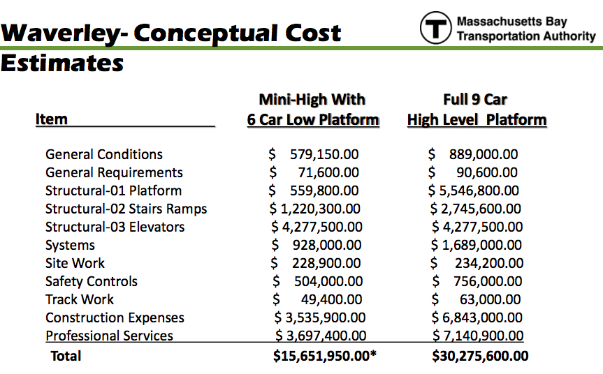
I posted on the very high costs that are driving the poor planning process for the Waverley and Belmont Commuter Rail stations. I’ve now found the slides from the T’s presentation here. Of particular note is page 17, which details costs for the project:

Now let’s take a look at some of these numbers. I’m not sure what General Conditions or General Requirements are, although if they’re so general, I’m not sure why the are higher for the longer platform.

Structural-01 Platform: $5.5 million for the platforms? That’s way too high. Remember, Uphams Corner, Morton Street and South Acton were all rebuilt for between $6.5 and $9 million, with full high levels, and ramps or elevators, landscaping, systems and all else. The cost for the platforms alone—and I’m interpreting this from recent T bid documents—is in the $2 to $3 million range. So there’s $2.5 to $3.5 in savings.

Structural-02 Stairs Ramps: Somehow, the ramps and stairs to get to a full-length platform cost $1.5 million more than the access to a mini-high. This makes no sense at all. Since a high platform is higher, and you’re accessing it from above, you need fewer stairs and a shorter ramp, so it should cost less.

Structural-03 Elevators: If you have ramps, you don’t need elevators. The Fairmount line gets by just fine with ramps and stairs, most of which are just as long as such a facility would require at Waverley or Belmont. There’s another $4.3 million saved. (Not to mention lifecycle costs of outdoor elevators.)

Systems: Again, I’m not sure why the systems for a longer platform would cost double the systems for a shorter one. Do you somehow not need lighting and such for the low part of the platform?

Site work, safety controls, track work: These are all relatively small items, but probably all inflated.

Then there are two big ones: Construction Expenses and Professional Services. Each of these, for a full-length, high-level platform, would cost about as much as the entire cost of the full-length, high-level platform stations built in South Acton, Uphams Corner or Morton Street. Each of them—combined, they cost double! It should not cost $7 million to for professional services to plan and engineer a high level platform, nor should it cost that much to construct it.

Good lord, at $100 per hour, that’s 70,000 hours—8 person-years, round-the-clock—of work. At 40 hours per week (2000 hours per year), this is enough to pay for a team of 35 people to work on the project for a year to design it. That doesn’t make a lick of sense. A full rebuild of Mass Ave in Arlington costs $7 million, but each of these items is $7 million alone, and the set of platforms is nearly as much, with the entire project four times as much? For 1600 feet of platforms, a couple of ramps and some stairs? Come on. These numbers are, as is all too common in Massachusetts, a misuse of taxpayer money, a giveaway to consultants in the place of good planning and cost controls.

How do these costs compare to other cities? Not well. In the Philadelphia area, SEPTA has rebuilt many of their Commuter Rail (well, “Regional Rail”) stations with high level platforms. They are somewhat shorter, in the 500 to 600 foot range, but the costs are much lower—in line with what the T spent along the Fairmount Line. For instance, the Fort Washington station was rebuilt for $6 million, including ramps, platforms and a station structure. Not $30 million. $6 million.

Which, of course, is right in the ballpark for what similar station upgrades have cost in Boston. Maybe Waverley will cost more if it is integrated with future development. But $30 million for a single station is so far outside the envelope of reality that it must be questioned.

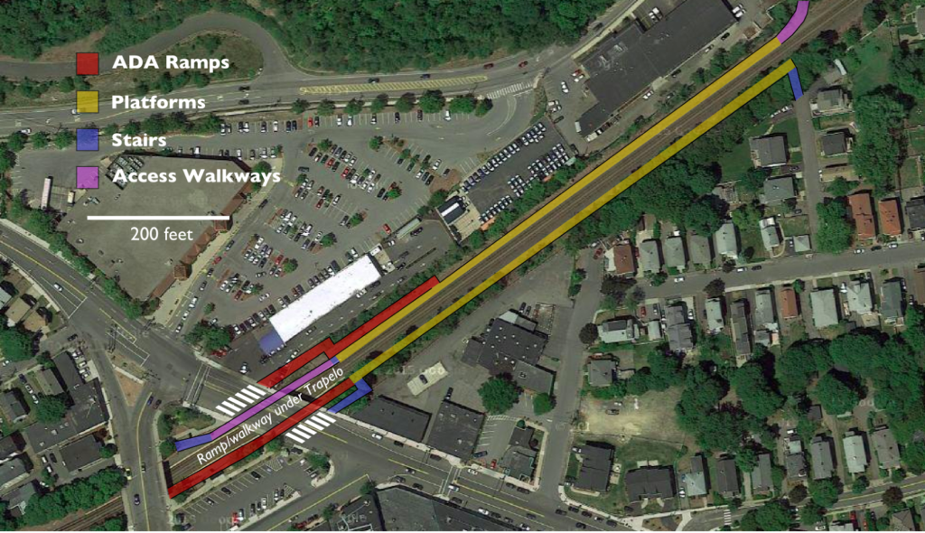
Here’s a quick (and by quick, I mean half an hour quick) sketch of what you could conceivably do with the Waverley Station. This is no more complex than any of the rebuilds on the Fairmount Line, and less complex than South Acton, so it should have costs in line with those projects ($6-$10 million):

This would not interact with any of the retaining walls, which the T claims ratchet up the costs, and would avoid the slight curve and superelevation at the current station site for level boarding. Both ramps would be about 300 feet long—the same length of ramps at similar stations on the Fairmount Line. A small taking would be required from the parking lot of the car wash to the north of the rail right-of-way and east of Trapelo Road. You don’t need four elevators for this. You need some concrete. And some actual thinking.

MBTA’s Belmont cost estimates are way out of line

Belmont might be getting a new Commuter Rail station. This is not a good thing. Why? Because the T is proposing to create a new parking-oriented station which is within walking distance of far fewer customers than the current stations, and then close those stations.

Really.

In 2012, the MBTA performed enough maintenance on the platforms at Waverley Square that it required them to bring the station in to compliance with the Americans with Disabilities act. The problem? The station was built in 1952 when the grade separation there was built (the second-to-last of the B&M’s grade separation investments; Winchester was the last) and is in a deep trench, with 20 feet of steps separating the railroad from the roadway.

Now, if a sensible organization were in charge, they’d spec a new station at Waverley accessed by ramps from the street above, full-length, high-level platforms, and build a new station. On the south (inbound) side, there is plenty of room for a ramp from street level to the platform (especially since with a four-foot-high platform, you only need to descend 20 feet). The width of the south side of the station is about 200 feet, so it’s a single-zig ramp to get up and down with about three landings on each. The right-of-way, which held three tracks until the grade separation, is 100 feet wide, so the north side (outbound) platform could be accessed by a ramp to the east of the station to a rebuilt platform, with the current stairwell providing access from the narrow part of the triangle. Alternatively, platforms could be moved to the east of the station where the line is straighter, and the current station area used for vertical circulation.

In Belmont Center, the solution is easier. It would be hard to build new platforms at the current station location, which is located on a curve and would necessitate a Yawkey-style double-platform solution: a costly endeavor. However, just east of station the tracks straighten out and the right-of-way is 84 feet wide, plenty for a pair of platforms and two tracks. The north side of the station would be accessible with a ramp in place of a short staircase and a short ramp to a high level platform, which could be build to the east of the current platform. The south side would require a longer series of ramps, probably just east of the station. But again, this is not insurmountable.

But what does the T want to do? The T wants to close both stops and build a new station in between. This new station would be within walking distance of fewer residents, and much further from the downtown employment areas at Belmont and Waverley (as well as McLean Hospital, the largest employer in the town). It would have a parking lot, so a lot of people who currently walk to the train station would have to drive. It would sever connections between the bus lines which serve Belmont and Waverley and the train station. (Do you live in Waltham and work at Mount Auburn Hospital? Say goodbye to your rail-bus commute, you’ll have to take the train in to Porter, the Red Line to Harvard, and the bus out.)

Does this make any sense? If you’re a Belmont resident, it does not. Apparently, if you’re the MBTA, it does.

Here is a quick table of the current stations and their catchment areas (defined as the total population of all census blocks all of part of which are within 0.5 miles of the station location):

Belmont (current): 4311
Waverley (current): 7452
Proposed location: 7019

So not only does the proposed location serve far fewer residents than the current two stations, it actually serves fewer residents than the currently Waverley Square station!

How does the T justify this farce of a plan? The same way the justified killing the Red-Blue connector: by wildly inflating the cost of the plan they don’t want (bringing the current stations in to compliance) and giving few if any details about the costs of what they want to build. Their estimated cost for rebuilding each of the Belmont stations? $35 million (well, they’ve now come down to $16 to $30 million). Their number for a new station? They can’t say, but think it will be less. This is so entirely disingenuous it knocks my socks off.

Let’s look at some data to see how far off these numbers are, looking at some recent station construction for MBTA stations with full, high-level platforms and note whether it was a rebuild or a new station and the type of vertical circulation:

Yawkey Station (Worcester Line), 2014: $13.5 million
Existing station. built on a curve, in a narrow corridor, required track realignment, and elevators.

Boston Landing (Worcester Line), 2016, $20 million
New Station, ramps

Newmarket Station (Fairmount Line), 2013, $12.3 million
New Station, ramps.

Uphams Corner (Fairmount Line), 2007, $7 million
Existing station, ramps.

Four Corners/Geneva (Fairmount Line), 2013, $17.7 million
New station, ramps.


Talbot Ave (Fairmount Line), 2013, $15.9 million
New station, project cost included a new bridge, ramps.

Morton Street (Fairmount Line), 2006, $6.5 million
Existing station, ramps.

Blue Hill Ave (Fairmount Line), 2017, $10 million
New station, center platform, ramps.

South Acton (Fitchburg Line), 2015, $9.6 million
Existing station, elevators. The T is willing to flat-out lie about the construction costs by including land acquisition costs, which are not an issue for either station here, considering the 100-foot right-of-way.

Littleton (Fitchburg Line), 2014, $8 million
Existing station, center platform ramps.

So let’s review. Existing stations upgraded to full high level platforms built in the last 10 years have ranged in cost from $6.5 million to $13.5 million, with an average cost of $8.9 million. New stations built with full high levels have ranged from $10 million to $20 million, with an average cost of $15.1 million (the ones with elevators cost more, and elevators have higher maintenance costs). So the T is being disingenuous in two dimensions. First, upgrading the two existing stations, based on these averages, would cost only slightly more than building a new station. And secondly, recent experience shows the price would be nowhere near $35 million dollars for each station. Not even in the ballpark!

In fact, the T’s own planning documents admit this and quotes a cost of $15–$18 million for stations with side platforms (double the cost of recent station rebuilds, but still nowhere near the $35 million figure) and $22–$30 for (new) center platform stations (based on the cost of the Boston Landing station, although Blue Hill Ave is center platform and half the cost of Boston Landing). So while this planning document inflates the cost of upgrading stations, it still doesn’t get it to the $35 million level. And the claims that new stations cost more than rebuilding existing stations are just wrong.

Now, the T will claim that the new station is needed because the current stations are underutilized. This is hokum. The current stations are underutilized for two very good reasons: frequency and fare policy. First, frequency:

Inbound:
Waverley: 9 departures, 3 peak, 2 reverse commute, 4 off-peak
Belmont: 14 departures, 4 peak, 2 reverse commute, 8 off-peak
Outbound:
Waverley: 12 departures, 4 peak,  2 reverse commute, 6 off-peak
Belmont: 13 departures, 4 peak, 2 reverse commute, 7 off-peak

If you’re in Waverley and you don’t need to get to North Station at a very specific time, it’s better to take the 73 bus to Harvard and the Red Line. The 19 minute travel time is half of the bus-subway route, but it only runs once an hour. In Belmont, you have a few more choices and fewer buses, but there’s still no frequency. Schedules are uneven, and some midday trains skip the stations. Departures should be rationalized once the line has full double-tracking, but the stations won’t attract more passenger without more service. Building a different station won’t help.

Then there’s the fares. A trip on the bus and subway from Belmont to downtown costs you $2.10, or $75 for a monthly pass. A train ticket? That comes at $5.75, or $182 for the month, nearly triple the cost. This is a longer discussion about T fare policy, but it doesn’t help drive ridership in Belmont. Still, neither is an argument to build a station which will serve fewer people. (And, no, a new station won’t be an express stop: the “super express” from South Acton doesn’t even stop at Waltham.)

So what’s going on here? I’m not sure if it’s a question of incompetence or something more nefarious. But it seems to be in line with a lot of what goes on with a lot of Massachusetts infrastructure projects: create an agenda (single station in Belmont), create a plan that is unpalatable to the community (less access, more traffic) and make up costs so that your agenda compares so favorably that it is the only logical option. Then advance it far enough that it’s illogical to turn back. We saw this with Red-Blue connector, which has cost estimates the Globe has called “deliberately high.” We’ve seen it in Allston, where this page has argued that the state is pursuing a far more expensive plan by being immovable on project guidelines and refusing to fully vet better alternatives (although there is some progress being made). Unfortunately, this Belmont “plan” fits the pattern all too well.

What should we do? Contact your legislator, especially if you live in or near Belmont. Go to meetings. Raise your voice. And let the T know that they can’t get away with further degrading Commuter Rail service by making up numbers.

Part 2 takes a deeper look at these numbers, and finds them to be no less made up.

Something is very wrong with MBTA project procurement

When the news broke about the escalating costs of the MBTA’s Green Line extension to Medford and Somerville, I can’t say I was surprised, but the cost numbers have now escalated in to absurdity. I’m not an expert in the bizarre project procurement, but the costs are now to the point where the project really should be reviewed and rebid, even if there is a delay. It is far beyond what similar projects cost in other cities, and the project procurement team at the T should be removed to allow someone from the outside to bid the project.

How ridiculous are the T’s numbers? Let’s take a look at them, and compare them with some other projects:

Minneapolis-Saint Paul Green Line
Distance: 11 miles
Cost: $957 million
Cost per mile: $87 million
Completion date: 2014
Engineering difficulties: rebuilding bridge over Mississippi River for light rail, rebuilding the entirety of University Ave lot line-to-lot line, junction and flyover with existing Blue Line in Minneapolis. Likely cheaper than the Green Line extension. But not 9 times cheaper.

Los Angeles Expo Line Phase II
Distance: 6.6 miles
Cost: $1.5 billion
Cost per mile: $227 million
Completion date: 2016
Engineering difficulties: Several grade separations, parallel bike/walk facility. Still four times cheaper than the GLX.

San Francisco Central Subway
Distance: 1.7 miles
Cost: $1.6 billion
Cost per mile: $941 million
Completion date: 2019
Engineering difficulties: full deep bore tunnel in a seismically active area with three underground stations. In a rather expensive city to work in. And barely more than the GLX, which is being constructed in a grade-separated right of way!

Seattle University Link
Distance: 3.1 miles
Cost: $1.9 billion
Cost per mile: $613 million
Completion date: 2016
Engineering difficulties: full deep bore tunnel below the water table in a seismically active area with two underground stations. And quite a bit cheaper per mile than GLX.

Now, here are two MBTA projects:

Red-Blue Connector
Distance: 1300 feet
Cost: $750 million
Cost per mile: $3 billion
Completion date: ???
Engineering difficulties: Cut and cover tunneling below the water table in a constrained corridor. Certainly no greater than building the Central Subway in San Francisco, yet somehow three times more expensive. This should probably be in the lower end of the $100 to $200 million range, not three quarters of a billion.

Green Line Extension
Distance: 4.3 miles
Cost: $3 billion
Cost per mile $700 million
Completion date: 2019?
Engineering difficulties: Relocating existing parallel commuter rail line, building a flying junction, parallel bike/walk facility.

Here’s the thing: none of the engineering challenges faced by the GLX and RBC are unique (flying junction in Minneapolis, parallel path in LA) or insurmountable, yet the costs are an order of magnitude greater than in other cities. The Green Line Extension is between three and nine (!) times more expensive than similar light rail lines, and more expensive than new light rail lines which are being built using deep bore tunneling techniques, which are not cheap. High construction costs? Seattle and San Francisco have pretty high construction costs and labor wages too. The remaining GLX construction should be rebid mimicking the processes used in these cities with a new team at MassDOT, and if costs aren’t cleaved significantly, there should be a full investigation as to why.

The for the Red-Blue connector, which everyone agrees is a very important link, somehow costs three to four times what much more complex projects cost in Seattle and Los Angeles (while the Blue Line uses heavy rail equipment, it is the same diameter as light rail trains). The project is only 1500 feet long, doesn’t require a deep bored tunnel, and has only one station at Charles, and the headhouse there already exists with provisions to connect it to the Blue Line. The fact that it costs $2.6 billion dollars per mile is laughable. For the cost of one mile of construction in Boston, Minneapolis could build 30 (!) miles of light rail, and Seattle four miles of deep bore tunnel (about what you’d need for the North South Rail Link) and at a cheaper rate per mile than the Green Line Extension. It’s not even in the ballpark of reality, and whoever at MassDOT comes up with these numbers needs to be sent out to pasture.

There is no logical reason why a project in Boston should cost triple—or more—what a similar project costs in another city. $2 billion was suspiciously high. $3 billion means that a lot of people are on the take, or that money is being pissed away. I’m all for transit expansion, but not at these prices. An outside manager is a good start. But this has been a problem for a long time, and the T’s project procurement staff has shown no ability to do their jobs. Get rid of them.

This is correctable. It needs to be corrected.

Quick thoughts on the ½ block Mass Ave bike lane

I took the liberty to bike home this morning from running across the Harvard Bridge to check out the new bike lane there (sans phone, however, so no sexy pictures). Here are some quick observations:

  • It needs flexi-posts. Too many drivers are used to using it as a right turn lane. Once installed, they should preclude that, which is where the real safety improvements come (that and No Turn on Red markings, which are long overdue; perhaps DCR and MassDOT will match with NTOR on the Cambridge side of the bridge). Whatever system is put in place needs to be kept year-round, with a snow-clearance plan (which includes the bridge, which MassDOT did not clear this past winter).
  • Flexi-posts would be nice on to the bridge, which is always a bit harrowing with catch basins on the right and traffic on the left, but that would mean it would be hard to pass slower cyclists, a relatively frequent occurrence. Perhaps intermittent (every 30 meters/Smoots) posts that would still allow cyclists to change lanes would work. It’s also MassDOT territory and interagency cooperation is not a thing in Massachusetts.
  • Once in place, there will no longer be the merge/bus stop/right turn hell that has been the situation there for years. (Or as vehicular cyclists would call it: paradise. To be dead serious for a moment: the previous situation at Mass and Beacon was exactly what vehicular cyclists advocate for: a free-for-all with bikes acting as cars. People died because of it. It is high time for the vehicular cyclists to be banished to the dustbin of history.)
  • The bike lane westbound/northbound on Mass Ave (on the other side) has been striped quite wide—at least 8 feet—coming in to Beacon, where it shares a bus stop. This means that both travel lanes are just nine feet wide. If nine foot lanes are okay (and they should be) you could dramatically improve Mass Ave.
  • The current lane off the bridge is probably the most important single block for a bicycle facility in the City of Boston, and perhaps the Commonwealth. It is heavily used, with high conflict rates and a steep downhill off the bridge which sent cyclists flying in to a sea of cars and bad pavement. So it’s the right place to start. But it’s just a start. The lane really needs to be extended all the way down Mass Ave (as has been proposed here and elsewhere). 
  • By moving the bus stop to Marlborough, a few parking spaces will be lost. And the M2 will have to find a new stop (I’m not sure where). In fact, it might make sense for both bus stops to be moved to either side of the Marlborough intersection, which would make my previous plan even more feasible (expect a redraft of that in the next couple of days).
  • Still, I think that this is a huge change, because the city eliminated a lane of traffic without a months-long, drawn-out “traffic study” which would claim a reduction in LOS and that therefore a bicycle facility couldn’t be accommodated. Is it reactive instead of proactive? Yes. And that needs to change. But it sets a precedent: we can remove traffic lanes in the name of safety. And it’s now time to act for a safer Mass Ave, a safer Beacon Street, and safer streets all around.