One of the issues I’ve touched on in the Longfellow Bridge series is the fact that there as no bicycle count done at peak use times—inbound in the morning. The state’s report from 2011 (PDF) counted bicyclists in the evening, and shows only about 100 cyclists crossing the bridge in two hours. Anecdotally, I know it’s way more than that. At peak times, when 10 to 20 cyclists jam up the bike lane at each light cycle, it means that 250 to 500 or more cyclists are crossing the bridge each hour. So these numbers, and bridge plans based on them, make me angry.
But instead of getting mad, I got even. I did my own guerrilla traffic count. On Wednesday morning, when it was about 60 degrees and sunny, I went out with a computer, six hours of battery life and an Excel spreadsheet and started entering data. For every vehicle or person—bike, train, pedestrian and car—I typed a key, created a timestamp, and got 2250 data points from 7:20 to 9:20 a.m. Why 7:20 to 9:20? Because I got there at 7:20 and wanted two hours of data. Pay me to do this and you’ll get less arbitrary times.
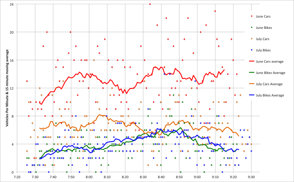
But I think it’s good data! First of all, the bikes. In two hours of counting, I counted 463 bicyclists crossing the Longfellow Bridge. That’s right, counting just inbound bicyclists, I saw more cyclists cross the Longfellow in one direction than any MassDOT survey saw in both directions. The peak single hour for cyclists was from 8:12 to 9:12, during which time 267 cyclists crossed the bridge—an average of one every 13.4 seconds. So, yes, cyclists have been undercounted in official counts.
Are we Market Street in San Francisco? Not yet. Of course, Market Street—also with transit in the center—is closed to cars. [Edit: Market Street is partially closed to private vehicles, with plans being discussed for further closures.] And at the bottom of a hill, it’s a catchment zone for pretty much everyone coming out of the heights. They measured 1000 bikes in an hour (with a digital sensor, wow!), but that was on Bike to Work Day; recent data show somewhat fewer cyclists (but still a lot).
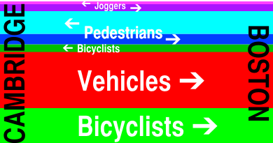
I also counted vehicles (1555 over two hours; 700 to 800 per hour, including three State Troopers and one VW with ribbons attached that passed by twice), inbound pedestrians (about 100, evenly split between joggers and walkers, although there were more joggers early on; I guess people had to get home, shower and go to work) and even inbound Red Line trains (30, with an average headway of 4:10 and a standard deviation of 1:50). I didn’t count outbound pedestrians, or the exact number of people I saw stopping to take pictures (at least three on my little nook of the bridge).
But did you come here for boring paragraphs? No, you came for charts! Yay charts! (Also, yay blogging at 11:20 p.m. when I should be fast asleep. Click to enlarge.)
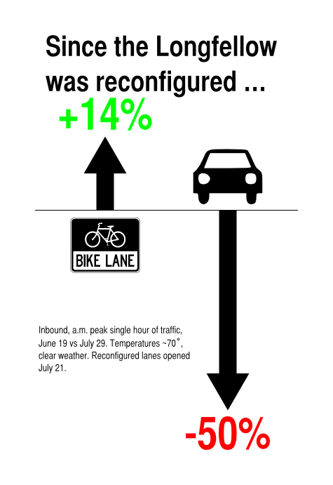
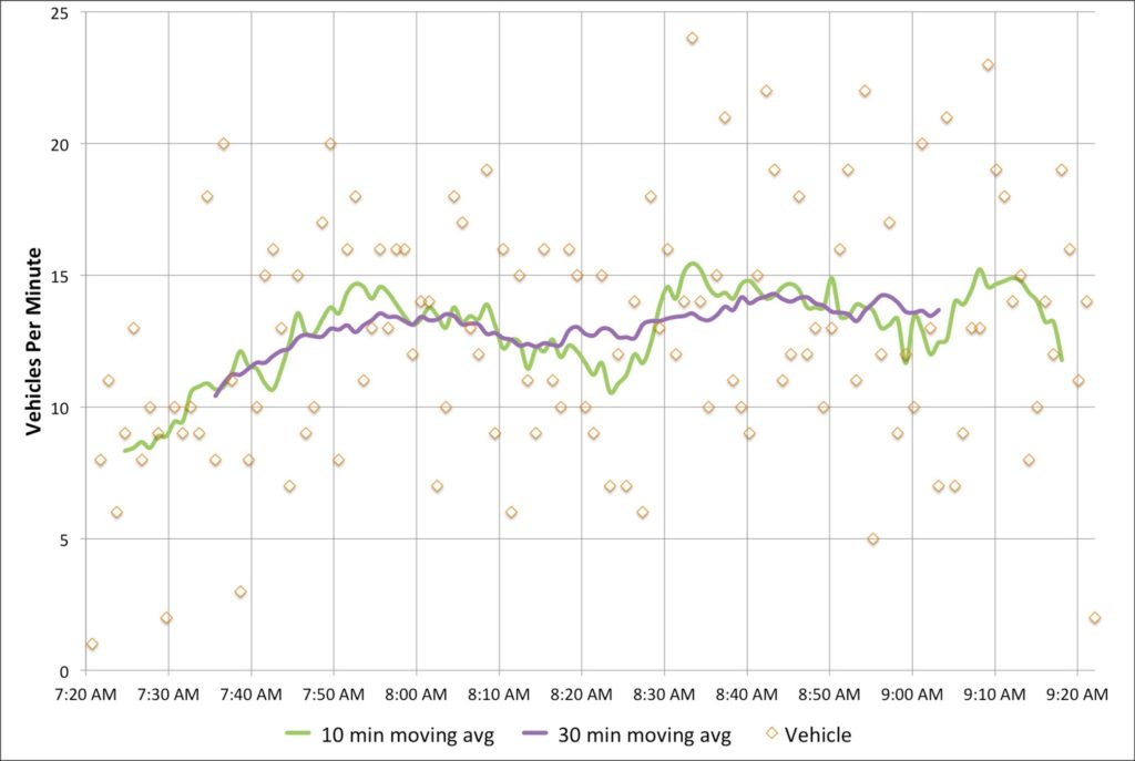
First, bikes. Cyclists crossing the bridge started out somewhat slow—the moving average for the first 20 minutes was only one or two per minute. But the number of cyclists peaks around 8:40—people going in to the city for a 9:00 start—before tapering off after 9. I’ve written before about seeing up to 18 people in line at Charles Circle which is backed up by these data; the highest single minute saw 11 cyclists, and there were four consecutive minutes during which 36 bikes passed. At nearly 6 bikes per minute for the highest half hour, it equates to nearly 360 bikes per hour—or 10 per 100 second light cycle. Too bad we’re all squeezed in to that one little lane. (Oh, here’s a proposal to fix that.) If anything, these numbers might be low—the roads were still damp from the overnight rain early this morning.
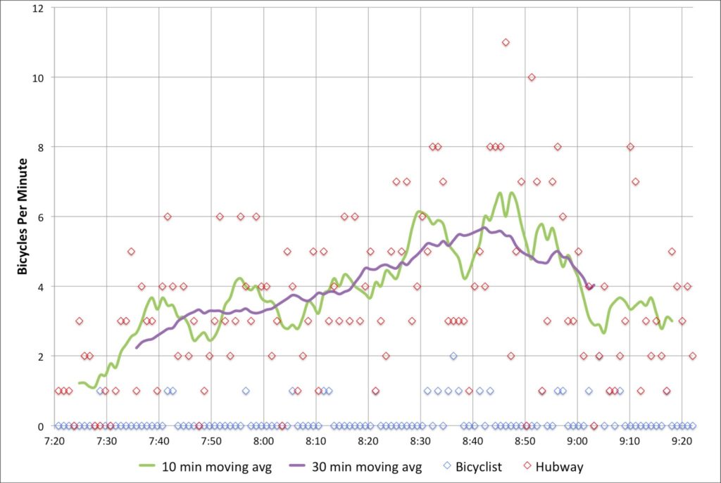
What was interesting is how few Hubway bikes made it across the bridge—only 25, or about 6% of the total. With stations in Cambridge and Somerville, it seems like there is a large untapped market for Hubway commuters to come across the bridge. There are certainly enough bikes in Kendall for a small army to take in to town.
Next, cars. The official Longfellow traffic counts show about 700 cars per hour, which is right about what my data show. What’s interesting is that there are two peaks. One is right around 8:00, and a second is between 8:30 and 9:00. I wonder if this would smooth out over time, or if there is a pronounced difference in the vehicular use of the bridge during these times. In any case, 700 vehicles per minute is not enough that it would fill two lanes even to the top of the bridge, so the second lane—at this time of day, anyway—is not necessary on the Cambridge side.
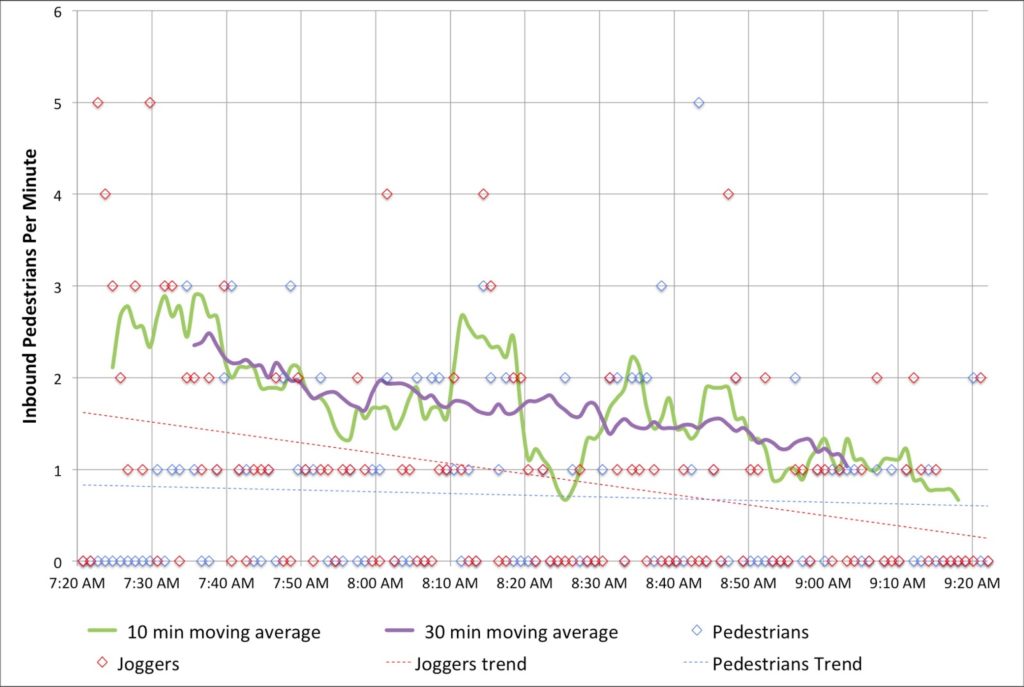
I also tracked foot traffic. I did my best to discern joggers and runners from commuters. Joggers started out strong early, but dwindled in number, while commuters—in ties and with backpacks and briefcases—came by about once every minute. I was only counting inbound pedestrians, and there were assuredly more going out to Kendall. Additionally, I was on the subpar, very-narrow sidewalked side; the downstream sidewalk is twice the width (although both will be widened as part of the bridge reconstruction).
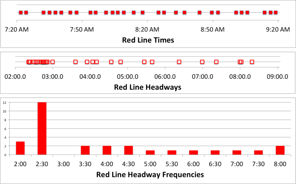
And I counted when the trains came by. In the time that 2500 bikes, pedestrians and cars crossed the bridge, 30 trains also did. Of course, these were each carrying 500 to 1200 people, so they probably accounted for 25,000 people across the bridge, ten times what the rest of the bridge carried. Efficiency! The train times are interesting. The average headway is 4:10, with a standard deviation of 1:58. However, about half of the headways are clustered between 2 and 3 minutes. That’s good! The problem is that the rest are spread out, anywhere from 3:30 to 8:30! Sixteen trains came between 7:20 and 8:20, but only 14 during the busier 8:20 to 9:20 timeframe. I wonder if this is due to crowding, or just due to poor dispatch—or a combination of both.
In any case, what Red Line commuter hasn’t inexplicably sat on a stationary train climbing the Longfellow out of Kendall? Well, after watching for two hours, I have an answer for why this happens! It is—uh—I was lying. I have no idea. But I say no fewer than a half dozen trains sit at that signal—and not only when there was a train just ahead—for a few seconds or even a couple infuriating minutes. I was glad I wasn’t aboard.
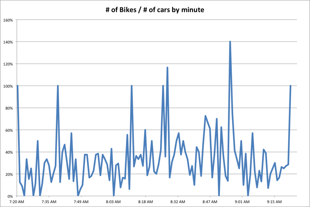
Finally, we can compare the number of bikes as a percentage of the number of cars crossing the bridge each minute. Overall, there were 30% as many bikes as cars. But seven minutes out of the two hours, there were more bikes across the bridge than vehicles. Cars—due to the traffic lights—tend to come in waves, so there’s more volatility. Although bikes travel in packs, too. Anyway, this doesn’t tell us much, it’s just a bunch of lines. But it’s fun.