When Google Maps launched bicycling directions, it was seen as a boon to the bicycling community nationwide. Finally, cyclists could see directions based on roads and trails, instead of being routed by the Googles on to highways and freeways. Speculation about the directions—that it would encourage more people to bike and even might influence city planning—abounds. People from Seattle to Portland to San Francisco to New York to Boston started throwing around reviews (mixed, actually; the service still feels very beta-y) about the new feature. It’s great that Google has released this product, but it feels like it might not be ready for prime time.
Around the same time as the feature launched, the first proofs of Bicycling Magazine’s annual ranking of cities for cycling came out, and there was a new #1. The newly crowned Minneapolitans (and their Saint Paulite brethren) were not as excited about the Google Maps cycling directions. Why? Because for quite some time, they’ve had their own version: Cyclopath.
Cyclopath was developed by, what’s best to call them, a bunch of bicyclist-geeks. Long before Google entered the marketplace, Cyclopath had developed, first as a project at the University of Minnesota and then as a “Geo-wiki” (part of it is to study of Recommender Systems, and even the behavioral science behind route finding). It was developed in 2008 and released to the public in the summer of that year, more than a year and a half before Google developed their nationwide network. It’s gone through several releases and now incorporates users opinions of various roads. While Google depends on a very analytic approach, Cyclopath provides more subjective data for users, which it seems, is more useful in the long run.
Plus which, Cyclopath’s data—since it was first uploaded—is consistently updated by its users. Find a road which has been closed? You can close it. Has a road been repaved or has it become incredibly potholed by a winter of freezing? Change its bikeability. Need to add a road? Add it in. Want to write about a long traffic light or a weird lane merge? That can be added in, easily. Google’s still in beta; Cyclopath is humming along.
In comes Google. Cyclopath likes it well enough, and doesn’t really see it as a threat, since they think they are better. In reality, they are two different approaches to the same problem: how do you get from Point A to Point B (as long as, in the case of Cyclopath, you’re in the Twin Cities). So, which is better? Let’s go through a few differences.
Quality of Route
This is the big one, let’s get to it right off. Cyclopath, with years of experience and input, rarely routes you inefficiently (you can change its algorithm, too, see below). Google Maps, on the other hand, has enough mistakes (it’s missing, for example, the Sabo Bridge and will route you on an Interstate ramp) that it’s a bit of a pain to use. But it’s not so much these glaring omissions—it’s the turns that are missing, often turns you can make in a car (try, for example, to make a left turn from Cleveland Avenue in Saint Paul to Mississippi River Boulevard)—which result in convoluted directions. And if you put in a ZIP code and Google happens to located it on an interstate, forget about non-car directions (even the car directions are bollixed up). Until these issues are fixed—and I know of half a dozen in Minneapolis and Saint Paul alone, so there have got to be hundreds nationwide—Cyclopath wins, hands down. I’m sure in cities which went from zero biking directions to Google, it’s great, but they have a way to go to catch up with Cyclopath.
Flexibility of Route Search
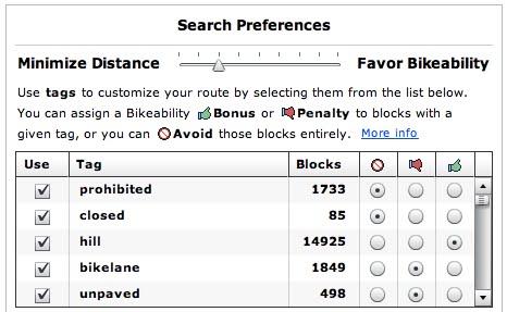
 When you search for a route in Google maps, you get several options: by car, by transit, walking or bicycling. Within bike directions, however, you have no options. There’s no way to avoid hills, or weight bike paths higher. They have gone on about their great algorithm, but there’s no way to know exactly how it works. The algorithm is what the algorithm is. In Cyclopath, you have choices. (see right) If you want to get from point A to point B as quickly as possible, you can choose to minimize distance. For a nicer, but potentially longer ride, choose, bikeability. And you can then assign penalties or bonuses to your routes for customization.
The one aspect of route flexibility where Google wins is in the post-search environment. With Cyclopath, you usually get a good route, but if you want to change it to, say, add a waypoint (often to get it to follow a certain road or trail) it won’t let you. You have to create a new route. Of course, Cyclopath can display multiple routes at once; Google can not.
Non-cycling Data
Cyclopath sounds great, but isn’t it just a glorified bike map with directions? Nope. While Google has added a lot of secondary data, Cyclopath more than keeps up. Google has more background layers, and draws on its wide search database to show photos and webcams and georeferenced Wikipedia articles and other such sundries which clutter the map. Cyclopath has a toggle for satellite imagery (the “P” key) which loads faster. In addition, Cyclopath has a plethora of local businesses and buildings tagged, some of which have very pertinent information added (such as “bike racks on north side” or “bathrooms on lower level”). In addition, Cyclopath has future trail alignments shown as being “closed” which Google omits.
Fixing data
If you want to fix data in Cyclopath—if you find a street which is closed (even temporarily, for construction) or a new bike lane or anything else which is missing, sign up, sign up, and edit away. There’s been little vandalism (a Star Tribune article from 2008 didn’t foresee any) and editing is encouraged to keep the map’s data up-to-date. The map is relatively easy to edit (although the onus is on users to assure that the network is configured correctly). In Google? Well, there is a link to email suggestions to Google. I have—more than once—and gotten an email that they are working on it. But it still gives wonky directions for those routes. And the ability to add data and comment on the quality of roads is, well, amazing functionality.
UI
Google Maps’ UI is a thing of beauty. Going from the clunky pre-Gmaps interfaces (yes, Mapquest, we’re looking at you, at least until pretty recently) to Google Maps, back in the day, was eye-opening. Zooming, scrolling and navigating were made far simple in Google Maps, and while it may be resting on its laurels, everyone else is just catching up. Cyclopath is a different animal, and while its main interface seems a slight bit clunkier than Google Maps (no, you can’t double click to zoom and recenter) it’s very well designed for a local, bicycling website, especially one which has editing capabilities and a community feel mixed in.
The Name
No one knows what to call Google Maps bicycling directions beta. “Google Maps Bike Directions”? “Google Bike?” Everything seems, well, clunky. Cyclopath has a great ring to it.
Geographic Range and expandability
Okay, here Google wins. Google Maps bicycling (or, um, whatever) is nationwide. Cyclopath is in the Twin Cities (one of which is the top cycling city in the country). Could Cyclopath be exported? Maybe. Its creators claim that it would take a month of tech work from a rather qualified person, and that there’d still be logistical issues (or, as they put it, “unknown unknowns”).
Implications for bicycling as a whole
Google Maps may actually stymie the development of Cyclopath-like websites in other cities—who may be content with their Mountain View bicycle overlords. While Google has created a respectable product, it does little to incorporate the huge knowledge base of cyclists around the country. Road users don’t so much care whether a street surface is concrete or asphalt, and how wide the lanes are. Cyclists do—and ceding the authority to Google by default may not be in the best interest for bicycling. Hopefully both services will thrive, and Google will become more suited towards biking. In the short term, Google Maps bike directions are good for cycling. In the long term, it has the potential to be a back-burner project for Google, but one which is just useful enough that enterprising individuals don’t continue to innovate with products and services like Cyclopath.
The Verdict?
Right now, if you’re in the Twin Cities, skip Google Maps. Cyclopath will give you better directions, and may even entice you to become part of the community. And any changes you make won’t come with a ticket number.

