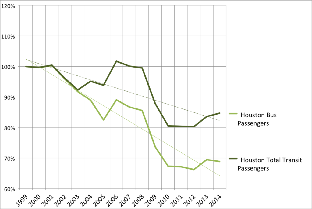
Last month, the MBTA presented its “Focus40” list of items it wants to complete by 2040. The Commonwealth Magazine article noted that the report states that the Blue and Red lines are only 600 feet apart, and connecting them would provide a two-minute walk in lieu of the Red-Blue connector at Charles. This sounds good. The only problem with this is that the Red and Blue lines are more than 600 feet apart. Quite a bit more. In fact, the walk from a Red Line train to a Blue Line train is more than three times as long. Where did the 600 foot figure come from? Let’s find out, with old-timey maps!
The Red Line runs beneath Winter and Summer streets. The Blue Line runs under State Street. These streets are, according to Google Maps (and, I assume, in real life), more than 1500 feet apart. But it turns out, that’s not even the real distance you’d have to walk between the subway lines. Boston’s subways were not built in a particularly coordinated fashion (although, unlike New York, which had two competing subway companies, the Boston Elevated Railway, or BERy, was the only game in town). The Green Line tunnel was built first, the Blue Line second (and, thus, below the Green Line) and the Orange Line tunnel third below the Blue (the Orange Line running through downtown predates the Blue Line, but for 7 years it ran on the Green Line’s tracks). Each newer tunnel went under the others, which is why the Green Line runs above. The Red Line wasn’t built until several years later, running below both the Green and Orange lines.
All of the lines were built within the confines of Boston’s notoriously old and narrow street grid, which was nearly three centuries in the making even then. So to fit stations in, and stairs between subway lines, both the Red and Blue Line stations are offset east of the Orange Line, and the Orange Line platforms are offset on separate sides of the subway to fit within the width of Washington Street.
Up until the 1960s, in fact, platforms were referred to as separate stations by the street they intersected, rather than station names. So the Downtown Crossing complex was referred to as Winter for the Forest Hills-bound platform, Summer for the Oak Grove-bound platform (then the Everett-bound platform) and Washington for the Red Line platforms. (It doesn’t help matters that most road names in Boston change at Washington Street.) Similarly, State was Milk-State on the Orange Line and Devonshire on the Blue Line. This seems nonsensical, until you think about it: to get to the Milk Station, you entered on Milk Street. To get to the State station, you entered on State Street. There are more examples; as this page posted long ago.
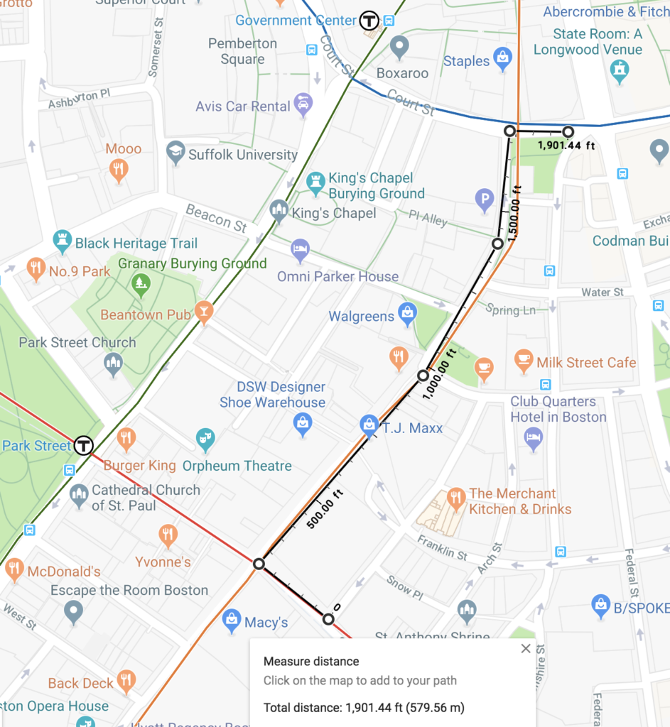
In any case, the Blue Line platform extends east from Devonshire Street, hence the name. The Red Line platform has entrances on Washington Street, but the actual platform begins around Hawley Street. To walk from Hawley to Devonshire via Washington? That turns out to be a walk of 1900 feet, up (or down) two stairs (since the Orange Line is built under the Blue Line, and the Red Line is under the Orange Line).
So where does this 600 foot figure come from? I’m actually not quite sure. What I think the number is indicating is the distance which would have to be dug between the two Orange Line platforms to provide a pedestrian connection between the Red and Blue lines. To make sense of this, we’re going to have to think in three dimensions (at least). Lucky for us, the Boston Transit Commission issued yearly reports during the construction of the subways in the early 1900s, and Ward Maps has them on their website (and has provided me with some high-resolution copies for this article, so shout out to Ward Maps for being excellent).
Remember that the Orange Line platforms are offset laterally. At Downtown Crossing, for instance, the northbound platform extends from Summer Street 350 feet north to Franklin Street, and the southbound platform south to Temple Place. In fact, the MBTA has been experimenting with new GTFS features to show the layout of Downtown Crossing, which you can view here. (Note, on the right side, the multiple levels; click B1 and B2 to toggle between.)
For the Milk-State platforms, this gets a bit more complicated. Washington Street is narrow enough at Winter/Summer: about 60 feet between buildings, but by the time you get to Milk Street, it’s narrower: only about 40 feet. Some of Boston’s oldest buildings stand here—the Old South Meeting House and Old State House date to the early 1700s—and the subway had to be built between the foundations; in the case of the Old State House, a subway entrance was built right in to the basement. (There are also newer buildings and, because reasons, parking garages.) This is barely wide enough for two subway tracks and a platform. So what did they do? They offset the platforms vertically: in effect, they stacked the trains.
Here’s what the tunnel looked like just south of the Milk platform when it was under construction around 1906:
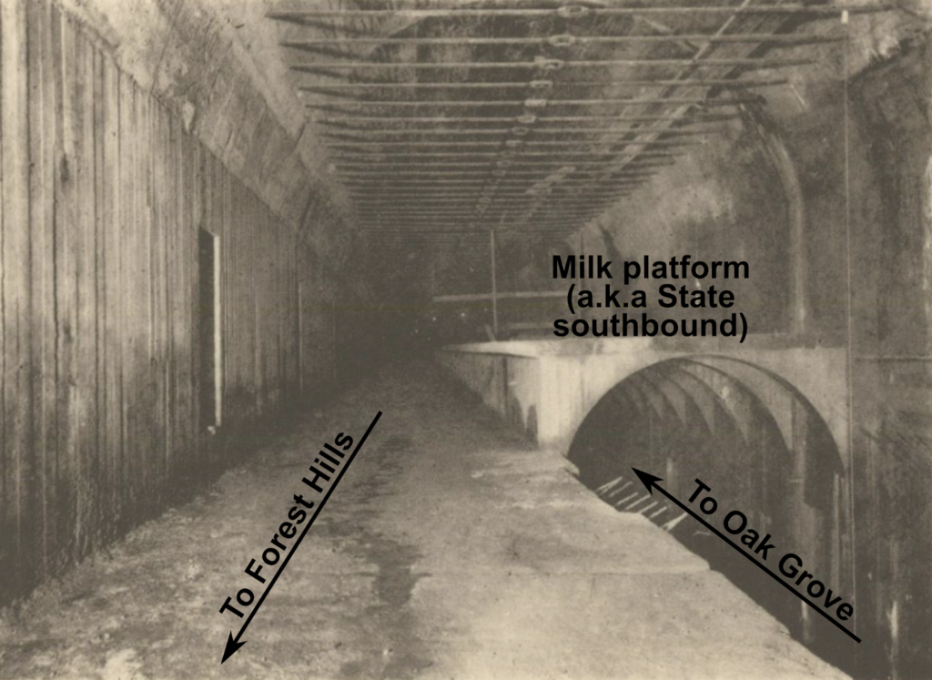 |
| Original caption: Portion of platform of Milk St Station over the track for northbound cars. For orientation, the Old South Meeting House is approximately to your right (and above). Original file. |
If you’re familiar with State station, this is the platform you exit off of coming on a train from Oak Grove. To get to the Blue Line, you walk along a corridor which is sort of an extension of the platform—dubbed, apparently, the speedway (from this detailed 1909 article on the tunnel), and now home to funky colors—and then the State platform, with trains to Oak Grove also to your left, and with escalators to the Blue Line to your right.
Here’s a map from 1913 showing the stations (and, yes, it’s the best map I can find of the actual locations of station concourses). I’ve shown current station names in all-caps, and former station names in lowercase; for DTX and State, I’ve outlined the platforms in their current colors and labeled the platforms with their original names. Note that while the Orange Line platforms were built 350 feet long, and only had to be lengthened minimally to accommodate six-car trains. (Original file from Ward Maps)
 |
| View the full-size version. |
Well, not quite. Look back up at the photograph above and imagine extending the Milk (Southbound State) platform shown 300 feet east (towards you) to meet the Summer (Downtown Crossing) platform. It would have to extend above the Oak Grove-bound Orange Line platform. When Oak Grove trains leave Downtown Crossing, then descend quickly to dive under the Milk Street platform pictured, descending at a 5.5% grade. So this would not be a level ramp by any means; in fact, a 5.5% grade exceeds the maximum allowed by ADA regulations, so it couldn’t even be built above the tracks with infinite space above. Which is kind of moot anyway, because it would also butt up in to the top of the tunnel pretty quickly. It would therefore have to jog south of Washington Street’s right-of-way, under the buildings there, which would add complexity to construction and yet more distance to the walk.
From 1906, here’s an elevation profile of the entirety of the Washington Street tunnel (now the Orange Line) connecting the elevateds north and south of the city (from 1901 to 1908, the elevated trains ran through what is now the Green Line, and the abandoned Pleasant Street Portal). I’ve added some annotation to it. The vertical orange lines show the ends of the platforms which would be used as the route for the pedestrian path. I’ve also shown the location of the Red Line (not built at this point) and the Blue Line (called then the East Boston Tunnel, or the E.B.T.). I’ve also superimposed the location of the other-direction Orange Line platforms on each drawing, and used black lines to superimpose other elements of the tunnel. I mainly want to draw attention to the fact that a passageway between the Summer and Milk platforms could not fit within the current envelope of the Orange Line, and would have to be built to the south, because to the north there are train tracks in the way, and to the south there is the minor issue of building foundations being in the way.
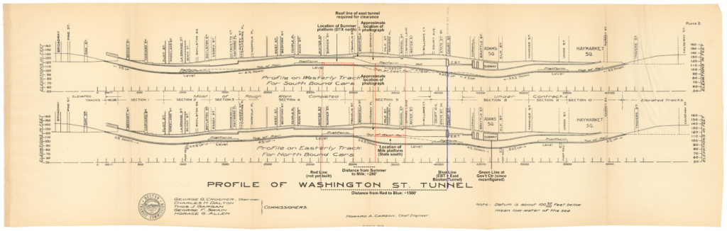 |
| View the full-size version. |
Again, this comes from Ward Maps, and the original file is here, and while the original has been sold (and, alas, not to me) you can get a reprint to hang on your wall (which I am considering).
So what are the takeaways from this little exercise?
- While the Orange Line platforms and concourses would allow a connection to be made between the Red and Blue lines, it would amount to a walk of more than a third of a mile, up or down multiple staircases, and along already narrow and crowded subway platforms. That’s 8 minutes of walking, plus climbing some stairs, and that’s assuming you can walk at 3 mph down crowded platforms. At rush hour, it might take a good deal longer. It would probably be faster to just take the Green Line one stop from Park to Government Center, since the Green Line is directly above the Red and Blue lines.
- The 300 feet which would be needed for an additional tunnel would have to go through and underneath the building foundations outside of the footprint of the street, because the Orange Line is already threaded under Washington Street, which is very narrow.
- The entire utility of this connection could be realized by allowing an out-of-system transfer between Downtown Crossing and State, which will be possible with the new fare system currently being procured. It only adds one flight of stairs: two up from Red to street level, then one down to Blue.
- This would do little to actually address the issue of core capacity, which is what the Red-Blue connector aims to address. Even if this was convenient for people to use, it wouldn’t result any less crowding on the Red Line, and the Orange Line and Blue Line platforms would actually become more crowded than they are today.