
Every few years, the MBTA publishes the Blue Book. It is a compendium of data, neatly packaged in a PDF format. (It would be nice if they published a Blue CSV, but that’s asking a lot of a public transit agency.) I haven’t had much time to play with it, but did download the data for the core subway lines, to compare 2013 to 2009 (the last Blue Book) and before.
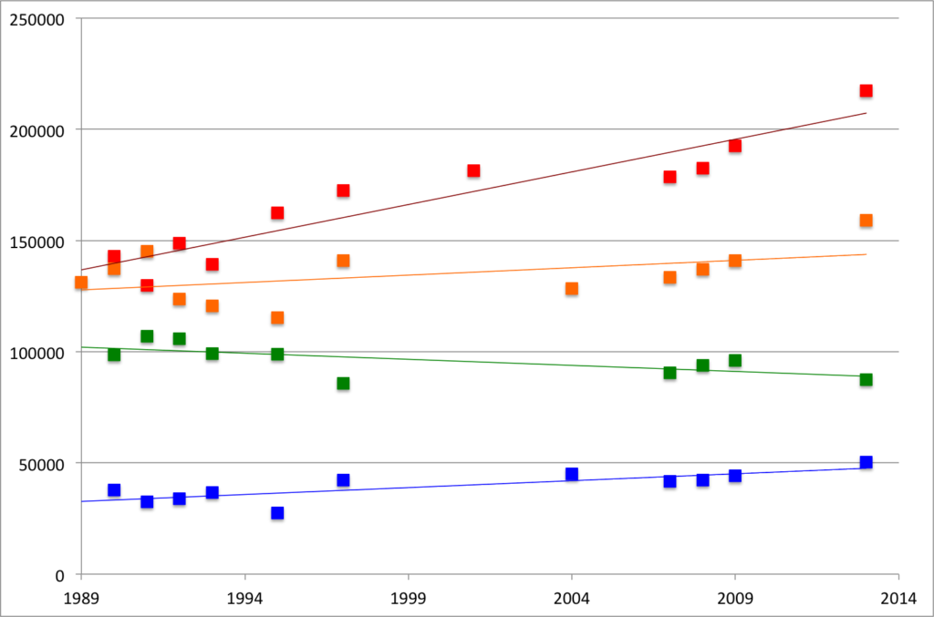
This shows data for each subway line (N.B.: it only shows subway boardings for the Green Line) for the past 25 years. The Red, Orange and Blue lines all grew by 13% since 2009, and compared to their lowest count over the past quarter century, they are up 67%, 38% and 82%, respectively. All three lines saw their highest ridership in 2013. If the trains seem crowded, it’s because they are carrying significantly more riders now than they were just a few years ago.
Then there’s the Green Line. It seems that ridership there is flat, but I haven’t had a chance to look at the branches. It might be due to it’s slow speeds, arduous boarding process, arcane rules, lack of traffic priority or a combination of these factors. Or it could be that it’s already basically at capacity, at least as currently configured.
I’ll have more analysis—including station-by-station counts (very variable) and bus routes (they’re growing)—in the coming days.