I’ve been intrigued by a few statements and metrics regarding buses recently. The first is that Beverly Scott recently said (on the radio, I think) that the T really should have many more buses than it does; she’d expect an agency the size of the T to be running 1500 buses, instead it has only about 1000. The second is that the T can not add any buses to the fleet, not only because of the cost of acquiring and operating new buses, but because there is physically nowhere to store and service them: the current bus yards are maxed out. And with proposals floating around for post-Sandy-New-York-style bus bridges, there would need to be a lot more buses in the fleet for that to happen.
My question was how heavily used the T’s buses are, especially compared to other systems. For every [fill in the route number here] bus that is jammed full of passengers, there’s a late-evening 350 with just a few riders. I decided to look at the ridership and fleet sizes for large bus fleets in the US, and see how many daily passengers there are per bus in the system. (Note that most fleets carry a 20% spare ratio, so the actual number of passengers a bus will carry in a day is 20% higher.) The short answer is that the T falls in to the normal range of major systems, if even at the lower end. The longer answer is that each system is different, and comparing them is all comparing apples to oranges.
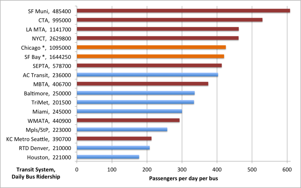
You came here for charts, right? Here’s one. On the right axis are US bus systems with more than 200,000 riders per day. On the bottom axis, the number of riders per bus. I’ll get to the colors below.

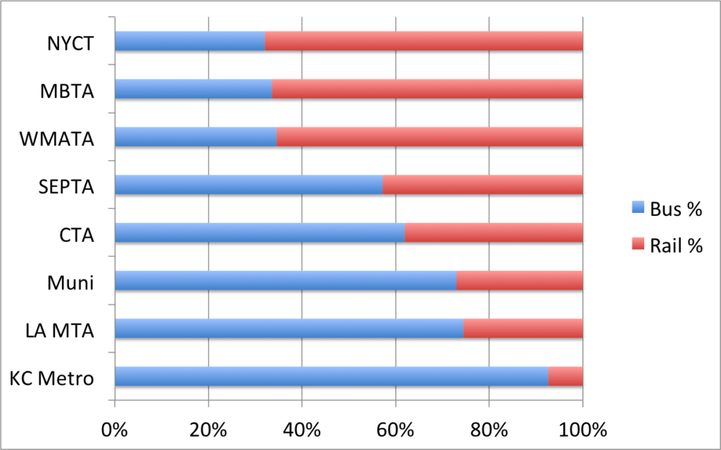
So note that the systems in San Francisco and Chicago perform way ahead of anywhere else. The reason there is twofold. One is that in both systems, buses are the backbone of the system: they carry more passengers than the cities’ rail systems, so that many of the busiest corridors are served by buses. In fact, of the top tier of transit cities (there’s a big drop from Seattle, with 390,000 riders, to Baltimore, with 250,000), Boston, New York and DC are the only cities with more rail riders than bus riders. The MBTA’s bus system really operates as a transit feeder system (and always has); the only “Key” bus route in Boston which serves Downtown Boston—other than the Silver Line—is the 111. Most of the busiest bus routes—the 1, 28, 39, 66 and so forth—are either crosstown routes or feed a transit line.
The other difference on the above list is that in several cases, the bus systems primarily—or only—serve the city, with a separate system (or systems) serving outlying areas. For the top-eight systems (in red), only the MBTA, SEPTA, WMATA (DC) and King County Metro (Seattle) serve the whole area, the rest are augmented by suburban systems (Pace in Chicago, several agencies in LA, New York and the Bay Area). For Chicago and San Francisco, I added in other agencies (Pace in Chicago, AC Transit, Golden Gate Transit and SamTrans in San Francisco, since all serve the City there; shown in orange) and it brings their passengers per bus rate in line with other systems.

In fact, it’s interesting that once this adjustment has been made, there are no high outliers: the top systems fall between 375 and 460 riders per bus. There are outliers on the lower end. WMATA is lower by quite a bit, and Seattle lower still; it’s possible the fleet size data there I am using isn’t perfect, or that they have different utilization rates. In DC, there are poor transfers between buses and trains, and rail service carries the bulk of passengers. I’m not sure about Seattle, but it has a very small rail system relative to any other system on the list.
In any case, it’s all apples to oranges because Boston is relatively unique among these systems. The buses are mainly set up as rail transit feeders (this is the case really nowhere else, at least to the extent that BERy was built on subway-surface stations), the system is region-wide, so lower-ridership suburban routes skew the numbers and buses do not carry the majority of riders. If this was a Venn Diagram of cities with more rail than bus passengers and a single region-wide bus and rail provider, only the T and DC would be in the middle. And the T does far better at bus utilization, it seems, than DC, and while Boston’s system was mostly built to integrate surface and subway lines, DC’s Metro was built long after the bus lines had already been established (mostly as streetcar lines, of course). So with the nearest we can get to an apples-to-apples comparison (apples-to-pears, perhaps?), Boston is far more efficient.
So, the T needs more buses. Except for San Francisco, the T, at ±1000 buses, has by far the smallest bus fleet of these top-8 cities (and San Francisco—with 800 buses—only has a 50 square mile service area; about the size of Boston proper; AC Transit alone has another 550). Cities outside the top-8 don’t have the same sort of capacity constraints the T (and other major bus systems) see on a daily basis. In Minneapolis, for example, the busiest bus route runs every 6 minutes. In Boston, several routes—the aforementioned 111, the not-even-key 7—run every 3 to 4 minutes at rush hour, and they’re packed.
Having more buses would allow more operational flexibility: a route like the 70, which could see many of its
problems solved with a couple of extra buses, could see such service without worrying about where to put them. But that’s easier said than done: finding land for a new or expanded bus depot isn’t an easy proposition, especially when existing land, in many cases near transit nodes, has high value. Still, ordering new buses is faster than new rail cars (one year lead time instead of half a decade) and having enough vehicles would have a positive impact not only during irregular operations, but on routes which are overcrowded right now. Buses can be procured off the shelf for $500,000 each. A $50 million capital investment for 100 buses—plus the cost of space to service new buses, of course—could have a quick but lasting impact.

