I was having a discussion on Twitter—as I am wont to do—about the densities of cities in the United States. The discussion turned to when various cities had reached peak density and I realized I had compiled such a list in a Google Doc several years back. When I’d created the document I’d set a lower limit to the size of city included (about 60,000) and the peak density (10,000 per square mile), but was more interested in the larger cities. Right now (well, as of the 2010 census), there are six cities with at population of at least 500,000 and a density of at least 10,000, in order:
New York (8.2m, 27k/sqmi)
Chicago (2.7m, 12k/sqmi)
Philadelphia (1.5m, 11k/sqmi)
San Francisco (805k, 17k/sqmi)
Washington DC (618k, 10k/sqmi)
Boston (618k, 13k/sqmi)
None of these cities will likely fall below either threshold any time soon (although for a few decades, DC was below 10,000 per square mile). Some cities may join: Long Beach is about 35,000 away from reaching this density, Seattle would need to add 150,000 and Los Angeles 700,000. Miami, which has a density of 11,000, would have to add 60,000 residents to reach 500,000. In addition, it should be noted that each of New York’s boroughs (except Staten Island) would qualify for the list as well.
But the list hasn’t been static, and in 1950, there were an additional six cities meeting this threshold, cities which are far smaller and less dense now than then. They are:
Detroit (1.8m/13k, now 713k/5.1k)
Baltimore (950k/12k, now 621k/7.7k)
Cleveland (915k/12k, now 397k, 5.1k)
St Louis (857k/14k, now 319k/5.2k)
Pittsburgh (677k, 12k, now 306k, 5.5k)
Buffalo (580k/14.2k, now 261k, 6.4k)
This almost perfectly defines the Rust Belt, and these cities have emptied out in the past 60 years. Chicago, Philadelphia, DC and Boston all started with similar trajectories in the 1960s and 1970s, but have arrested their falls and remain as large, dense cities. With the exception of Baltimore and Detroit, each of these Rust Belt cities is now below both 500,000 and 10,000, and Detroit has lost two-thirds of its population and is only above 500,000 because it’s baseline—the fourth largest city in the country in 1950 (behind NYC, Chicago and Philly)—was so high. 1950 was the peak of density in the United States, and it will be a long time until we have as many large, dense cities as we had then.
While these cities certainly had less-diversified economies than the cities which have stayed on the list, they haven’t done themselves any favors. New York, Chicago, Philadelphia and Boston all have extensive mass transit systems; DC and San Francisco have build them (other than Detroit, the dense Rust Belt cities all have some sort of mass transit, but nowhere near the extent of the six large cities; the Big Six today are also the cities with the highest transit mode share in the country). Most also limited the spread of highways in their urban areas, something which didn’t occur in the Rust Belt cities. Policies which encouraged residents to leave the city worked too well, and these cities are now half-abandoned, or more, despite being as dense as their peers 60 years ago.
Not all cities peaked in 1950. If we expand our criteria to cities which peaked at at least 60,000 people (keeping the 10,000 density requirement) and include New York boroughs, we’ve seen peak population densities stretching back a century.
The first was in 1910 when Manhattan reached its all-time peak of 2.3 million residents, a density of 101,548 per square mile. The list of cities (at least those with at least one million residents) which have ever achieved such density is short: Manila. And it’s only about half the size of New York. Paris, at 55,000 per square mile, is the densest western city today. In 1910, New York had as many people in half the space. Once subways opened allowing easy access off the island it was a safety valve, allowing people to move out of jammed tenements to the relatively spread-out outer boroughs.
One city, Lawrence, Mass., peaked in 1920 (the Merrimac valley could be called the linen belt 100 years ago as its textile mills moved south). Two peaked in 1930: Somerville, Mass. and Jersey City, N.J. In 1940, Providence, R.I. peaked (and is the first city on this list to have fallen below 10,000, although barely).
1950 was the peak; in addition to the cities above, Brooklyn, Philadelphia, DC and Boston peaked, as well as several smaller cities. Cities which peaked in 1950 have, in general, fared far worse than those which peaked before or after. The only cities which have seen their populations decline by more than half peaked in 1950, in fact, the average decline for 1950-peakers—65% (although this doesn’t include cities like San Francisco which peaked in 1950 and have since surpassed that)—is lower than any other city on the list.
The Bronx peaked in 1980 (Queens is larger today than it has ever been), and no city, large or small, peaked in the 1990s. Several small jurisdictions peaked in 2000, and as of 2010, New York City as a whole, Queens, San Francisco and Miami and several other small cities are at their peak.
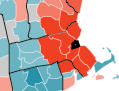
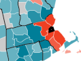
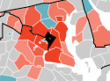
There are, however, two other “cities” which could be included on the list, that is, if you were to agglomerate small, dense suburbs of large cities. (Combined with Hialea, Miami Beach and some others, Miami would also make the list.) One is (not surprisingly) in New Jersey, where just the stretch from Bayonne to Fort Lee boasts nearly 700,000 residents at a density of 17,000 per square mile—similar to San Francisco. The other is north of Boston. Somerville, Chelsea, Cambridge, Malden and Everett all fall above 10,000, but only have 308,000 people (albeit in just 22 square miles). Add in Winthrop, Watertown, Revere, Arlington and Medford and you have an arc north of the city with 505,025 people living in 48.8 square miles—a population density of 10,340. Boston has by far the largest percentage of residents in 10,000+ jurisdictions outside the major city (37%, SF and NY are 26 and 21, the others are under 10) and all but Lawrence are contiguous. So if the cities and towns north of Boston combined to form, say, North Boston, or Chamedwathronfordville, it would be a pretty big place.