
 |
| Yelp-rated routes in Boston. Click to embiggen. |
I noticed a while ago—as did some other folks—that Yelp users have been, for some time, rating transit lines. I was intrigued. Here was really interesting data about how people felt about different transit lines, distilled in to a simple 1-to-5 rating. While not every line was ranked in Boston (my first search) there were plenty that were, and I compiled a list of routes, star-ratings and the number of Yelps.
In Boston, only some routes were rated, and they were, not surprisingly, centered in the more student- and hipster-centric part of the city. For instance, no bus line in Dorchester or Mattapan got Yelped, but most in Cambridge and Somerville have many reviews. I figured the best way to show these data was on a map, and after some machinations (especially in resorting the shapefile so the thinner lines would display on top of the thicker ones) I got the map above. It’s pretty cool—click it to enlarge. (Here’s the full MBTA system map if you’re not familiar with the lines; I left off route numbers for clarity.)
But I realized that pretty cool wasn’t cool enough. There was probably a much richer data set out there. Boston has about 750 Yelp reviews, 450 of those for rail lines. Was there city with a wired-in community, lots of bus and transit routes, and high transit ridership? Did I just describe San Francisco to a T? And, voila, there are nearly 2000 Yelp reviews of transit lines in San Francisco, at least one (and usually many more) for nearly every line Muni runs (see exceptions below). (Here’s the Muni system map.)
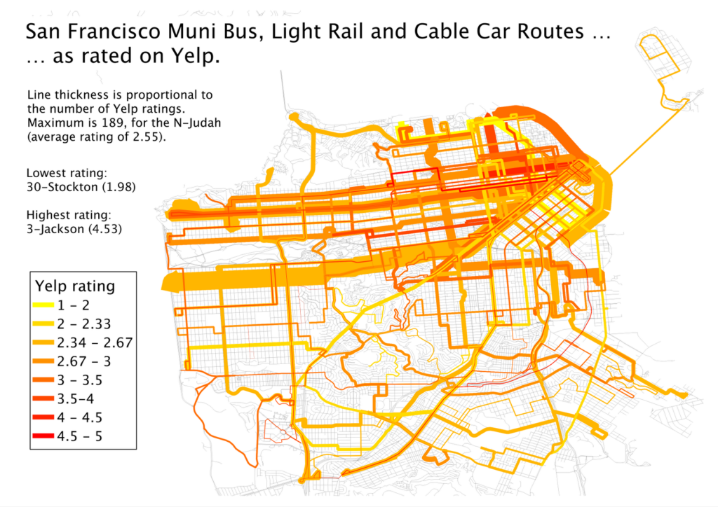 |
| Muni Lines, as reviewed by Yelp. Click to Embiggen. |
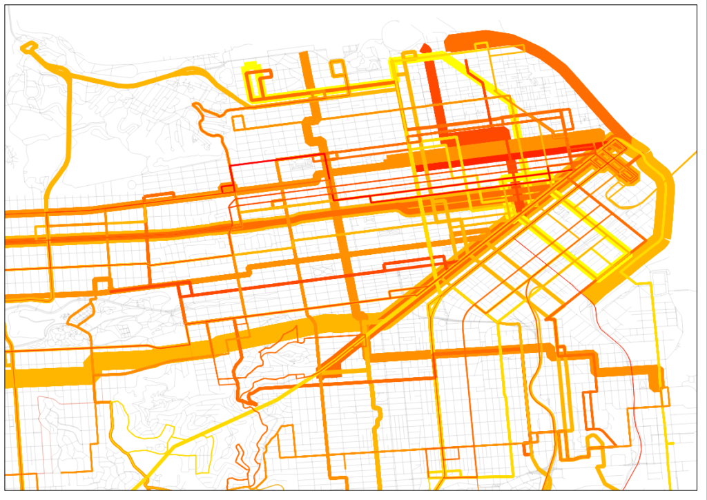 |
| San Francisco inset. Click to embiggen. |
That. Is. Sexy. The N-Judah has nearly 200 reviews. Wow. And in case the downtown area is too clustered for you, there’s an inset to the right.
I also realized that I had a pretty fun data set here, too. I went to a talk by Jarrett Walker the other day at MIT where he mentioned, amongst other things, that we should not focus on the technology used for transit, but whether if fulfills the mission of getting people from one place to another. In San Francisco, we have a jumble of buses, trolleybuses, streetcars and even cable cars and we have a pretty good way of quantifying whether they are accomplishing the job of transit. (In Boston, even though the B Line serves tens of thousands of passengers a day it manages a 1.36 Yelp rating—remarkable as the lowest possible rating is 1. None of its 34 raters give it a 4 or a 5. Still, it moves a lot of people marginally faster than they could walk.)
| Vehicle type | Routes | Avg Reviews | Avg Stars | Weighted Avg |
| Bus | 39 | 22 | 3.03 | 2.77 |
| Trolleybus | 12 | 41 | 2.95 | 2.79 |
| Cable Car | 3 | 64 | 3.81 | 3.87 |
| PCC | 1 | 114 | 3.42 | 3.42 |
| Light Rail | 5 | 65 | 2.31 | 2.43 |
I am so interested in San Francisco’s Yelp bus ratings that I’ve tabled the whole of the network.
| Line | Vehicle | Stars | # Ratings | Line | Vehicle | Stars | # Ratings | |
| 1 | Trolleybus | 2.96 | 78 | 48 | Bus | 2.71 | 17 | |
| 2 | Bus | 2.53 | 26 | 49 | Bus | 2.33 | 40 | |
| 3 | Trolleybus | 4.53 | 17 | 52 | Bus | 2.5 | 8 | |
| 5 | Trolleybus | 2.73 | 55 | 54 | Bus | 2.6 | 10 | |
| 6 | Trolleybus | 2.88 | 16 | 66 | Bus | 4 | 1 | |
| 9 | Bus | 2.42 | 26 | 67 | Bus | 3.4 | 5 | |
| 10 | Bus | 3 | 24 | 71 | Bus | 2.56 | 27 | |
| 12 | Bus | 3.33 | 15 | 108 | Bus | 2.5 | 16 | |
| 14 | Bus | 2.55 | 44 | 01AX | Bus | 3.67 | 6 | |
| 17 | Bus | 3.67 | 6 | 01BX | Bus | 3.31 | 13 | |
| 18 | Bus | 3.25 | 16 | 08X | Bus | 2.56 | 18 | |
| 19 | Bus | 2.66 | 41 | 14L | Bus | 4 | 3 | |
| 21 | Trolleybus | 3.58 | 31 | 14X | Bus | 4 | 6 | |
| 22 | Trolleybus | 2.74 | 92 | 28L | Bus | 4.33 | 3 | |
| 23 | Bus | 3 | 9 | 30X | Bus | 3.2 | 35 | |
| 24 | Trolleybus | 2.81 | 32 | 31AX | Bus | 3.56 | 9 | |
| 27 | Bus | 2.07 | 28 | 31BX | Bus | 3.75 | 8 | |
| 28 | Bus | 2.48 | 42 | 38AX | Bus | 3.71 | 14 | |
| 29 | Bus | 2.5 | 36 | 38BX | Bus | 3.29 | 7 | |
| 30 | Trolleybus | 1.98 | 82 | 38L | Bus | 3.44 | 61 | |
| 31 | Trolleybus | 2.48 | 23 | 71L | Bus | 3.5 | 10 | |
| 33 | Trolleybus | 3.24 | 33 | California | Cable Car | 4.13 | 69 | |
| 36 | Bus | 2.1 | 10 | F | PCC Streetcar | 3.42 | 114 | |
| 37 | Bus | 3.42 | 12 | J | Light Rail | 2.49 | 45 | |
| 38 | Bus | 2.45 | 119 | KT | Light Rail | 2.13 | 23 | |
| 41 | Trolleybus | 2.82 | 17 | L | Light Rail | 2.13 | 38 | |
| 43 | Bus | 2.82 | 28 | M | Light Rail | 2.23 | 31 | |
| 44 | Bus | 2.83 | 24 | N | Light Rail | 2.55 | 189 | |
| 45 | Trolleybus | 2.62 | 21 | Powell-Hyde | Cable Car | 3.78 | 99 | |
| 47 | Bus | 2.13 | 23 | Powell-Mason | Cable Car | 3.52 | 25 |
The only lines not Yelped are the 35-Eureka and 56-Rutland. These lines have 30-minute headways (as does the 17-Parkmerced, see this route service chart with headways for all lines) while most lines in San Francisco have service every 15 minutes or better.
Next up: New York’s subways. And beyond.
The train ratings match my experience well. Let's put the lower-ridership Blue Line aside, since I've only used it once and it serves a different part of the city. Of the other three, the Red Line is the best in terms of frequency, train modernity, and station quality (at least from South Station north; south of South Stations it's probably not as nice, but fewer people use it so it doesn't weigh down the ratings too much). The Orange is better than the Green in terms of rolling stock quality, and also in terms of frequency unless you're using the Green Line's shared section. Really the problem is that in the off-off-peak, the Green Line branches and the Orange Line drop to really bad frequencies, like 13 or 16 minutes; the Red Line branches do the same, but most ridership is north of JFK-UMass so it's less of a problem.
Now if only the MBTA turned those off-peak headways into 15-minute clockface patterns, posted clearly at each station…
Great post, lot of good data in here.
We think Yelp isn't the ideal way for people to rate and review their MBTA rides so we're building a site just for riders and commuters. Check us out at RateTheMBTA.com.
Our data so far from Twitter has shown that the REd Line is the most reviewed line and also among the poorest. Daily delays and breakdowns. The Green Line is right behind it while the Orange Line ranks higher.
@ratethembta, that's a great idea. I think this is helpful in the sense that these are ratings from a wider population; RateTheMBTA will probably pull from a different subset than Yelpers.
@Alon, agree with most points. The OL frequencies are pretty awful off-peak, and it would be helpful if they were clockface, although the real time prediction apps (and new signage at most stations) help it. The GL can be unpredictable and there's no way to know where the trains are; they really need some technology there. The one saving grace is that inbound during the evenings the D Line at least runs on a pretty good schedule although, again, it's nowhere near clockface (every 13 minutes or something silly).
This is such a great resource that you are providing and you give it away for free. Buy Yelp Reviews Cheap
It is in rare cases do brands become viral within a short period using the twitter followers.How To Get Twitter Followers
By psychological insight, while an individual sees a high societal following, he inevitably is skilled to see you as an expert figure. Kind of like while you see a police force on the street or a celeb being followed through paparazzi. It’s a natural human nature and it can make enormous chances probable for your brand.How To Get Twitter Followers
Reviews are the links of the local globe. They drive a new brand, product, service or bossiness and are imperative to growth.Get Google Reviews & Rating