Hubway Data Visualization
Ari Ofsevit | www.ariofsevit.com | @ofsevit
My Hubway Trips
Before I talk about where to next, apropos of very little, one more map. It is 1000 meter buffers around each station in the seven largest (>500 bikes) bike sharing systems in the US and Canada (arranged approximately geographically; I love how DecoBike in Miami actually looks like the Florida peninsula).
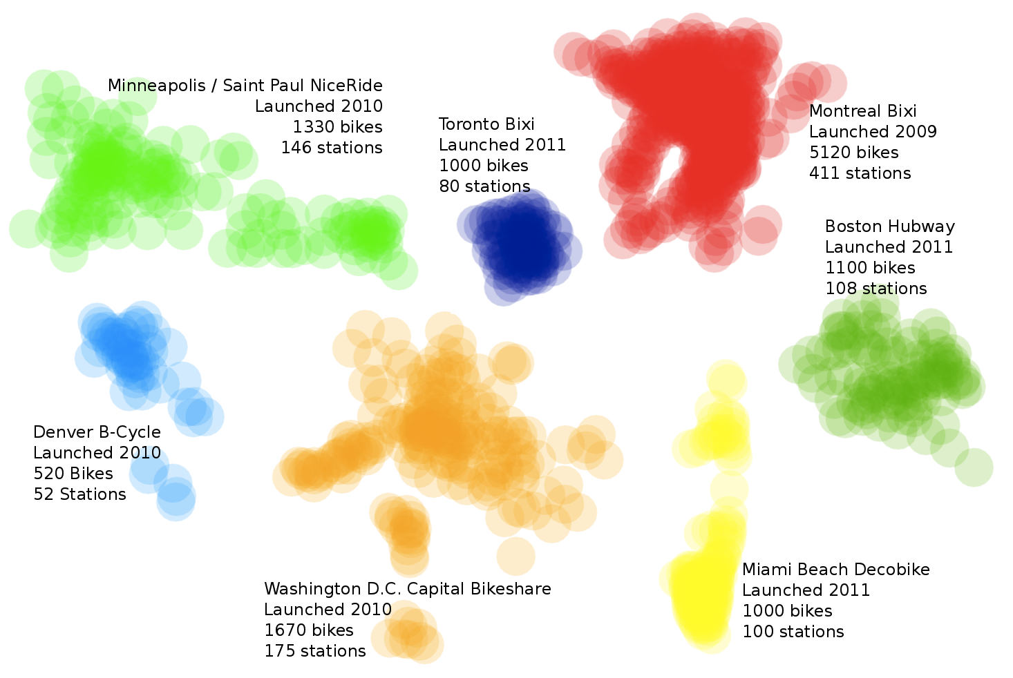
Note, of course, that Montreal is the oldest and by far the largest (more than twice as large as Capital Bikeshare) but that it doesn't cover appreciably more area than others. It seems that Canadian bike share systems are a good deal denser than their US counterparts.
As to what comes next. Well, someone with more technical prowess than myself (and perhaps more time, too) could take Hubway's live data stream and create charts like the ones I have for each station that update in real time. (HubwayTracker sort of does this, actually, but doesn't get quite the same oomph in its graphs since it's tracking station status and not overall use.) It would be fantastically cool if Hubway incorporated averages and charts in to its user data, and allowed you to share that in your social media. I'd definitely post a chart like this on my Facebook and Twitter.
And lest I forget, a bit about me. I have a website. Oh, wait, I have four websites (ariofsevit.com, tsastatus.net, skitrailreport.com, birkieguide.com) and a resume and a Facebook and a Twitter (@ofsevit) and even old-fashioned "e-mail" if that is your thing (my.name@gmail). I'm super interested in transportation systems and data analysis and display and I thank Hubway and the MAPC for these data and for these data and the opportunity to play around with them.
Ari Ofsevit | www.ariofsevit.com | @ofsevit