Hubway Data Visualization
Ari Ofsevit | www.ariofsevit.com | @ofsevit
Maps
The first idea I had was to map each station as a pie chart showing the types of rides: weekday and weekend, registered and casual. Using the same color scheme as the last chart I got the following:
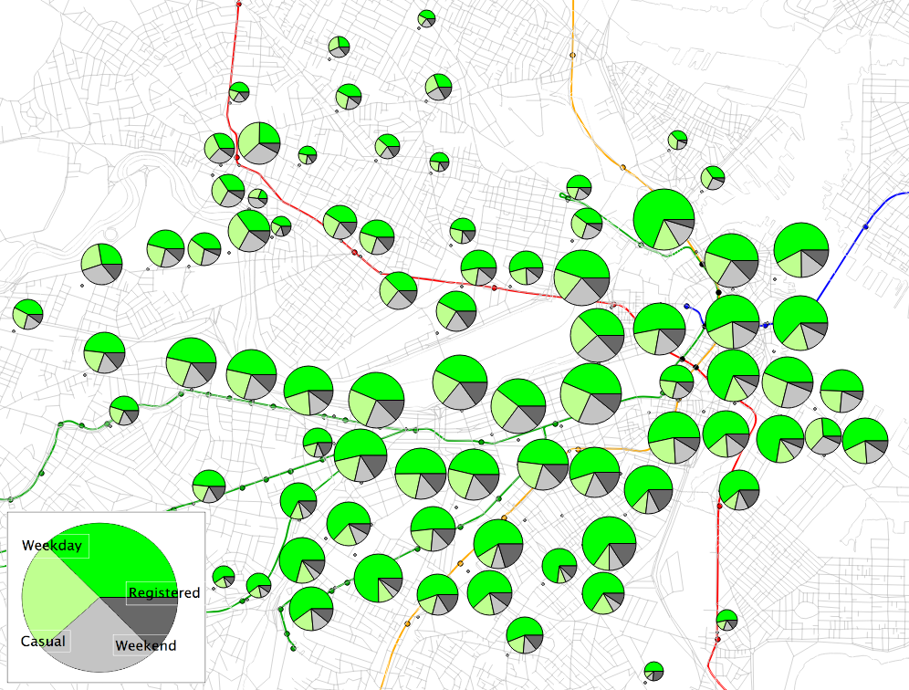
As I looked through the data, I realized that I was mostly interested in weekday, registered users. Sure, weekend and casual use accounts for a sizeable portion of Hubway ridership, but with lower speeds riders are not using it as much for transportation. I wanted to focus on the core user group, those who used the system frequently and regularly. Breaking out registered users on weekdays seemed to be the best way to accomplish this. The first map shows the starts and ends for each station by time of day. Well, it just shows starts, but mouse-over it to show ends.
Legend: 5 a.m. to 10 a.m. 10 a.m. to 3 p.m. 3 p.m. to 8 p.m. 8 p.m. to 5 a.m.
Station starts: mouse-over to show endsOne thing that became apparent (and we'll get to this further when we look at each station) was that there were several different profiles for station use amongst these registered, weekday users. Usage peaks at the rush hours (I defined these loosely, as 5 a.m. to 10 a.m. and 3 p.m. to 8 p.m.), but it does so much more at some stations that others. In addition, the percentage of rides falling during these 10 hours ranges dramatically, from as low as 50% to over 85%! Using the above data, I categorized the stations in to five groups, and mapped them out:
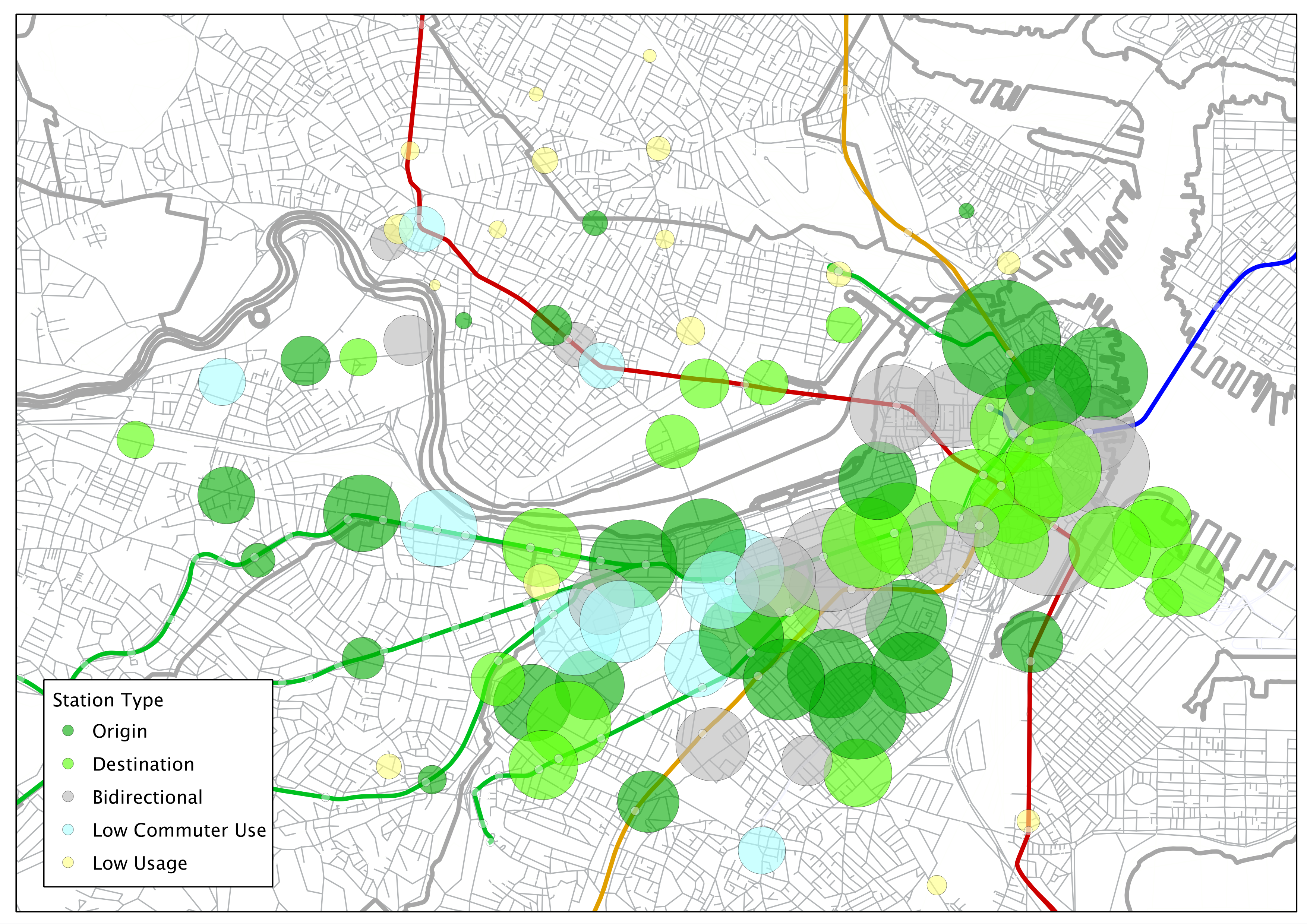
Here is the information behind the groupings:
- As mentioned above, rush hours were set as 5 a.m. to 10 a.m. and 3 p.m. to 8 p.m.
- "Origin" stations see at least twice as many trip starts as ends in the morning
- Likewise, "Destination" stations see twice as many trip ends as they do starts
- Evening ridership is somewhat more balanced; but was taken in to account as well
- "Low commuter use" stations saw fewer than 5/8 of their ride transactions during "rush hour"
- "Low usage" stations are generally newer stations which have seen fewer than 1000 ride transactions and show no discernable commuter bias (there are some low use stations which already have strong commuter trends, these are categorized).
What about the speeds between stations? This is a bit of a trickier subject. How do we calculate the distance between stations? The easiest way is to calculate the straight-line distance based on their latitude and longitude (this is how we calculated the speed chart). Other methods would be to feed pairs in to the Google Maps API, but there are two issues here. One is that it's bicycle routing API does not always return a valid route or the shortest route (using, say, sidewalks, short sections of one-ways or "hook turns" to make lefts where they otherwise wouldn't be allowed). The second, more pressing issue is that I wasn't about to learn how to use/code these data in a couple of weeks. So straight line it is! (For what it's worth, this seems like a pretty good compromise, all things being equal: since most trips are relatively straight, even given Boston's winding street grid and water features.)
Once settled on that, dividing trip lengths and distances was pretty easy. For these data, I culled only points from August and September, 2012, when stations in Cambridge, Brookline and Somerville were operational. And because showing every station pair (more than 8000) would be way to busy and contain lots of averages based on one or two trips, I decided to only show station pairs with at least 20 trips in one direction. The width of each line is proportional to the total number of trips. Also, I cut out any trips with speeds over 15 m.p.h. (these appeared to be concentrated at a couple of stations, and with some 30 mph speeds, were obvious errors: Good luck getting a Hubway above 20 without a serious downhill) and below 1 m.p.h. (since these really don't constitute commuting trips at speeds half of a slow walking speed, or 1/3 to 1/4 of normal Boston walking pace).
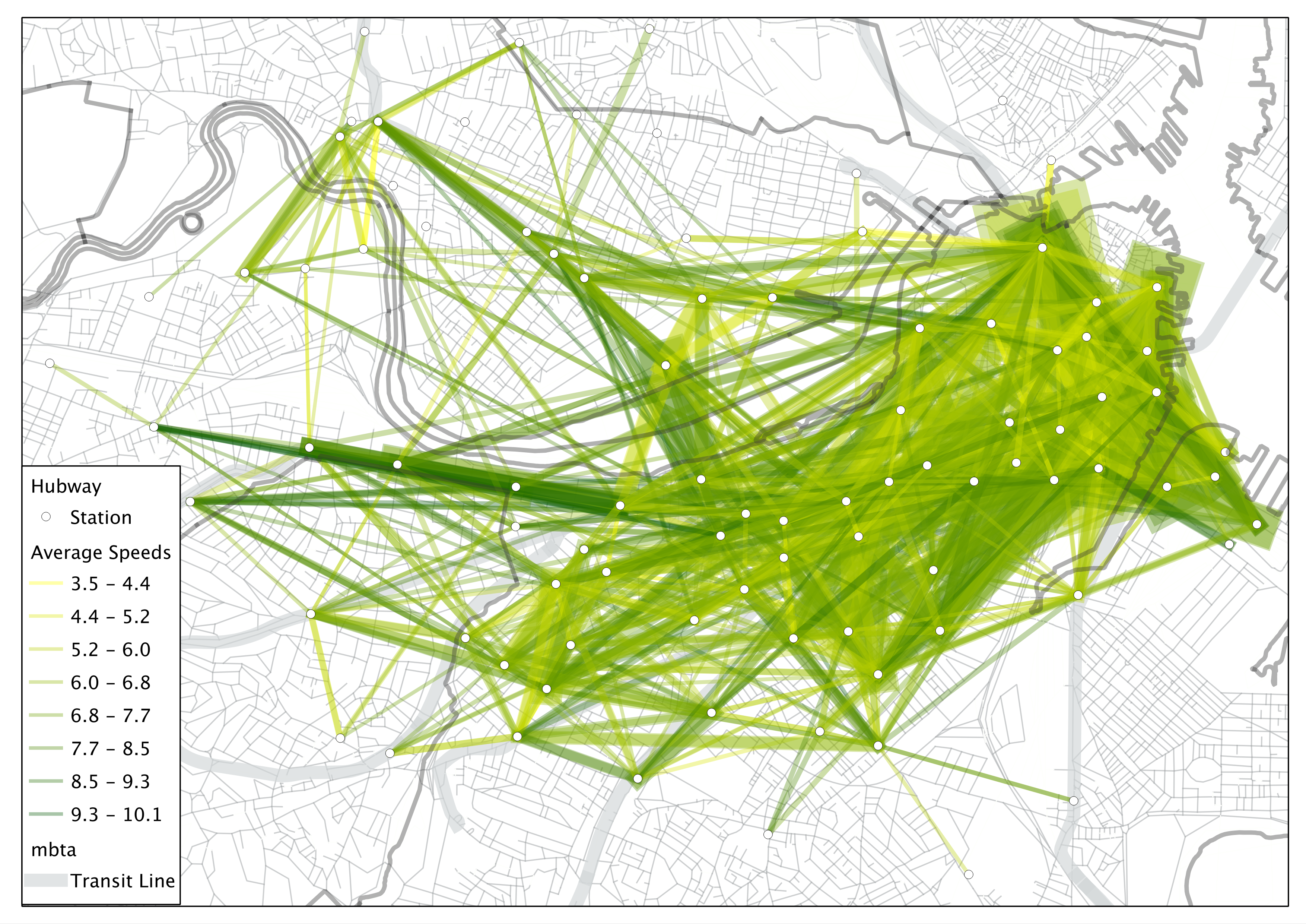
Some interesting things going on here. As would be expected, straighter trips are generally faster trips (since we used straight line calculations). It also appears that trips near the core are slower, probably due to traffic and frequent intersections. The fastest trips seem to concentration along Commonwealth Avenue west of Kenmore Square. Either there's a straight street there with good bicycle facilities and few traffic lights or BU students are speedsters (or a combination of both). It also appears that other college-served areas (Harvard, MIT, Northeastern, BU Medical Center) have higher trip speeds. Maybe this is due to more trips being at less trafficky times (I did not test this) or maybe it is from the spry legs of undergrads not yet hardened by years of in-town traffic.
I'll look next (with some more maps) at the differences between the two largest drivers of Hubway Use: North and South Station. (They're really interesting! No, seriously, guys!)
Ari Ofsevit | www.ariofsevit.com | @ofsevit