Hubway Data Visualization
Ari Ofsevit | www.ariofsevit.com | @ofsevit
My Hubway Trips
One of the great things about Hubway is that they give you a record of every trip you take, its origin and destination and time. Of course, they only show 20 at a time, and the data aren't particularly clean, but with a little elbow grease you can grab your data. That's what I've done to mine.
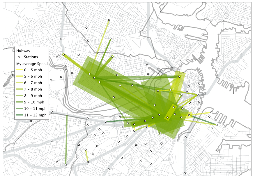
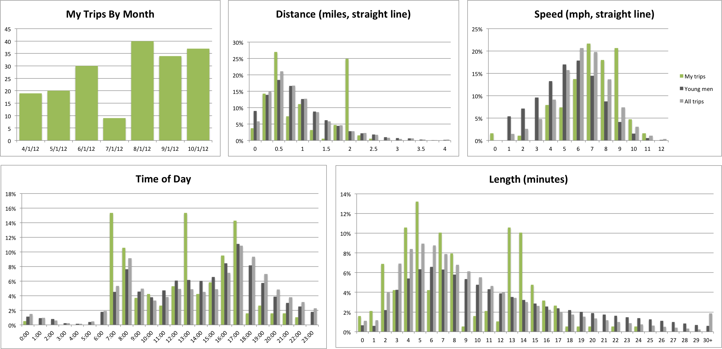
The numbers? I've ridden Hubway for 28:30, that's right, more than a day, and covered 217 straight-line miles. I got in for just $50 this past April, so so far I'm at less than 25 cents per mile and counting. My average speed is 7.6 mph. My fastest ride? I sped from Stuart and Charles to Kenmore Square at 11.7 mph. That's faster than the T.
My most frequent trips are from Central Square to my office (my commute) which is unique in that the route there and the route back are almost completely separate. On the way there I take Mass Ave to Main Street across the Longfellow, and Charles and then on to the Common. On the way back, I take St James to Berkeley to Comm Ave to Mass Ave and cross the Harvard Bridge (364.4 Smoots plus one ear). Getting to the Longfellow is horrible, and while this is longer (usually 2-3 minutes longer, according to Hubway) it's safer and more pleasurable.
So what does it look like? Here's a map and a histogram. And if you want one of these for your Hubway use, contact me or email me an excel of your rides copied from online.
Finally, we'll look at where I think these data could lead next.
Ari Ofsevit | www.ariofsevit.com | @ofsevit