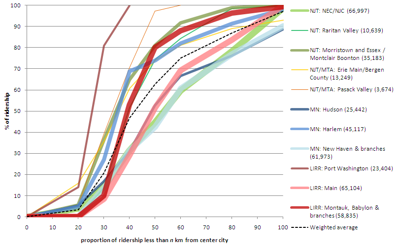
On his blog Pedestrian Observations, Alon Levy recently compared ridership on the different commuter lines in New York. It’s an interesting post, with a chart of the different lines which was begging to be thrown in to Excel and graphed. Which I’ve done:
 |
| Notes: line width is proportional to ridership. Lines are grouped by color. Green = NJT. Yellow = NJT operating in to New York. Blue = Metro North. Red = LIRR. The chart will definitely make more sense when referenced to the original post. |
Levy points out that lines are almost operating as separate systems: some as closely-spaced commuter rail (the group of lines more to the left) and some as almost intercity rail (the ones more to the right). In the first group, half of the ridership rides from stations between 30 and 40 km from the city center. In the second, half the ridership takes rides from at least 50 km out. What’s interesting to note is that each group has lines from each system; it’s not like the LIRR has denser lines while the Metro North has far-flung stations.
It does seem that lines which were once or are now major intercity routes are more likely to have longer-distance commuters and look more like intercity trains. The four lines in this group constitute the three main lines which operate frequent intercity service from New York (the LIRR doesn’t have any cities to operate to, of course) to Boston (New Haven), Albany (Hudson) and Philly/DC (NEC). Of course, even though the Metro North in Connecticut serves trains to Boston and Springfield, it is still painfully slow with maximum speeds of only 70 mph, half the speed of the NJT NEC towards Trenton.
Anyway, I think the chart looks pretty cool. (Next up: giving the same treatment to Boston’s trains, and whining about the MBTA’s commuter services a bit.)
