 |
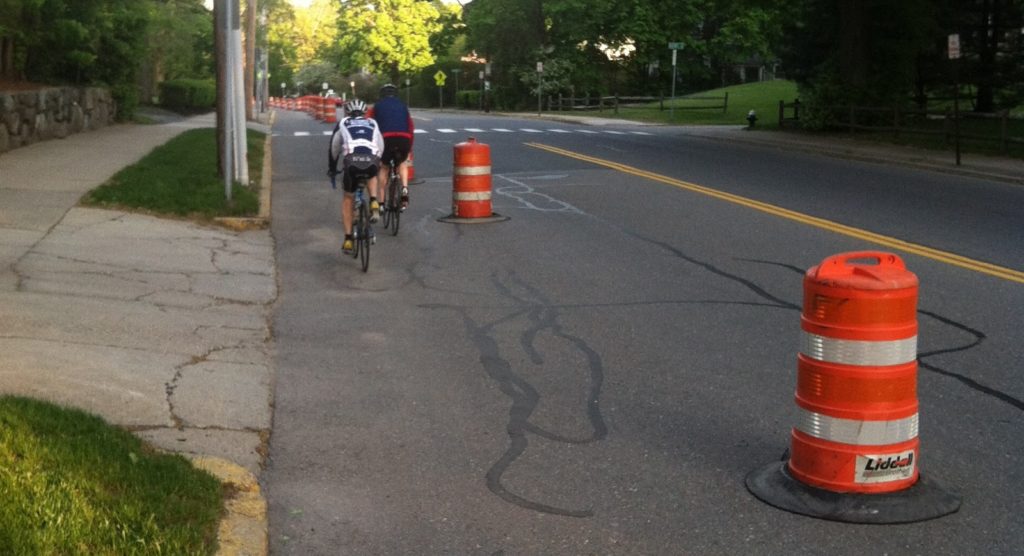
| Two cyclists correctly using the temporary “cycletrack” along Massachusetts Avenue in Lexington. |
Biking through Lexington a few weeks ago, I noticed that the Minuteman Bikeway was set to close for most of May for construction work related to a collapsed culvert. And at an opportune time: the first day of construction would coincide with Bay State Bike Week‘s start, and it would last through the rest of the month, Memorial Day included. The Minuteman is certainly a recreational asset, but is also heavily used for commuting; the site of the construction is only five miles from the Alewife MBTA station, where many cyclists transfer to the Red Line or other bicycle facilities.
The only logical detour? Massachusetts Avenue, a.k.a. Routes 4, 225 and 2A. In other words, it’s not a quiet country lane. While some cyclists are comfortable riding the road (and it can be faster cycling than the bike path), many are not. Ideally, there would be a detour around the construction work. But with a narrow right-of-way and heavy construction equipment, this is not possible. So the town of Lexington, to its credit, did something remarkable: they banned parking along Mass Ave and “barreled off” a lane of traffic to create a contraflow cycletrack for a half mile around the closure. As far as I know, it is the first such facility in the state.
And if you want to see it, you better act fast: it will be gone in two weeks.
As well-intentioned as this temporary infrastructure is, the communication to the public could be better: signage both at the site and even online is confusing to cyclists who will already be thrown out of their comfort zone. The crux of the issue is that when you are implementing a new and different infrastructure plan, you need to be clear to the users what they should do. Unfortunately, both signage at the start and end of the lane and at the project’s website (description and sketch; both pdf) is ambiguous, and thus users were unclear as to how to traverse this section of roadways. It seems that highway engineers created a good plan, but the signage was not properly thought through and vetted.
According to the detour notice (pdf), the following detours occur:
- Westbound bicycle traffic will take a left on to the Seasons Four driveway, and a right on to the Mass Ave sidewalk, following the sidewalk to Woburn Street and taking a left to get to the trail crossing and proceed up the trail.
- Eastbound bicycle traffic will take a right on to Woburn Street. It will then turn left across Woburn Street and proceed on the far-left (north) side of Massachusetts Avenue between a row of barrels and the curb—this is the (temporary) protected, contraflow cycletrack. At the end of this facility, they will take a left on to the Seasons Four driveway, and proceed as normal along the path.
- Any cyclists who wished to use the roadway along Mass Ave should use the traffic lanes as usual but should note that lane width will be constricted by the construction.
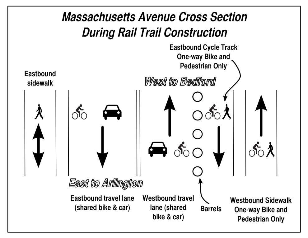
In other words, a cross-section of Mass Ave looking westbound would look something like this:
Simple right? Well, not really. Here are the problems with the communication:
- The project notice is buried on a town website. It’s easy enough to find with a Google search but not well publicized. Once you find it, however, it is a poorly-formatted word-doc-turned-PDF. I don’t want to toot my own horn (or, pardon me, ring my own bell), but the bulleted section I wrote above is much more informative than trying to parse the information from this document.
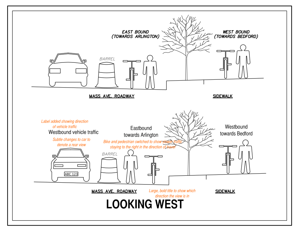
- The sketch which accompanies this notice (but is not linked from it) is clean and simple, but unfortunately leaves out important information to show users how to use the facility. It shows what appears to be the front of a car in the westbound travel lanes, when in fact this should be the rear of a vehicle. This is a fine engineering mock-up, but this is a case where more detail is necessary. It also is too simplified to show the direction of travel, and would be well-supplemented by an overhead sketch as well. It even lacks a proper title, such as “Mass Ave looking westbound” for user orientation. You certainly don’t want information overload, but in this case, important information is left out.
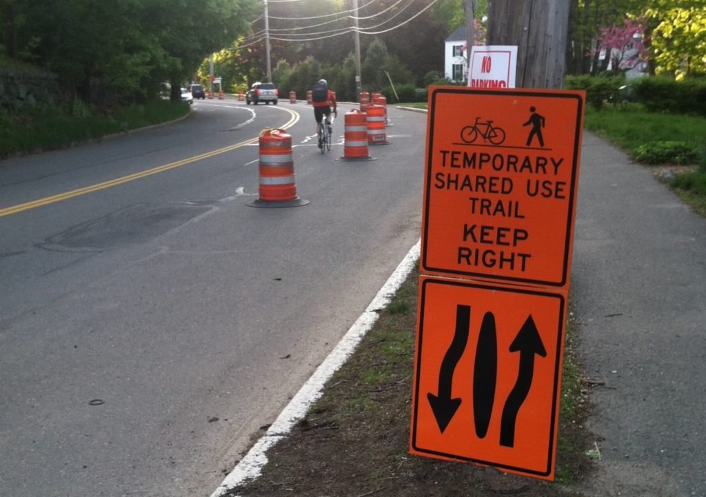
- The signage onsite is abundant, but lacks important information. In a case such as this one, it is not enough to use uniform highway signage: you are dealing with a different user group, and with a situation which is unique. And even then, the signage is ambiguous. Imagine showing up as a cyclist and trying to make heads or tails of the picture below. Kind of difficult.
- The written sign shows a picture of a bicycle and pedestrian (fine) and then the text “Temporary shared use trail. Keep right.” Keep right of what? Is this referring to the sidewalk or to the “cycletrack” lane? Does it mean “keep to the right of the sidewalk” or “keep to the right of the cycletrack” or “of the sidewalk and cycletrack, use whichever is furthest right”?
- Below this sign is a which shows two directional arrows (which bend for no particular reason) around a center island. This is also very ambiguous. Does the island refer to the area between the sidewalk and the “barreled off lane”? Or does it refer to the barrels? Is it telling westbound cyclists to use the “cycletrack” and eastbound cyclists to use the roadway (presumably with traffic on the other side)? Coupled with the signage above, it is no closer to making any sense.
 |
| Good idea, poor signage. This sign makes very little sense. Do they mean keep to the right of the on-street lane, or keep to the right of the sidewalk? Who knows! |
What it needs is more of a cross-section, with words and pictures (see above). Yes, it might be a larger sign, but it would also make it much clearer who was to use the trail, and where. Many trail users take the path daily, so a clear sign on the first day would allow them to properly use the facility during the entirety of the construction. This was, unfortunately, not the case.
As for the sketch, a few minor tweaks could make it more usable. Here is the original sketch, and below my retouched sketch with some annotation regarding changes. It’s still not perfect, since it doesn’t show the whole road, but it at least leaves less room for confusion and interpretation.


Yep. Terrible signage. I was biking west on the path and went west in the barreled off lane. I thought it was a tight squeeze when we came across eastbound riders.
I know! And, it's actually good execution until you get to the whole no one knows what the hell is going on part. Really too bad. Maybe I should print out some guerrilla signs and bike out and tape them up. Hmm, I wonder how this would look 11×17 …
It seems like they could use the short duration paint that they use for utility marking to paint bike symbols and arrows in the respective lanes/sidewalk.
point of order. the two lanes of mass ave are kind of wide. lexington closed a portion of the west bound lane only; one lane has not been dedicated for cyclists, only a portion of the road width.
also, super critical commentary. has the author shared these view points with the local bike committee….who likely worked with municple employees to come up with the plan, and signage?
dont want to see activism be substituted with agitation. we need to be an even voice in order to make real progress.
Wow, second anonymous, that's a lot of big words! It's true that no travel lane was closed, but parking was banned and that lane was offset with a protective barrier for cyclists going in the opposing direction. And I am trying to be supportive of this; they could have simply put up a couple of detour signs and let the chips fall where they may. Instead they built an impressive (if temporary) bit of bicycle infrastructure.
As for the signage, it seems that it was wrung through the machinations of a DPW which didn't take in to account the user base. I based my conclusions on riding the closed portion of trail and observing several confused cyclists. The signage is quite vague, and the exciting (if temporary) infrastructure could have been better used with better explanations.