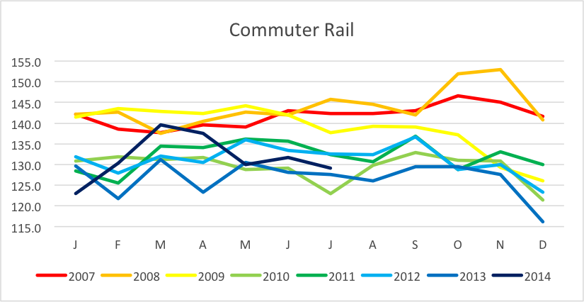
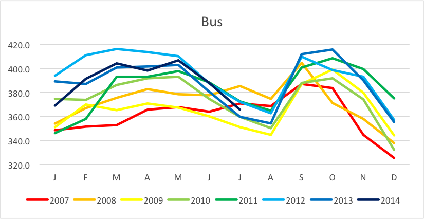
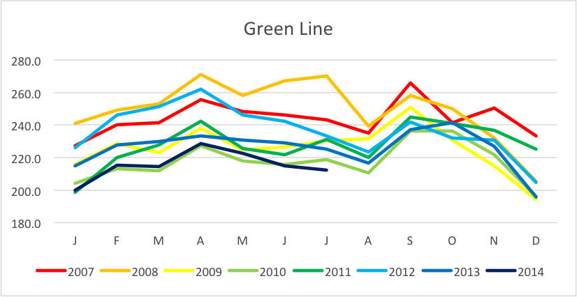
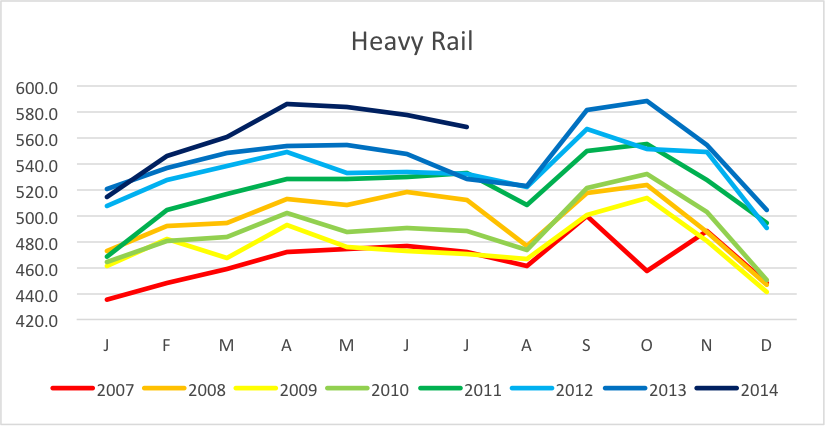
The MBTA recently released its monthly ridership report. The headline was generally that ridership increased despite a minor fare increase (we’ve discussed fare and ridership elasticity before, as the amateur economist). The spreadsheet also included ridership estimates going back several years, and if you look at ridership back to 2007, things get interesting. While overall ridership is growing, that growth is being driven almost entirely by ridership on the Red, Orange and Blue lines. Bus ridership is growing much more slowly, and Green Line and Commuter Rail ridership is falling.
I looked at several ways of graphically displaying these data and decided that the best was to show a chart for each transit mode, with colored lines ramped from red (2007) to blue (2014). It makes it easy to see if the more recent numbers are higher or lower, and to see the variability between months of the year (for instance, bus ridership drops off appreciably in the summer, other modes less so).

In 2007, the split between Commuter Rail, Buses, Light Rail and Heavy Rail was as follows:
CR / Bus / Grn / R-O-B
12% / 30% / 20% / 38%
 Since then, buses haven’t changed (the overall ridership has grown, at the overall growth rate of the system). Commuter Rail and Light Rail are down appreciably, while Heavy Rail is up dramatically. The split now comes to:
10% / 30% / 17% / 43%
 These may not seem like big swings, but they are actually quite dramatic. In 2007, Commuter Rail carried between 137k and 147k passengers per day, peaking at 152k in late 2008. Commuter Rail ridership dropped significantly during the recession, however, and averaged in the 120k range during most of 2013, a not-insignificant drop of 10%. There were some increases this spring, but whether they will hold remains to be seen. Green Line ridership has also dropped by about 10%, from 240k to 250k per day in 2007 and 2008 to 225k today. It too saw a major drop in 2009 from which it has not recovered except for a few months in 2012; right now it is at its lowest levels since 2007. Bus ridership has increased by about 7%, from 360k passengers a day to 390k, give or take. Add these all together, and they basically offset. Commuter Rail and the Green Line have lost 30,000 passengers per day, and the bus network has gained that many.

But then there’s heavy rail. The subway system is busier than ever (at least in recent memory). In 2007, there was no month with a daily average of more than 500k riders on the subway system. Every month in 2013—even the normally-quiet December—was above 500k per day, an average increase of 17% in relative terms, and 90,000 passengers in real numbers. And 2014 is, so far, outpacing 2013, it’s quite possible that the heavy rail system will board more than 600k passengers per day this fall (September and October are generally the peak months). Notice how the dark blue 2014 line is far outpacing the past few years (not to mention the 2007 to 2010 period). If the average ridership growth from January to July of 2014 carries in to the fall, we’ll easily crack 600,000 rides per day in October (if we crack 622k, we’ll double 1990 heavy rail ridership). In other words, get ready for crowded trains this fall.
Why heavy rail is growing so quickly, and other modes less so, is likely due to a number of factors. I would put forth that increased development has helped, as has the heavy rail capacity (it was only within the past 20 years that the T increased from four to six car trains, more recently on the Blue Line). For commuter rail, it likely has to do with fare and parking increases, which, while proportional to other modes (for fares, at least) are higher dollar amounts (often $1 or $2 versus 25¢). The Green Line lags because of substandard service along much of its route—especially on surface branches with no signal priority and on-board fare collection gumming up the schedule—and due to overcrowding. However, it is also illustrative of the necessity of an undelayed procurement of high quality rolling stock as most of the heavy rail equipment is at least 33 years old, and many Red Line cars are 45 years old. New equipment may well help the T keep up with ridership growth, but hopefully it won’t be to little, too late.

It is kinda confusing that you use the colors of the lines to represent years instead of routes (i.e. red line). Maybe you can plot time on the X axis from 2007-2014 with monthly breakdowns by mode/line to clarify
I agree with Nelson, you can tell a better story with the X-Axis relating to a time series. I would argue the decline in Green Line service might have a strong correlation to increased rents in their service areas and access for commuters to park their vehicles. I wouldn't be surprised if D-Line ridership is higher compared to the other 3 lines because of its commuter lots. Whereas the other lines are dependent on commuters who may not work in downtown and resident parking is strictly enforced.
The Green Line are also in neighborhoods and in towns where rents have skyrocketed. It might be interesting to see ridership compared to median rents in each area. I do agree with you signal priority for trains should be implemented.
I experimented with what you describe. It was my initial inclination, and I've actually used it in a longer-term charting of similar data.
Two issues with doing that here. Seasonal variability is a two-fold problem. It masks the changes, especially for the lower-ridership lines, so it's harder to see the trends, and you have to put a trendline over it to make it stand out. And seasonal variability is interesting to note, too, since the trends are pretty constant (with some odd outliers).
Second, tthe data used here doesn't come strictly by line, it comes in groups. The heavy rail would have to be some non-T color (black?) which would defeat this purpose. So you'd have yellow, green and purple (I can even match T colors) but no red, blue or orange. So it gets janky that way.
Interesting hypothesis regarding the Green Line, but the issue is that the Red Line also serves areas with large rent increases, and it's growing quickly. Half of the Green Line (C and D) serve areas which have always had high rents, and the other halves (B and E) serve areas with rents comparable to parts of the Red and Orange Lines (in the E Line's case, some of the same neighborhoods.
Did the Green Line numbers change significantly after the front-door boarding policy was introduced? That has really made service even slower (as if it wasn't slow enough already). I understand the T wants to reduce fare evasion (and so do many riders), but the unintended consequence to the T's solution (requiring everyone to board and exit via the front door only during off-peak times) is that fewer people are going to ride because of how much slower each trip becomes.
I wouldn't be surprised. It's an inane policy; most of the people boarding in the rear are monthly passholders, and most operators have people come to the front to pay fares. It just winds up delaying everyone who does pay their fare. The Green Line has had a relatively long flat trend for about 25 years, I think it is likely a product of deferred maintenance, capacity issues and slow orders. If they were able to get the track up to snuff (40 mph in tunnels, 35 in medians with signal priority, 50 on the D Line) with prepayment (or at least all-door boarding and proof-of-payment, better cars and more capacity, I bet more people would ride.