Transport Report: March 2011 << Previous month — Next month >>
Every day this year, I've recorded how far I travel, and by what mode, in a nifty Google Doc.
I'm about to set off on a Walk of the Pacific Crest Trail and don't have time to do much more than post the charts with a couple very brief comments. First off, however, I'll continue to track my daily mileage, so look for many new charts here at the end of the summer. Second, go to Ariwalks.com and keep tabs on my hike as it goes along. And get ready for some spiky blue lines!
Here's the data, broken out in to charts:
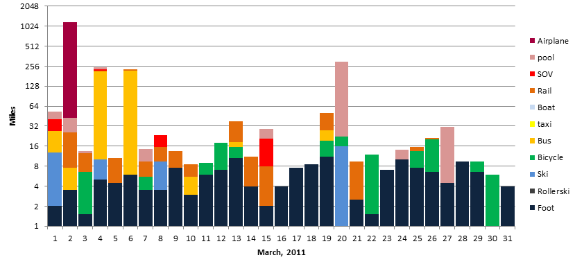
Miles per day by mode. Log scale, base 2 (to get more lines). NB that all data starts at one; there is no way to display zero values in a log scale, so 1 null mile is added to each day to display the graph correctly.


Quick notes:
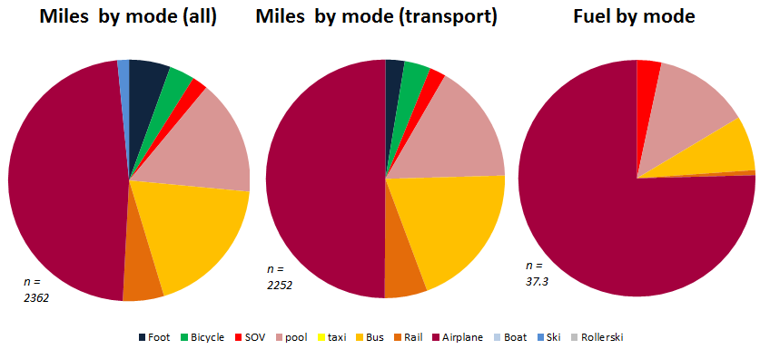
Without skiing, I spent precious little time driving in single occupancy vehicles anywhere (just four days, and no long trips—which I made by plane, carpool and bus). So even though air travel was less than half the transport miles, it accounted for more than three quarters of the fuel use. I walked and biked more, too, since the snow in Boston finally melted, although what was interesting is that compared with Minnesota, I walked more and biked less. With a much more cohesive transit system—and living on a very frequent bus route and four minutes walk from two train lines—I'd often decide not to bike somewhere based on weather or bike parking where in the Twin Cities I would have saddled up in no time. Interesting to note.
<< Previous month — Next month >>
© 2011, Ari Ofsevit